


How to add a complex color to the interior to make it stylish and elegant.
Emphasize common subject
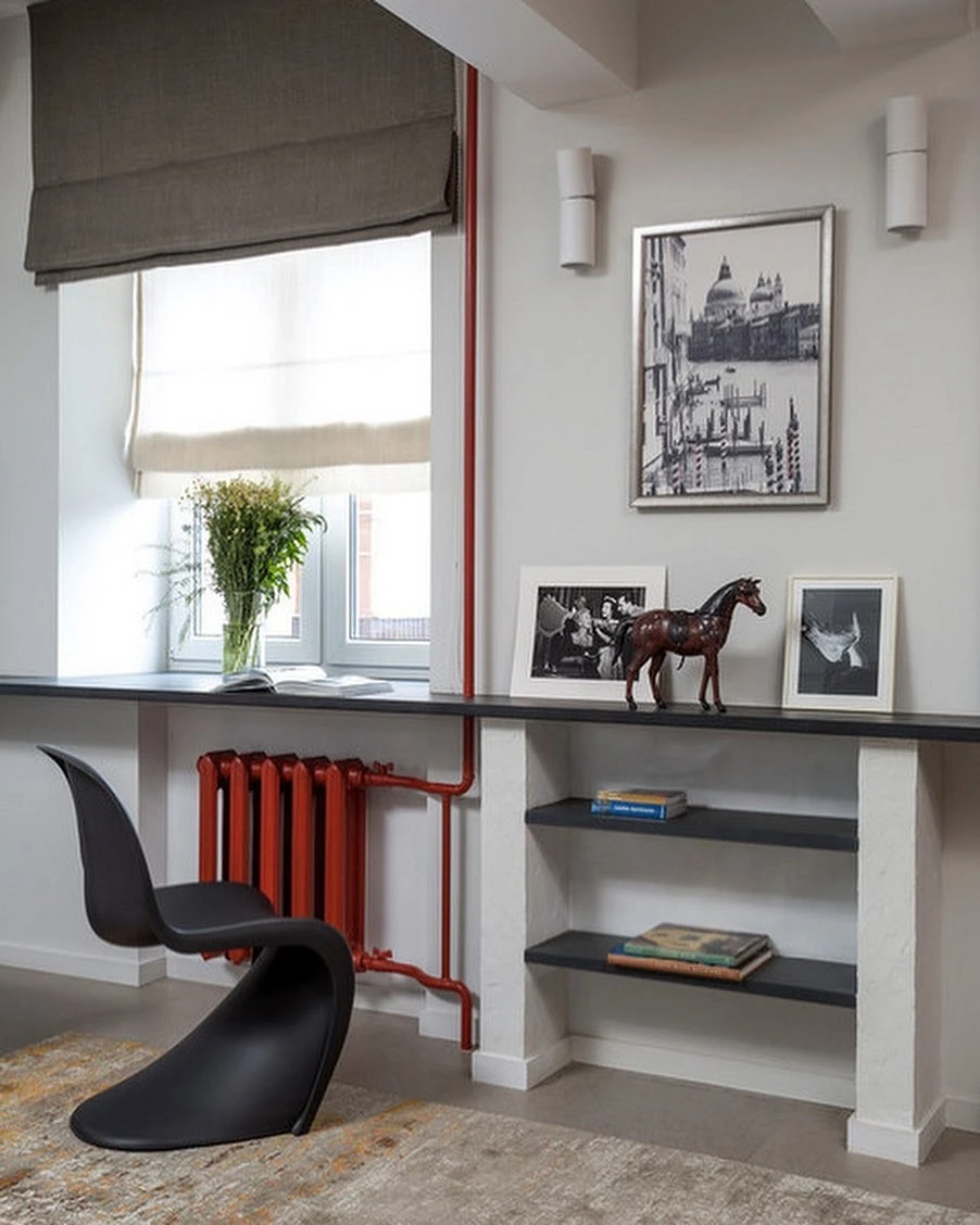
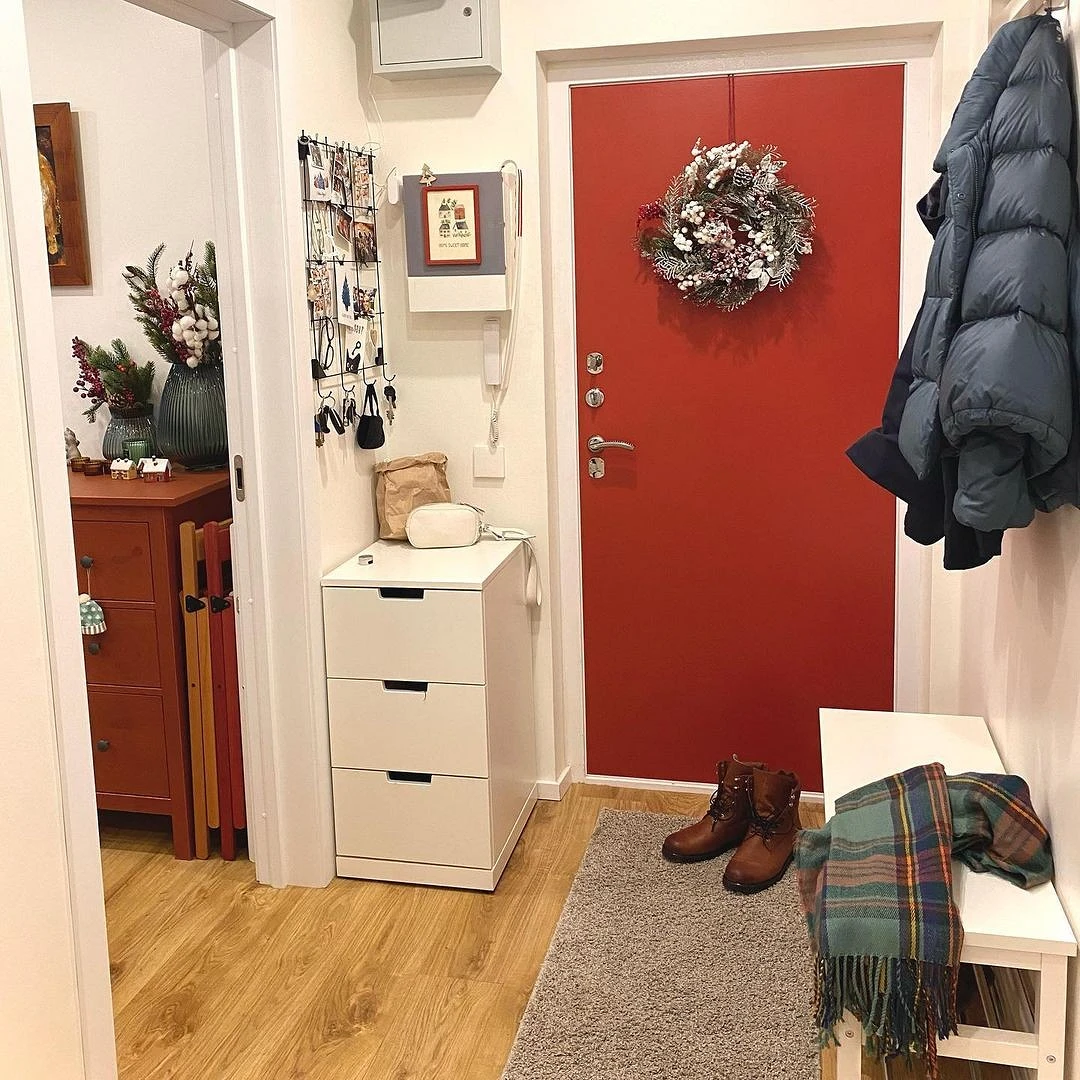
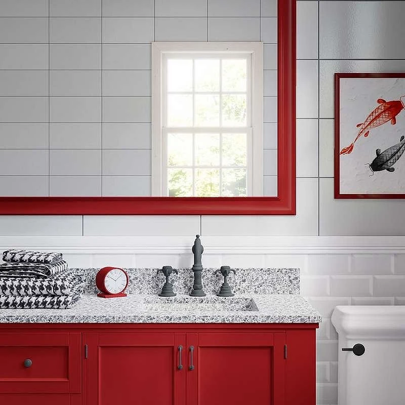
With red, you can emphasize things that you are used to seeing in a different color, and not pay attention to them. In this case, they become an unexpected accent, and this is always remembered. For example, a door, a central heating radiator, or a window frame can become red. If the base and the main accent are neutral, they will be a great addition to the interior.
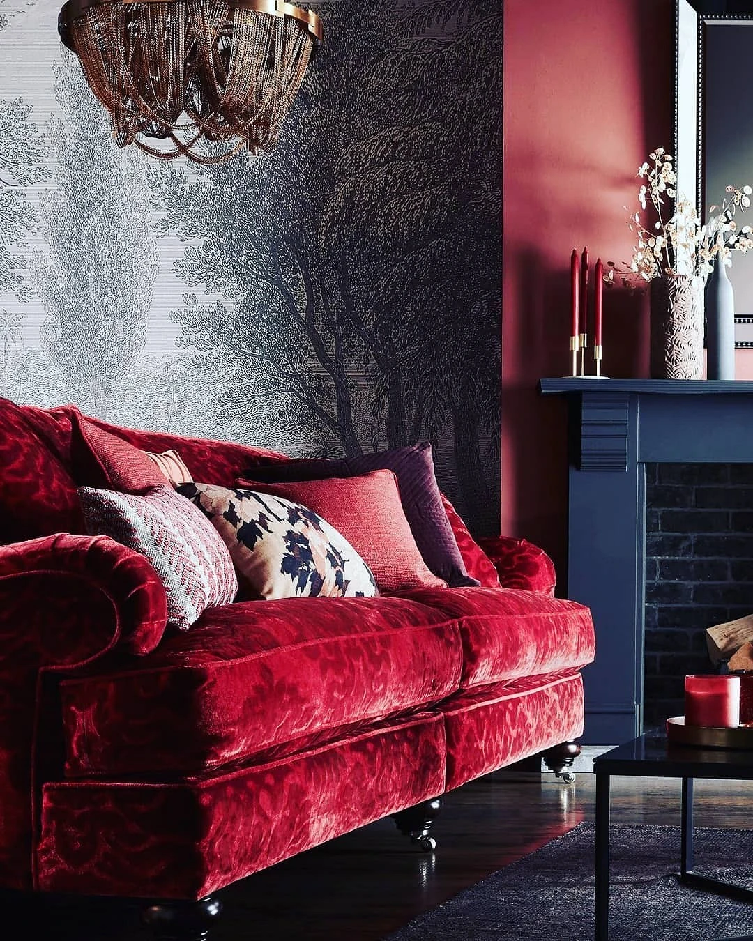
Use cool tones
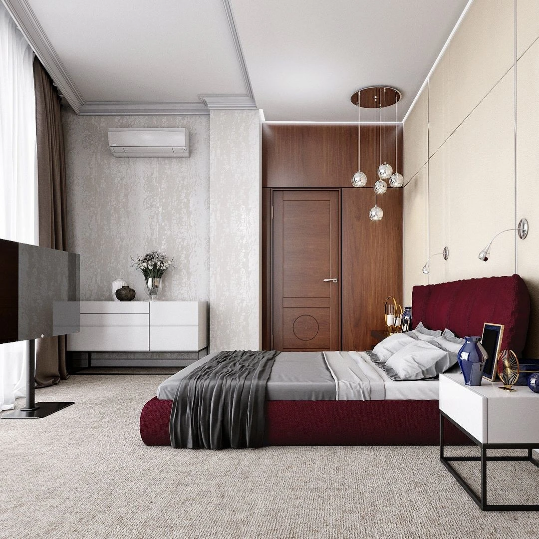
The cold wine color is perceived not as aggressively as the warm scarlet. Wine, on the contrary, is considered noble, and adds some depth to the space. It can be used for accent walls, large pieces of furniture (beds, sofas, or wardrobes), and fit into various interior styles, even classic ones. But in this case, the rest of the palette will also have to be selected in cold shades.
Choose muted shades
Pay attention to furniture and decor in muted colors. The same goes for the color of the wall covering. If you are not buying ready-made paint, but tinting it yourself, make some samples of muted red. Then choose the best one by coloring.
Both warm and cold shades, diluted with white, are not so striking and do not overload the interior.

Focus on the color wheel
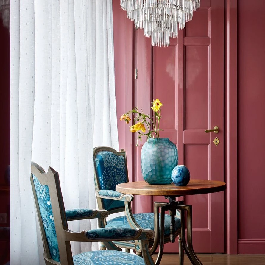
If you use the color wheel, you can choose colors that blend well with each other and look harmonious in the interior. For red in particular, the companion colors are yellow and blue. You just need to choose the right shades for them, based on the specific tone of red. They should be approximately the same distance from the center of the circle.
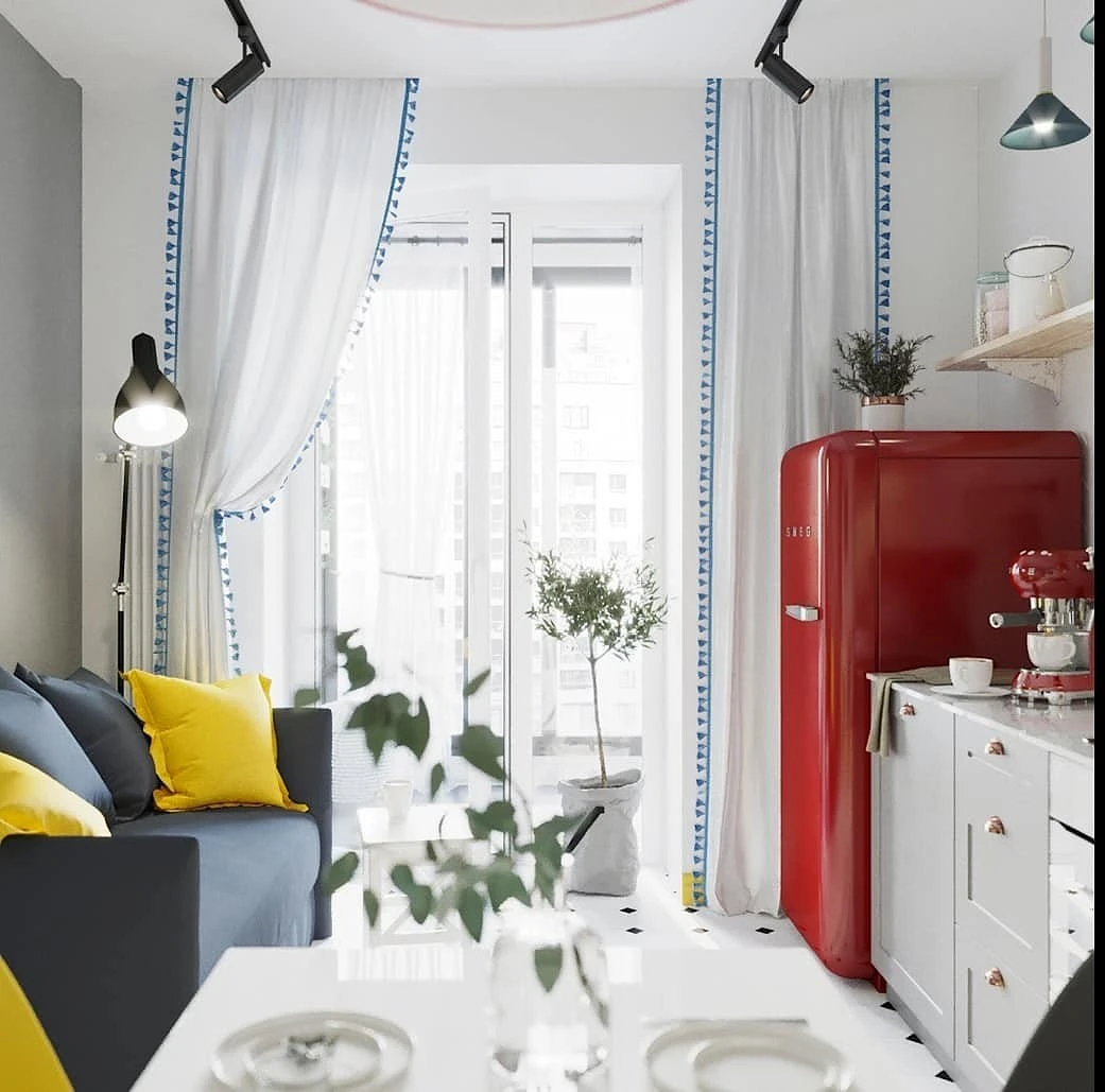
For example, if you want a bright warm red refrigerator in the kitchen, it will be successfully set off by the cold tones of lemon and muted blue. And so that the space does not turn out to be too saturated, it is better to take a light base for these colors – cold white.

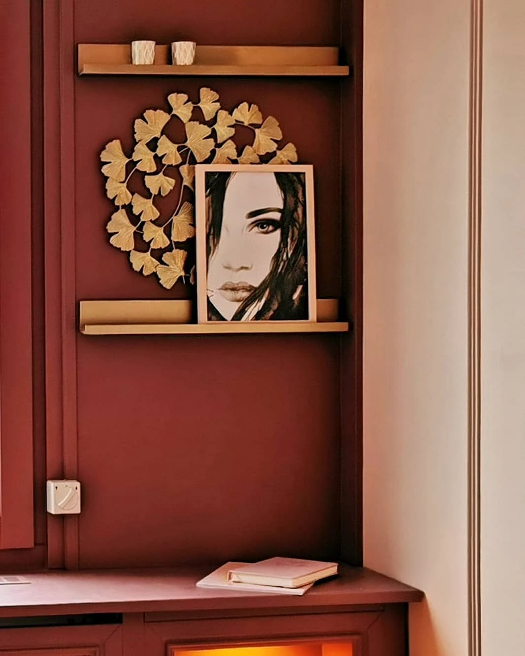
Complement large objects with small ones
If you put a red armchair in the living room, pick up red pillows on the sofa under it. Then add a few very small inclusions: fragments of paintings or posters on the wall, a subtle pattern on the backsplash tile. The gaze will automatically notice that there is a well-thought-out color system and order in the space. And the interior will seem thoughtful and complete.

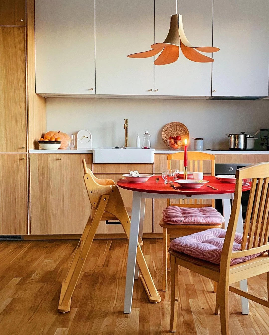
Leave for non-residential rooms
A safe way to add any bright shade and not get tired of it quickly is to design non-residential rooms in this way: kitchens, bathrooms, corridors, and workrooms. Red in this case will attract attention, cheer up, and will not have time to get bored for a long time.
In addition, the red color helps to cheer up and concentrate, which is not always appropriate in the bedroom but is useful at the desk or in the bathroom.
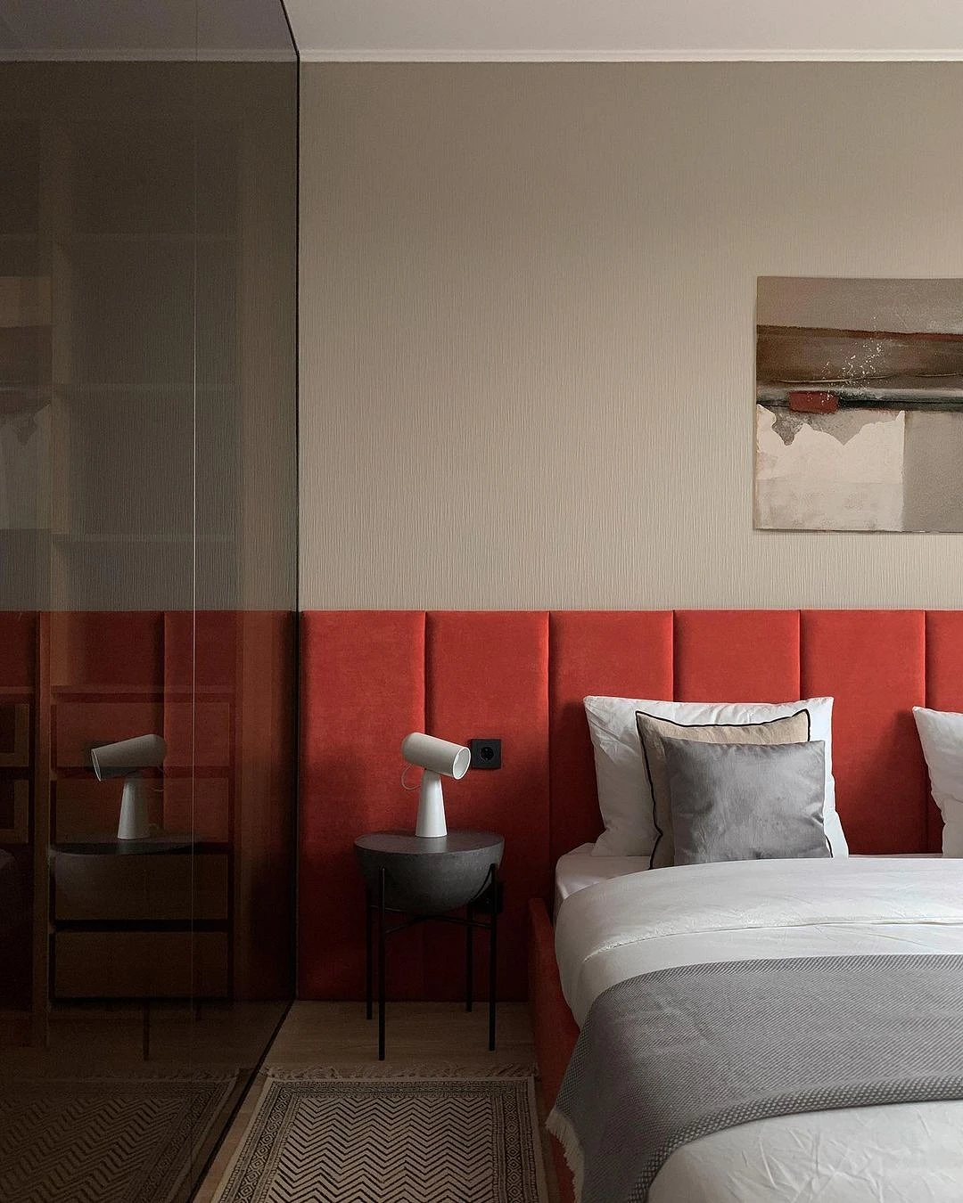
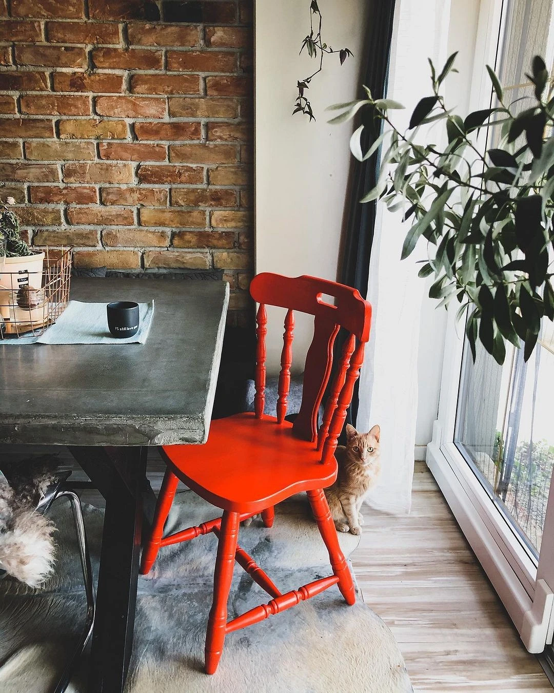
Select textures for red
A lot depends on the texture for which you choose red. For example, a red glossy kitchen set is likely to look too aggressive in the interior. A red velvet headboard or a wooden chair, on the contrary, will add comfort and peace.
The most important thing about our X that it is for
those who are in a hurry


