


We have collected bright Scandinavian interiors and adopt simple techniques that can be repeated at home.
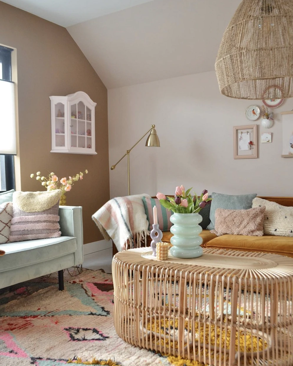
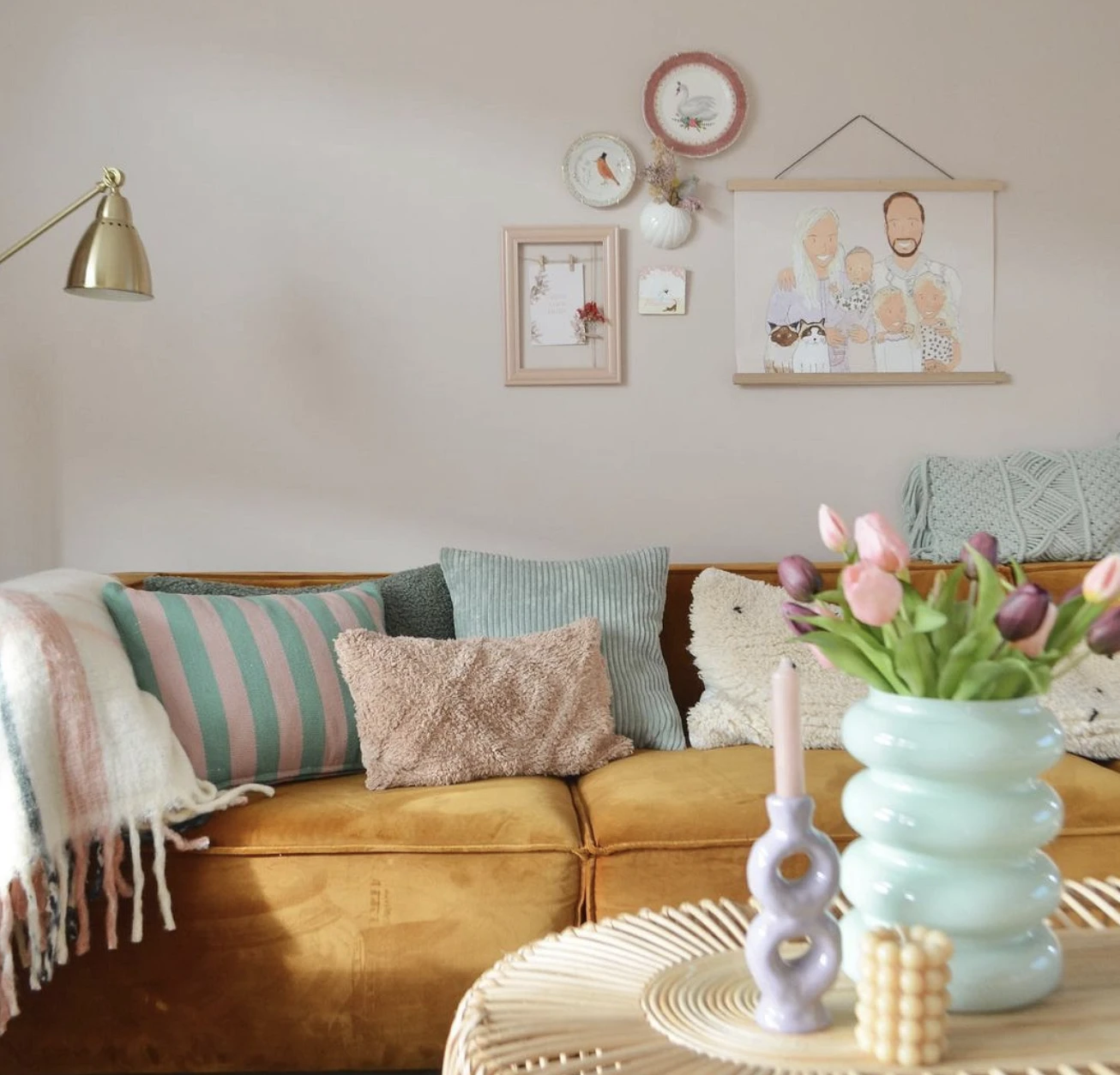
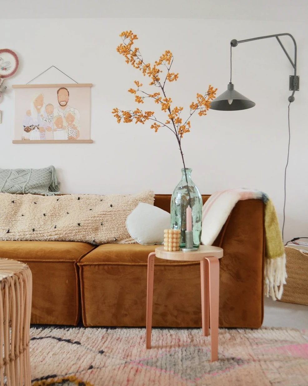
Interior with ocher sofa
In this living room, the main accent is a large ocher sofa. It harmoniously echoes the sand-colored wall and wooden furniture. The second bright spot is a small mint-colored sofa. But that’s not all: the third accent color is light pink. It, along with mint, can also be found in decor: sofa cushions, candlesticks, and posters on the wall.
What to adopt
This interior clearly shows how the use of several colors at different points of the room makes the space harmonious and interconnected. Therefore, when it comes time to choose textiles and decor, stick to one color scheme. And if you like a bright piece of furniture, support its color somewhere else.
Living room with bright decor
If you have already designed a neutral Scandinavian interior, this does not mean that you cannot make it brighter without repair. For example, in this living room, plain white walls act as a backdrop for a gray sofa and a wooden coffee table, but the space is made interesting by poster wall hangings, vases, and cushions.
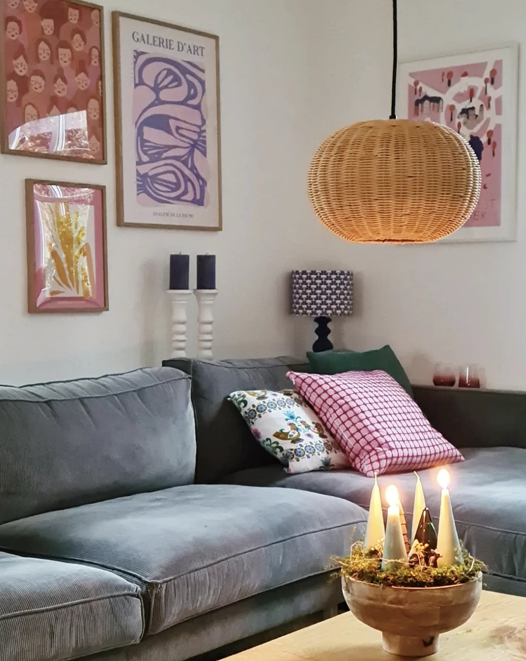
What to adopt
When decorating a room, do not pick up accessories just like that, according to the “what you like” principle. This, of course, is important, but you need to determine the overall color that will be repeated or a single style. Also, think over in advance the location of posters, vases, candles, and textiles so as to evenly fill the entire space with them.
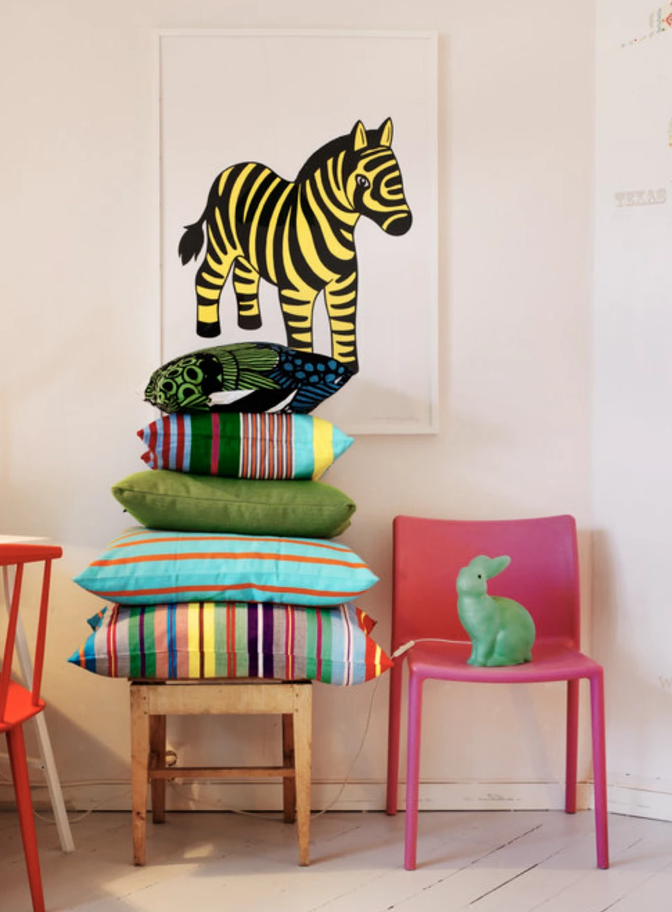
Children’s room with the colorful furniture
For this Scandinavian nursery, the designer chose accent furniture: a red sofa, multi-colored chairs, and a table with a green base. They are complemented by bright posters, wall panels, and pillows. In combination with a neutral base, it turned out to be childishly colorful and festive, but not too colorful.
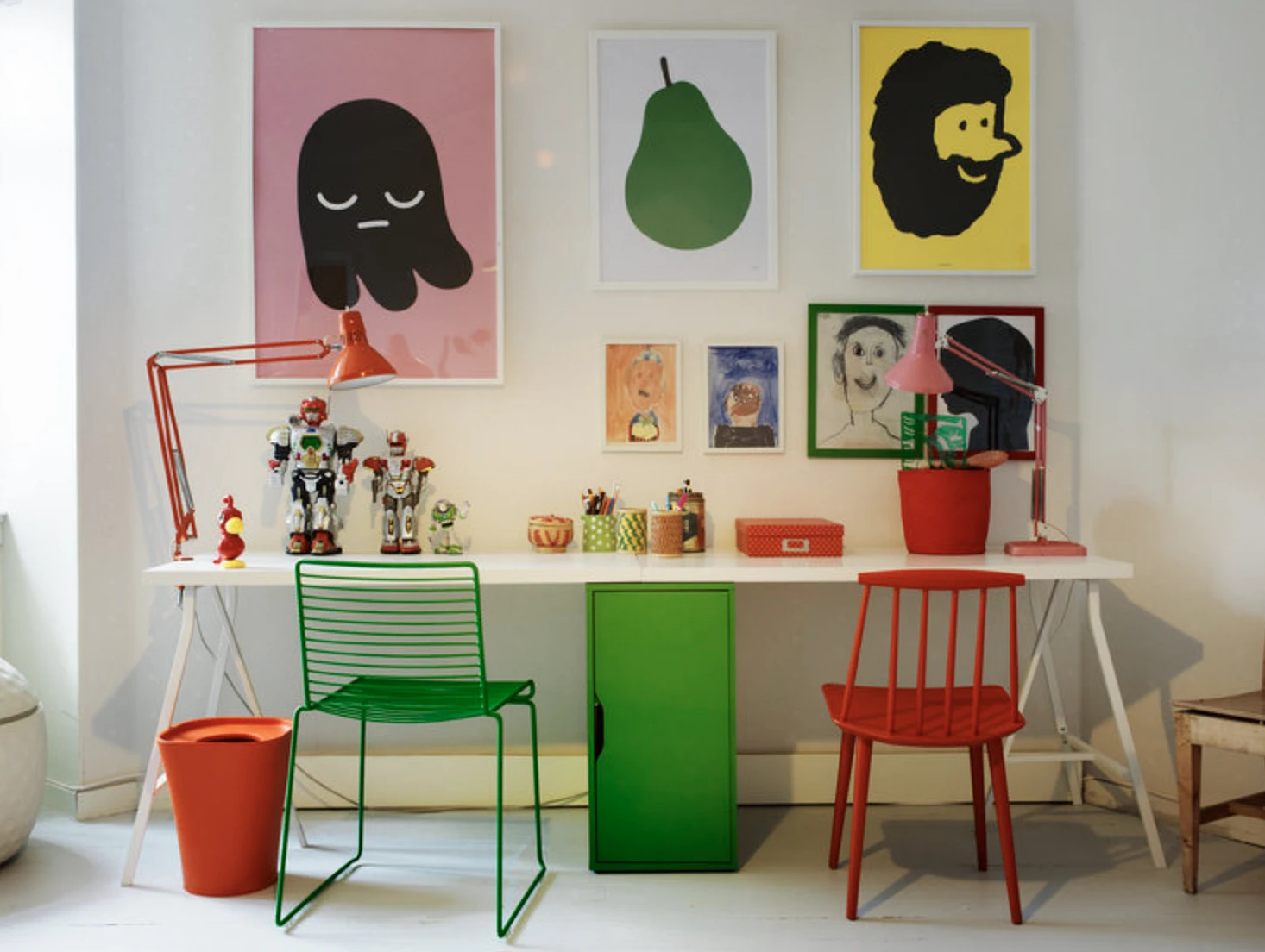
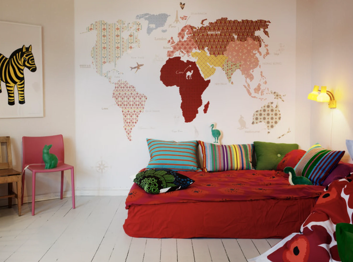
What to adopt
Remember that it is not necessary to choose only standard upholstery and familiar neutral finishes for furniture. Some items can also be saturated with bright colors if they are loved in your home. And do not forget about good lighting so that the room looks aesthetically pleasing not only in daylight but also in the evening.
Interior with color and geometry
In this living room, bright colors are used locally, but they immediately catch the eye. The secret is that they are complemented by clear geometric shapes: rectangles, triangles, and squares. These figures are found everywhere: on the carpet, in candlesticks, sofa cushions, the frame of a small sofa, and vases.
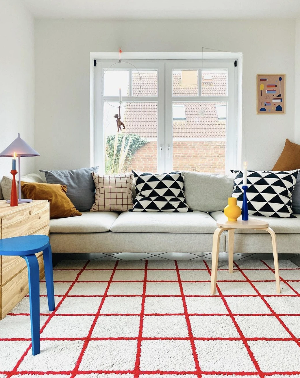
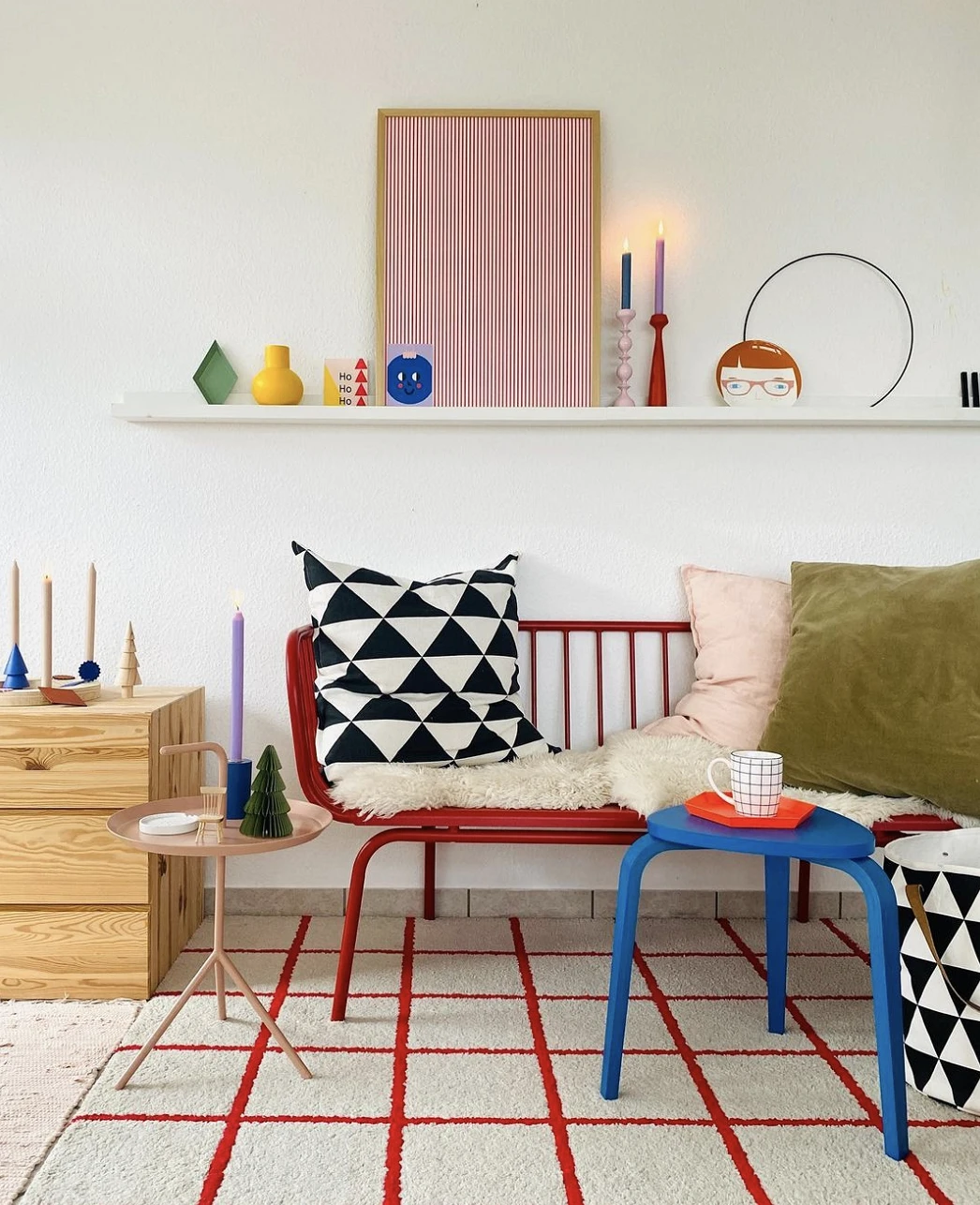
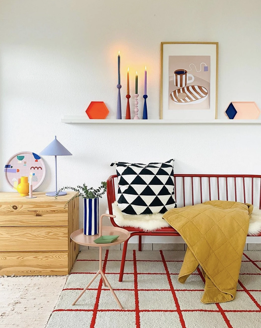
What to adopt
When working with a palette, don’t forget about other visual patterns: patterns, ornaments, and lines. If you combine color and shape, you will achieve an interesting effect, but it is important not to overload the space visually. Therefore, if strict straight lines prevail in the interior, it is better to refuse, for example, floral motifs in the neighborhood.
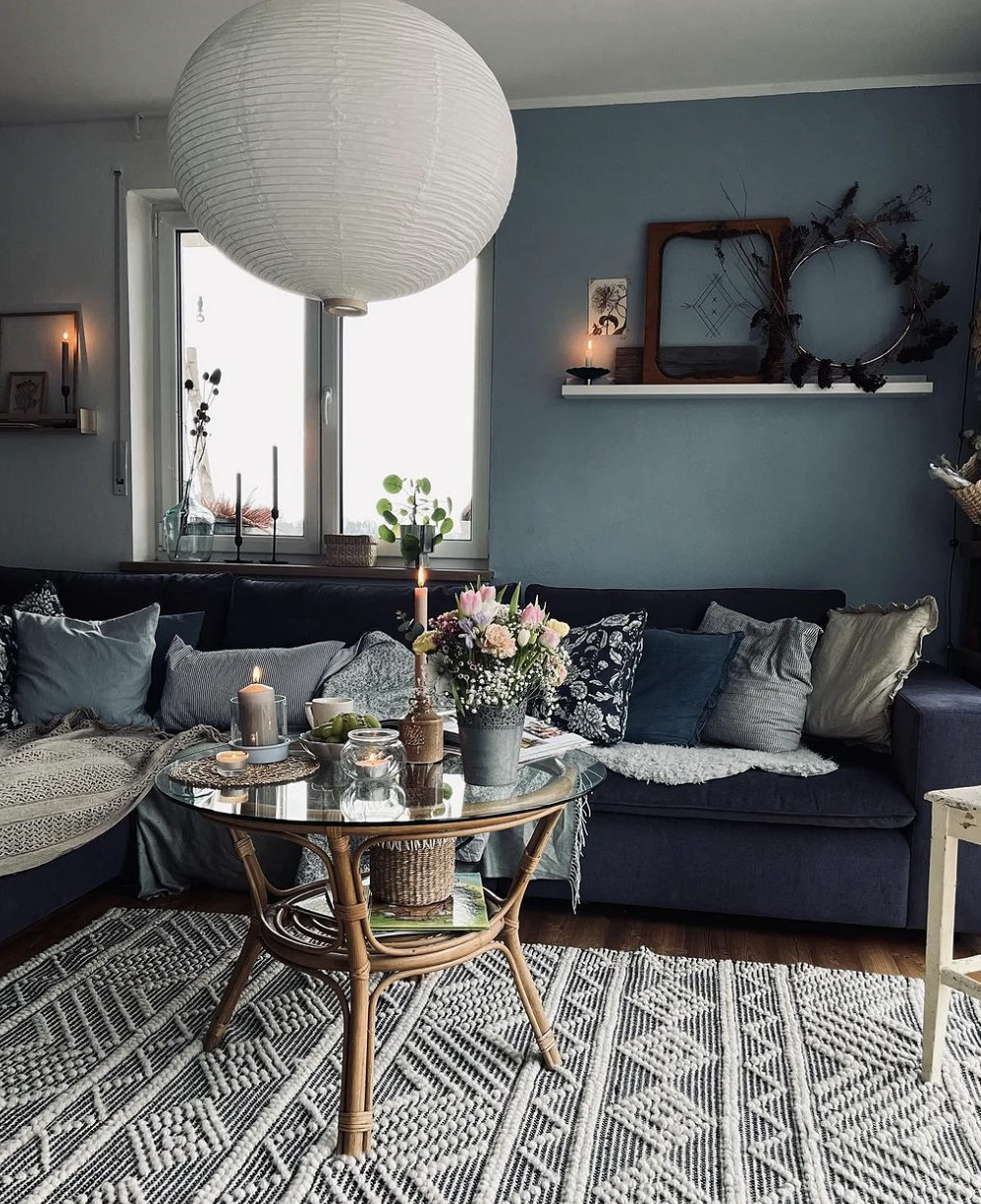
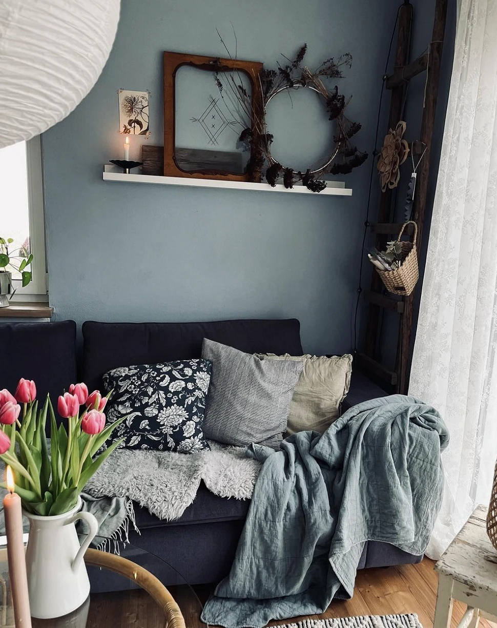
Living room with blue accents
Colorful does not always mean bright or saturated. For example, this living room looks very harmonious in its calm blue tones, but at the same time, it does not seem faded and boring at all.
What to adopt
If you are afraid that accent colors will soon become annoying and tiring, take natural muted shades instead: blue, cyan, green. They are suitable for decorating walls for the upholstery of a sofa or cabinet facade, and for textiles and small decor.
The most important thing about our X that it is for
those who are in a hurry


