


Brown is an elegant, noble, and at the same time very cozy color. We will tell you how to decorate your kitchen in these shades to make it stylish and relevant.
Repairs in the kitchen have been done for years: changing the cabinets, appliances, and decoration in the cooking area is not so easy and also quite expensive. Therefore, you immediately want to decorate the space in such a way that it does not get boring and remains relevant for a long time. The best choice for this is noble basic shades and textures that are out of trend. In this article, we will consider one of these options and tell you how to decorate a brown kitchen in different styles.
Features
Psychologists endow this color with positive qualities: it relaxes, calms, and gives a sense of stability and security. All this is due to associations with natural elements: soil, wood, stones, etc. In this series, it is not associated with any negative pictures such as blood, cold, or darkness. It doesn’t irritate or excite the psyche, and it doesn’t make you sad like blue or purple in large quantities. Thanks to this, the color can be used both as an accent and as a base, without fear that it will quickly become boring or cause discomfort.
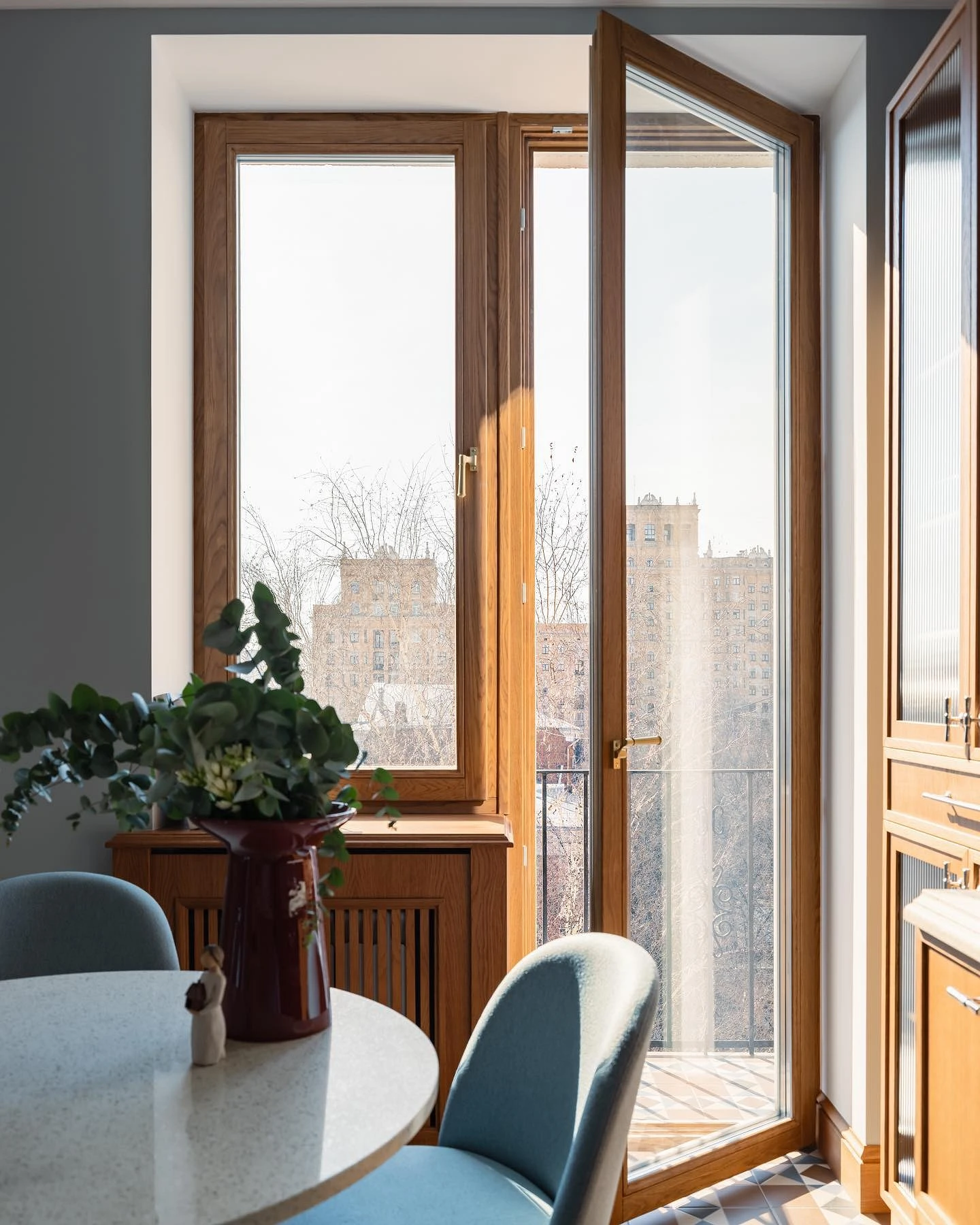
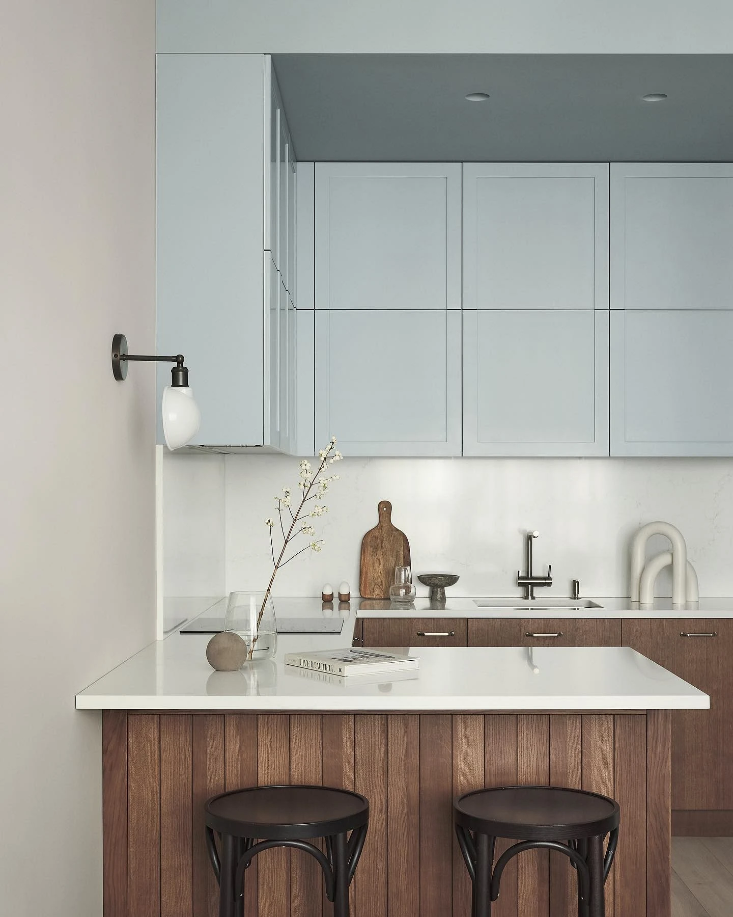
In the interior, brown is one of the basic neutral shades. It is “native” to the texture of wood, so it is often chosen for cabinet furniture, doors, and floors. Sometimes for walls too. Due to the warm undertone, the color creates a feeling of coziness, and shades with a predominance of cold notes look very elegant, expensive, and status. Brown is often unjustifiably considered boring, but it has a lot more shades than it looks, and they can all look different, cause different feelings.
For a kitchen in brown colors, the following are best:
- Neutral “dessert” shades are milk chocolate, praline, hazelnut, coffee with milk, caramel, cocoa, and cinnamon.
- Discreet cold – wenge, dark chocolate, taupe.
- Dark ones with red undertones – mahogany, sepia, brick, mahogany, copper.
- Warmer, brighter and cozier – terracotta, amber, honey, chestnut, golden.


Successful combinations with brown in the kitchen
In the interior of the kitchen, brown will not be the only color in any case. Let’s take a look at what it is best to combine it with.
With white
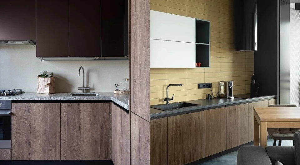
The main problem with chocolate and coffee shades is that they are quite thick and enveloping. If there are too many of them in the palette, then the room will easily turn from cozy to visually cramped. Among the entire spectrum, it is white that best balances deep tones. It fills the space with light and air, making it visually more spacious. A white and brown kitchen is an ideal scheme for a small area or an apartment with low ceilings.
White is traditionally used for wall and ceiling decoration, but you can also choose it for part of the kitchen set. Top or bottom – up to your taste. Also, remember that it is important to combine shades correctly: if brown is colder, snow-white with a blue tint will go with it, and if warm reddish, then it is better to take ivory, powdery, and milky.


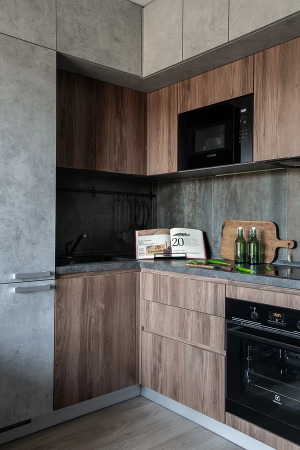
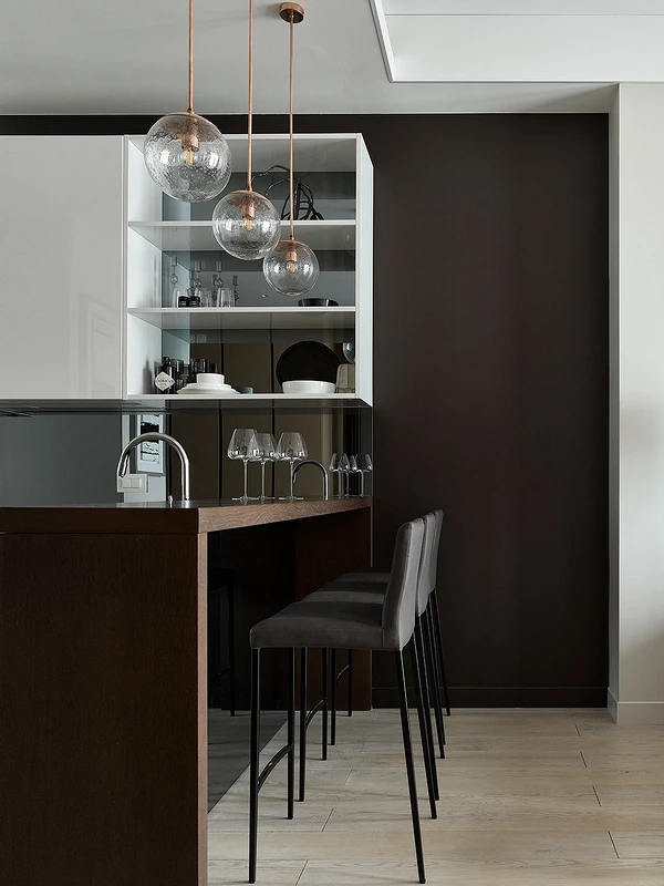
Grey
Another universal achromat, but in this combination it performs a different function. It does not give lightness, but, on the contrary, “collects” brown, making it more graphic and, depending on the textures and surroundings, more brutal, restrained, or elegant.
In this case, the combination can be any. A gray-brown kitchen is a kind of universal construction set, where you can make the floor, walls, facades, and backsplash achromatic. The same goes for the second color. The main thing is to dilute the combination with cozy textures, provide a sufficient amount of light and, if possible, complement with inclusions of white or light beige.


With beige
Beige is the closest relative of brown, only lighter and warmer, diluted with white. In pairs, they look harmonious in different styles and in any combinations. The danger of such a combination is that both shades are basic, and at the same time dense. At the same time, it is already hot in the cooking area, so they definitely need to be muffled, cooled, and refreshed a little. Any variants of white, light gray, blue, mint, or cold green do a great job with this task – they can be added to the palette as additional.


With bright colors
Not everyone likes an overly calm basic interior. If this is about you, then feel free to supplement the noble base with bright inclusions. Just avoid too open, unnatural shades. As for the rest, any colors that you like and fit into the general palette will do red, sunny yellow, red, blue, emerald, olive, and pink. And remember the golden rule: the richer the shade, the less it should be in the color scheme.


With pastel color
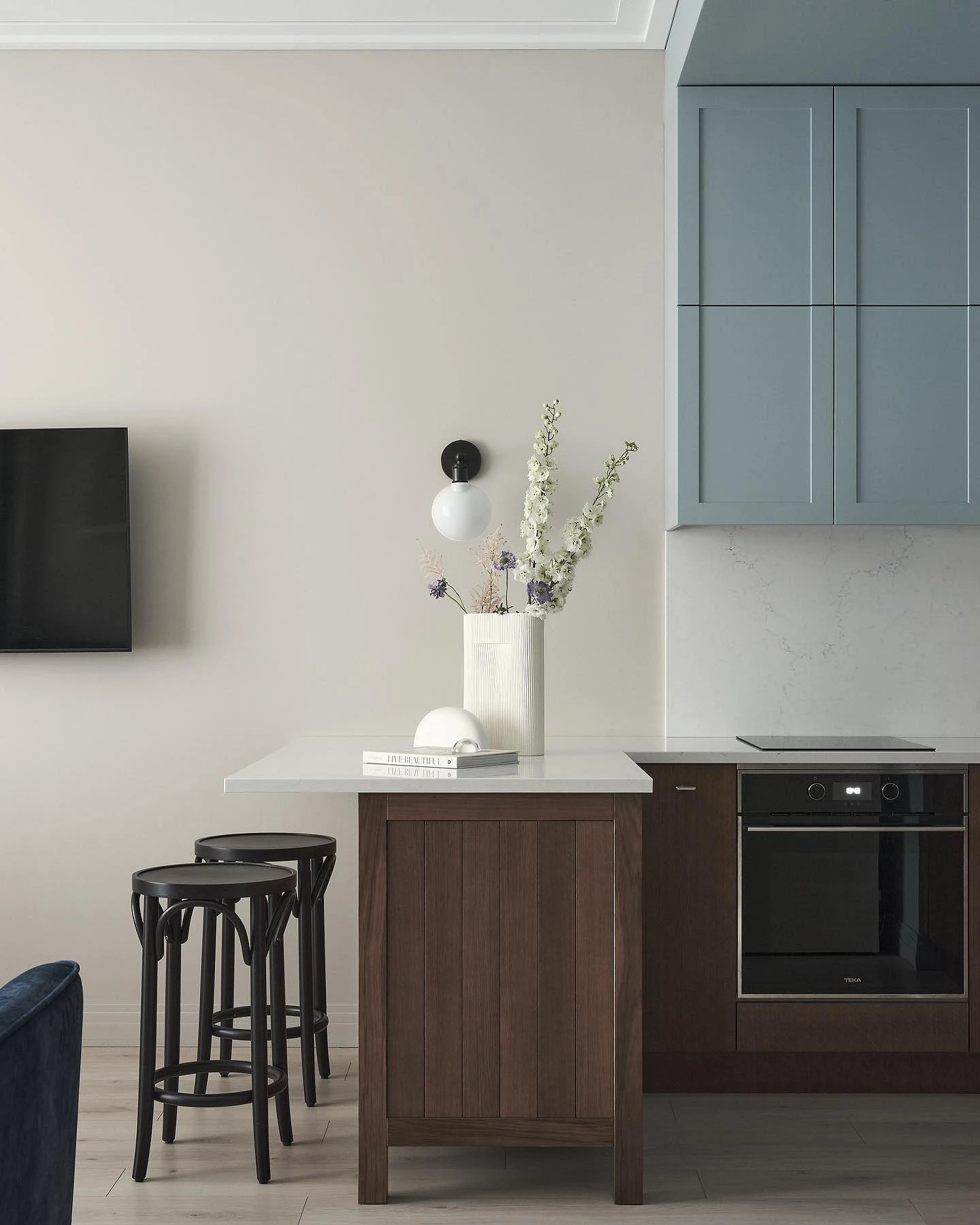
A slightly calmer option for those who still like color, but at the same time do not want to overload the space or generally prefer less bright shades. Any pastel colors fit well on the chocolate and coffee background, you get a cozy, but at the same time coloristically interesting combination. Peach, mint, lavender, and blue can be chosen for both décor and decoration. Or, for example, make part of the facades of the headset in an unusual shade.
Applications
In the kitchen area, brown can be used in any amount. If you want to make it the main or one of the main elements of the palette, then choose a color for furniture or decoration.
Furniture
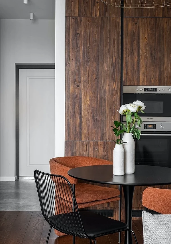
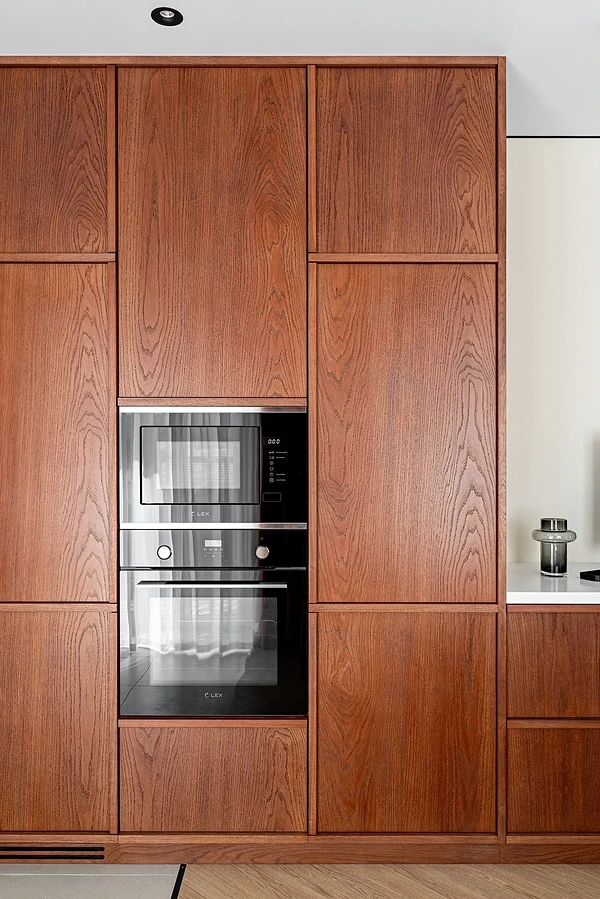
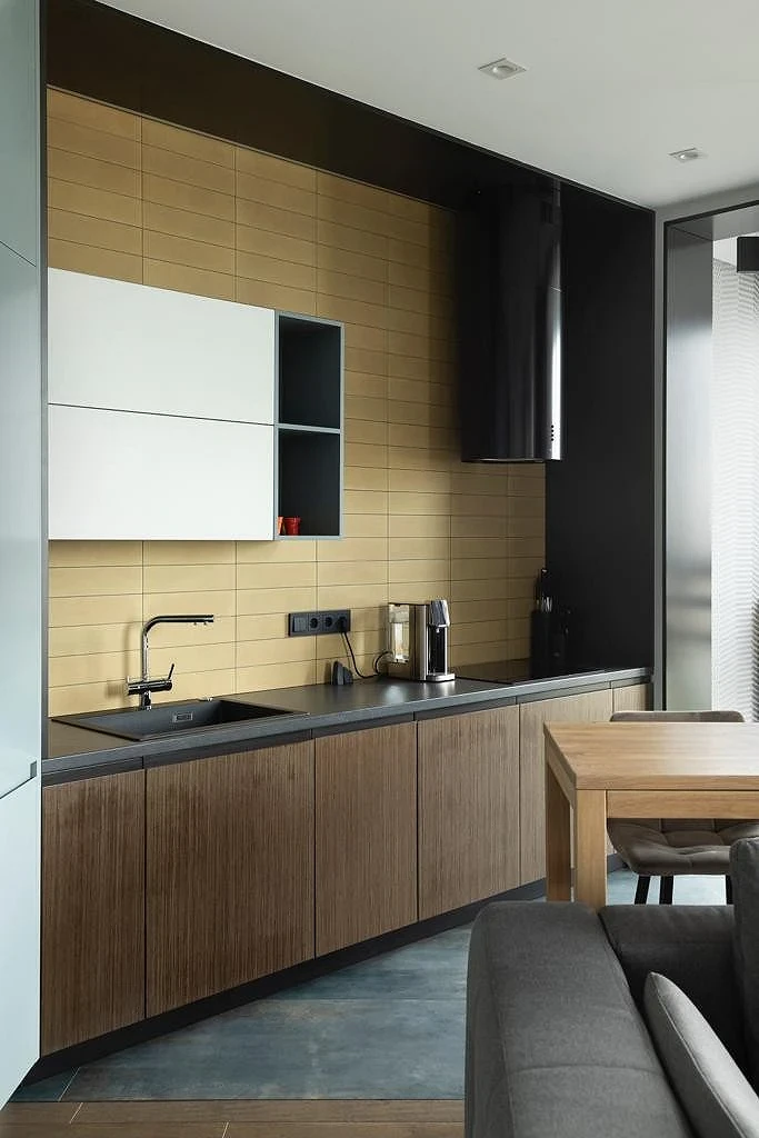
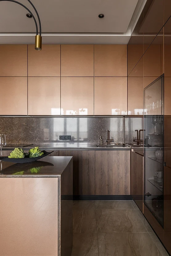
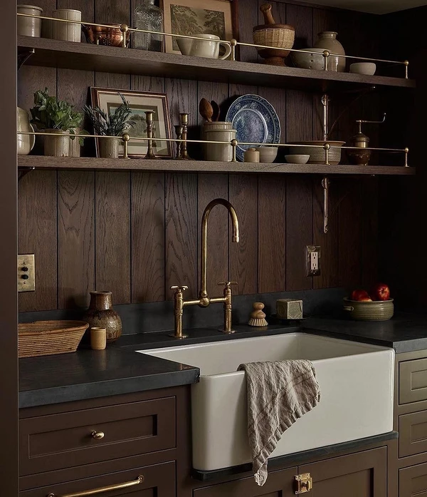
The central piece of furniture in any kitchen is a set. It can be made brown in whole or in part by choosing a different shade for one row of cabinets or column: white, beige, gray, or bright. Chocolate looks most harmonious on the texture of wood, so you can choose facades made of solid wood, veneer, or MDF with a pronounced wood pattern. But in some styles, smooth surfaces, both matte and glossy, will also be appropriate. In this case, choose a beautiful deep shade for the facades so that the furniture does not seem too simple and does not look cheap.
You can also make a dining group or additional storage systems in chocolate if you have them in your kitchen. Examples of what such brown kitchens look like are in the photo below.


Finishing
For finishing, coffee is chosen less often, since most often the kitchen is small in area, and dark finishes hide the space.
But that doesn’t mean you can’t use it. If the kitchen area is spacious, use it in any way: to decorate the floor and all walls, with or without textures. But if the area is small, it is better to choose a deep dark shade for an accent area of the wall or backsplash. Or even limit yourself to a brown floor, imitating some natural texture, and for the rest of the decoration, choose lighter light shades.
Remember that the finishing materials in the cooking area should not only be visually beautiful, but first of all practical. The most important characteristics are: wear and moisture resistance, durability, and ease of maintenance. For flooring, it is best to choose tiles, porcelain tiles, or moisture-resistant laminate. For walls – washable paint, ceramics, plaster, or anti-vandal wallpaper that is not afraid of water and steam.


Ideas for Different Styles
Due to its versatility, the dark base shade is appropriate in any style. You just need to take into account the characteristics of each.
Here are some general rules for using color in different directions:
- For classics in their pure form, this is almost a must-have color. This style involves the use of natural materials and noble shades, so the best choice will be a solid wood set with a stone or quartz countertop. You can complement brown facades with milky white or cream, and add golden fittings and faucets.
- In neoclassicism, you can slightly lower the degree, and make a more laconic and light interior. For example, a white or beige-brown kitchen with smooth fronts, but a couple of interesting details like accent lamps, décor or part of cabinets with fluted glass doors, looks elegant and cozy at the same time.
- Country and other variations of the rustic style have a lot of wood and stone in the interior, so you can safely choose furniture in different natural shades of brown, and combine them with each other and other natural shades.
- Contemporary and minimalism are similar in many ways, as they are based on the same principles. Here you can focus on the wooden surface or, on the contrary, choose matte plain facades without handles and any decorative elements. The main thing here is the unity of shapes and a clean picture without visual noise.
- Scandinavian design is simplicity, practicality, and coziness in one bottle. A wooden floor is suitable for the kitchen, in a lighter shade you can take a set and furniture for the dining group. Dilute all this with white and light gray, complementing the texture of the wood with natural décor.
- The loft concentrates on a combination of pronounced textures: it is still the same wood (but preferably untreated or aged), concrete, leather, metal, and glass. And, of course, brick – it can become the basis of a dark finish.


