


When planning the layout of home, you need to distinguish between zones that are different in purpose. This is called “functional zoning of the room” – the term is familiar not only to professionals. Let’s talk about these tricks.
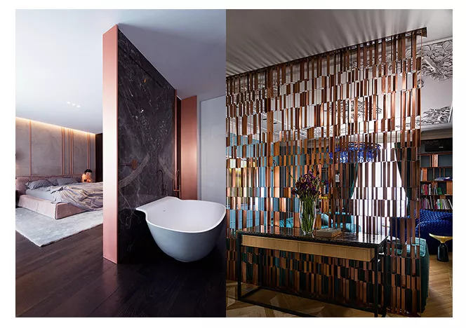
1. Stationary partitions


They are solid, unshakable. This is their plus, but also a minus too: it is difficult to change something, and it is difficult to get rid of them. Partition walls do not need to reach the ceiling, extend from wall to wall, or be in a straight line. Some believe that zoning is only relevant in large rooms: it helps to organize the space so that it is not perceived as a furniture store showroom. We assure you that zoning is even more important in small apartments. His task is to rationally use the area, reasonably arrange furniture, create optimal routes, and most importantly, make sure that several people can be in the room, do different things, while feeling comfortable and not interfere with each other. Zoning a room in a compact apartment should be done especially delicately,


2. Sliding partitions
Either there is a wall between the rooms, or it is not – both lovers of open spaces and their opponents are satisfied. It must be understood that “movable” walls do not replace real walls, the sound insulation is not the same, so it is unreasonable to separate the home theater with them. But the kitchen from the living room – just right. Sliding partitions are made only to order, exactly to the size of the room. Most often they use colorless frosted glass. It looks light and fits any interior… There are from one to five “sashes” in the partition, which are either suspended from the upper guide rails or rest on the lower ones (each system has its own pros and cons). Sliding doors are similar to partitions, but they have fixed dimensions, no more than two canvases and only one rail. You can make it so that doors or partitions will “leave” deep into the wall. To do this, construct a false wall.


3. Floor level difference
A very practical method of zoning a room. Because in the emerging elevation (podium) you can hide what you don’t need to see (from communications to ski equipment). The higher the podium, the larger things fit inside. There is a limit to height, especially with low ceilings. But a small podium is also valuable: drawers are made in it. The podium also corrects the proportions of the room: it will visually shorten the elongated one if you arrange it at the end. In a square it can be arranged diagonally.


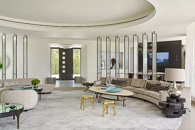
4. Ceiling level difference
Some rightly believe that when zoning a room, it is better not to touch the ceiling at all. But still. If the height of the ceiling above us changes, there is a feeling that we are moving from one space to another. In addition, different functions require different heights: where active communication takes place, the ceilings can be higher, where they sleep and rest, lower. However, if the architect imposes on you undulating ledges of an indescribable configuration, motivating this with the “image of a space station”, be vigilant. These bells and whistles increase the time of work and financial investments, and their beauty is doubtful.


5. Different wall coverings
It is especially effective when the coatings have different textures. For example, paper wallpaper throughout the room, and bamboo in a cozy corner. True, as the architect Natalya Astakhova said, “if two textures simply “meet”, this is not zoning, this is a hodgepodge, you need suitable furniture, lighting, etc.” Often there is a dining area: either masonry on the wall, or a large poster or photo wallpaper. Artificial stone is more practical than natural, but sometimes it looks very unnatural. And it is better not to place photo wallpapers in front of the window: they can glare. The difference in coatings also creates optical effects: you can correct the proportions of the room.


6. Different floor coverings
The simplest example: is in a recreation area with armchairs and sofas, a soft carpet is placed on the floor. Cozy and comfortable: it is easy to remove or change to a new one. But the “carpet” of artistic parquet or an insert of stone mosaics, which sometimes accentuate the place of the table, is laid tightly and forever binds you to this arrangement of furniture. If you like to change, think about it… Any flooring will visually reduce the space. A single cover increases it. On the other hand, there are practical reasons: it is reasonable to lay tiles in the kitchen area. Compromise: use different materials, but similar in color. A special problem is the joining of materials.


7. Fabric curtain
This method of zoning a room is used infrequently. For some reason, it is believed that curtains and draperies, especially if they are not on the window, are feminine details that create a boudoir atmosphere. Use a translucent plain light fabric, a natural fiber with a rough texture, and not taffeta – then you definitely won’t get a boudoir. The translucent fabric is remarkable in that it isolates, but maintains the integrity of the space. No need to make the curtain stationary, nail it tightly. Hang the fabric on a curtain rod like a curtain, placing it on the ceiling where you want it. The curtain successfully separates the sleeping place in the studio, and the work area, and the dressing room in the bedroom. Perhaps, in the latter case, silk taffeta would be quite appropriate.


8. Furniture
It is difficult to overcome stereotypes and pull her into the middle of the room. But after all, a cabinet or a rack, in fact, the same partitions, only more functional – they can store something. If the rack is supposed to be placed parallel to the window, it is wiser to choose a through the model to allow light to pass through. It is not recommended to place it directly opposite the entrance to the room: when the gaze rests on it, the integrity of the space is lost. For zoning, you can use low objects (example: a cupboard with dishes separates the dining area), and even sofas. And here is a particularly interesting solution: to divide the room with a wardrobe that opens in both directions.


9. Screen
To genius, a simple reception, mobile and beautiful. The screen appeared in China in the 6th century and at first was only paper or silk. In the VIII century, she moved to Japan and came in handy there: she zoned houses. The screen is the forerunner of Japanese sliding partitions. The artist Sergey Maksyutin said well about this subject: “It gives a person freedom in planning his space, depending on his mood and condition. The screen lives by the movement of a person: he can rearrange it, fold it, remove it and even hang it on the wall – each time the picture is completely different.


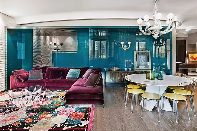
10. Color
This is the first thing a person perceives when entering a room. The sharper the color contrast in different zones, the more obvious the border between them (at least visually). On the other hand, too frank contrast is tiring (one zone in red, the other in green). Zoning a room with color requires special sensitivity. And do not forget that optical problems can be solved in this way. Warm red, terracotta, brown shades seem to bring objects closer, make them heavier, and the house more comfortable; light cold tones of objects move away.
11. Second level
The value of an apartment is determined not by the area, but by the volume. High ceilings open up huge resources – a spatial Klondike. The fifty-meter studio gained additional meters due to the mezzanines above the bathroom and the hallway: five-meter ceilings easily made it possible. Most often, a sleeping place is located on the mezzanine. No need to drag a bed in there, arrange a bedroom in the spirit of Japanese minimalism: a futon on rough wooden flooring boards. A bedroom on the mezzanine can be made at a much lower height. It doesn’t have to be there to stand upright. Children will especially like this zoning of the room. Unless, of course, you are lucky with the height of the ceiling.
12. World
It is uninteresting and wrong when there is even monotonous lighting throughout the room. And there is no need to strive for brightness, too bright light is just as tiring as dim. The room should have lighter and darker zones, light is unthinkable without a shadow. The illumination intensity of the zone depends on the function. It is also important to know that light can be warm and cold – depending on the light source, it has a bluish, neutral white or yellowish tint. It is interesting to use this when zoning, but your “freedom of creativity” is limited. Subdued yellowish light is comfortable for relaxing, but not suitable for work, in this case, white or blue is more appropriate, which, in turn, is not suitable for a dining room. It is good to remember that the bluish glow will make the shades of blue in the interior brighter, with yellow the brightness of reds and yellows increases. To make us feel comfortable, there should be color patches around us. Highlight something that you consider worthy, whether it is an interesting colored rack, a mosaic panel or a picture on the wall.
The most important thing about our X that it is for
those who are in a hurry


