


We tell you how to fit blue curtains into the interior of the kitchen, living room, bedroom, and kid’s bedroom. With what to combine different shades of color and what design to choose for different styles.
Window textiles make the room more comfortable, and the design is complete. Curtains can be almost invisible, calm basic colors, or act as a bright accent. In this article we will tell you how to fit blue curtains into the interior: what models and shades to pay attention to, as well as what to combine curtains with.
Features
Blue is traditionally associated with something calm, unhurried, and large-scale. This is the air, the sky, the ocean depth, and the expanse of the lake. In psychology, it is believed that color clears thoughts, helps to concentrate, gives peace of mind and helps to relax. In the interior, blue-blue shades look elegant and expensive, they do not cheapen space and form interesting combinations with other colors. At the same time, they are rarely used in large numbers in one room, because deep tones can cause a melancholy mood or even blues, and the cold of blue must be balanced with warmer and “cozier” colors.
Blue has dozens of different shades. For example:
- Light – heavenly, cornflower blue, classic blue.
- With a gray undertone – Niagara, gray, steel, Black Sea, midnight.
- Bright – ultramarine, diamond, azure, denim, cyan.
- With a green undertone – turquoise, thrush eggs, aquamarine, Bondi beach waters.
- With a purple undertone – indigo, Persian, blueberry, night.
- Dark – sapphire, Prussian blue, blue-black, night blue, thunderstorm, cobalt.
Among them, you can choose the appropriate option for any color scheme: light or dark, neutral or saturated.
What to combine with
The combination of blue curtains with other elements of the palette can be built according to different principles: monochrome, neutral base, contrasts, and complex color combinations. In general, there are no frankly unsuccessful combinations with blue curtains. The main thing is to remember about the color temperature.
With white and gray
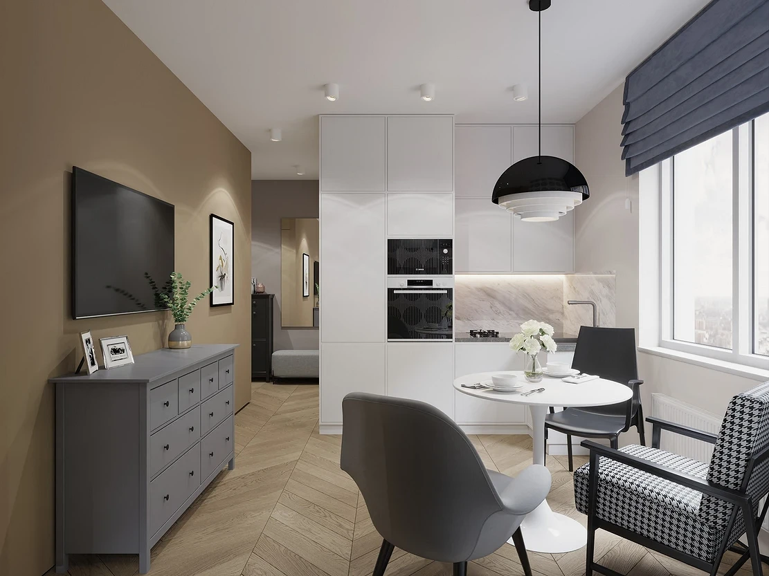
White and gray are two of the most versatile elements of the palette. The first just goes with everything, and the second has such a variety of shades that choosing the perfect one is not difficult. By themselves, they are both quite cool, so the overall composition can turn out to be cold and even uncomfortable. This is especially true for blue curtains in a gray interior – such a palette needs to be diluted with light warm tones: for example, cream, ivory, coffee, wheat, etc. Of the brighter ones, olive green, terracotta, ocher, and brick are suitable. In the design of the room, it is advisable to use wooden and soft textures, and for the curtains themselves, choose a matte fabric without a cold sheen.
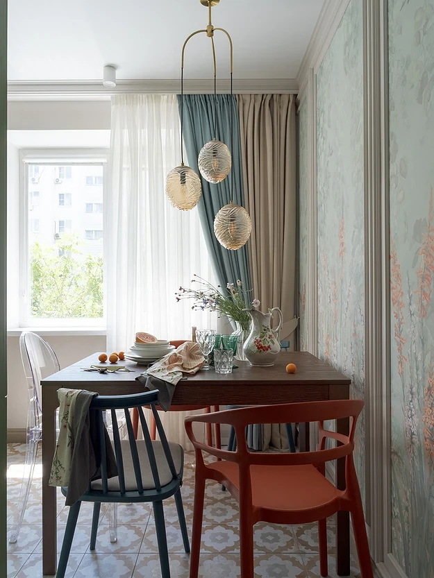
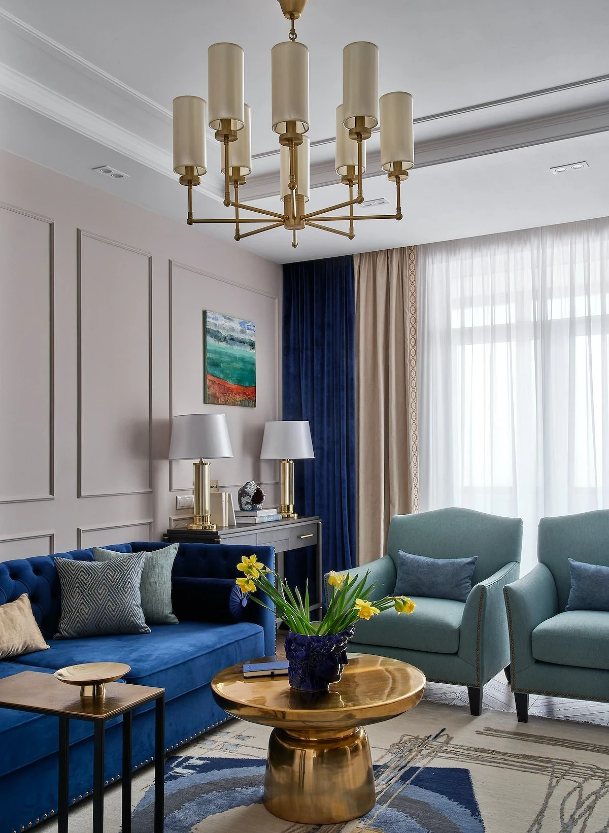
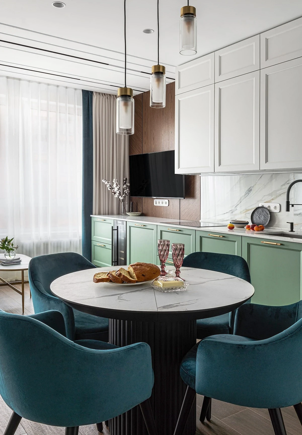
With beige and brown
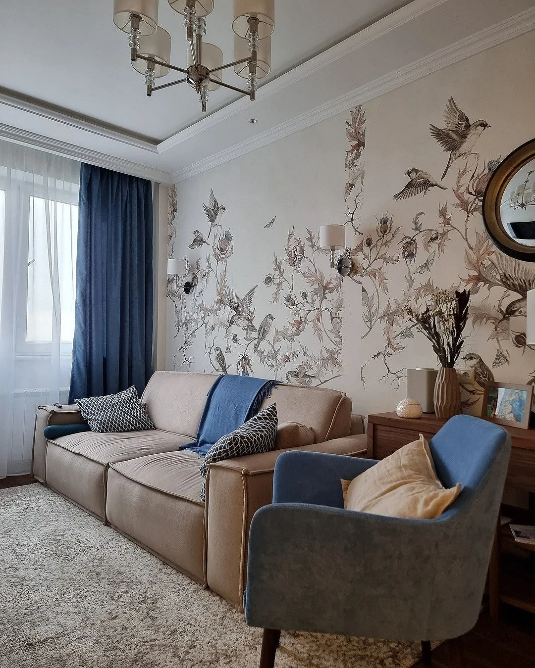
Another classic combination is beige + blue in any variations. This couple always looks good together, as it was conceived by nature itself: sea and sand, sky and earth evoke pleasant relaxing associations. Almost all shades of beige and brown belong to the neutral warm range, so they can be used as a base: for example, for finishing walls, facades, or upholstery of large furniture. And textiles will just become an accent that will create the necessary contrast and refresh the interior.

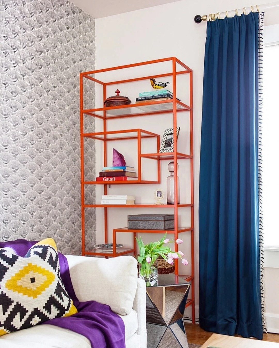
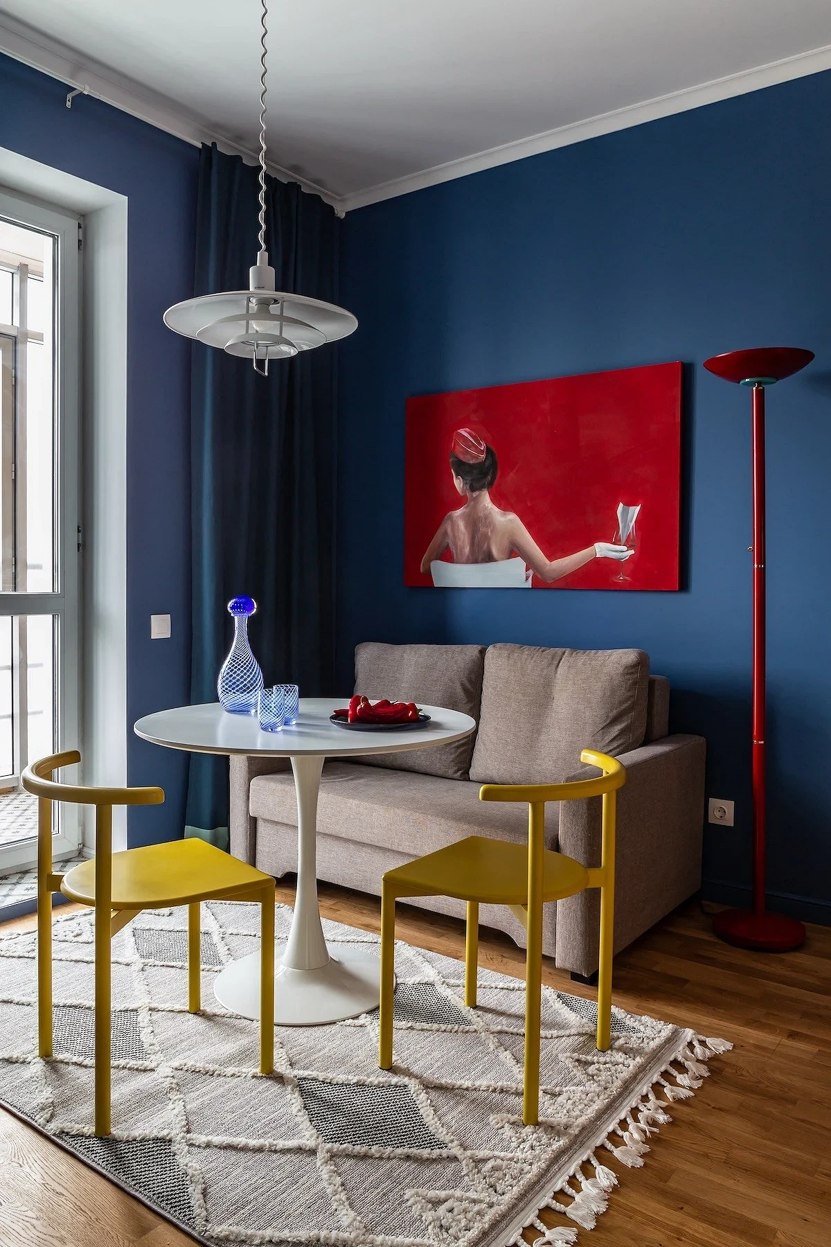
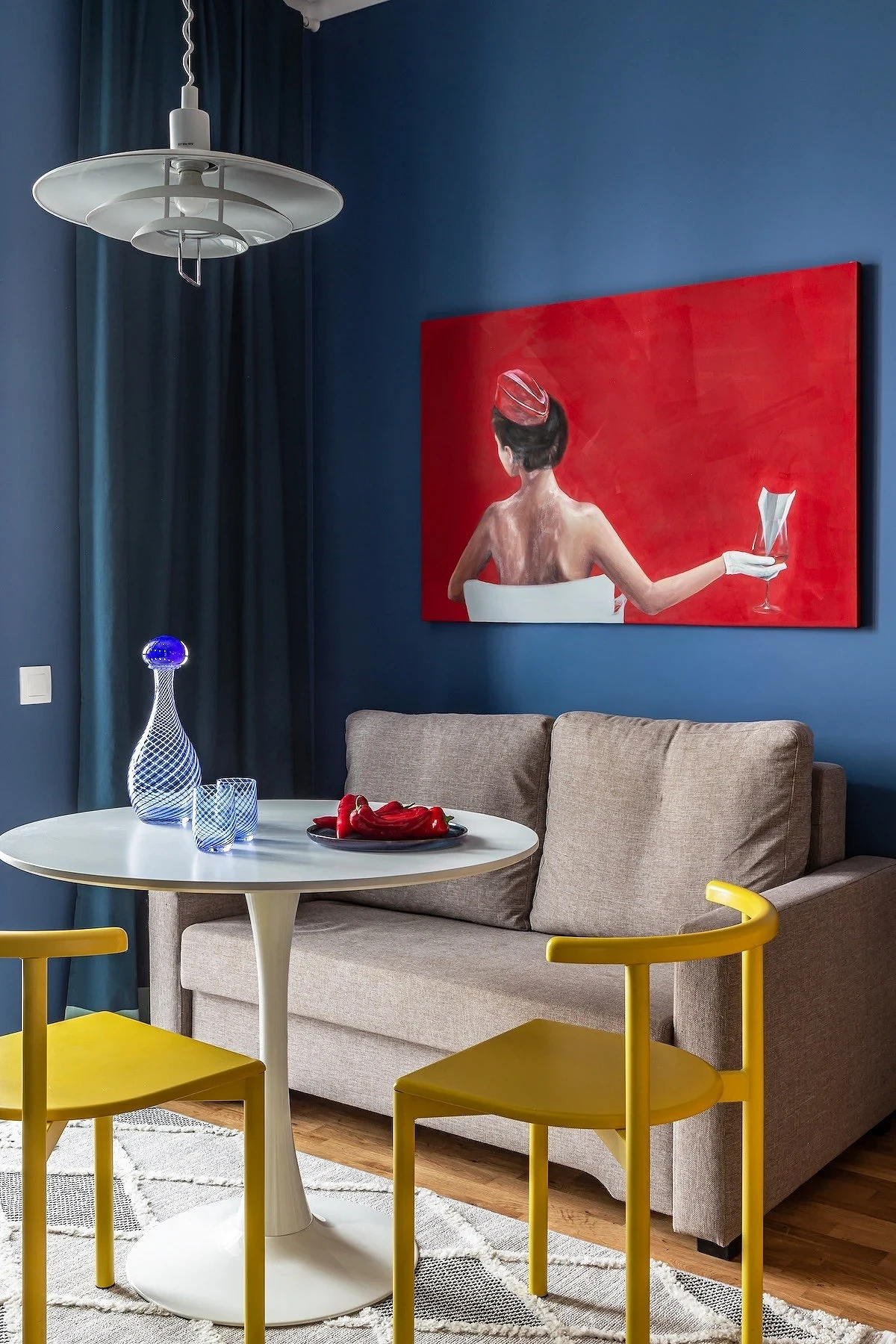
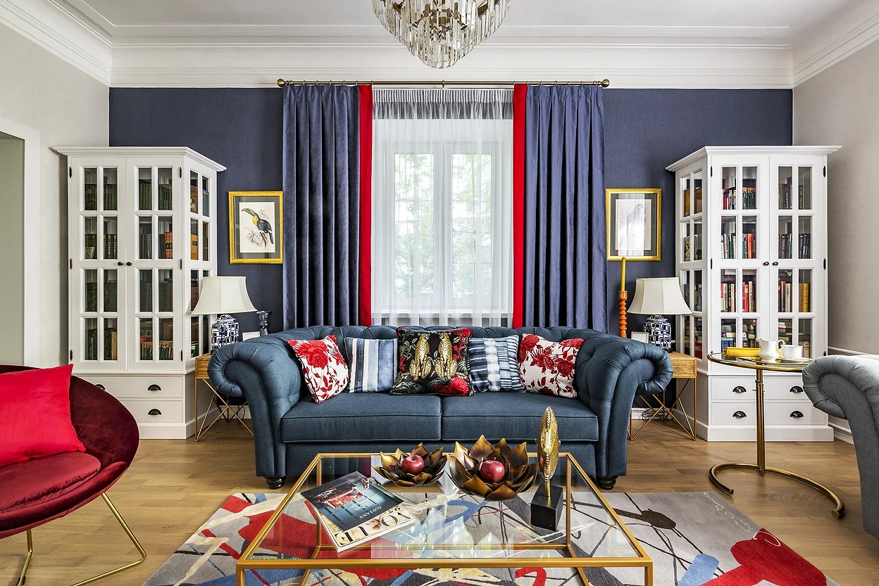
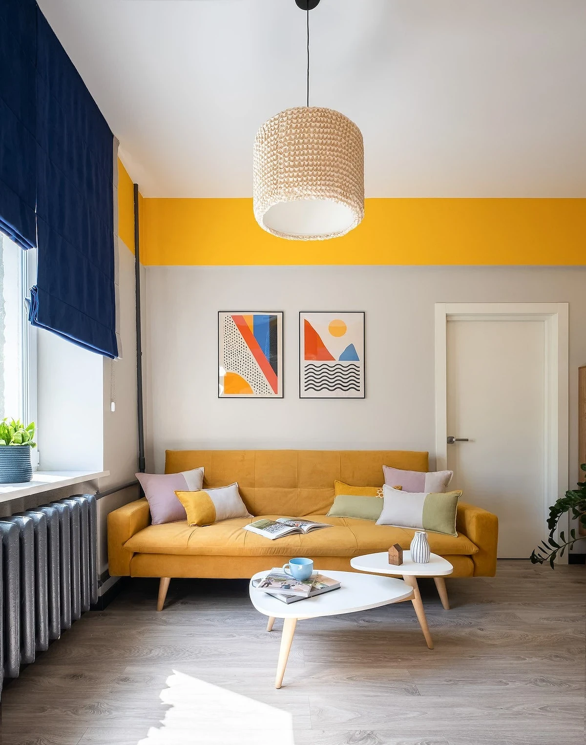
With red and orange
Red and orange tones paired with blue-blue look bold and impressive due to the pronounced contrast. Since all of them are quite bright and active in themselves, in such a combination you need to choose which of the accents will play the main role. If curtains, then their color can be repeated in other textiles, sofa or chair upholstery, and large decor. It is better to take red and orange not in its pure form, but to find a slightly muted deep shade that will not tire the eyes and overload the interior, even if used pointwise.
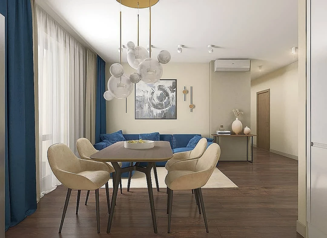
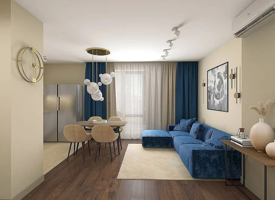
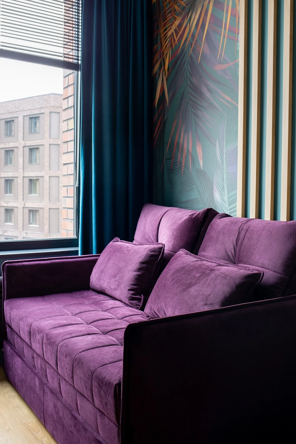
With blue and purple
In coloristic, combinations of neighboring elements of the color wheel are called analog. They are not the easiest to implement, but they look very impressive and create a unique atmosphere: deep, enveloping, and intriguing. Best suited for the bedroom, boudoir, and living room, although they can be used in any room. Purple is almost always used as a point accent: for example, in a pattern on wallpaper, decor, or decorative pillows on a sofa. Blue-blue tones usually occupy about 30-40% of the palette. In addition to textiles, it can be part of the decoration or a couple of pieces of furniture. The composition is supplemented with 1-2 basic colors: white, light gray, brown, and beige.
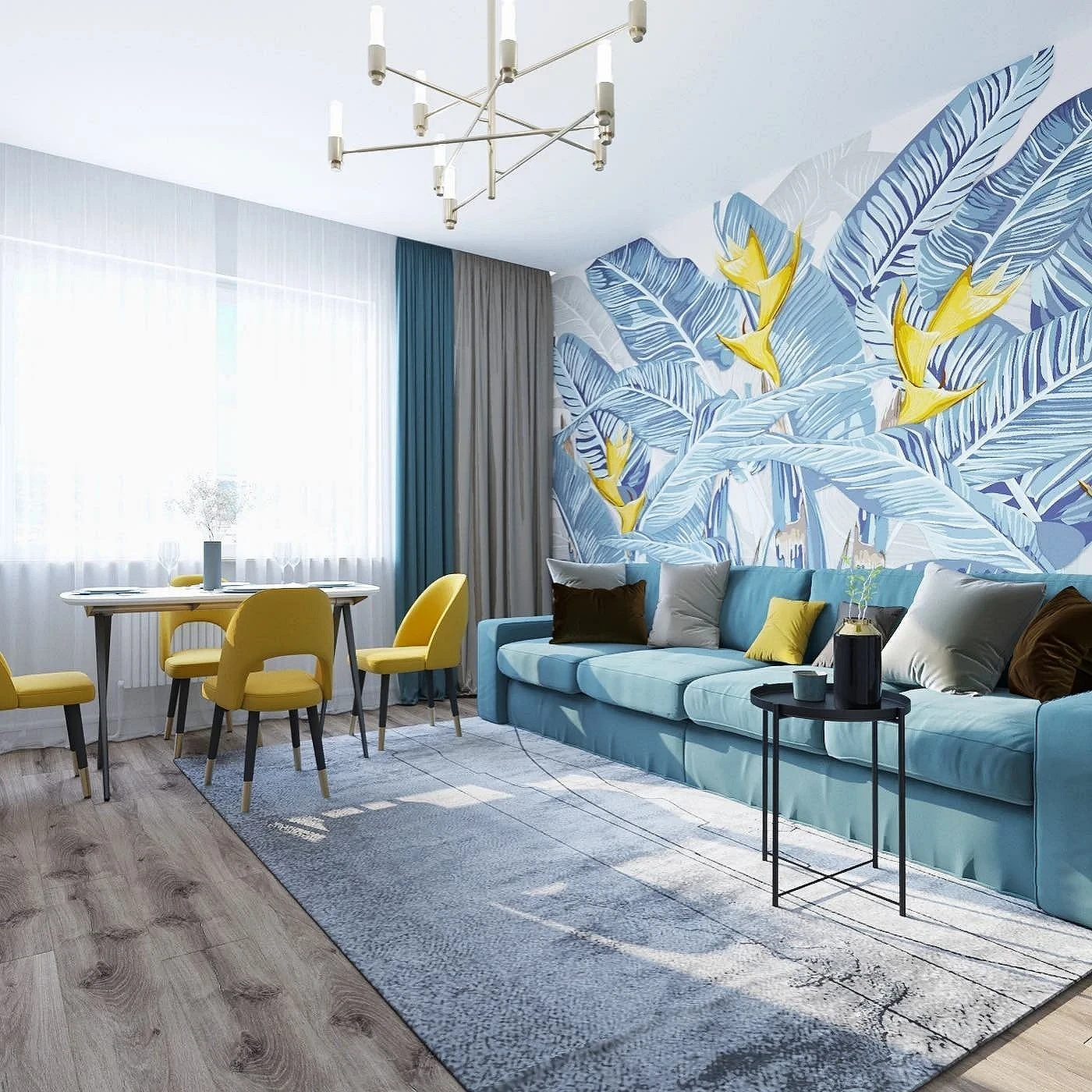
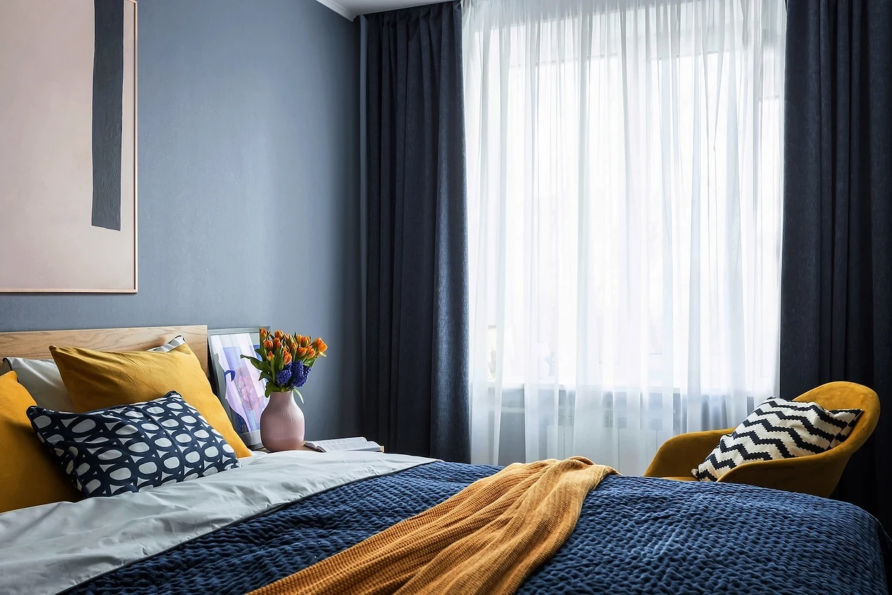
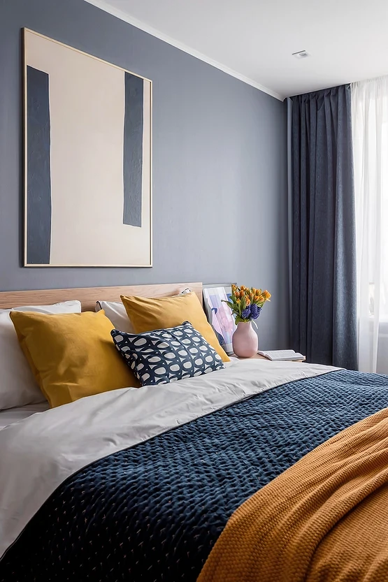
With yellow and green
Both yellow and green are often found in nature and look good with blue: the first due to a bright contrast, similar to a combination with red or orange, and the second due to the principle of some kind of adjacency. The richer the shades you want to use, the smaller part of the palette they should occupy. For example, if the curtains are aquamarine or azure, then sunny yellow should also be used pointwise: for a blanket, carpet, small wallpaper pattern, one small piece of furniture, etc. Green can even act as a base if you choose the most neutral and muted version, diluted with white or gray.
Design Options
In addition to the right shade, it is important to choose a design that will look relevant
Color combinations and the design of curtains depending on the overall style of the room where you hang them:
- Oceanic, cornflower blue, or steel is suitable for discreet neoclassicism. Typically, these curtains complement the gray-beige base.
- Blue, denim, or sky blue, along with white, is often used in scandi or rustic style. In the first case, plain textiles are chosen, and in the second, patterns traditional for the country or Provence will be appropriate: flower, polka dot, or checkered.
- For minimalism and contemporary, any muted shades and the most concise design are suitable. The classic option is plain curtains till the floor touches. Two-tone curtains are also in fashion now. Contrasting shades can be on one canvas or double curtains of different colors are hung on the window.
- Eclectic or vintage interiors often feature rich colors and unusual combinations of fabrics. Any patterns are acceptable: from botany to bright geometry or interesting abstraction.

Ideas for different rooms
Consider how blue-blue curtains look in the interior of different rooms and how to be guided when choosing textiles.
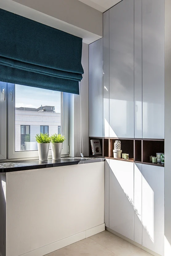
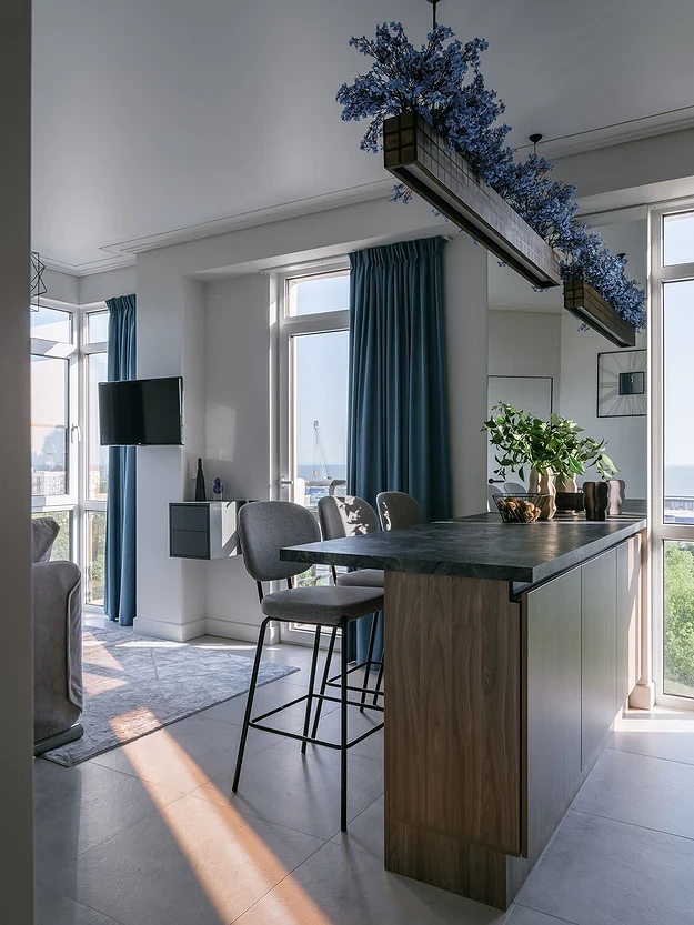
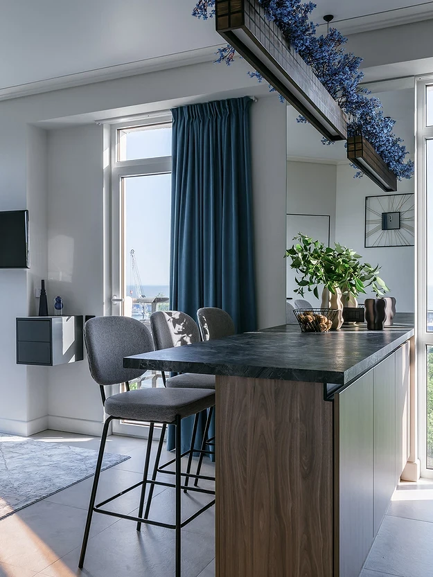
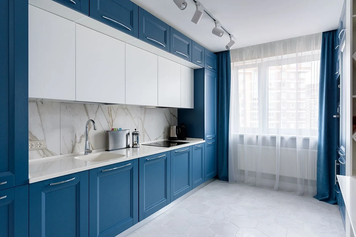
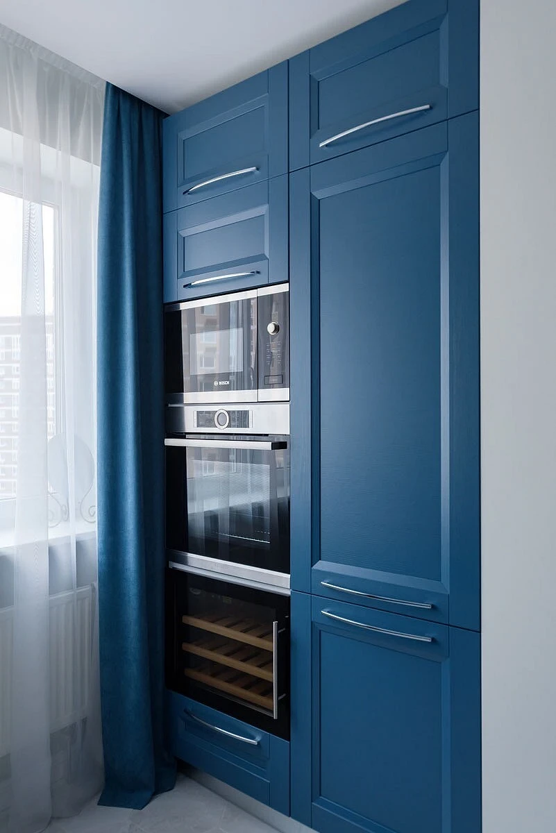
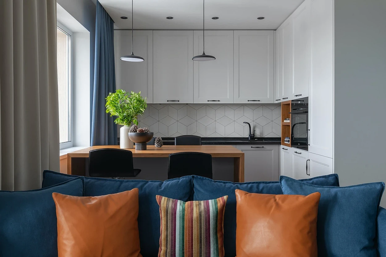
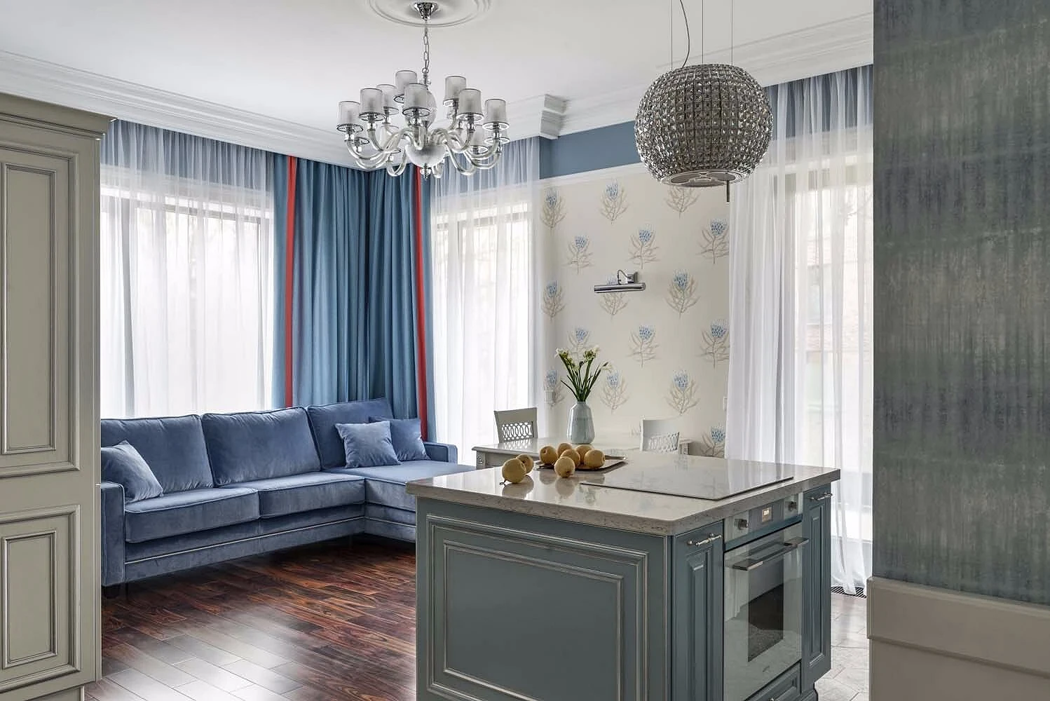
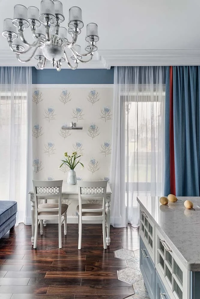
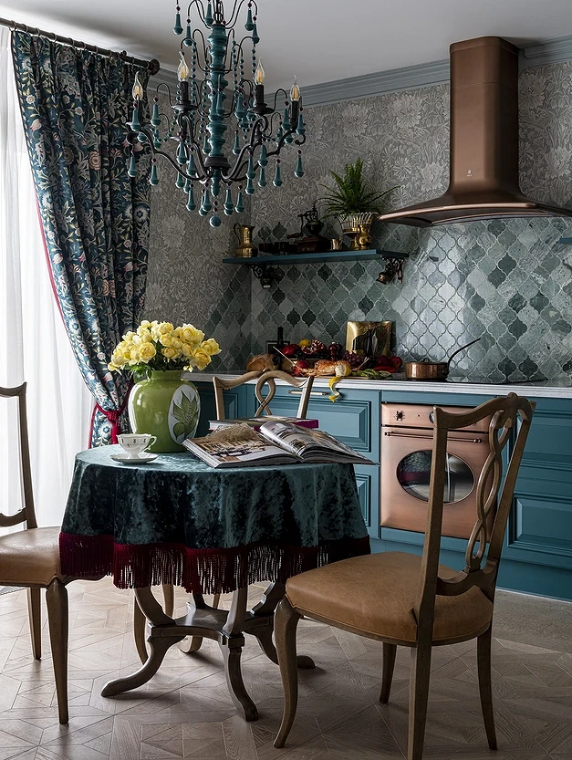
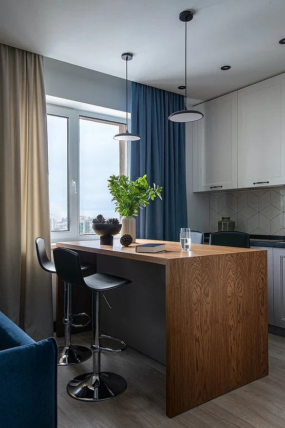
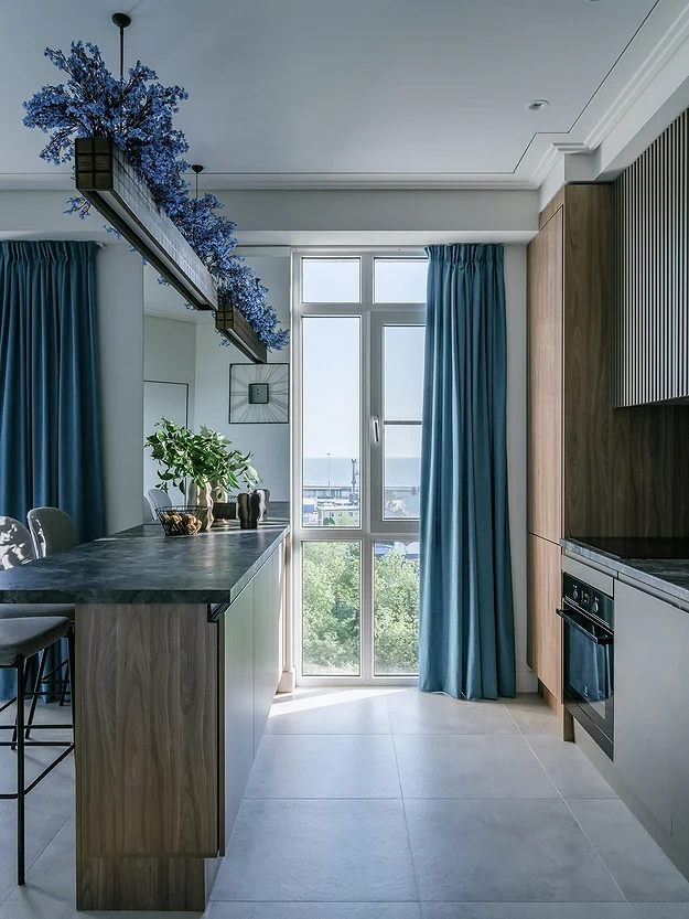
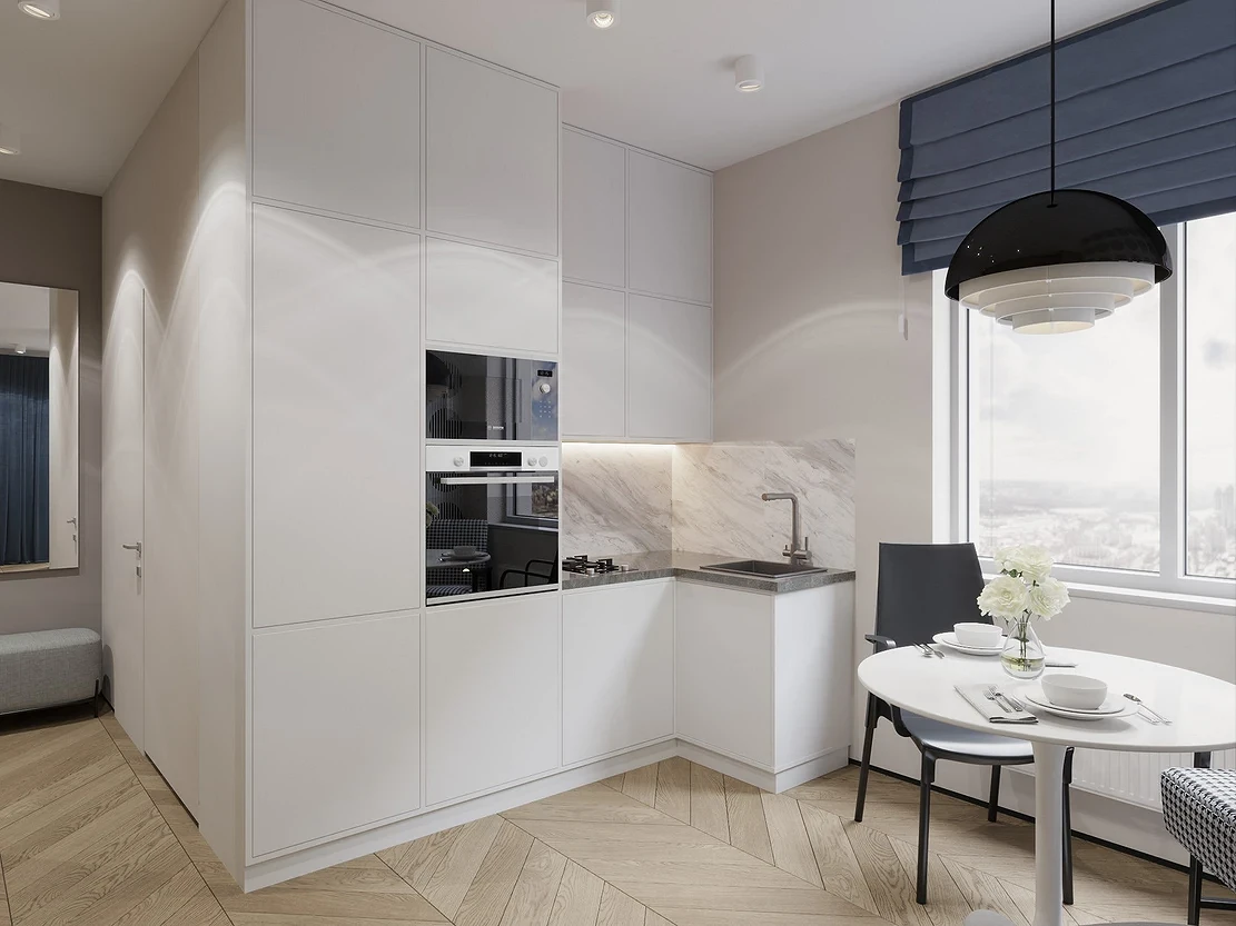
Kitchen
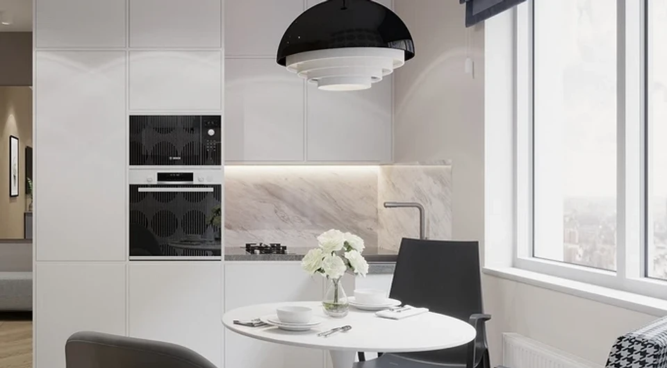
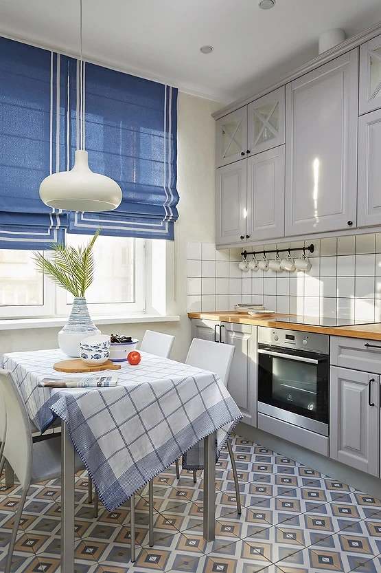
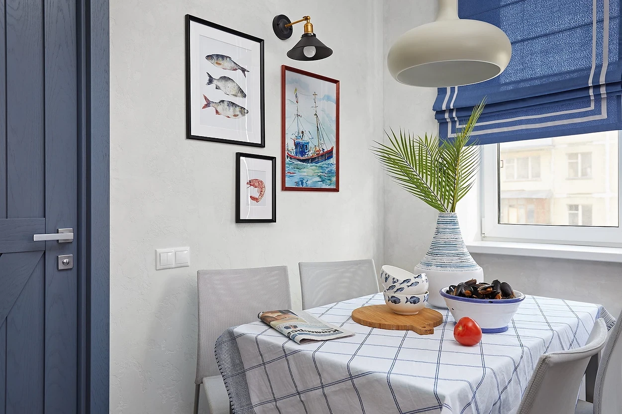
Most often, a calm palette is chosen for the kitchen, where warm or neutral tones predominate. Just they are very well diluted with more saturated and at the same time cool accents, including textiles. Color combinations and curtain design depend on the overall style. Often, blue-blue curtains complement a white or gray base. This option is good if the windows face south or east and there is enough sun in the room. Since the kitchen can get hot during cooking, a cold palette will cool the room a little.
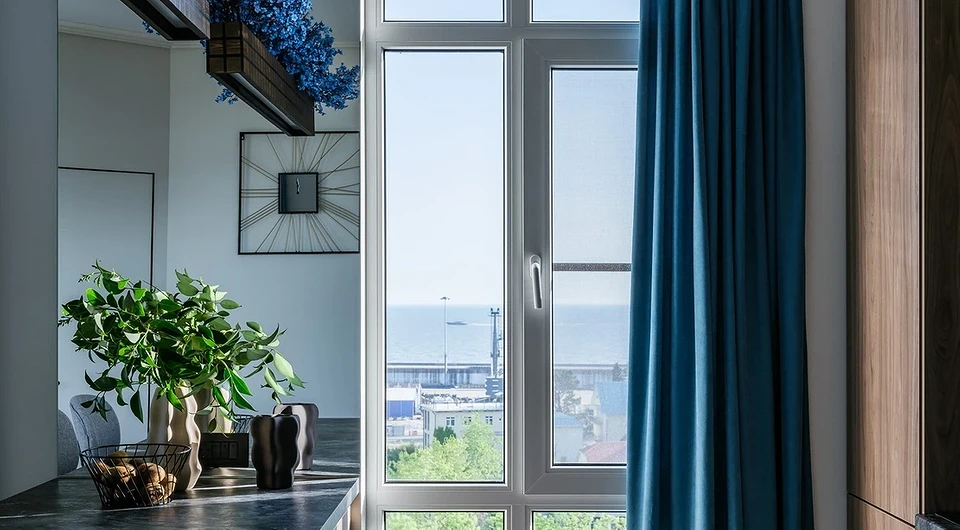
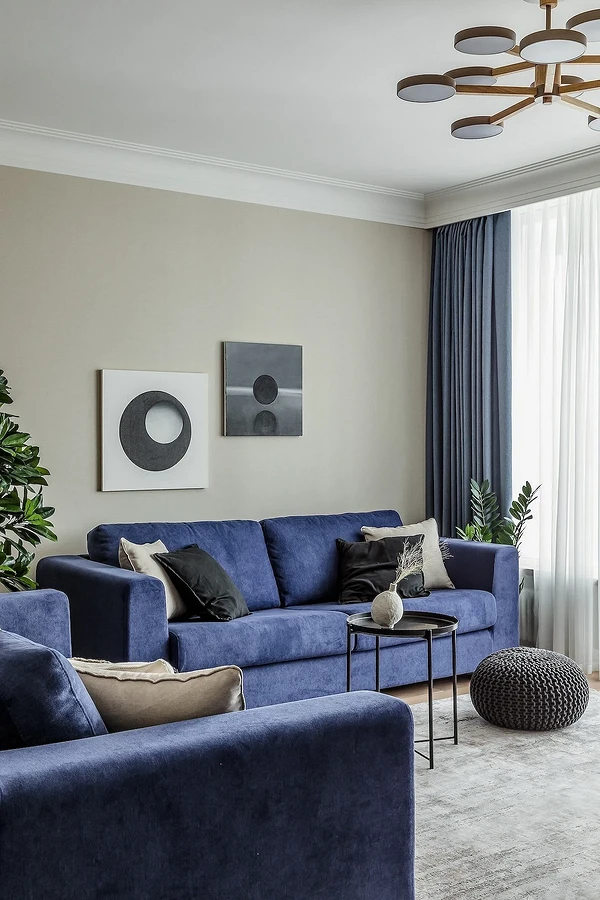
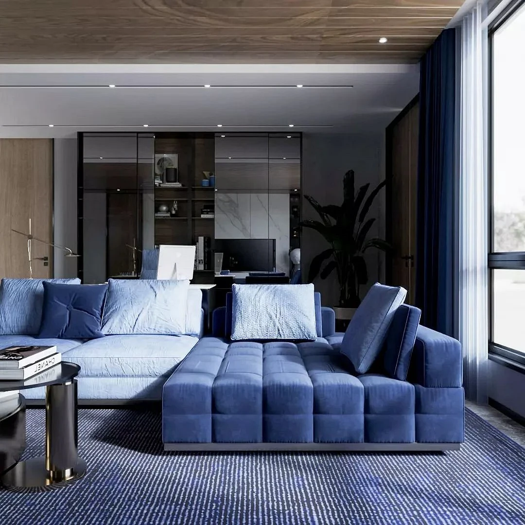
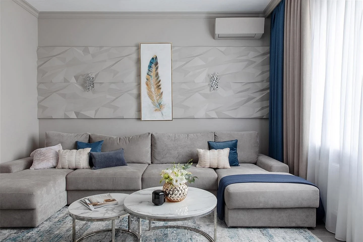
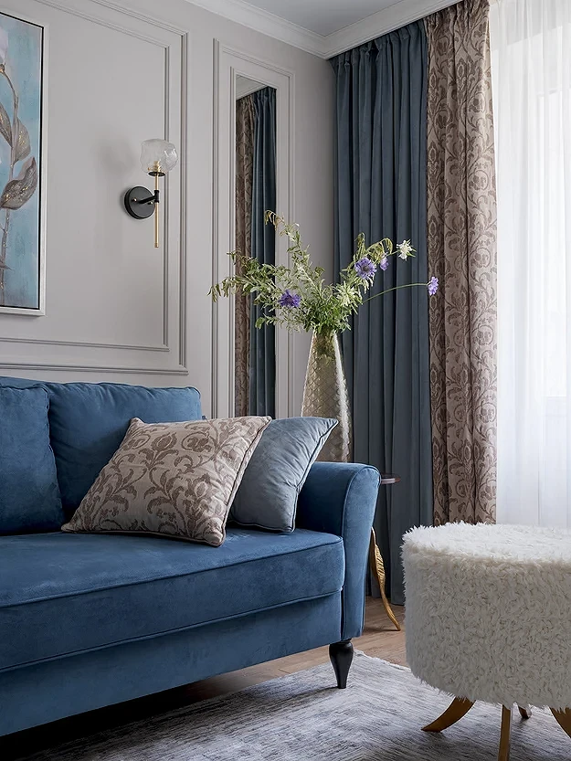
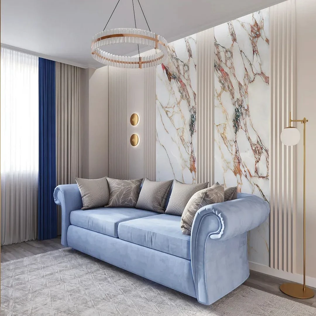
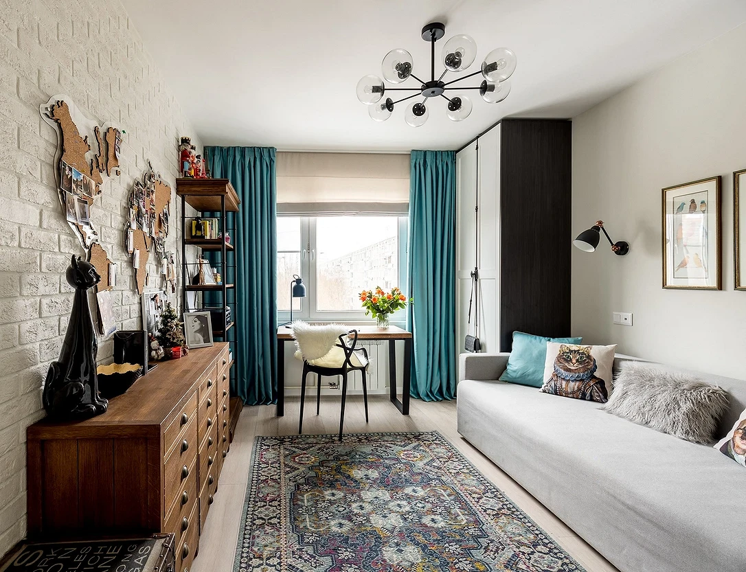
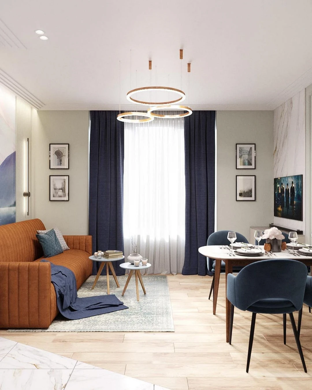
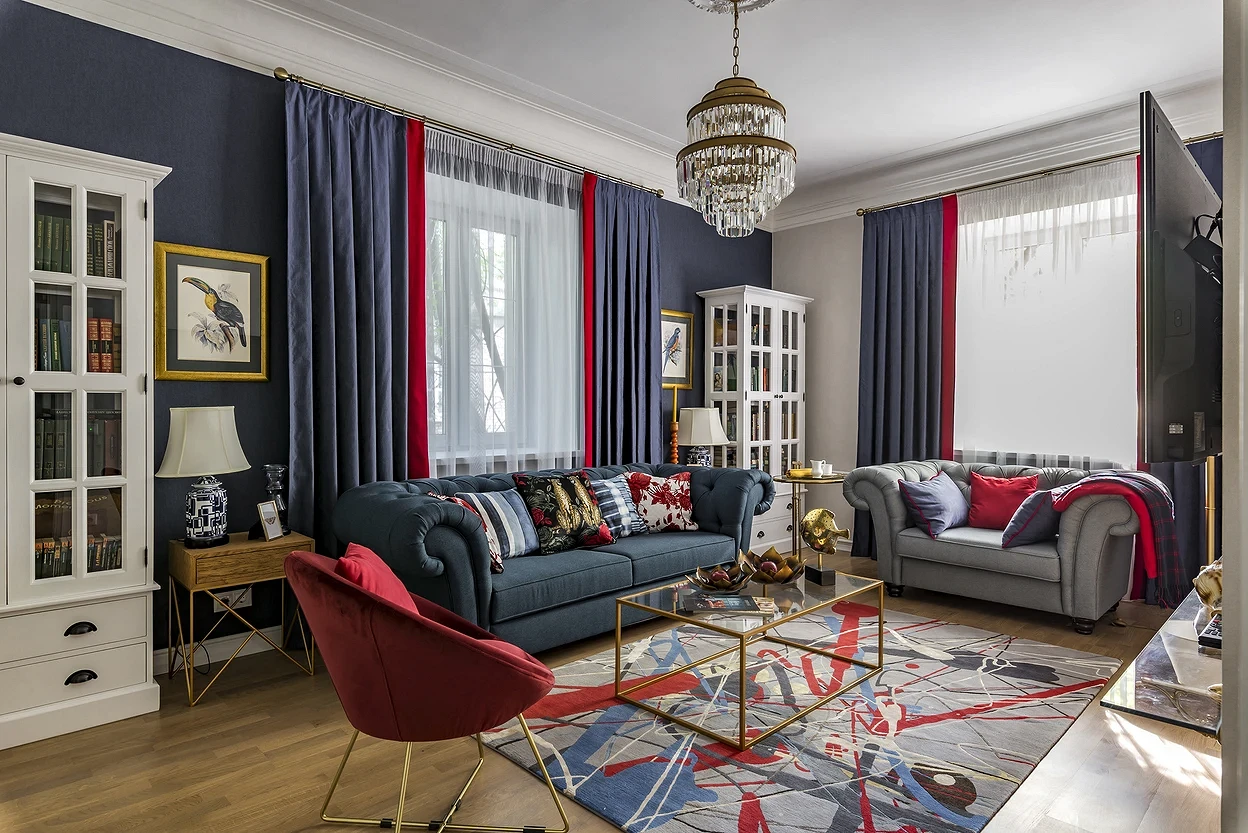
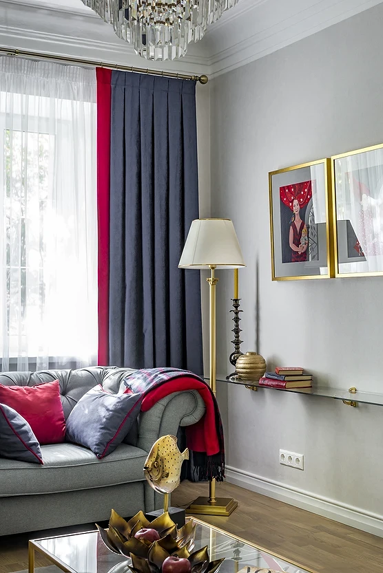
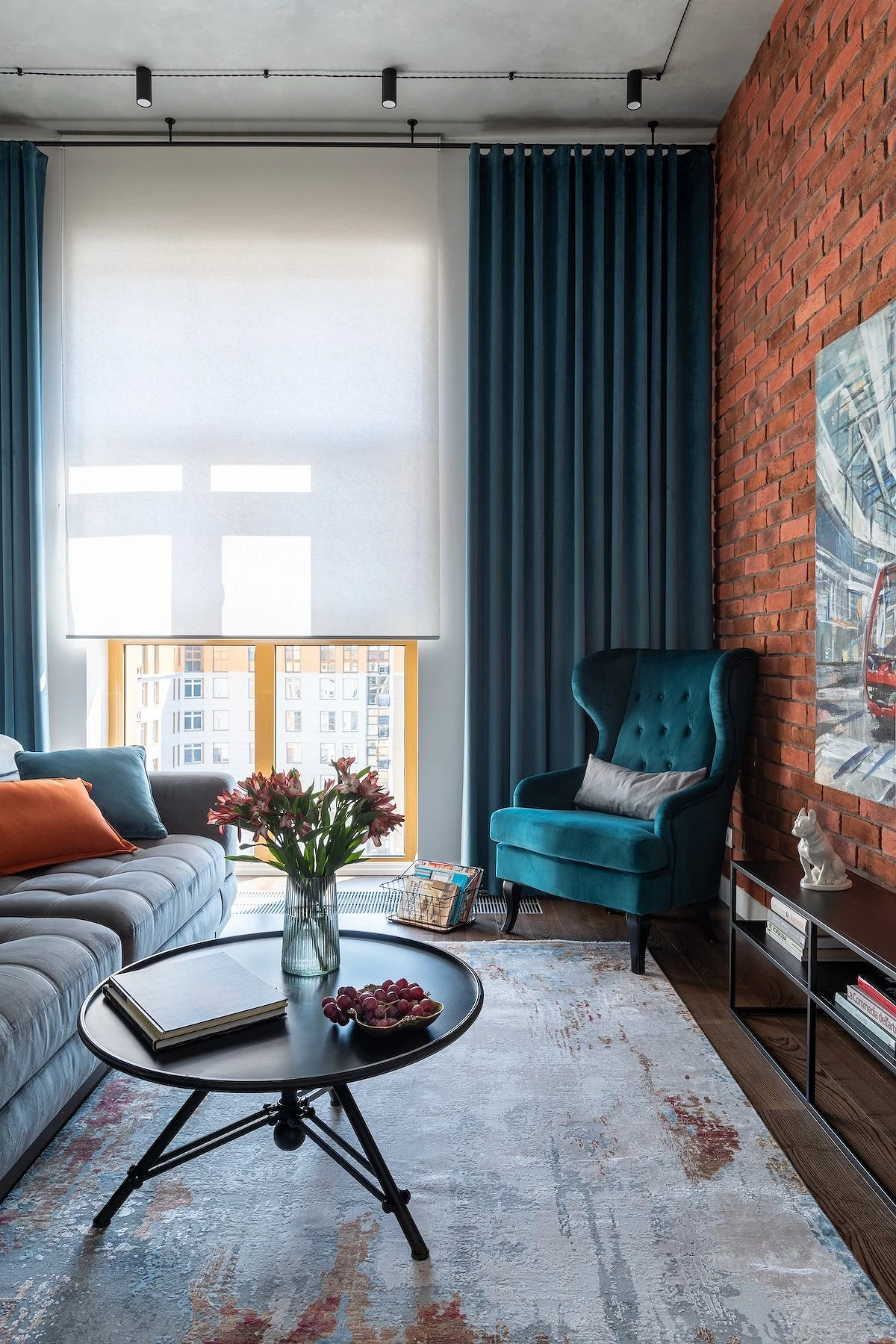
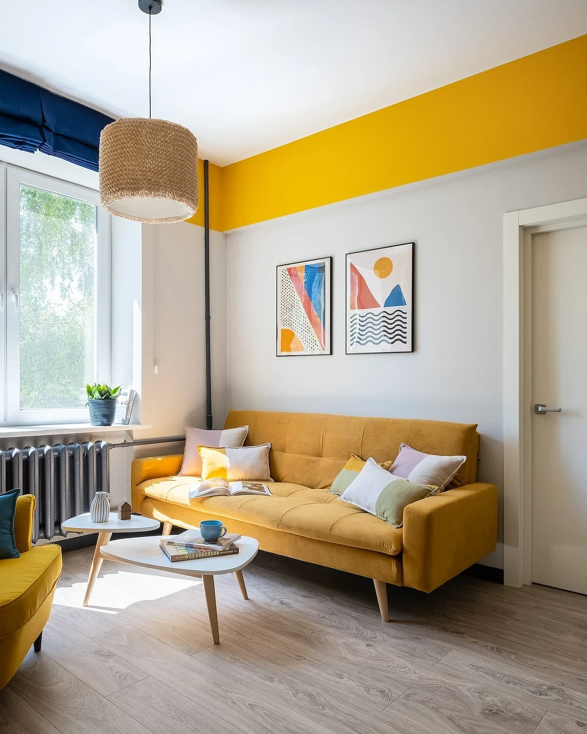
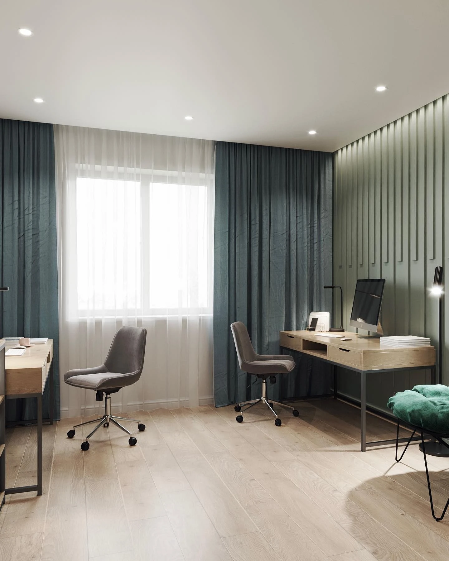
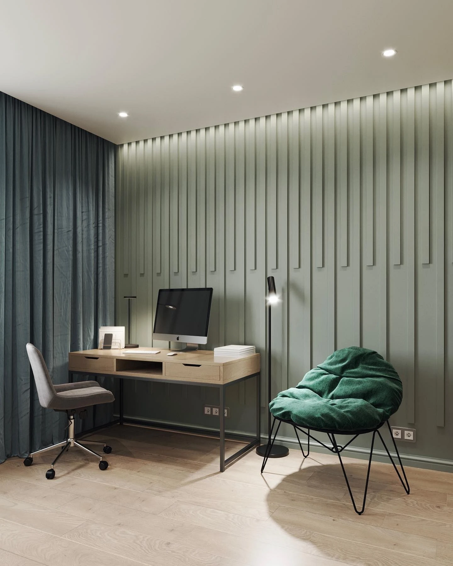
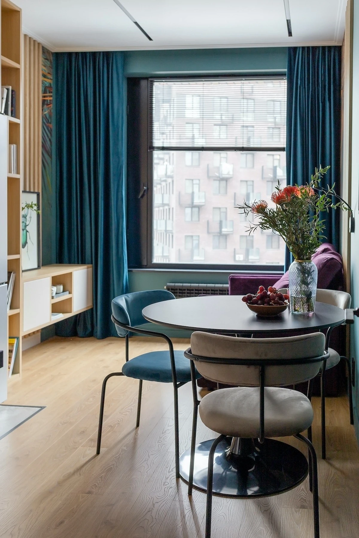
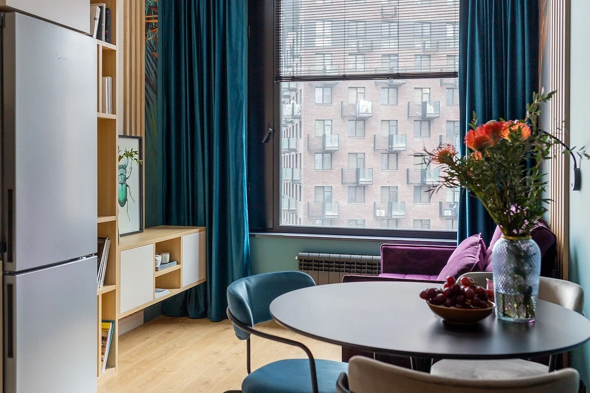
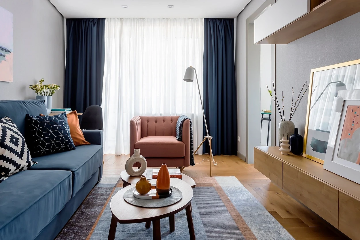
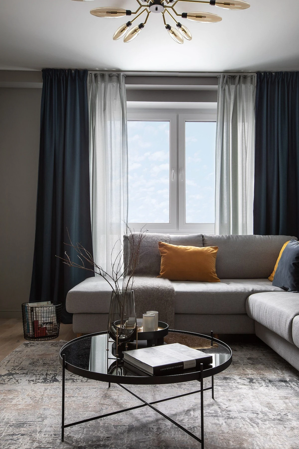
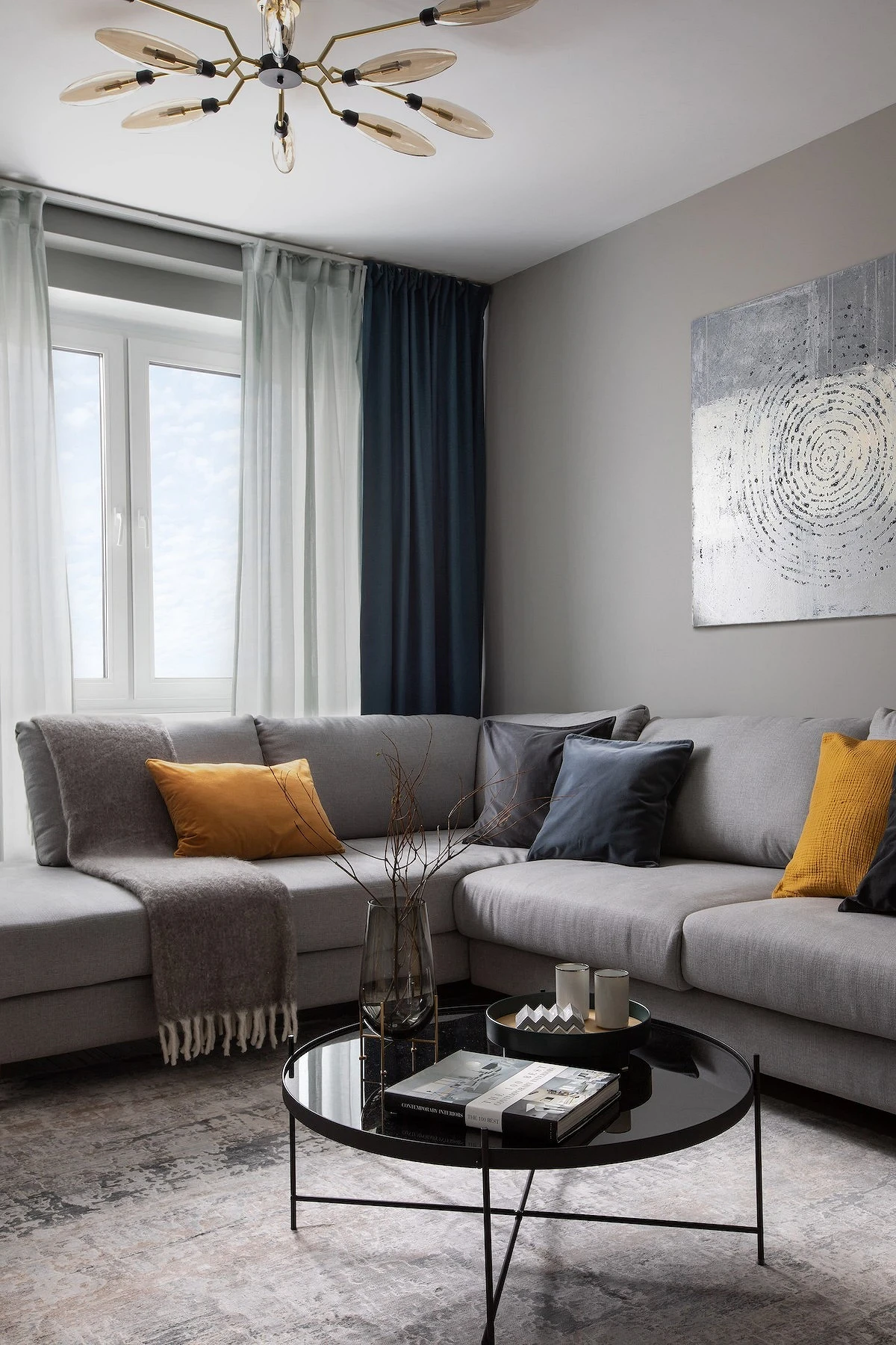
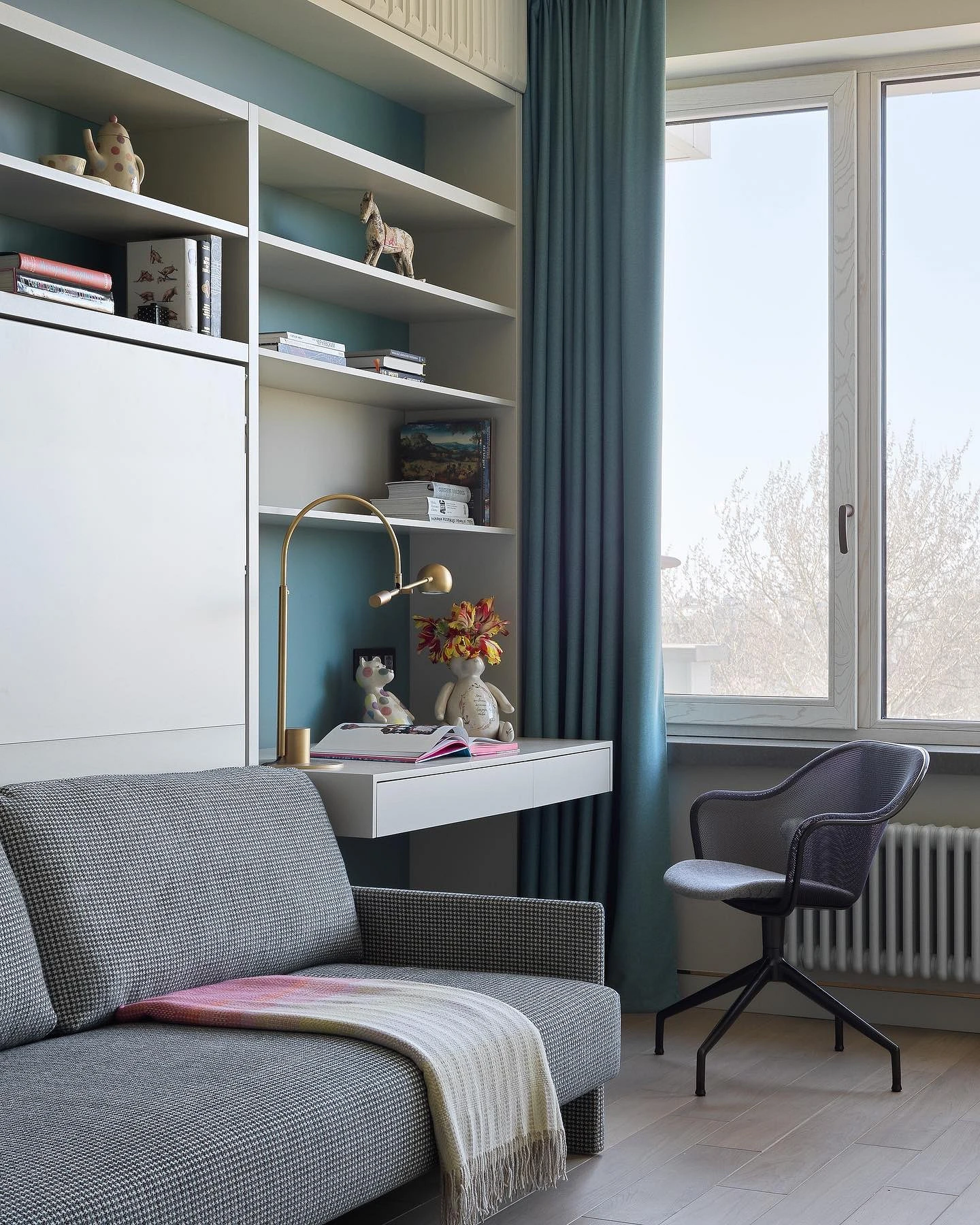
Blue curtains in the living room
Select the shade and material of the curtains in the living room, taking into account the initial data of the room.
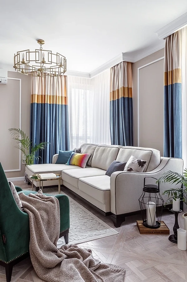
If it is small or the windows face the north side, it is advisable not to darken the window. In this case, a loose fabric of a heavenly, cornflower blue, steel, turquoise shade is suitable. If there is a lot of space and there is no shortage of sunlight, you can beat the opening differently and make it more contrasting with the walls. Consider beautiful complex tones: oceanic, stormy sky, blueberry, Prussian blue, etc.
Accent textiles are especially appropriate if the room is filled with neutral furniture. So a gray sofa or a simple wooden dining table will play in a completely different way against the background of blue curtains. Since the living room is a front room, the window can be decorated in every possible way: hang a beautiful cornice, add velvet garters to the curtains, choose tulle with embroidery, etc.
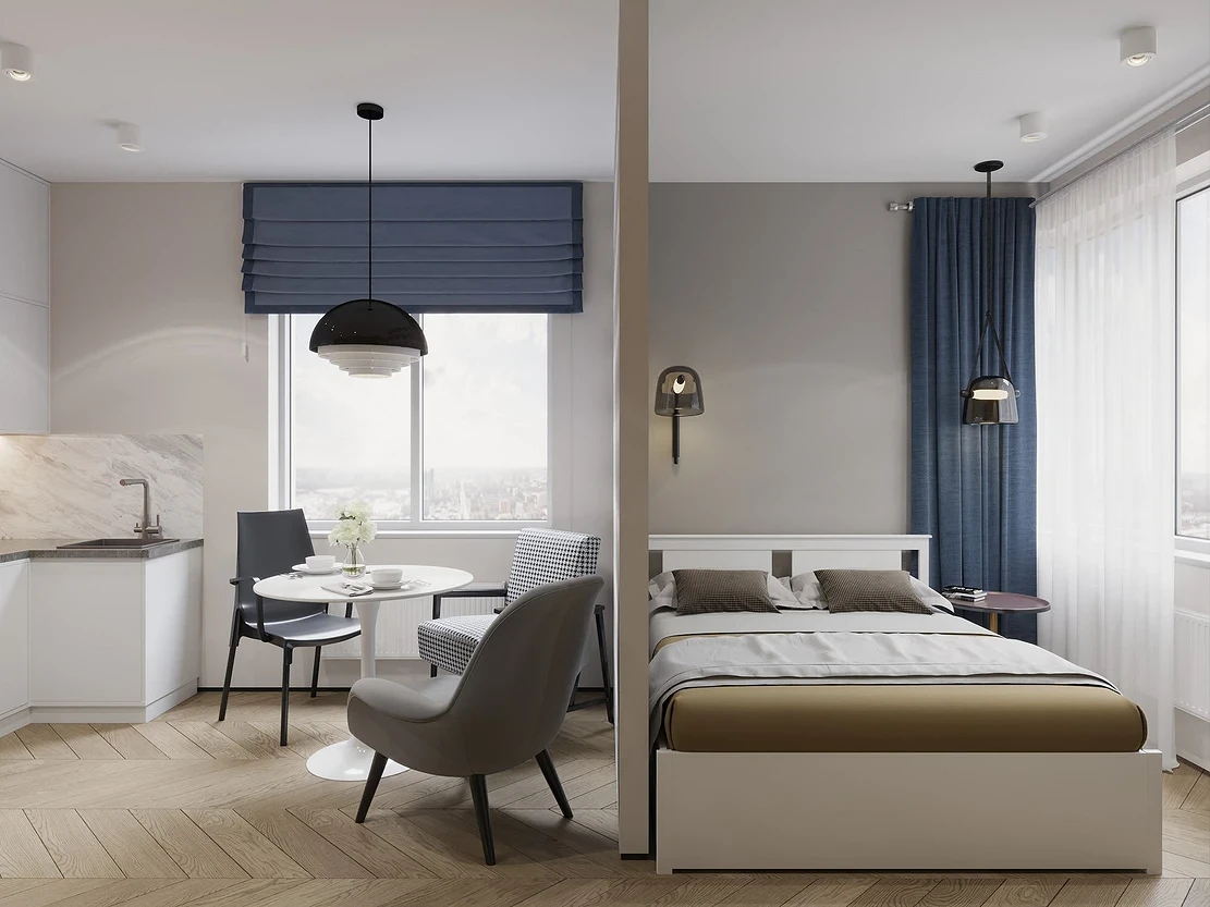
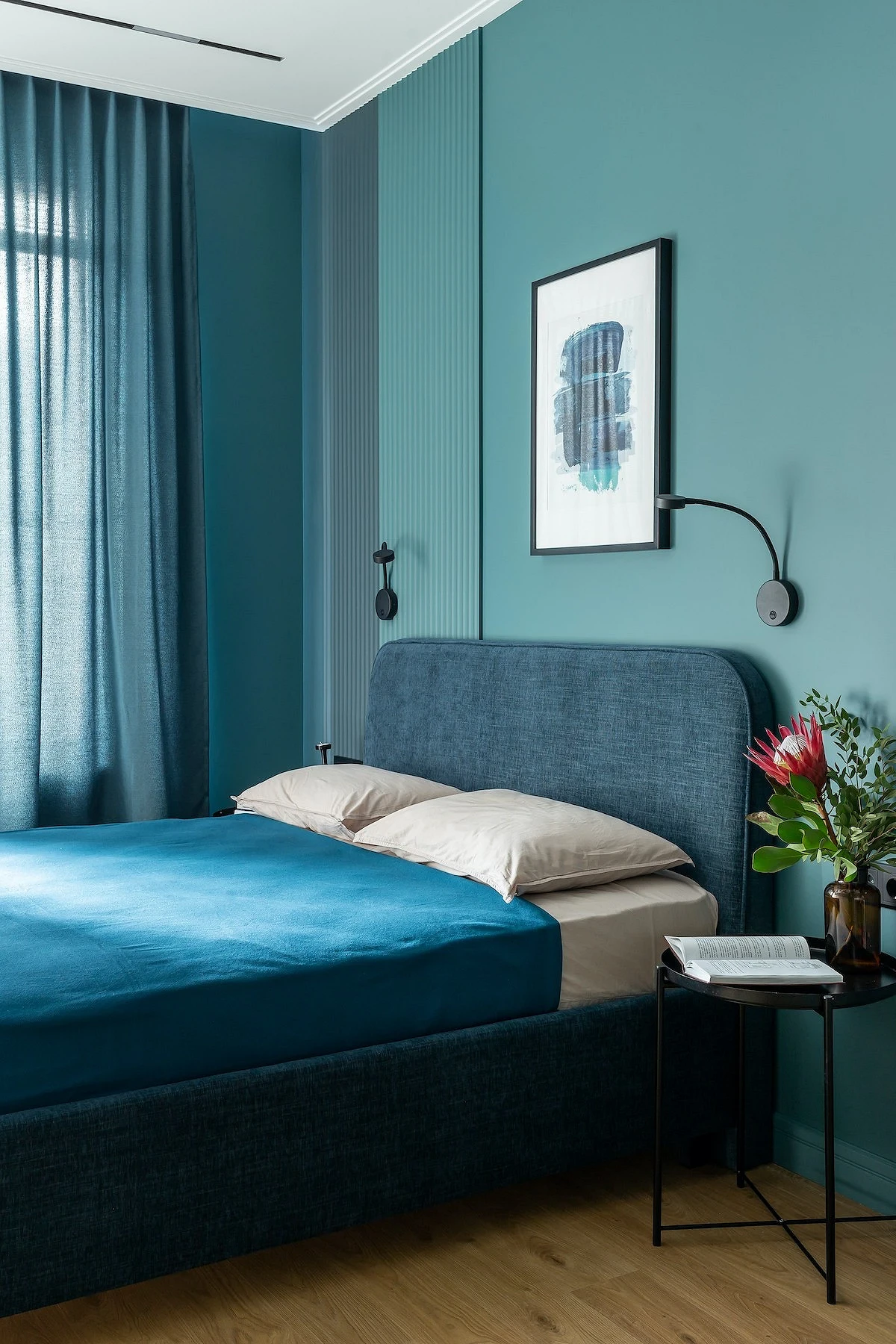
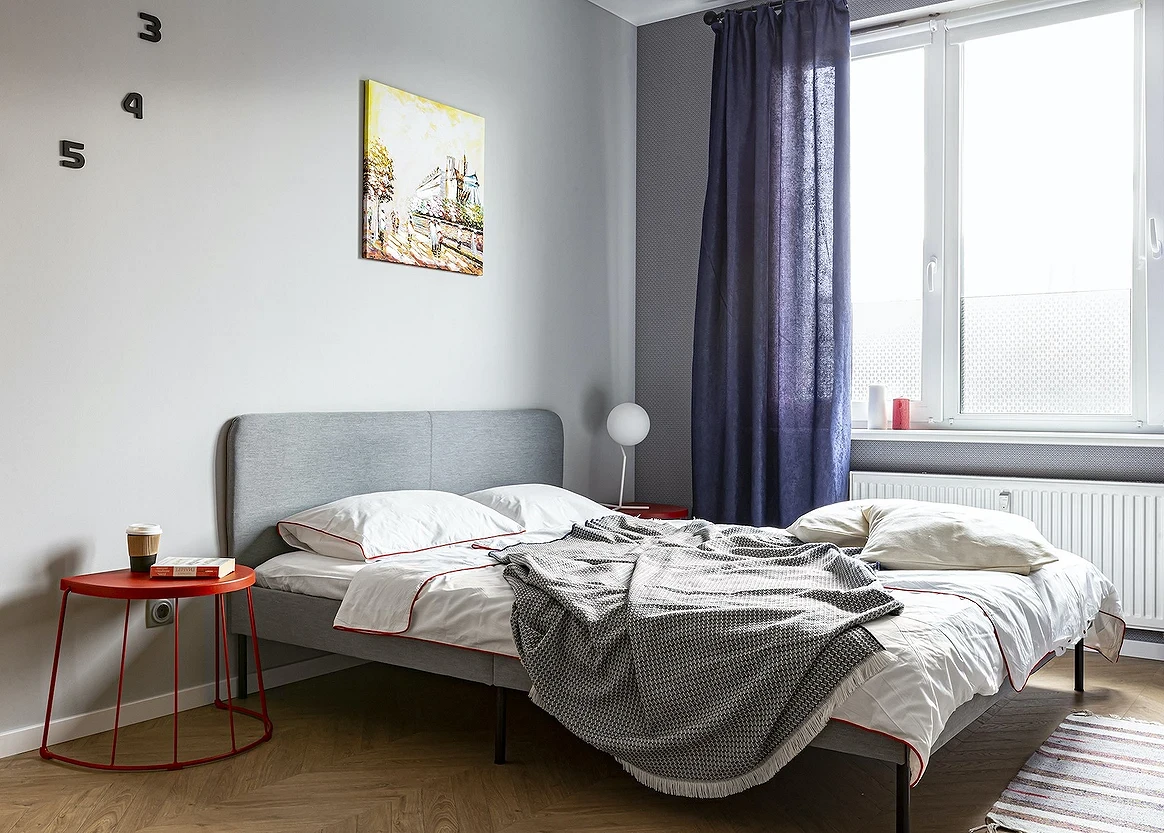
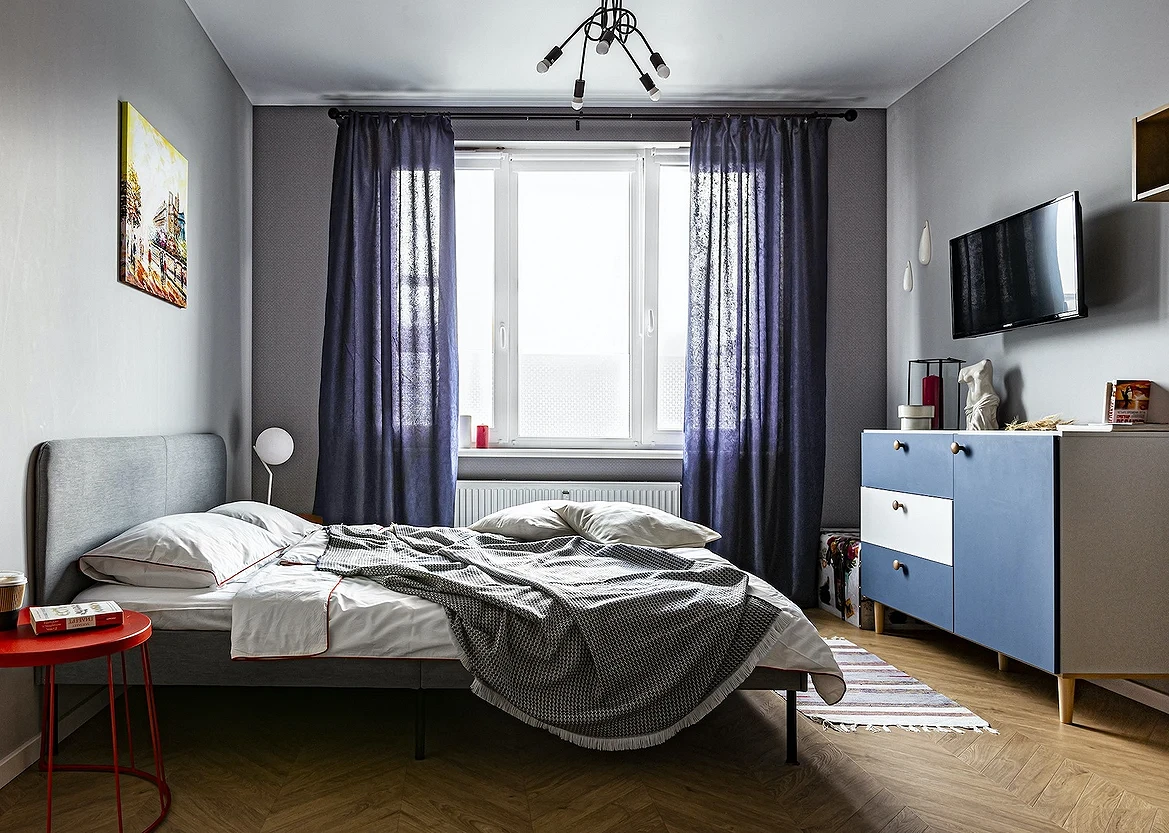
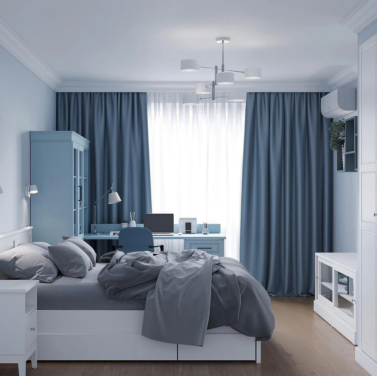
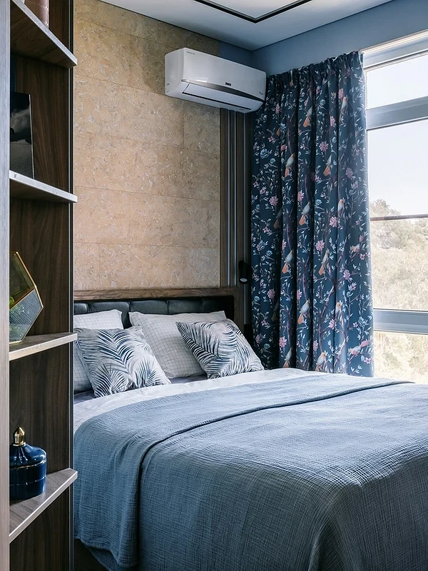
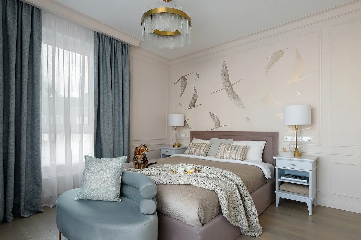
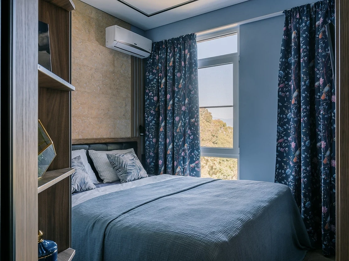
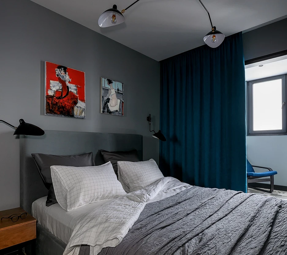
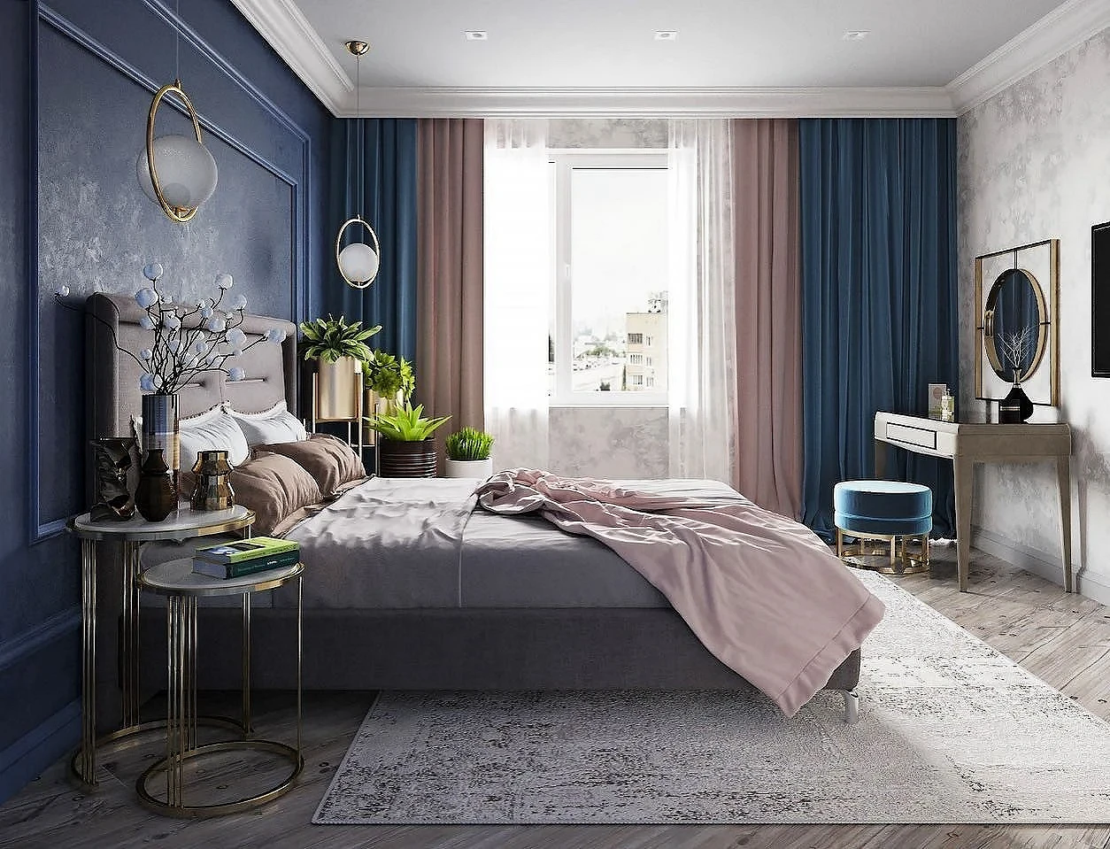
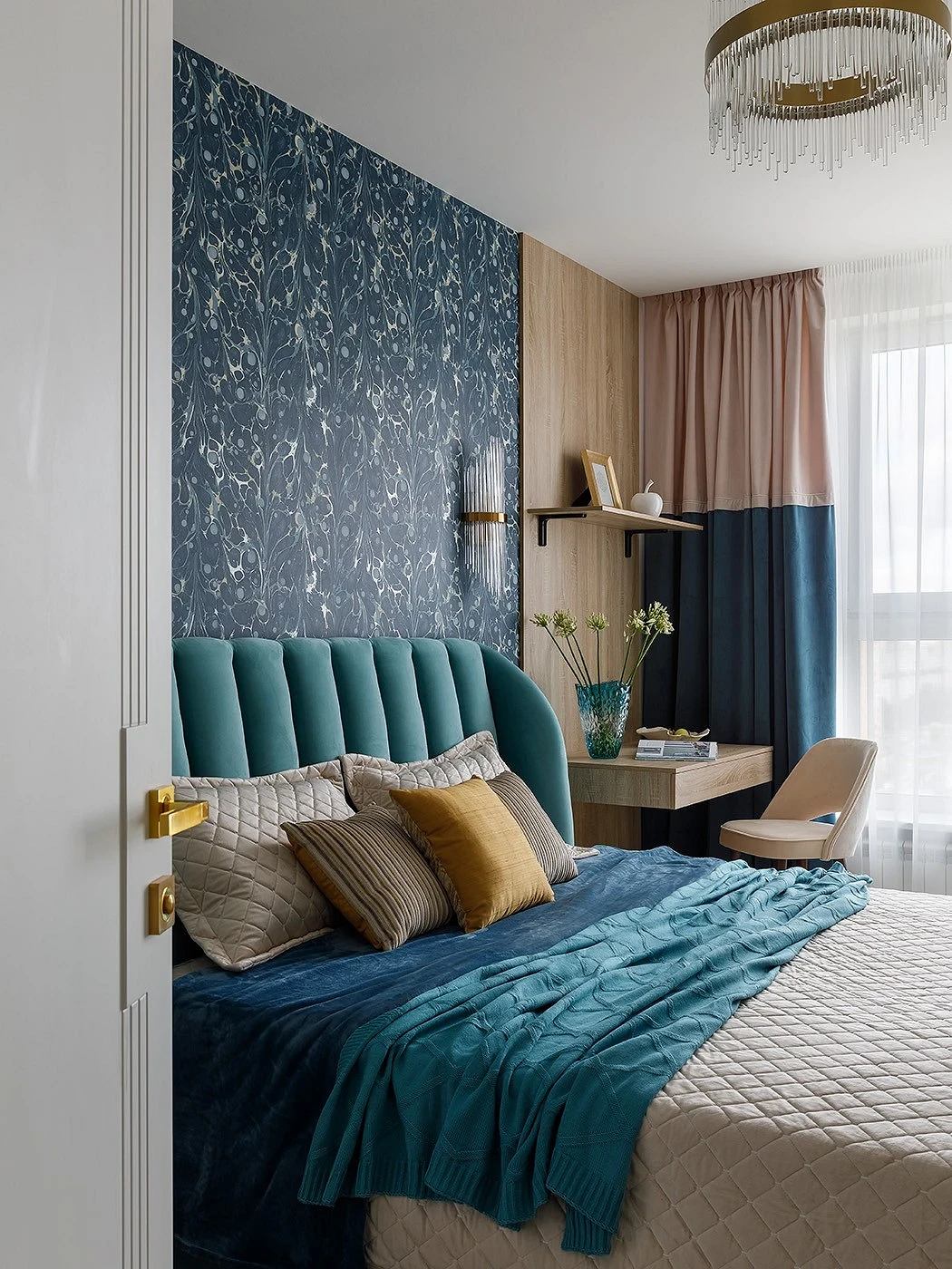
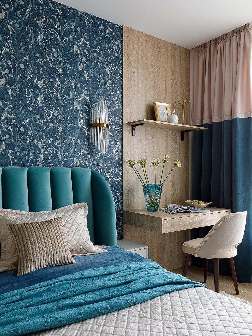
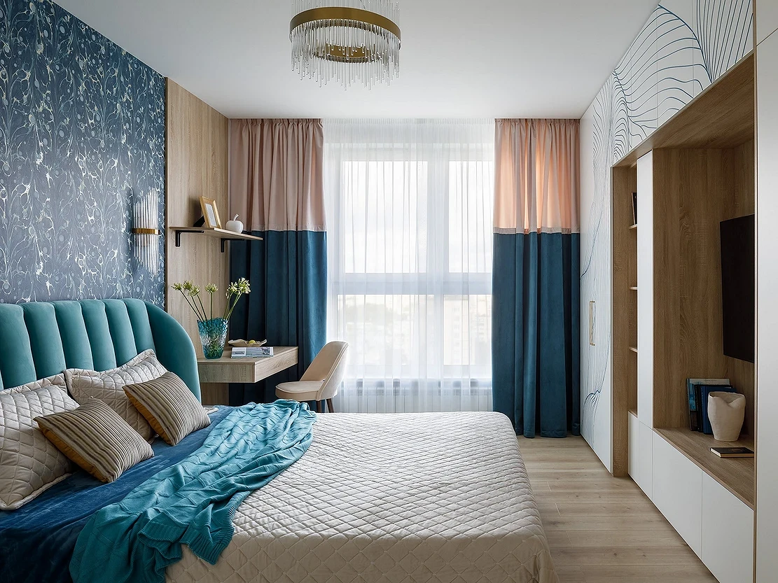
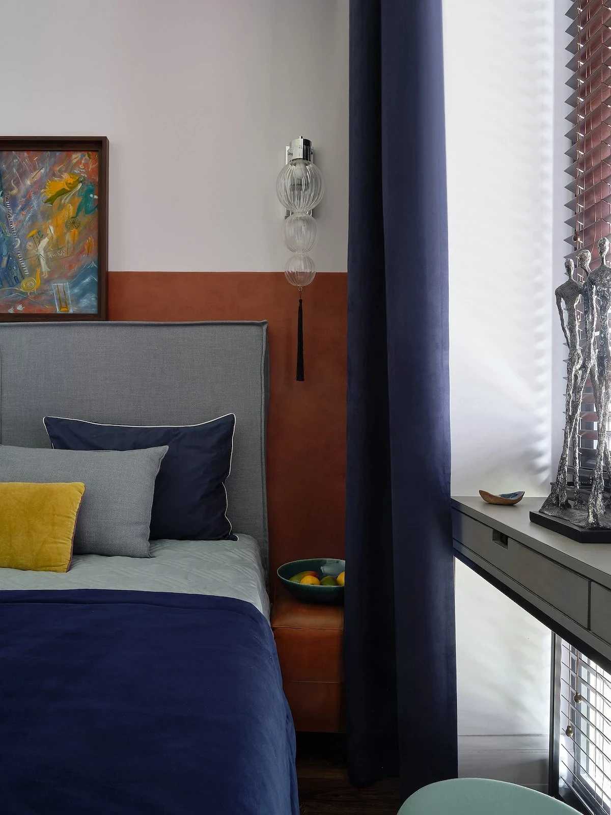
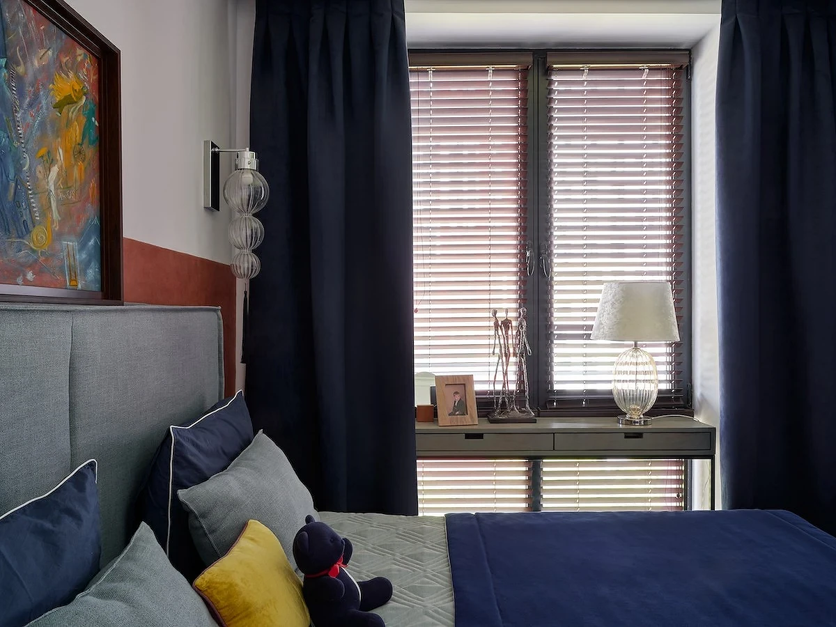
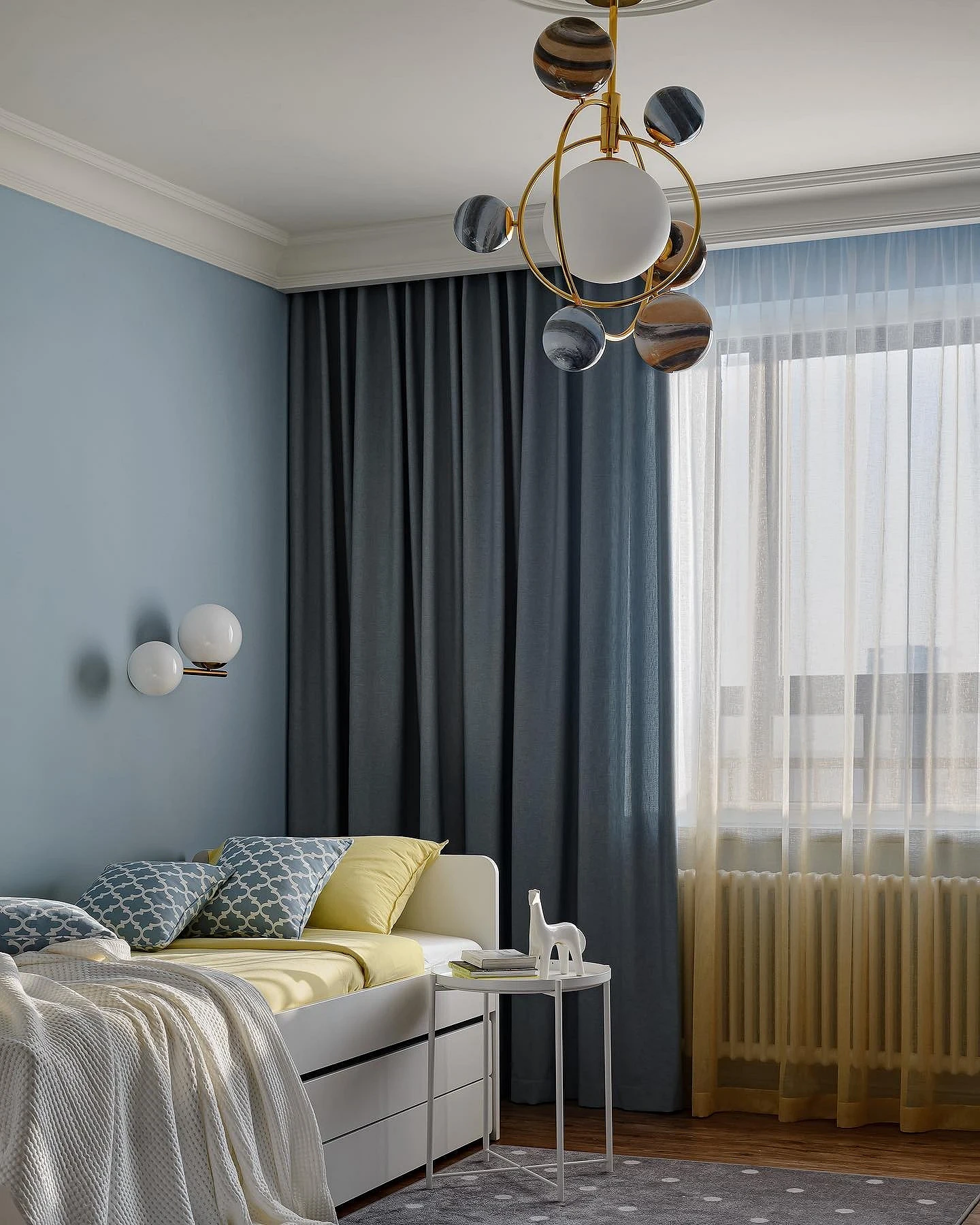
Bedroom
In the bedroom, blue curtains will help create a peaceful and secluded atmosphere.
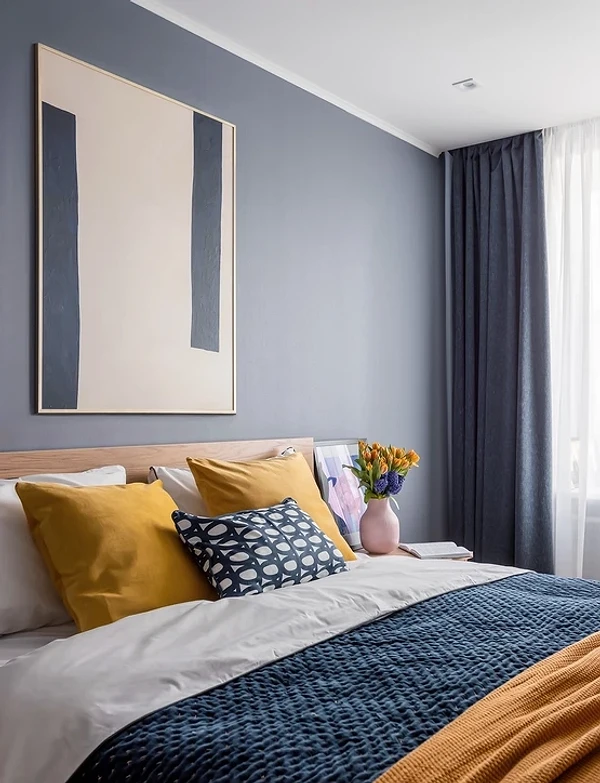
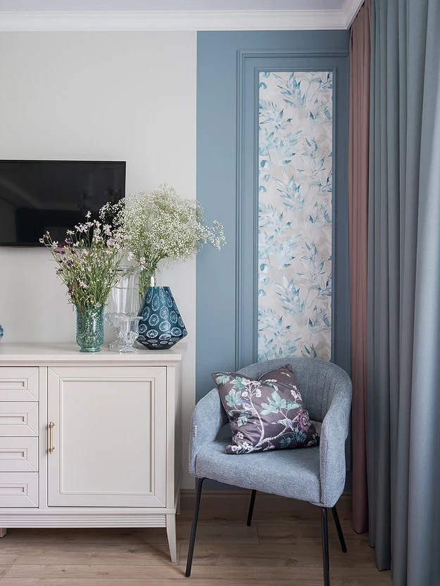
Any dark deep colors here are good for window textiles, as it protects from the sun better than, for example, light translucent curtains or tulle. The interior itself can be made in any range. Most often these are basic colors: beige, gray, and white. Curtains in this case are complemented by a couple more details in tone: for example, bed linen, ottoman or headboard, paintings, and other decors.
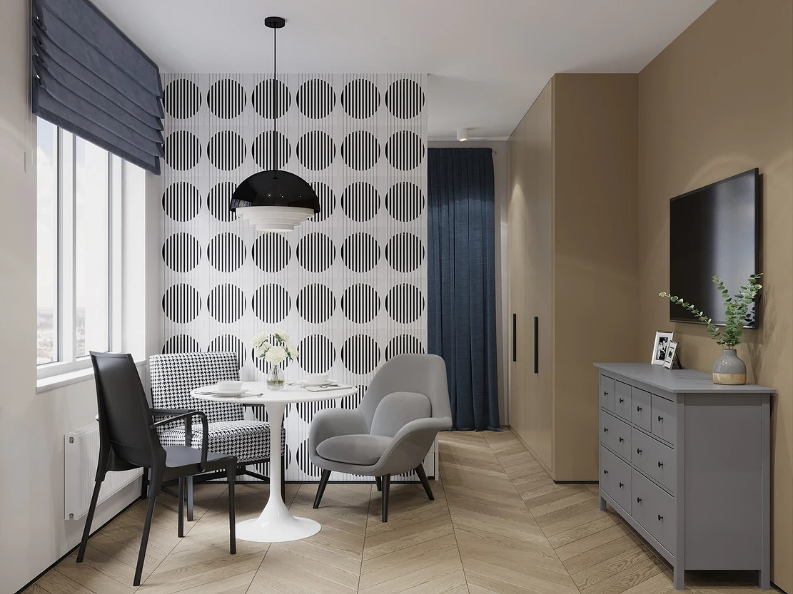
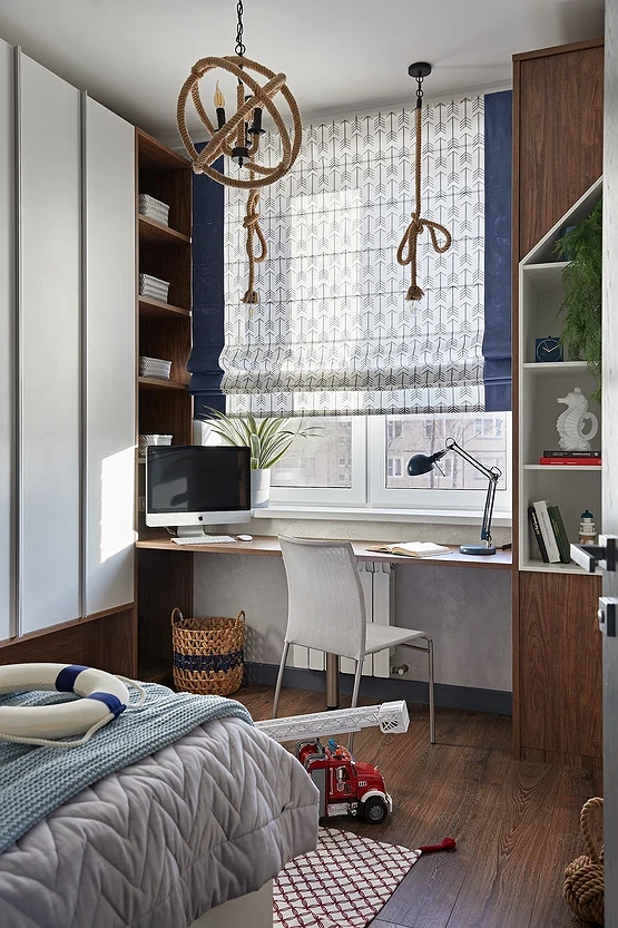
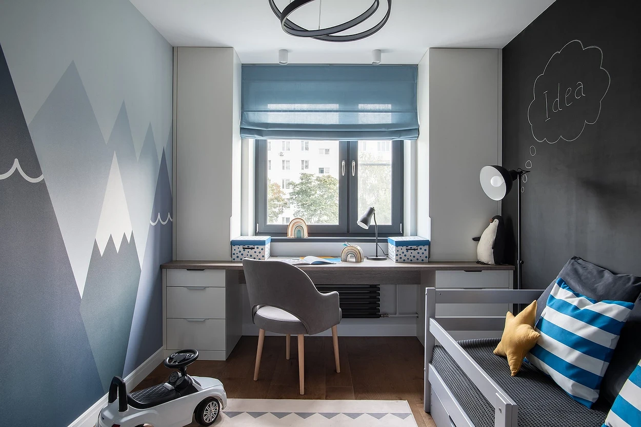
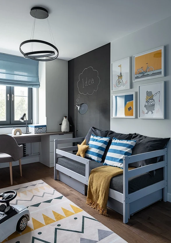
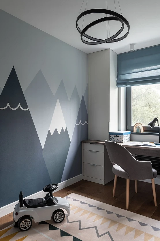
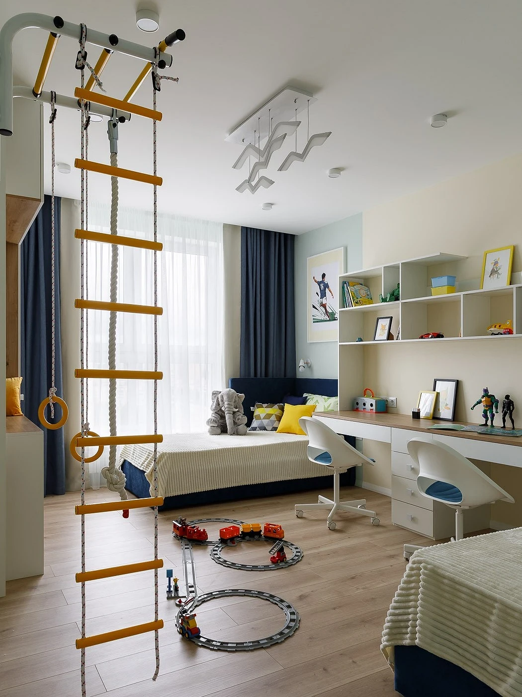
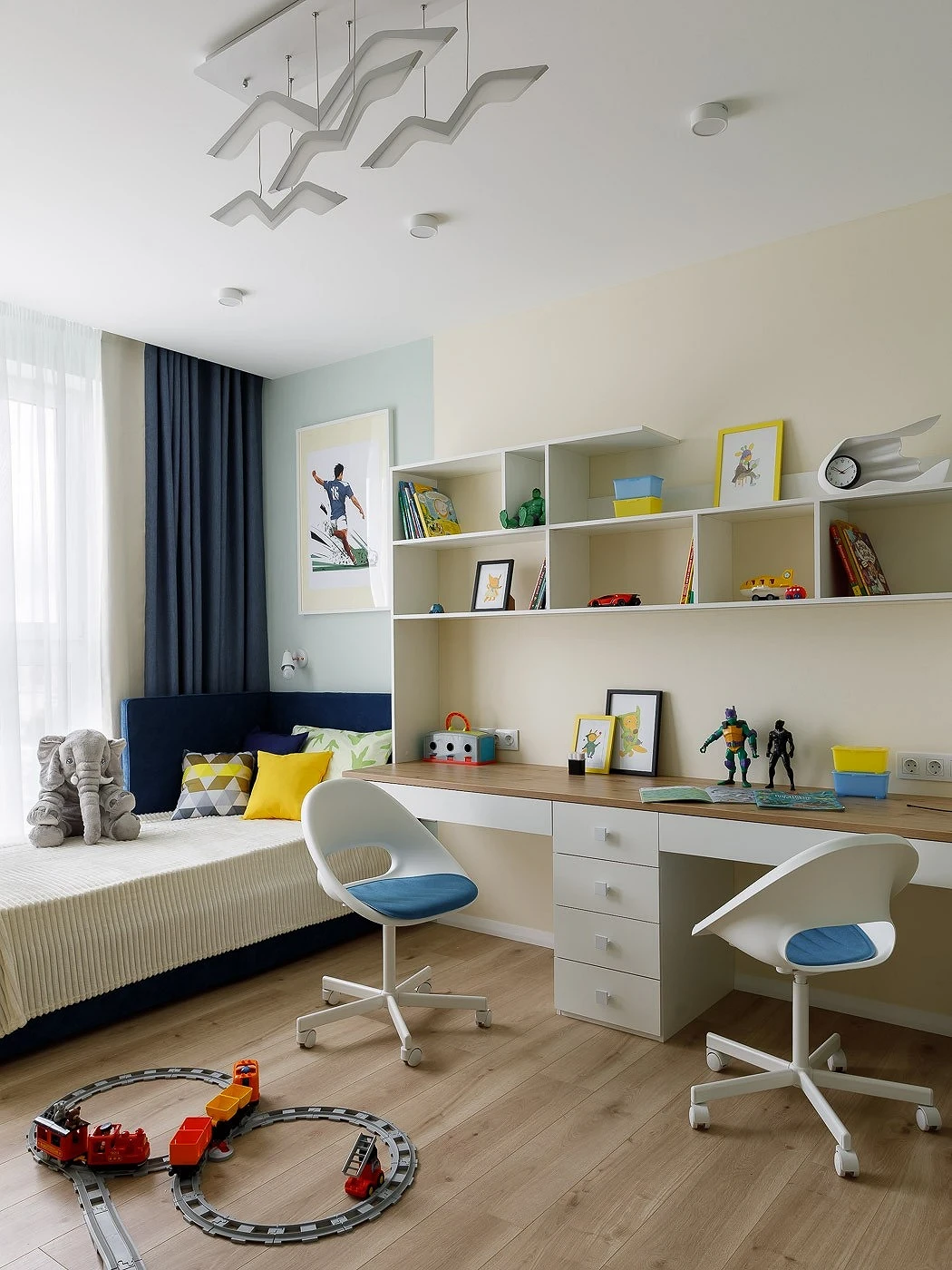
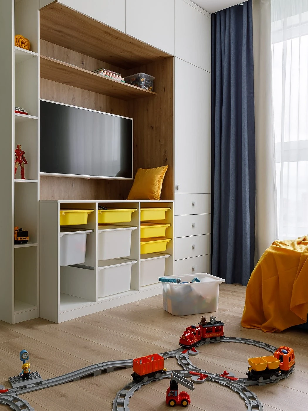
Kids Bedroom
In the nursery, window textiles are subject to the same requirements as for the bedroom: openings should be well darkened during rest (especially if the child is small and sleeps during the day) and study (if the child is already studying).

Blue-blue tones are traditionally used in the design of a boy’s room, but the color itself is gender-neutral, so it is also suitable for a girl’s bedroom or children of different sexes. Adding deep restrained shades to the palette in general will be a good solution since they have a beneficial effect on the child’s psyche, helping to calm down and relax. The design of the curtains can be anything: both laconic (for example, all the same plain curtains), and more cheerful, with color patterns.
The most important thing about our X that it is for
those who are in a hurry


