


The clients, a young couple with a child, showed the designer options for apartments to buy with a request to design and bring to life a stylish, functional living space.


As a result, the designer advised opting for an apartment with an area of just over 100 m². The advantages of the home are its size and open layout, conducive to the formation of an open space that a young couple dreamed of. The apartment is divided into two parts with only one bearing wall. The interior includes exposed structural elements of the building: concrete load-bearing columns (between the proposed kitchen and living area), a concrete ceiling, and unplastered brick walls.
Redevelopment
The couple focused on a spacious public area, consisting of a functional kitchen with an island, a large dining table, and a full relaxation area. Combining the living room and the kitchen-dining room, we got a free flowing space, conditionally delimited by columns, which at the same time visually connected the two functional parts of the room.
Contrary to the common scheme, when children are tied to a private part of the apartment, in this case, they decided to do otherwise. In order for the baby to always be in sight, they did not arrange his room far from the daily public area, choosing a place in that part of the home where the mother spends more time.
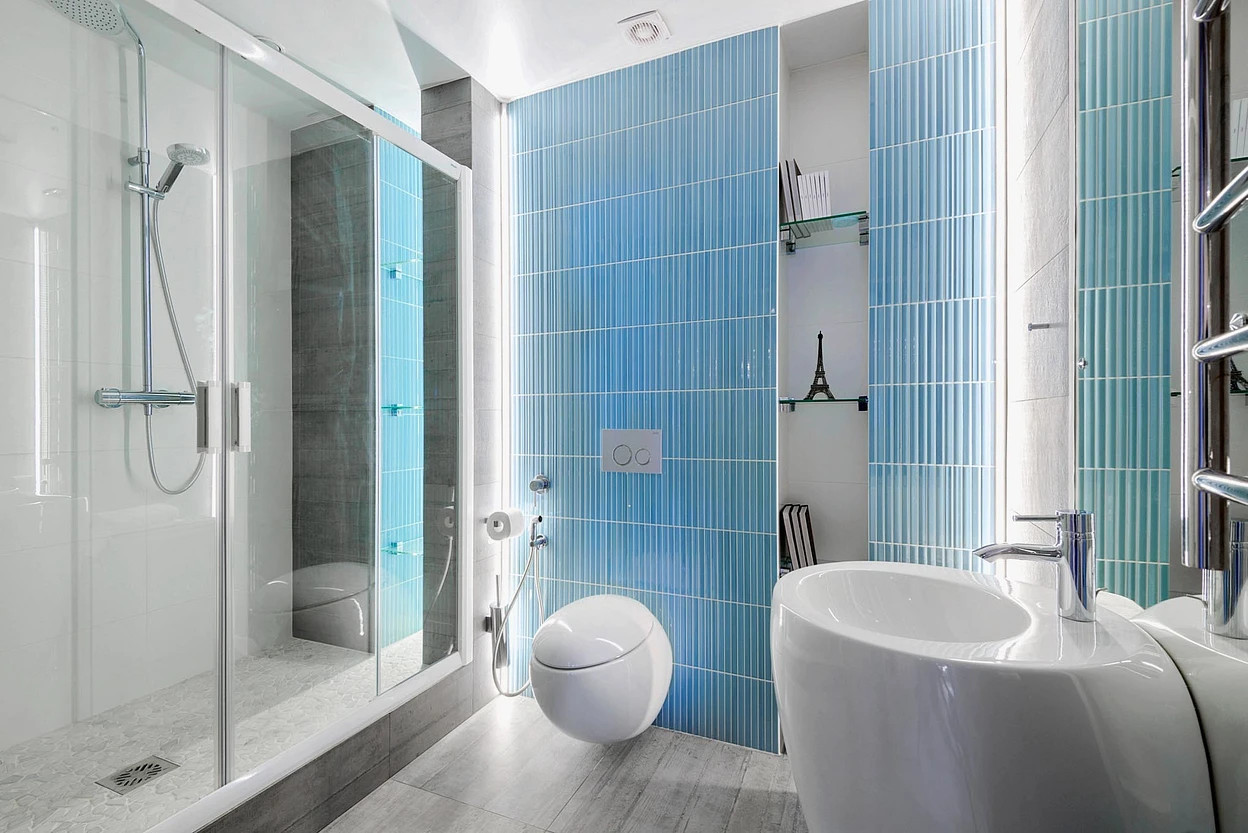
Initially, two bathrooms were equipped at the entrance to the apartment. By combining them, we got a full bathroom with a font and a complete set of plumbing. Also, a utility block was identified in it in the form of a wardrobe, in which a washing machine, a water-heating tank, and laundry baskets were placed.
In a private area, fenced off by a load-bearing wall, the parents’ bedroom was equipped with access to a spacious dressing room, which was separated by a frosted glass partition. In addition to a spacious dressing room, we provided a built-in wardrobe for outerwear in the hallway and a closet in the nursery. A sewer riser was located to the right of the entrance to the apartment, which made it possible to equip a bathroom with a shower in the immediate vicinity of the parent’s bedroom.
The role of the main color accent in this interior is played by the walls, fragmentarily “covered with moss”. Picturesque elements of vertical gardening – phytowalls – look like summer and do not require special care, but they invariably delight the eye, compensating for the lack of communication with nature during the long Siberian winter. Phytowalls are also designed to soften the “harsh” finish of the living area. This amazing opportunity was presented by a single wall in the middle of the apartment. When examining it, we found diagonal metal ties, sheathed on both sides with blocks of sibit – cellular concrete, which has excellent thermal insulation. Having found out exactly where the fittings were going, after obtaining permission, they cut out several round niches in the “free” part of the background white wall and used them for decorative purposes, installing mirrors and panels with painted stabilized moss there. It is easy to take care of: It is enough to spray occasionally, maintaining humidity. In deep niches, “wineries” were arranged for horizontal storage of bottles.
Project author
Repair
A screed was made throughout the apartment. The windows were not changed, as they were of good quality, only new window sills were installed and heating radiators were replaced. The bedroom and living room were equipped with split systems . And to ensure the purity of the air, breathers were placed in each room – compact supply ventilation units. In tandem, this climate technology creates a wonderful microclimate in the apartment.
All new partitions (bedroom, nursery, parents’ bathroom) were built from moisture-resistant drywall on a frame made of metal profiles. The places of attachment to the walls of kitchen cabinets, TVs, shelves of the wardrobe partition were reinforced with plywood sheets. Behind the wall of the kitchen there is an elevator platform, so I had to use soundproofing.
In the TV area in the living room there is a communication shaft, which was also finished with plasterboard sheets. When choosing finishing materials, the designer suggested leaving an uncovered concrete floor slab in the living room, sanding it and covering it with a matte varnish. In the hallway, kitchen and bedroom, a plasterboard false ceiling was installed, lowering it by 120 mm and painting it white.

Design
The interior is built on a contrasting combination of colors and textures , light surfaces are opposed to dark ones. The cold texture of concrete walls, glossy facades of cabinet furniture and glass door panels is balanced by a warm “wooden” laminate on the floor, a “wooden” wall in the home theater area and textiles. Structural details – concrete columns, concrete ceiling, unplastered brick walls – bring loft features to the interior; this effect is enhanced by color accents.
In the structure of this apartment, the columns play the role of load-bearing elements, which it was not possible to get rid of. Therefore, they were given the status of almost the main structural elements within the chosen style concept. They not only provided a light, airy and clear division of space into zones, but also gave expressiveness to the interior.
The designer did not decorate their concrete surface, as well as part of the ceiling and walls. The space of the public area was divided into a kitchen area (with a white ceiling and white walls) and a recreation area (with a concrete ceiling and a wall lined with painted brick ). In the public part, they did not dare to leave the entire surface of the ceiling unfinished – the concrete would have looked heavy. The white hemmed ceiling from the kitchen proceeded into the hallway. To support the black elements (glass facades of appliances, spots on the ceiling, chairs) and enliven the monotonous white surface, it was decided to decorate the corner of the wall with black graffiti fonts applied using stencils.


The most important thing about our X that it is for
those who are in a hurry


