


Love red? Many believe that it energizes and even improves brain function. However, people rarely use it in the interior, being afraid of excessive aggressiveness. We tell you how to bring this tone into the atmosphere and not overdo it.
1. Set the accents
The simplest, but at the same time effective way to bring red into the atmosphere is to place color accents.

A poster on the wall, a couple of decorative pillows, a vase – and now the interior has sparkled with new colors.

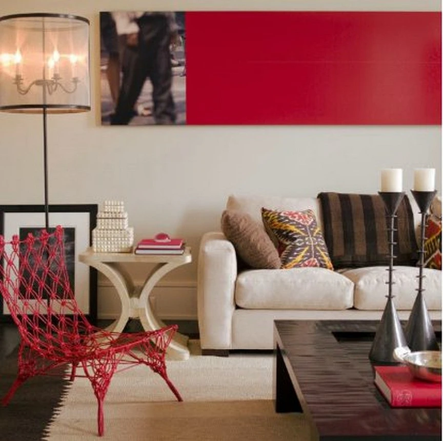


You can limit yourself to just one accent: for example, a bright red armchair or a bedside table. This solution will be especially appropriate in monochrome interiors.

By the way, it is not at all necessary to choose red as the only color accent: it can become one of the “bright spots” in the interior. The main thing is to select matching tones and “dilute” them with neutral shades.

2. Decorate a bright wall
The red color is perfect for decorating a bright accent wall.

Such a decision would be especially appropriate if the rest of the interior is made in a more calm, neutral range.


If it seems to you that painting an entire wall red is too much, remember that such a bright contrast, if desired, can always be “broken” with light or, say, black and white posters, photographs, or paintings.

3. Consider a bright bathroom
If, within the living quarters of an apartment, you are still not ready for bright colors and bold experiments, a bathroom can become your “outlet”. Why not decorate it in a cheerful and invigorating red hue?


You can “dilute” the red color in the bathroom with beige or add black and white so that it doesn’t turn out too flashy.

4. Bright hallway
Another great place for bright self-expression is the entrance hall.


Just a little bit of red – and a cheerful mood when leaving for work and returning home is guaranteed.


5. How about a red floor?
Everyone is already used to bright accent walls in the interior, but how about painting the floor in bright scarlet? See how juicy, stylish, and unusual it can turn out.

6. Please note: Bright kitchens are back in fashion
Tired of the white-gray-beige neutral color scheme popular in recent years, designers are gradually turning back to bright colors.

An accent red set may well be the highlight of your kitchen.


Bonus: 5 spectacular combinations of red with other colors
Especially for those who dare to use red in the interior, we offer the top 5 win-win combinations of this color with others.
1. Red + powder pink
Pink color and its delicate, powdery shades are increasingly being called the “new beige” by designers and representatives of the specialized media. Indeed, this tone is quite light and neutral, and therefore looks appropriate in almost any interior, does not get boring, and provides ample opportunities for combinations.

Powdery pink will be a great backdrop for the active red color and will slightly reduce its “straightforwardness”, giving the atmosphere sophistication.
2. Red + deep dark tones
The red color goes well with dark shades.

True, paired with black, it looks too contrasting and somewhat rustic, but next to more complex and deep tones it looks completely different – elegant and stylish.

3. Red + white
A time-tested catchy combination of colors that allows you to place accents and enliven the atmosphere, without overloading the space.


Does a bright color depending on how ready you are for red in the interior?


4. Red + gray
A slightly less contrasting, but no less spectacular combination of colors. It exudes sophistication and bohemianism, in addition, gray and its shades have been at the peak of popularity for several seasons. Scarlet tones in this situation should be used carefully, pointwise.


5. Red + blue
Fiery red is surprisingly harmoniously combined with cold shades of blue, balancing it. Depending on what color temperature is closer to you, you can base the scarlet tones and “cool” them with blue, or take blue as the base and shade it with red accents.


Also, both colors can perfectly act as a duet of accent tones against the background of a neutral interior.
The most important thing about our X that it is for
those who are in a hurry


