


We tell you what emerald looks most advantageous and how to apply it in the living room, bedroom, bathroom, and other rooms.
Natural colors are a trend that will be relevant for a long time to come. Sea depth, fresh dense greenery, or a scattering of precious stones – the emerald color in the interior evokes different associations, but invariably works to create an atmosphere of luxury, stability, and tranquility. In this article, we will tell you how to apply this complex shade in different rooms and with what to combine.
Color Features
This is a rather dark and cold shade of green, with a slight blue shift. Its uniqueness lies in the fact that, depending on the intensity, it looks bright and calm at the same time, does not irritate the eye, and does not seem boring either. The closest “relatives” are ultramarine, a shade of pine needles and bottle glass.
Emerald in the interior plays different roles. So, depending on the environment and the general style of the room, it can emphasize the status, make the atmosphere luxurious and elegant; create a chamber and peaceful atmosphere in the room; bring a touch of mystery to the interior.
The perception of this variation of green depends on how much it is used, on the combination with another palette, and on the textures surrounding it. Stone and marble surfaces will enhance associations with jewelry, while soft natural fabrics, clay, wood, and rattan – with wildlife.
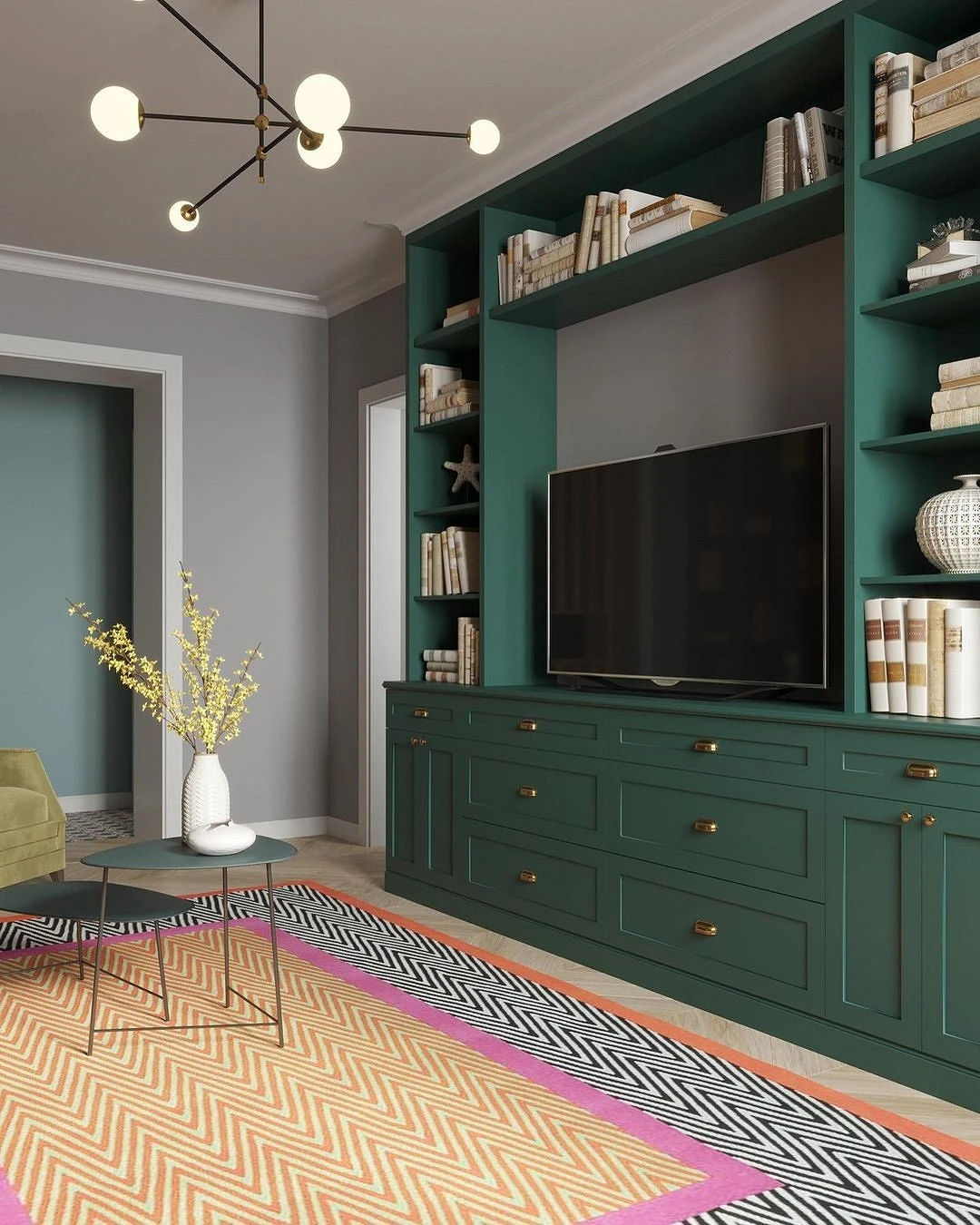
The combination of emerald in the interior with other colors
Emerald is not a basic color, so you need to be careful when combining it with others. The best pairs for it are neutral achromatic tones, and the shade itself is best used as an accent element since its overabundance can have a negative effect on the psyche and mood. Consider the most successful combinations.
With basic colors
White will be an excellent base, which will not only emphasize the nobility of malachite green but also add space and air to the space. This is important, since there is a rather dark tone in the combination, and it is desirable to dilute it with something, especially in a small room.
Gray works the same way. This is the most neutral background for brighter accents, which calms the active colors in the interior. It is better to take a medium undertone, with a green tone, or a cold one, since warm gray can conflict with cool emerald.
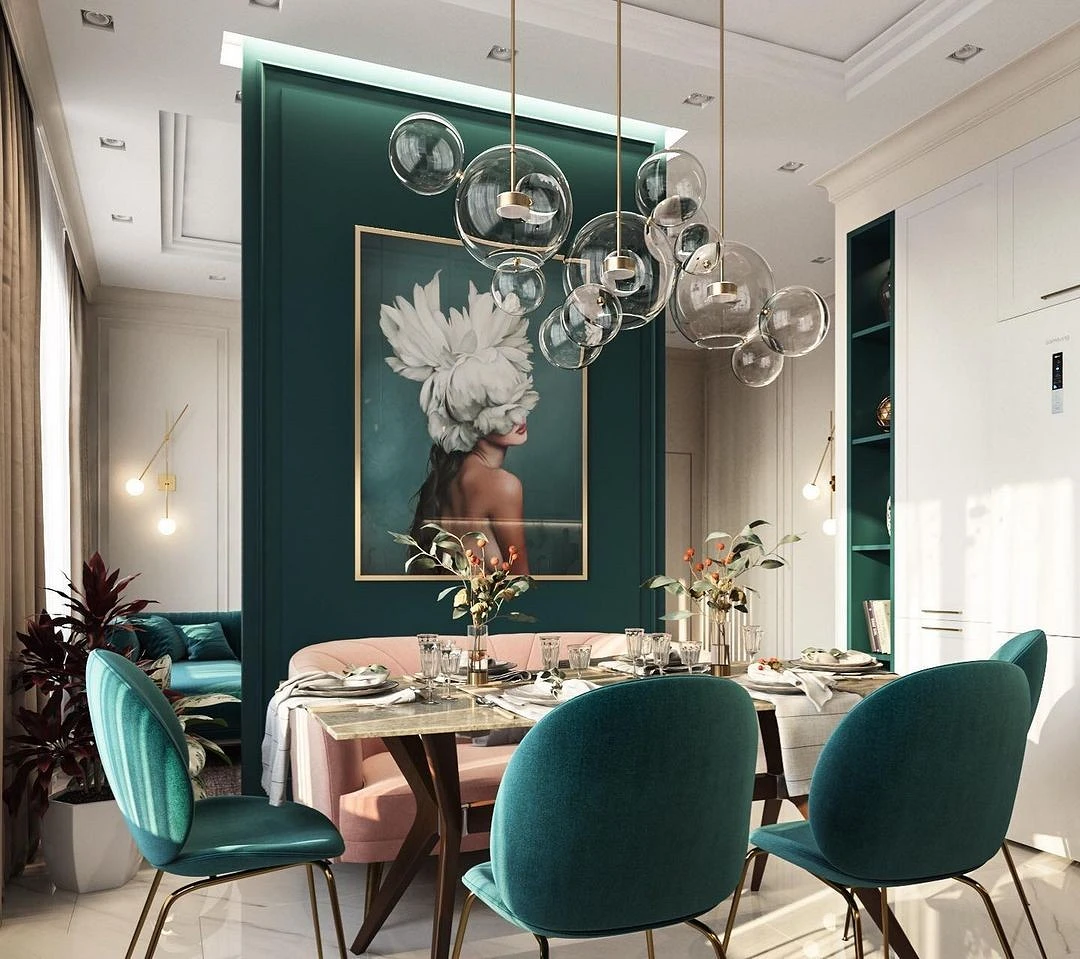
With pink
The pink and green combo is already considered a classic of the genre. It works with any shades of green, but pink is better to take not acid-bright, but slightly muted shades. At the same time, the temperature does not matter: blue-green will go well with cold powdery and peach.
With purple
Another spectacular combination of two non-basic colors. At the same time, purple is also a dark and active tone, which can put quite a lot of pressure on the psyche. Therefore, both lilac and emerald in this combination should be accent colors, always with the presence of a neutral background.
With blue
Since blue is part of the shade, this kindred combination is always a win-win – in this variation, emerald takes on a deeper and colder color associated with water and nature. Emerald is combined with any gradation of blue: from sky blue to rich cobalt. So that, as with purple, this combination does not depress, it is better to dilute it with neutral colors: white, gray, cool beige. Use for decor or accent furniture.
How to use it in different rooms
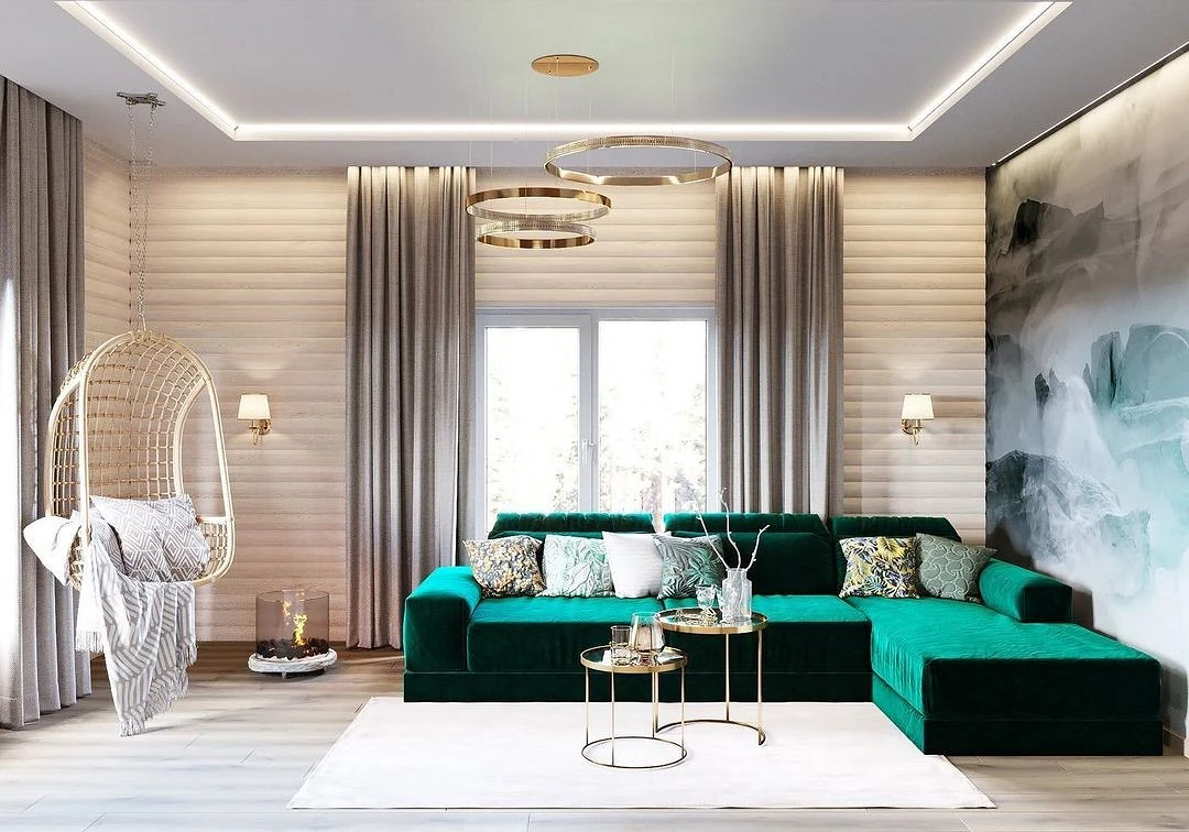
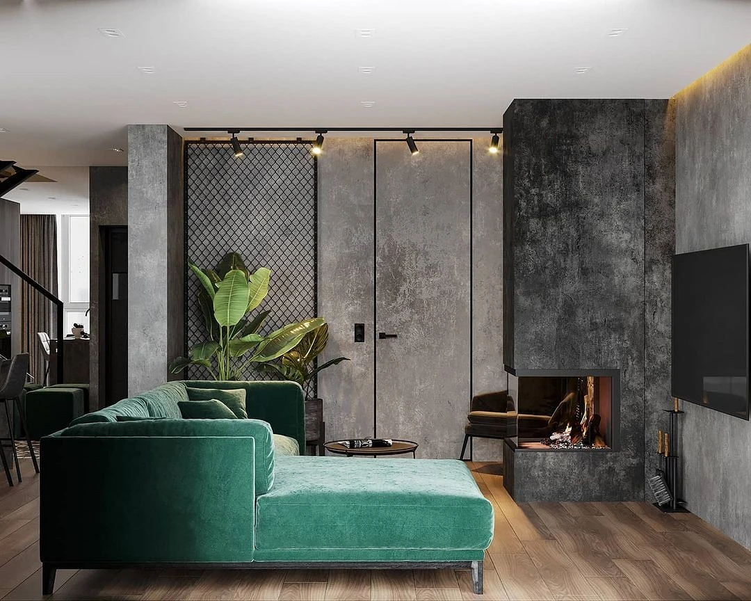
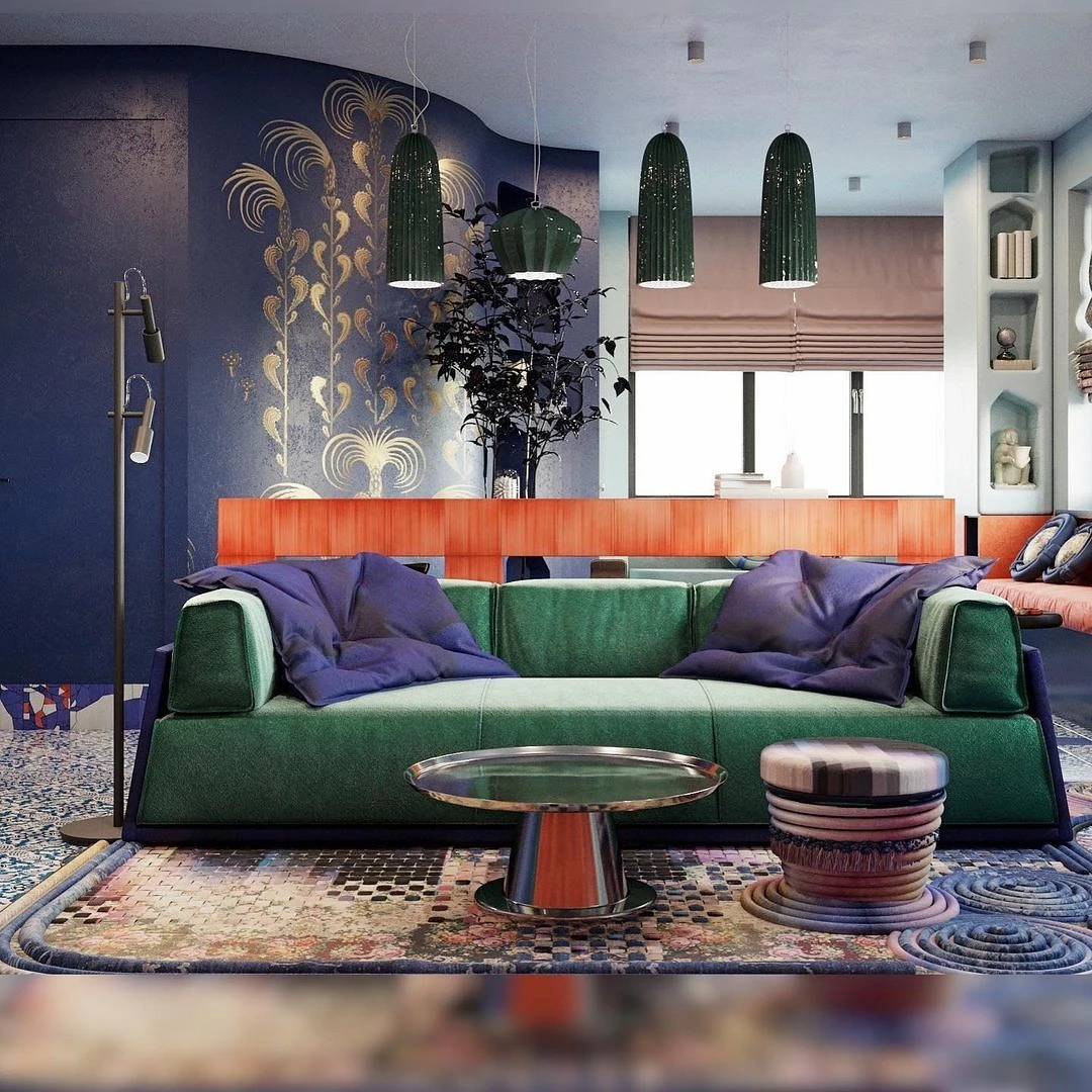
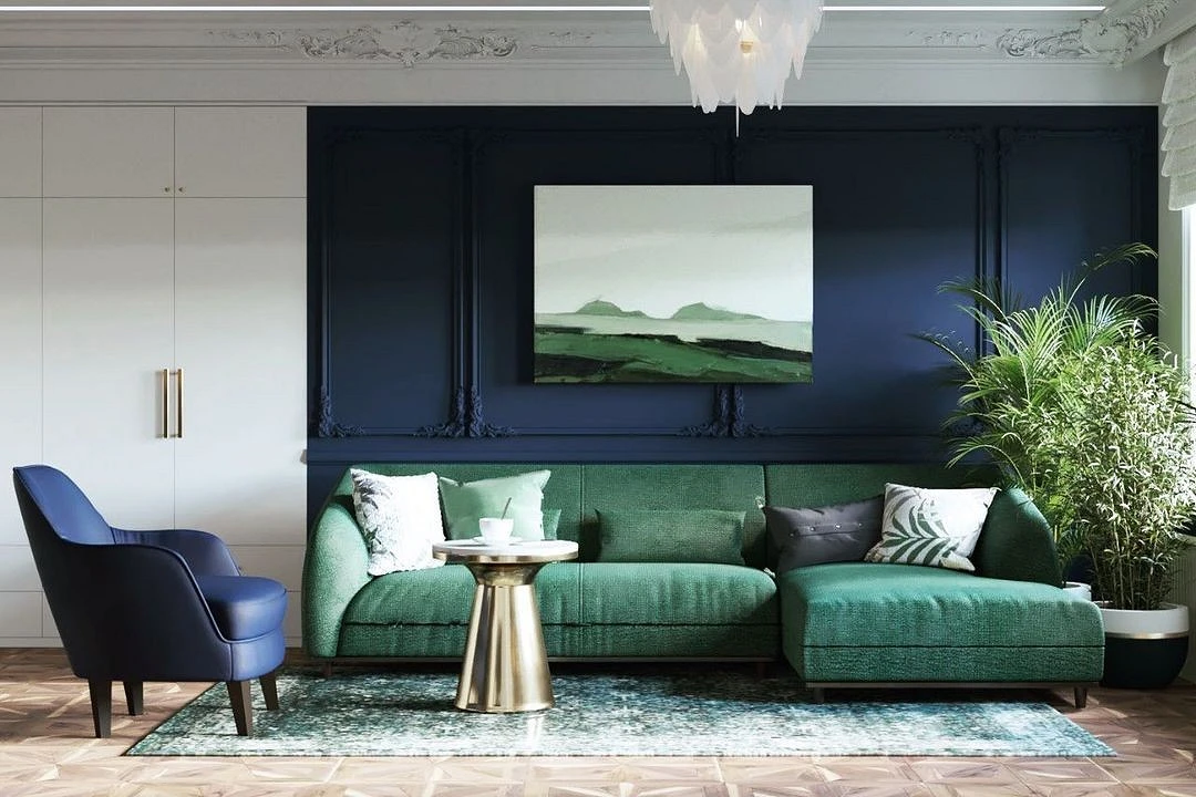
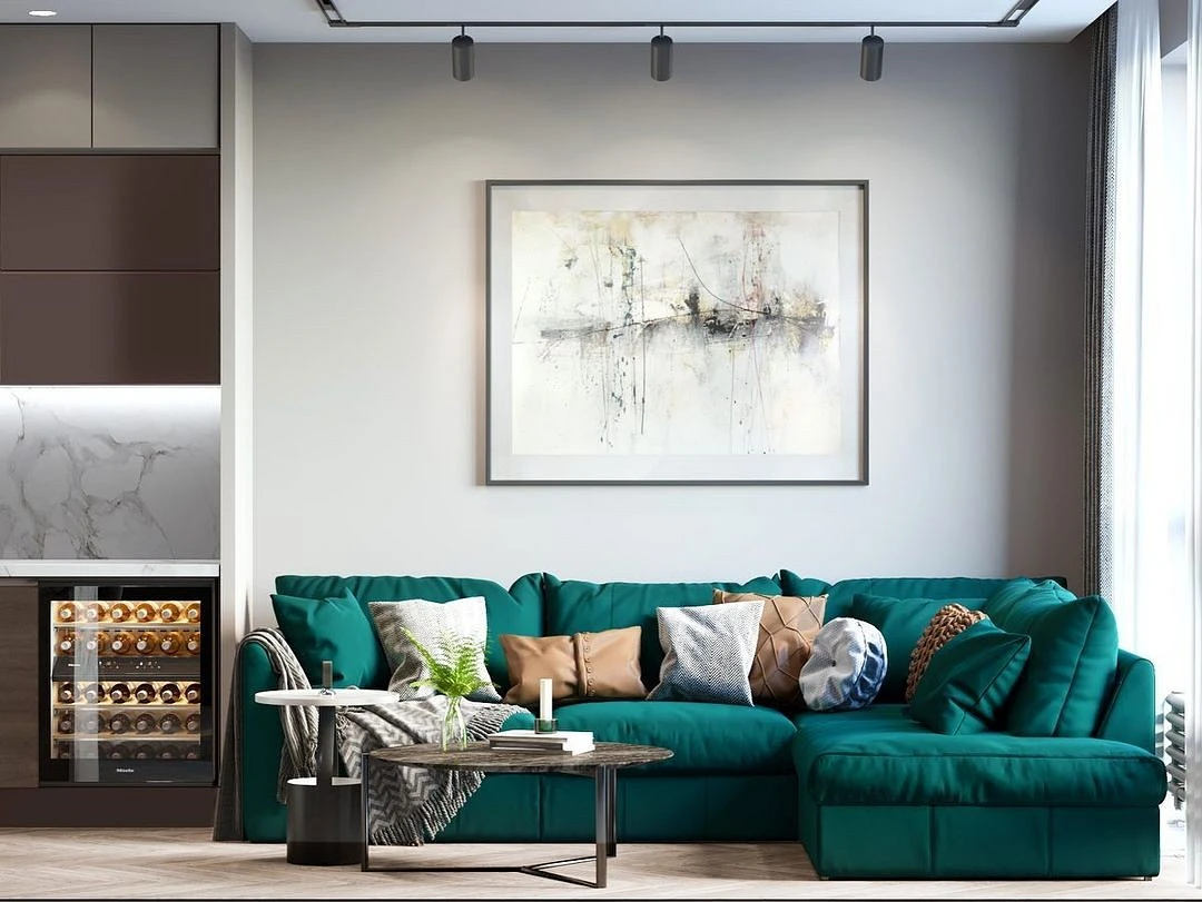
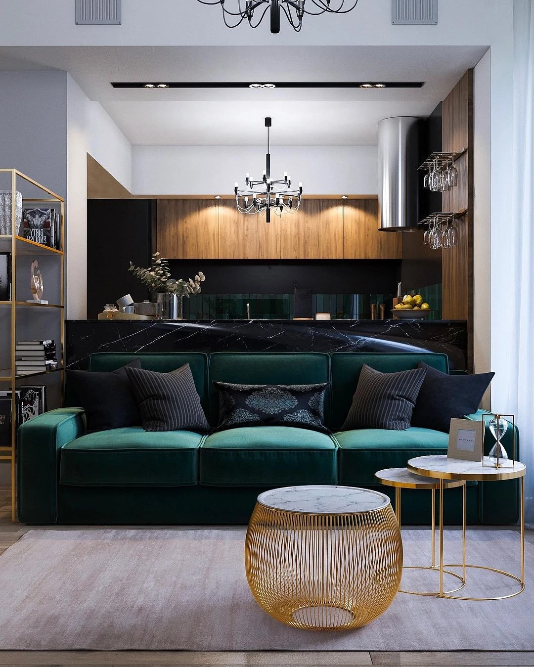
In the living room
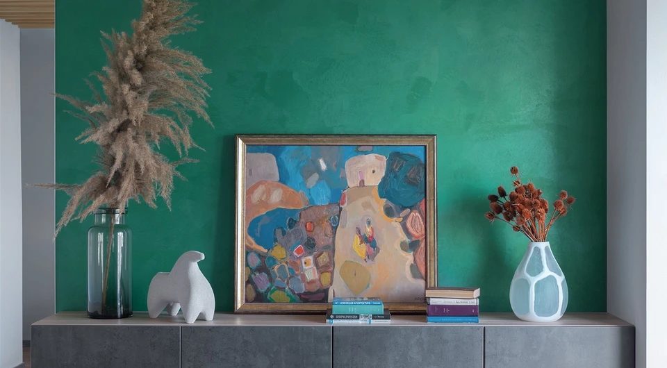
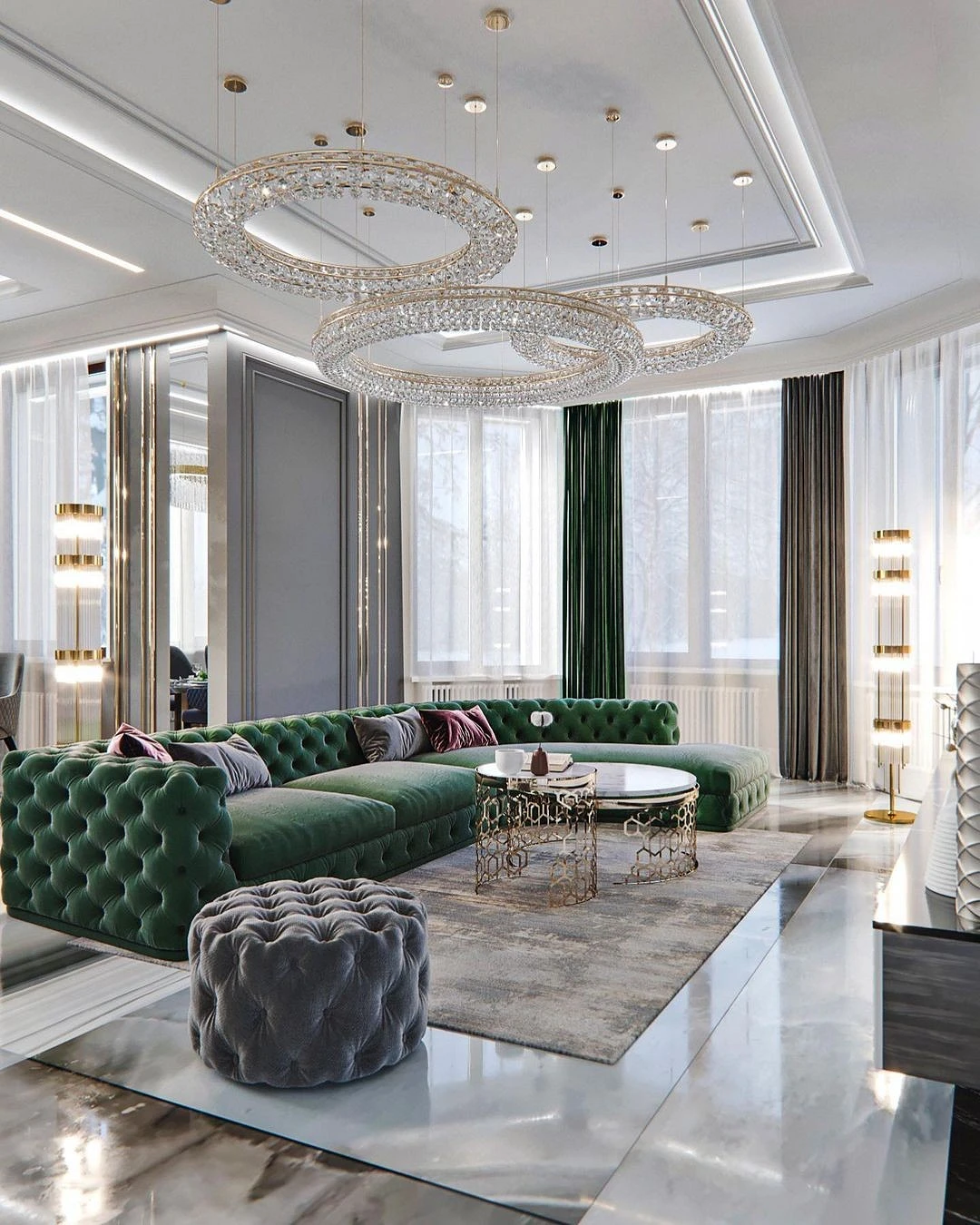
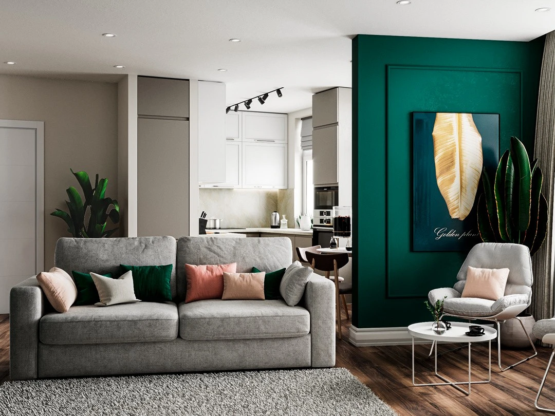
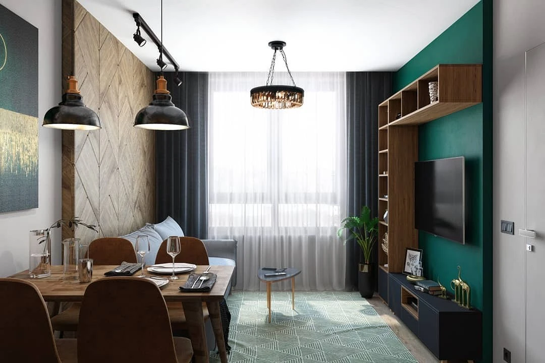
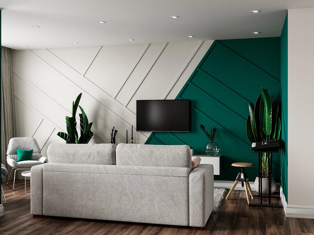
The emerald in the interior of the living room refers us to museums where royal residences are recreated and there are entire rooms with that name. But this does not mean that this color is appropriate only in lush classic interiors.
Green is associated with energy, creativity, and vitality – qualities that are perfect for a front room where family members and guests gather for lively conversation. To maintain such a cheerful mood in the palette, it is better to use malachite in doses and combine it with lighter calm colors.
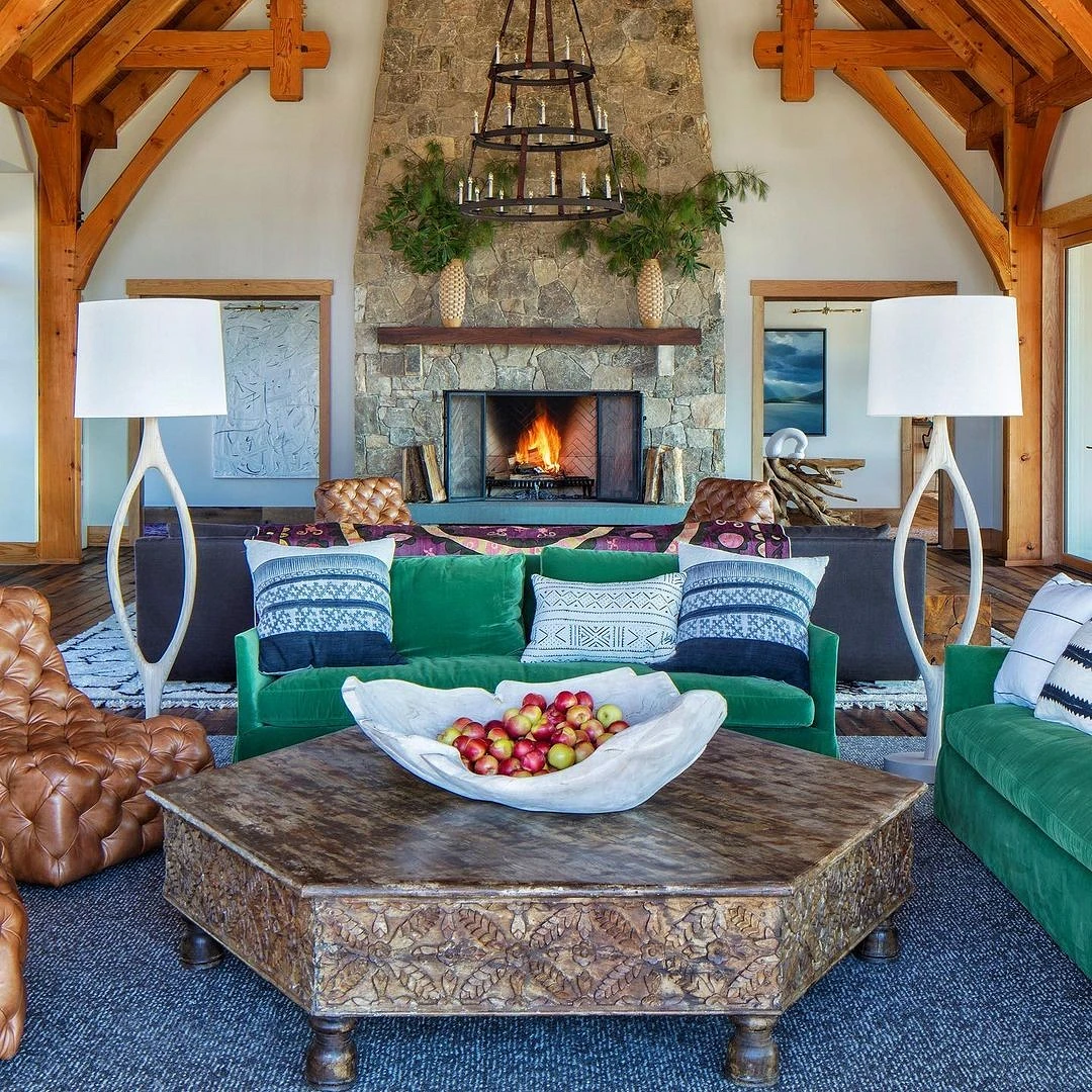
The most popular solution is a sofa as an accent element. It will not only be a bright spot and focal point of the room but the color of an expensive stone is additionally revealed thanks to textured fabrics and materials: velour, velvet, leather, etc. You can support it with other shades of green or blue, as well as gilded elements.
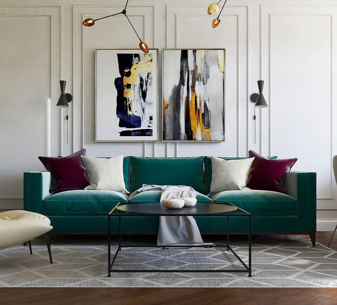
If you want to experiment and try on the dark green on the walls, it is better to use it pointwise – for one wall. So you can highlight the area behind the TV or sofa and visually zone the space.
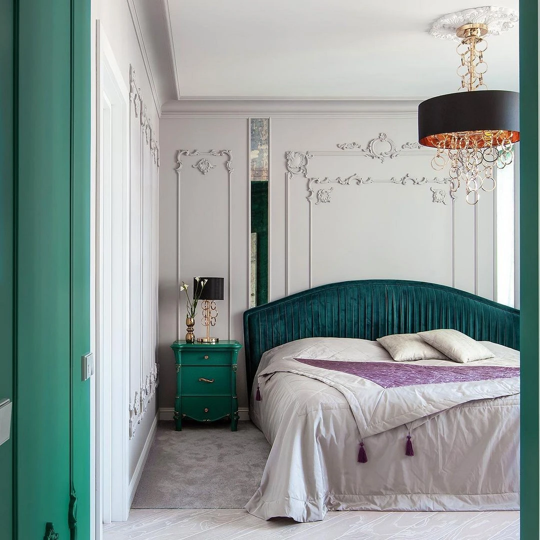
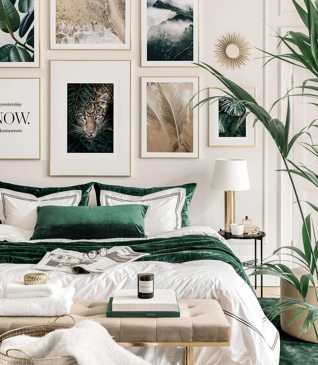
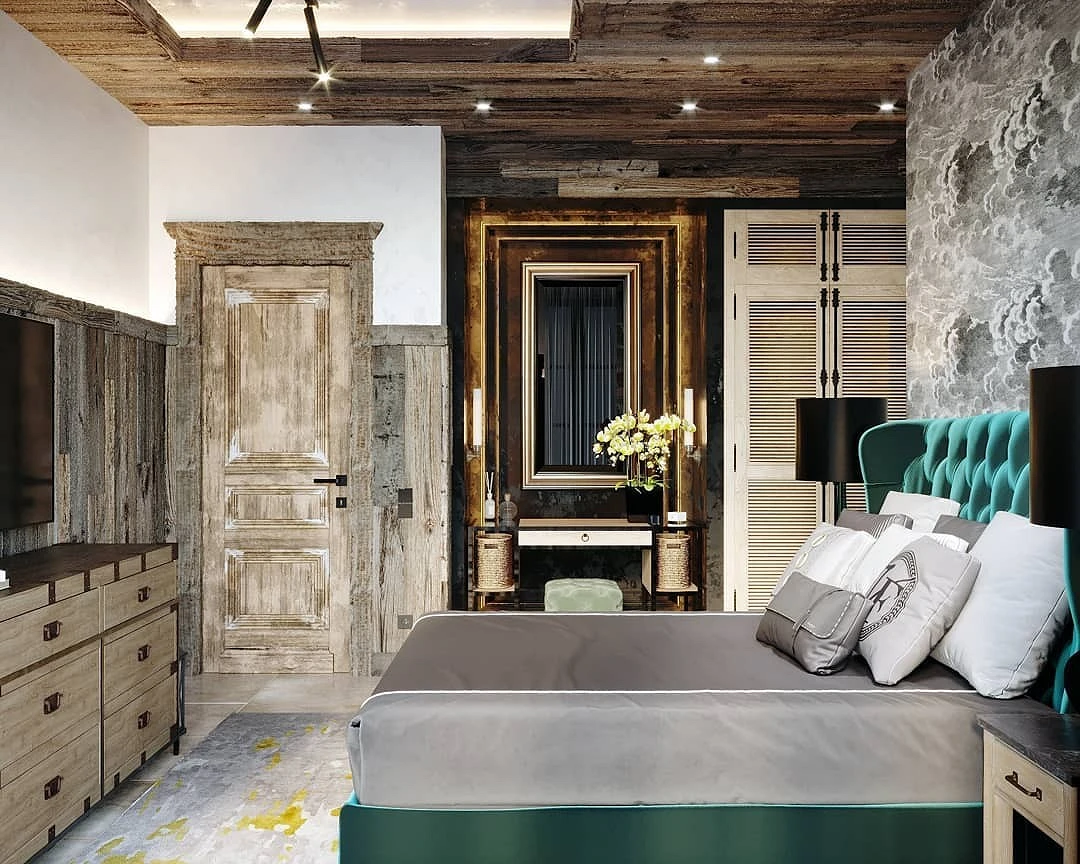
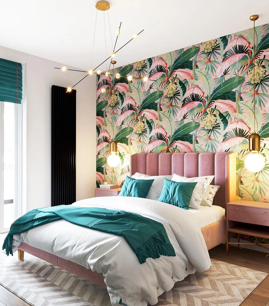
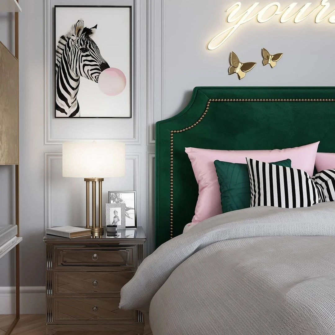
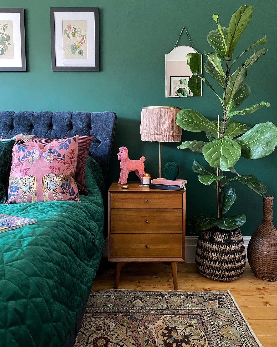
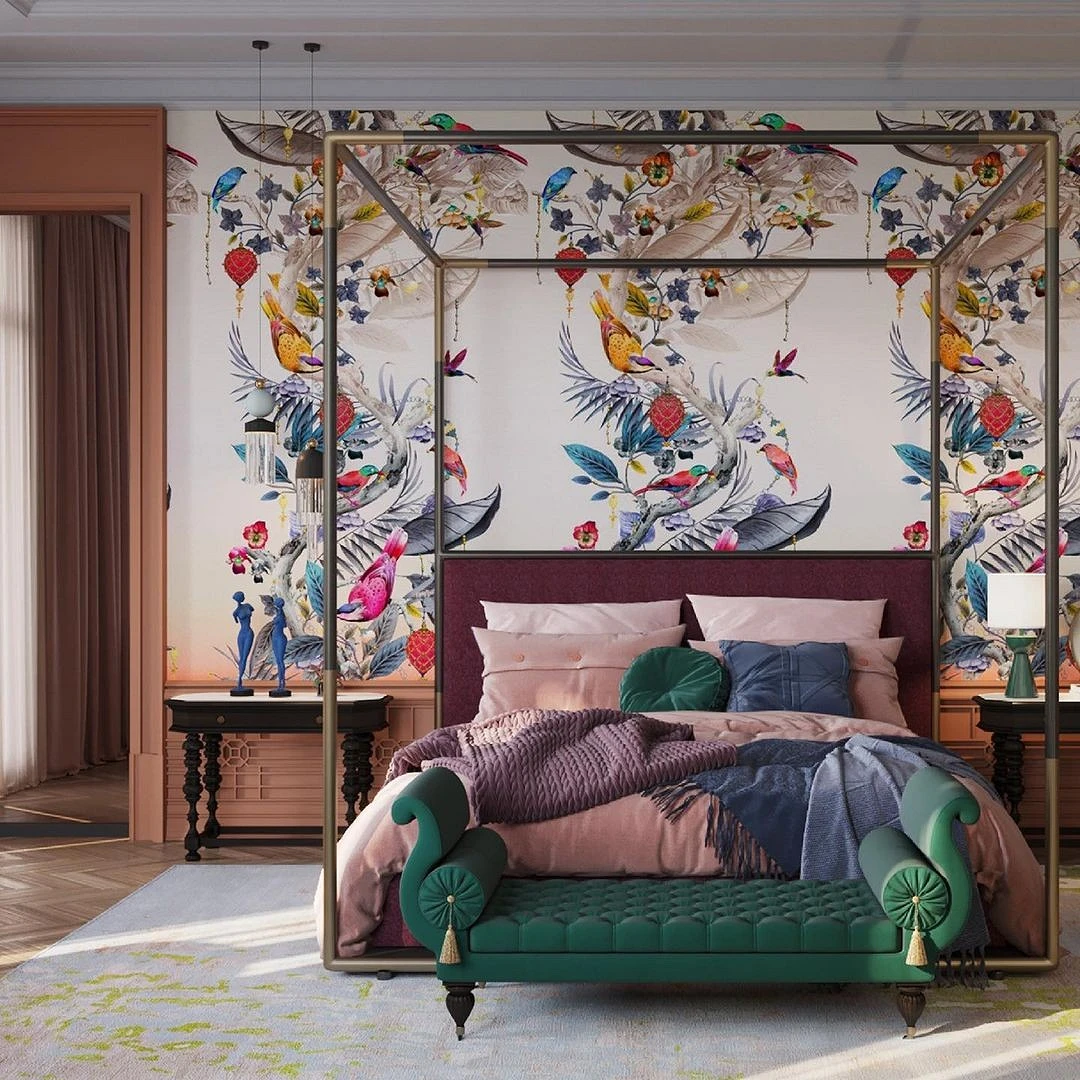
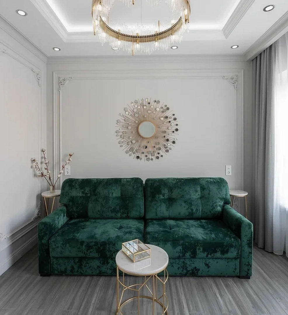
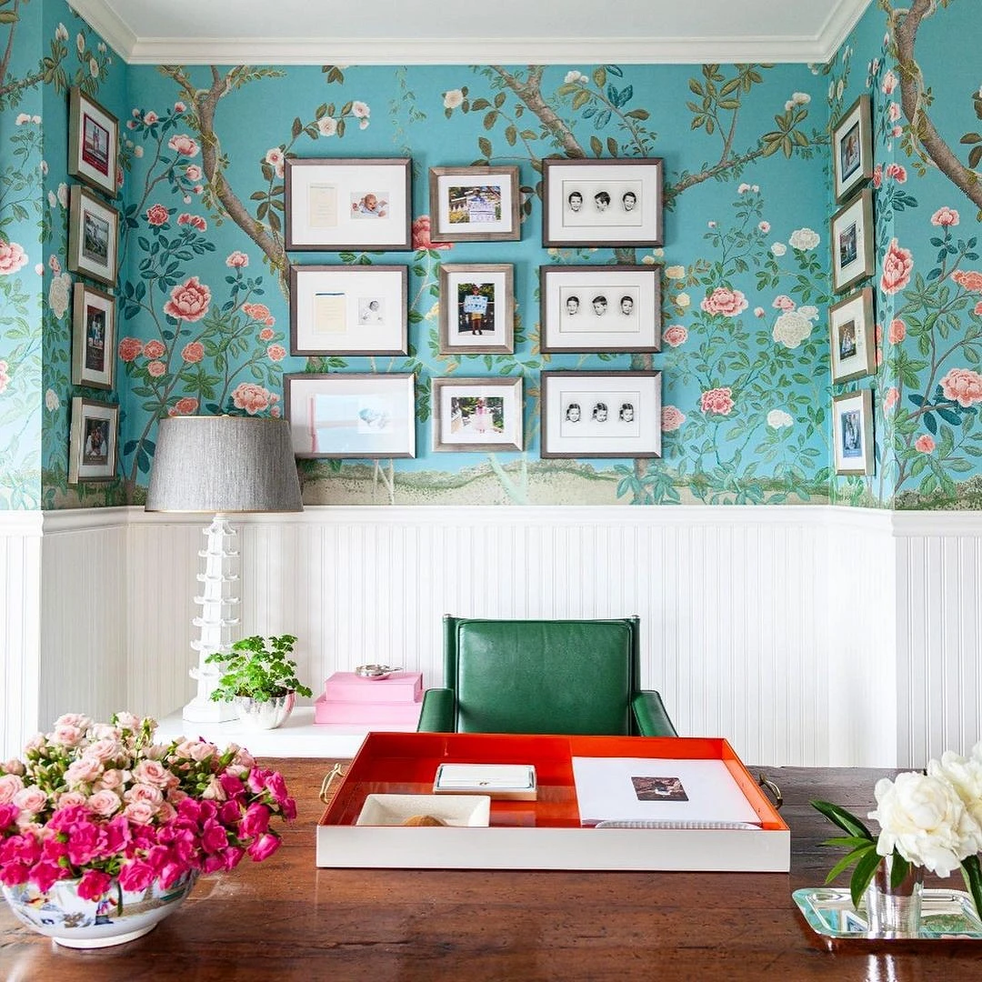
In the bedroom
Emerald color in the interior of the bedroom is often found in decoration. Since the relaxation area is a private and very secluded space, a dark palette here helps to create an intimate atmosphere and set you up for relaxation. You can paint in blue-green both all the walls and one or two – as an accent. You can complement the finish with textiles and decor to match.
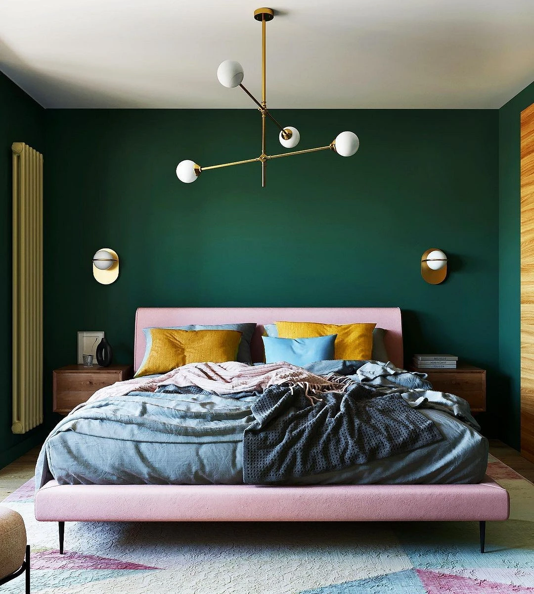
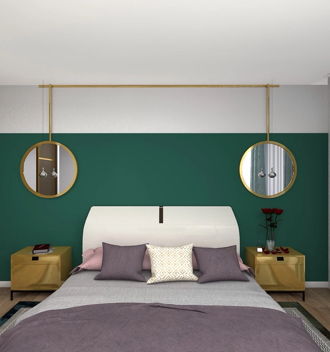
If the malachite walls are too bold, and you want to see the bedroom bright, you can use this color for individual elements: an ottoman at the makeup table, armchairs, curtains, bed linen, etc. An emerald headboard or a whole bed frame looks spectacular.


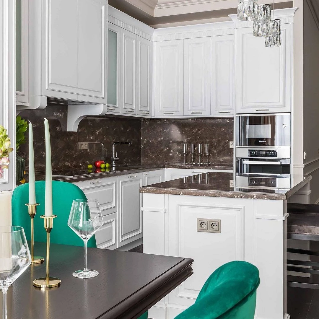
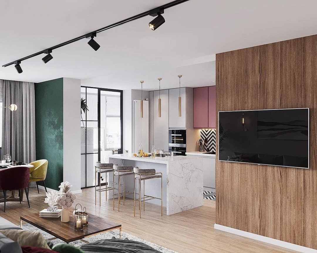
In the kitchen
In the kitchen, the palette plays a special role: some colors excite the appetite, while others, on the contrary, muffle. The predominance of one or the other depends on the specific requests for this room. The emerald color in the interior of the kitchen belongs to cold but energetic colors, therefore it can be used both as the main and as an additional element of the palette. As a basis – in the decoration of walls, kitchen set. As an accent – on an apron, in the form of chairs in a dining group, an armchair or a sofa, decor.
If a neutral range is chosen for the kitchen, then malachite is used as a bright, sometimes the only color spot. But it goes no less well with other active “edible” shades: burgundy, chocolate, berry, peach, mint, etc.


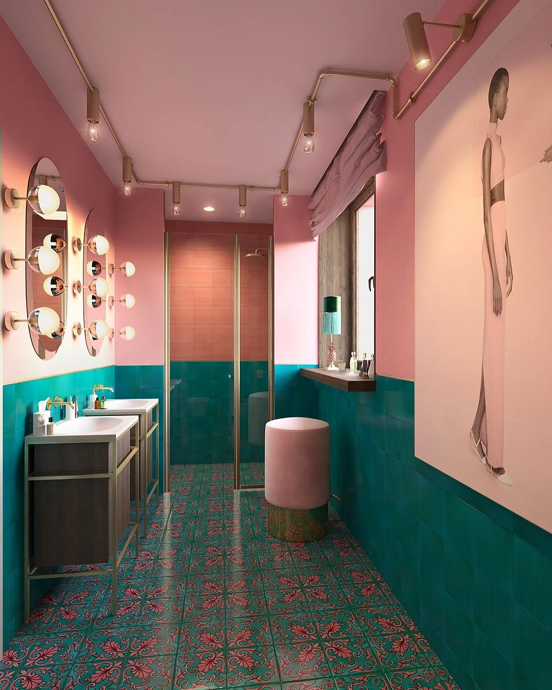
In the bathroom
In the bathroom, any variants of blue and green look organically, as they are directly associated with water. Also, it is in this room that you can experiment and play with the “precious” characteristics of the emerald.
It will look good in vertical and figure tiles, as well as stone and marble finishes. Gilded elements and elegant glass lamps will help to create the effect of a jewelry box.
This active shade can be used pointwise – for example, to highlight the area by the sink, shower, or bath with such tiles. If the bathroom is small, it is better to combine dark finishes with light elements, be sure to use mirrors, sophisticated light, and glossy surfaces.


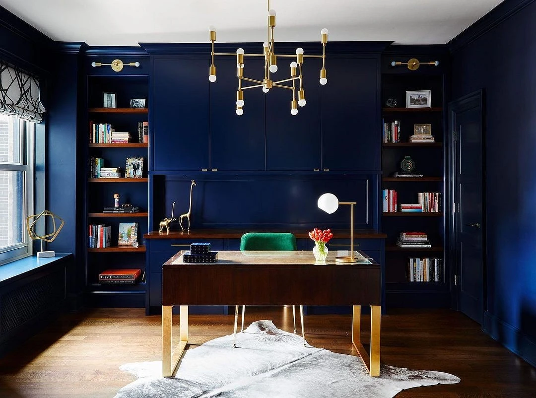
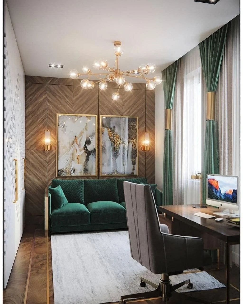
In the office
Shades of precious stone and bottle glass will perfectly fit into the design of your home office. Firstly, they add luxury to the interior and make it more solid, and secondly, they help to focus and set up for work. Noble greenery goes well with natural wood, stone texture, and natural fabrics. Can be a bright accent on a neutral light background.
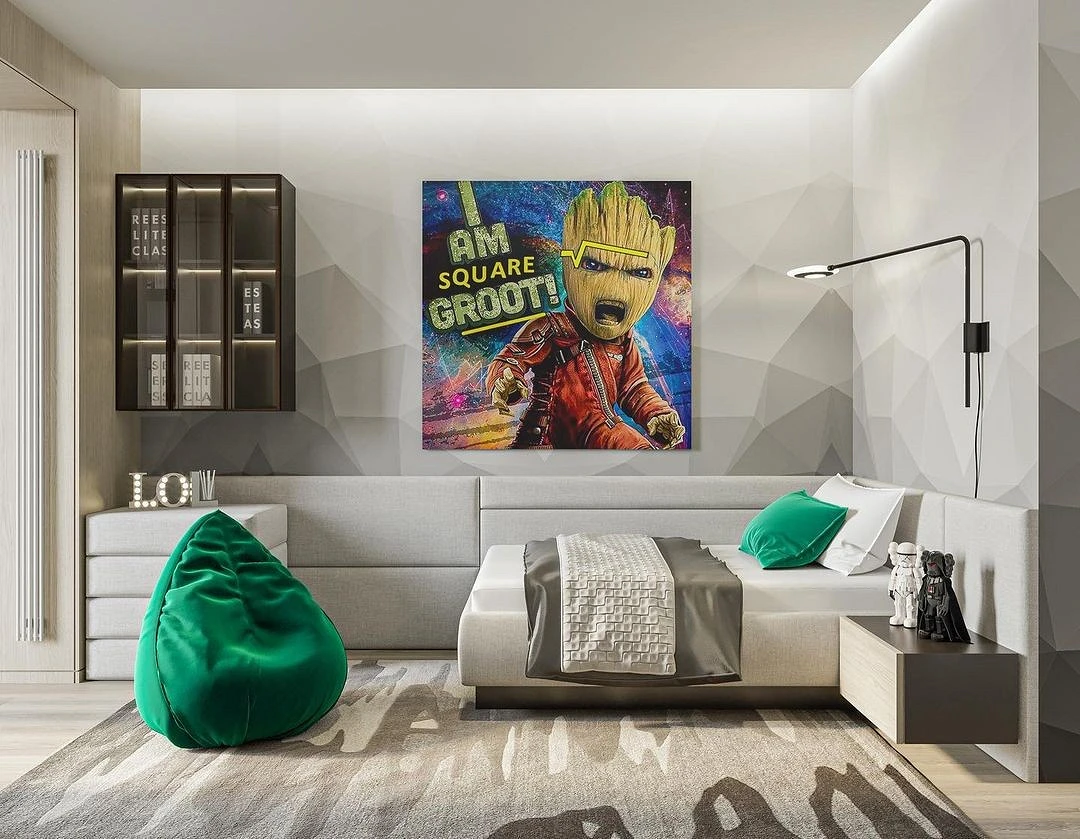
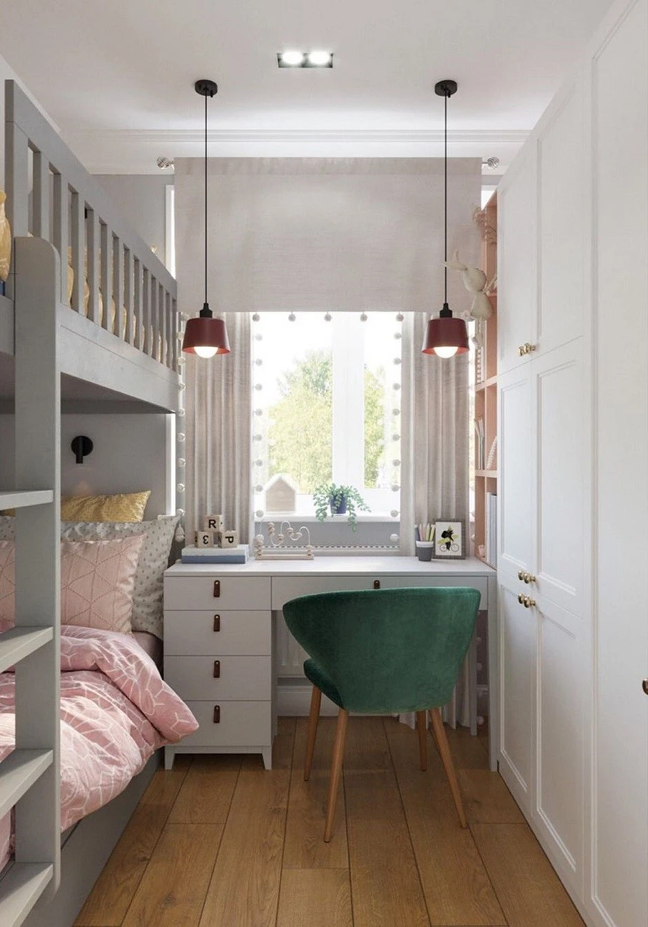
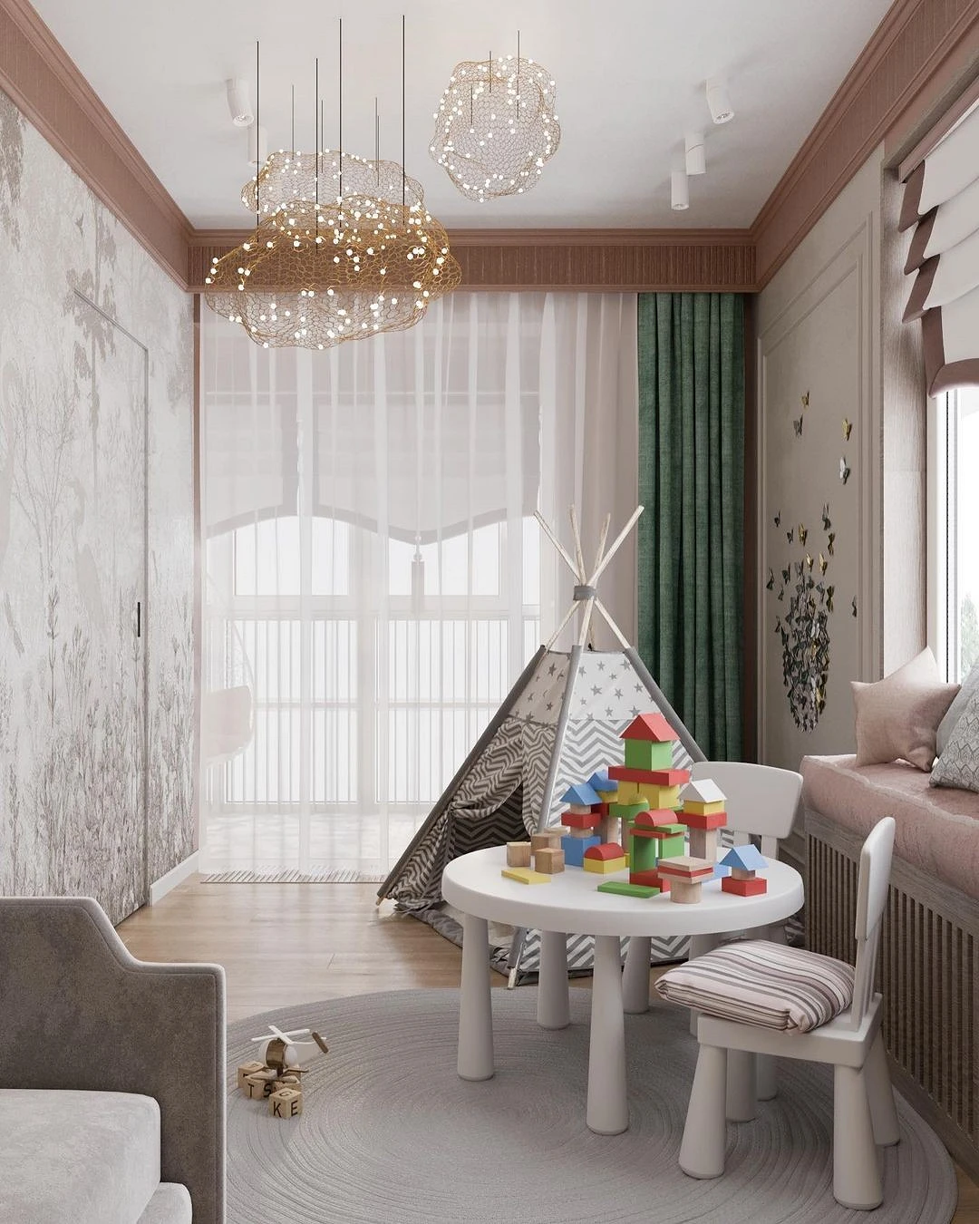
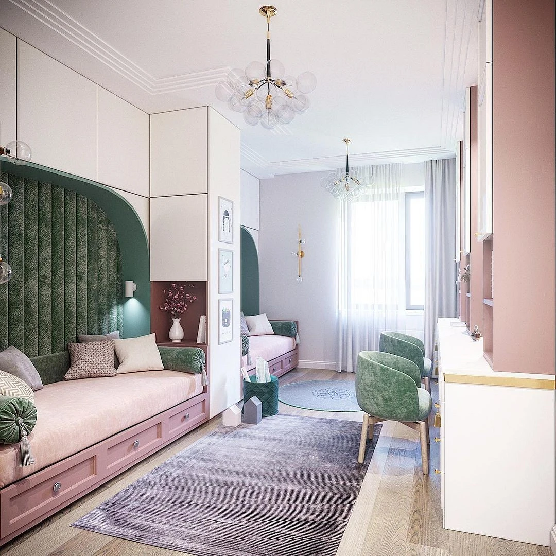
In the nursery
Unlike energetic light green, green-blue, on the contrary, calms and restrains excessive children’s activity. It also helps to concentrate on educational games or lessons, so it is great for decorating the work area.
So that the room does not turn out too gloomy, it is better to use lighter and calmer variations of malachite and always accent. Can be combined with other bright elements: pink, blue, and yellow. The general palette of the nursery should be dominated by neutral base colors that will balance the active color accents.
In the hall
The entrance hall in the apartment, as a rule, is made out on the basis of practical considerations. A small area, with high pollution – the best option for the entrance area is a light palette and a simple finish.
The natural color of the expensive stone will help to dilute the neutral interior, making it elegant. The easiest way is to use deep malachite as a bright accent, for example, an ottoman for shoes.


The most important thing about our X that it is for
those who are in a hurry


