


We show the 7 best combinations of beige with other colors and also tell you how to use it correctly in the interior and what shades to pay attention to.
Noble and elegant beige is an absolute classic when it comes to the color design of your home. From season to season, it experiences ups and downs: either it rises to the peak of popularity, or it receives the title of the most boring and insipid shade. In this article, we will tell you how to use the beige color in the interior and what combinations of colors with it will allow you to create an up-to-date design in any style, with photos of beautiful examples.
Peculiarities
Beige is considered one of the most comfortable and inviting colors for an apartment or house. It is discreet, warm, and close to natural colors, therefore it is perceived by the psyche as naturally as possible. In interior design, it has long been at the top, and there are several reasons for this.
- Being a light brown undertone, it has many variations with different impurities: from white to green and pink. Depending on the nuance, texture of the material, and lighting, it can be perceived in completely different ways.
- Thanks to this variety, it goes well with all colors: warm or cold, dark or light. It does not draw attention to itself, therefore it favorably emphasizes the depth of other shades.
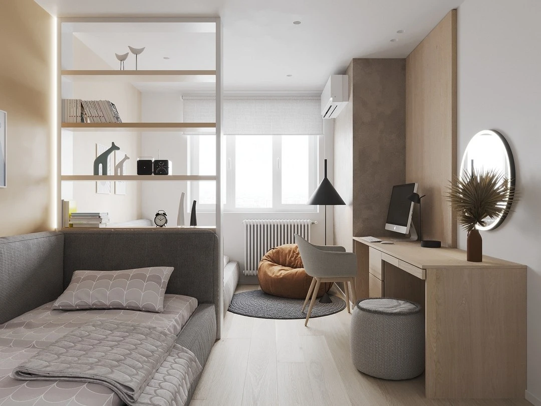
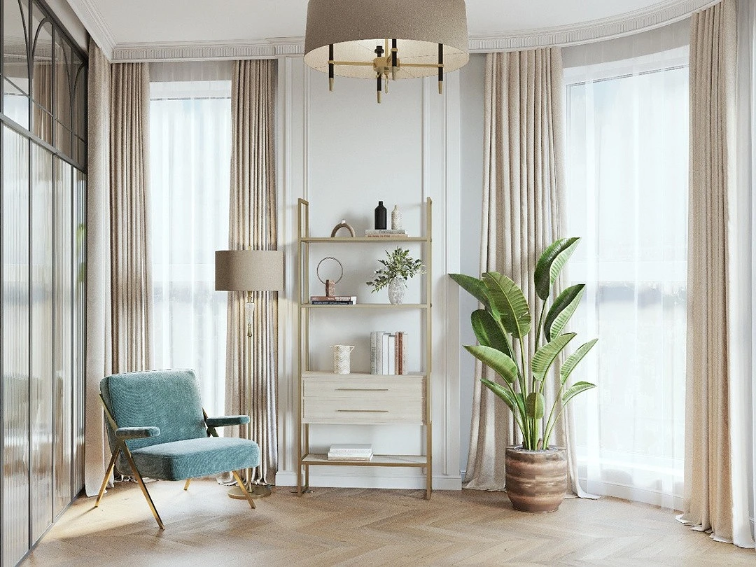
- It is universal – suitable for most styles, with the exception of monochrome-cold hi-tech (although it can also be used there). This is a must-have for classic interiors, modern and art deco, the basis for eco and country, often used in minimalism and contemporary. Perfect for Scandinavian style.
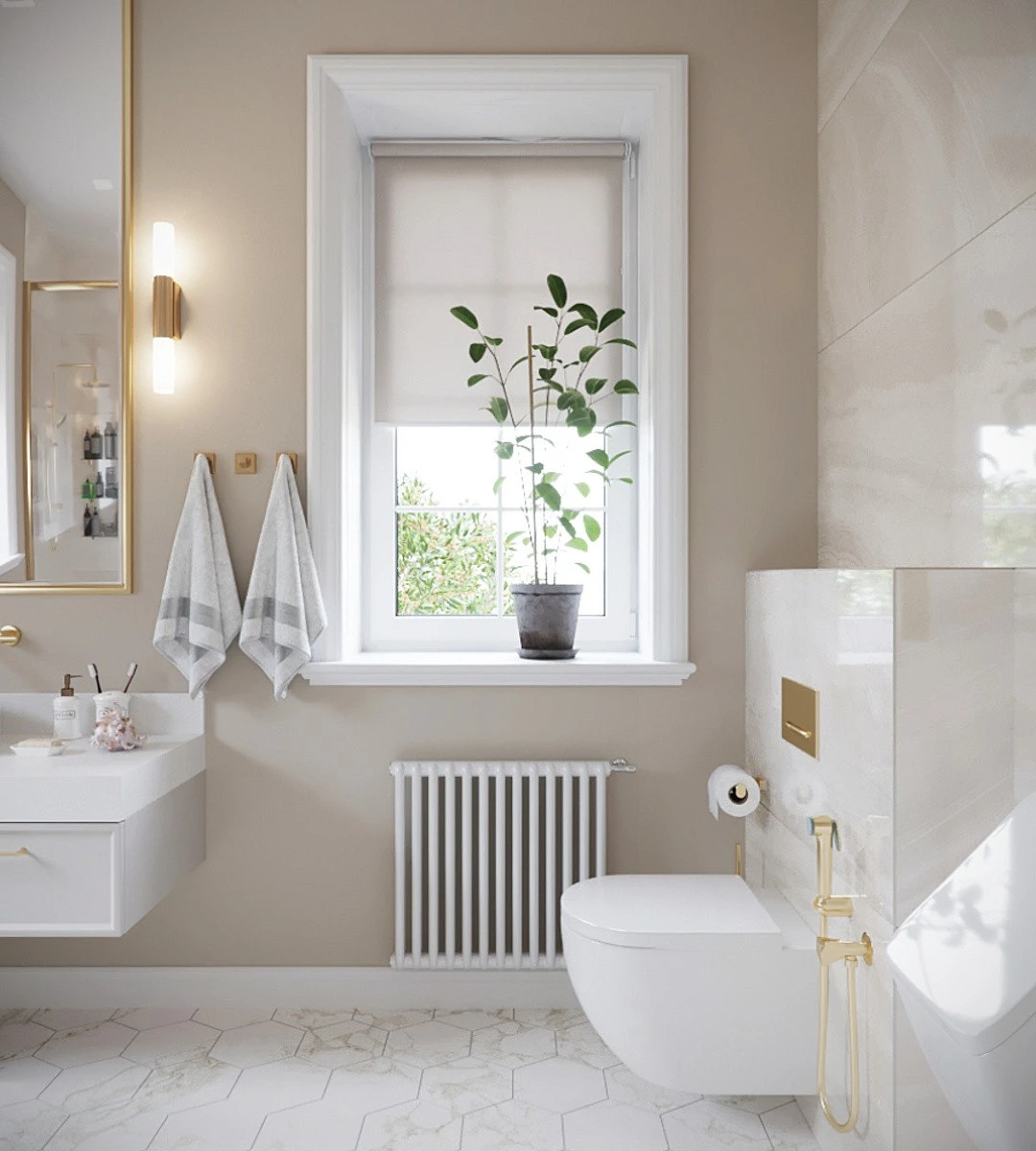
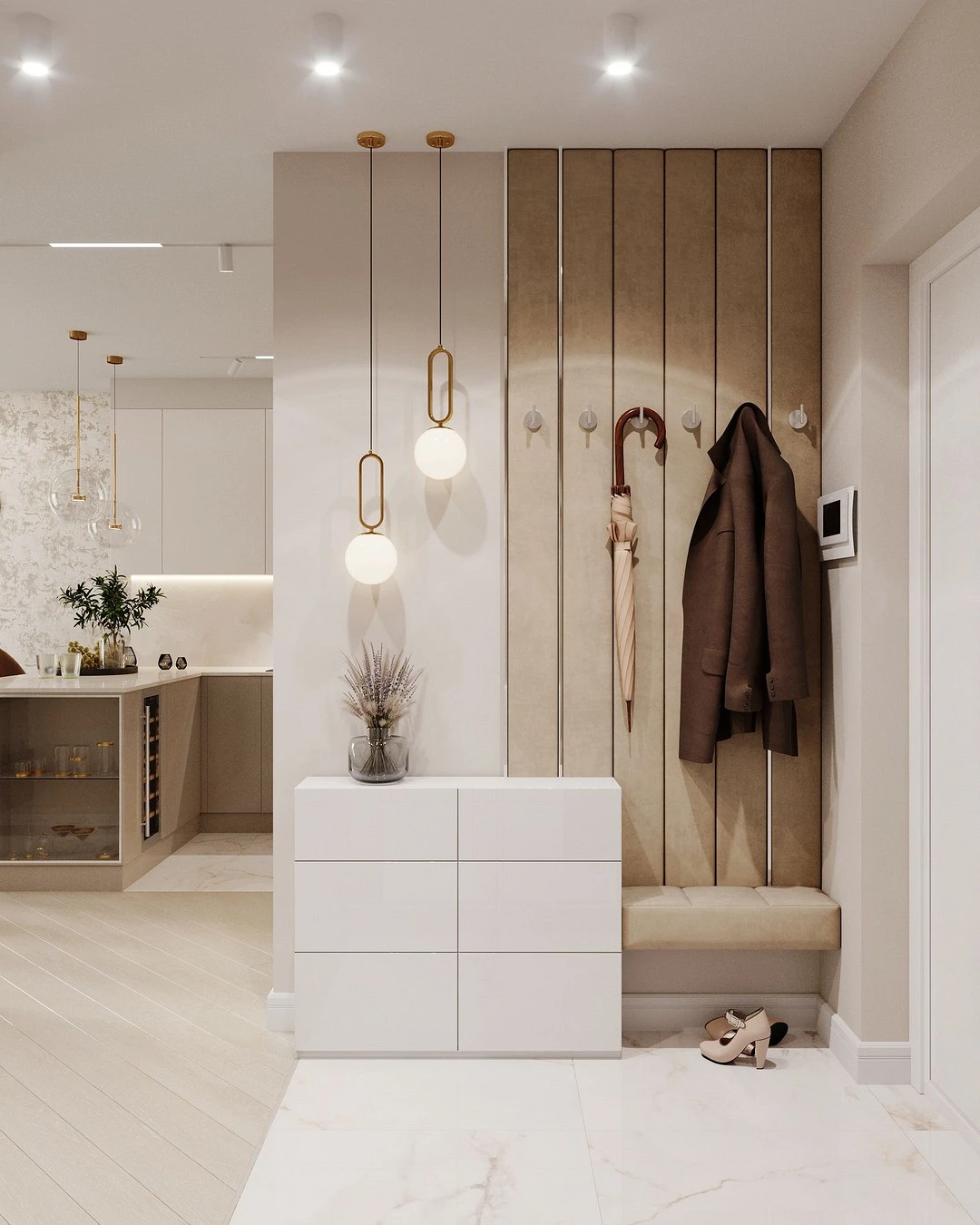
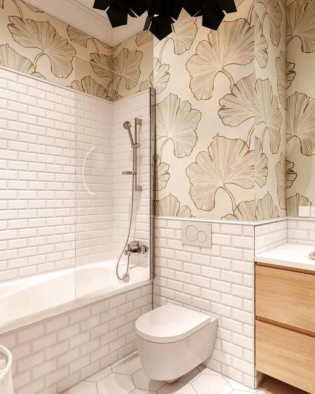
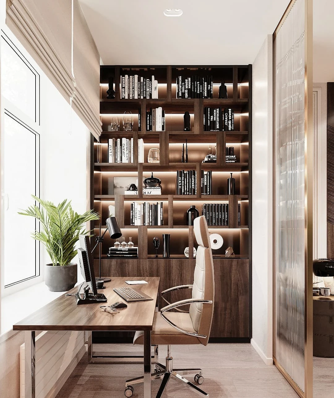
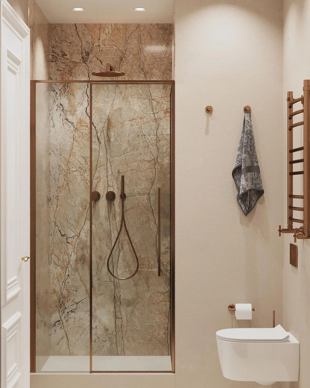
- Suitable for all rooms, whether it is a bedroom, a nursery, an office, an entrance hall, or a bathroom.
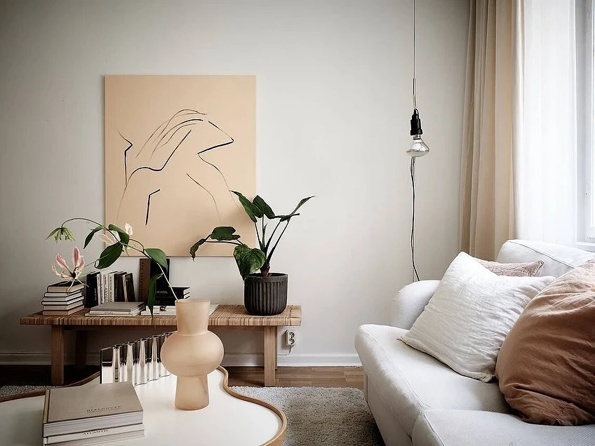
- This is a light and warm tone, which means it solves two housing problems at once: small areas and lack of sunlight. In the company of white and other nude shades, it adds air to the space, and also gives the room the effect of warm natural light, even on a cloudy day.
- Neutrality in this case is not a disadvantage, but an advantage. It can be used as a durable universal base, and the mood of the interior can be changed according to the mood with the help of decor, bright accessories, etc.
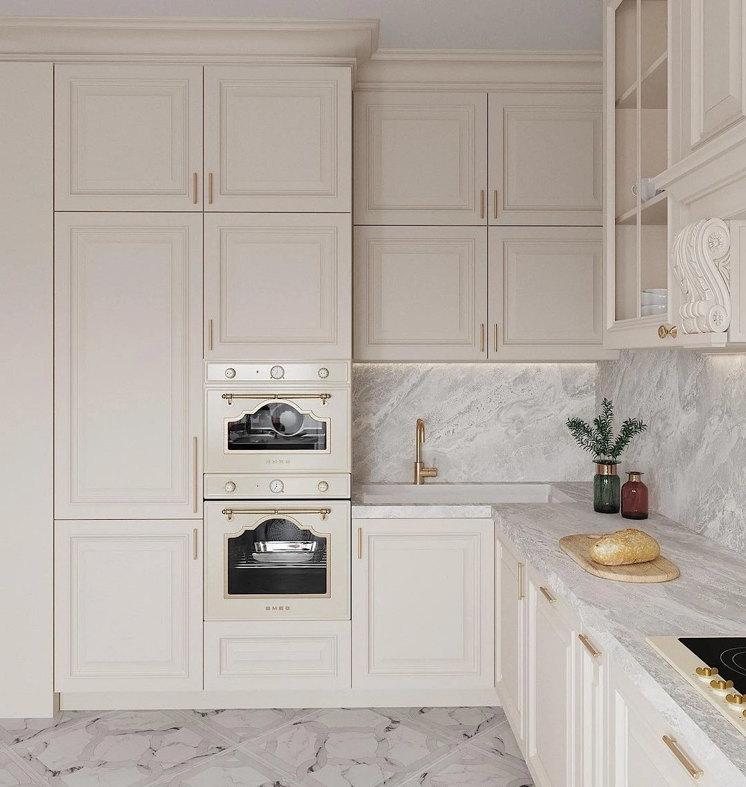
Despite the fact that beige formally belongs to the warm spectrum, it has enough cold shades. White sand, marshmallow, pumice, oatmeal, gray feather, foggy morning, and gray crystal will look good in the interior.
Among warm variations the most popular are: sand, jasmine, golden, cream, biscuit, suede, almond, creme brulee, mother-of-pearl, smoky, navajo.
What colors in the interior are combined with beige
Let’s consider different options.
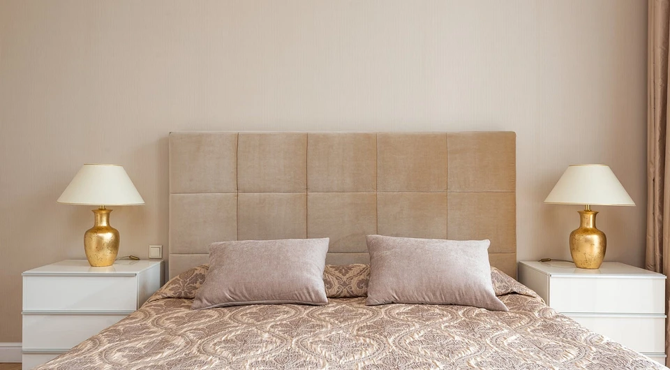
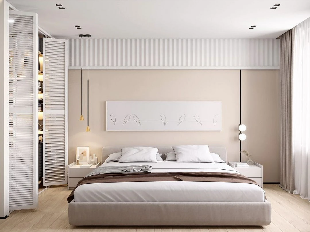
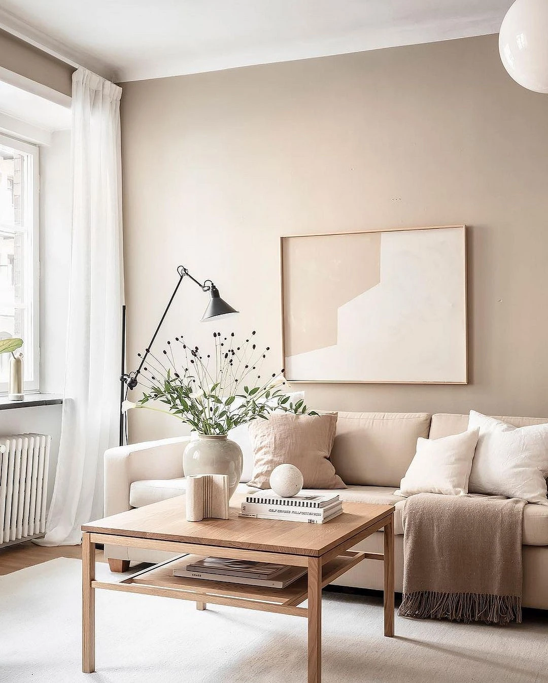
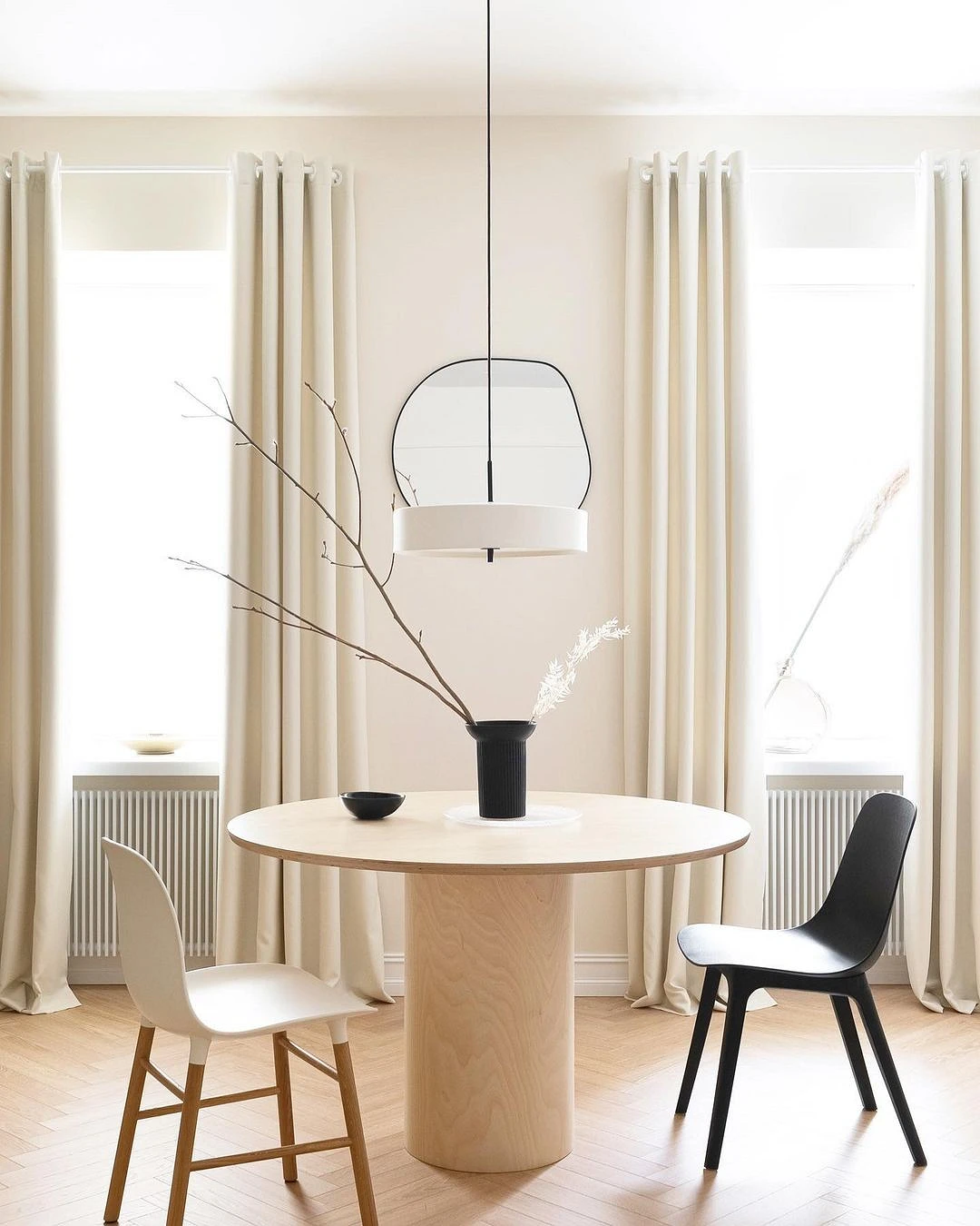
White
White, in principle, looks good with any elements of the palette due to its versatility. It refreshes the color scheme, visually enlarges the space – this is important if the room is small, and adds an airiness to it.
A beige and white pair can be found in any style: from strict classics to scandi or minimalism. Depending on the selected variations, they can look quite contrasting and complement each other, forming an almost gradient flow from one subtone to another.
So that such a combination does not look too flat and artificial, it must be supplemented with pronounced textures and at least 1-2 dark accents that will “gather” the space and draw clear lines in it.
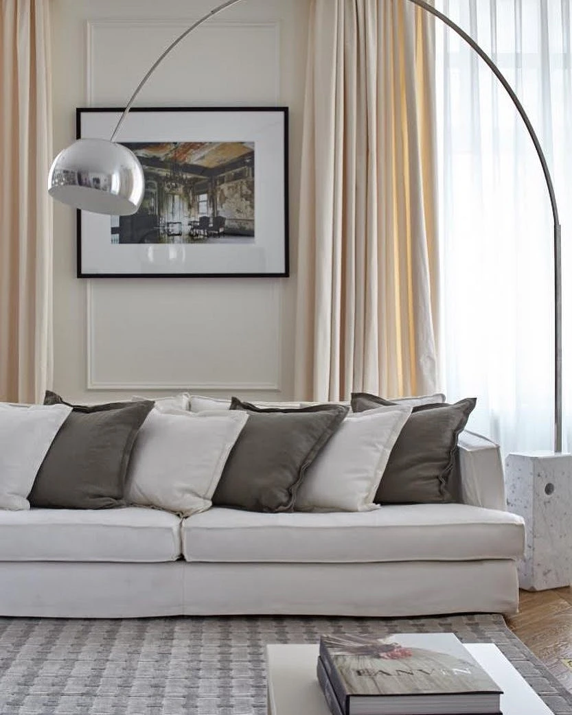
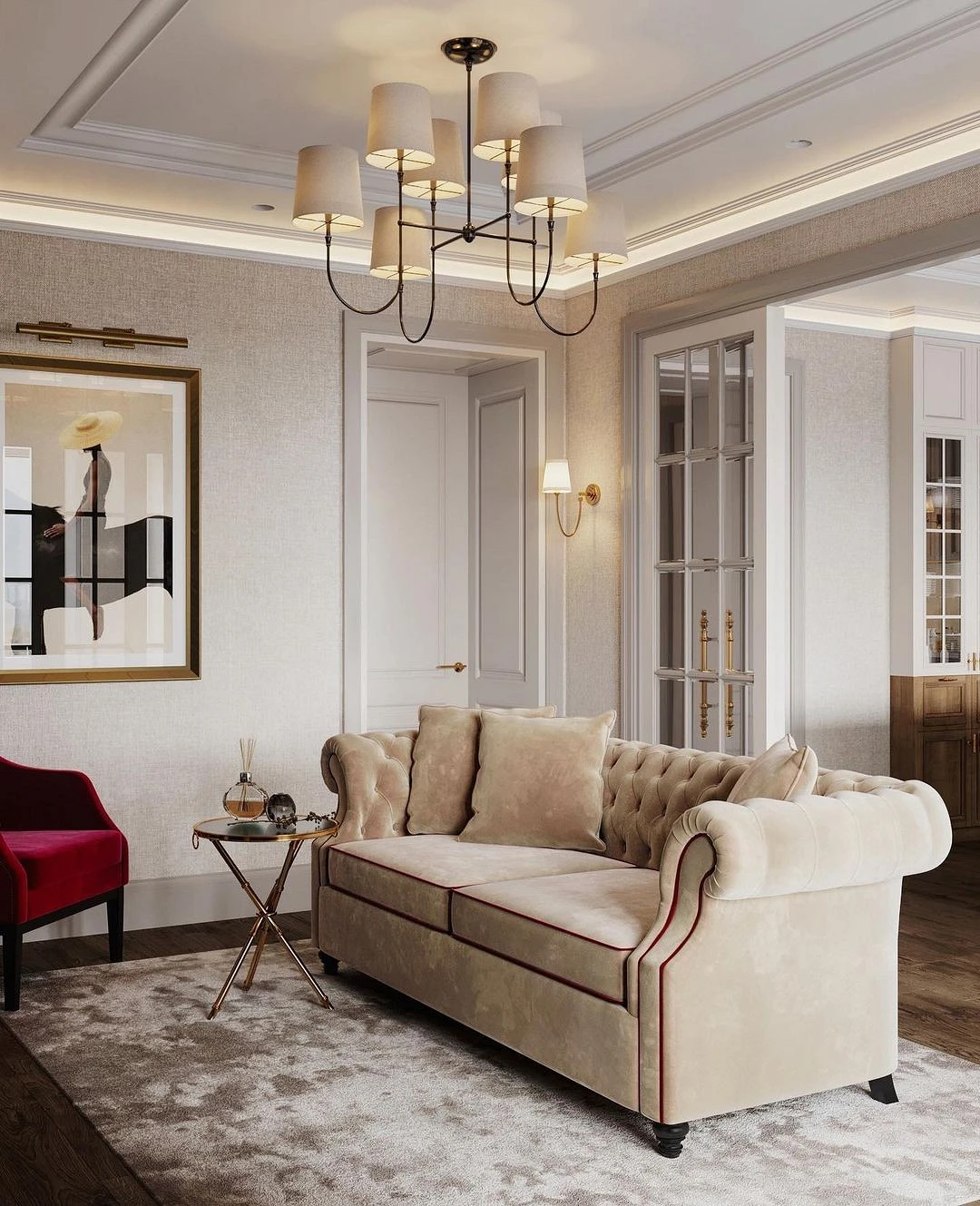
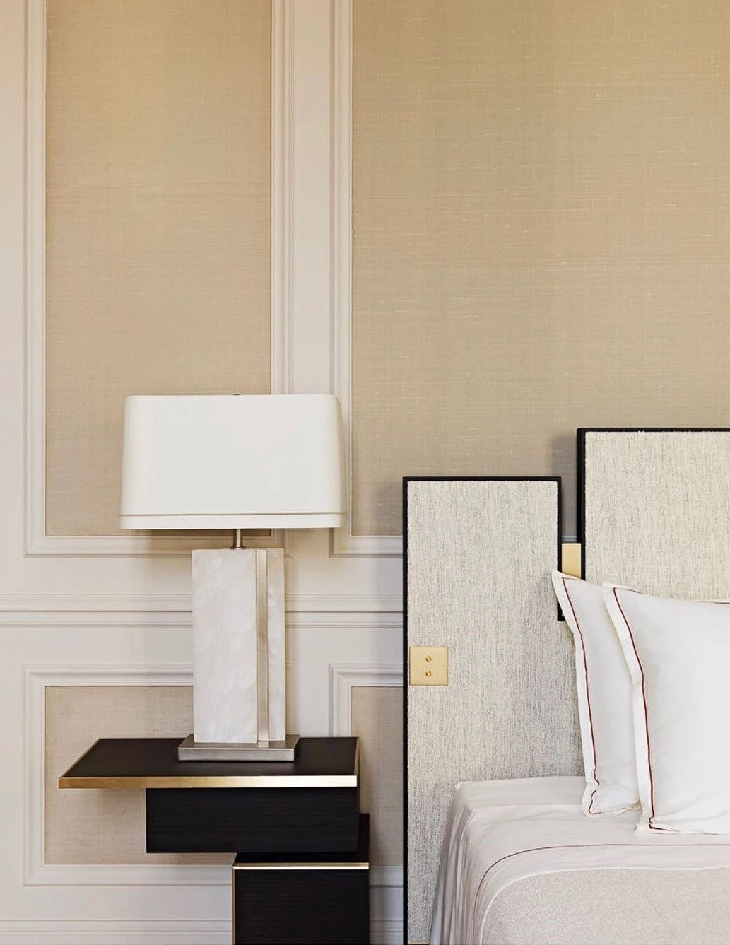
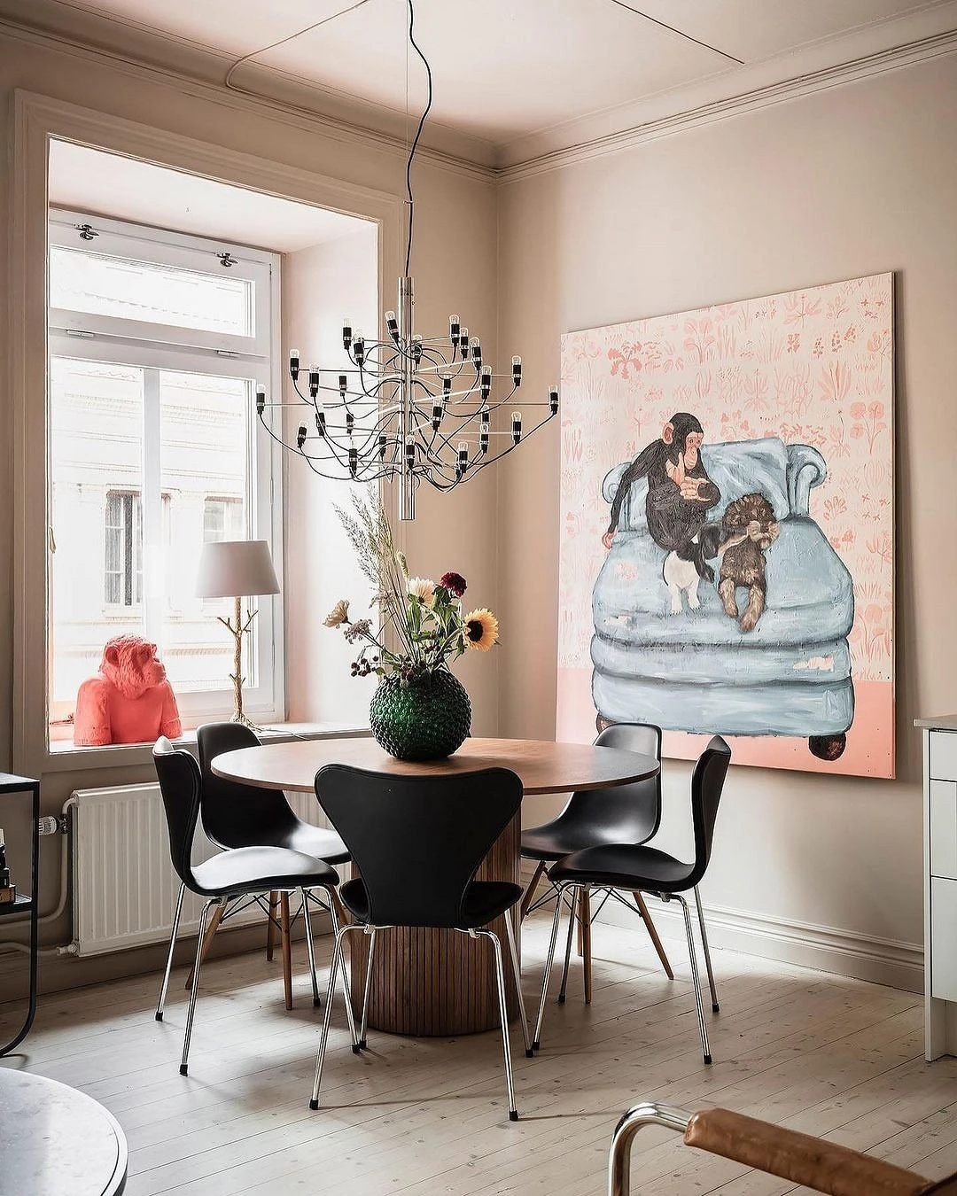
Black
The second achromat also gives a win-win combination in which it is difficult to go wrong with shades. The result is a discreet, stylish, and elegant combination. Such a palette is often found in classics and neoclassical, in art deco, modern, minimalism, and contemporary.
Thinking through the combination, remember that black has the opposite effect of white: the space is visually reduced, so you need to be careful with dark colors in a small room where there is little sunlight.
Beige is better to make as the base and black – accent. It can be used in furniture, decor, and partly in decoration. For example, dark interior doors and skirting boards look very impressive, especially made of wood. It is practical to make a dark floor in the hallway, in the kitchen, or in the bathroom.
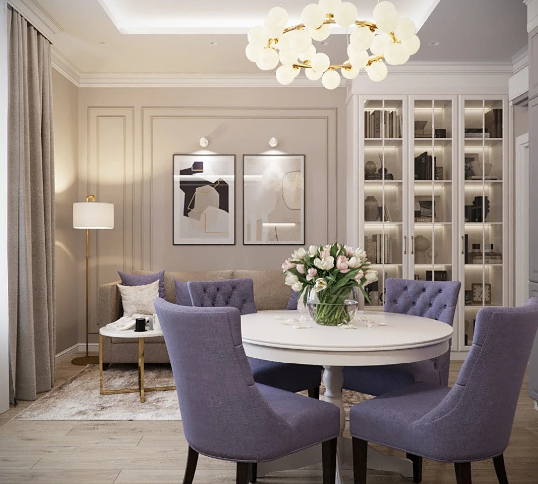
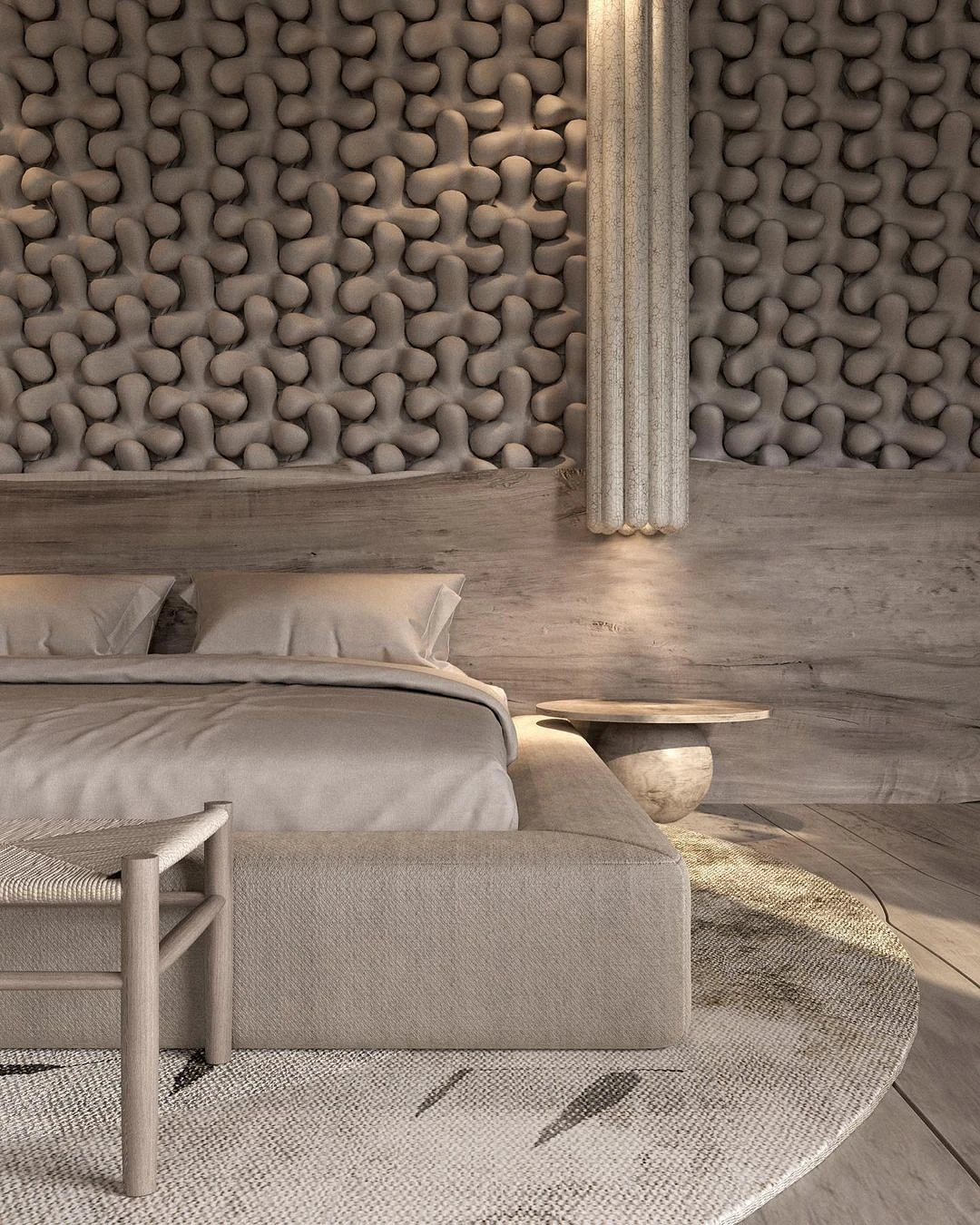
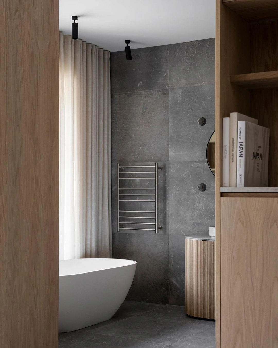
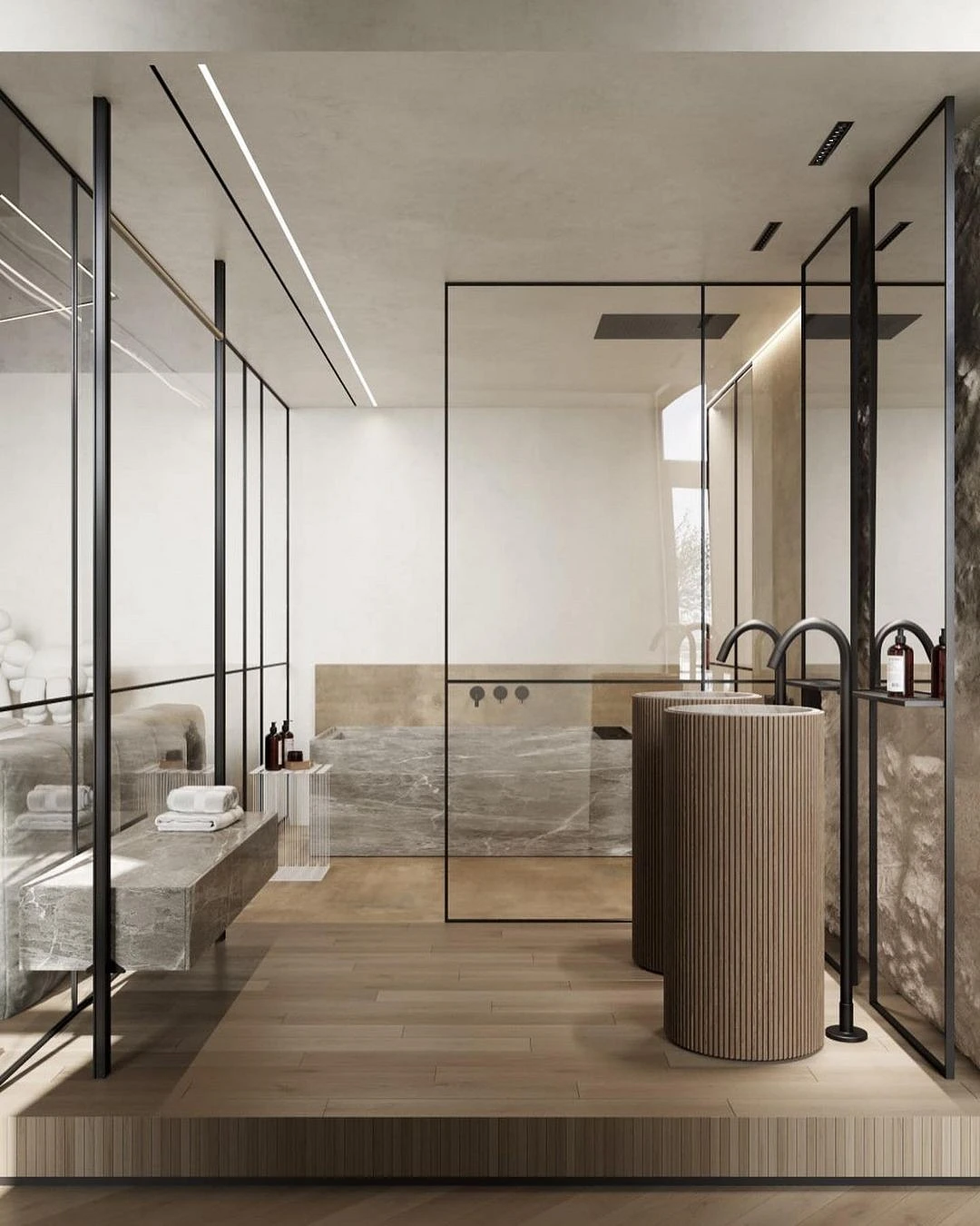
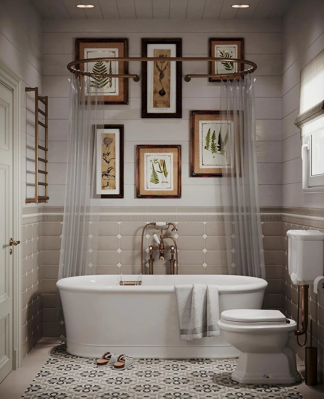
Grey
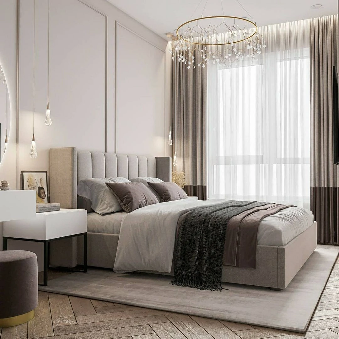
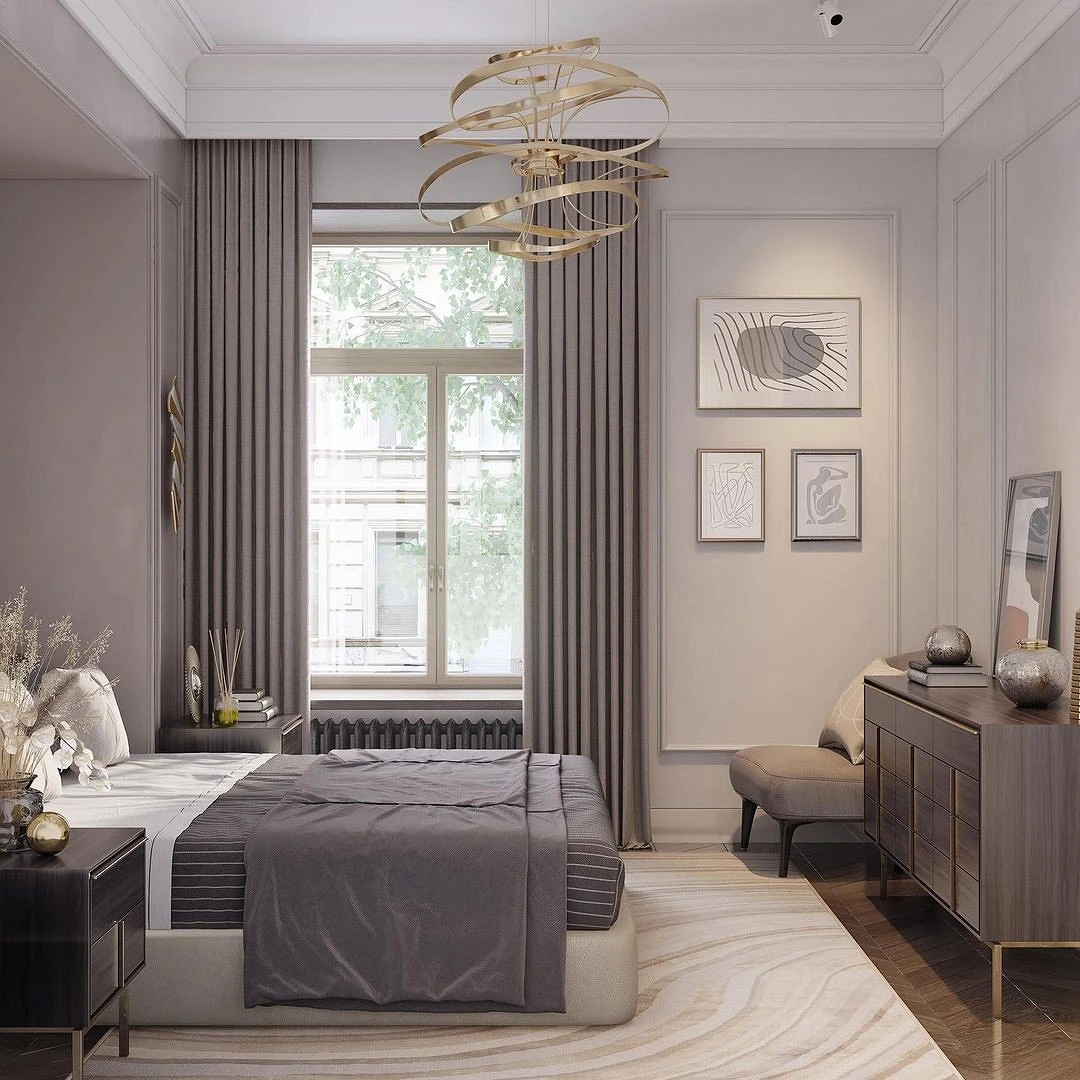
Finally, the third element of the achromatic spectrum. Gray creates the perfect combination with beige in the interior.
Such a combo can be safely used in any style, especially if you design a minimalistic and monochrome space in natural colors, with a lot of active textures and natural materials. Can be used in any room, be it a bedroom or a bathroom.
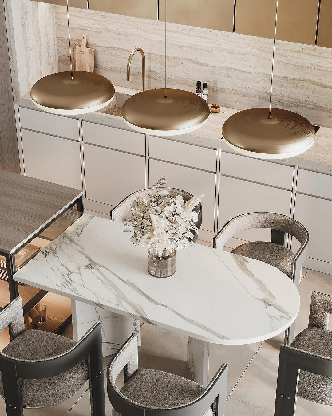
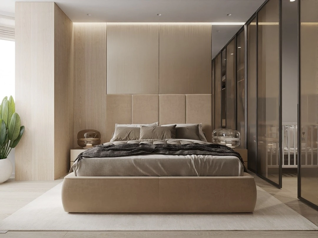
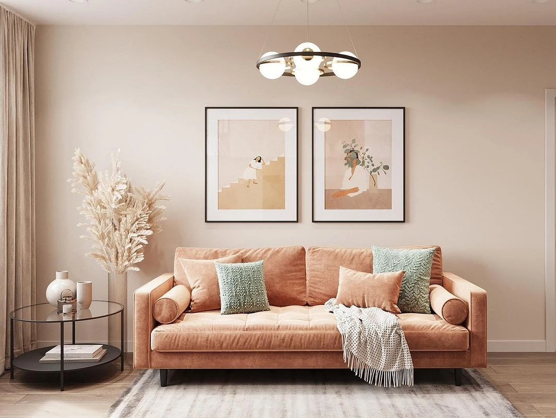
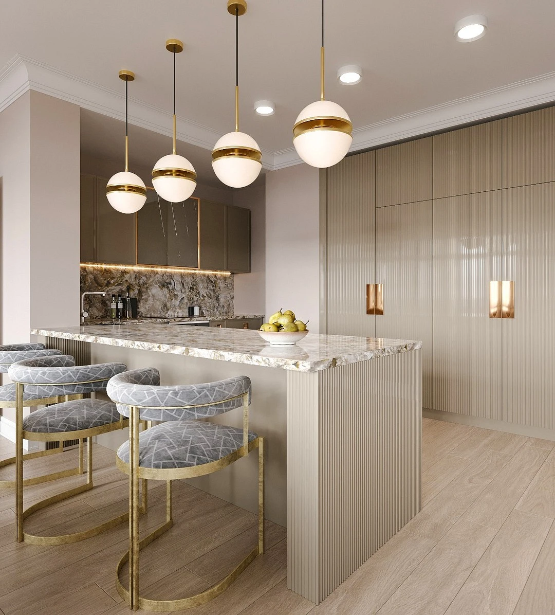
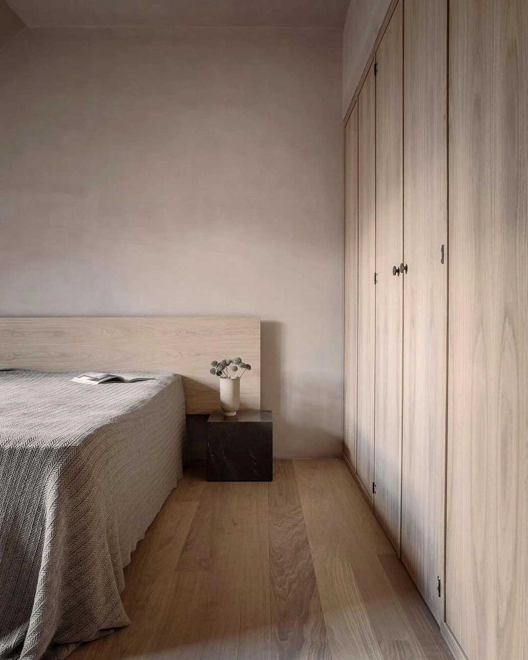
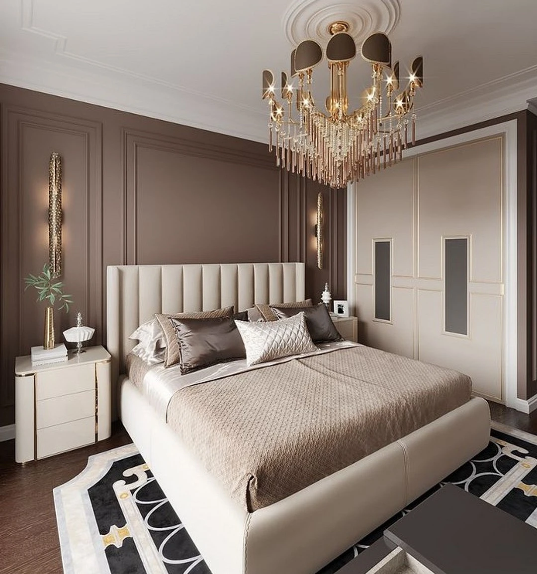
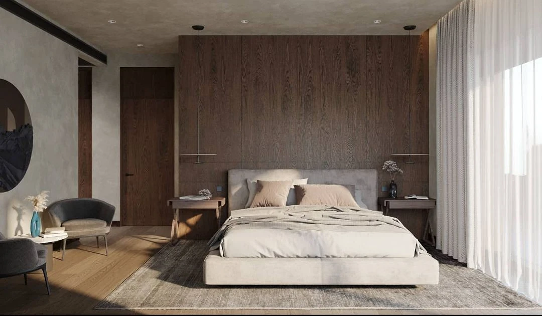
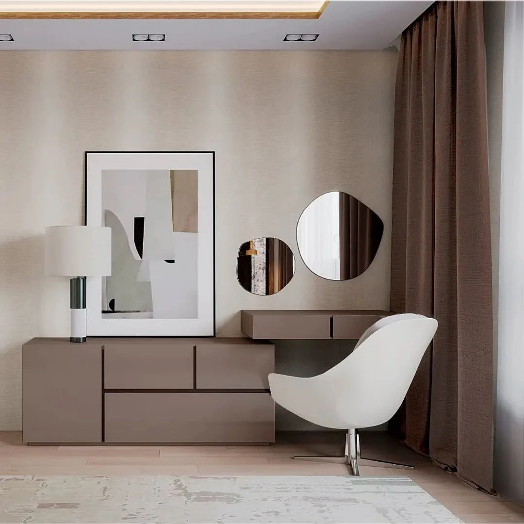
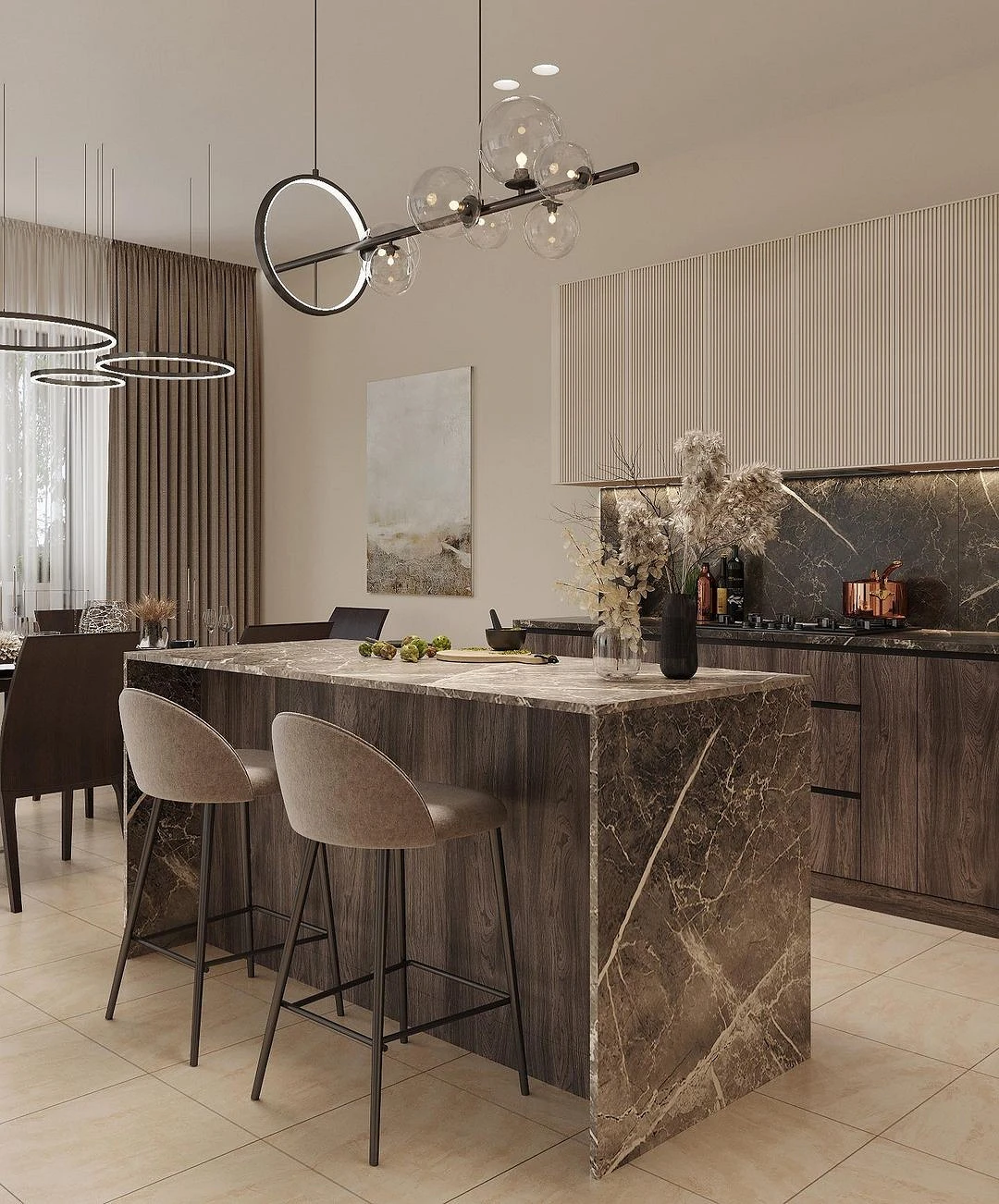
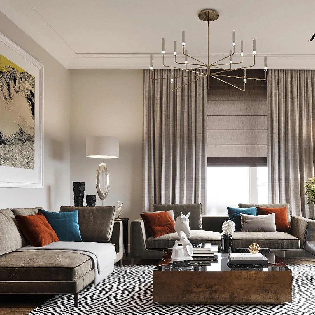
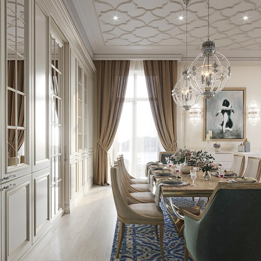
Brown
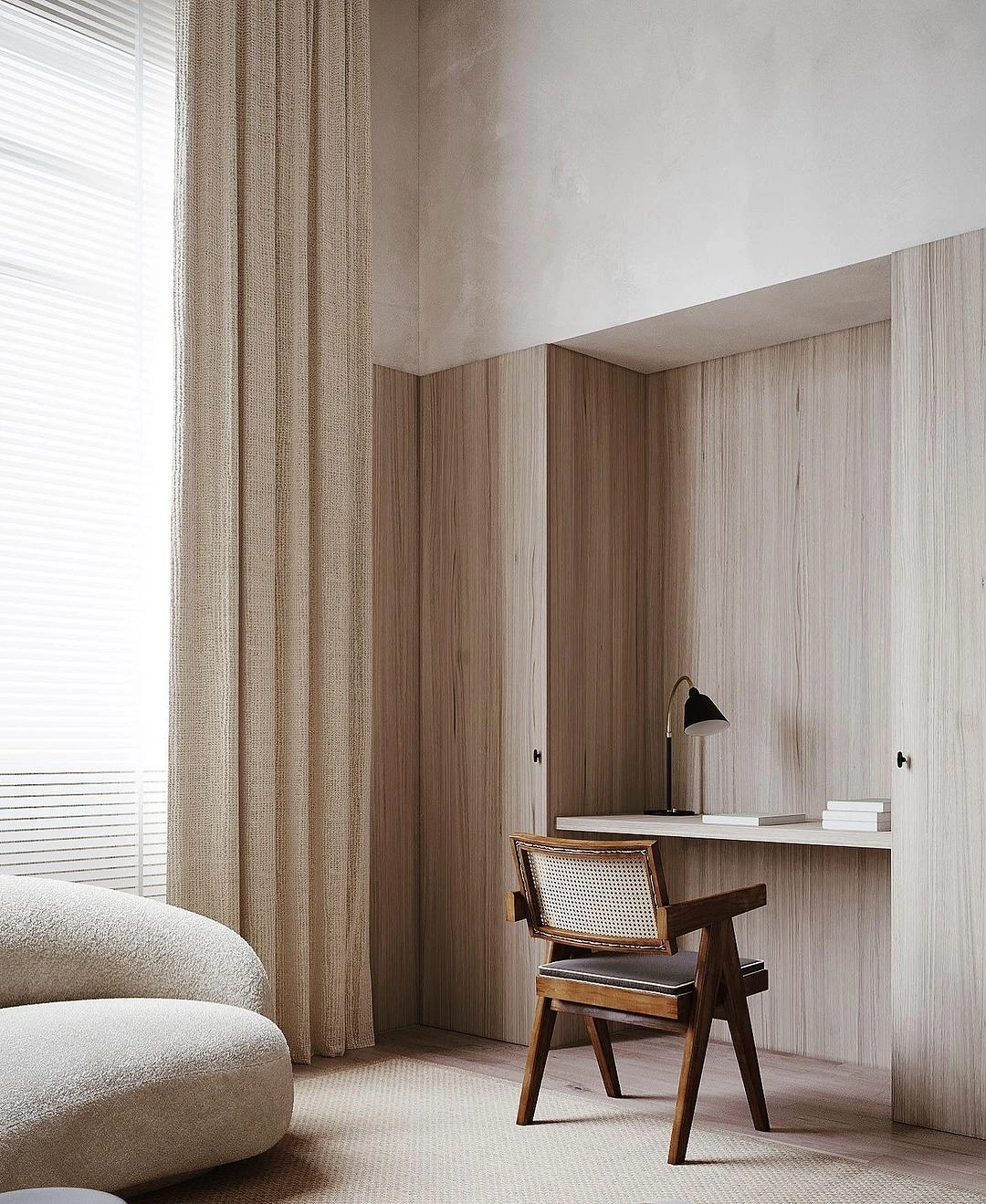
As relatives, they blend naturally, especially if they are united by texture – for example, wood. Deep chocolate looks good with cold shades of beige, they can be diluted with splashes of gray and even blue. Saturated dark brown can be used as an analog of black: to designate borders with it, draw clear lines, and add volume to space.
This pair is suitable for rooms of any size and is best with windows facing north or northwest to compensate for the lack of warm sunlight.
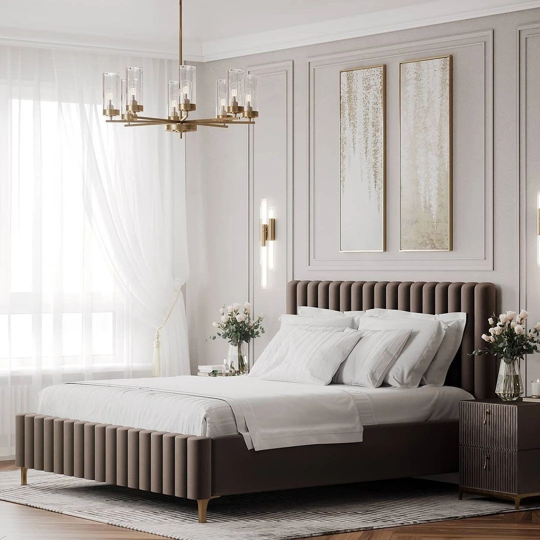
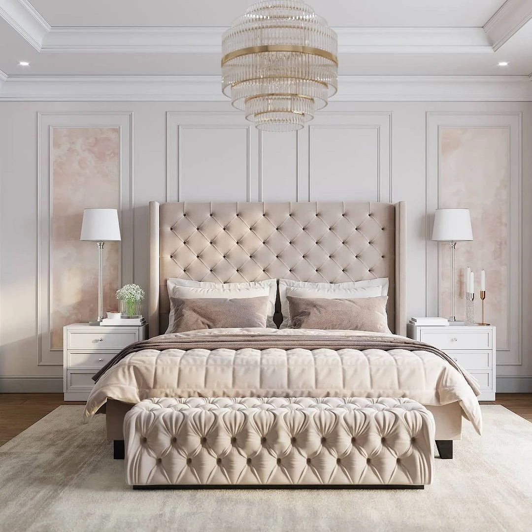
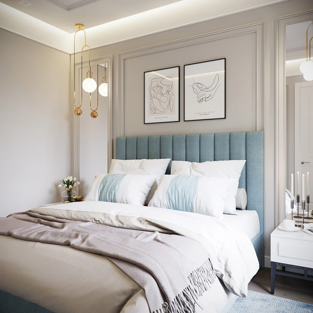
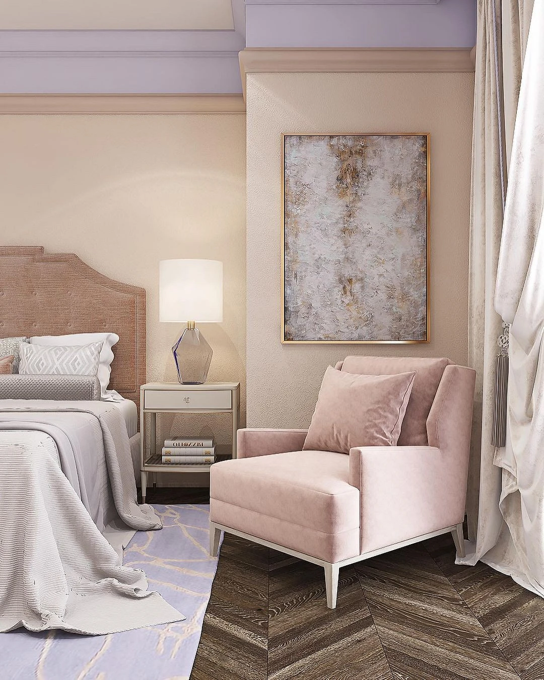
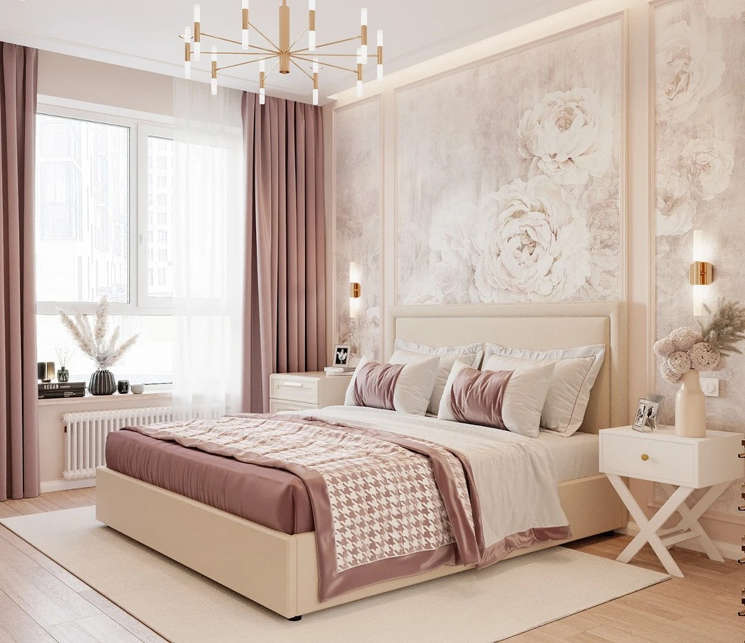
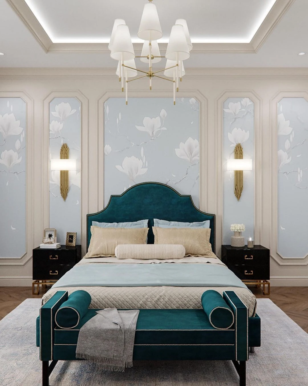
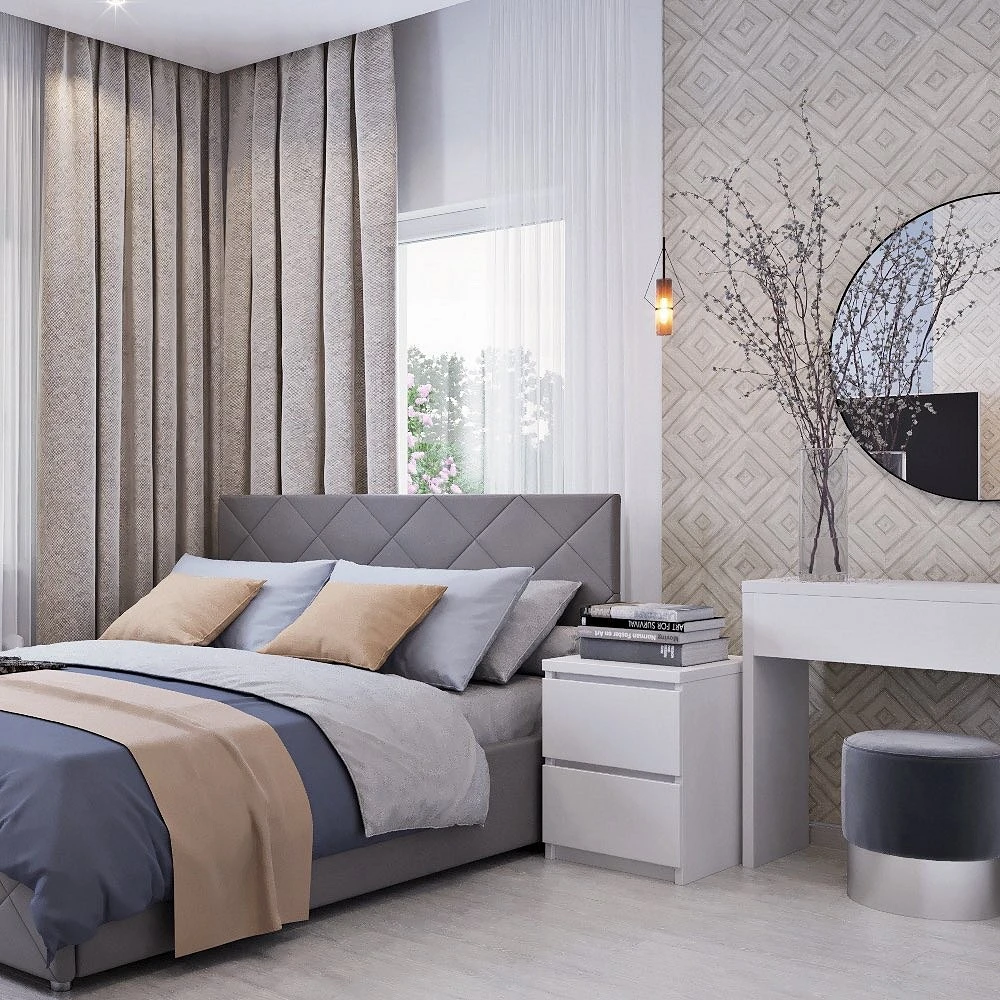
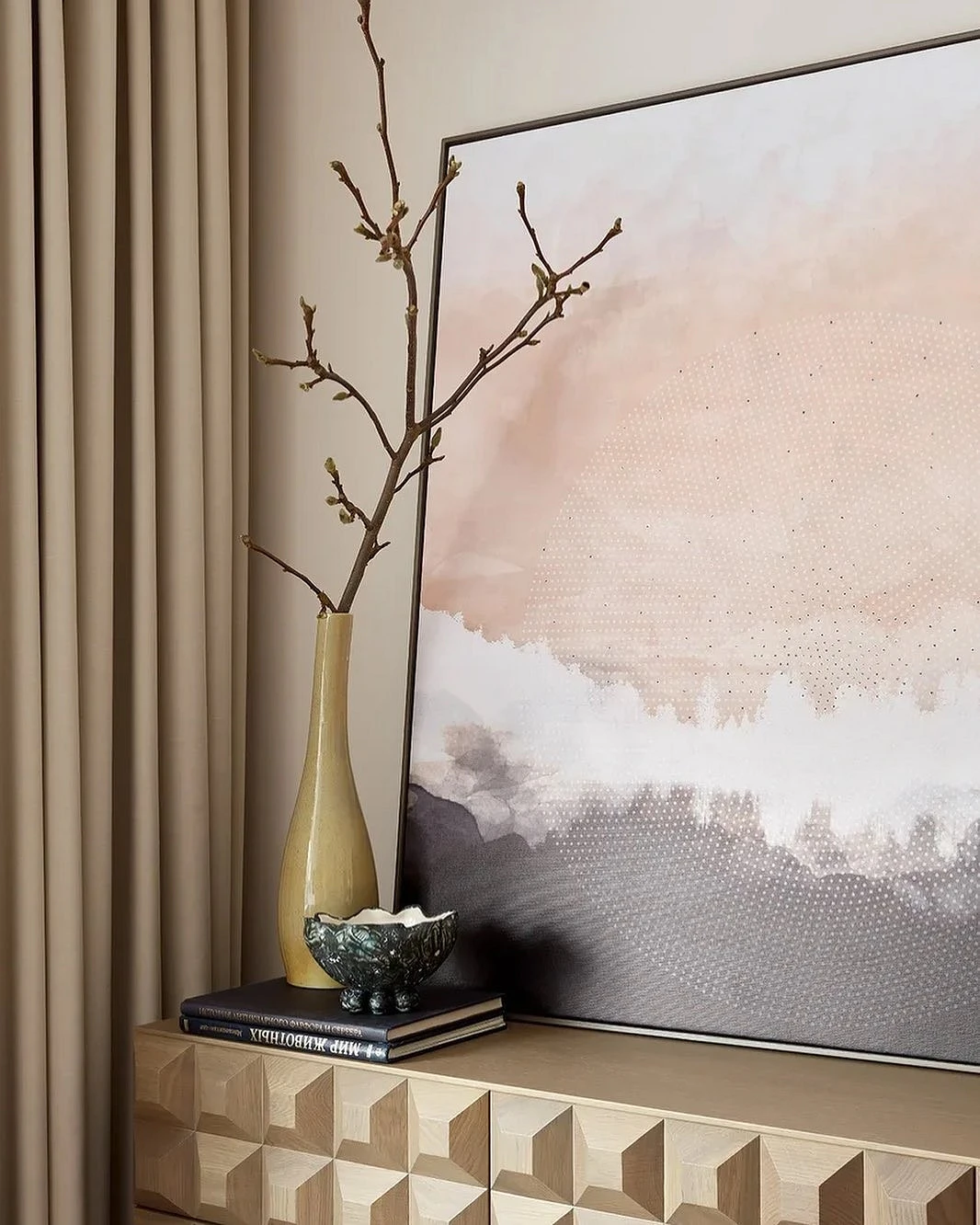
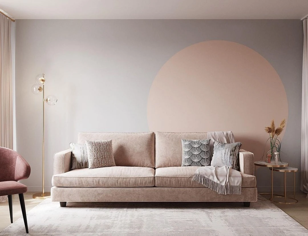
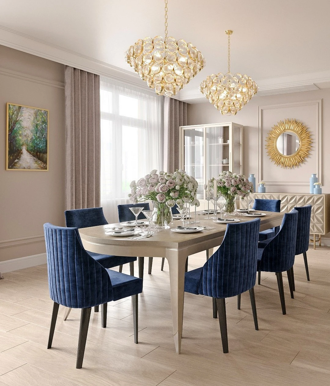
Pastel shades
Pastel colors, especially cool, dusty ones (blue, lavender, pale pink) cool and balance the warm creamy base, thereby immediately refreshing the room.
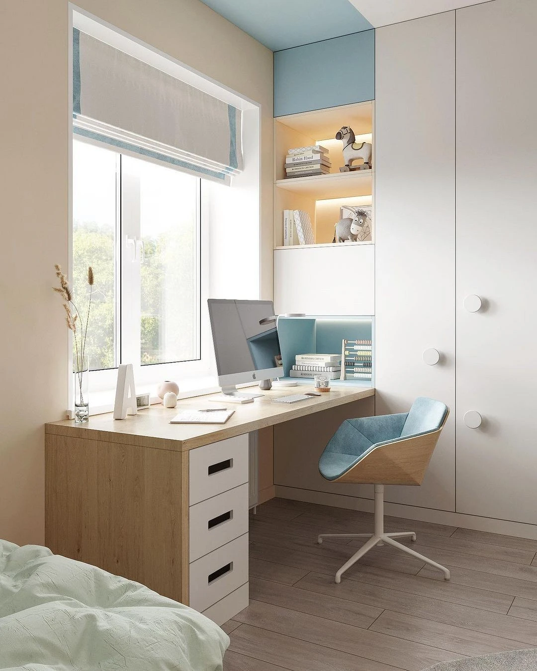
With blue, a natural combination is obtained: sand and sky, pebbles, and water. Pink will add an atmosphere of warmth and romance, so it is most often found in the bedroom or nursery. Violet – will be an interesting accent, highlighted and balanced by a light base.
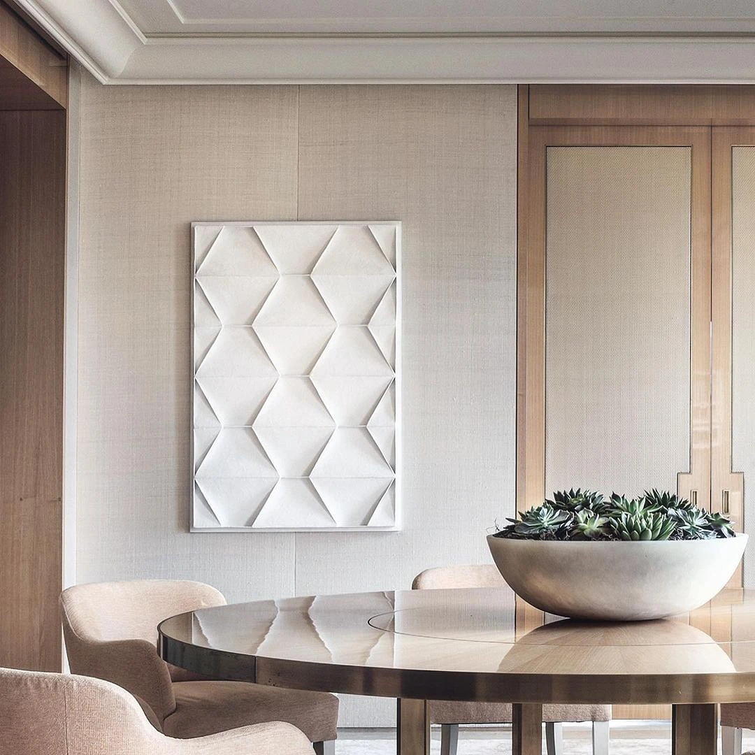
Natural gamma
Most of the nuances of beige can be found in nature – and there you can peep ideas for combining with any natural tones. Brown, terracotta, the surface of stones or minerals, ocher, brick, indigo, straw- any of these colors will open on a calm neutral background. The richer the tone, the more accentuated it should be.
You can dilute such a palette with light gray or white to add airiness.
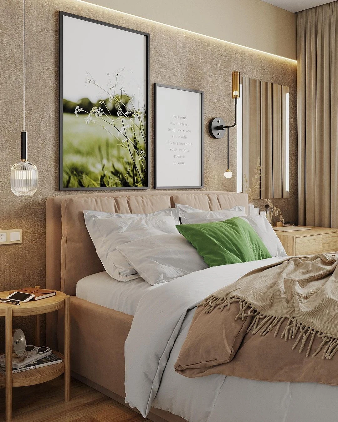
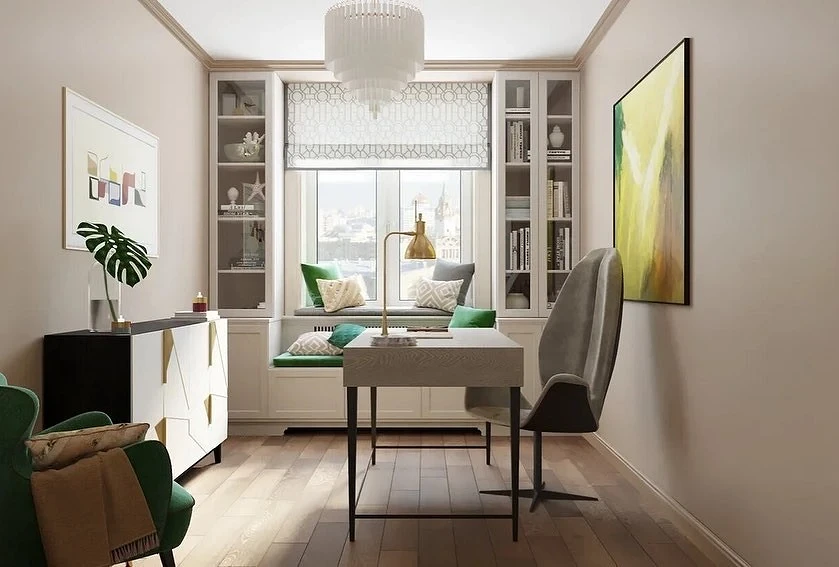
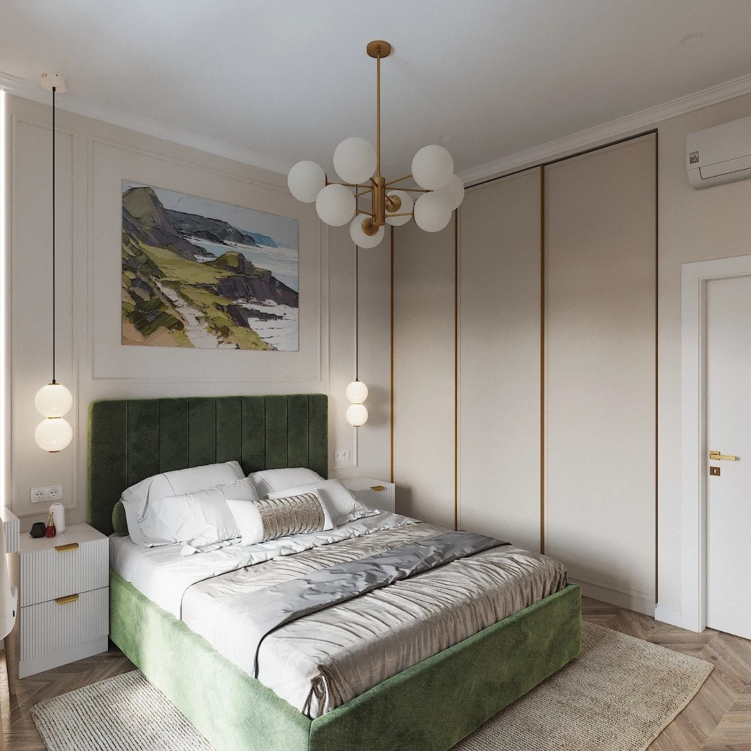
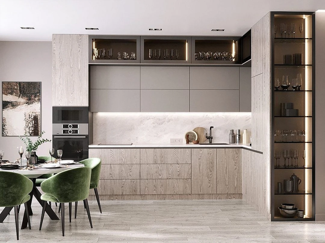
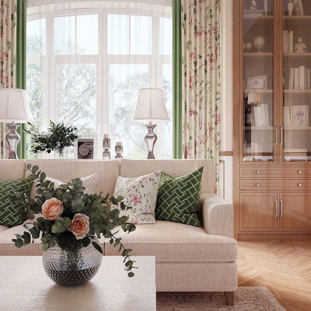
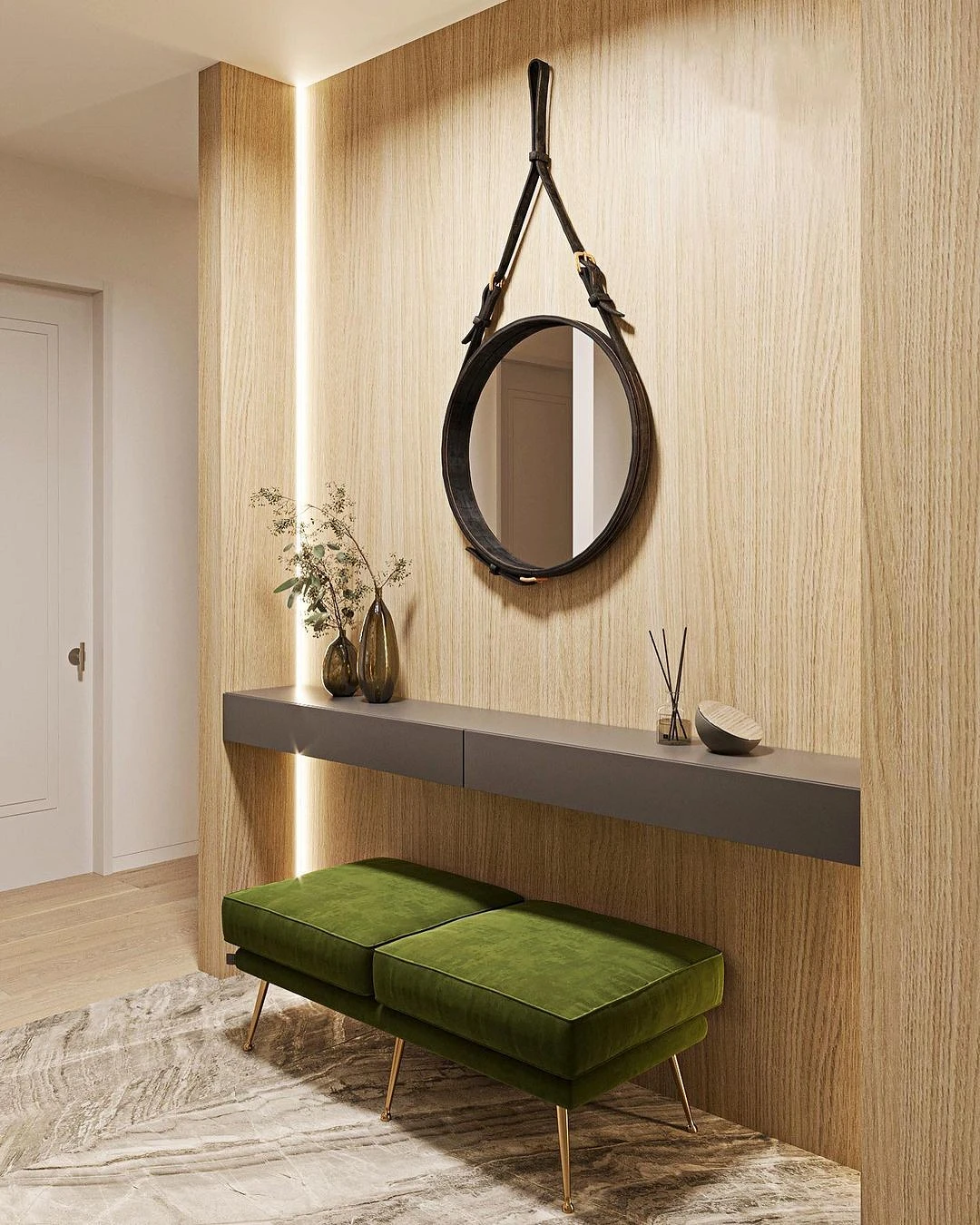
Green
Like any colors from the previous paragraph, green is a direct association with wildlife, which means that the combination with it will be a win-win. Even in small quantities, it will immediately refresh the space, and add comfort and a cheerful mood to it. This combination is almost a classic for eco or boho style.
Choose a shade of green depending on the situation: the more light in the room, the deeper and colder greens you can take. So, for example, in a living room with large windows, local emerald, mint or mossy accents will look great. If the sun is not enough, pay attention to juicy fresh foliage or a calmer olive option.
Application Tips
And finally, a few tips on how to handle both simple and complex colors so that the design does not look flat and old-fashioned.
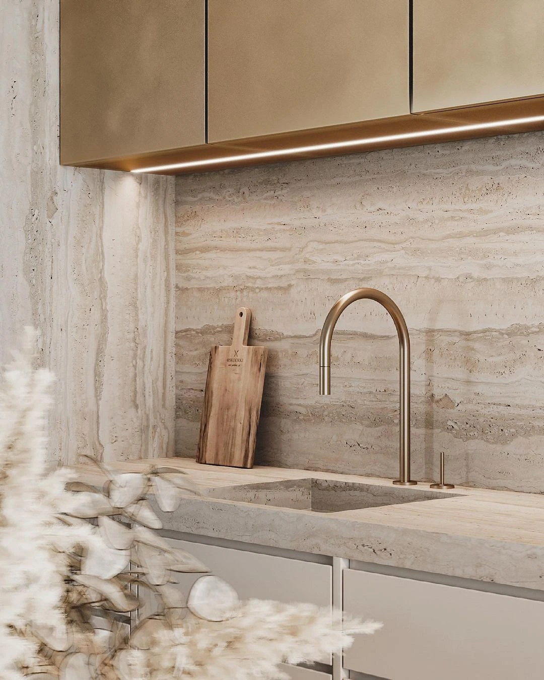
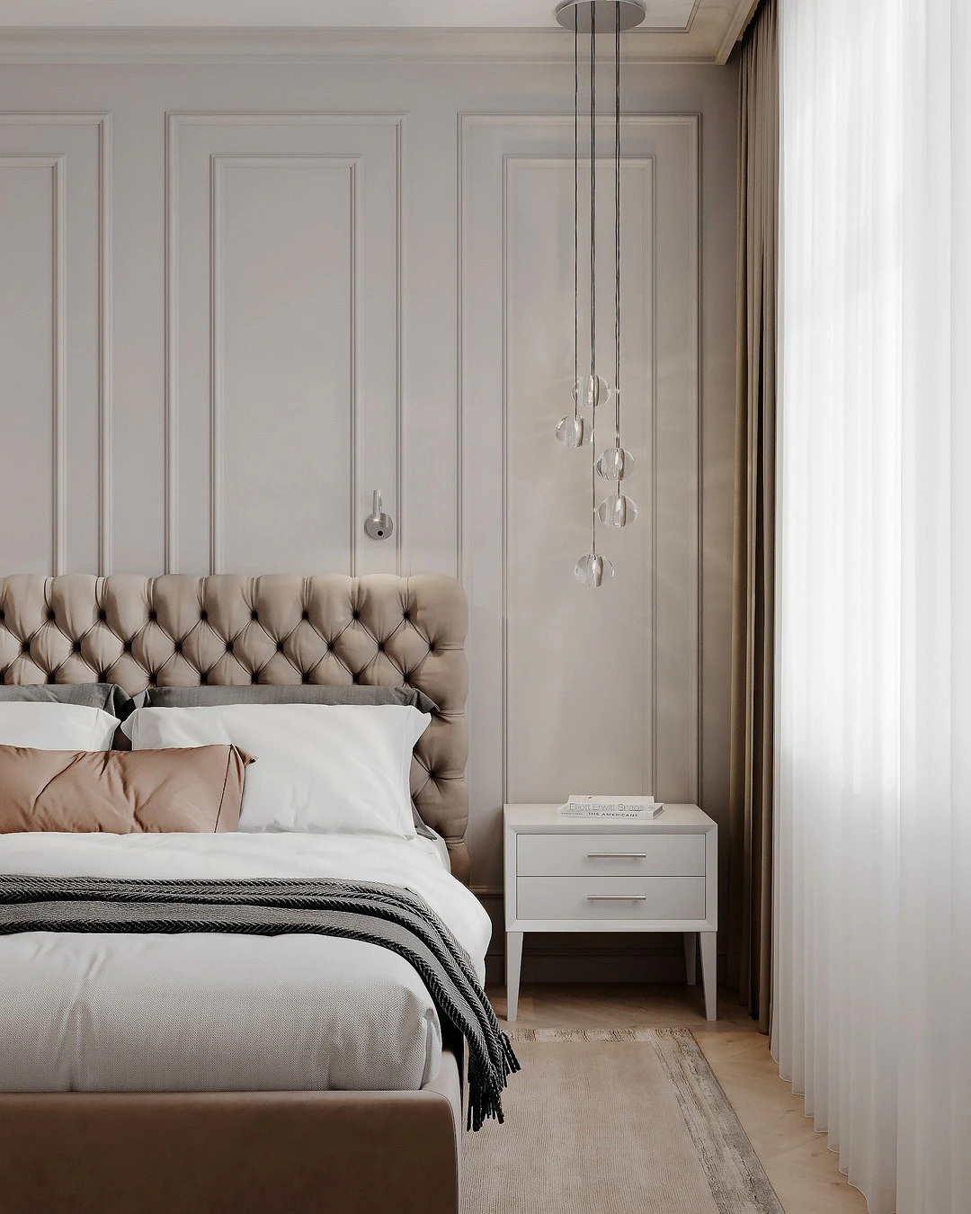
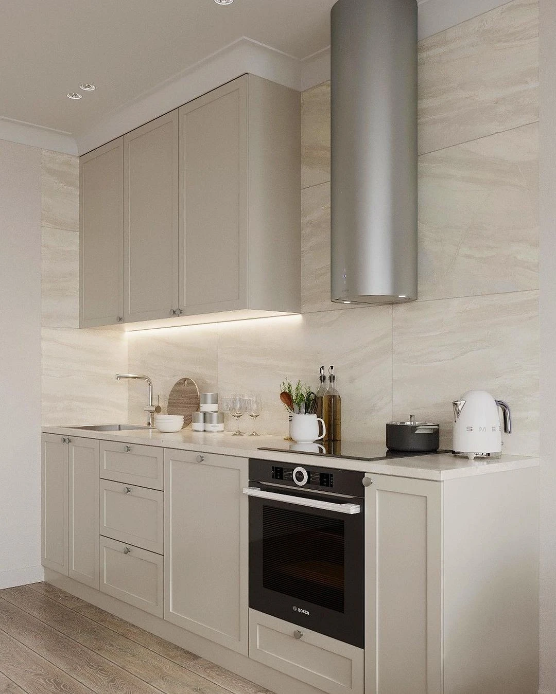
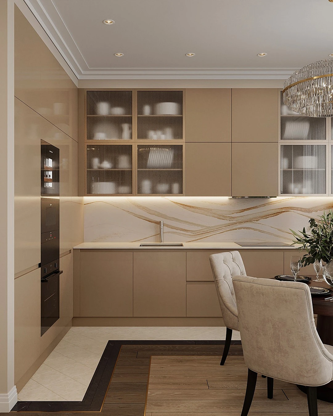
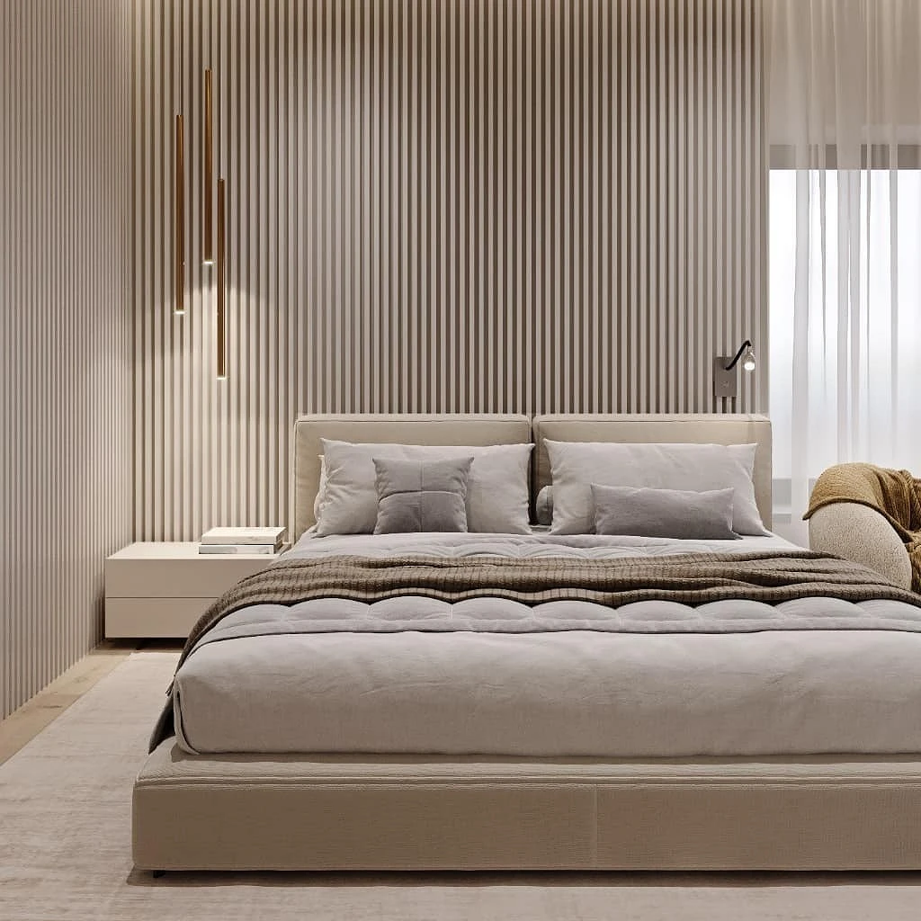
- The secret of a successful interior in beige tones is when choosing a shade to start not from an abstract palette, but from natural textures. Wood, sand, wheat ears, pebbles, marble veins, straw, and bird feathers – natural shades and pronounced textures will give the color depth, it will look interesting and voluminous.
- When choosing a palette, decide what effect you want to get from the room: a cozy nest, a luxurious simple interior, an elegant space. Depending on this, choose warm or cold nuances of beige.
- The location of the room also affects the choice of temperature. Windows to the north – the lack of sun is compensated by warm colors. Windows to the south or east, there is always a lot of light in the room – you can use a restrained cold palette with a gray undertone.
- Consider a combination of several textures and guides that will make the space more graphic – for example, dark fittings, skirting boards, frames, furniture details. This is especially important if a monochrome palette is chosen.
- Light beige will be a great replacement for white walls in a Scandinavian or minimalist interior. Pearl, ivory, champagne, powdery – they can replace sterile snow-white, which looks uncomfortable in a hospital in large area.
- Use layered lighting and mirrors to bring out the details you want and create an interesting play of light.
- Cream can be used not only as a base, although it is this role that is most often assigned to it. It is also suitable for upholstered furniture, kitchen set, cabinet body, textiles and decorative elements.
The most important thing about our X that it is for
those who are in a hurry


