


Peach, pale blue, caramel, inky blue, and others — we tell you what colors you should choose for the interior this year.
Despite the fact that we make renovations for years, you can and should follow the trends. Moreover, trends in interior design do not pass as quickly as in other industries. In addition, you can add a couple of bold trendy shades locally: for example, through décor or textiles. And change it at any time. In this article, we tell you which trendy colors of 2024 are worth paying attention to and how to use them.
Neutral shades
Even though there is a basic backbone of neutral colors (white, beige, gray, brown), some of their shades can become a real trend. This year, the line of naturalness in design continues.
Sandy
If the classic beige is boring, and white seems too sterile and uncomfortable, the perfect compromise between the two is a delicate sandy shade. It is light, light, at the same time very warm and enveloping. Suitable for walls and large furniture, for textiles and décor – in general, complete versatility.
And you can complement it the way you like:
- Another base is for a calm neutral interior.
- Graphic black or dark gray for contrast and dynamics.
- Green, terracotta, deep blue to create a brighter and more interesting palette.


Caramel
Darker than sandy; Sweet and viscous, this color as a base color is the key to a peaceful and comfortable interior. It evokes the most pleasant associations, warms, and soothes. It also emphasizes and reveals other shades of beige and brown.
It’s a great substitute for classic gray or cool white if you want more warmth. Especially in the northern latitudes, where there are few sunny days and it gets dark early. Even in cloudy weather or on a winter morning, a room decorated in caramel shades will look sunny and welcoming. Thus, it gives a good mood and makes up for the lack of dopamine.
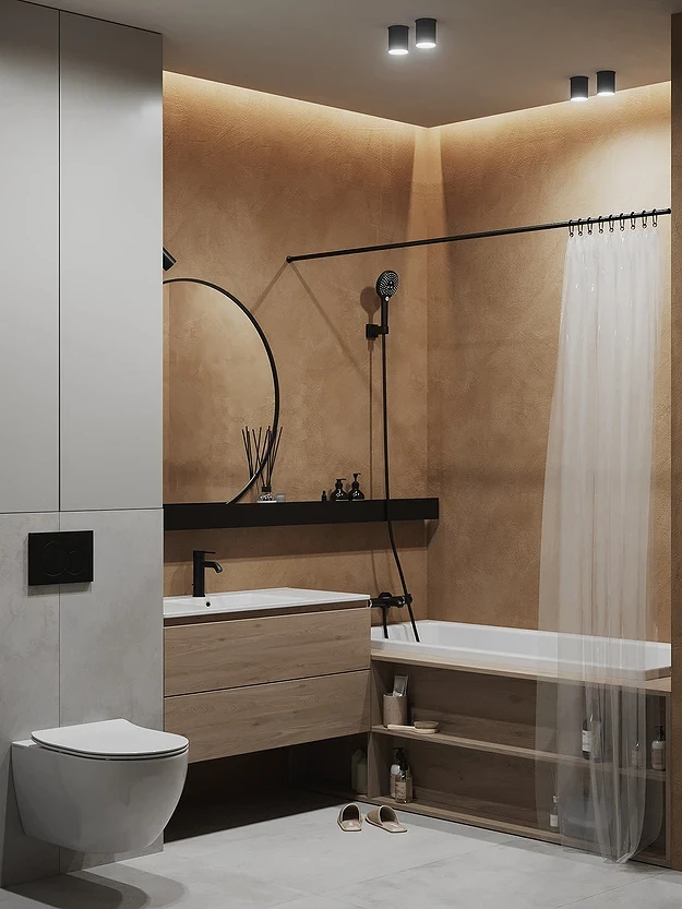
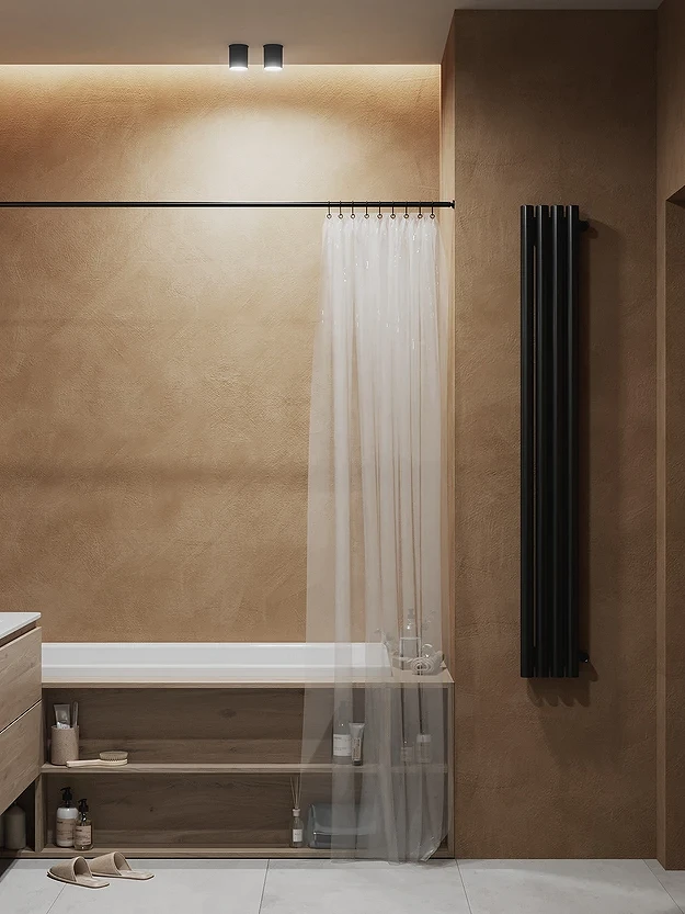
Wood
Any natural shades of wood have been and remain in trend. They do not need to be hidden by repainting furniture fronts or choosing tinted flooring. On the contrary, designers suggest emphasizing the natural beauty of the material in the first place. Depending on the species, not only the pattern changes but also the shade of the wood: from bleached oak to wenge or contrasting zebrano, which will definitely not go unnoticed.
Of course, it is best that the texture is natural. But real wood is not suitable for everyone on a budget, and not everywhere it is the best material (for example, in wet areas), so it is allowed to use high-quality alternatives such as veneer and MDF.


Earthy tones
The myth that only light colors are suitable for small rooms has long been debunked. When used correctly, dark shades will not make the space small and cramped, on the contrary, with the help of the box effect, you can expand it. In general, designers, and after them those who do repairs on their own, are increasingly turning to beautiful deep colors.
Among the base, it is primarily a set of earthy shades: brown, gray-green, brown, almost black, rocky, and others. In the interior, they look restrained and are best combined with the texture of natural materials, as well as light natural colors. Suitable for any style, but the absolute favorites are all options for classics, loft, and rustic.


Trendy colors in the interior-2024: a warm range
Now the general trend is dopamine design. The surrounding space should be positive, cozy, relaxing, and warm shades are the best way to do this.
Peachy
Peach Fuzz is a cheerful shade of orange that the Pantone Institute announced as the main color of 2024 in interiors. The name itself – peach down – speaks of its lightness and softness. Although the shade is quite bright, it fits into the framework of the pastel palette and does not irritate at all, but, on the contrary, helps to relax. And, of course, to recharge your batteries after a hard day.
Surrounded by a delicate orange and pink palette, it is easy to forget about all the hardships, so those who love such a palette regardless of fashion trends can safely take Peach Fuzz as a basis. If the color seems too bold, but you want to try it, a couple of accent pieces of furniture or décor are a great option.
Peach goes best with muted green, beige, brown, and any other pastel colors.


Rusty Red
Red is an active and bold color, an option that is definitely not for everyone. But this year, it’s got a lot of interest again, and this time it’s the unusual shade of rust that’s in the spotlight. Despite the unpleasant associations, the color itself looks very beautiful, it attracts the eye and allows you to place accents.
As an additional element, the palette fills the interior with warmth and life, while not overloading the eye or irritating. Due to the brown undertone, it is best combined with this color, as well as with any basic shades. For contrast, you can add olive or deep blue to the palette.


Sunset Shades
As the natural focus of design continues to be relevant, designers continue to look for inspiration in the world around us. For example, this year it will be the natural colors of the sunset, one of the most beautiful natural phenomena that can be observed regularly. The group of actual colors includes any shades of red, pink, and orange that resemble the setting sun. Moreover, it is allowed to use them both separately, choosing one, and together, thereby creating a feeling of a warm sunset right at home.
The best addition to this range will be neutral shades of beige and brown. White, of course. If you want to create a complex palette, you can combine sunset colors with sky blue, bluish, ash purple, or berry.


Not Doll Pink
Barbicore literally captured all the top trends last year, but due to such explosive popularity and widespread use, many people have already managed to get bored. Therefore, in 2024, pink is still a trending color, but with minor adjustments. So, instead of doll-like saturated tones (from the classic color of Barbie to fuchsia), its more complex, muted shades will prevail in the interiors:
- Powdery.
- Ash Rose.
- Antique.
- Smoky.
- Paradise pink.
- Tango.
- Cherry.
Both pale pink, almost bleached, and deeper dark variations will be relevant.


Cool Tones
This year, the list of trendy colors includes many noble shades with a slight chill.
Pale Blue
A pale blue, almost white shade will be more and more common this year. It is chosen as a base along with white and gray, especially since the light color visually expands the space, and the cool undertone enhances this optical effect since the surfaces seem a little further away than they are.
It seems that such a cool color is not suitable for our climate with a perpetual lack of sun, but this is not the case. If you complement blue with delicate cream or ivory, wood texture, and soft fabrics, you will get a very cozy and at the same time stylish space.
Pale blue is relevant in almost all styles but looks especially good in neoclassical, eclecticism, scandi, and soft minimalism.


Inky Blue
Despite the fact that many consider blue to be unnecessarily depressive and sometimes anxiety-inducing, in reasonable amounts, it does not have any negative effects.
Designers love this color, and in 2024 we will see it often in interiors. The current shade is a thick, rich blue, reminiscent of ink in a pen. It feels good in a variety of combinations and will be a great accent if you want to add depth to a space, make it more elegant, but do without too bright colors. It reveals itself especially well on matte textures.


Cold Matcha
Japanese green tea has long gone from a curiosity to a popular drink on par with lattes, cappuccinos, or traditional tea. Now, it is pushing the boundaries of influence, and if you are looking for which trendy color to choose for the interior in 2024, then this is one of the most relevant options. The shade of the match is expected to be popular by one of the main trend analytics companies WGSN.
The color is a pastel version of green with a subtle gray undertone, which tips the scales from a warm spectrum to a cold one. Matcha looks very noble and refreshing, visually it is very reminiscent of mint, but with a smaller share of blue. It looks good both on walls and on large furniture, as well as small point accents. It can be combined with any cool colors, gray, white, black, beige, and brown.


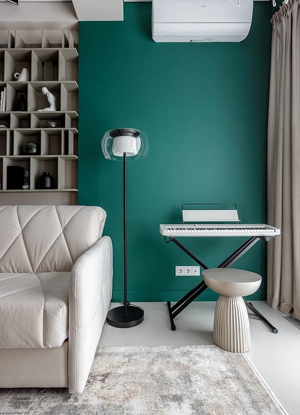
Forest Green
Another trendy shade of green, also in a cold palette. It is called in different ways: forest, coniferous, and fern. Deep dark green with blue undertones looks both luxurious and soothing, it is bright but not flashy, so it can play a different role in the palette. For example, you can paint an accent wall in a forest shade, choose large furniture in this tone, or add indoor plants with large leaves to the interior.
Designers suggest complementing this version of green with other natural tones, as well as cool colors: blue, and purple. For more contrasting combinations, shades of red and orange are suitable.


