A light palette, gloss, and tall doors — we tell you what techniques will make a narrow hallway spectacular, and show you how to implement them with examples.
It’s great when guests get right from the threshold into a spacious hall. But this pleasure is not for typical apartments. In some new buildings, the entrance area is often a small cramped pencil case. In this article, we will tell you how to arrange a harmonious design of a narrow hallway in an apartment.
Features
An elongated entrance area has several main problems:
- There are no windows in the hallway of the apartment, which means that the small room also becomes very dark. Hence, the first task is to provide enough light in the entrance area. This is important, because here residents and guests change clothes, look at themselves in the mirror, and fix their makeup.
- On several squares, you need to place the necessary minimum as you like: a storage system, a mirror, a place where you can take off and put on shoes, a hanger.
- The small width of the entrance area limits the possibilities of planning: a roomy wardrobe will not fit, the chest of drawers will have nowhere to open, there may not be enough space even for a rack. Giving up furniture is not an option at all – you need to look for compact alternatives.
- At the end of the day, a long tunnel just doesn’t look aesthetically pleasing. We want each zone in the apartment to look beautiful and harmonious, so we need to adjust the proportions of the long corridor at least visually.
The design of a small narrow hallway in an apartment (photo below) should solve all these issues.


General Rules
Let’s figure out what techniques will help you design a stylish design of a narrow corridor in an apartment, as in the photo in the gallery.
Minimalism
In this case, it does not matter in what style the entrance area is decorated, whether it is Scandi or classic. The main thing is not to overload a small room and not to clutter up an already narrow passage. To do this:
- Use furniture that is simple in shape and only the most necessary.
- Limit yourself to 2-3 decorative elements. The smaller they are, the better.
- Choose a laconic finish without large contrasting prints.
It’s okay if the entrance area seems a bit empty at the planning stage — in real life, the hallway will be filled with clothes, shoes, umbrellas, etc.


Gloss & Mirrors
Glossy and mirrored surfaces, as well as light colours, make the space look bigger.
Use them in the entrance area, but don’t overdo it: if the floor, the ceiling, and the cabinet body shimmer, and all this will be reflected in each other, the interior will look gaudy, and the colors will shine.
Strike a balance: let the glossy floor be accentuated by matte plaster on the walls, or vice versa. There can be several mirrors (for example, full-length mirrors and mirrors on the wardrobe), but they should not be strictly opposite each other, otherwise you will get not the most pleasant labyrinth effect. If there is not enough light in the hallway, install a mirror at the end to reflect the part of the living room with a window.


High openings
Narrow spaces appear disproportionate when the unequal aspect ratio and the wrong scale are apparent.
This is easy to correct with the help of tall doors – openings to the ceiling are just in trend right now. You can add scale to them by decorating the wall around with moldings to match the finish – they will duplicate the contours of the opening, the canvas will seem larger than it is.
In order not to fragment the space, take note of another trend of recent years – flush-mounted doors, which are painted in the color of the finish. You don’t have to mask them completely — let the boundaries be visible, but unobtrusively.


Zoning
If the entrance group is not very tiny, zone it in the same way as any rectangular room.
Not only is this functional in terms of layout, but it will also help the eye find focal points and move between them, rather than wandering along the long, monotonous surface of the walls. With the help of different finishes, several colors, lighting, and furniture, you can create the feeling that we are not looking at one elongated space, but several separate ones – just without doors.


Furniture by size
For small elongated rooms, you will have to look for non-standard options.
Or make custom-made furniture – it will be more expensive, but often there are simply no other options. For example, if you need to design a narrow hallway with a wardrobe, the standard model will most likely not stand up in depth.
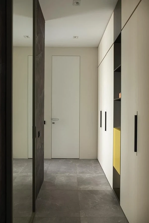
A good option for limited space is built-in floor-to-ceiling systems. They compensate for the shallow depth of the lockers and use the entire wall area. Most often, vertical surfaces are empty or covered with paintings, although they can be used much more rationally.


Choosing a color for the interior of a narrow hallway
The right color scheme is the key to success when designing an elongated entrance area. There are two main approaches to choosing a palette
Light tones
This is the easiest way to visually expand the space, to add air to it. Since the entrance area gets dirty quickly, you don’t want to make it crystal white. Choose non-marking shades: cream, beige, sand, gray. Also, it is not necessary to use only light colors. Set accents with separate objects or paint one wall in a darker color to create an interesting contrast and make the interior more voluminous.
By the way, use the color game to visually change the proportions of the narrow hall. For example, paint smaller walls with light paint, and long ones with dark paint. This technique is based on the basic properties of colors: everything that is light seems larger than it is; Everything that is dark is less.


Casket effect
If you want something a little more spectacular, you can go the other way.
For example, do not try to change the proportions or hide the real volumes of the room, but simply divert attention from them. This design hack is suitable for apartments where there is a living room with large windows at the end of the hall.
The essence of the technique is simple: the entrance area is decorated in dark colors without bright accents, and a person at the entrance sees natural light at the end of the corridor and instinctively moves there. It is good if the living room is not separated by a door at all or the canvas will have glass inserts.


Illumination
In a long hallway, it is important to provide several light sources so that there are no dark corners and sad shadows.
Use:
- Several shades spaced at equal distances. They can be exactly the same or from the same collection to maintain visual unity.
- Track lights along the entire length of the hall.
- Concealed lighting, which is mounted in a suspended or stretch ceiling.
- Multiple local sources. Illuminate a mirror, paintings, or shelves in an alcove.


Projects
Finally, here are some examples of well-designed interiors from which you can take interesting ideas.
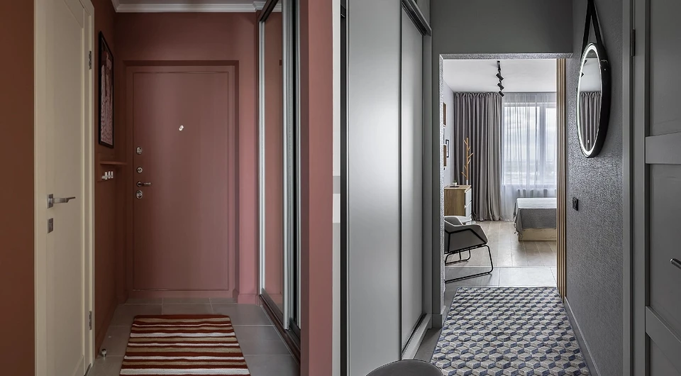
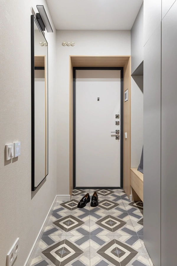
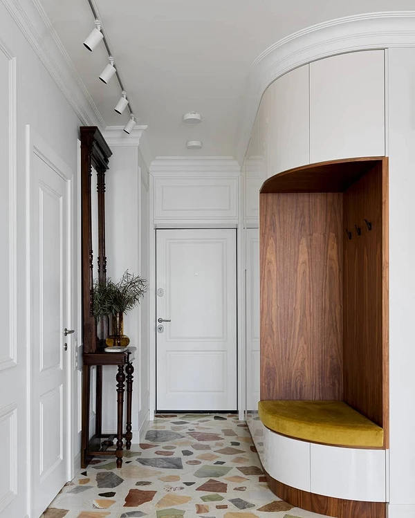
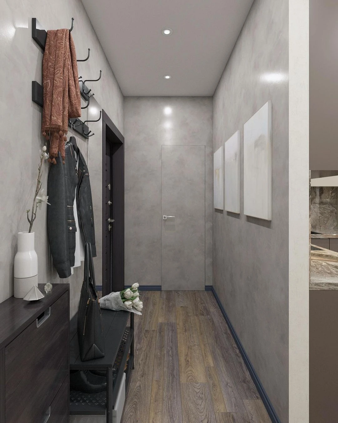
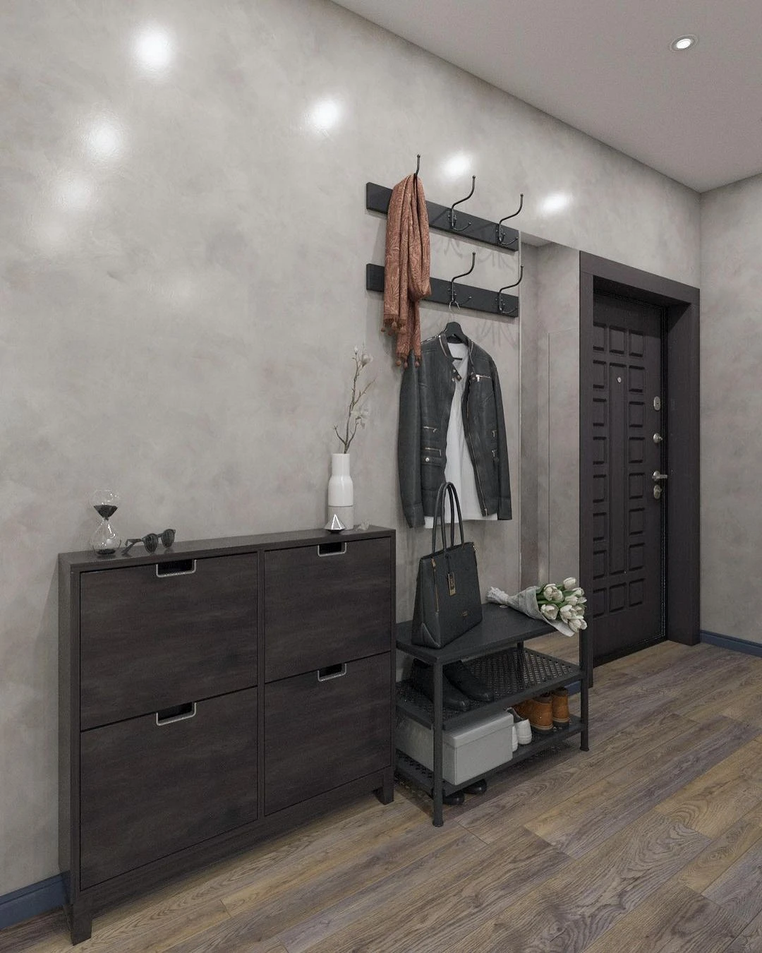
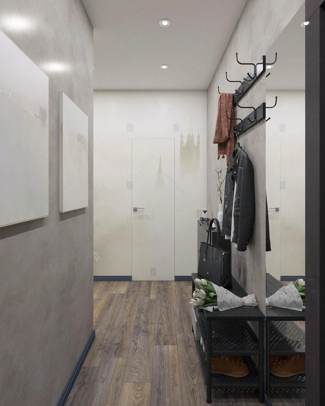
In Grey
In a narrow entrance area, it is not always possible to find a place for a wardrobe – this is just such a case. If the square footage is too small, it is better to move the main storage system to another room: bedroom, dressing room, living room. But you can’t leave the hallway completely unfurnished.
For example, here the designers left one wall empty, hanging only paintings, and along the second they placed compact systems: a hanger for outerwear in two rows, a bench with a place to store shoes, a shallow console.
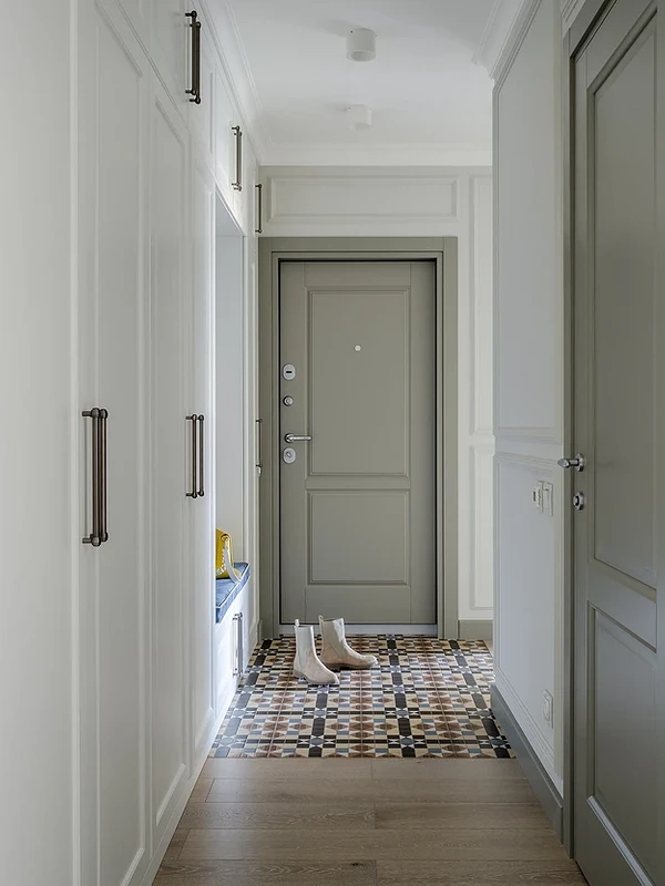
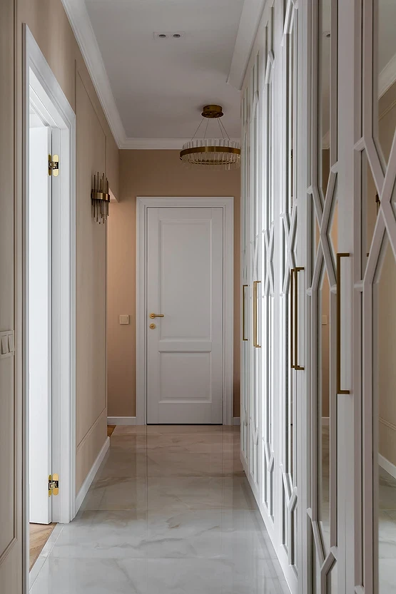
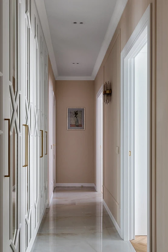
Minimalism and classicism
This project is an example of how there can be nothing superfluous in design, and this is the best thing. The long elongated entrance hall is made in a light neoclassical style, but at the same time it is not overloaded with décor and bulky architectural elements. Due to the light palette, the space feels airy and spacious, and the large built-in wardrobe from floor to ceiling along the entire wall does not press.
The area of the entrance area is 9 squares, but the length of the end wall in the narrowest part is less than a meter. Because of this, planning options have been limited, and in such situations, a single closed storage system becomes the best option.
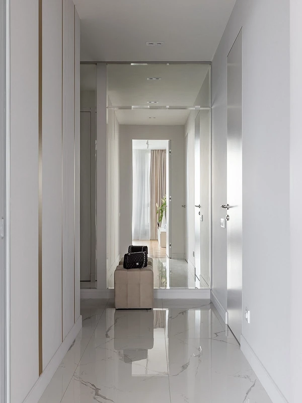
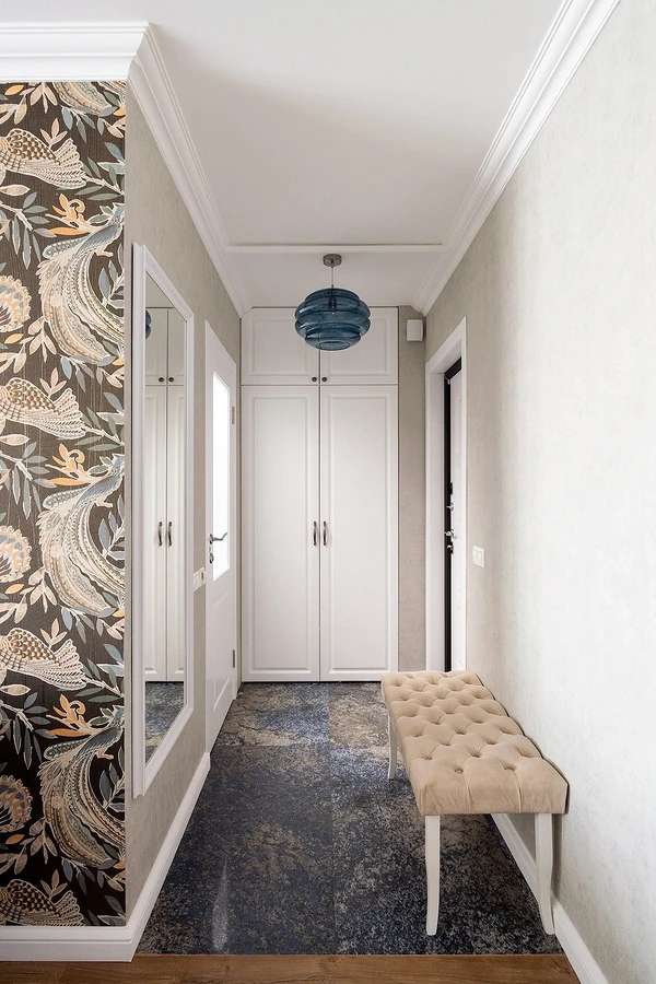
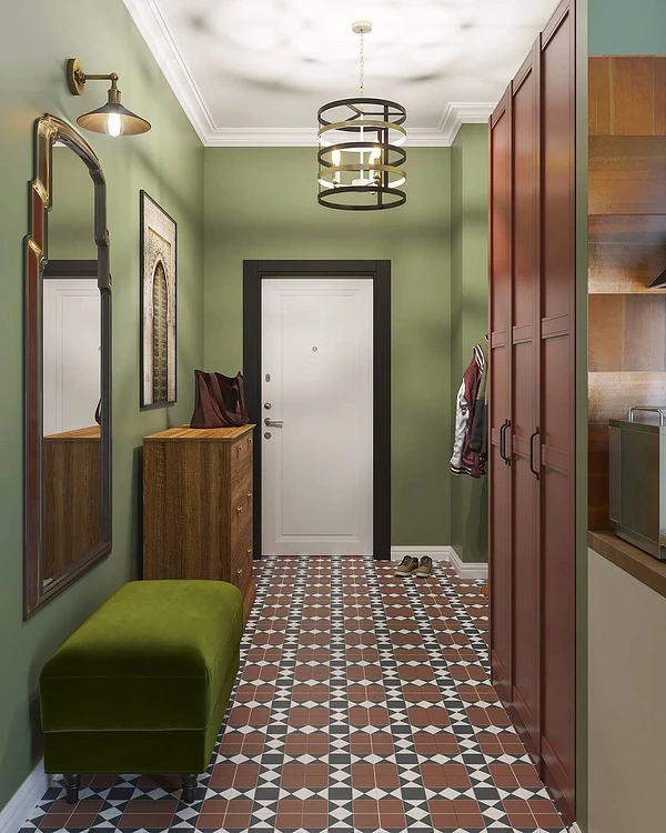
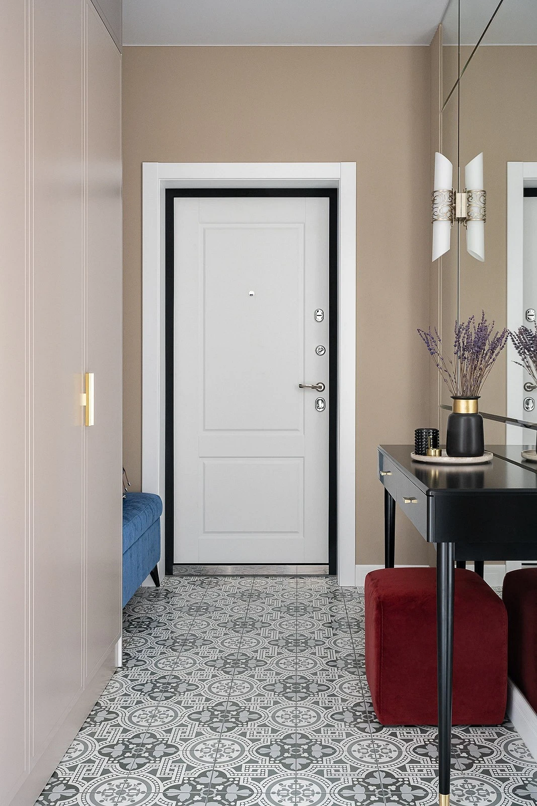
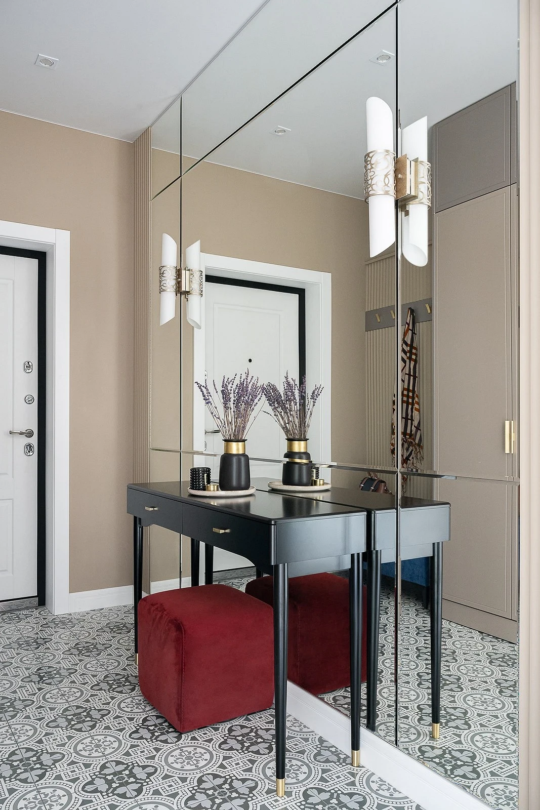
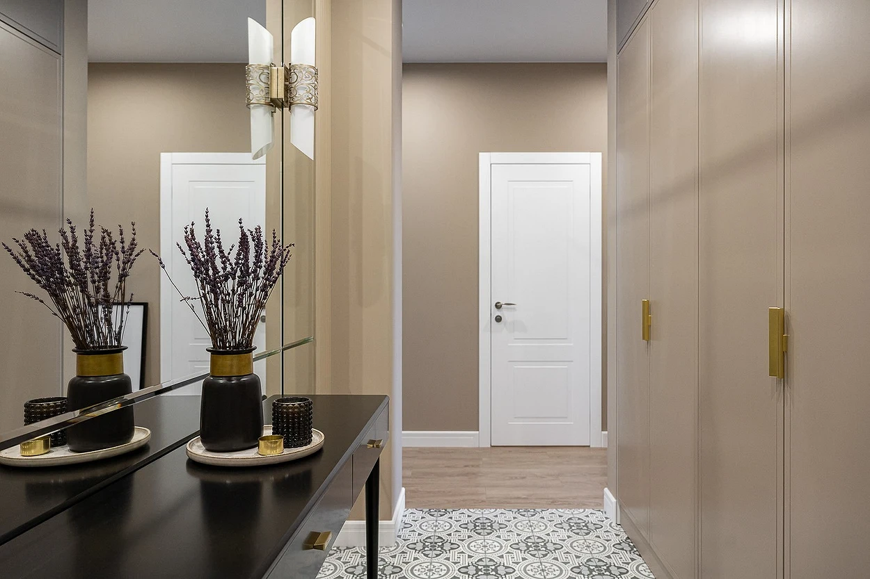
Mirror Wall
A mirror is the best tool for visually expanding a space. And the larger the area of the reflective surface, the stronger the effect. So, in this apartment, they decided to make a whole wall of mirrors. This compensated for the rather dense arrangement of furniture: on one side of the door there was a large wardrobe and a banquette, on the other side there was a console for décor and small things and an ottoman under it.
As a base color, the designer chose a classic light shade of beige. But it doesn’t look boring, as it has been diluted with bright accents. And one of them, together with the white front door, is just happily reflected in the large mirror.
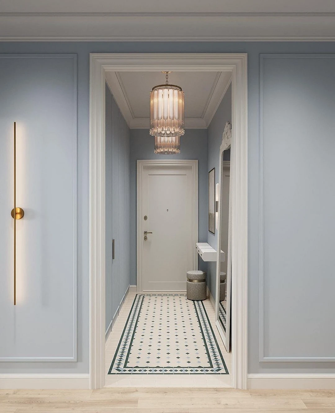
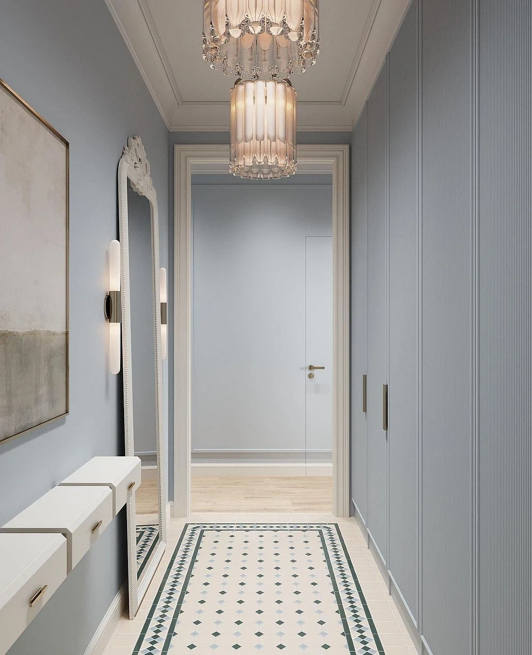
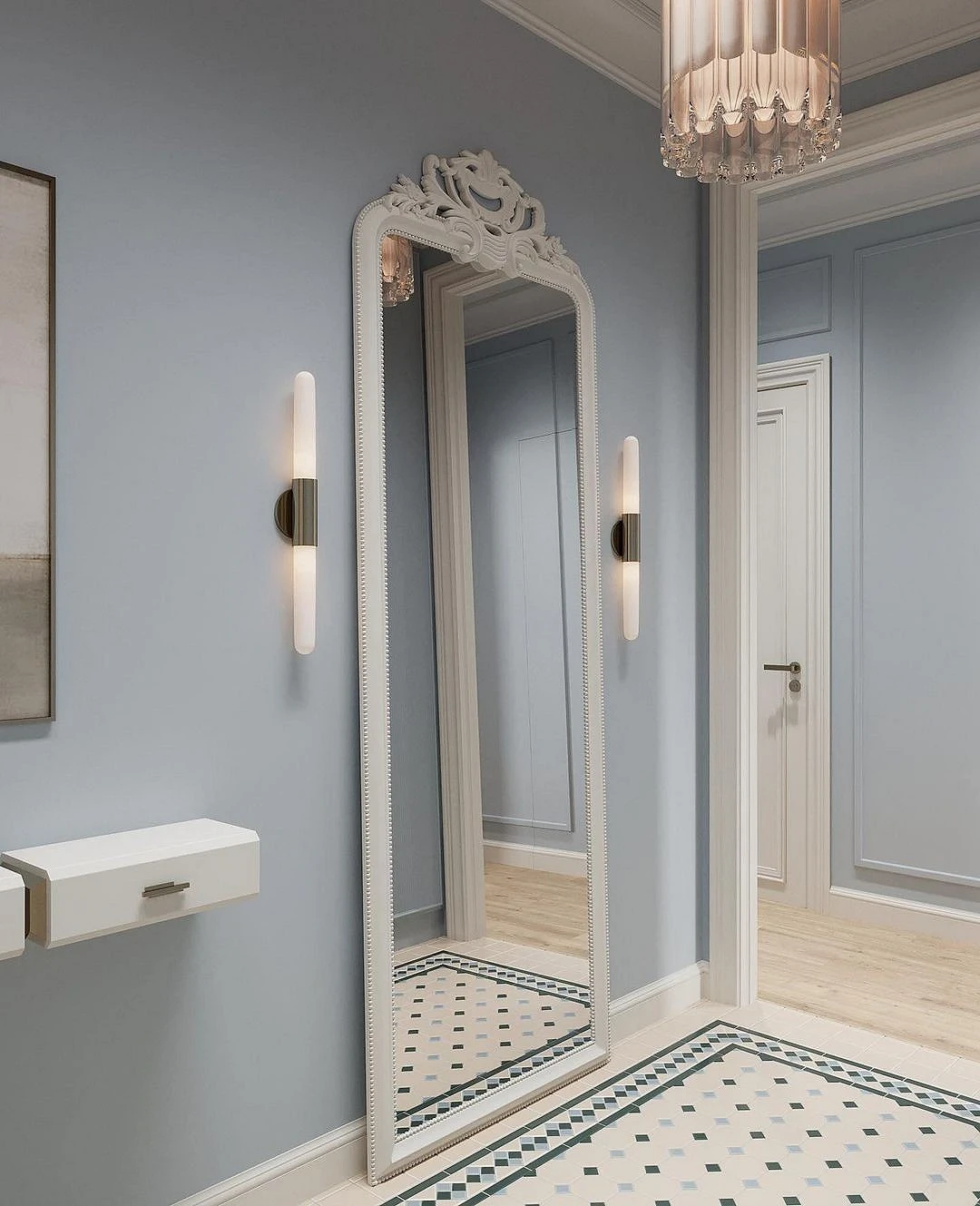
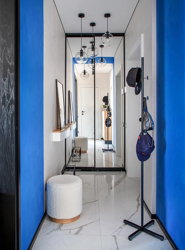
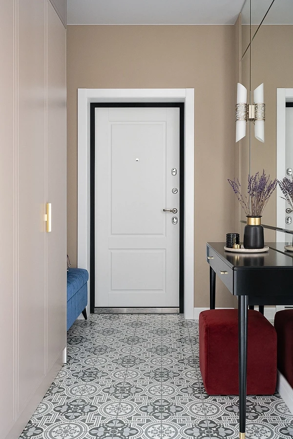
Blue walls and stucco
The combination of blue and white gives a stunning effect in any room: it refreshes, fills the space with air, makes it brighter. You don’t even notice the proportions of the hall — first a carpet of tiles on the floor, then a large accent chandelier and, finally, a large mirror in a figured frame.
All the décor is located on one side, and a spacious wardrobe is built into the other. It is painted in the same tone as the walls, thanks to which it is completely camouflaged under them.