


Colors, finishing materials, furniture, lighting, style features: all the nuances of decorating a living room in light colors are collected in one article.

Popular and beloved, but dangerous and risky. It’s all about the interior in light colors. This is the case when there are only a couple of steps from a light, airy space to a boring and faceless room. A couple of wrong steps. And in this article, we will tell you how not to do them. And also how to decorate the design of the living room in light colors in an apartment so that it turns out to be multifaceted, interesting, and voluminous. And we’ll show it in a photo.

What are the interiors of living rooms in light colors?
Monochrome

White with white on white is not exactly what is meant by monochrome room design. There really is one main, leading monopolist color here. It fills the entire space: walls, floor, ceiling. Captures furniture. But if you use only one shade, the room will become as flat as a sheet of paper. Volume and fullness in monochrome rooms are obtained due to a variety of halftones and shades. For example, paler and darker. Rich and vice versa, calm, balanced, warm, and cold.
Another technique is a mix of textures for finishing walls, floors, ceilings, furniture upholstery, and textiles. Smooth surfaces can be alternated with:
- Embossed wallpaper;
- Gypsum panels;
- Moldings;
- Stucco;
- Decorative plaster;
- Microcement;
- Wood and stone;
- Accent fabric elements: bouclé, jacquard, matting or linen.


Base & Pastel Colors
This is an option for those who feel uncomfortable in a monochromatic interior, but do not want bright colors. Introducing a few soft pastel colors is the safest way to add variety.

Pastel colors are the same blue, red, and green, but muted with white, mixed with it. The result is dusty, calm, delicate colors.


Base + bright accents
If you want a holiday, juicy colors, you can add accent details to a neutral base and pastel colors.

At the same time, it is important to observe the proportions. Non-professionals can use a simple scheme: 60% is the main color, 30% is the secondary color, and only 10% is the accent color.


In the next section, let’s take a closer look at the palette for decorating a light living room interior.
Palette Composition: How to Distribute Colors
Base Colors
These are the ones that shape the space, fill it. They occupy the largest area in the room and are the background for furniture, décor, textiles. For the living room, the basic color is the color of the walls, ceiling, floor, large pieces of furniture: a sofa, bookcases.
White

In fact, designers rarely use boiling white. If you look closely, you can see a subtle milky, smoky, or other of the many shades that exist. This avoids the feeling of “sterility”.
White is a rather capricious color. It is often used in spaces where there is little light to add air. But it is important to know here: in dark, poorly lit rooms, it can become grayish. What’s more, white will look different in the morning and evening, in winter and summer. Electric light also has a strong effect on perception.
But white also has a significant advantage — it is “omnivorous” and can be combined with absolutely any color. White is the perfect canvas.


Pale Grey

Another neutral, achromatic color. It will serve as a good background for furniture and décor.
Over the past few years, it has become so popular that it has competed with the eternal leaders – white, black, and beige.
Gray is multifaceted, it can be warm and cold, and has different barely noticeable shades: green, blue, and brown. It is suitable for sunny, hot rooms with windows facing south and southeast. It will help to make the space more “cool”.
Gray can be easily combined with many other colors: yellow, blue, red, green, and purple.


Beige
After an overabundance of beige interiors in the early 2000s, this color has been on the list of anti-trends for a long time. Beige was perceived as synonymous with boredom and monotony. And there’s some truth to that. Such an interior can easily become faceless and dreary. Beige requires carefully chosen accents. They are necessary to create character and dynamics.

In recent years, designers have brought beige back into our homes and apartments. It is especially relevant for eco-interiors, styles that imitate the natural landscape.
In terms of compatibility, beige is more difficult than white and gray. It is much more difficult to find a mate for him. Different partners will suit different shades. And there are a dozen or more shades of beige: ivory, gray-beige, sand, crème brûlée.
Warm beige will work well with brown and terracotta. Cold – with shades of blue and green. And both with black.


Pastel colours
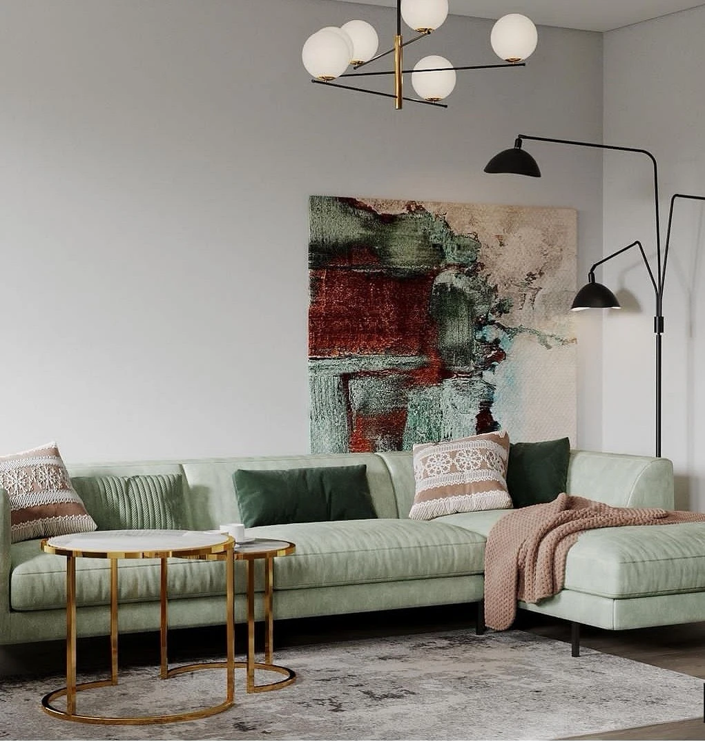
Dusty pink, peach, cream, gray-green, pistachio, mint, bleached blue, lavender, and other pastel colors can occupy a fairly large area.

Since they are muted and calm, they will not irritate the eye. But they will perfectly shade the basic ones, making the space deeper and more voluminous. In such tones, you can paint sections of the walls, choose a pastel carpet or curtains, a sofa or armchairs.


Bright accents
Decorative pillows, a blanket carelessly thrown on the arm of an armchair, a bright spot on a painting, a vase, or a statuette – for all these small but significant details, you can choose a bright color. Or paint one of the pieces of furniture.

These can be:
- Shades of blue: turquoise, sapphire, azure, cobalt and others.
- Terracotta is one of the trendiest colors this year. It resembles clay or brick.
- Sunny, energetic yellow. He returned to the interiors.
- Lilac and purple. Their shades have come to the fore thanks to the Pantone Institute and its 2022 Color of the Year.
- Green. Another consistently trendy color. Living rooms in a modern style in light colors can be complemented with elements of emerald, malachite, and olive.


Finishing materials
Ceiling
In modern interiors, the ceiling is often decorated in a light palette: white or the palest possible beige or gray shades are chosen.

If the floor slabs are flat enough, communications do not pass through them, they are simply plastered or painted. In other cases, you can sheathe the ceiling with plasterboard and only then apply finishing materials. For apartments in eco-, country, and Provence styles, wood is often used for ceiling cladding: clapboard, imitation of timber, and plywood.
If you want to carry out the work as quickly as possible and without unnecessary dirt, you can stop at a stretch ceiling. A matte plain finish is preferred. Solutions with shadow adjacency, as well as seamless joints, look interesting.
Wall

The most inexpensive option is to wallpaper them. Today, you can find options with the texture of wood, concrete, stone, plaster, or just a flat plain coating. In some cases, a discreet and unobtrusive pattern will look organic. For example, vegetative or geometric.
One of the most popular ways to decorate walls is with paint. More often, they choose a matte monochrome coating of basic shades.
You can use decorative plaster, or microcement. These are more expensive materials. An interesting and rarer solution is to drapery the walls with fabric.
Floor

The choice of materials for the floor is limited only by the imagination of the customer, the designer, and, of course, the budget.
The most affordable is linoleum. Now it is not used as often as it used to be, but if funds are limited, you can consider this option. Moreover, the choice of textures and patterns has expanded significantly in recent years. And the quality of the application has increased.
In the category of a higher class are laminate, vinyl quartz, and porcelain stoneware. The first two are tactilely reminiscent of wood. The latter can only imitate it externally. On the other hand, porcelain stoneware is considered a more natural coating.
Among the expensive solutions: are engineered board and parquet. They are chosen by connoisseurs of natural materials.
As for the color, it doesn’t have to be white or very light. Natural wood shades, as well as shades of natural stone, look harmonious.
Furniture in bright interiors
Furniture can sound in unison with the rest of the space, and complement a single palette. Or it can be accentuated, or characteristic.

In the living room, the dominant is a sofa group. It includes not only the sofa itself, but also the adjacent armchairs, ottomans, and a coffee table. In monochrome interiors, they set the pace due to interesting shapes and textured upholstery. If the interior of the living room is built on contrasts, one or more pieces of furniture can become bright spots on a neutral background.


Illumination
This is what creates volume and relief. Surprisingly, it is no less important in bright rooms than in dark ones.

It is important to create several lighting scenarios at once.
- The general, main light is the brightest and covers the entire room.
- A working room is for reading, and a desk if there is no office.
- Decorative — for lighting niches, textures of wall decoration, décor items, and ceiling decoration.


Decor
A harmonious and almost always successful solution for the décor of light walls is paintings and posters.

These can be both individual works and entire compositions assembled from several canvases.
You can easily and quickly transform the room with the help of textiles: curtains, tulle, decorative pillows, carpets, plaids can both continue the single palette in monochrome solutions and act as contrasting details. The beauty of textiles is that they can be changed every season. For example, you can assemble different sets for summer and winter.
And, of course, the interior comes to life thanks to telling trifles: vases with or without flowers, candles, figurines, decorative figures, mirrors – all this tells about the character, views, preferences of the owners of the apartment.


Bright living room in different styles
White, beige, pale gray are the basis of Scandi. Features of this style: simplicity of lines, restraint, filling the space with light, practicality, functionality. White walls, floors, ceilings, furniture are a classic version of Scandi.


Minimalism
Minimalism and white or pale gray are inseparable. As a rule, in this style, light solutions are ideal for living room design. And if they still build the space on contrasts, they prefer a combination of neutral tones and deep black or graphite.


Wabi-sabi
This is a special Japanese philosophy. As applied to interior design, it dictates maximum simplicity, modesty and unity with nature, close to asceticism. Grayish, beige shades, natural shapes and textures perfectly emphasize the environmental friendliness of this style.


Japandi
Another fashion phenomenon of recent years. And also related to Japanese aesthetics. But formed at its intersection with the Scandinavian style. A minimum of décor, functionality, restraint, dislike of bright and loud accents, tolerance for slight imperfection – all this is about Japandi. Natural shades, including light colors, are the basis for it.


Retro style
Aesthetics of the 50s, 60s. The energy of the 70s. A return to the freedom-loving 80s and 90s. Recently, designers have repeatedly turned to the trends of past years, returning long-forgotten fragments to modern homes. And this trend continues. And a light palette is a good background for experiments and the implementation of bold ideas.


