


Ivan Pozdnyakov and Pavel Zheleznov, P+Z studio, designed the interior of an apartment of 80 square meters for a young family with two preschool children. The main idea of this project is a light modern space that will not get boring with time.
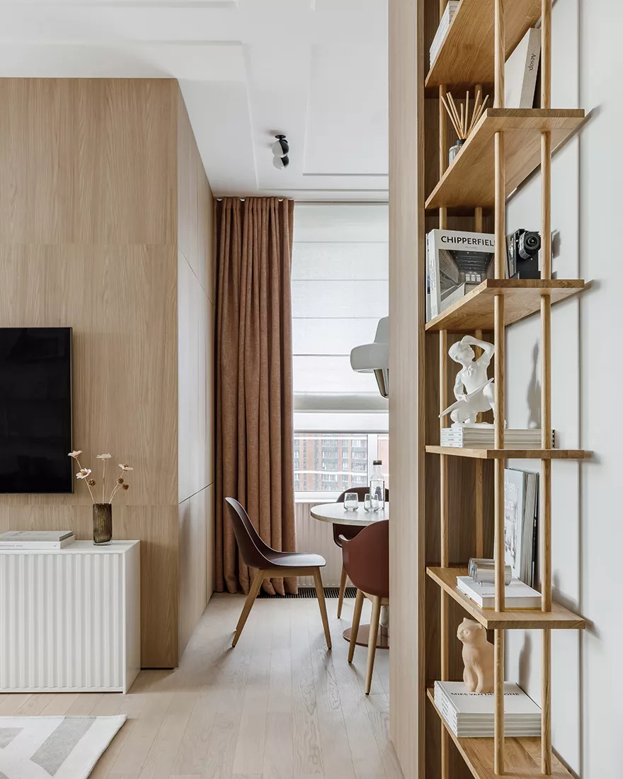
The apartment, which is located in the residential complex, was originally a “bare” box: with concrete walls and open engineering systems. Here it was necessary to place a common area of the kitchen-living room, as well as two bedrooms with bathrooms, a dressing room, and a lot of storage space. Since housing does not have the status of an apartment, it was necessary to take into account strict regulatory restrictions on the location of the kitchen and bathrooms. Because of this, it was impossible to carry out a global redevelopment – only to change the configuration of the walls of the rooms in order to integrate into them the cabinets, racks, and shelves that customers requested. This decision was dictated by another feature of the premises: large windows – an obvious plus of the apartment – significantly reduced the area of the walls, so necessary for storage places.

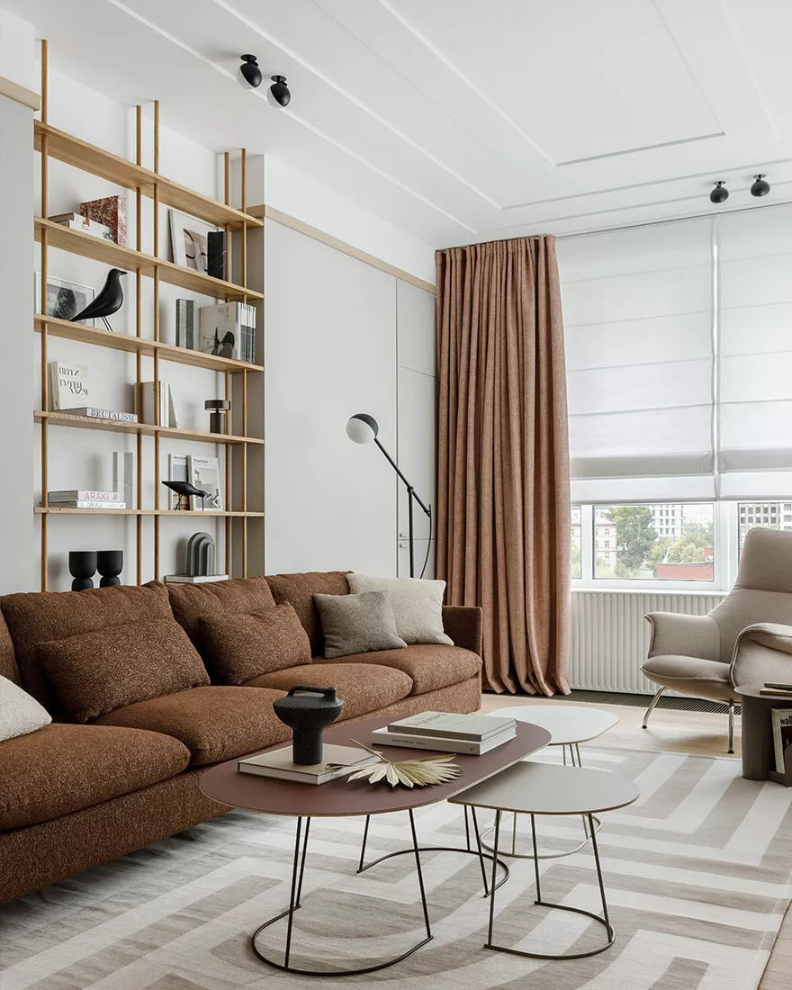
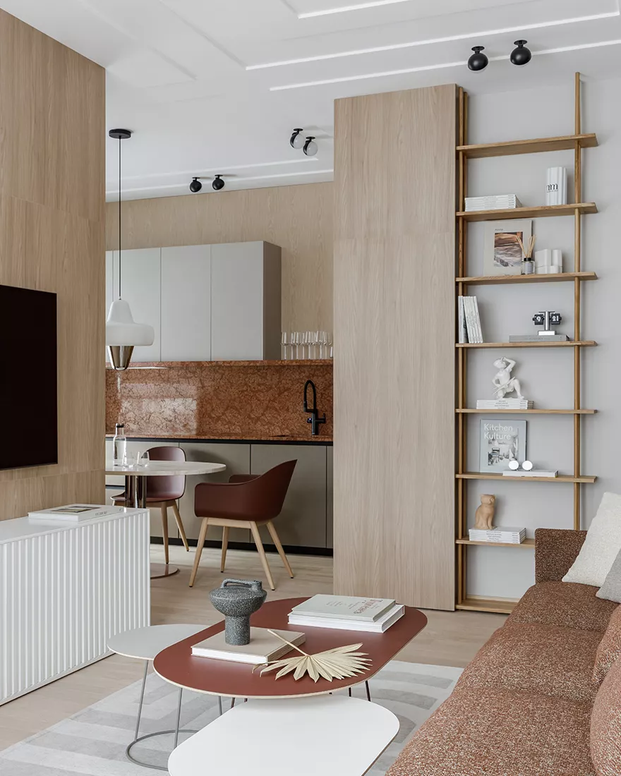
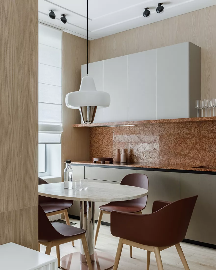
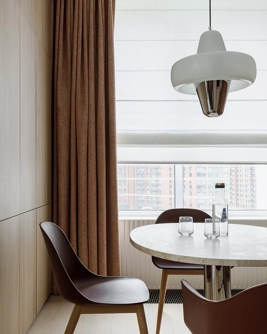
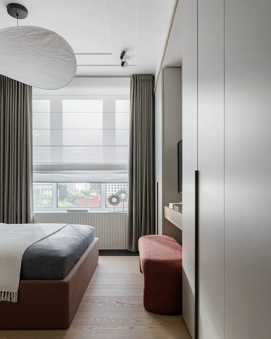
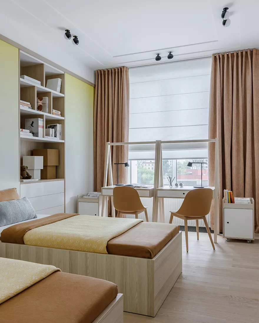
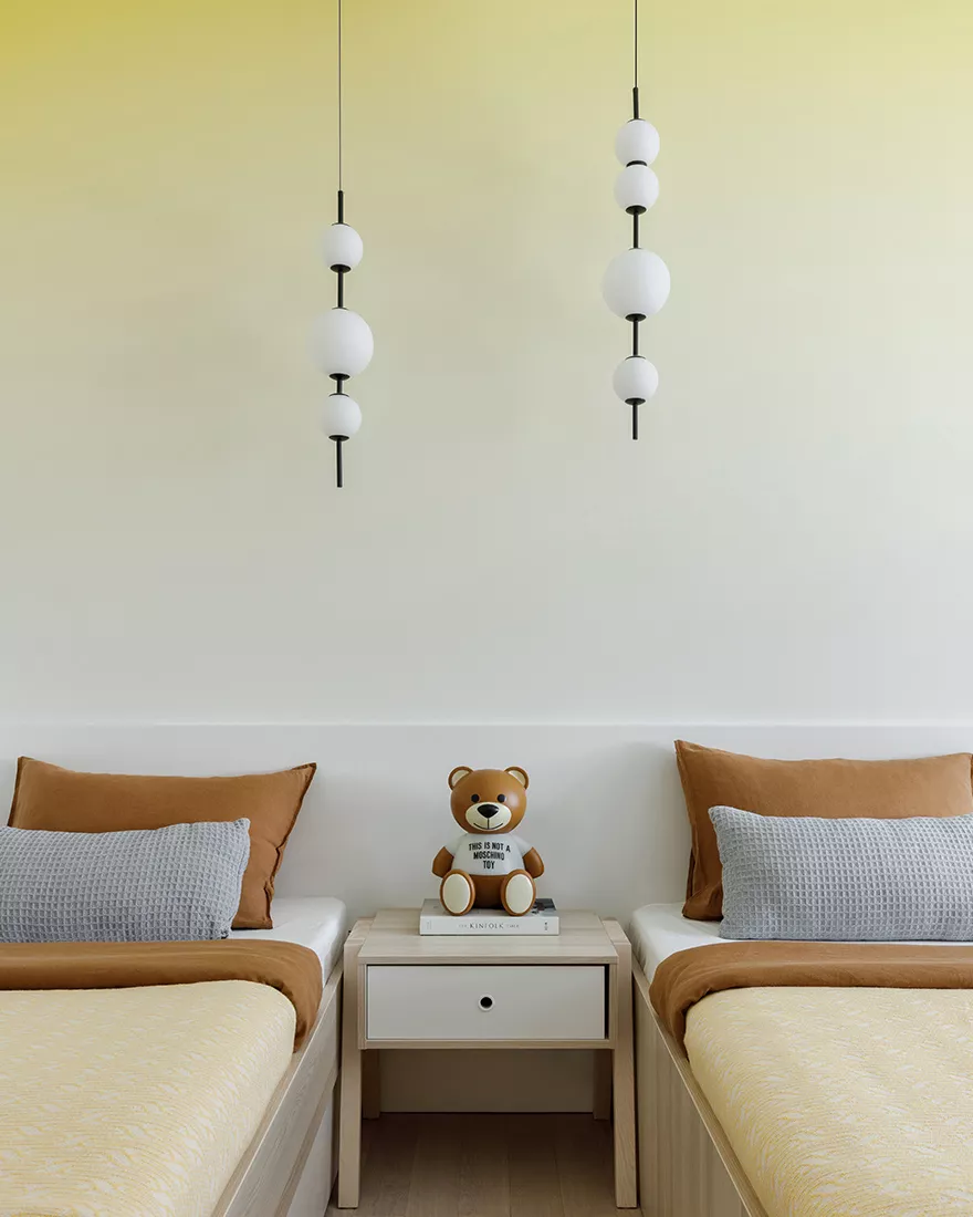
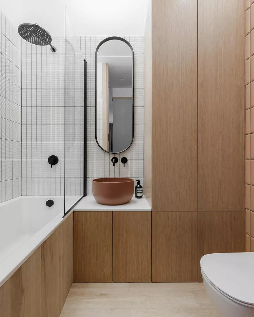
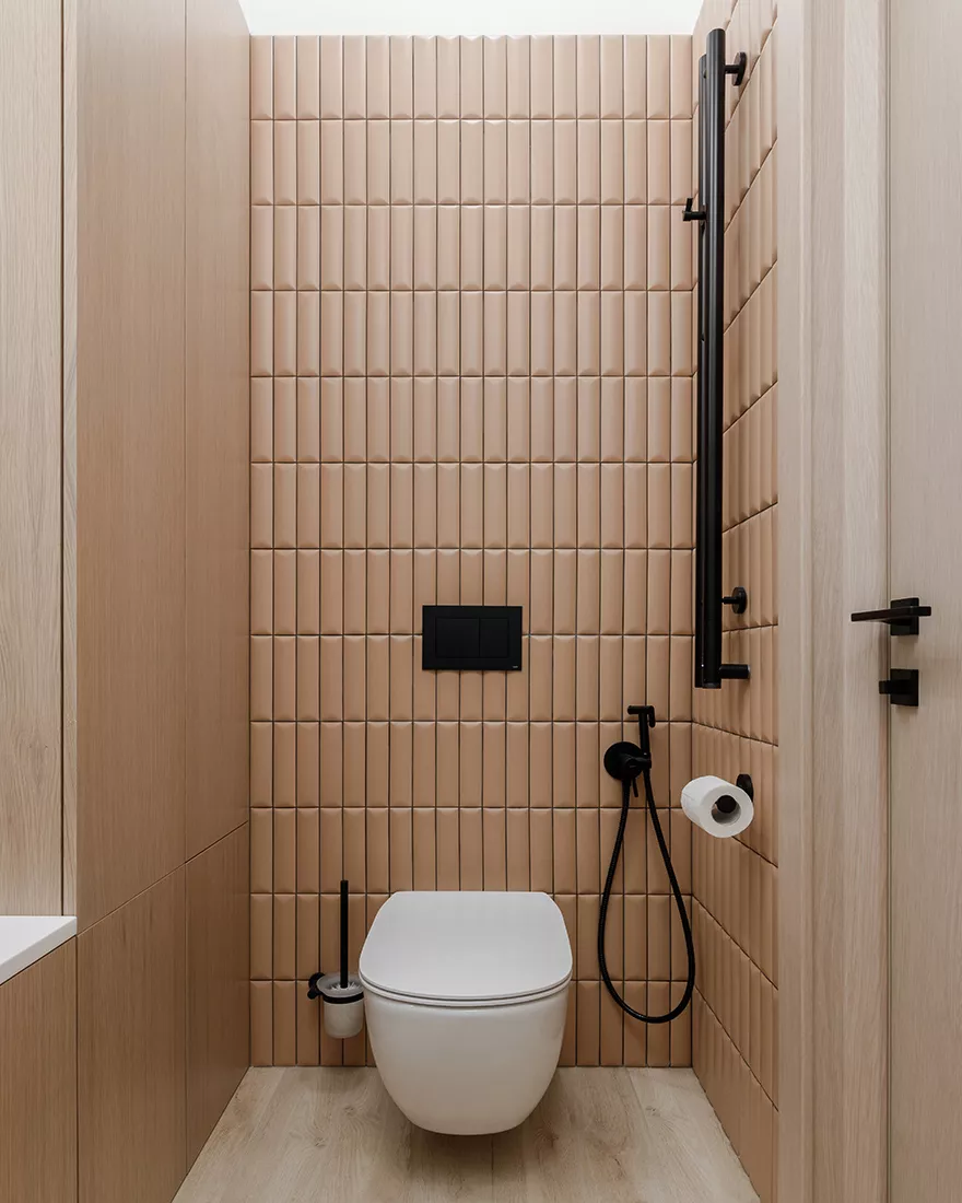
“The kitchen-living room occupies the farthest part of the apartment from the entrance,” said the authors of the project. – The living room with corner glazing is as open as possible in the direction of a magnificent view of the river and a landscaped courtyard park. In general, corner windows began to be widely used in the architecture of constructivism at the beginning of the XX century. This became possible due to the widespread use of concrete structures and the abolition of the role of the facade as a load-bearing element of the building. And, of course, thanks to one of Le Corbusier’s principles – a free facade. This glazing principle has been applied here as well. Other areas of the apartment have ordinary windows. In them, we arranged bedrooms: parents’ and children’s. All rooms are separated from each other by walls with integrated cabinets, which, in addition to functional convenience, creates the necessary sound insulation of the rooms with each other. Along the outer walls of the apartment, there are bathrooms and a dressing room, combined with a laundry room. “
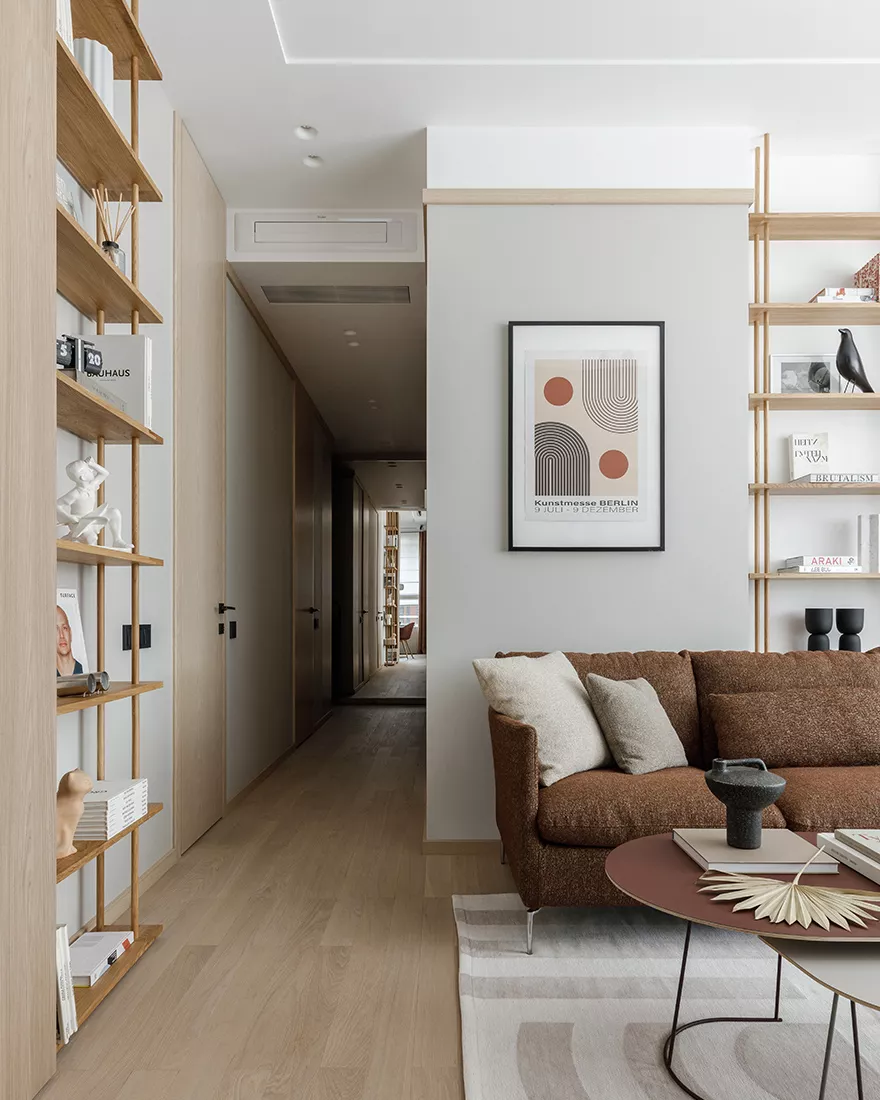
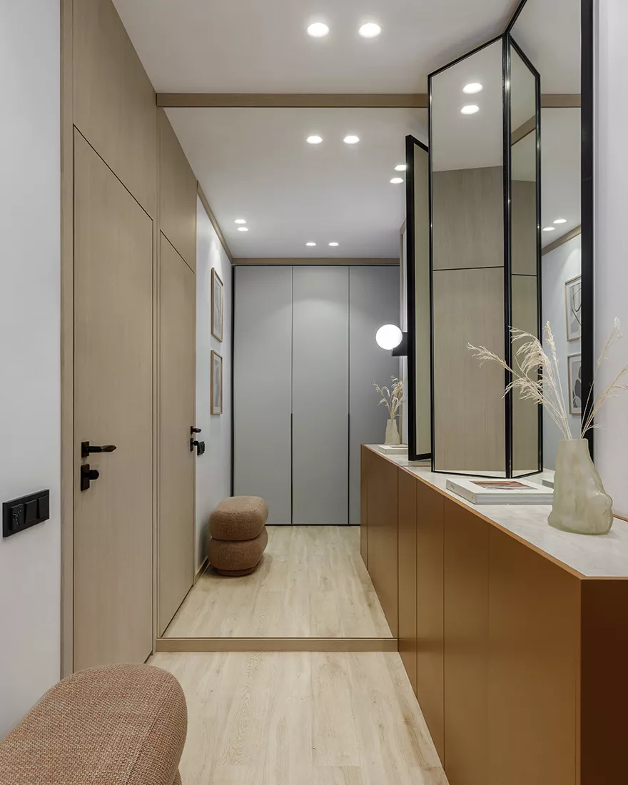
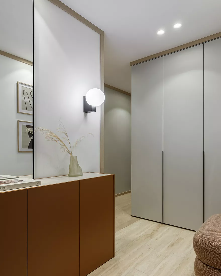
The harmonious proportions of the apartment are largely the merit of the designers, who were able to balance a small area of rooms and almost three-meter ceilings. To do this, the upper part of the walls was allocated with a frieze using a standard plinth, at the same time hiding the height differences in the ceilings where the air conditioning system is installed. The same plinth used to decorate the corners of the walls in the hallway creates the effect of walls in a kind of frame. And the area of the compact entrance area is visually increased by mirrored walls and a mirror cabinet screen.
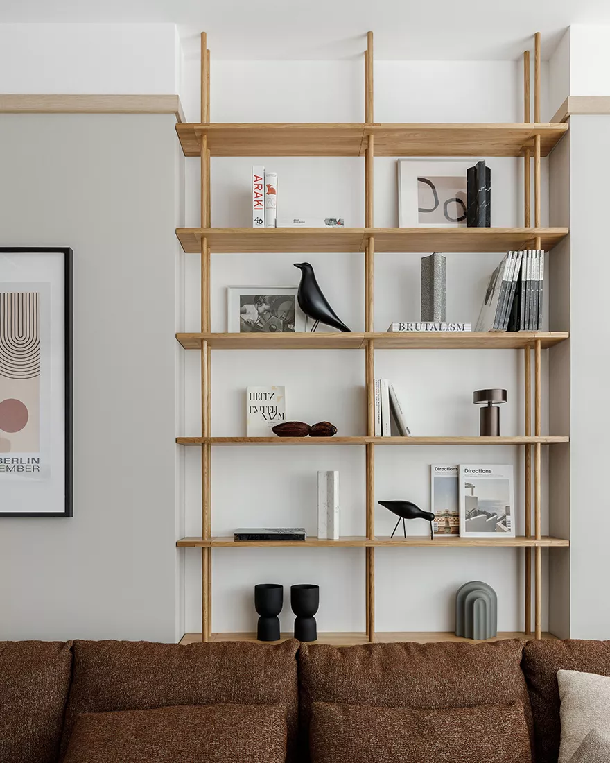
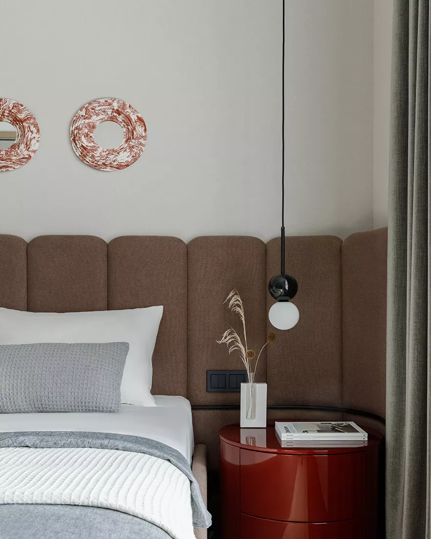
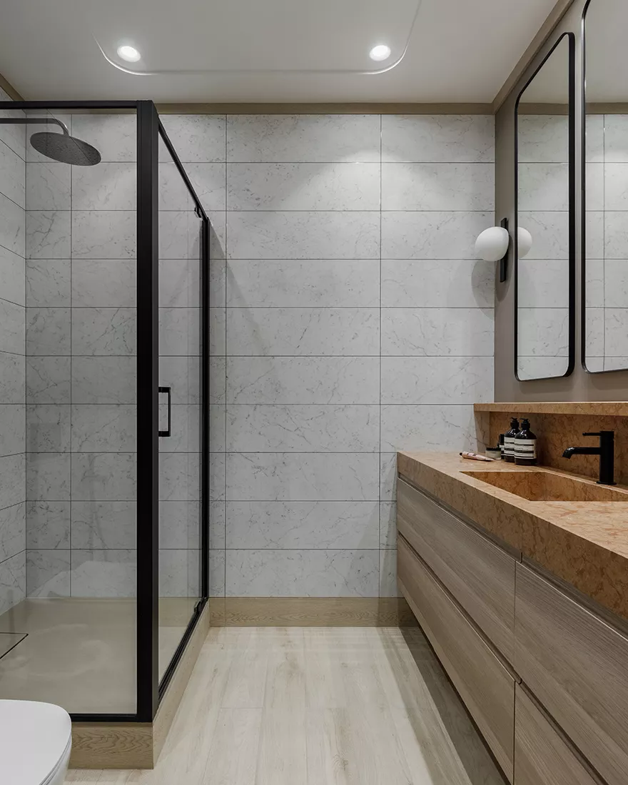
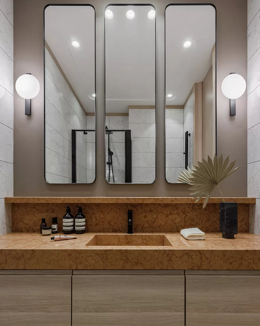
“The interior is designed in the monochrome coloring of the beige-terracotta scale,” said Ivan and Pavel. – We used a palette of natural materials of light shades – light oak and Botticino marble – with the addition of active terracotta colors: this is a dark upholstery fabric and furniture finish, as well as Rosso Verona stone. Such a pleasant combination of materials creates a calm and neutral background for the interior. The soft contrast doesn’t irritate or get boring over time.” Furniture also looks harmonious here – designers say that they chose Scandinavian and Italian factories with a relevant, modern, and clear design. These are a rack in the Foggia living room, Menu chairs, a Prianera sofa, an Ernestomeda kitchen, Caccaro storage systems, a dining table &Tradition.
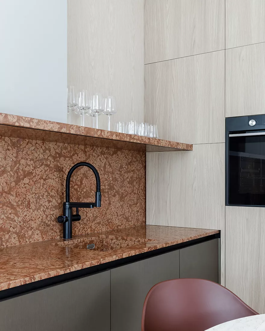
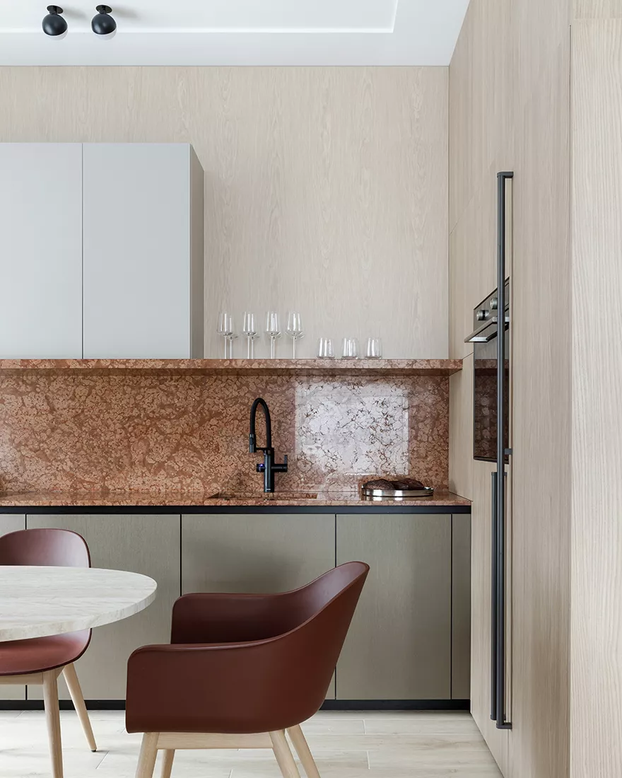
In the kitchen, the eye is attracted by an unusual solution in the form of an inverted letter P: a countertop made of marble, passing into the kitchen apron and an open shelf, above which the upper cabinets are located. “Such a heavy stone structure, connected to furniture, required a jeweler’s precision of installation and the complexity of the design solution. Visually, it seems that kitchen cabinets are on a shelf, but in fact, it is the cabinets that support the shelf. They’re in this tandem, the load-bearing element.”
“We are pleased that in this project we were able to find solutions that allow us to create a cozy interior without using a large number of decor and details. The phrase Less is more became a manifesto of minimalism in design, which was proclaimed by architect Ludwig Mies van der Rohe. The simpler the design, the more expressive and functional it is; every detail should carry meaning. After all, it is the functionality of every detail of an object, material, and even its shape that we call design.”
The most important thing about our X that it is for
those who are in a hurry


