


The most popular shades, successful combinations with other colors, and ideas for each room – we tell and demonstrate how to use pink in the interior.
Many people still associate pink in the interior with acid fuchsia, a house for Barbie, and “a nursery for a little princess.” In fact, it is a complex and unexpectedly versatile color with many shades that can look gentle, elegant, and even brutal. It all depends on what you combine it with. And what are the options, we will tell in this article.
Peculiarities
In psychology, this color has several basic meanings. Firstly, femininity and tenderness, which is why it is so often chosen for the design of women’s interiors, boudoir bedrooms, and dressing rooms. Secondly, it is associated with childhood, tranquility, and security, so it is also great for a nursery. In addition, pinkish shades also have a physical effect: they relax and relieve stress. Sometimes even relieve headaches. In general, this is a universal element of the palette that looks good in both spacious and small rooms, as a low-key backdrop to replace boring base colors or a brighter accent. It can fit into almost any style, with the exception of hi-tech or exaggerated loft. Pink feels especially organic in neoclassic, shabby chic, contemporary, retro, eclecticism.
What color you can combine pink with depends on its variation. Looks best in the interior:
- Salmon, pastel coral, peach, soft rose, and other warm tones with orange undertones.
- Primula, lotus, pearl blush, baby and pale pink, crepe, lemonade – gentle bleached shades.
- Lilac chiffon, lilac, fuchsia, begonia, Persian rose, magenta, lilac sachet – brighter variations with a cold purple undertone.
When choosing companions, remember that pink itself belongs to the warm spectrum. Therefore, if the windows of the room face north and there is usually little sun, complement it with tones at the same temperature. And if, on the contrary, the room is located on the south side, it is better to take cooler shades and combine them with blue, blue, gray, emerald, etc.


What colors go well with pink in the interior
What pink goes best with? It can be both basic and bright accent tones.
White
White can be safely called the most versatile element of the palette: it harmonizes with any color, regardless of its brightness and color temperature. Together with pink, it creates a light, airy, delicate interior. White is most often used as a discreet background, which at the same time visually makes the space larger, while light or dark pink in the interior plays the role of a brighter accent. The less it is in the palette, the richer the tone can be: from salmon to fuchsia. This combination looks great both in private rooms (bedroom, nursery) and, for example, in the bathroom or in the kitchen.
There is another option – to use both tones as a background. In this case, take pastel and diluted variations of pink, which are visually closer to cream or the same white. And in addition to them, you can take any contrasting shades: from brown and black to green or dark blue .


Grey
Another achromat, as versatile as white, but even more diverse with hundreds of shades of its own.
As a result, combinations of different style and atmosphere are obtained. So, together with dirty pink in the interior, gray can look bold and catchy – this is a great option for contemporary or eclecticism with loft elements. And noble mother-of-pearl tones are often used in elegant neoclassicism .


Beige
Finally, another basic element of the palette is classic beige. Like gray, it has many variations: from delicate creamy to denser coffee and sand.
Beige in this case works the same way as white or light gray – it’s a great neutral background. Only due to warmth, the room looks cozier. If achieving this effect is the main goal, especially when the windows of the room facing north, you can leave only these colors in the palette or even enhance the warm range with muted orange, brown or red. If you want contrasts and volume, blue, blue, and mint will look bright and refreshing on a pink-beige background.


Brown
On the one hand, brown is traditionally referred to as neutral base tone. On the other hand, it is quite dense, so without suitable companions it can look heavy and flat.
In the interior, the dusty pink color will go well with any nuances of brown: from coffee with milk to wenge or mahogany. They are visually united by a common warm undertone, even if the variations themselves are quite cold. Brown is best used for furniture, including large ones, and the pinkish range will become both a lighter and more delicate background and one of the colorful shades – depending on what tone you take.


Green
Speaking of popular combinations of pink in the interior, green immediately comes to mind. This combination can rightly be called a classic.
The duet of pink-green shades is so popular for a reason: it combines tenderness and freshness, warmth and coolness, and depending on the chosen tones, it can look romantic, girlish, bright, or elegant. Since both colors are self-sufficient, in this combination it is necessary to correctly distribute the proportions. One must be the leader in the palette, and the second must be additional. If both shades seem too bold to you, they can be diluted with any neutral background: white, gray, or beige. Also, this pair will be successfully complemented by natural brown.
To make the combination look harmonious, select color variations so that they match in temperature. So, for example, the olive will look good with peach, tea rose, and powdery. And emerald or mint – with colder tones, slightly leaving in purple. When drawing up a gamma, draw inspiration from nature with its flowers in the garden or in the meadow.


Blue
Red is considered one of the best companions for blue, but in general, any options from the warm spectrum will do. In this case, the temperature contrast should not be too large.
It is better to take a pinkish tone in a diluted form, a little dusty – it will suit the role of a calm, but at the same time an interesting background and a deep blue will set it off and emphasize it favorably. Next to blue, any options with an orange undertone look great – it turns out a lighter, even pastel version of the red-blue combination. Such a palette is often used in the nursery, especially when the children are of different sexes or you just want to avoid obvious gender clichés.


Orange
Elements of the color spectrum close to each other always look spectacular.
This also applies to the bold combination of pink-orange hues, which can look both quite contrasting and almost monochrome, flowing into each other. At the same time, the palette is bright and very active. In order not to overload the space visually, be sure to balance such a pair with white, airy tones of gray or beige. You can also add some dark contrasts: black, brown, and deep blue.
This combination looks great in the kitchen, as warm “edible” colors create the right associations and stimulate the appetite. If you want to use the palette in the bedroom or nursery, choose pastel colors that are as muted as possible so that the colorful environment does not get in the way of relaxing and giving the brain a rest. This is especially true for young children, who are already quite energetic and often hyperexcitable.


Ideas for different rooms
Due to the large number of shades and combinations, the color can look different in every room.
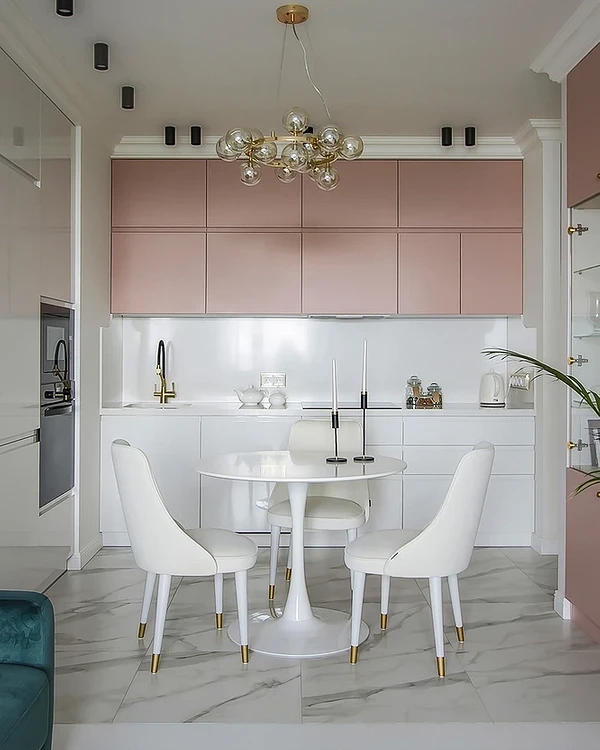
Kitchen
Any warm palette looks advantageous in the kitchen, especially in the red-orange-yellow spectrum – such colors cause appetite and create a feeling of comfort. You can fit pink into this range or choose a more strict, but even more effective combination with achromats: for example, replace white with black or combine with noble gray. In this color, you can decorate walls, a set, and individual small elements: for example, decor, dining chairs, or kitchen textiles.


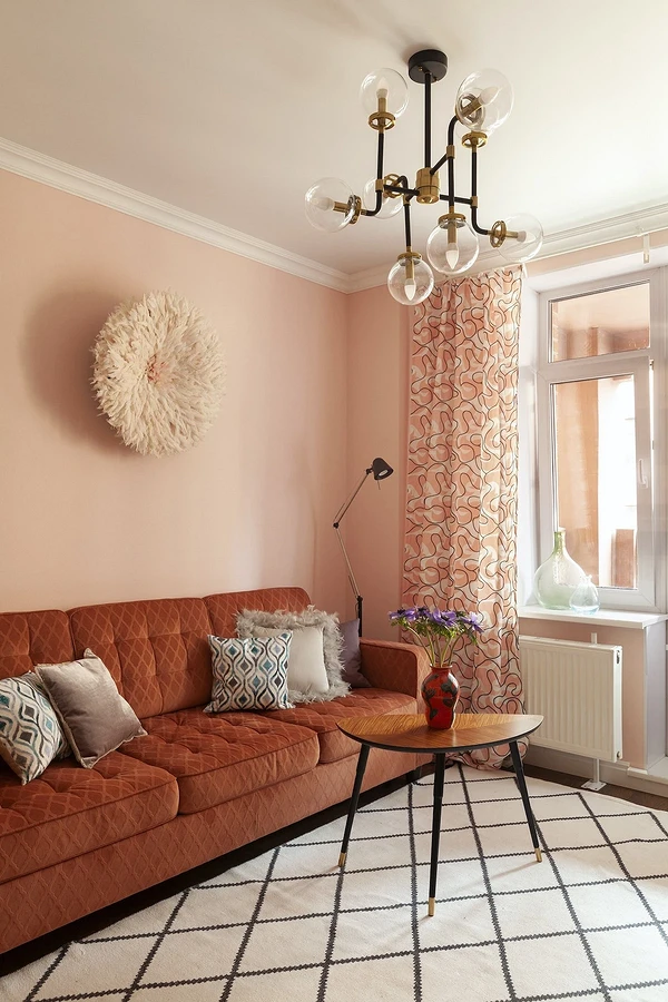
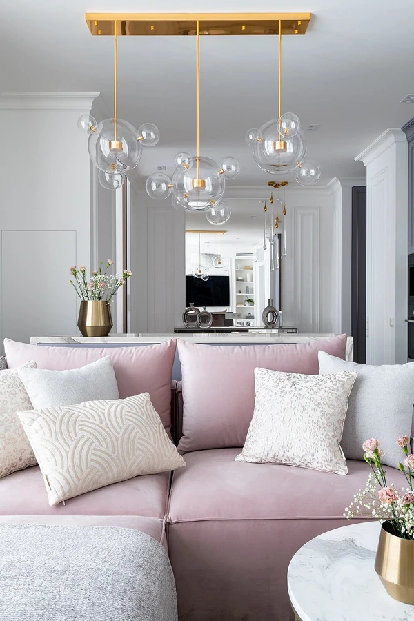
Living room
In the living room, you can safely experiment and not be afraid of bright colors. Make a soft group of blue, mint, purple and pink furniture, add orange or yellow details to the room, and use pastel colors to liven up a neutral background. There are a lot of options for working with a palette in the hall. Choose what you like, and if you still prefer the classics in color design, leave peach, purple, or lemonade for point accents that can be replaced at any time.


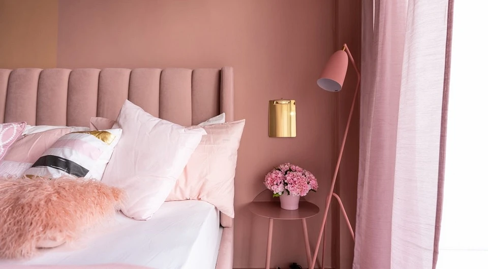
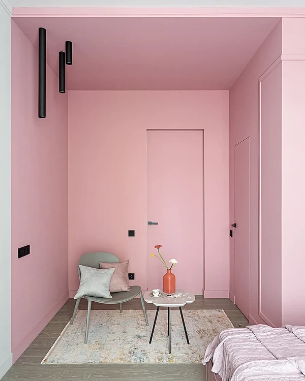
Bedroom
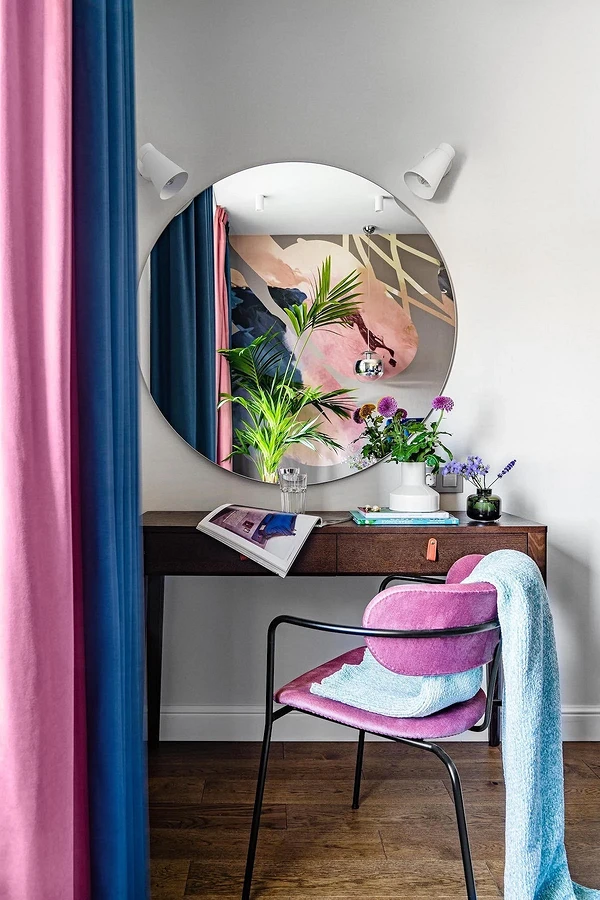
Due to its relaxing characteristics, calming effect on the body, and just pleasant associations, this color is often used in the bedroom. Not necessarily just for women: if you take a neutral dusty shade and combine it with, for example, gray, blue, or brown, the palette will suit both a couple and even a bachelor. Bleached powdery tones are used for walls, and more saturated ones are used for textiles and decor. If you want to create a more unusual and bold accent, you can choose a bed with a soft frame in this color.


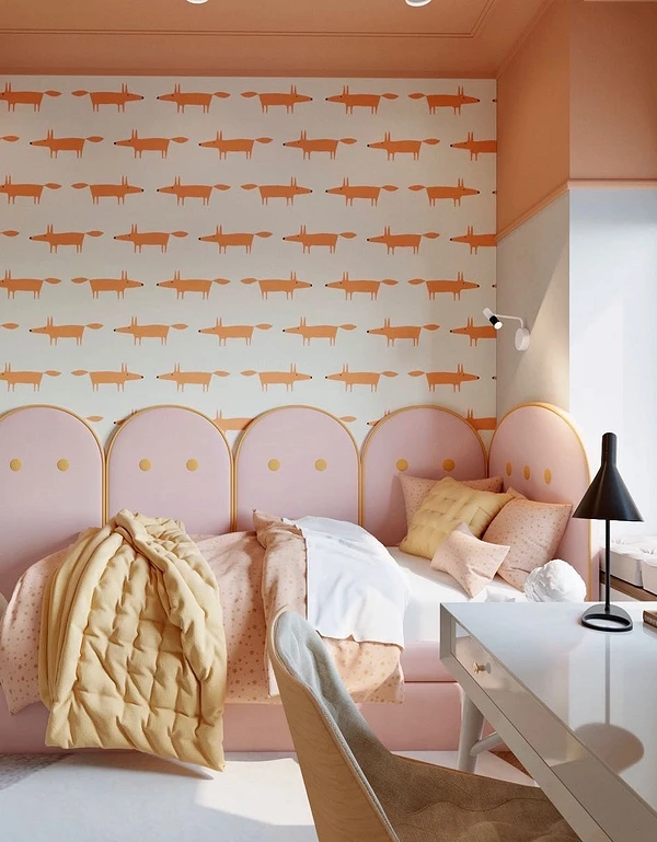
Kids Bedroom
In the nursery, as well as in the bedroom, pink is actively included in the palette. And this is not only a girl’s room: you can use warm or, conversely, colder shades when decorating the interior for two children, as well as for a boy. Salmon, powdery, peach, and other cheerful, but not acidic tones are used for accent walls, large furniture, decor, and textiles. Other elements of the color scheme can emphasize them or, conversely, set them off.


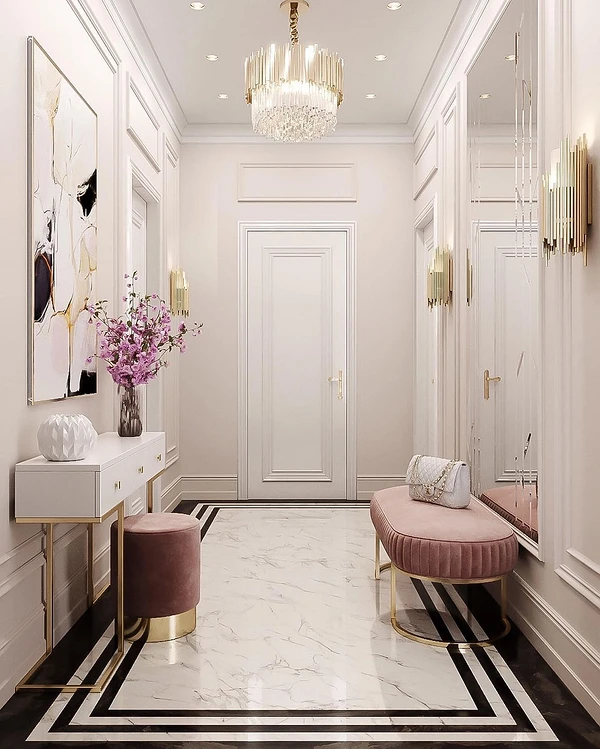
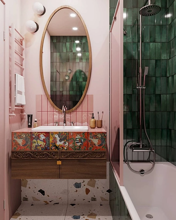
Bathroom
The bathroom is also a fertile field for experiments. It can be decorated in delicate pastel colors or choose several rich colors: for example, lilac and emerald or baby pink and blue-violet. Colored plumbing looks unusual, but you can stay in the field of traditional solutions: for example, use pinkish tones for wall decoration or furniture facades.


The most important thing about our X that it is for
those who are in a hurry


