


What do modern blue curtains and draperies look like? What shades do designers prefer? How do they use such textiles in their projects? What colors go with blue? We’ll tell you about everything.
Light blue curtains in the interior: how much is this solution in demand among designers now, what shades, shapes, and styles do they prefer and how do they combine such textiles with other colors in the room? In this article, we will answer all questions in detail and show photos of the best solutions.
Features and psychology of color

Light blue is considered the color of balance, peace, and relaxation. It is the color of the sea and sky – carefree, clean, light, and airy. It has a calming effect. And, according to some reports, it helps to tune in to work and perform it more efficiently. All this makes this color scheme one of the universal ones for decorating residential interiors. It is used in any premises: from the kitchen to the bedroom. And in different styles: from classic to modern contemporary and minimalism.
Shade Options

Cyan is a mixture of blue and white. Depending on the proportions in which they are mixed, a different version can be obtained: more pastel, or, conversely, bright and saturated.
- White-blue. The lightest, barely perceptible shade. Such curtains will add air to the room, they will look light, almost weightless.
- Blue pastel has a slightly more pronounced tonality. It’s still a very light, translucent color scheme, but easy to see and read.
- Sometimes a third tone is added to the duo of white and blue. For example, turquoise is a color at the junction with green, saturated, bright, and energetic.
- The third can be gray. In this case, a more complex tone is obtained: gray-blue curtains are more restrained, and have a muted shade.
- Heavenly. Azure, clear, reminiscent of the sky in clear weather.
- Violet blue is another complex, multi-component tone. It can be bright, and saturated if you add more purple. Or, conversely, muted, dusty, if there is a lot of white in the composition.


The best color combinations
It seems easy to choose companions for light blue curtains. And partly this is true. There are classic combinations that guarantee success. However, with some paints, this color scheme works more difficult. Consider the most successful options.
With achromats

This is exactly the case when it is almost impossible to make a mistake. Achromats – white, gray, and black – get along well with any other colors, including active and saturated ones.
- The tandem with white reminds me of the marine theme, summer, and warmth. This is a duet full of air. It looks optimistic, energizes, uplifts, and gives a feeling of lightness, and coolness. Curtains in light blue tones will look advantageous against the background of white walls and set off light-colored furniture and flooring. The combination options are almost limitless.
- A duo with gray, unlike the previous version, gives the effect of restraint, stability, balance, and soothing. It is not so contrasting and saturated, but elegant and noble. The proportions in this case can be any. For example, the whole room can be designed in gray tones, and blue can act as an accent.
- With black. Perhaps the most daring and even slightly dramatic decision. Black can be used as an accent wall in a room, or it can be chosen as a flooring color. Blue, depending on the shade, will play the role of a bright accent or, if it is muted, harmoniously shade and add light.


With shades of beige and brown
This combination is in the spirit of the modern desire for naturalness, and environmental friendliness of living spaces. What could be more natural than a duo of sand and marine colors? At the same time, beige and brown often act as a base and background.

This combination is often chosen for interiors in the style of modern classics. Refined, and elegant, it is able to decorate and refresh the space. This duo is especially well suited for northern rooms, where cold, grayish light comes from the street most of the time. Cream, beige, and brown in this case will add warmth and adjust the cool palette.


With red, green, and blue
Green, red, blue – all these colors can “make friends” with light blue. But it is important to maintain the proportions correctly.

- Shades of red and orange are active and saturated in themselves. It is better to use them in doses, for small pieces of furniture and furnishings, textiles, and decor items. Then they favorably emphasize the curtains.
- Green can be both bright, active, and dusty, muted. In the first case, it is better to follow the same rule as with shades of red and orange. Green is quite suitable as a background and can be used for large surfaces.
- An interesting, monochrome combination can be obtained with blue options. Blue paints can be used even on large surfaces, for example, to paint walls. Interestingly, the blue curtains in the blue interior look very intimate, as in the first photo. It turns out a deep, monochrome space.


Light blue curtains in the interior of different rooms
We have already said that such textiles are quite versatile and suitable for any room. But there are features.
Light blue curtains in the interior of the living room

Usually, curtains are selected in an already finished interior, when the key palette is formed and understood. Therefore, the shade of textiles must correspond to the overall tone. The living room as a public area in an apartment or house, a place for receiving guests allows the use of bright, saturated colors. If the room is designed in neutral colors: beige, white, gray tones – take a closer look at the active options: turquoise, aquamarine, heavenly.
In this case, it is not at all necessary to use the classic technique – to select curtains for decorative pillows or other decor. The living room allows you to experiment. If you are not yet confident in your abilities, try using shades that differ by one or two tones. So the space will become more voluminous and deep. The same goes for prints and textures. They don’t have to be the same. The main thing is that they do not argue and do not interrupt each other.


Kitchen
It is believed that shades of blue muffle the appetite. For some, this will be a plus, but if such an action is embarrassing, add red and orange tones to the interior, they have the opposite effect, awakening the feeling of hunger.

Light blue in the kitchen can have other advantages. It brings a feeling of coolness. And in the kitchen, where they often cook, especially if it overlooks the sunny side, it is often hot. Then “cold” textiles will add psychological comfort. Especially if you combine it with a light base – the color of the walls and furniture.


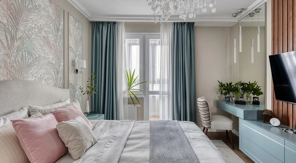
Bedroom
It is important to create a comfortable, relaxing, calm atmosphere here. To help – muted, dusty, complex shades: pastel, with a gray or purple undertone. In this case, the base can be either light or dark.

Bright colors are best introduced in fragments and dosed, as small accents. At the same time, pay attention to the density of curtains, they should protect well from sunlight. Even light blue curtains can do a great job if the lining is made of blackout fabric.


Kids bedroom
The same rules as in the bedroom.

But since the kid’s bedroom is often also the place where the schoolchild’s desk is located, cold tones that tune in to the working mood turn out to be very useful.


Curtains in light blue colors: fashion trends
Window textiles, like any other interior elements, are subject to fashion trends. What was popular a few years ago may look outdated and out of place today.

What solutions are designers using today? Here are some helpful ideas.
- Simple forms. In most design projects, you will see concise, understandable, fairly strict forms of curtains. This is due to the desire for minimalism, which has remained relevant for several years. Sophisticated, and richly decorated with flounces, ruffles, and fringe, the canvases remained only in interiors with emphasized style. For example, in traditional classics, some rustic styles.
- Complex, multi-component colors. These are dusty, muted shades or deep, saturated ones. Unambiguous pure colors are less common. And in the case of light blue, they can give the effect of a kid’s bedroom.
- Matte fabrics. A light, unobtrusive satin sheen or noble velvet is allowed. But more often, designers use curtains made of matte fabric, dense or translucent.
- Two and even three in one. Bi-color and tri-color textiles remain popular. Shades can be either close relatives, then a gradient effect is created, or quite contrasting. Colors can change each other horizontally or vertically. They are used in equal proportions, or one acts as the main one, and the second as an edge.


