


Beautiful shades, successful combinations with other colors, and use cases – we tell you how to create a stylish and noble interior in light blue tones.
Sea, sky, fresh air – a light shade of blue evokes the most pleasant associations, helps to relax and enter a state of peace. It looks good with a variety of colors, adds lightness to the space and visually makes it more spacious. In this article, we will show inspiring photos of blue interiors and tell you how to use this noble shade correctly.
Variety of shades
Light blue belongs to the cold spectrum and has many different shades. Only in the Pantone palette there are about a hundred blue tones: from darker ones with hints of gray and purple to almost white, with an admixture of green and mint.
Consider the best colors for interiors:
- White-blue is the lightest pastel tone that is suitable for any room. Due to the fact that it is diluted with white, it can also be used on a large area: for example, for wall decoration.
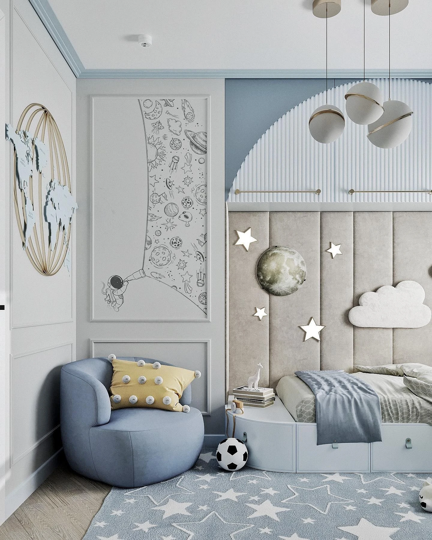
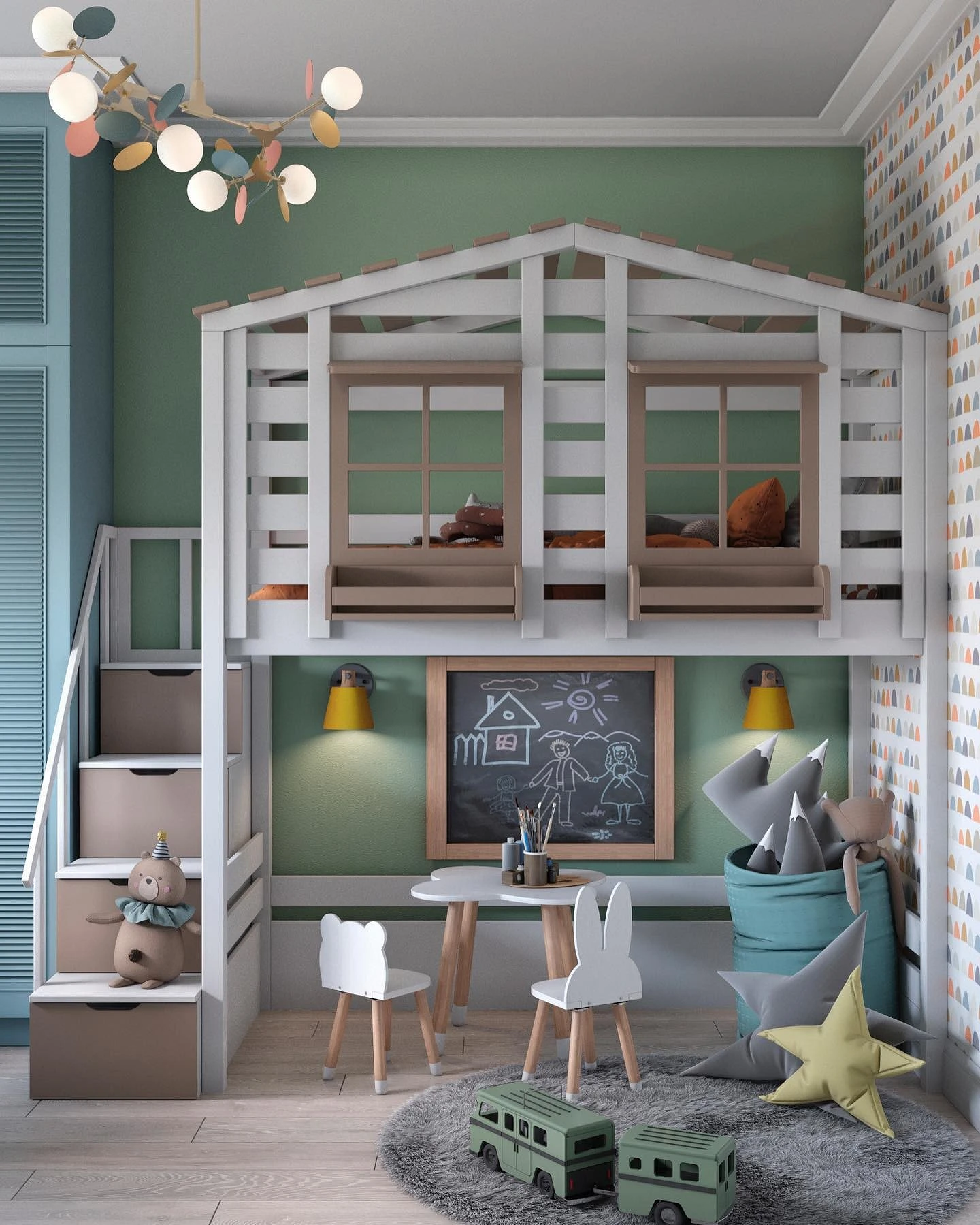
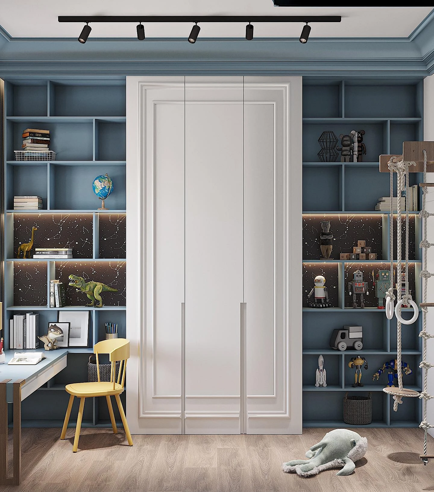
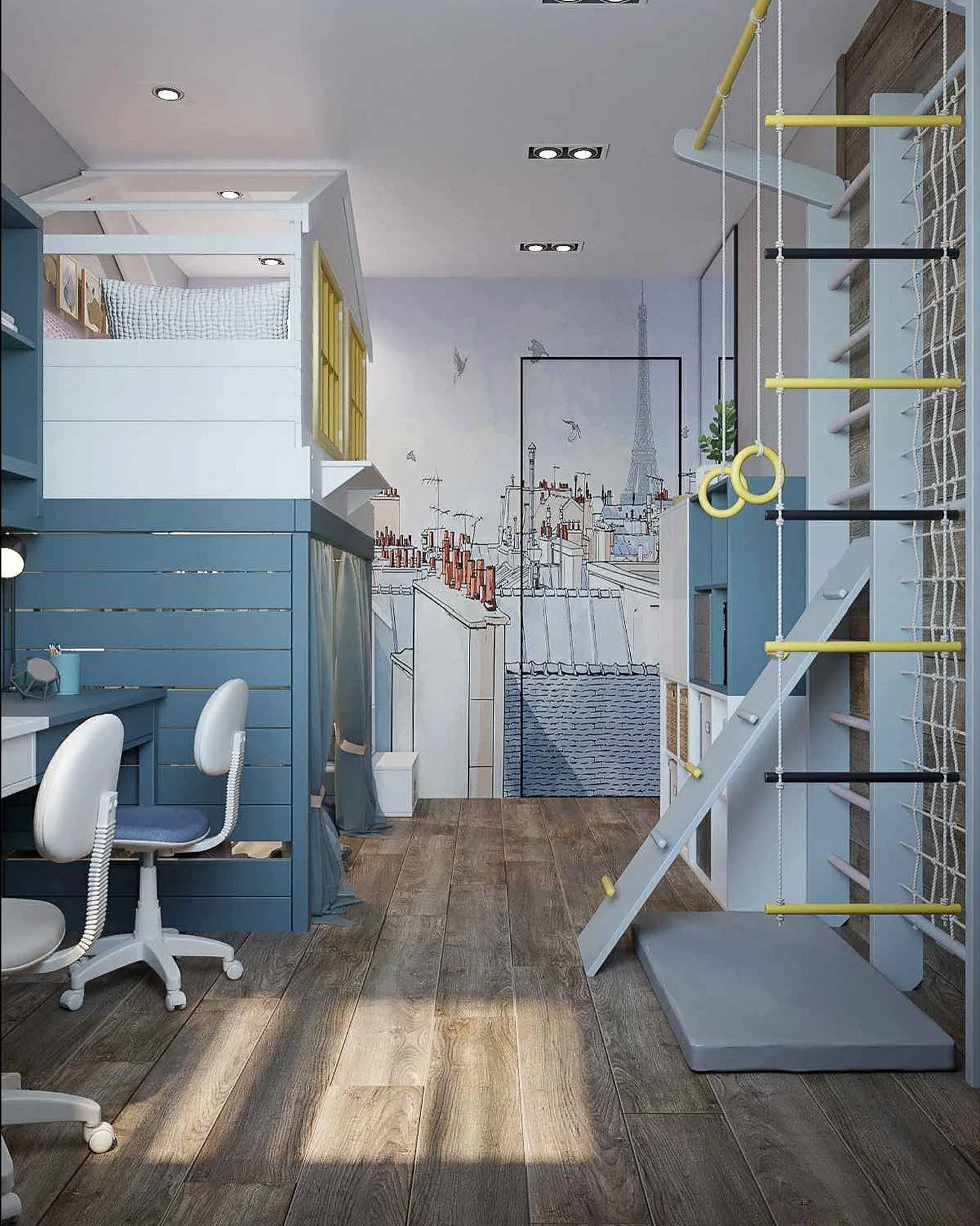
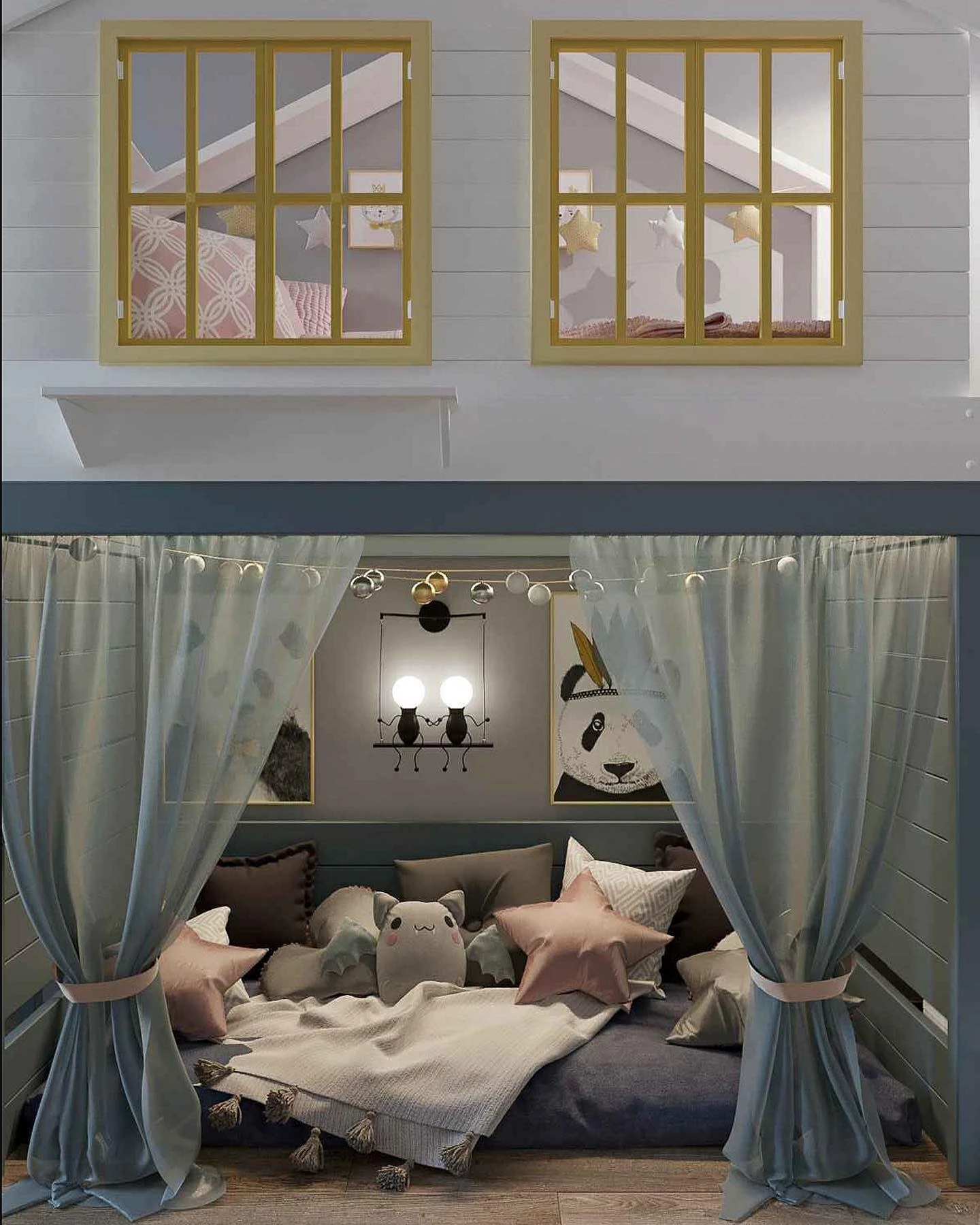
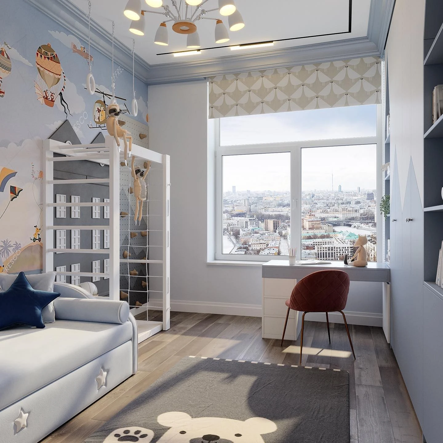
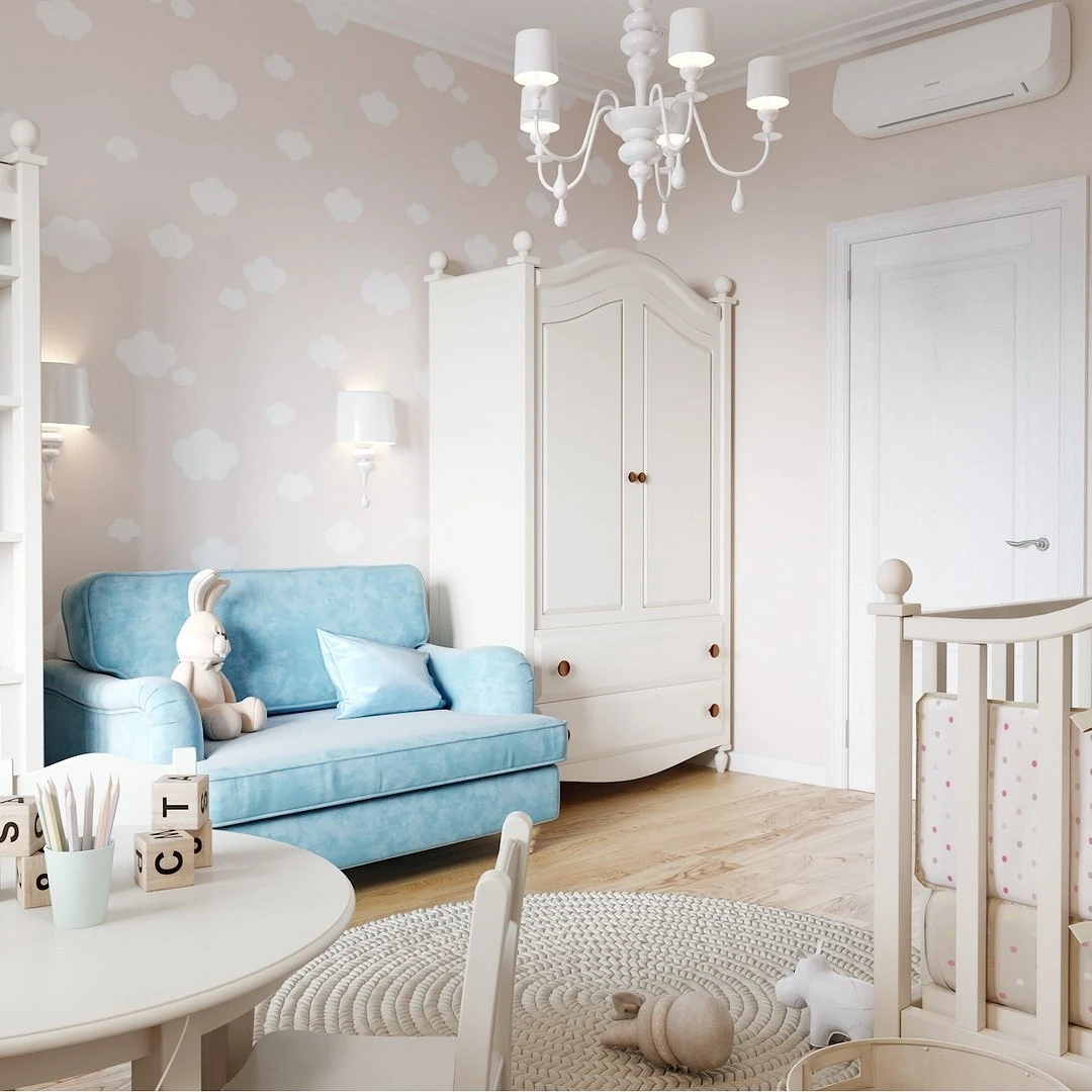
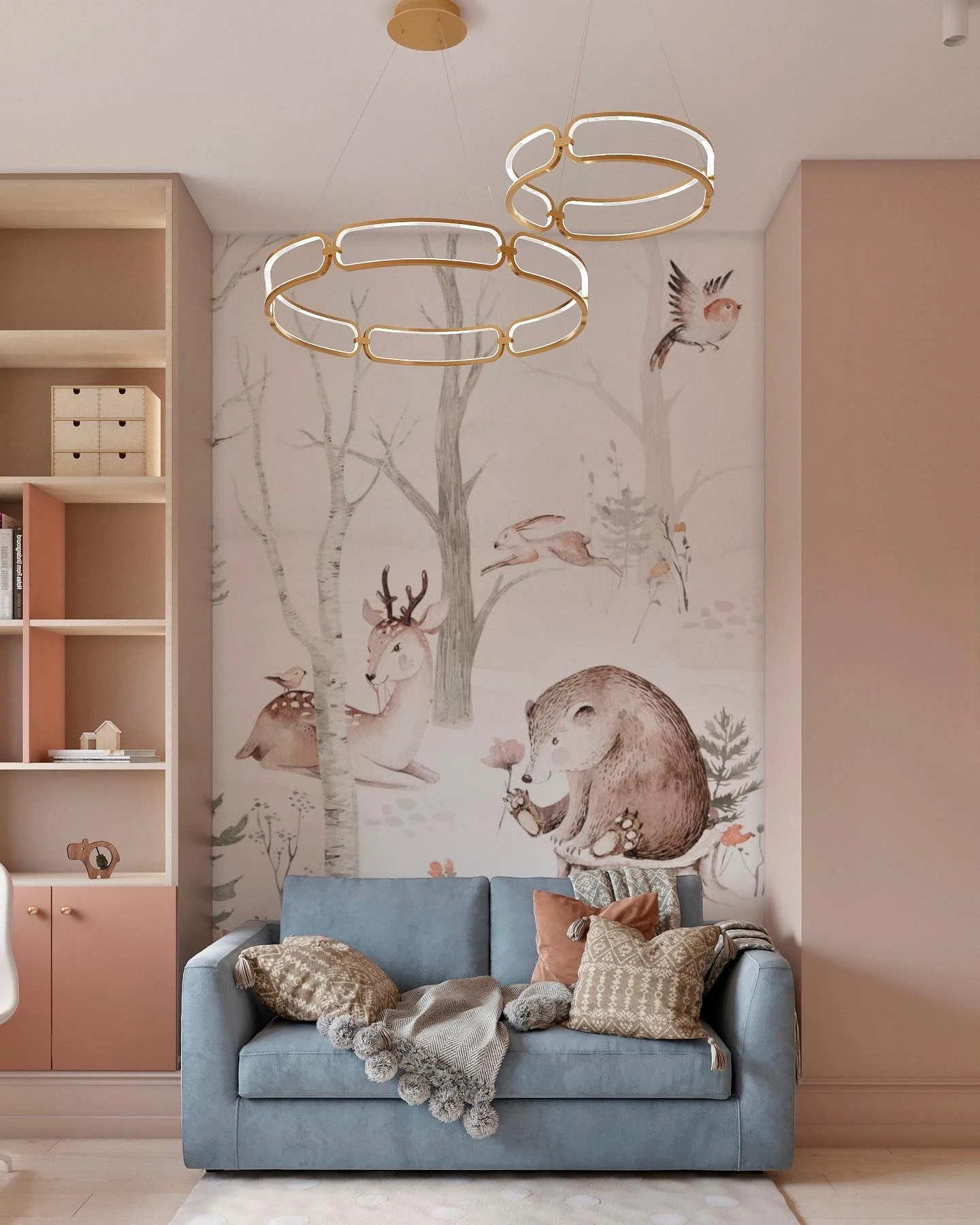
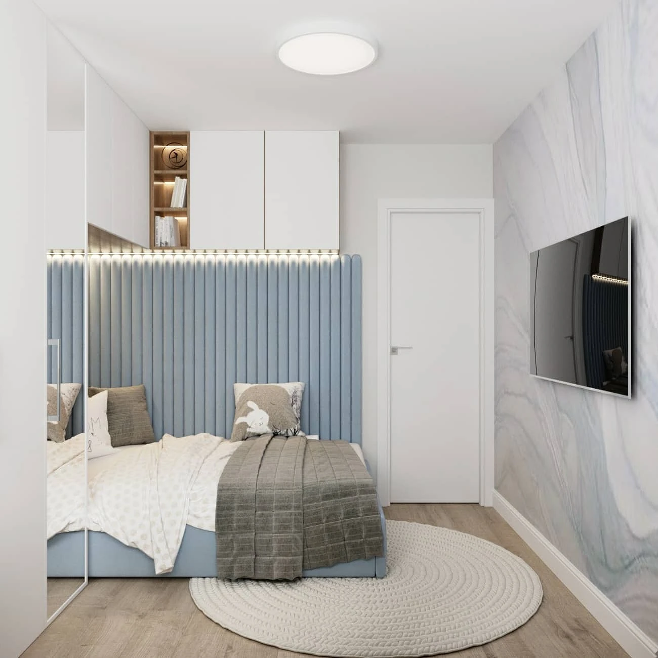
- Children’s is another bright and calm option with a slight lilac tint.
- Sky – a more saturated tone, is considered a classic blue tint. Looks good in the form of bright accents.
- Aquamarine is a bright and saturated color with a pronounced green undertone.
- Turquoise has a green bias but is a little darker and denser.
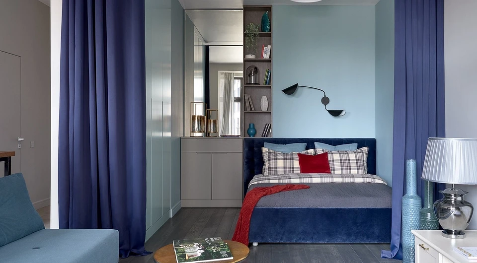
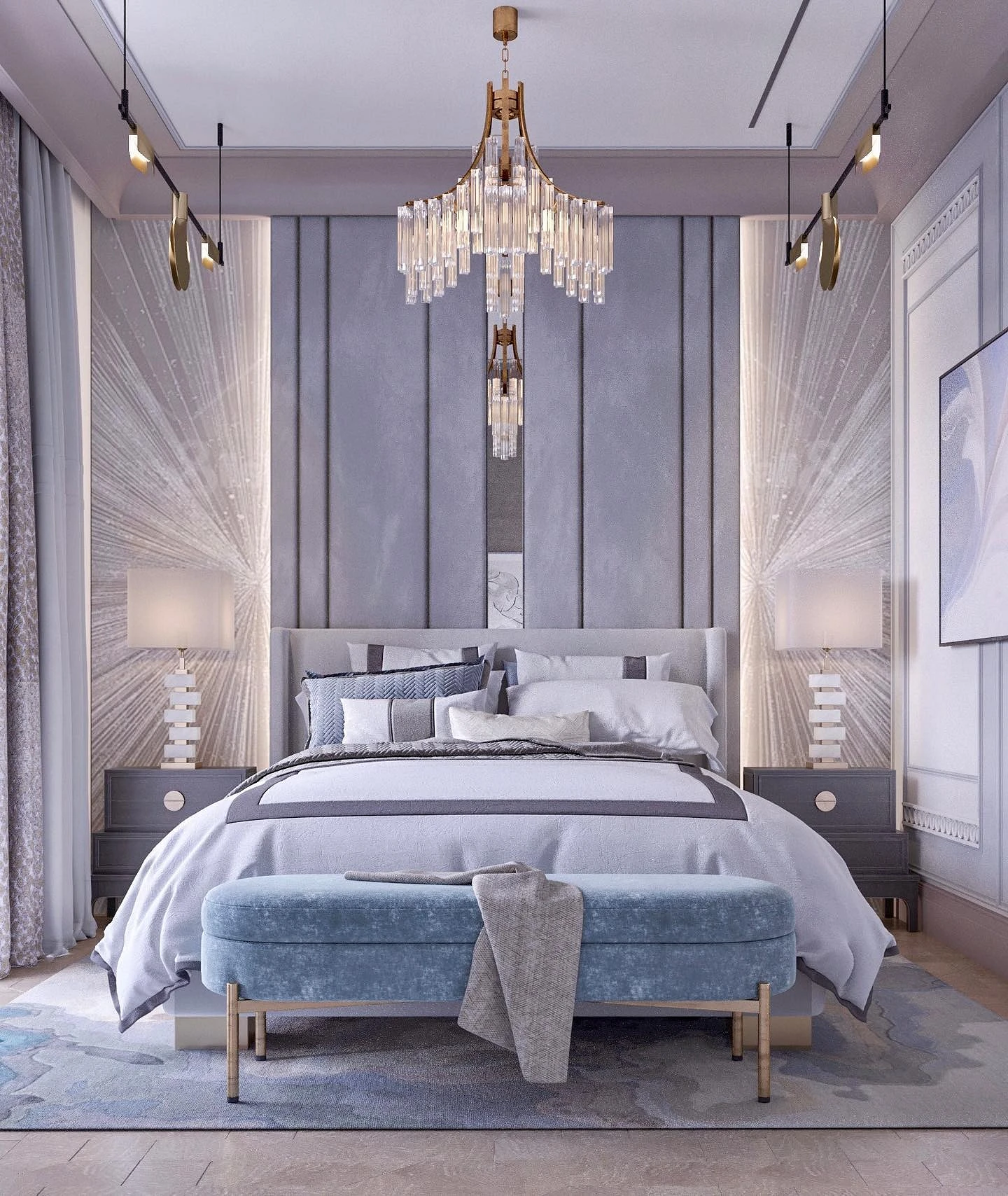
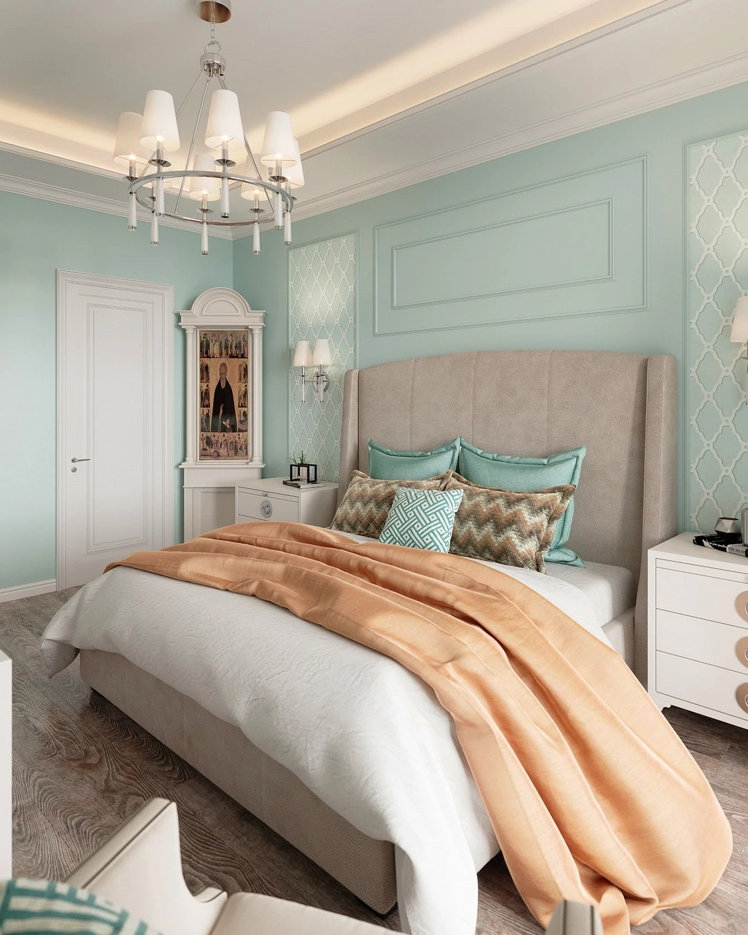
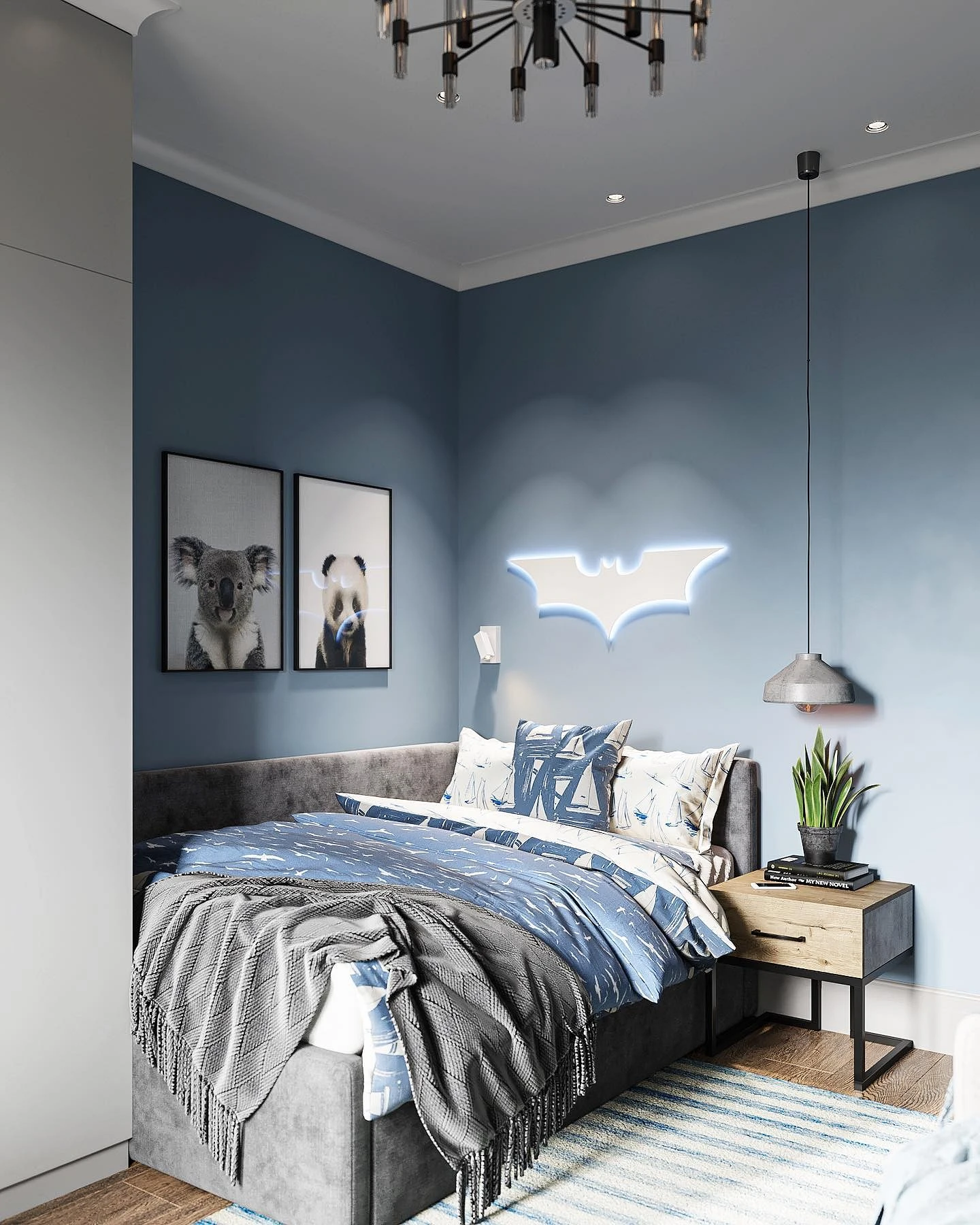
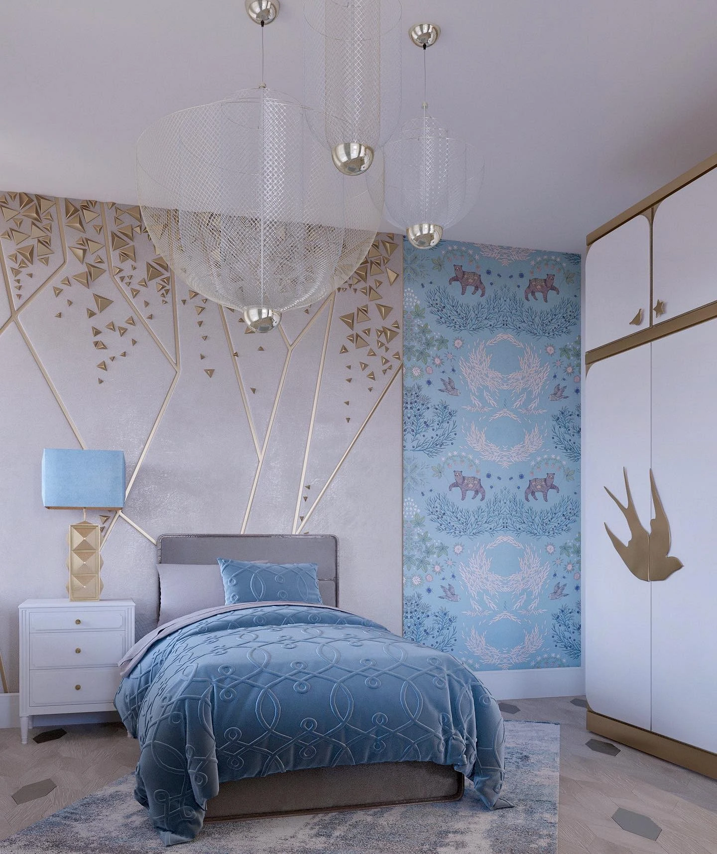
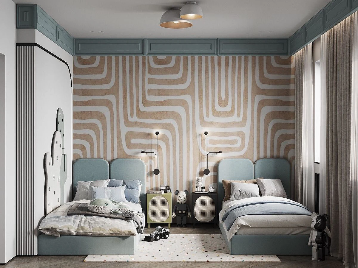
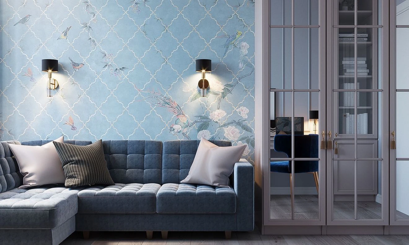
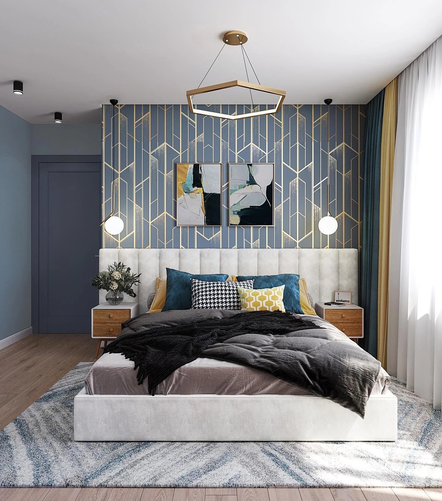
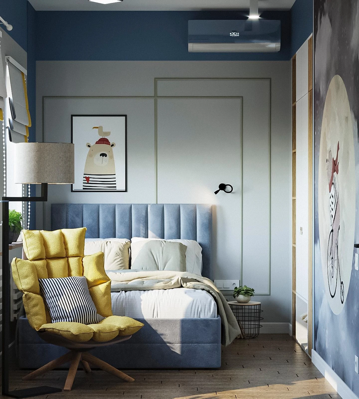
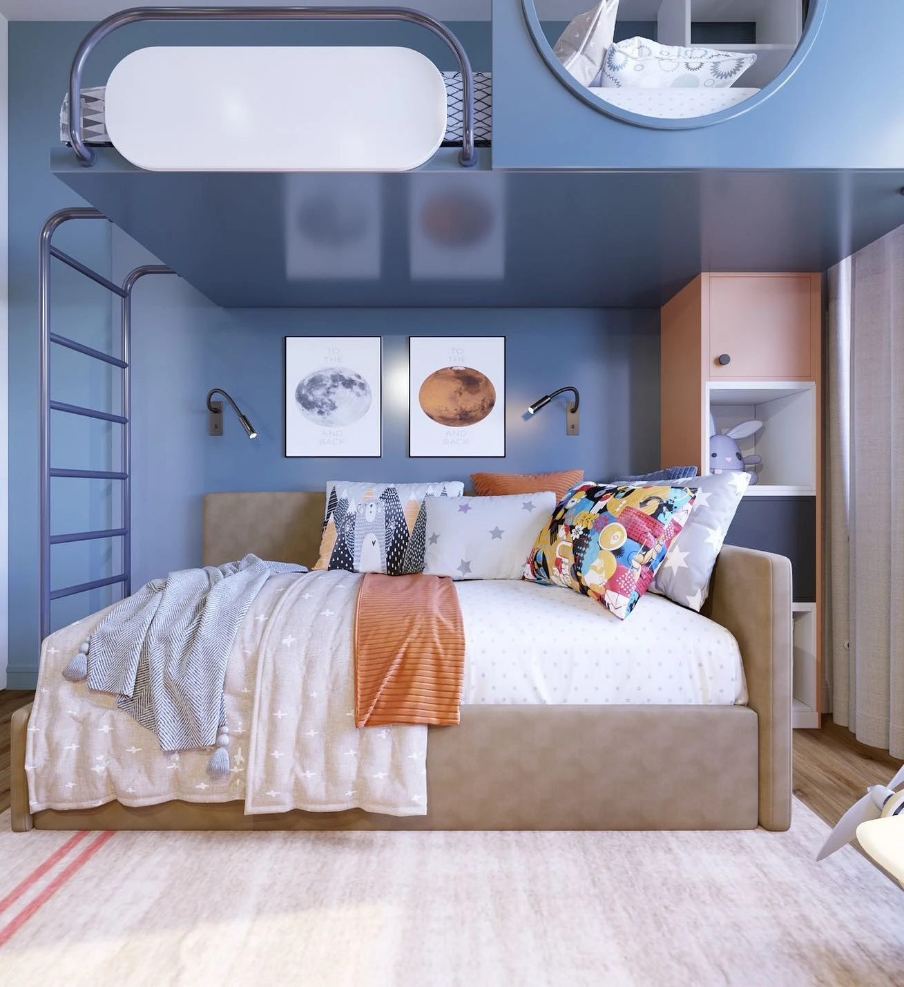
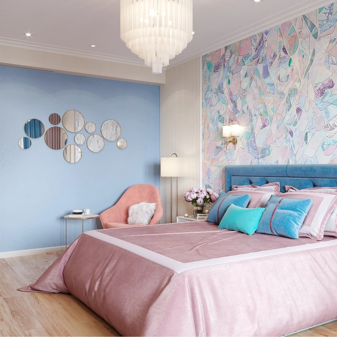
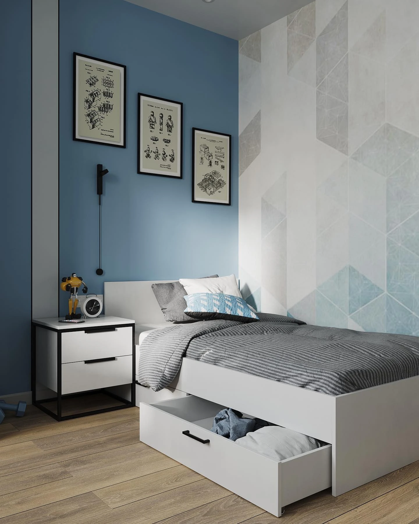
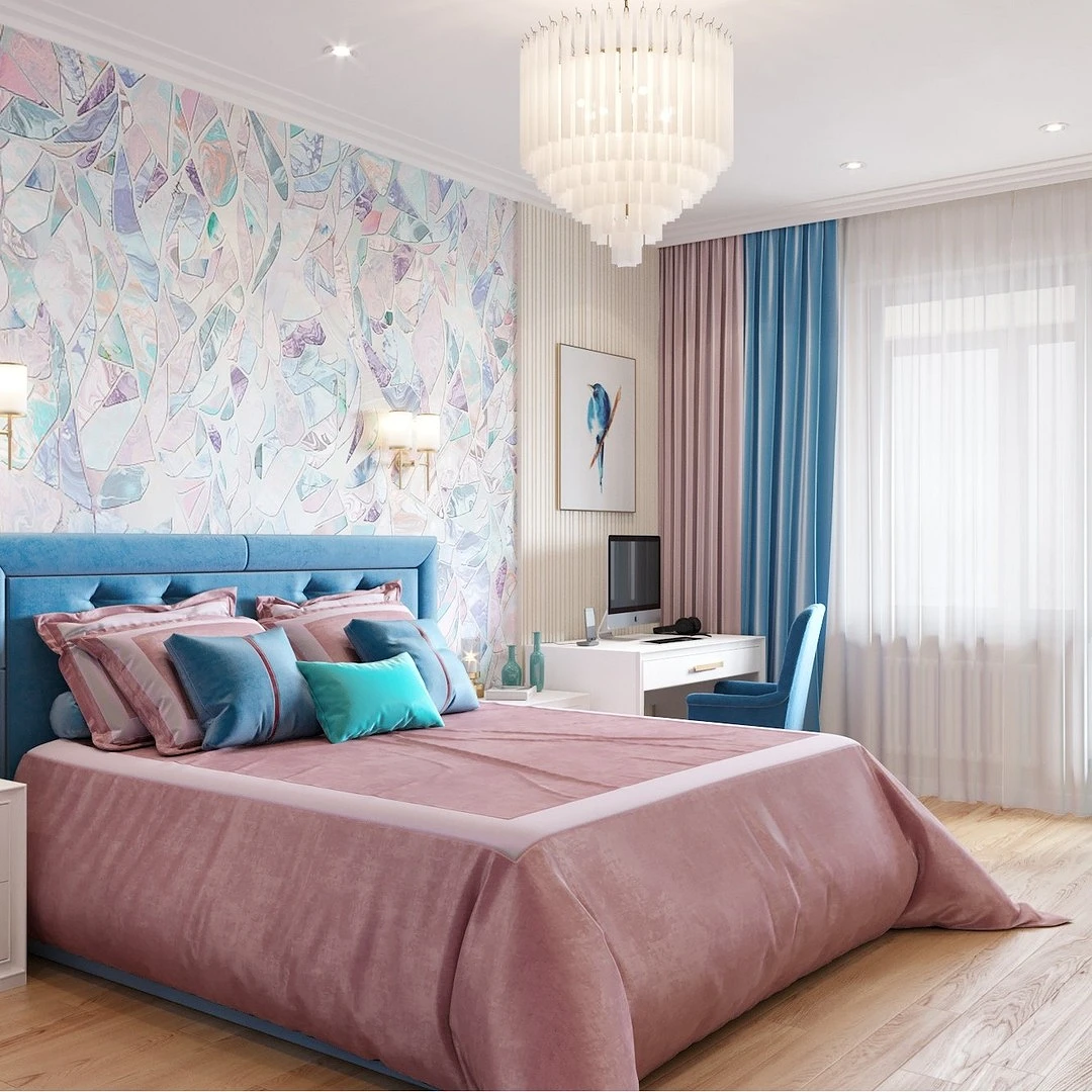
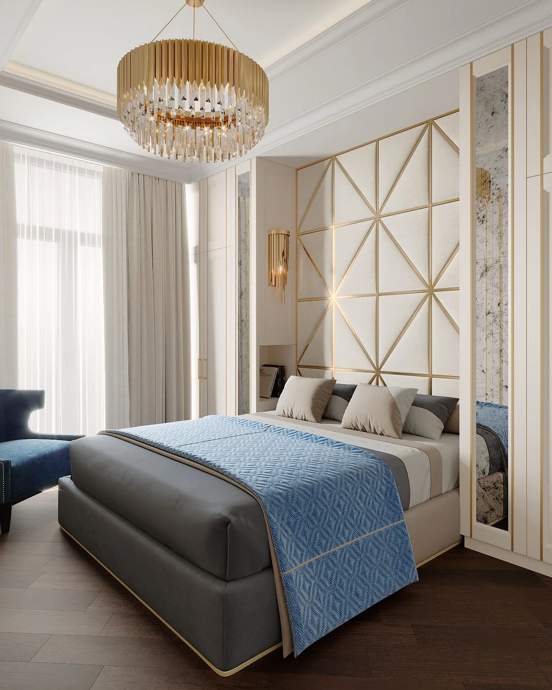
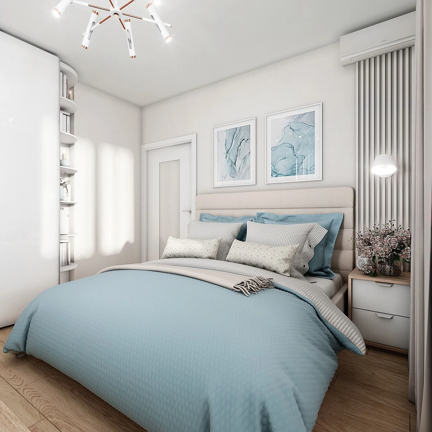
- Cornflower blue is a deep, rather saturated nuance of blue with a blue-violet bias. Often used in the bedroom, where you want to create a chamber atmosphere.
- Azure – visually resembles heavenly, but is more active. This is what the surface of the ocean looks like at tropical resorts.
- Dusty – a muted tone based on gray.
- Pervenche is a beautiful light color with purple undertones. Reminds of violet petals.
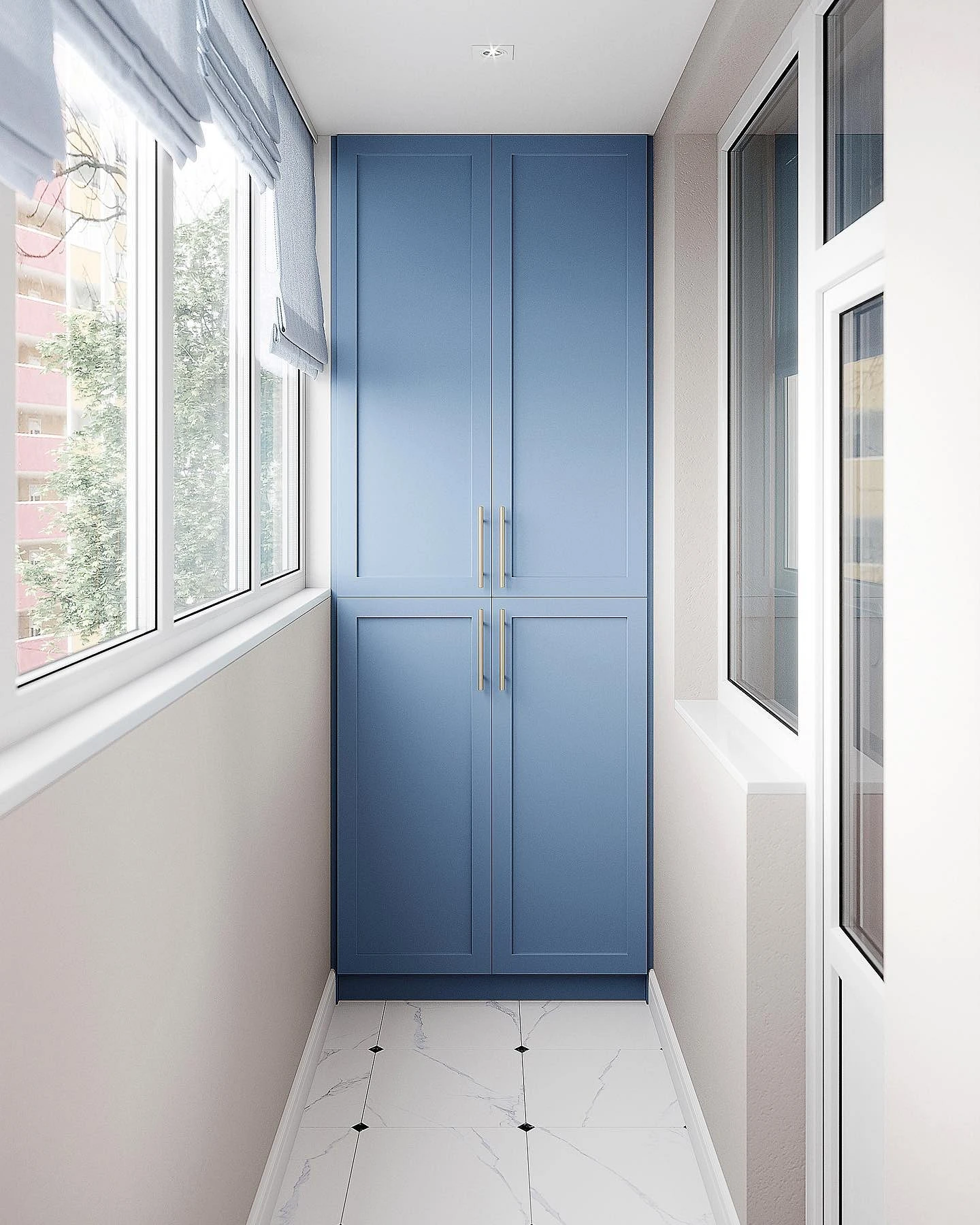
- Denim is a shade of classic jeans, dark enough, so it is often used locally as an accent.

The combination of colors with blue in the interior
Consider what blue colors in the interior combine best.
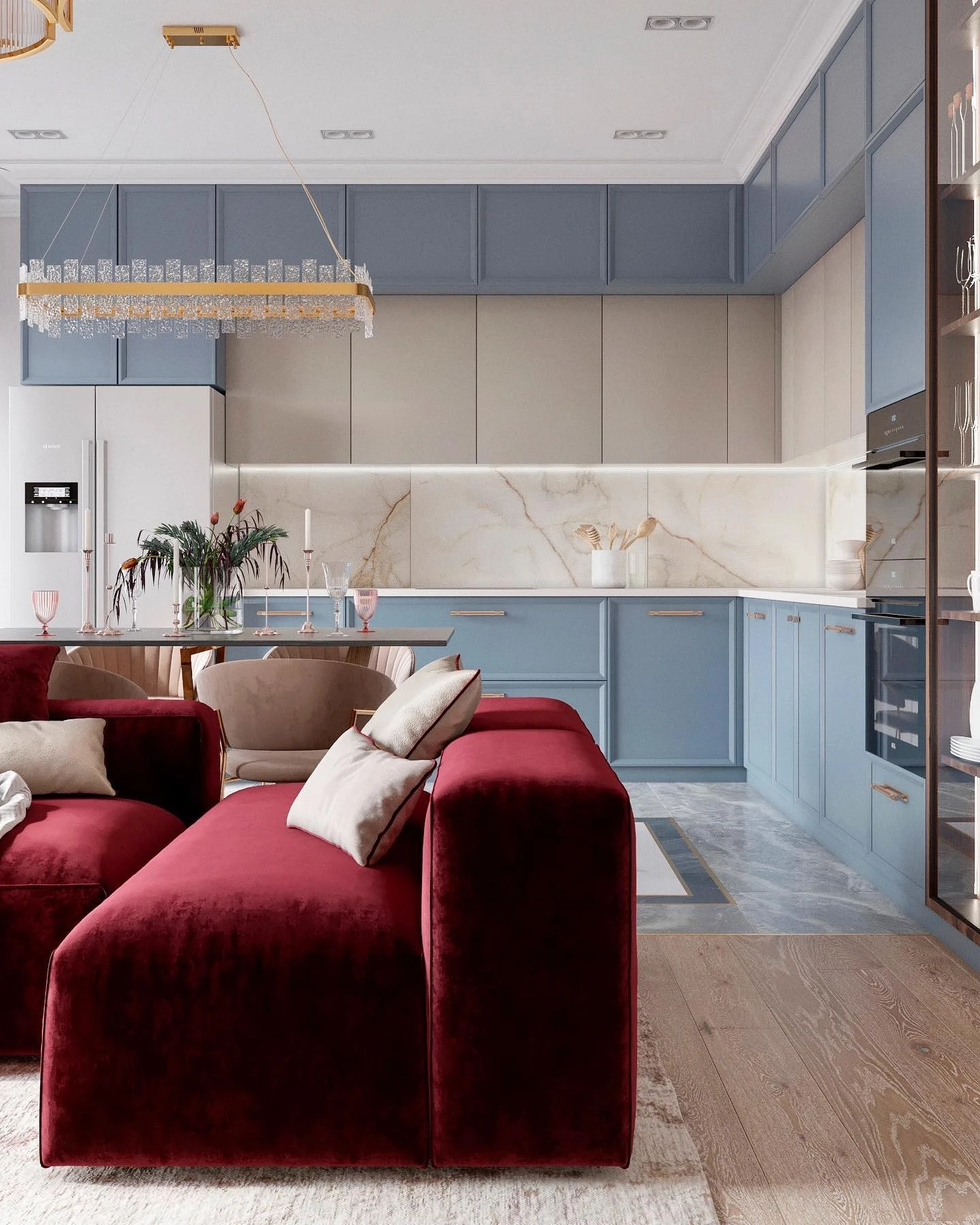
With beige and brown
The blue-beige combination is characteristic of nature (sea and sand, sky and soil), therefore it is pleasing to our eyes.
It is a calming and balanced combination where the coolness and freshness of blue are balanced by warm neutral beige or light brown. If you combine rich cornflower blue or denim with deep chocolate, you get a completely different atmosphere: a refined, thoughtful, chamber.
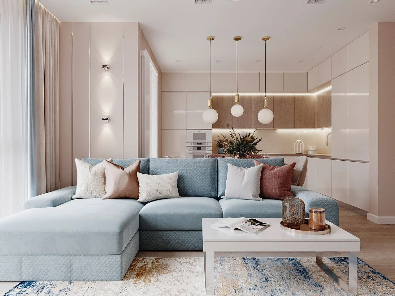
Beige and light blue look equally good in all variations: cream walls and accent details, or, conversely, blue wallpaper in the interior and sand furniture. To add volume to such a palette, dilute the pastel pair with darker contrasting details: dark gray, black, and brown.


With achromats
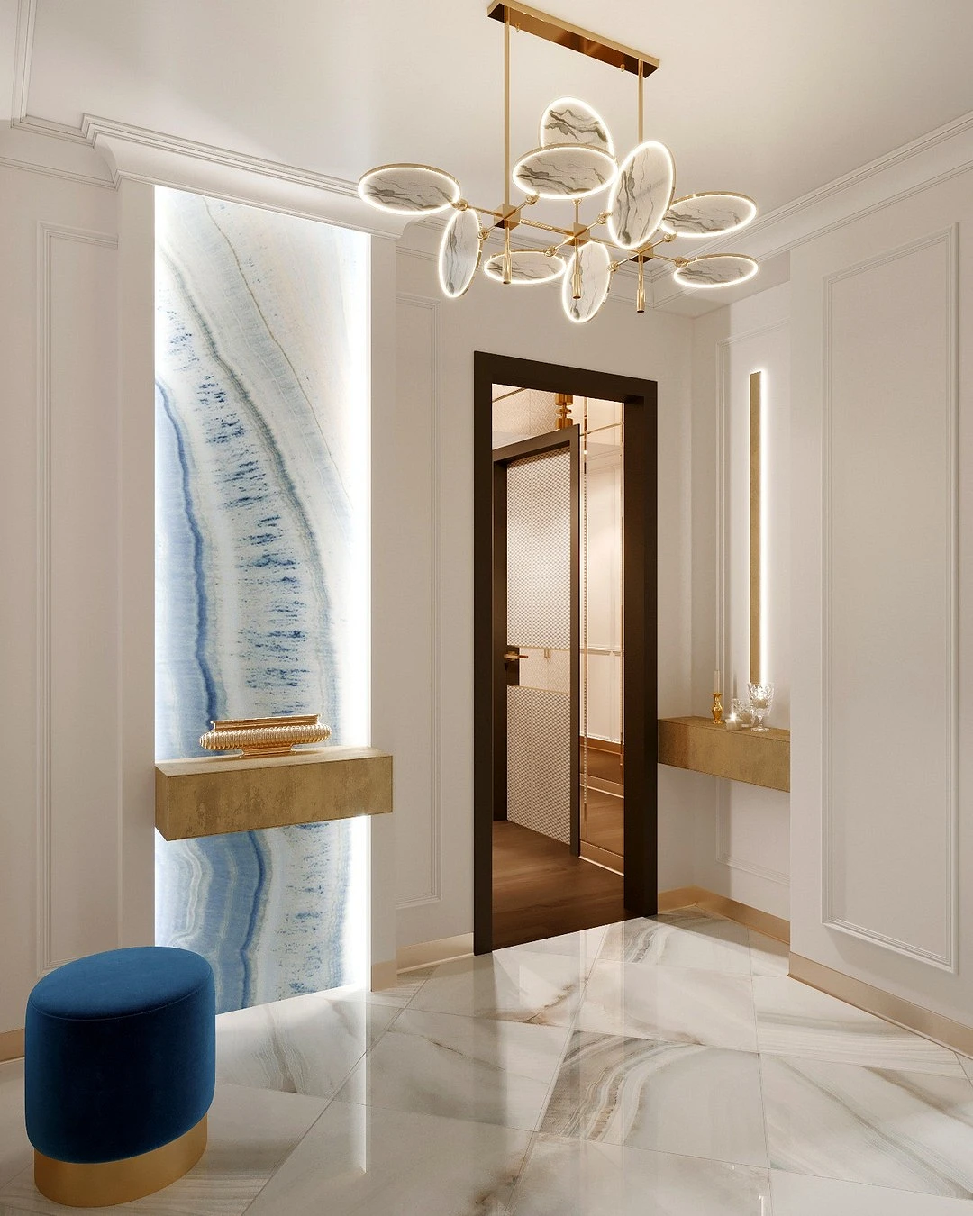
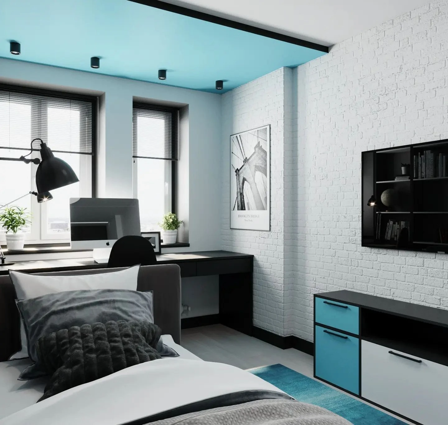
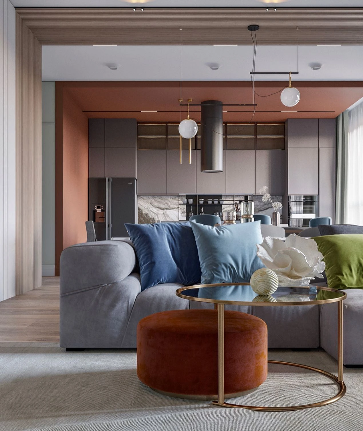
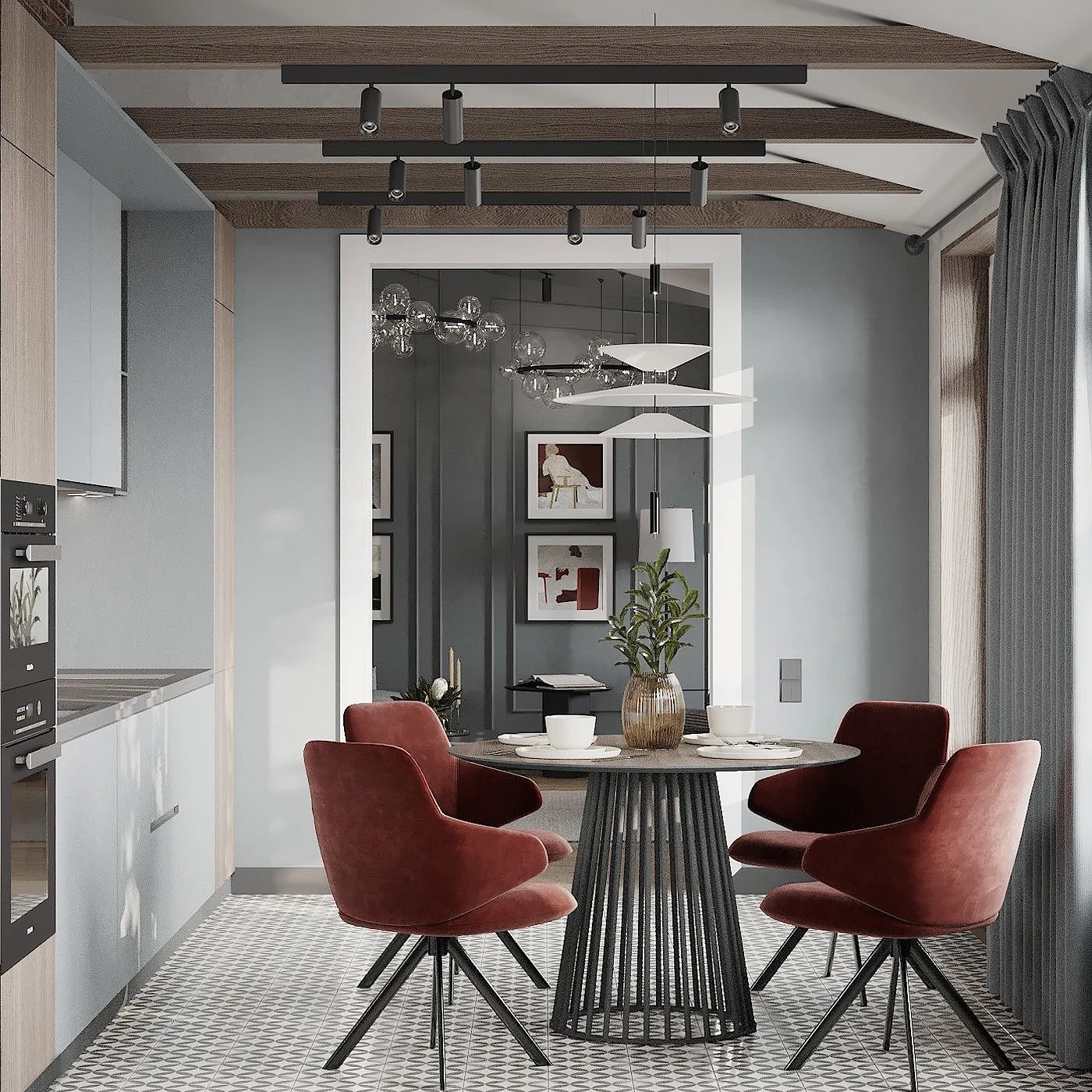
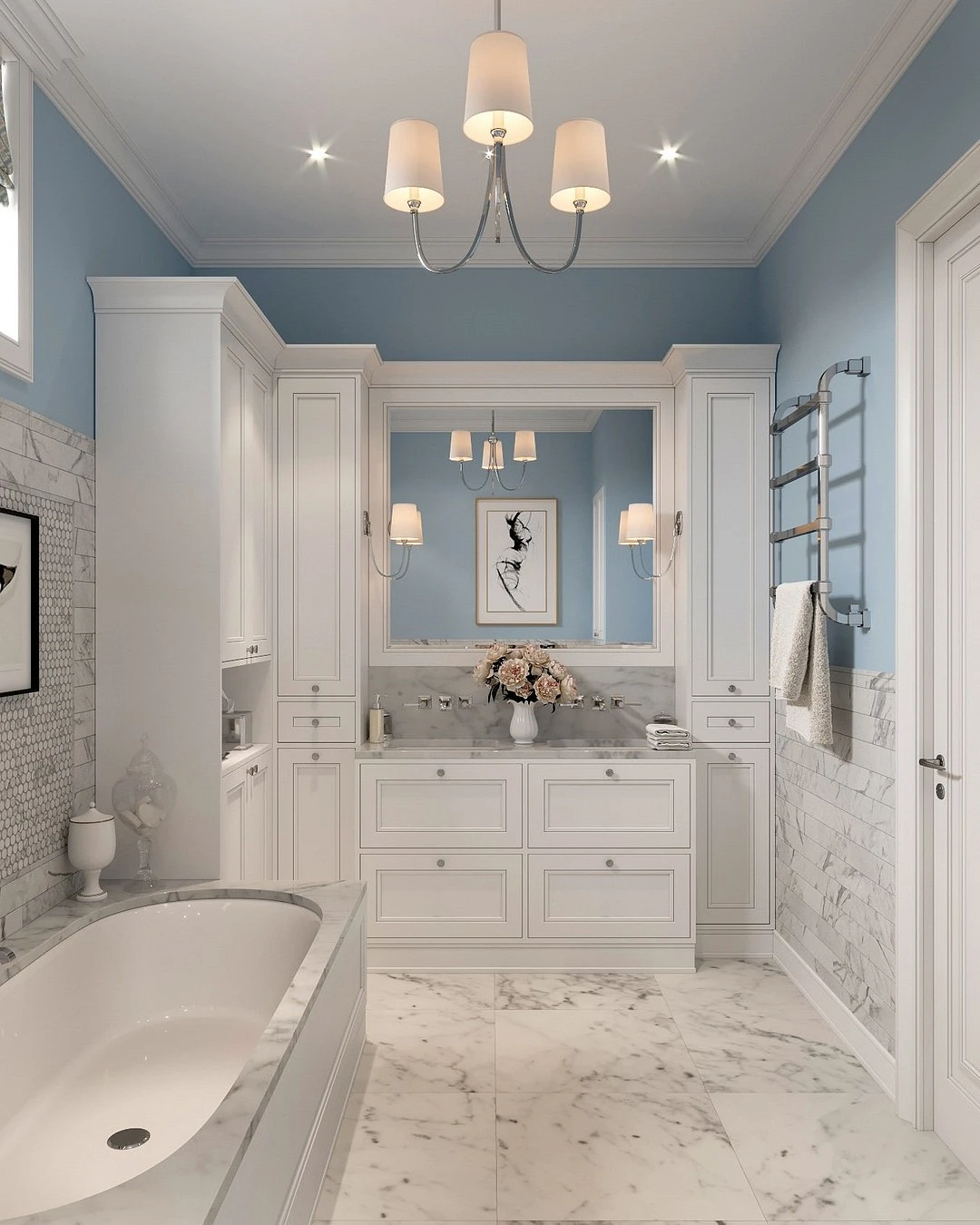
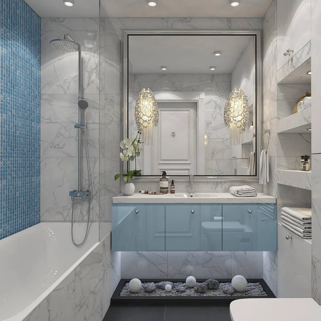
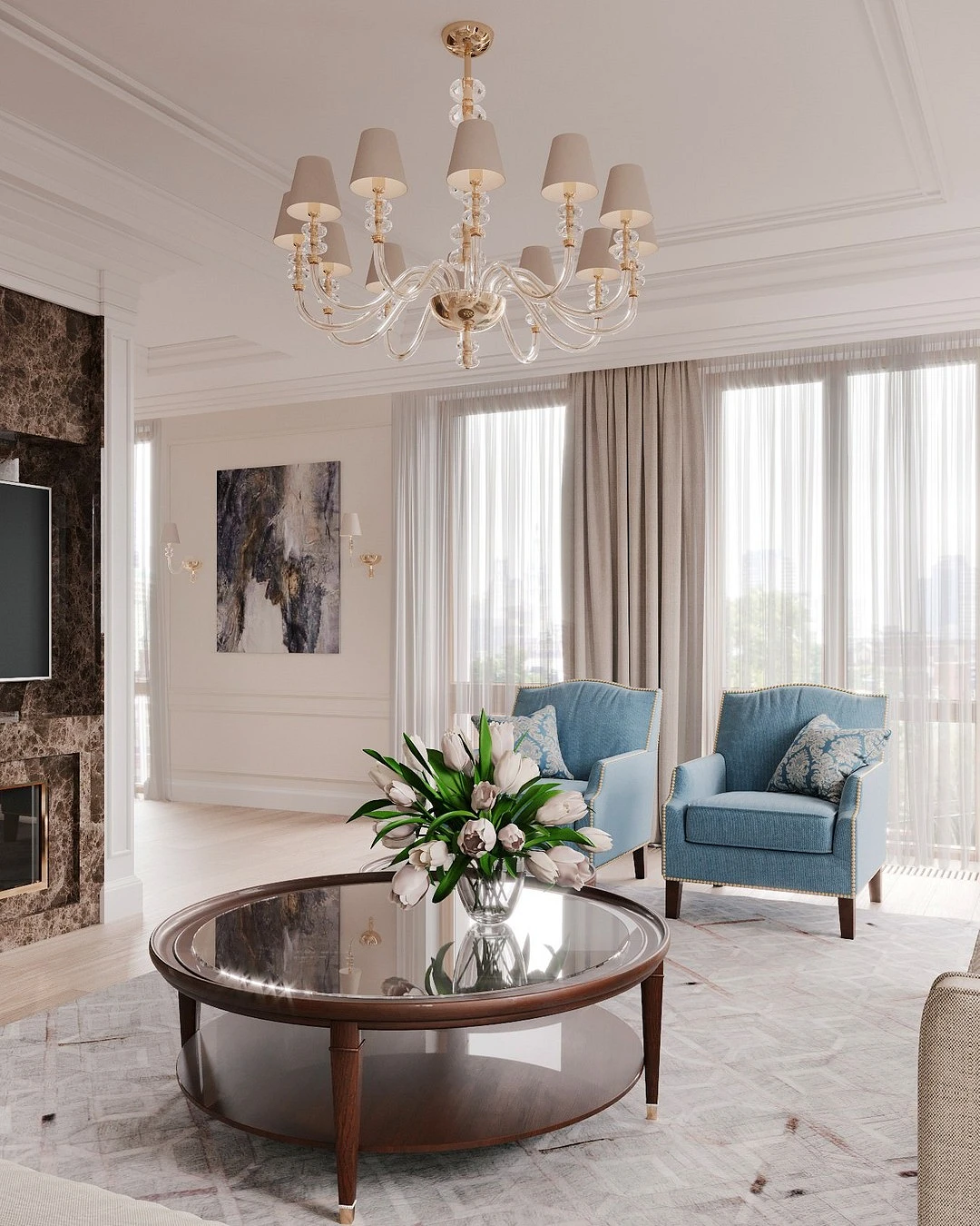
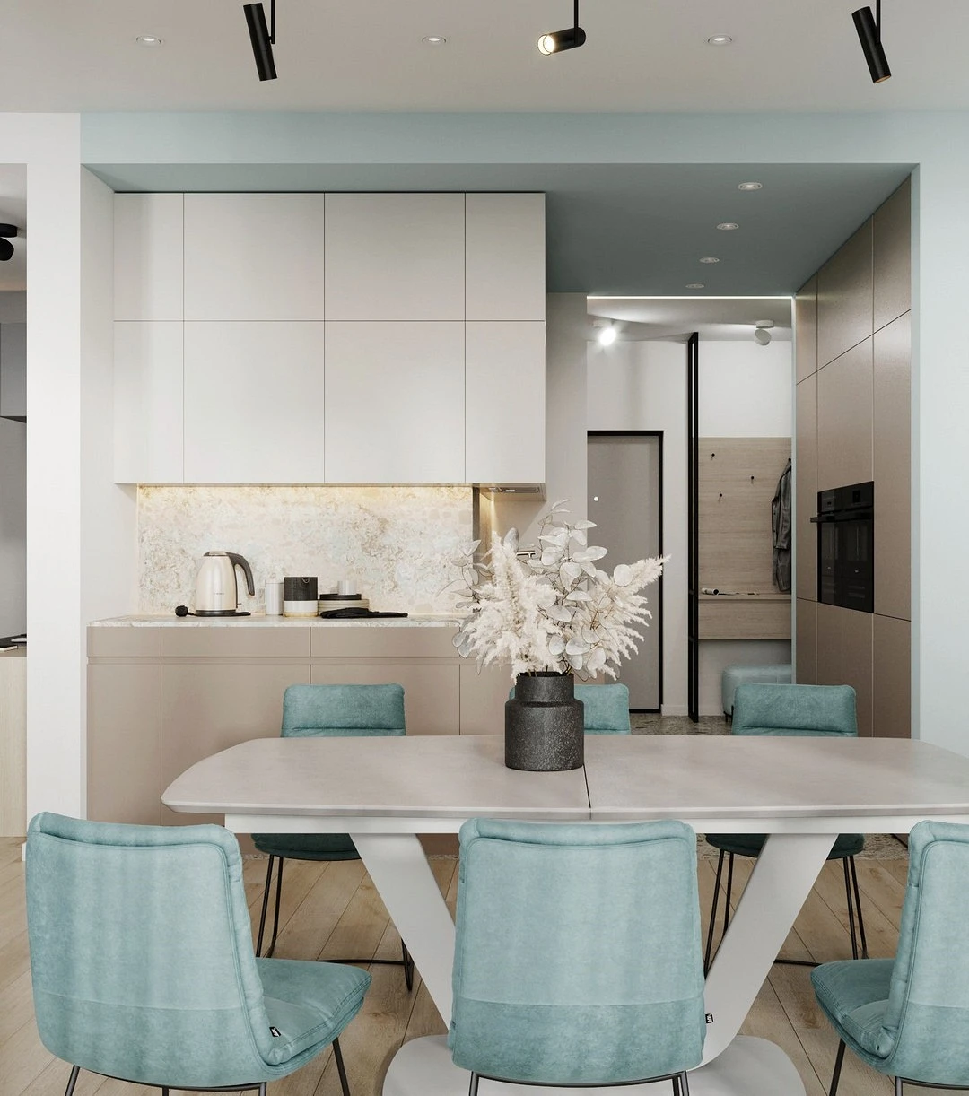
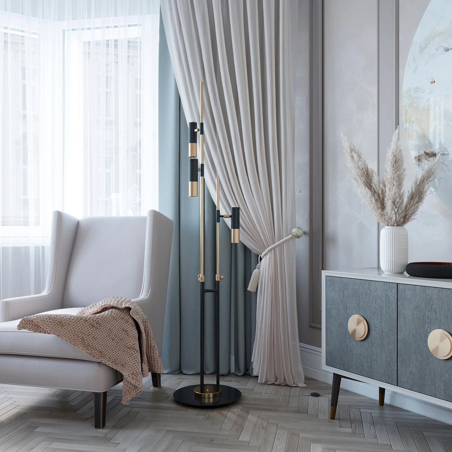
White, black, and gray are absolutely universal and look organic with any color, and light blue is no exception.

White will complement the light airy shade and emphasize the lightness of space, gray will harmoniously complement the noble tone, and black will add contrasts. In the palette, they can be used all together and in any proportion.


With blue and purple
On the Itten color wheel – a kind of cheat sheet of ideal combinations – one of the most popular schemes is the combination of three neighboring shades.

And for a good reason: for example, light blue complements a more saturated blue very well. As a third color, you can add purple to them – and you get a very stylish, deep, and sophisticated palette. However, remember that blue and purple are quite complex colors. In large quantities, they put pressure on the psyche, causing a depressive mood. To prevent this from happening, use them locally, and be sure to dilute this trio with neutral base tones: white, gray, and beige.
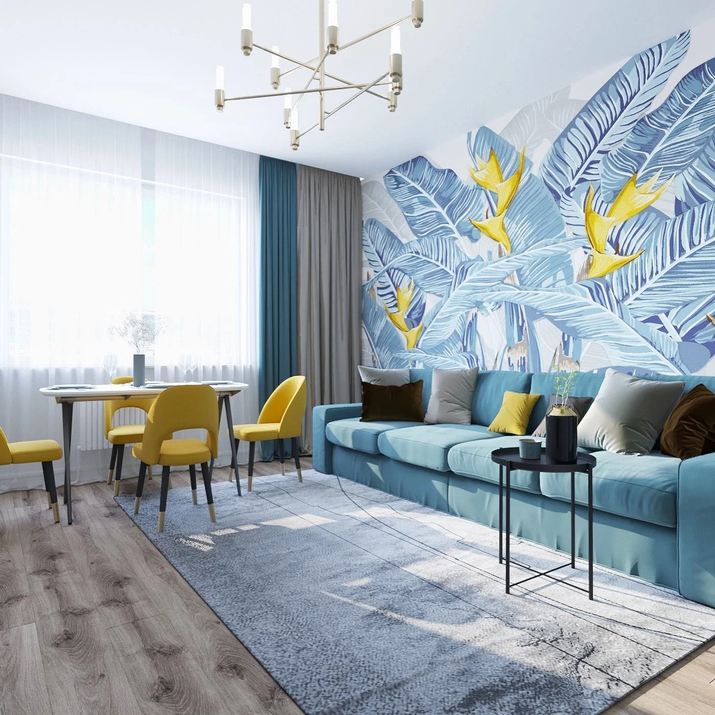
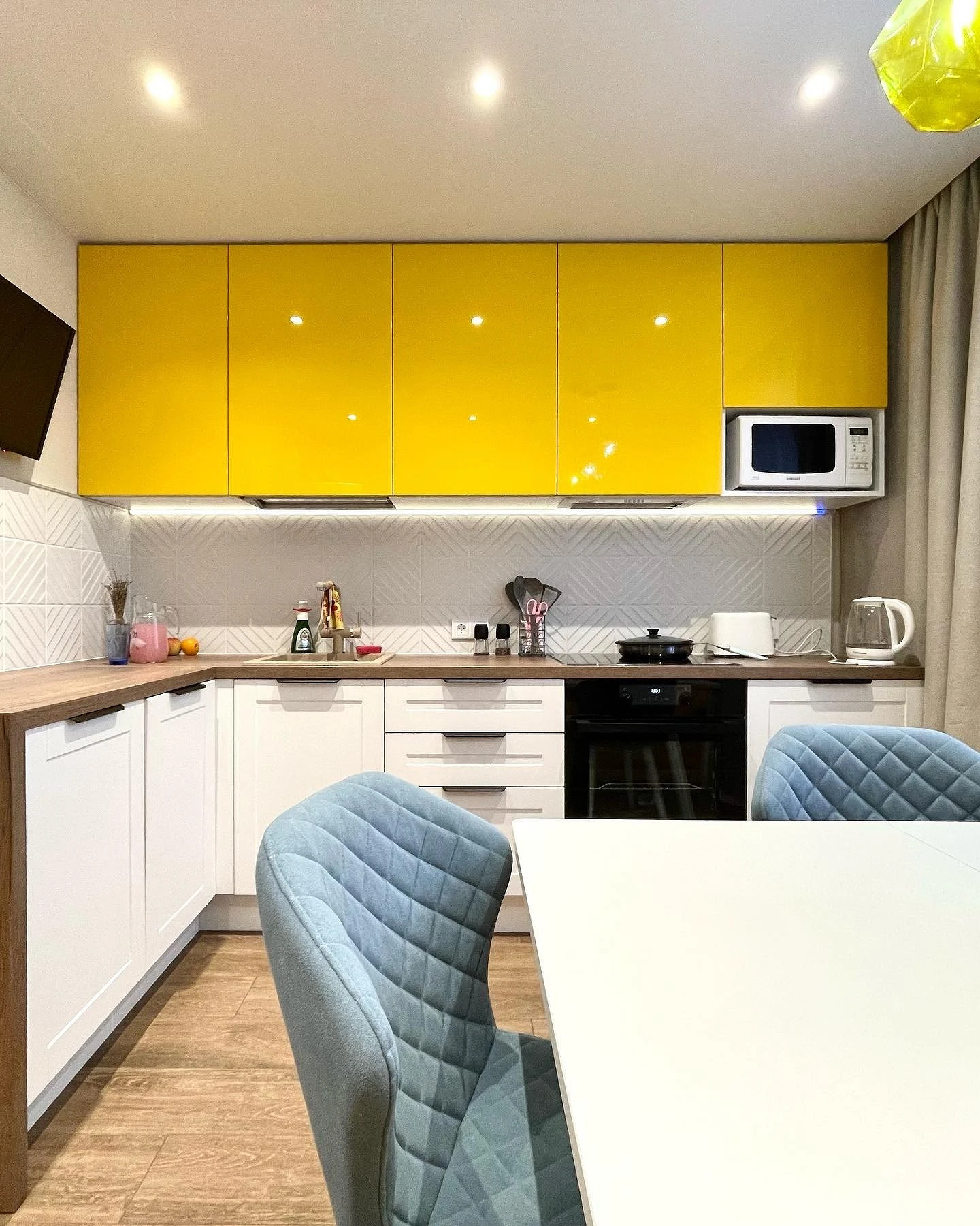
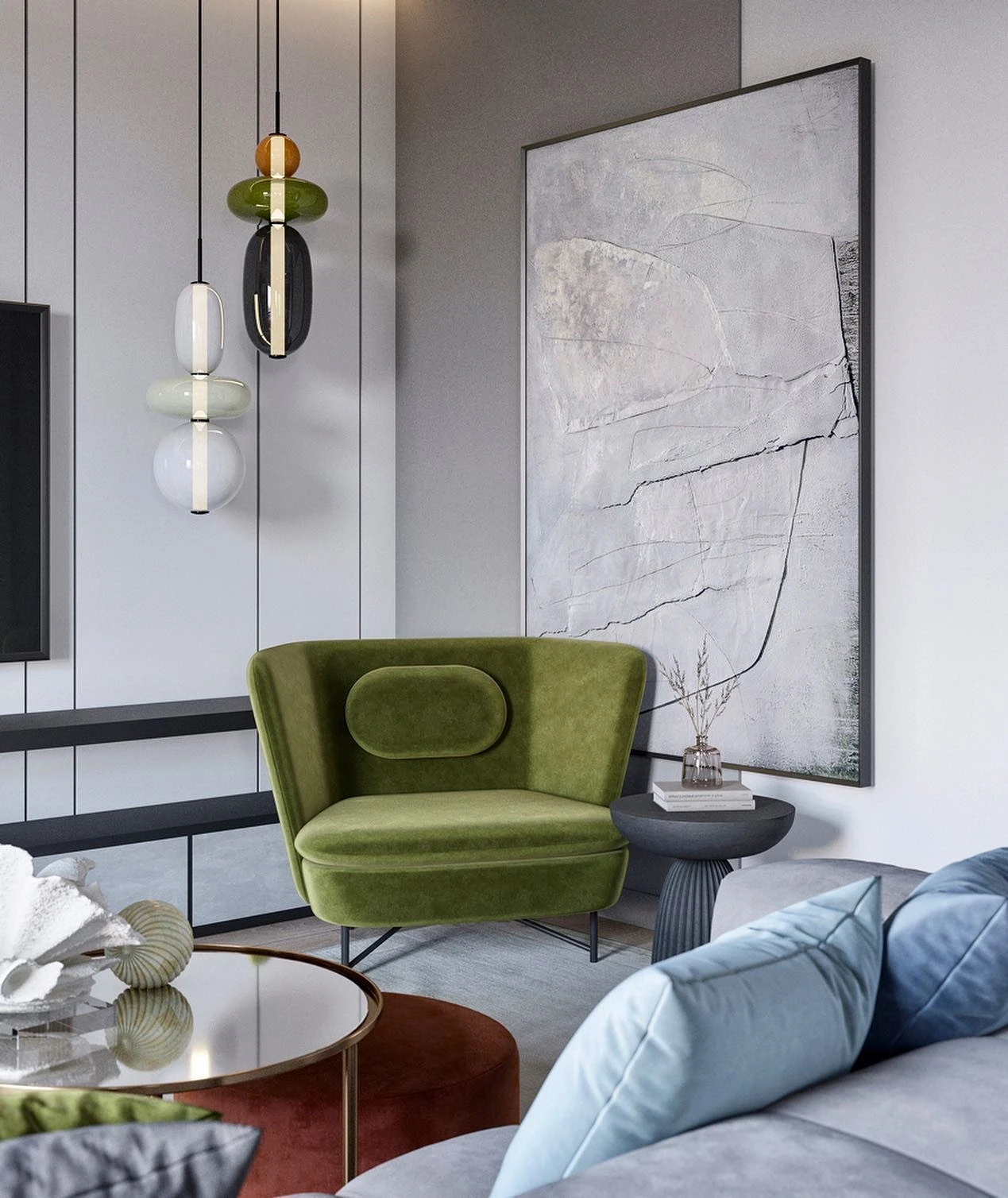
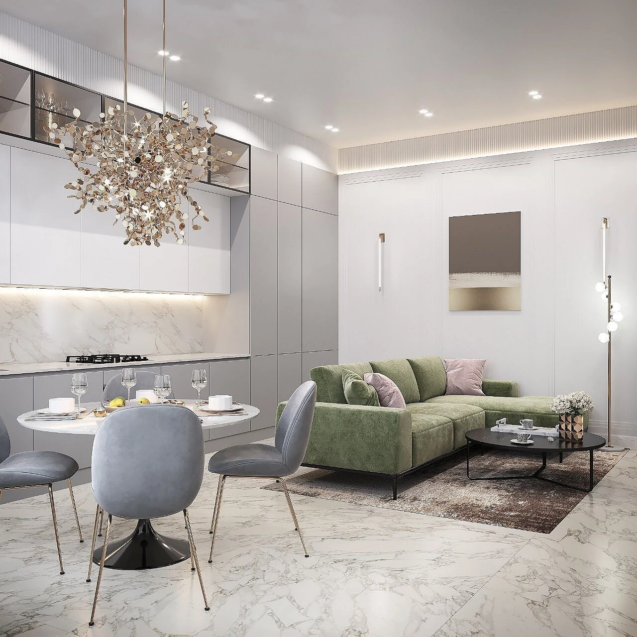
With yellow and green
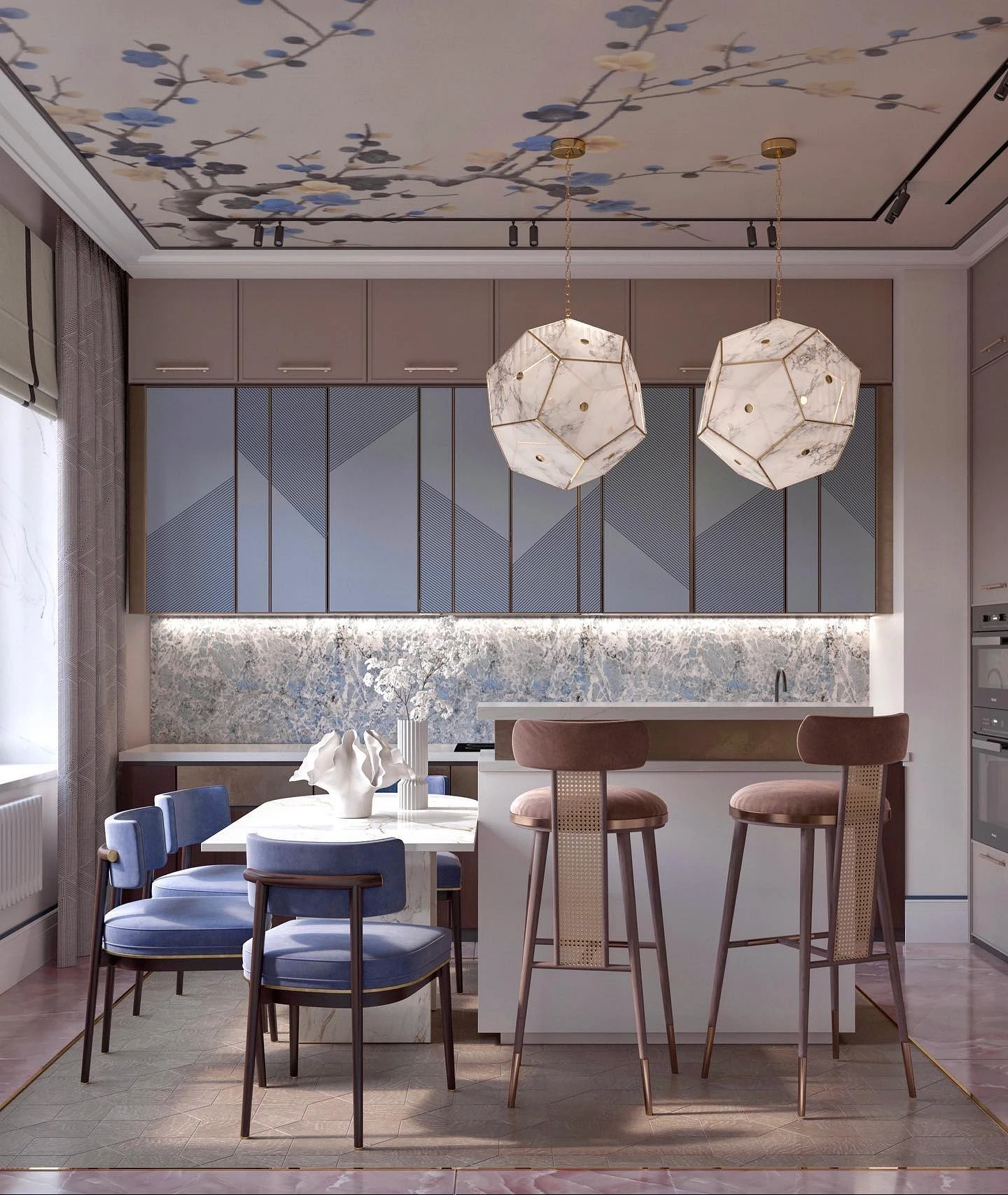
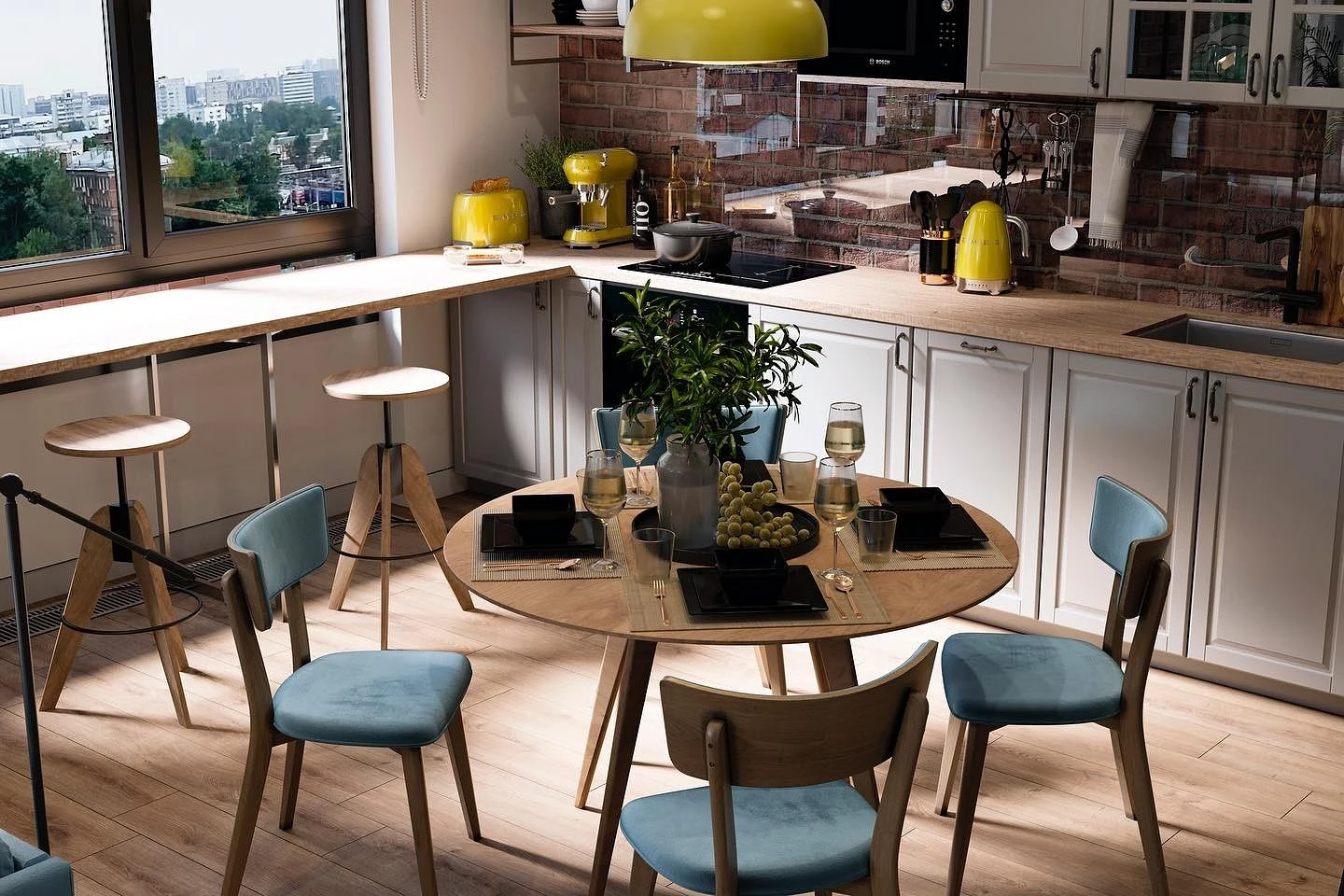
Juicy natural shades feel great in each other’s company. Complement the soft blue finish with green furniture or bright yellow decor.
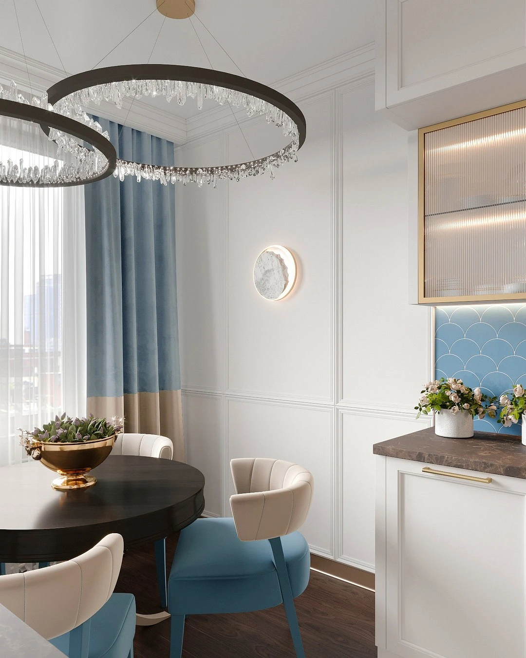
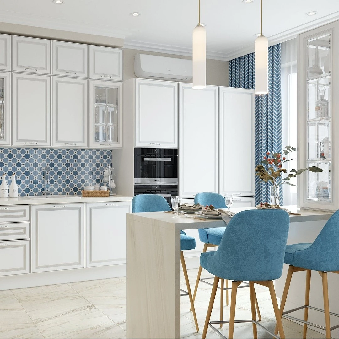
Thinking through combinations, be inspired by ready-made solutions from the outside world: juicy foliage and the smooth surface of the lake, ripe lemons with dark green leaves against the summer sky, the colors of pansies, cornflowers in the field, etc. Such combinations are well suited for the nursery, kitchen, and dining room.
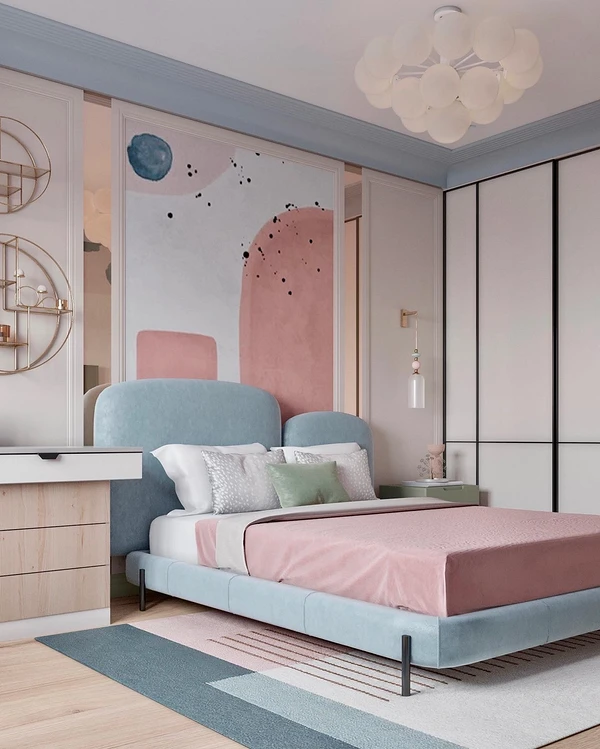
With red and orange
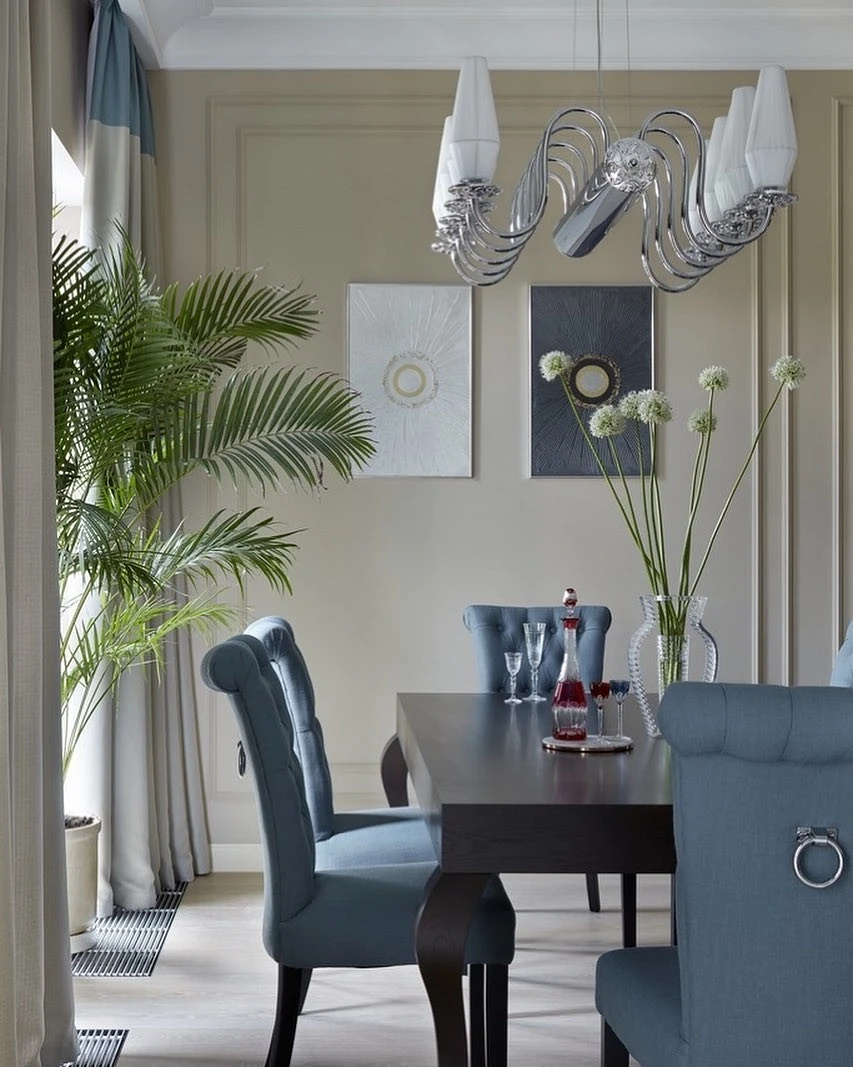
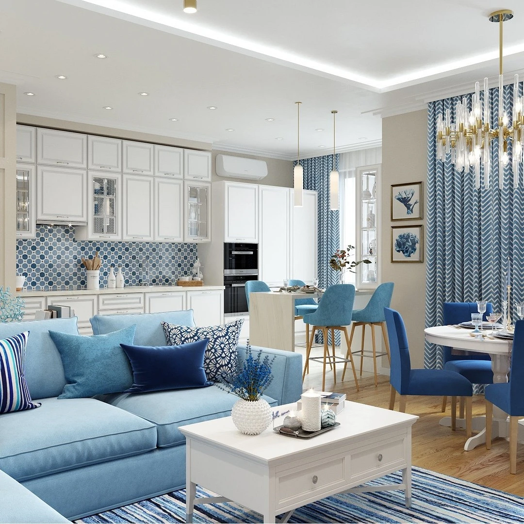
The combination of blue in the interior with red is one of the most spectacular. It can be used in many ways: to create an intimate atmosphere in the bedroom, decorate a bright living room, or balance active, appetizing shades with a cooling blue in the kitchen.

This pair will also fit into the office, guest room, hallway, and bathroom. The most important thing is to choose the right shades since red itself is a very active and even aggressive color, which is dangerous to overdo it. It is better to use it as an accent, light blue as a second color, or the main one, but then take a neutral shade.
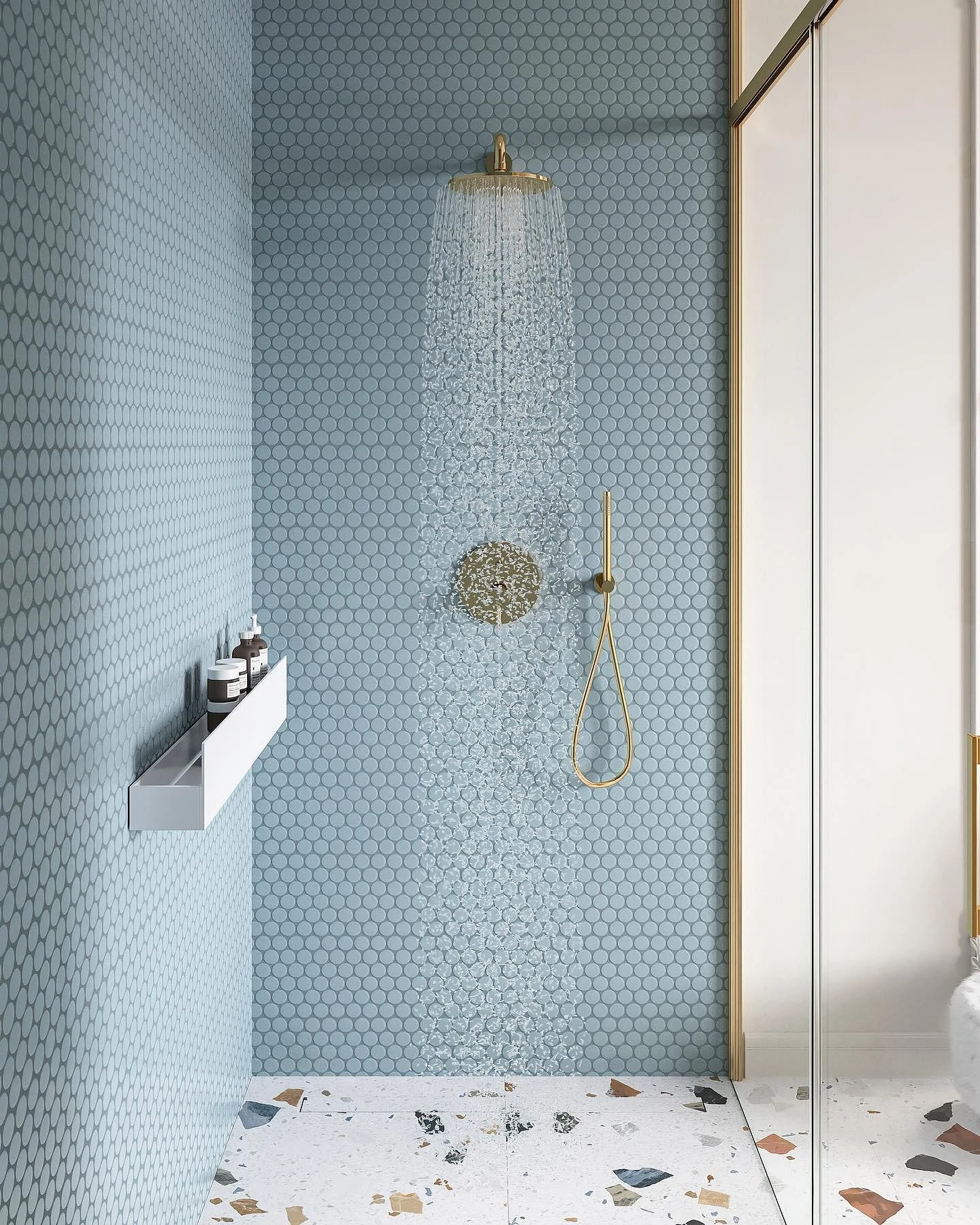
The same rule applies to orange. It’s a bright and energetic color that brings a neutral palette to life, but it shouldn’t be overdone. Use such a pair in the living room or in the kitchen, in the guest room and nursery, as well as in the bathroom.
How to apply in the interior
It is important not only what colors are combined with blue in the interior, but also how to apply it – and this can be done in different ways.
Finishing
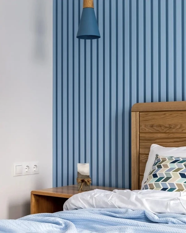
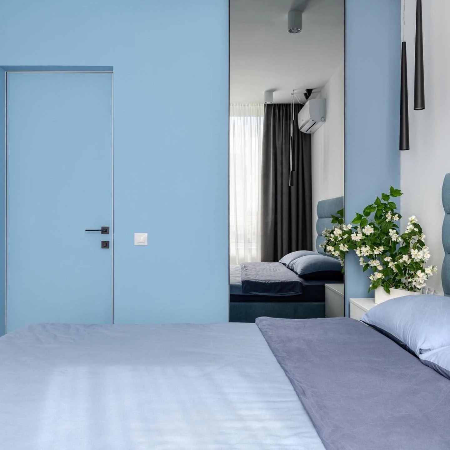
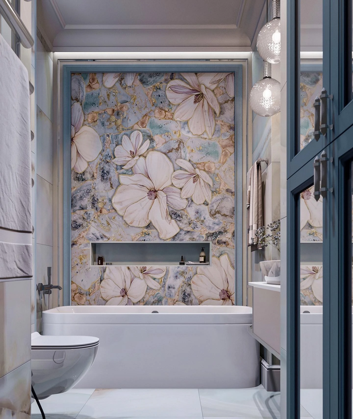
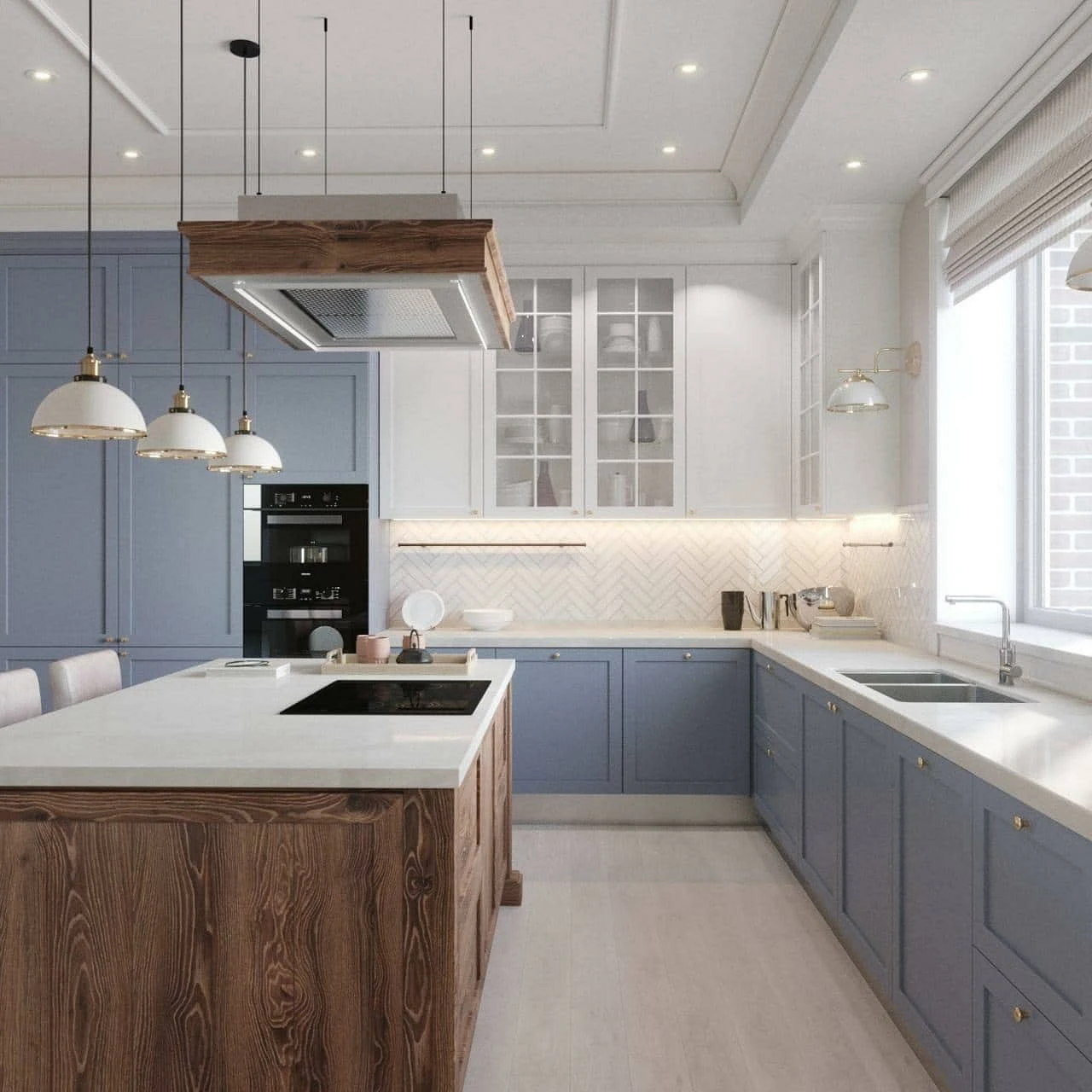
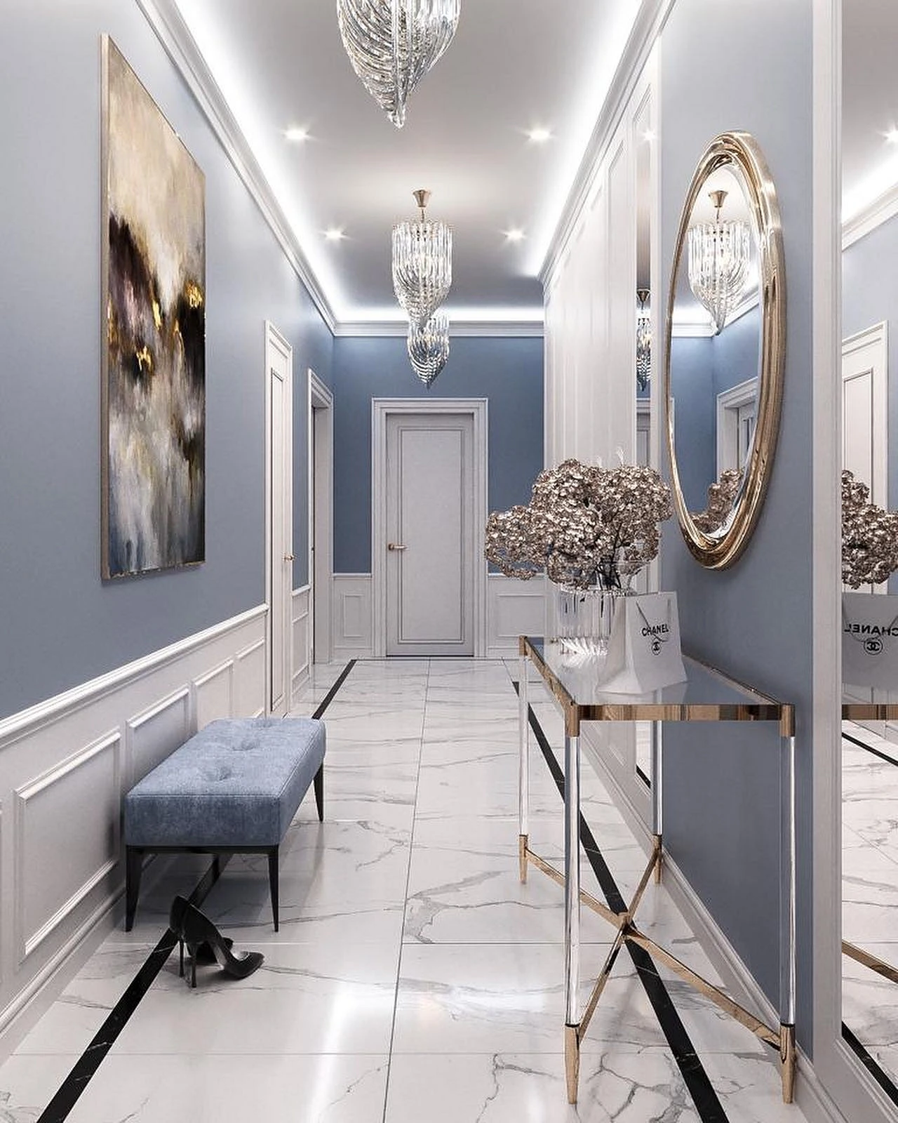
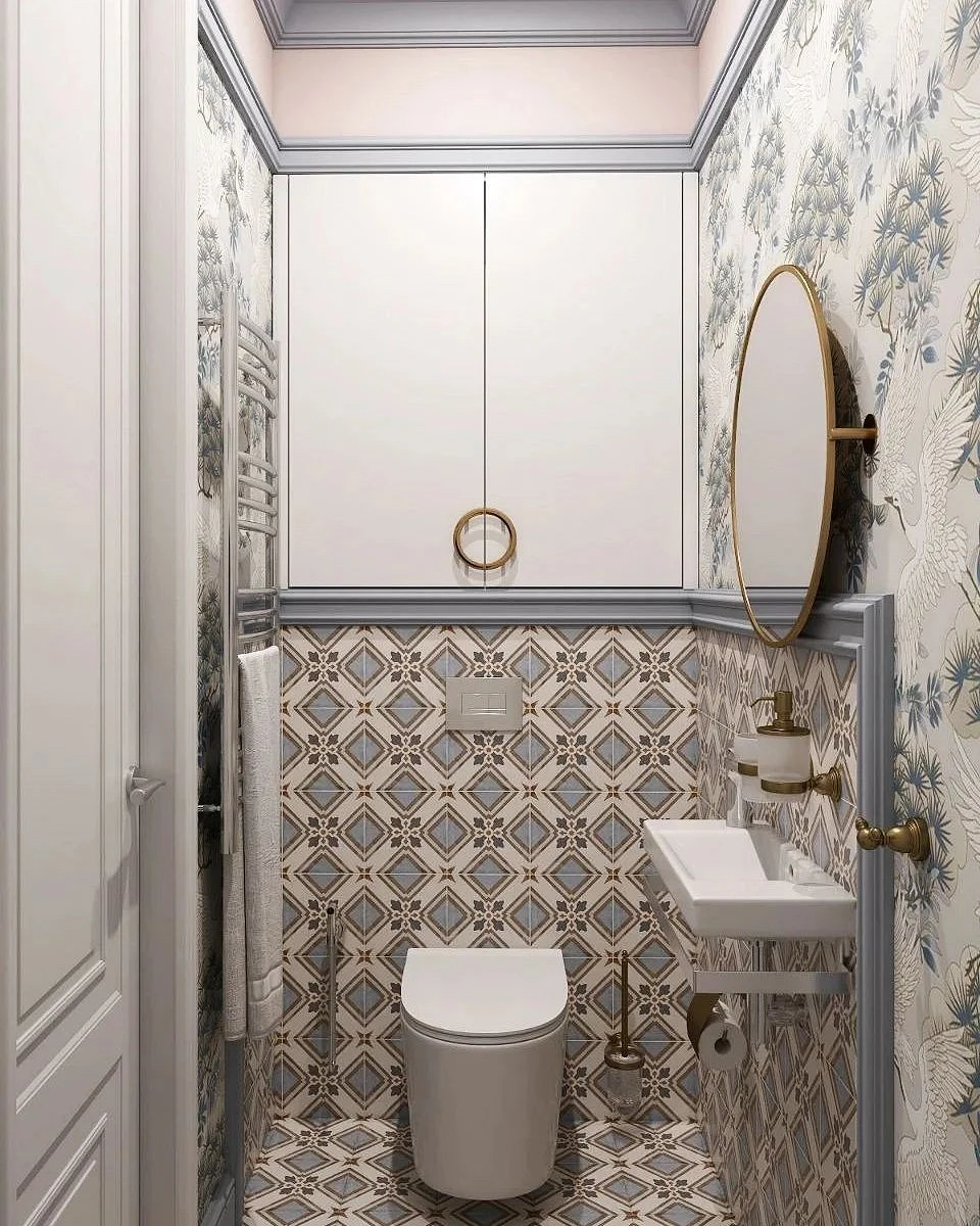
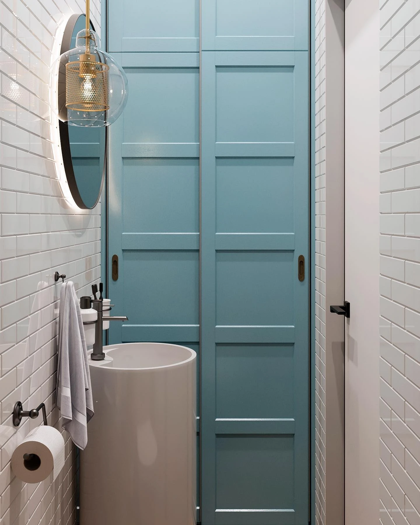
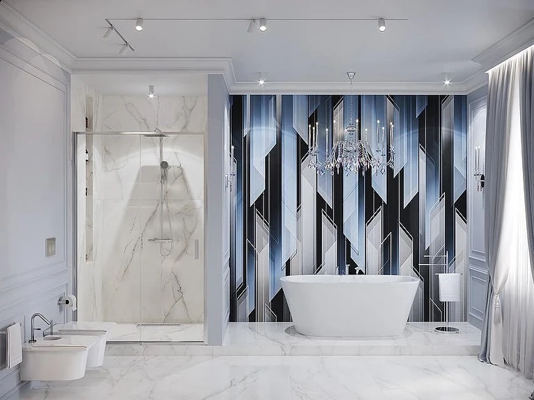
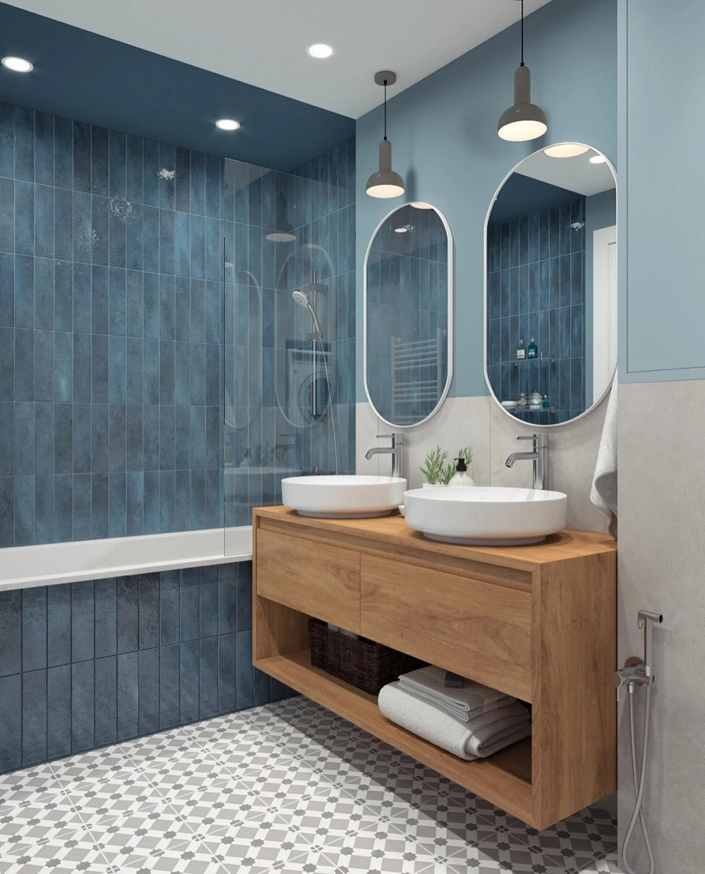
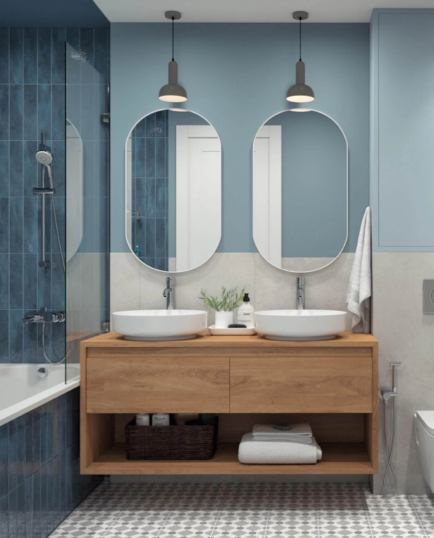
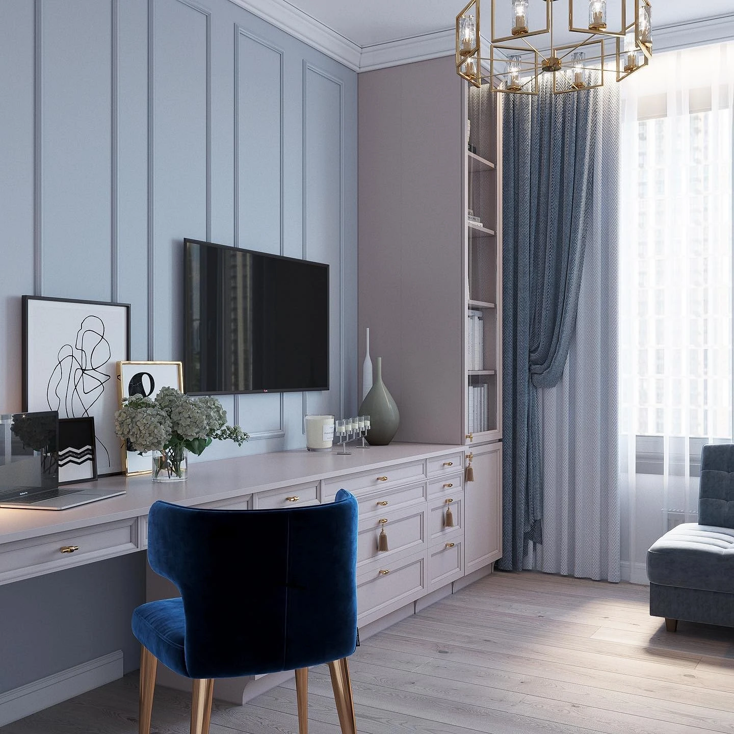
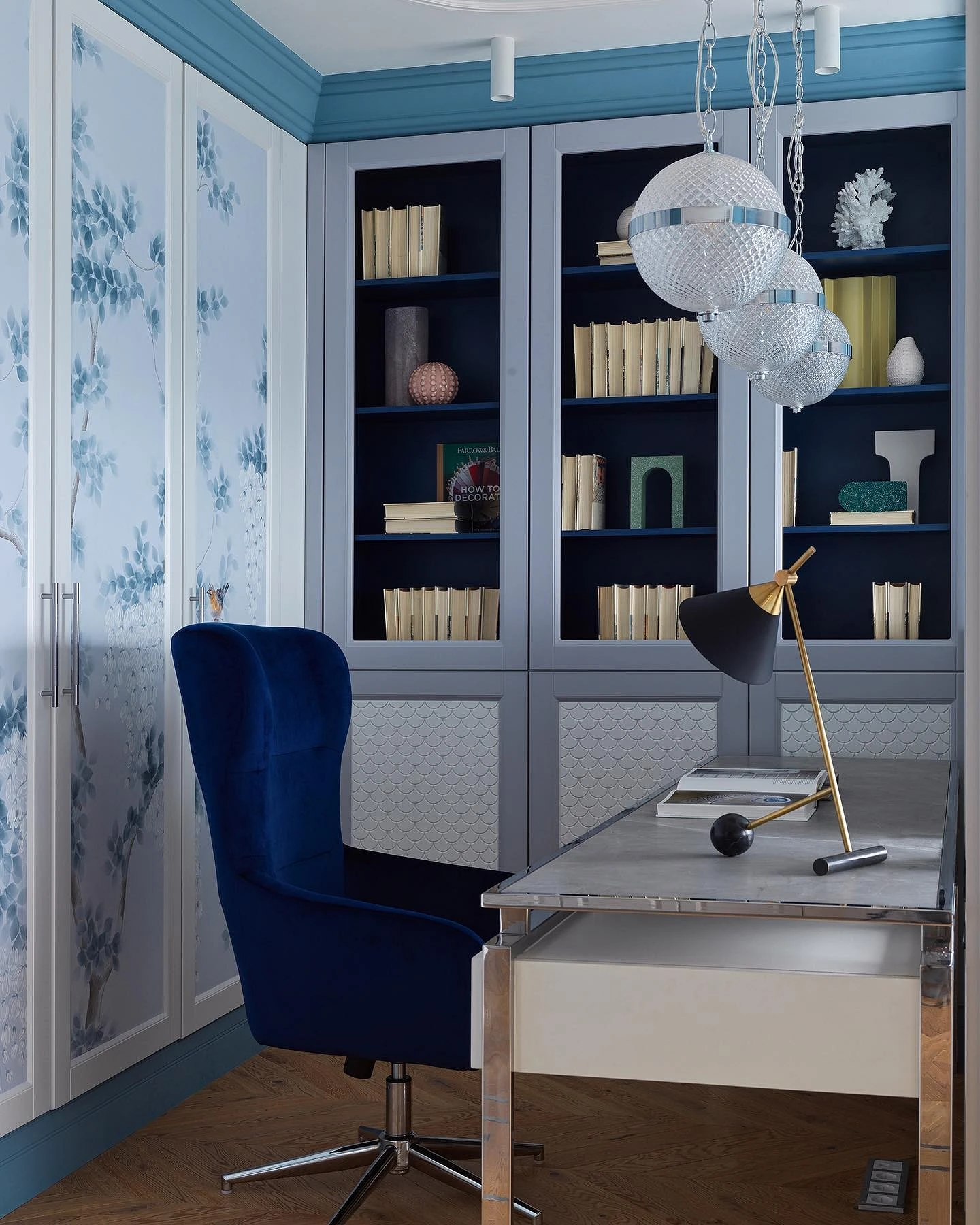
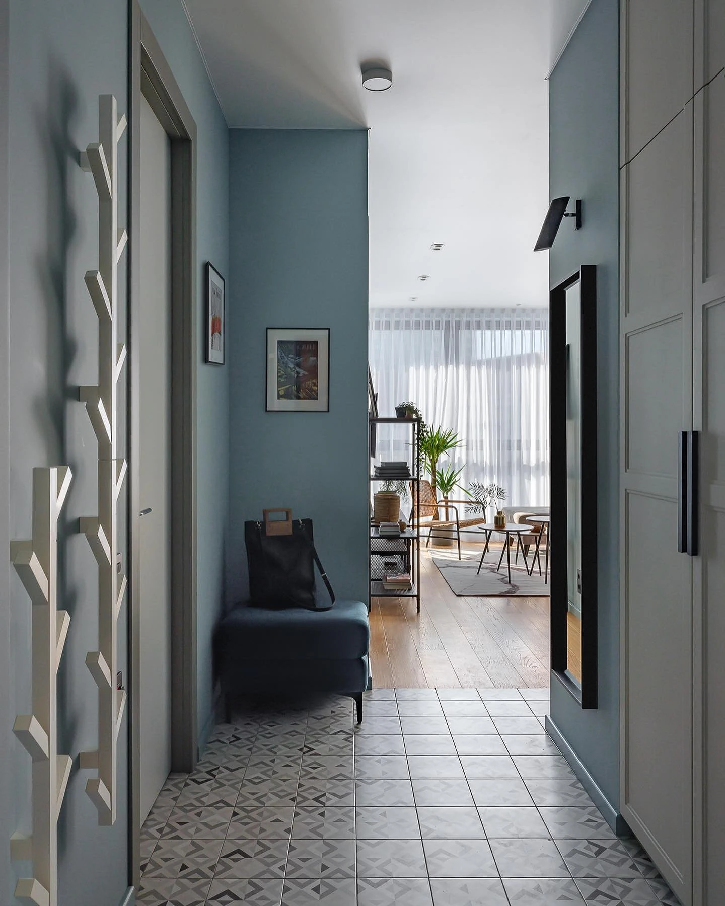
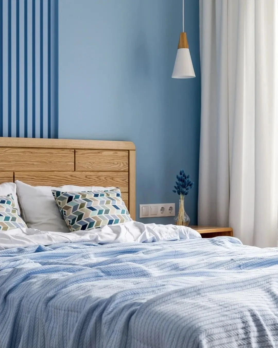
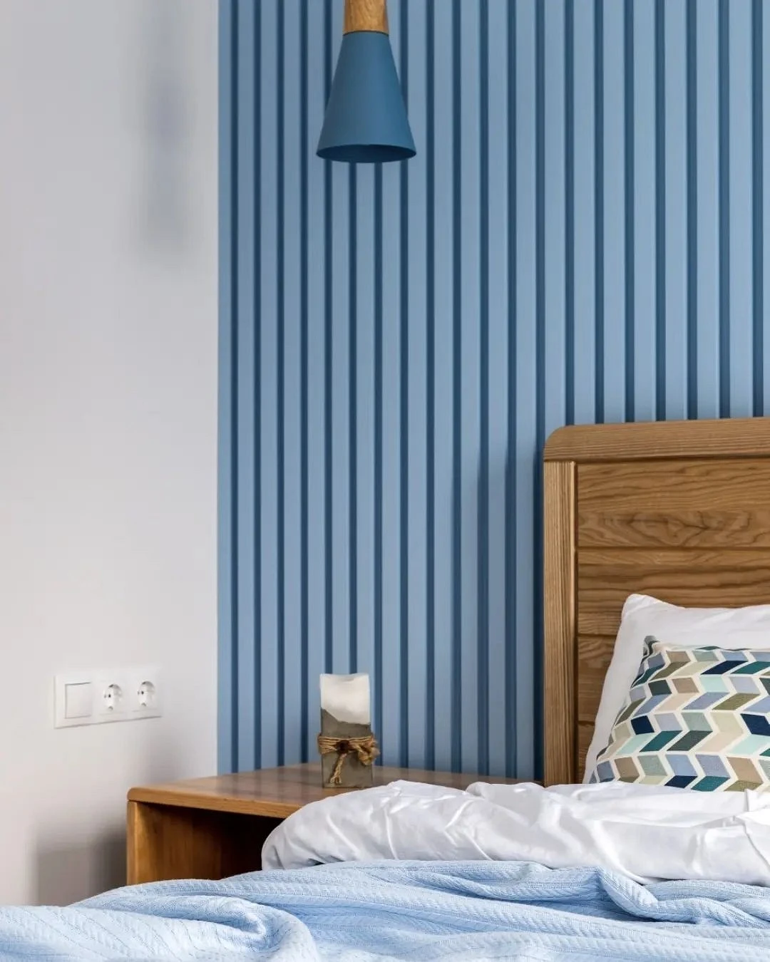
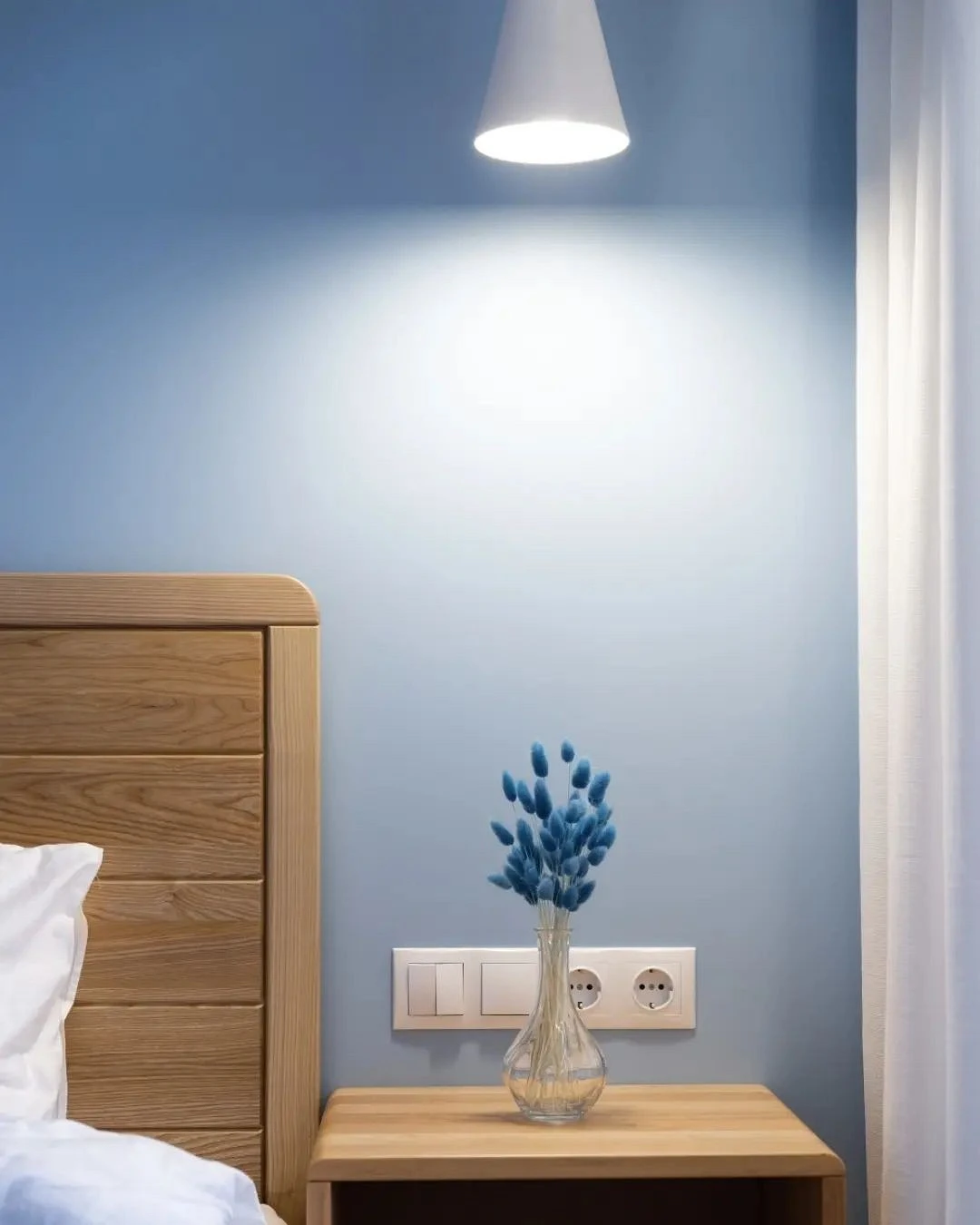
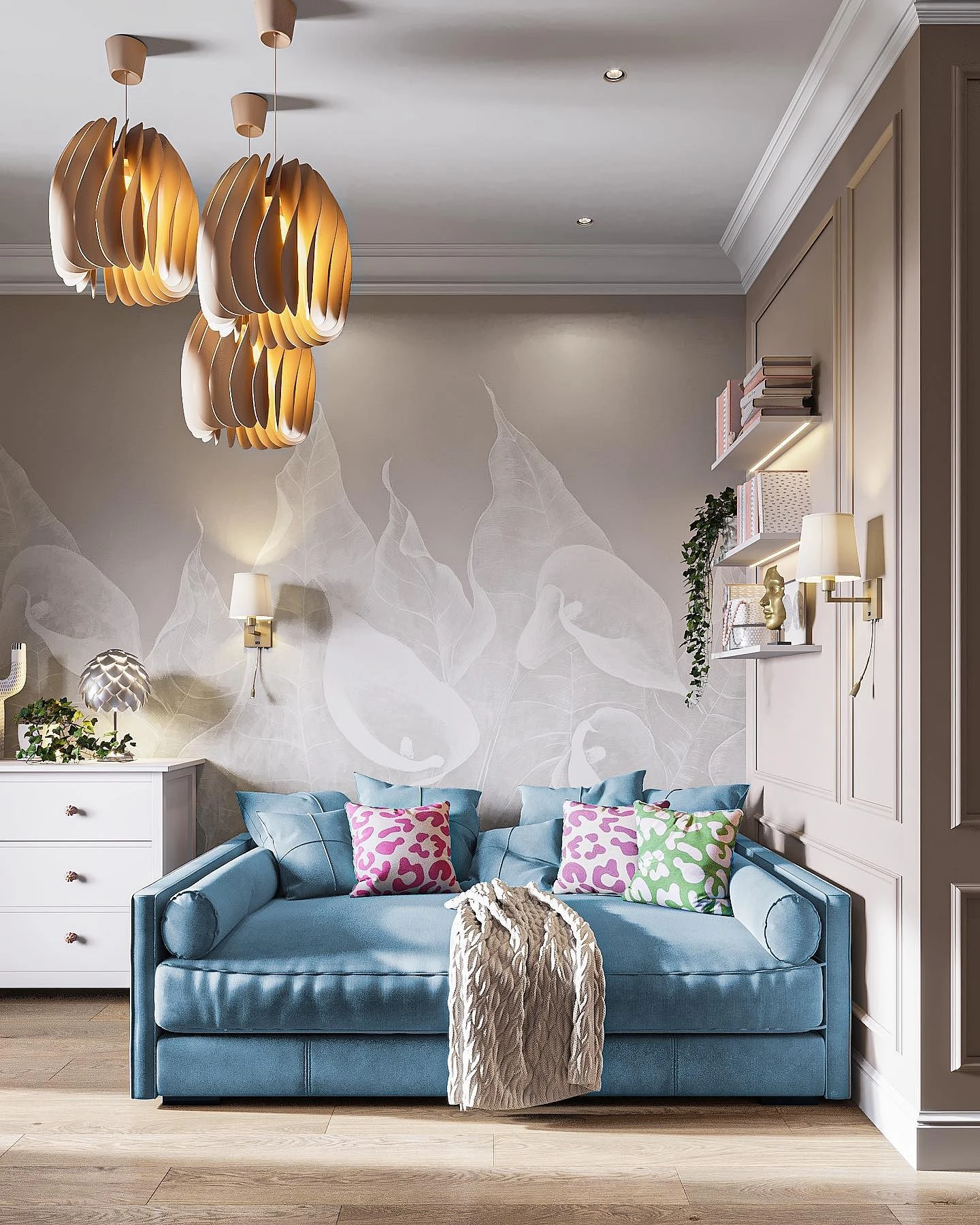
Unlike dark blue, its light variation is used in decoration much more often. Blue walls in the interior look elegant, and fresh and do not put pressure on the psyche. A gentle pastel shade is also suitable for small rooms since cold tones visually expand the space. And if you add glossy surfaces and mirrors to such a finish, the effect will be even stronger.
When choosing a specific shade keep a few things in mind:
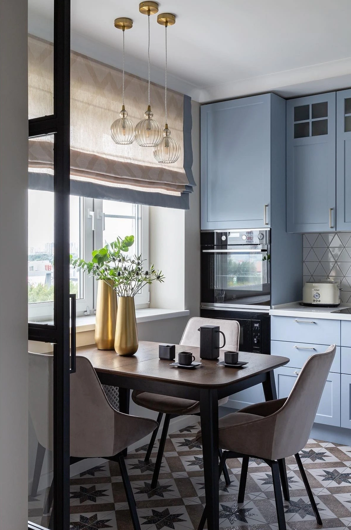
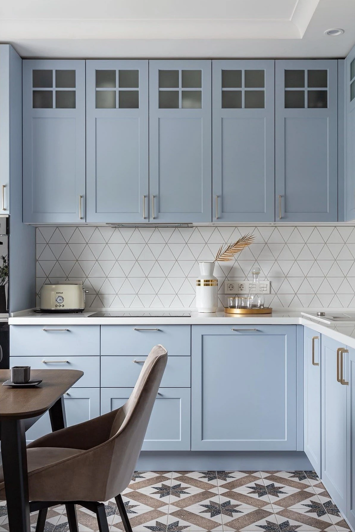
- General style. For example, gray-blue walls look best in a Scandinavian interior. For neoclassicism or Provence, you can choose a more saturated tone, with a bias towards lilac.
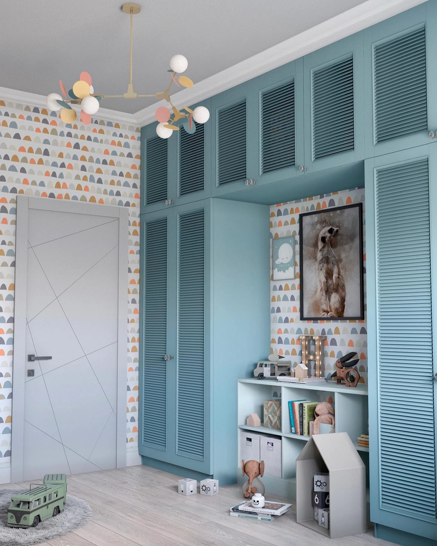
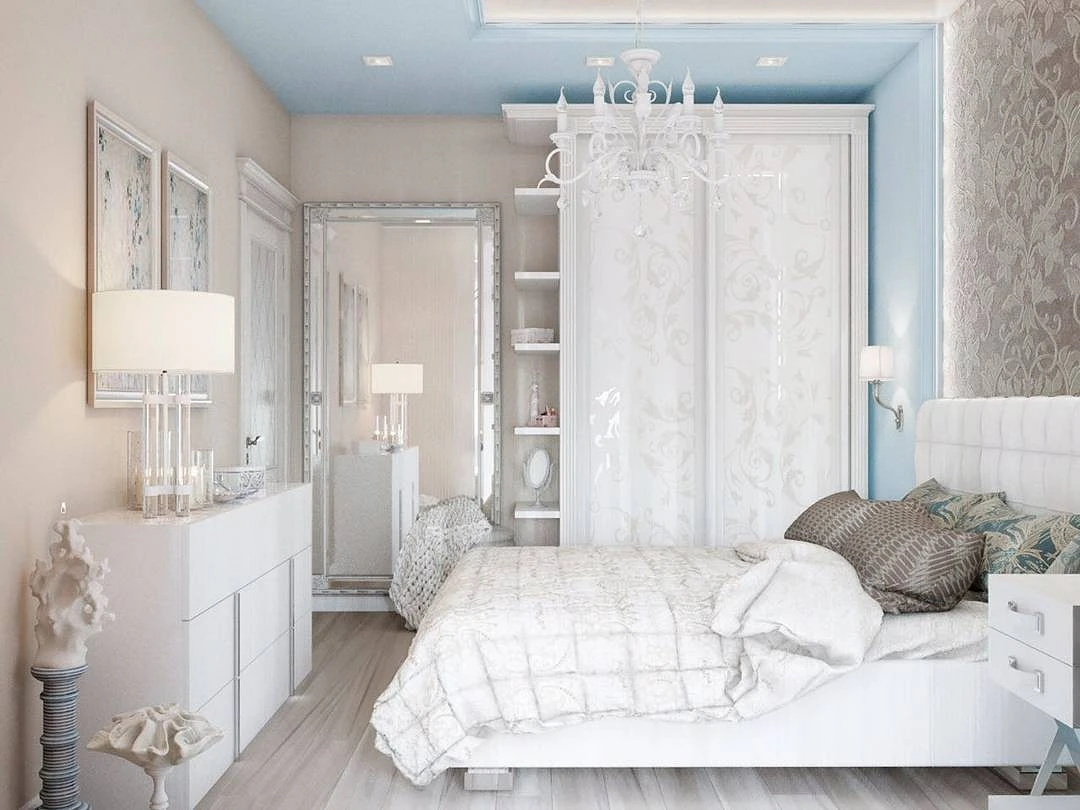
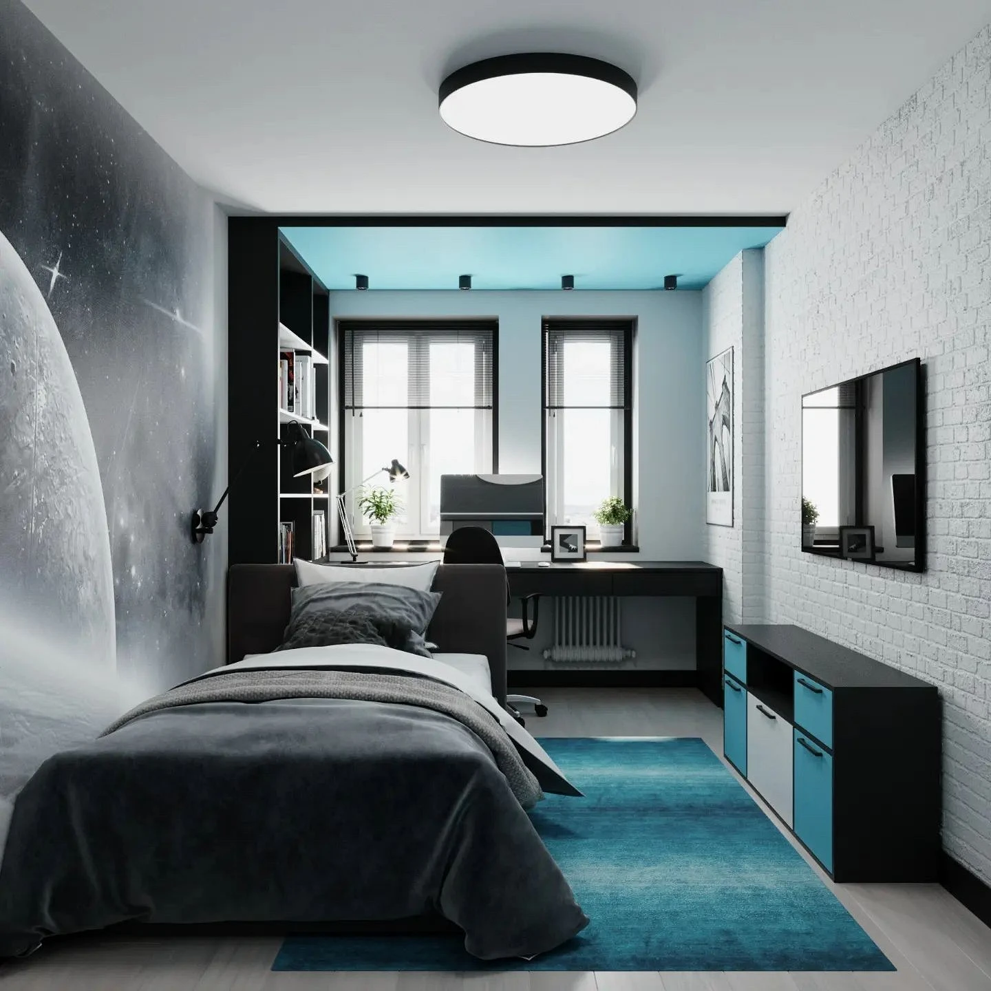
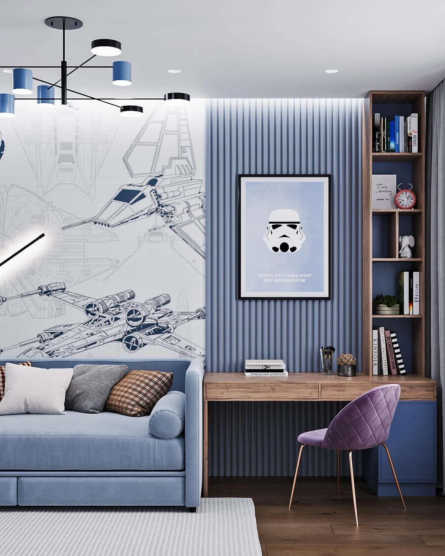
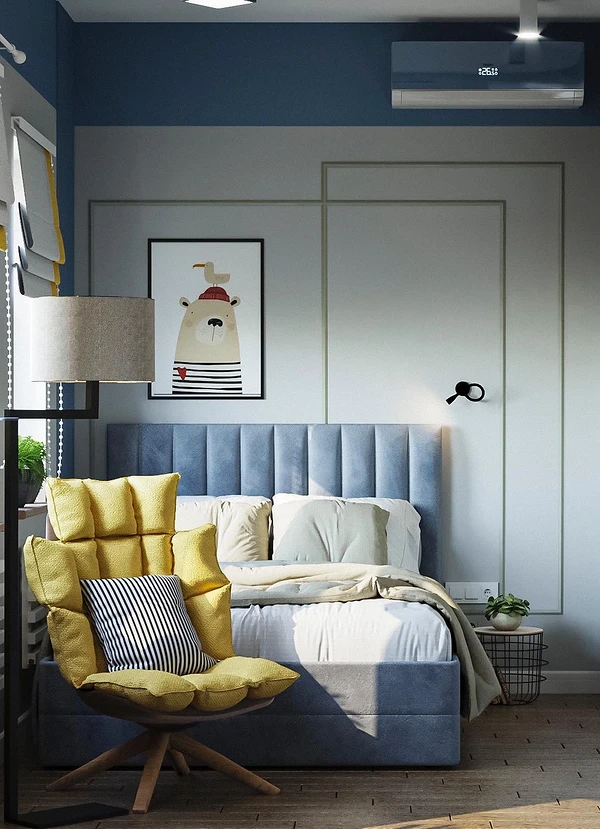
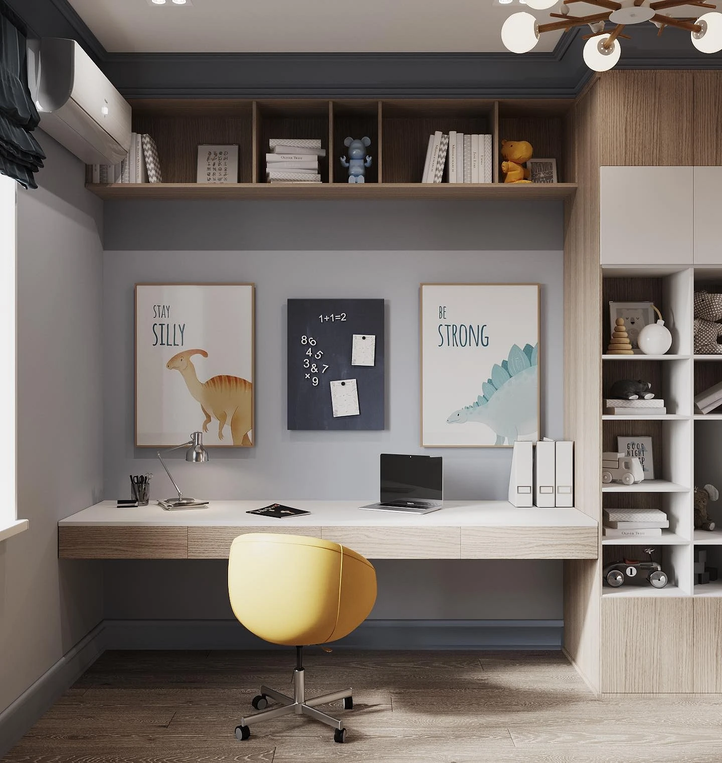
- The purpose of the premises. Cheerful, but not acidic colors are suitable for a nursery: for example, heavenly, turquoise, and cornflower blue look good. You can add brightness to the living room and kitchen, and choose more subdued variations for the bedroom that will create a cozy and intimate atmosphere.
- Room location. If the windows face south or southeast, the room will have a lot of sunlight. The coldest tones will suit here, which will cool the space. But if there is not enough natural light (for example, windows on the north side), use softer and lighter variations, be sure to complement them with warm colors: cream, terracotta, peach, ivory, sand, etc.
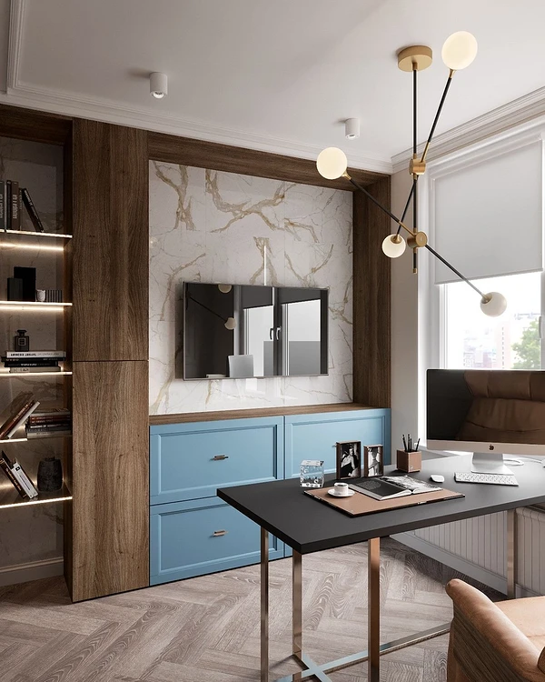
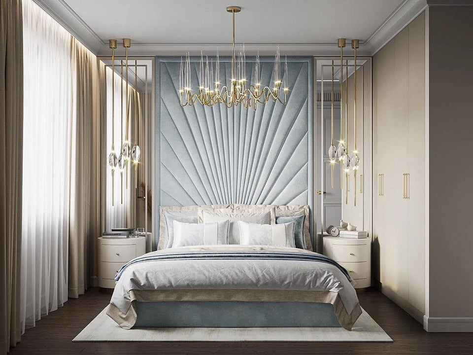
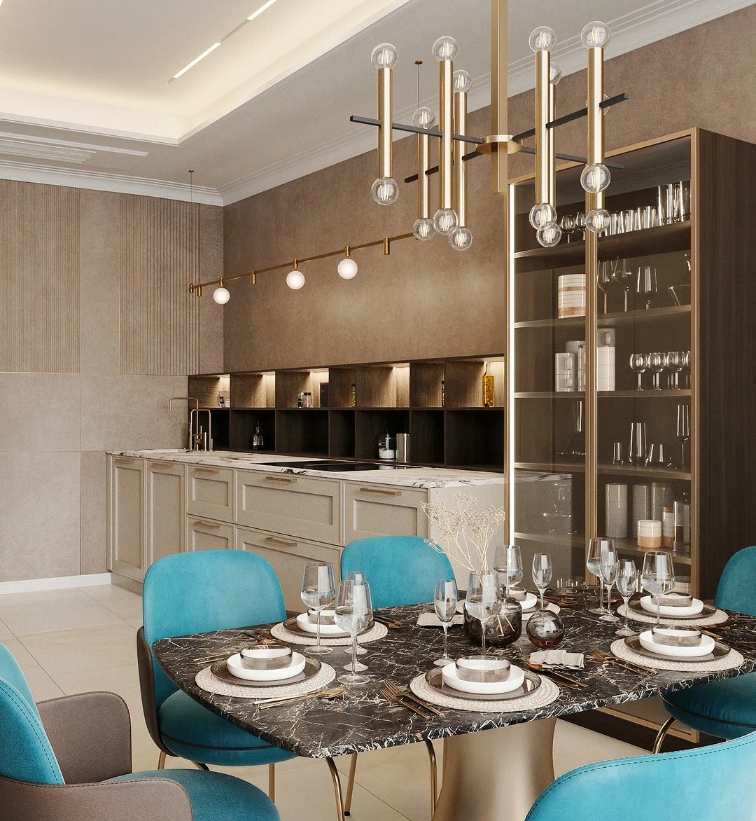
Furniture
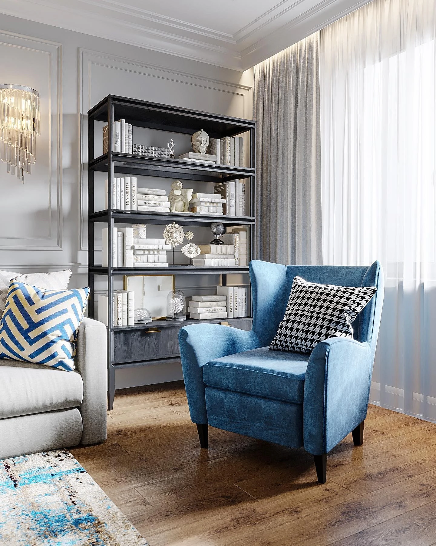
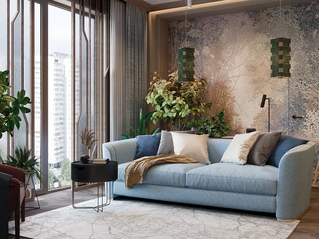
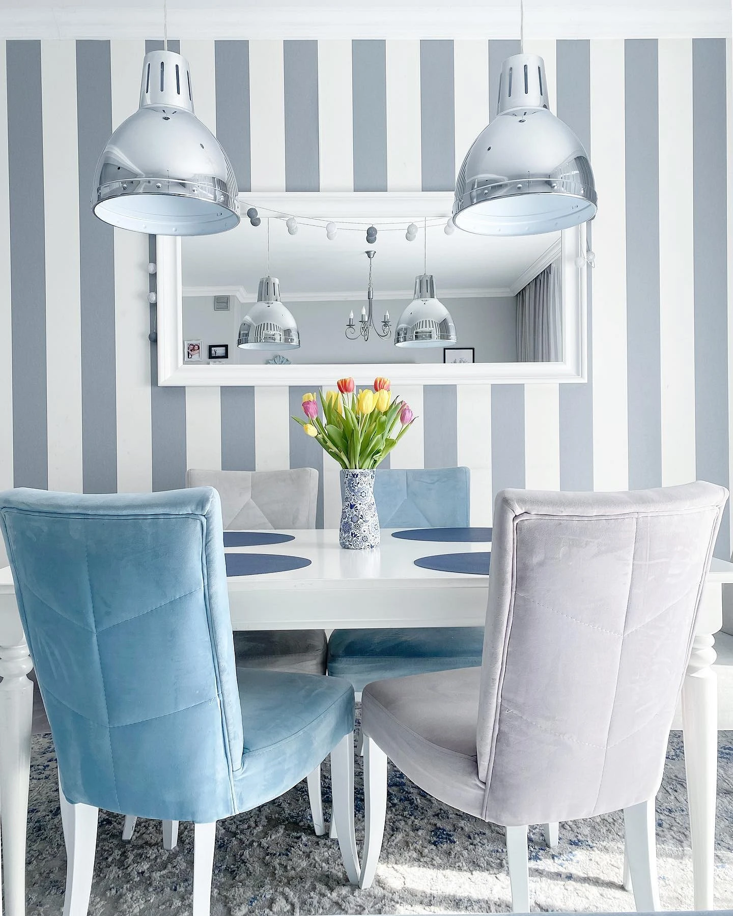
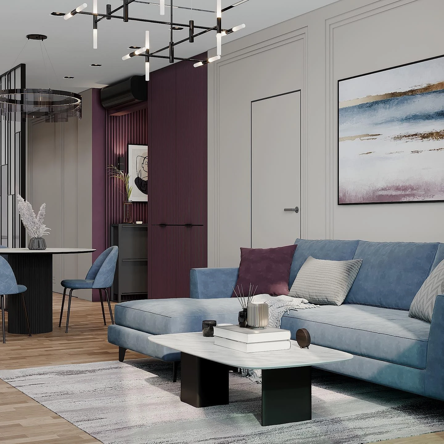
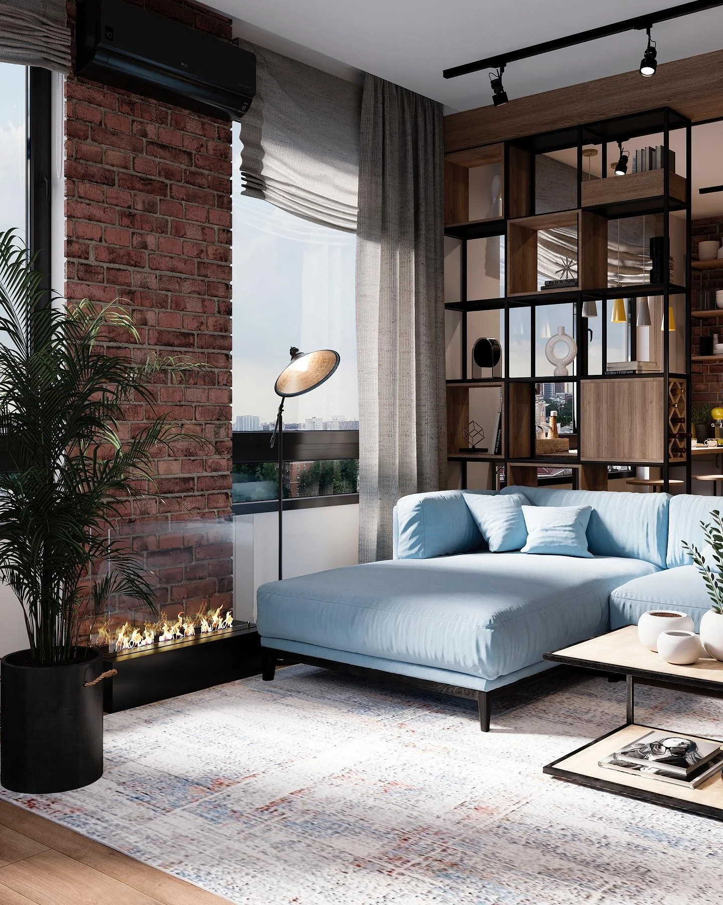
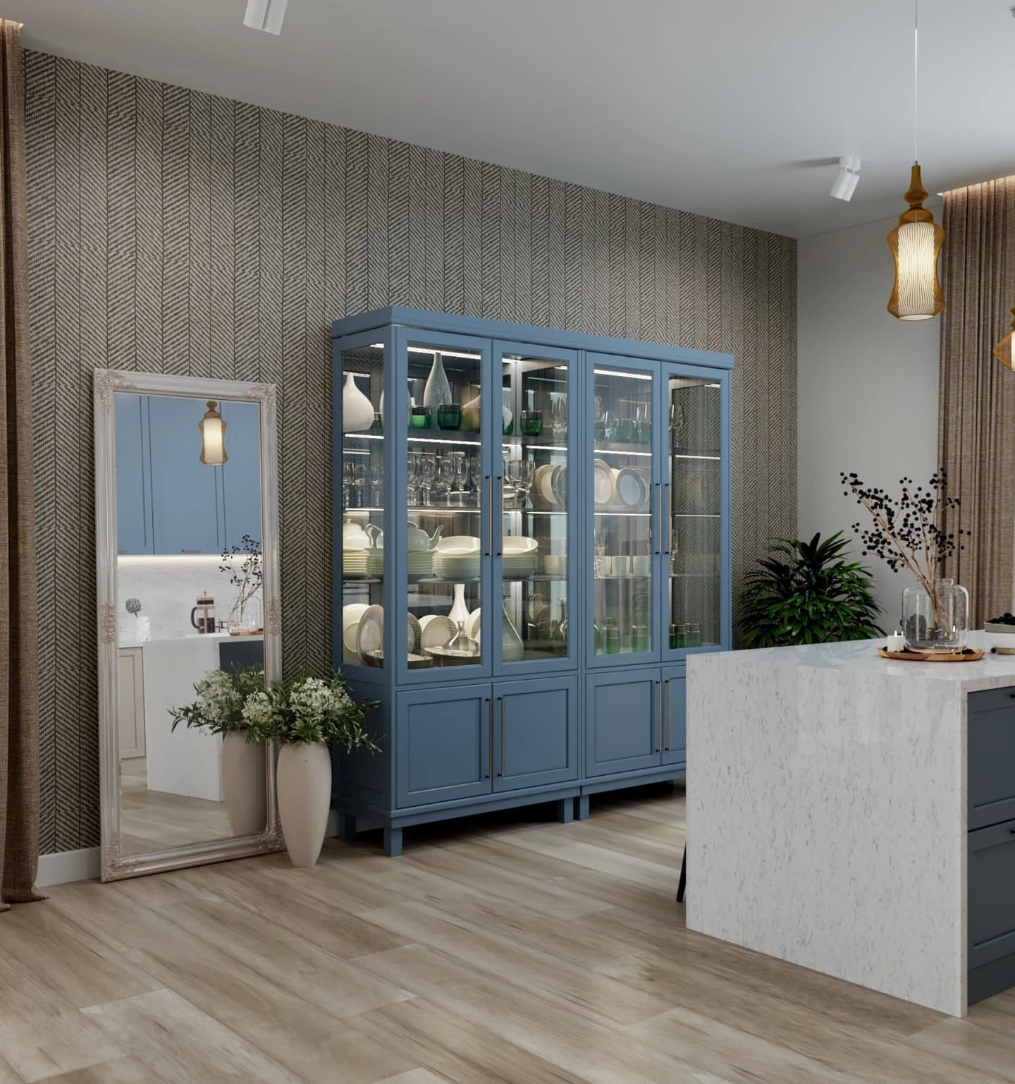
If you prefer a basic finish but want to add color to the interior, pick up bright enough furniture.
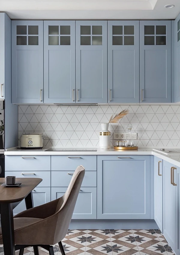
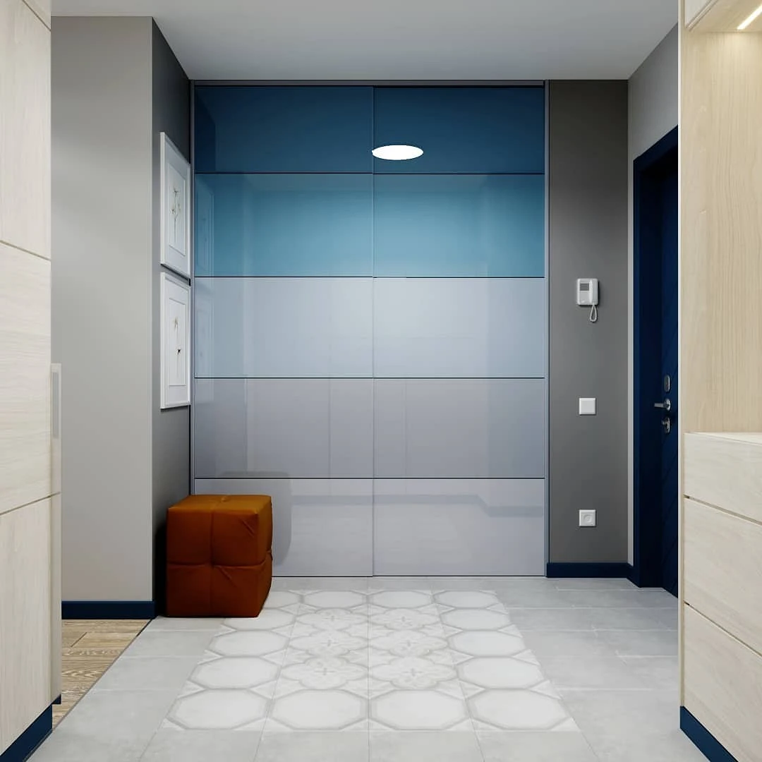
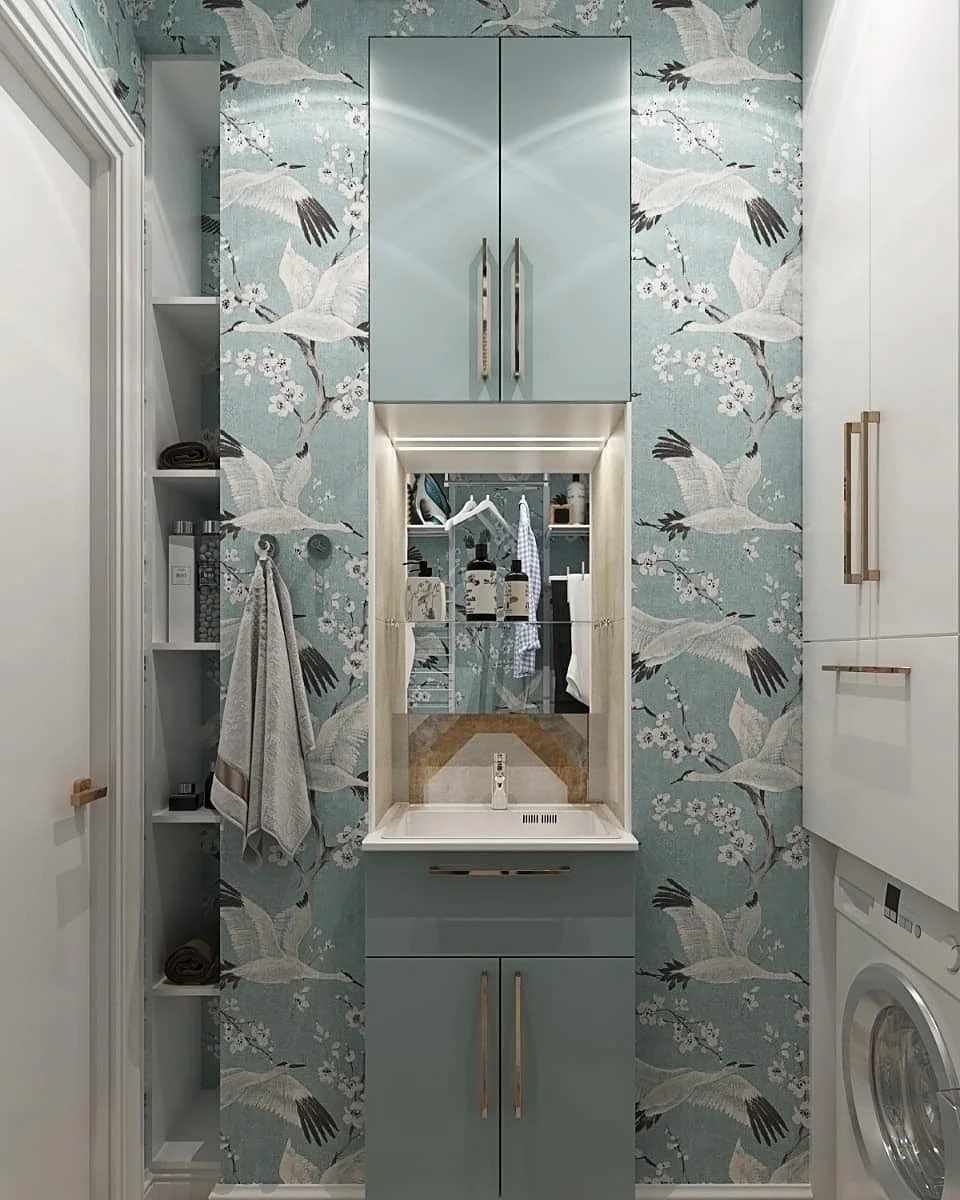
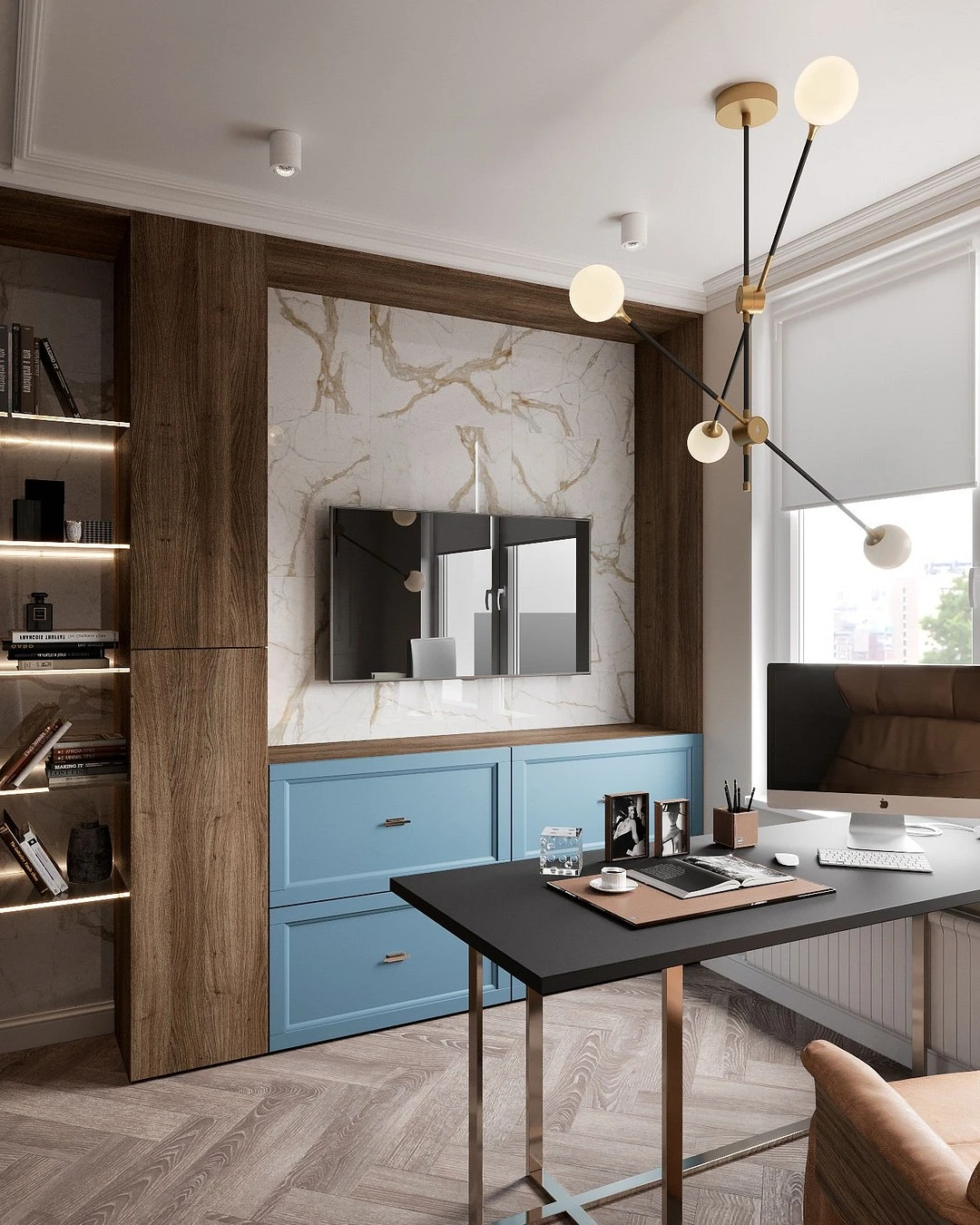
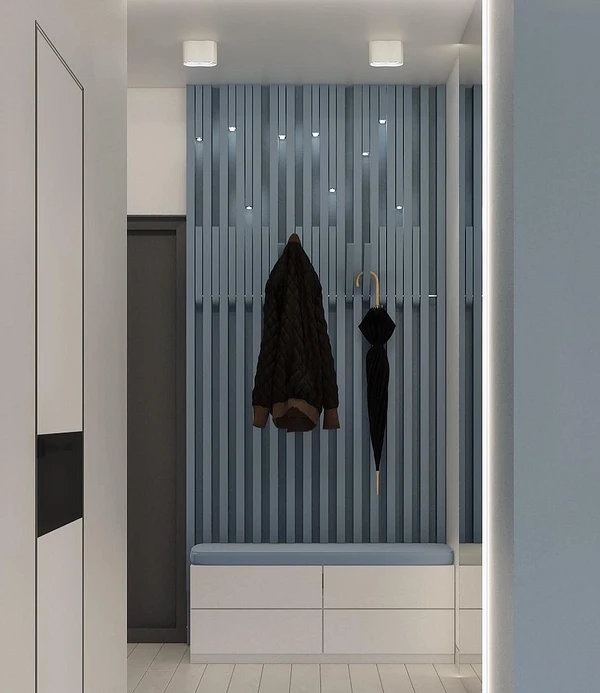
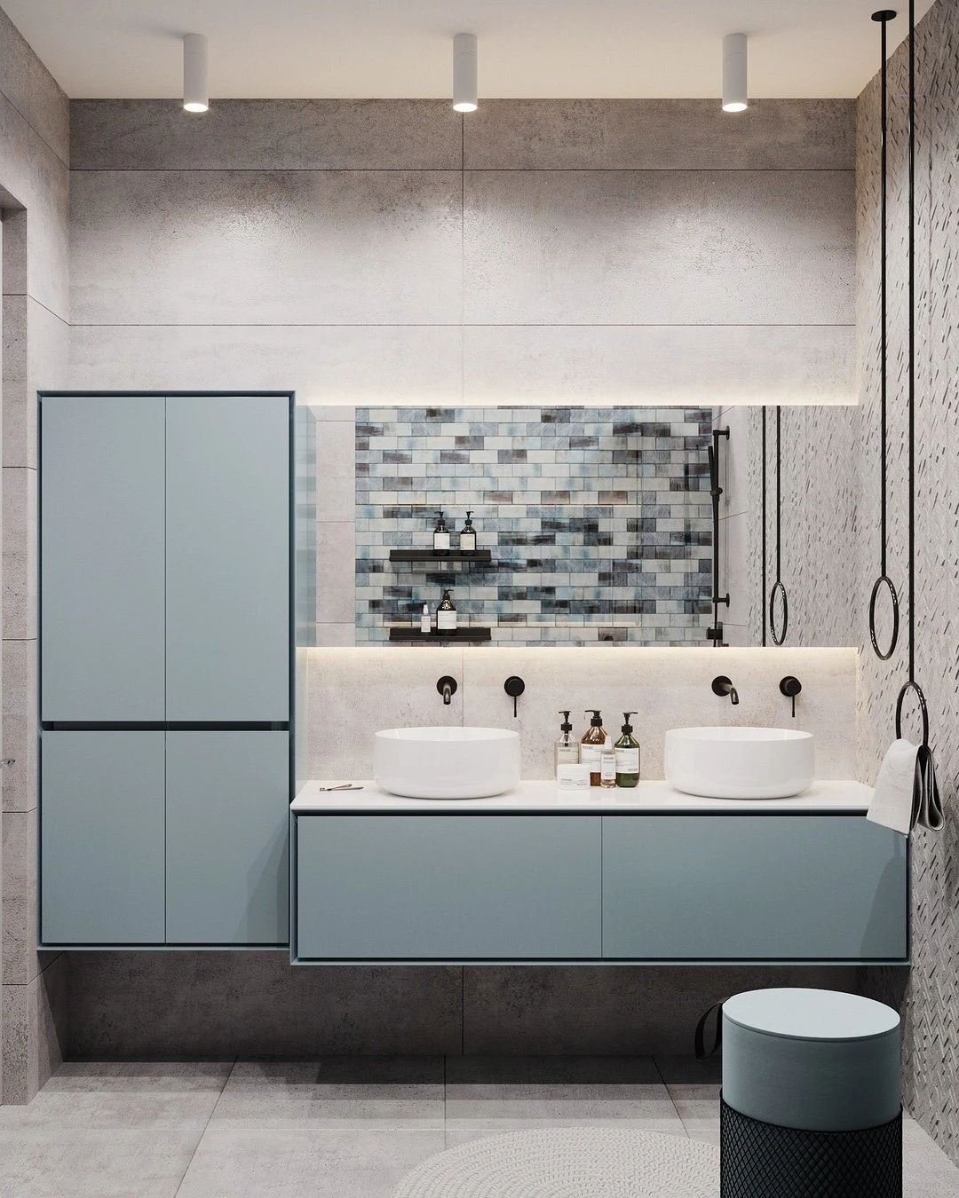
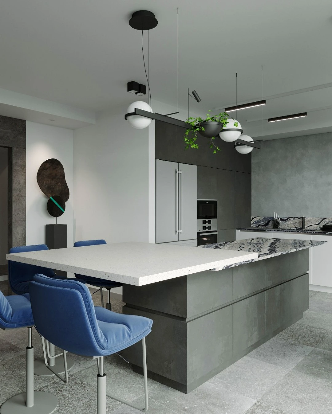
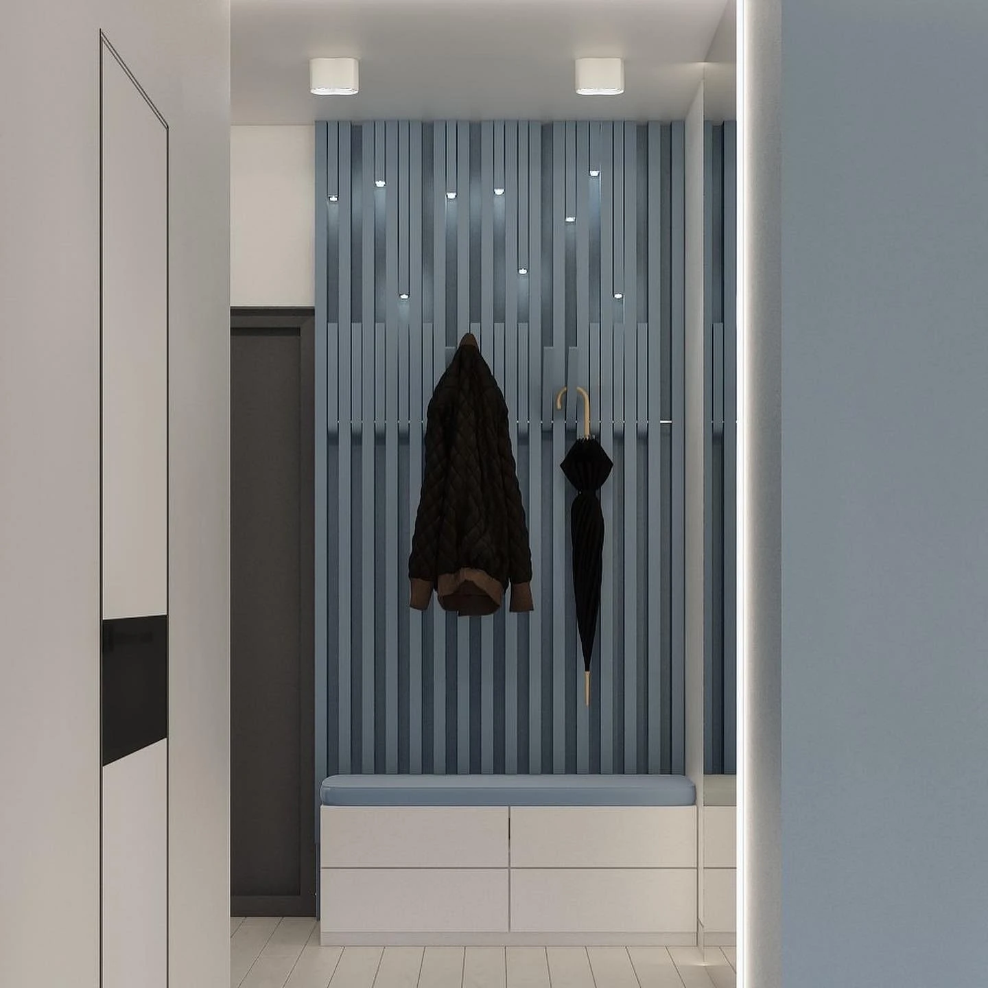
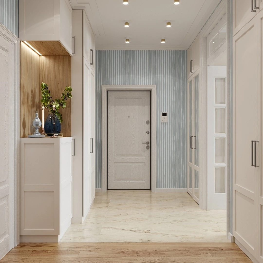
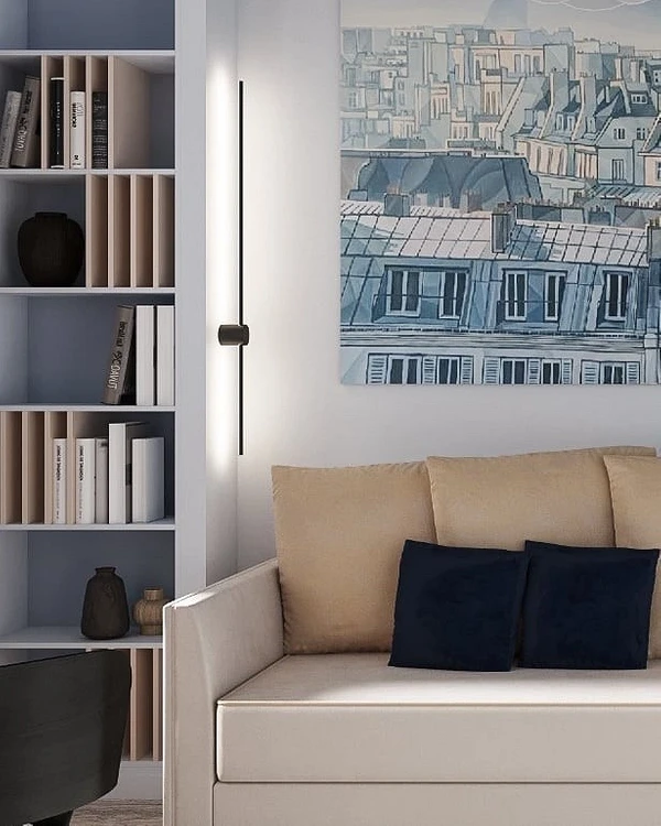
In the living room, it can be a sofa, armchairs, or poufs, in the kitchen – a set, in the dining room – dining chairs. In the bedroom there is a soft base of the bed or an accent headboard, in the nursery, there is a bed or a small sofa. In the bathroom, it will be interesting to look at a bright cabinet under the sink or a cabinet installation above the toilet. And in the hallway, it can be a floor hanger, a pouf, or a bench for changing clothes.
To prevent the product from looking lonely, support its color in other elements: for example, decor or textiles. it doesn’t have to be exactly the same shade – the tone may differ, but overall visual unity is important. It is also important that the selected nuance matches the temperature with the rest of the palette. If it is dominated by warm tones, then do not use a pronounced cold variation of light blue. But for a cool gray-blue interior, cool shades are just right: steel, grayish, dusty, pervenche, etc.

Decor
Finally, the safest option is to introduce color accents through decor. It can dilute a completely neutral monochrome interior (for example, in beige, black and white, or gray tones) or complement a rich palette.
Blue can be:
- Curtains on the windows.
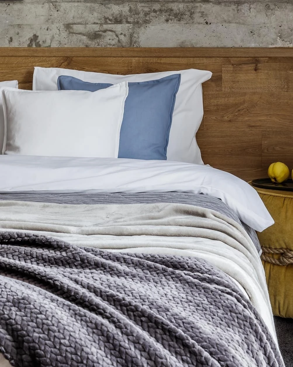
- Bed linen.
- Carpet.
- Tablecloth.
- Decorative pillows.
- Figurines, candlesticks, vases.
- Serving utensils in the kitchen.
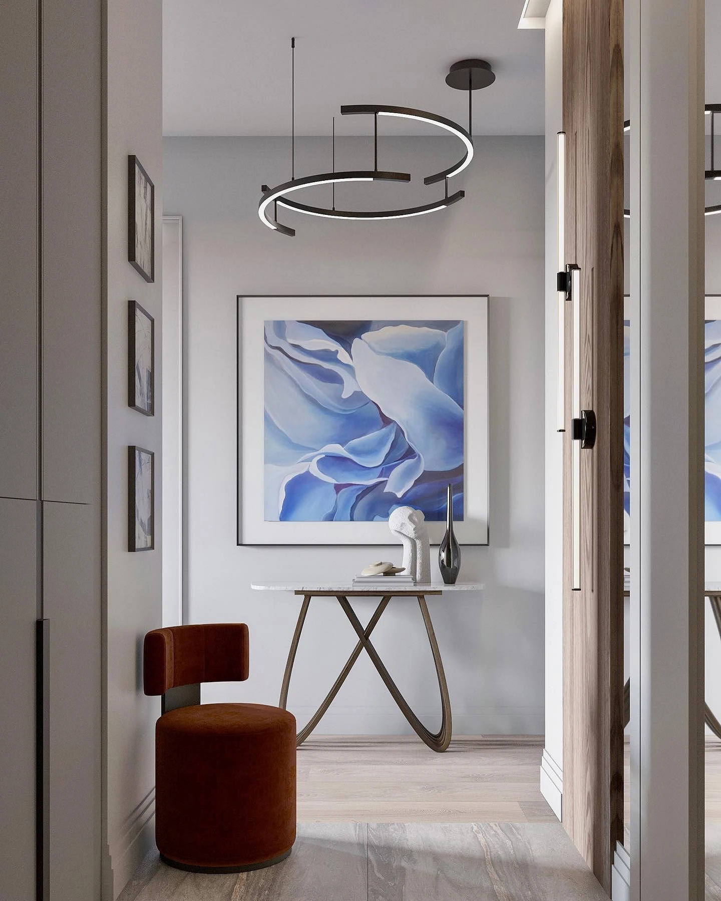
- Frames for posters, paintings, or mirrors.
The main advantage of this solution is that at any time you can update textiles and accessories, changing the mood of the interior and giving yourself a rest from a particular shade.

The most important thing about our X that it is for
those who are in a hurry


