


Dusty pink, muted yellow, gray-olive – we have collected examples of non-standard colors for those who want to go beyond.
Colored cabinets are no longer a rarity in design projects and in the choice of apartment owners who design them themselves. Sophisticated shades of kitchen facades always attract the eye and make the interior special. In our selection – different tones of the kitchen cabinets, are not always bright. After all, the pastel shade of the kitchen can also be unusual. And to make it easier for you, if you wish, to order the same kitchen, we determined the shades from the photo using an online converter. And we will give the color number according to the gradation of the international NCS palette.
1. Grey-olive
Gray-olive in the design of the kitchen can play in completely different ways. It all depends on the style of the kitchen and the accompanying design: wall decoration, apron, and floor.
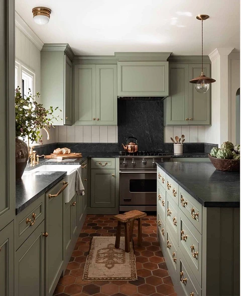
For example, in this project, the kitchen is decorated in a style close to modern classics. This is hinted at by facades with moldings, golden fittings, high ceiling cornices, and a strict dark stone in the form of a tabletop. The decoration is softened by the light shade of the walls and the not-quite-classic ceramic sink. These elements make the space cozier. Approximate gray olive NCS number S 3010-G50Y.
2. Red purple
Also, this color can be called “wine”. It is, of course, difficult to determine it with absolute certainty only from a photo. But this kitchen looks amazing. In general, you can experiment with this color even in a small kitchen.
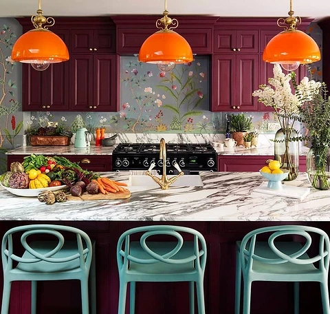
Despite all the saturation of the color, it is not flashy, or deep. Such shades give depth to the space. The approximate NCS color number is S 6030-R10B.
3. Dusty pink
Worldwide designers decorate kitchens in shades of pink. But still, this cannot be called a frequent technique, and that is why they look unusual.
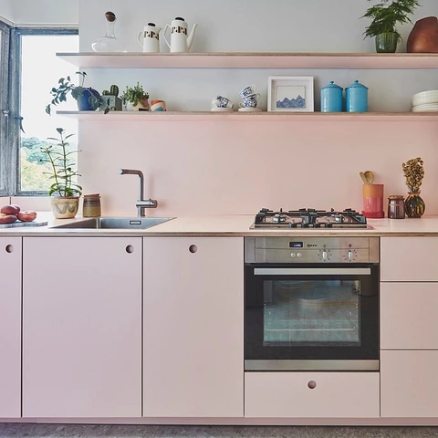
At the same time, the color of a dusty rose is suitable not only for the apartment where the girl lives. Gender stereotypes in design have long been abandoned, and the dusty rose color is even considered basic, one of those that can replace white. Approximate color of the kitchen set in the photo by NCS – S 2010-Y80R
4. Muted yellow
Yellow is usually included in accents, but choosing such facades is definitely an option for the brave.
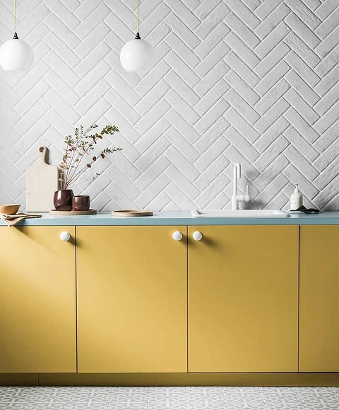
It is better to surround such a bright set with light walls and a wooden floor. In this example, a turquoise-colored countertop was chosen to pair with yellow, but you can also prefer more traditional combinations – with black or light stone, or wood. The approximate NCS kitchen color is S 2040-Y10R.
5. Boiled crayfish color
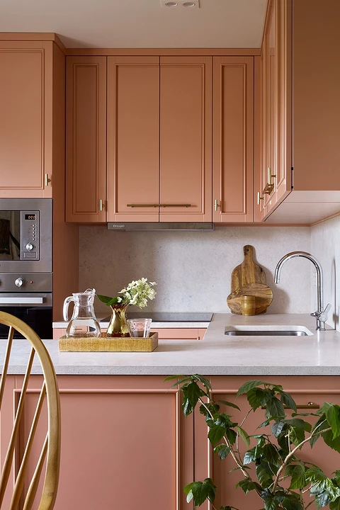
This is what the designer and owner of this kitchen, Natalia Mitrakova, called it. In her apartment, Natalia wanted to recreate the atmosphere of the American South, and this shade is one of the reflections of the goal. The color of the kitchen is at the junction of coral, pink, and beige. Very soft and warm. The approximate number according to the NCS palette is S 3030-Y60R.
6. Pearlescent beige
Even a beige shade can be unusual, like this example of a kitchen unit. The color seems to literally glow from within. Approximate color according to the NCS palette – S 4005-Y20R.
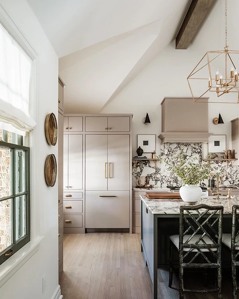
This color is quite easy to combine with other items in the kitchen space, and it will also be interesting to combine it – choose lower and upper cabinets in different colors, and maybe a kitchen island, if the area allows. Achromatic colors are suitable for the combination: white, and black. And also, for example, blue or swamp green.
7. Yellow-orange
Orange kitchen is a bold technique that can be implemented in outrageous, kitsch designs. And also in the country, for example, where you want to somehow experiment. The design of such a kitchen will look more interesting not in minimalism. The minimalist style still suggests a more relaxed palette.
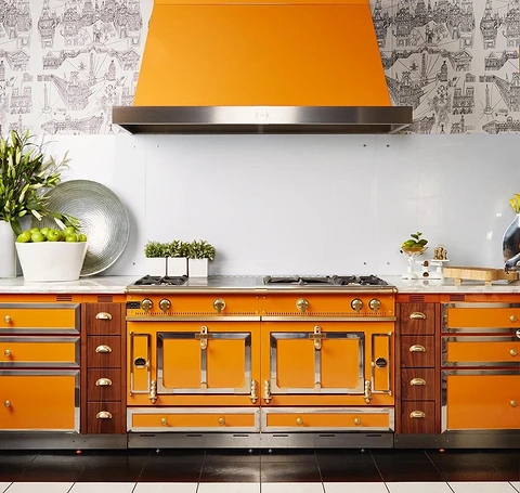
For example, the shape of this kitchen set evokes associations with the industrial space: large appliances, and metal decoration. If you decide to use orange, you should try to repeat the same style in furniture. The NCS color number is S 1080-Y30R.
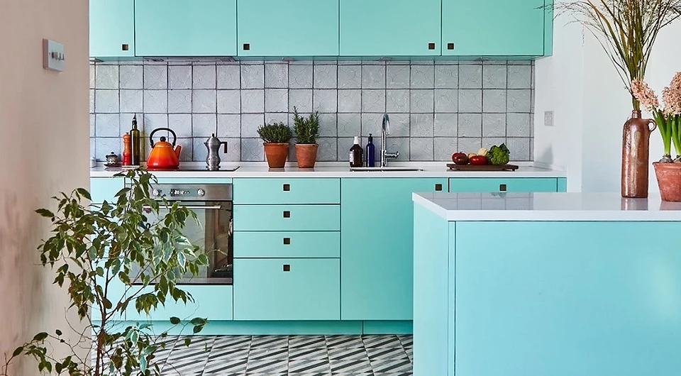
8. Sophisticated green with turquoise
The kitchen from the project of designer Olesya Paramonova is as bright as the entire interior of the apartment. It is difficult to give this shade a specific name, it is a mixture of green and turquoise, something close to opal green. The approximate NCS color number is S 4040-B80G.
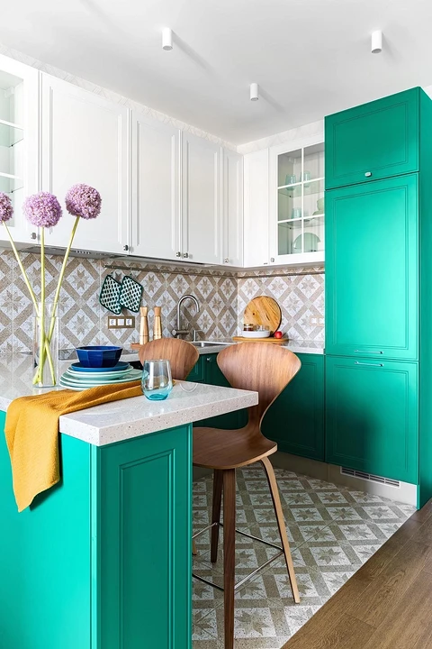
Colored cabinets are combined with white ones. This is done in order not to greatly overload the eyes of the owners of the apartment.
The most important thing about our X that it is for
those who are in a hurry


