


Color combinations that will give a feeling of lightness without hackneyed patterns and obvious solutions.

1. Beige and pistachio
They often try to soften the interior with local color accents, but this technique does not always give the desired effect. Instead, make lighter shades the centerpiece of the palette. For example, beige and pistachio give a feeling of airiness. Let them call to each other: paint part of the wall beige, and its continuation in pistachio. Pick up two-layer curtains in these colors. And for an accent, take a more saturated green, then the interior will turn out to be complete and harmonious.


2. Grey-blue and pearl white
This light and delicate combination will appeal to those who love cold shades. Gray-blue and white are well combined in decoration and in textiles. They can act as the main and accent colors or be equal. And to make the interior warmer and cozier, add light wooden surfaces: for example, a small chest of drawers or a bedside table. Do not forget about dark details: they will add graphicness.


3. Lilac and gray
Lilac is close to pink, but it is used much less frequently. Therefore, the interior with it will turn out to be just as gentle, but original. Pastel lilac looks best on textured textiles, so use it to upholster a sofa, armchair, pouffe, or dining chairs in the kitchen-living room.
Take light gray as the second main color. It is suitable for finishing and large furniture: a kitchen set or a wardrobe. And so that the interior does not seem overloaded, shade the gray-lilac pair with cold white.


4. Cornflower blue and beige
If you want to take beige as the basis of the color scheme, it will need a brighter, but not flashy accent in a pair. Look among pastel colors: for example, delicate cornflower blue organically echoes beige and refreshes the palette.
Introduce a shade of blue into the interior through textiles. For example, hang curtains in this color in the bedroom or cover the bed with a cornflower blue blanket. A little trick: add gold details to make the decor look more sophisticated and expensive.


5. Gray and gold
Another way to get a delicate interior without color clichés is to take two shades of gray as a basis and emphasize them with golden splashes. A lighter tone can be used on a large area: paint the walls or ceiling, lay a large carpet on the floor. Let the second shade be darker. Leave it for furniture: a sofa, armchairs, or a closet. So the interior will not seem boring and flat.
Then add gold accents. Distribute them evenly throughout the room: these can be picture frames, a coffee table, or curly lamps. It will turn out noble and very elegant.


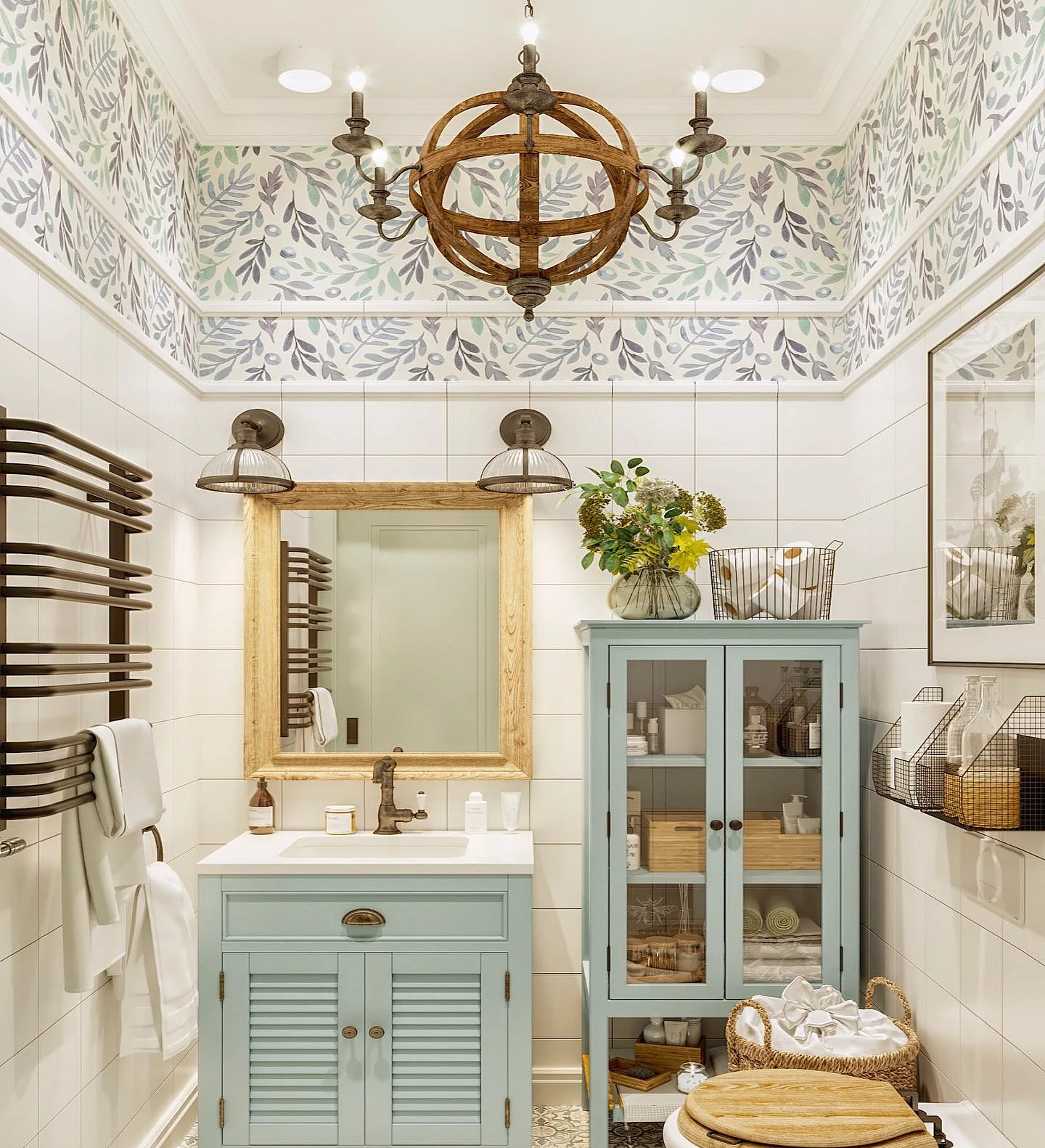
6. Mint and lilac
An interesting combination of pastel shades that is suitable for small rooms. This combination is often found in the decoration and decor of the bathroom. Furniture can also be mint or lilac: for example, a cabinet under the sink. And it is better to shade this pair with tiles, floors, and ceilings of a simple white color – this way the interior will turn out to be airy, but not too “sugar”.


The most important thing about our X that it is for
those who are in a hurry


