


Designers decorate furniture details, accent walls in blue, or mix them with gold. Take a look if you like this beautiful color but are hesitant to include it in your interior.
1. Decorate the bedroom
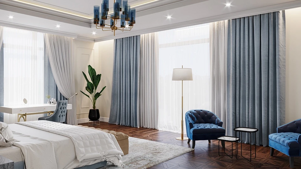
Blue and its shades in the design of bedrooms, as this color promotes relaxation and rest. However, it is advised to use it accentuated so that the space does not look too cold.
Blue is considered the most neutral color for the psycho-emotional state, it can be used both in the style of modern classics and in minimalism, but you should not overdo it so that there is no feeling of cold and depression.
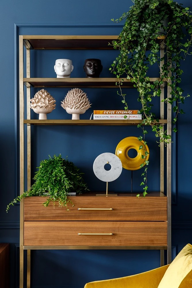
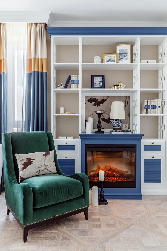
2. Mix blue with gold
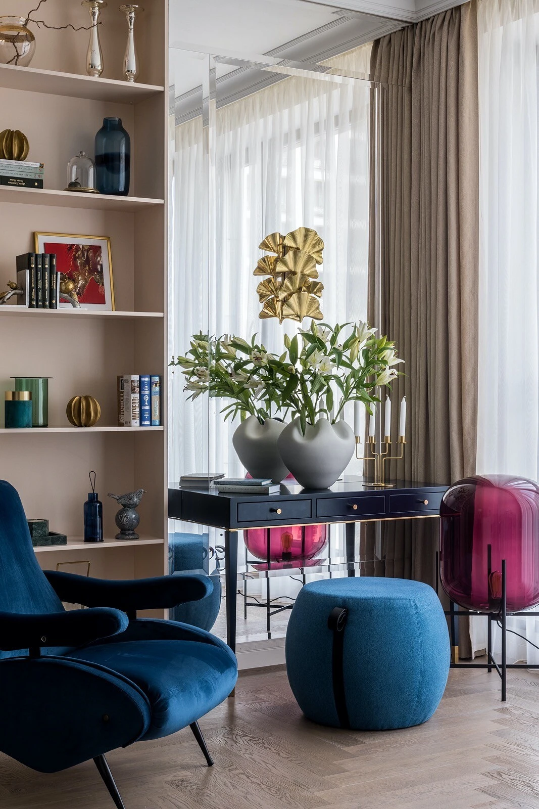
Gold metals have been in trend for several seasons now, and they will perfectly fit into a room that is decorated in blue shades in whole or in part. This combination always looks elegant.
Combination of classic blue and gold. These colors complement and offset each other well, as blue tones down the gold, while gold adds sparkle to the blue.
3. Decorate the walls in blue
Classic blue is a symbol of constancy and trust, the color of faith and confidence, and decorates voluminous surfaces in blue, in particular walls. This finish is easy to dilute with the help of furniture and decor, just choose the right companion colors: light and bright tones, earthy and dark.
No need to be afraid of color! These are old stereotypes that light colors expand the space, everything is quite the opposite: dark shades visually make the room larger and hide its flaws in the form of corners, ledges and boxes. Do not forget that the color of the walls is a beautiful background on which you can paint a gorgeous picture.
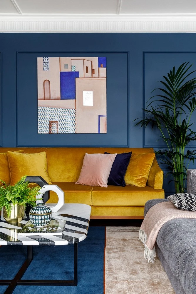
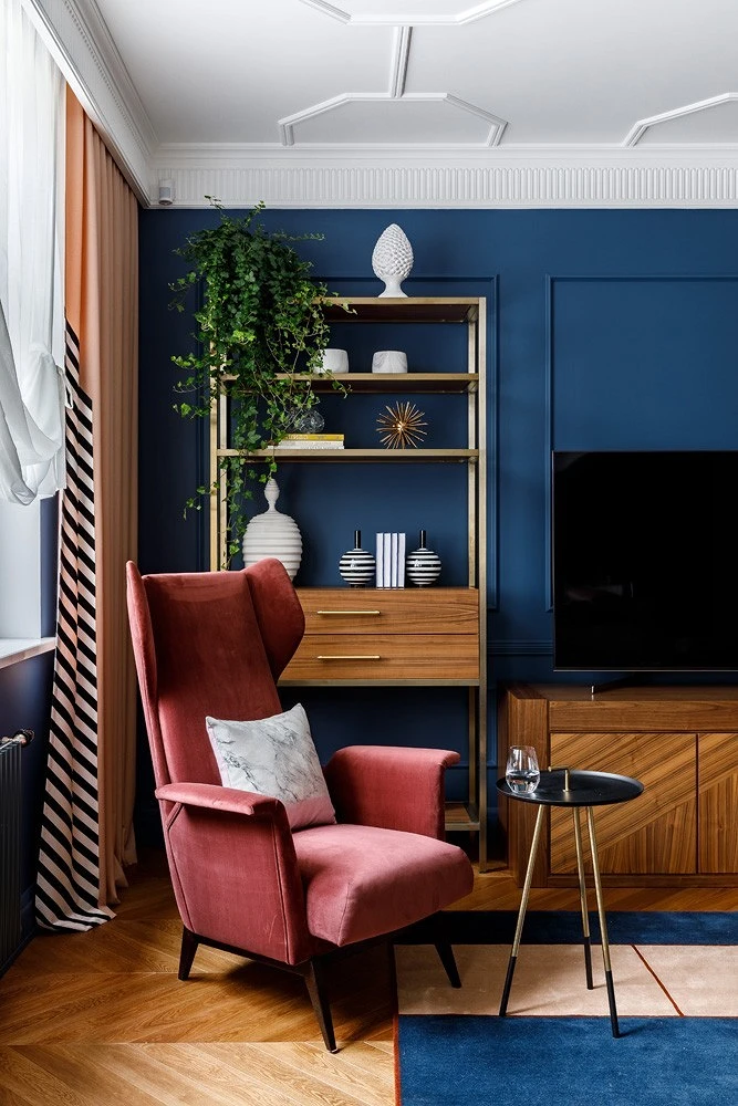
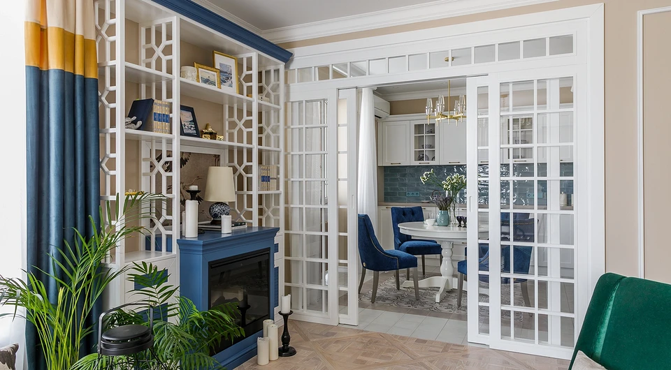
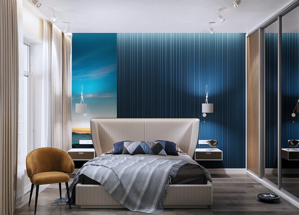
4. Or make one accent wall
blue on the main wall, thereby making it an accent. Moreover, the decoration of this wall can be different, as well as its purpose. For example, voluminous panels at the head of the bed or behind the sofa, the wall behind the TV, facing the wall around the fireplace, and the hearth itself with colored marble, finishing the kitchen apron with mosaics or tiles.
The designers recommend making the rest of the walls in the room background, choosing white or gray, and adding a color opposite to blue in the details. For example, put a terracotta carpet on the floor, hang yellow-brown curtains, and put an ocher-colored chair. So the interior becomes more airy and contrast appears.
Classic blue should evoke positive feelings and emotions in you in order to enjoy its beauty every day. Therefore, I always find out from my customers what associations blue evokes in them. So, for example, one of my clients liked the mountains against the background of the starry sky, because they reminded me of fishing trips to mountain streams. So the wall in his bedroom turned dark blue. Classic blue in the living room allows you to calmly relax from everyday work, creates a feeling of reliability and stability, so it can be used if apartment owners strive for an atmosphere of relaxation in their interior.
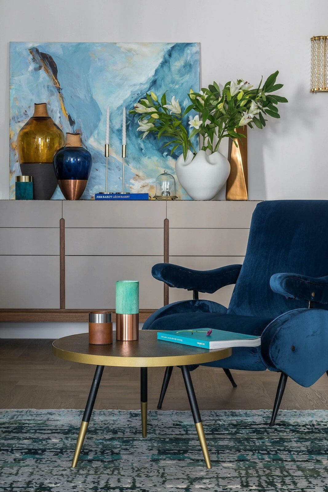
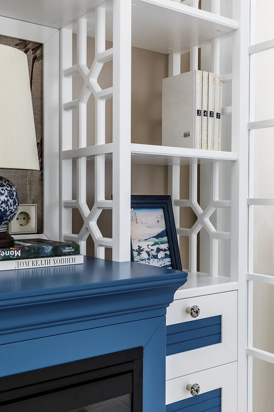
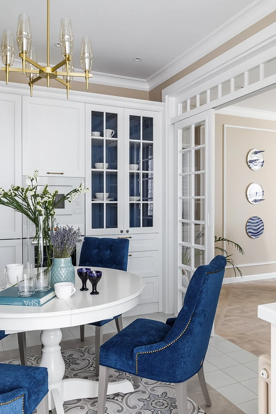
5. Use blue in furnishings
If painting the walls blue is too bold and bright for you, it can be used in furnishings. For example, put chairs in the kitchen with blue upholstery, paint parts of a decorative fireplace, or hang curtains in this shade.
Classic blue has been popular in interiors for a long time, I often use it as accents on the walls, but it is also interesting to introduce it in objects – upholstery, textiles, painted parts of furniture. It goes well with many shades and can be both an addition and an accent on a discreet base.
The most important thing about our X that it is for
those who are in a hurry


