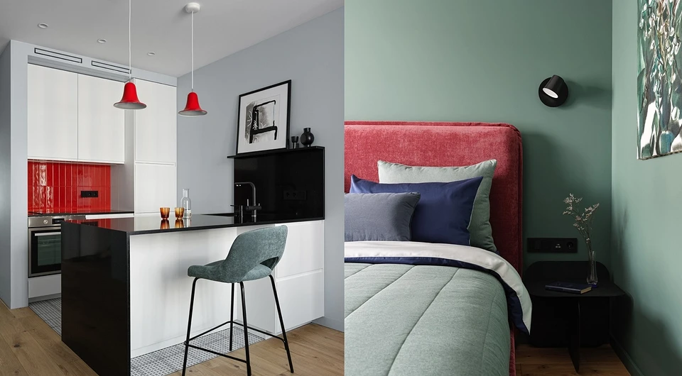
The interior could be called restrained if it were not for the red accents that add to its emotionality.
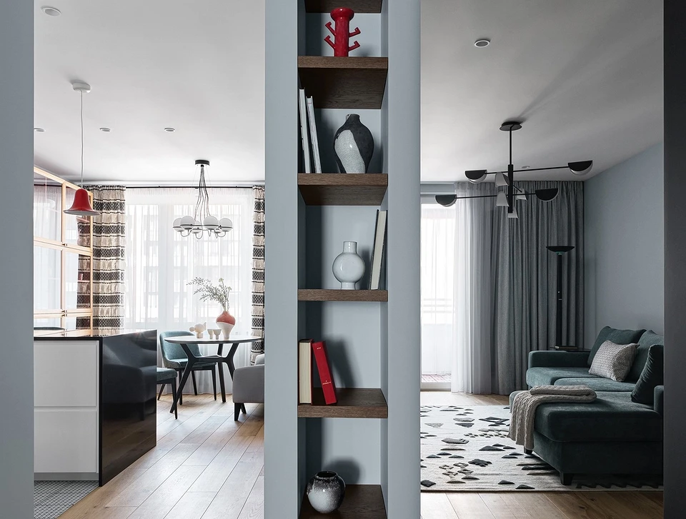
The customer asked the designer to organize a comfortable space that would be convenient for two people. The main wishes were as follows: to make a dressing room, a workplace so that you can work at home, and to visually unite the rooms of the public area. The designer designed the office area in the bedroom, and for the optical unification of the living room and the kitchen-dining room, she proposed the idea of a rack that would hide the interior partition from the end.
Planning
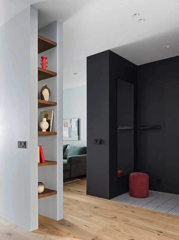
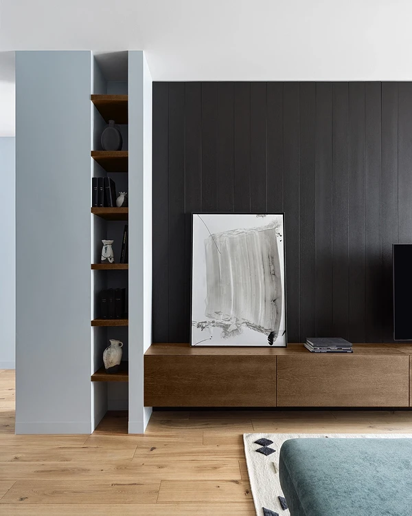
The apartment with an area of about 70 sq. m has a logical and clear layout: the total volume is stretched horizontally, the entrance is approximately in the middle, and the windows are on two sides. Relative to the hallway, to the right is a block of public spaces (kitchen-dining room and living room), to the left is a bedroom, and straight ahead is a bathroom. The redevelopment was minimal: instead of one of the two bathrooms, a dressing room was made (next to the bedroom), and the space of the kitchen and living room was also opened, removing the doors. At the end of the wall that separates these two rooms, a bookshelf was made, and it visually unites the kitchen and the living room.
Repair
The apartment came from the developer in the form of a “box” with block partitions and high-quality floor screed; Basic electrics were also made. During the renovation, the walls were plastered and painted, the ceiling was made of plasterboard, spotlighting, and outlets for ceiling and wall lamps. In each room, in addition to the overhead light, local lighting was provided – sconces and floor lamps. Turning the lights on and off were projected on pass-through switches; We also provided the main switch for all the lights in the apartment.
Engineered boards and ceramic tiles were laid on the floor. The wall in the living room, on which the TV is now fixed, and the other, in the hallway, were finished with panels veneered with wood veneer.
A spacious wardrobe was made in the corridor, part of which was reserved for storing household items.
There is also a shallow storage cabinet in the living room. In addition, in the living room, books were stored on open shelves, and appliances were stored inside the cabinet under the TV. All built-in furniture is made of MDF and painted with enamel in the same color as the walls.
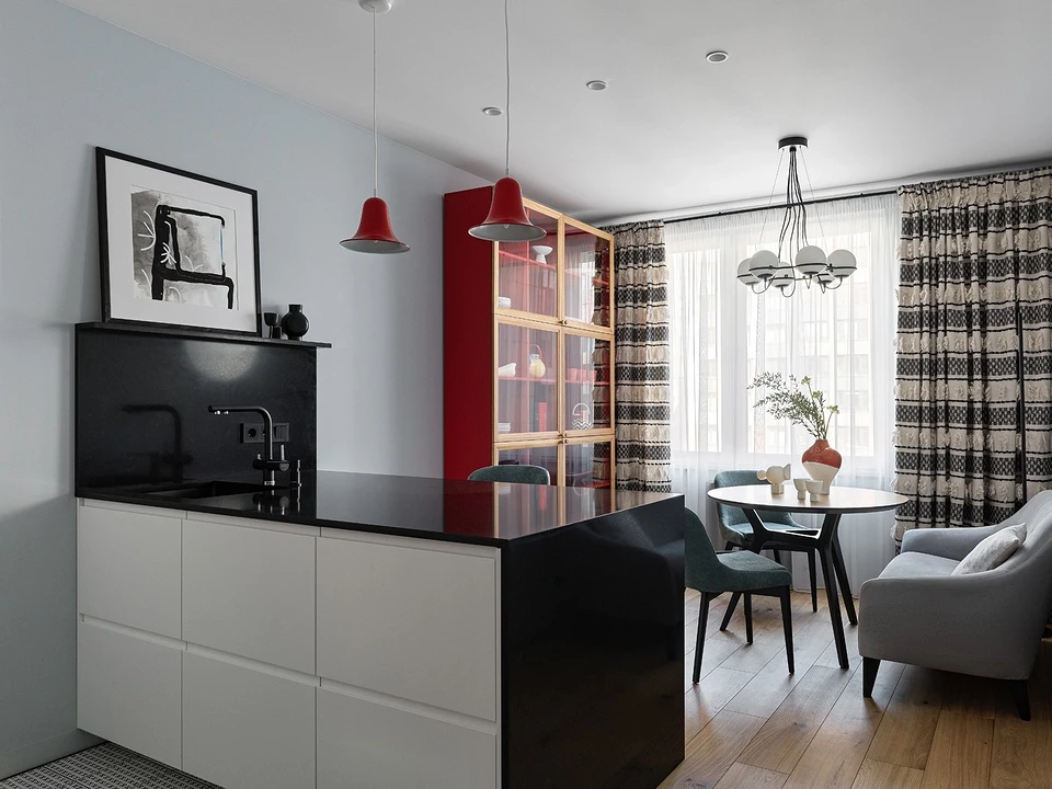
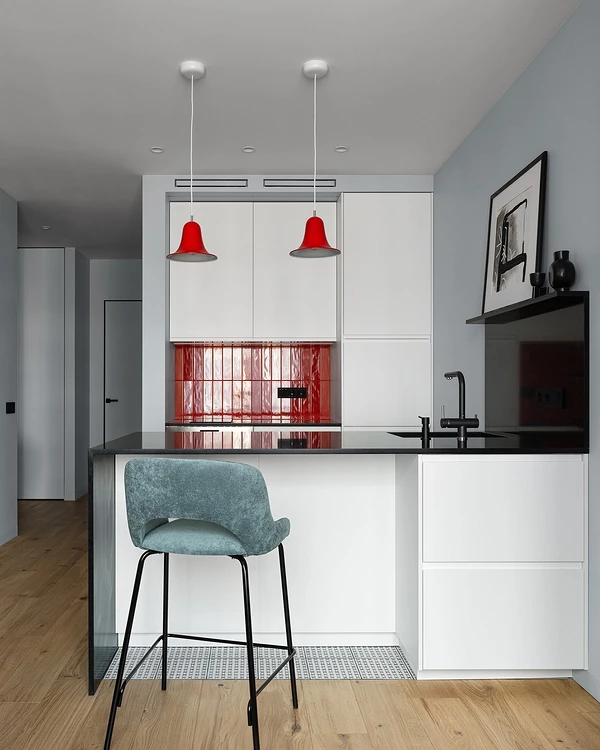
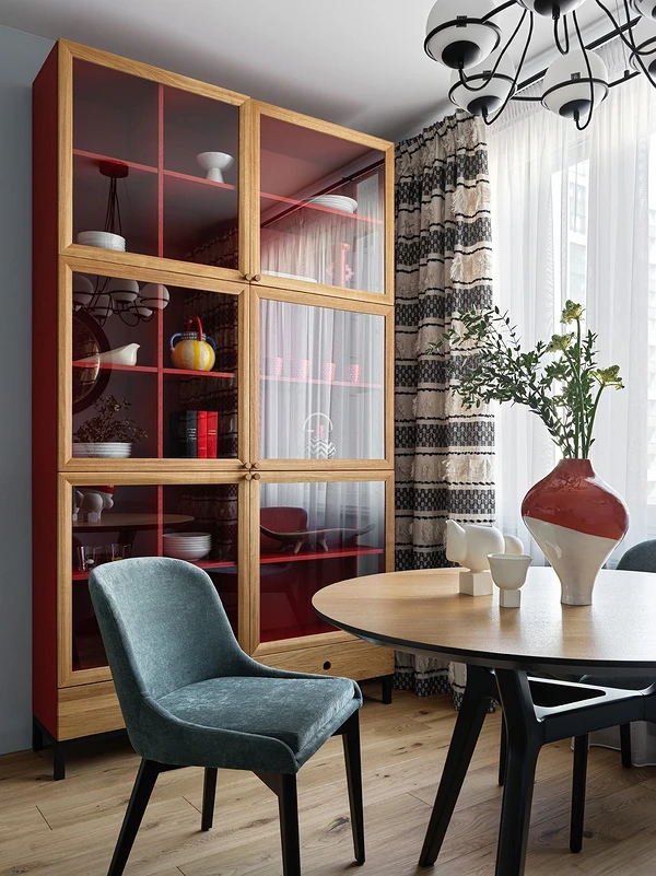
The kitchen was compact, so the function of storing dishes was transferred to the sideboard. The kitchen set was made as neutral as possible, with matte white fronts and hidden handles. The red lamps and backsplash are accents, as well as the black quartz agglomerate countertop.
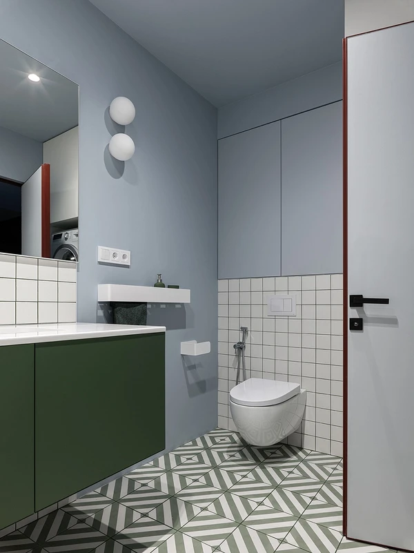
The bathroom cabinet is in the color of the floor tile pattern, the stool is painted in the color of the cabinet. With green grout, even white tiles look spectacular. The tiles were calculated and laid so that there were no ugly undercuts. Above the washing machine, they made a cabinet for storing household chemicals.
Design
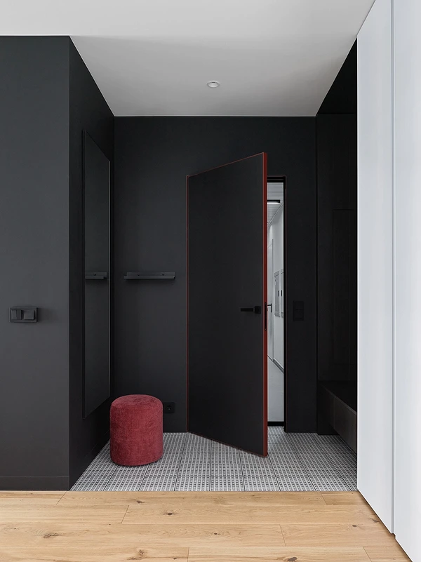
The client wanted a bright interior with red accents. The designer introduced this active color very carefully, with the help of details. So, in the kitchen-dining room, it is a sideboard for dishes, lamps, and tiles on the backsplash. The door frames were also made red, which gives an interesting effect: a thin delicate edging when the doors are closed, and a bright accent when open.
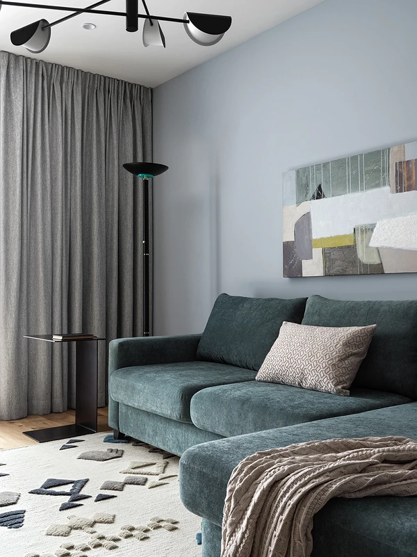
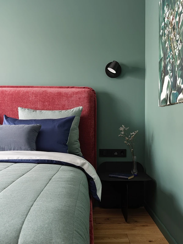
To avoid excessive brightness and not disturb the restrained structure of the monochrome background, Svetlana Mamaenko chose a muted, complex shade of green. Green and red are the so-called complementary colors, located opposite each other on the color wheel, so they look harmonious together.
There is a sofa in the living room of this shade, chairs in the kitchen, a cabinet in the bathroom, and walls in the bedroom. However, in the bedroom, the blue is also not bright, and in the bathroom, where the ceiling and the upper part of the walls are covered with such paint, it is diluted to blue. In general, the designer likes to make a colored ceiling in small spaces: this technique distracts attention from the size of the room.
To zone the bedroom with an office by the window and a dressing room, the designer suggested decorating the work area with paint of a muted blue shade.
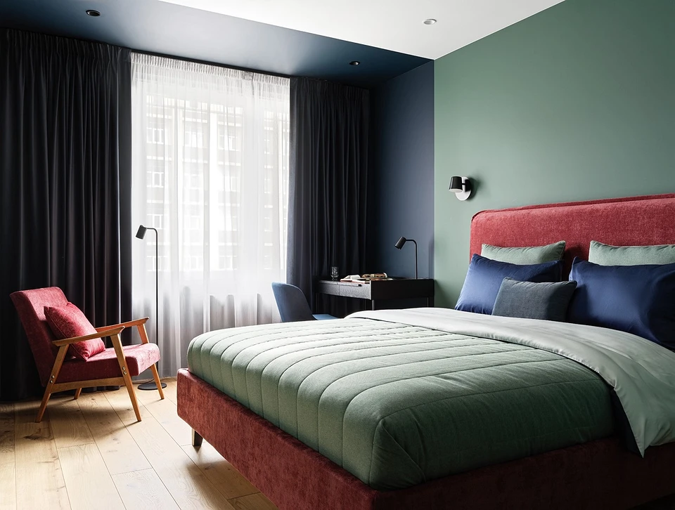
Also, the idea of painting helps to balance the geometry of the room: the bed is on the axis of the bedroom area, the chandelier is clearly in the center of the white part of the ceiling, and the room looks harmonious.
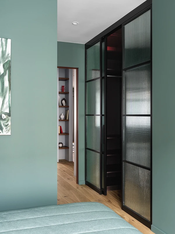
Behind a sliding partition made of fluted glass, there is a dressing room. The glass partition of the dressing room helps to make the bedroom space deeper and more interesting.
The hallway area is highlighted in a very dark color (anthracite). There are only two bright accents here – the pouf and the edging of the door. Behind this wall-colored door, the front door is hidden.
The textiles were selected together with textile designer Irina Rusakova. In the living room, as well as in the bedroom, the curtains are neutral, in the color of the wall. Carpet in the living room with ethnic motifs, with different pile lengths. The shades of the carpet repeat the colors of the painting above the sofa.