


To choose the right paint color, you need to test several shades and trust your instincts. Read our tips and see examples of beautiful interiors with painted walls.
The choice of colors for the interior is one of the key points. It sets the mood and shapes our feelings. Therefore, the issue should be approached carefully. Our article will help, in which we give tips and ideas on what color to paint the walls in the house.
Selection Tips
Not sure how to choose a wall paint color and afraid that the end result won’t meet your expectations? Here are 5 tips to help you decide.
1. Trust your first instinct
It often happens that you plan to paint the walls in a certain color, but then, when you see a wide palette of shades in the store, you begin to doubt. In this case, designers advise not to change the original decision – a spontaneous choice is likely to be not the most successful.
It is best to have a detailed design solution for the room on paper. Color combinations will already be thought out in it, and the temptation to change your choice will become less.
2. Match with furniture
If we are talking about a full-fledged renovation, it is first important to decide on most of the furniture, and only then, what color is better to paint the walls. The combination of shades in this case will be more balanced, besides, you can choose the tone, starting from the pattern on the upholstery of the sofa or chair.
Another argument in favor of this tip is that repainting the walls is cheaper than completely refurbishing the room.
3. Choose paint with rich pigment
Regardless of the shade (it can even be very light), try to choose a paint with rich pigment. It is this finish that will ultimately give the room depth and look interesting in different lighting conditions.
Such paint can be found in the assortment of foreign manufacturers Portola Paints and Farrow and Ball.
4. Don’t give up on testing
Even if you fell in love with a certain tone in the store, don’t buy it right away. Ask for a paint sample and test it at home under different lighting conditions. Light does wonders for color, so seeing how a particular tone looks in your room is very important.
5. Choose the right test site
When testing a paint sample, it is important to choose the right place. Test paint next to other finishes and as far away from distracting elements in the room as possible. So you can accurately understand how the room will look after the repair.
And the last tip. If you still can’t wait to buy paint directly in the store, always give preference to a lighter palette. Sometimes you want to add more color to a space, but in a real room, the lightest shade will most likely look brighter than in a jar.

The best options for what color to paint the walls
1. White
The most popular choice for painting large surfaces due to its versatility. White and its shades (beige, cream, ivory) visually enlarge the space, making it lighter. White is uplifting and calming and also helps to focus.
With white, you can combine any furniture and floor finishes. If it seems that the interior looks boring, feel free to add bright colors. It can be bright furniture or an accent wall.


2. Black
It is widely believed that black and dark gray narrow the space and put pressure on the psyche. But in fact, this is one of the most stylish interior solutions, of course, with the right selection of proportions and combinations with the environment.
The interior with a black wall becomes elegant. Its depth emphasizes the details and gives expressiveness. It becomes the perfect backdrop for artwork and vintage furniture. A classic combination: black walls and light furniture or floors.


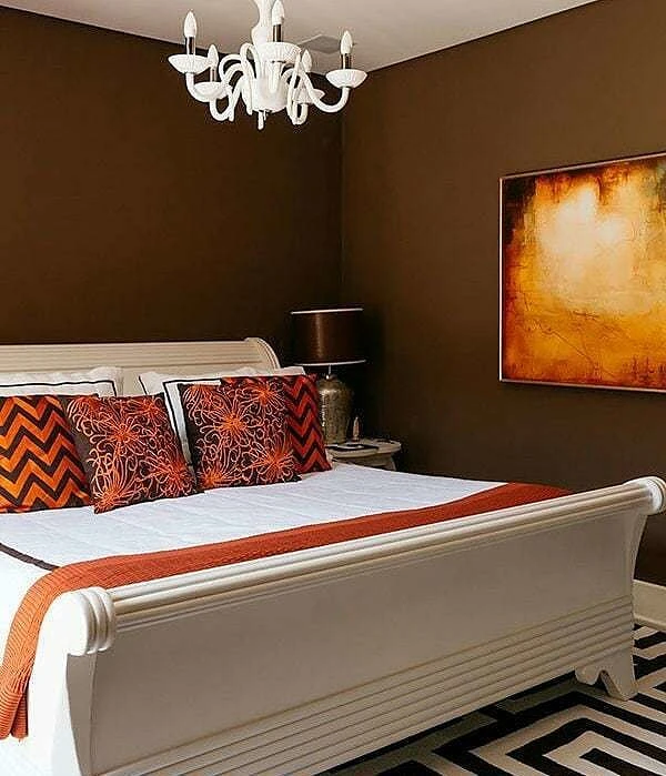
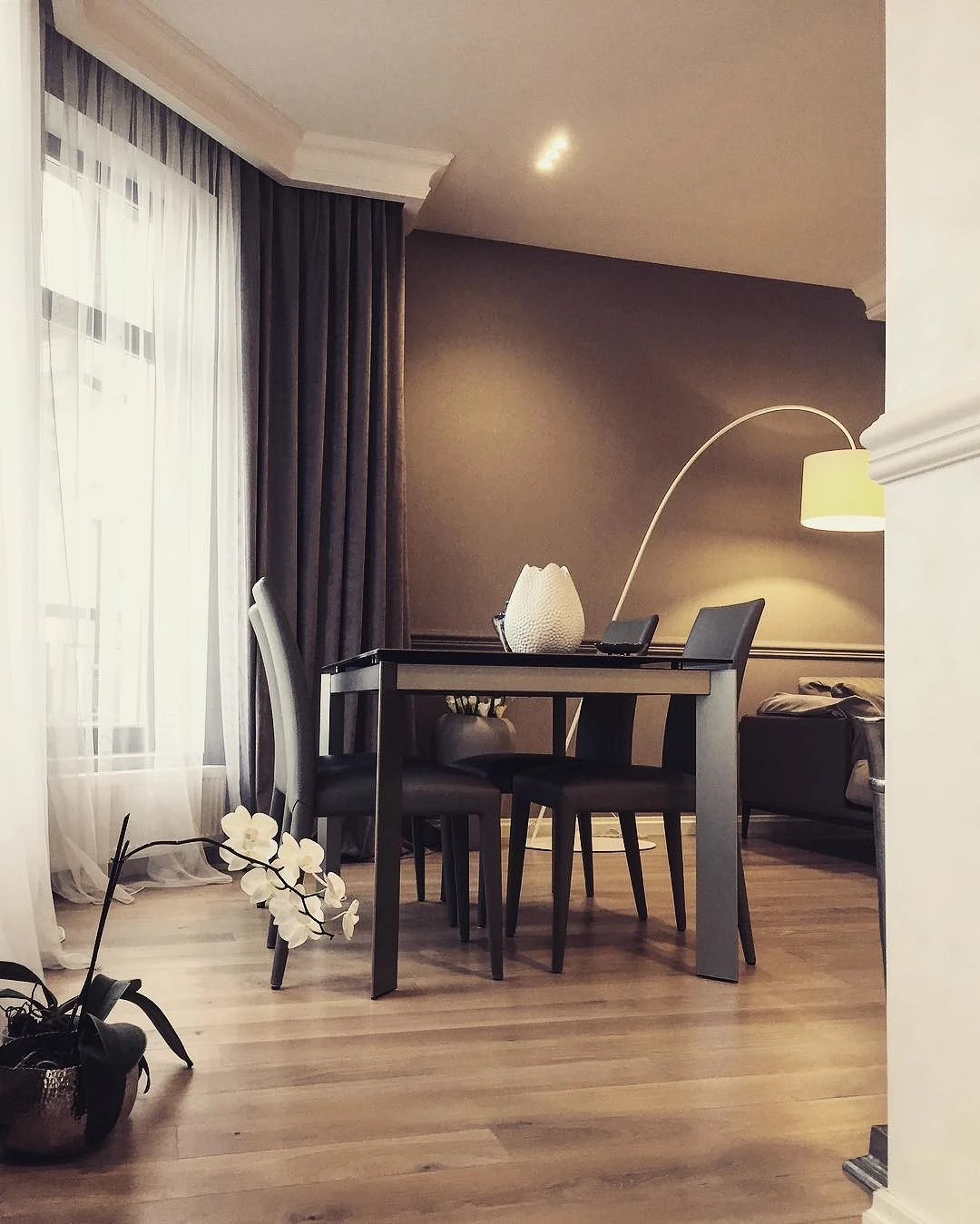
3. Brown
Brown is the color of stability and reliability. It is suitable for classic interiors, as it is considered quite conservative. Brown is also recommended to design a recreation area, as it soothes.
In order not to make the interior too gloomy, it is recommended to combine brown with white and other light colors, such as beige. This rule works both when choosing furniture and when choosing what colors to paint the walls in a room. Another good combination is brown trim and turquoise accessories in the interior.
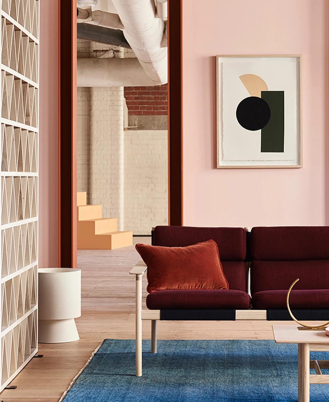
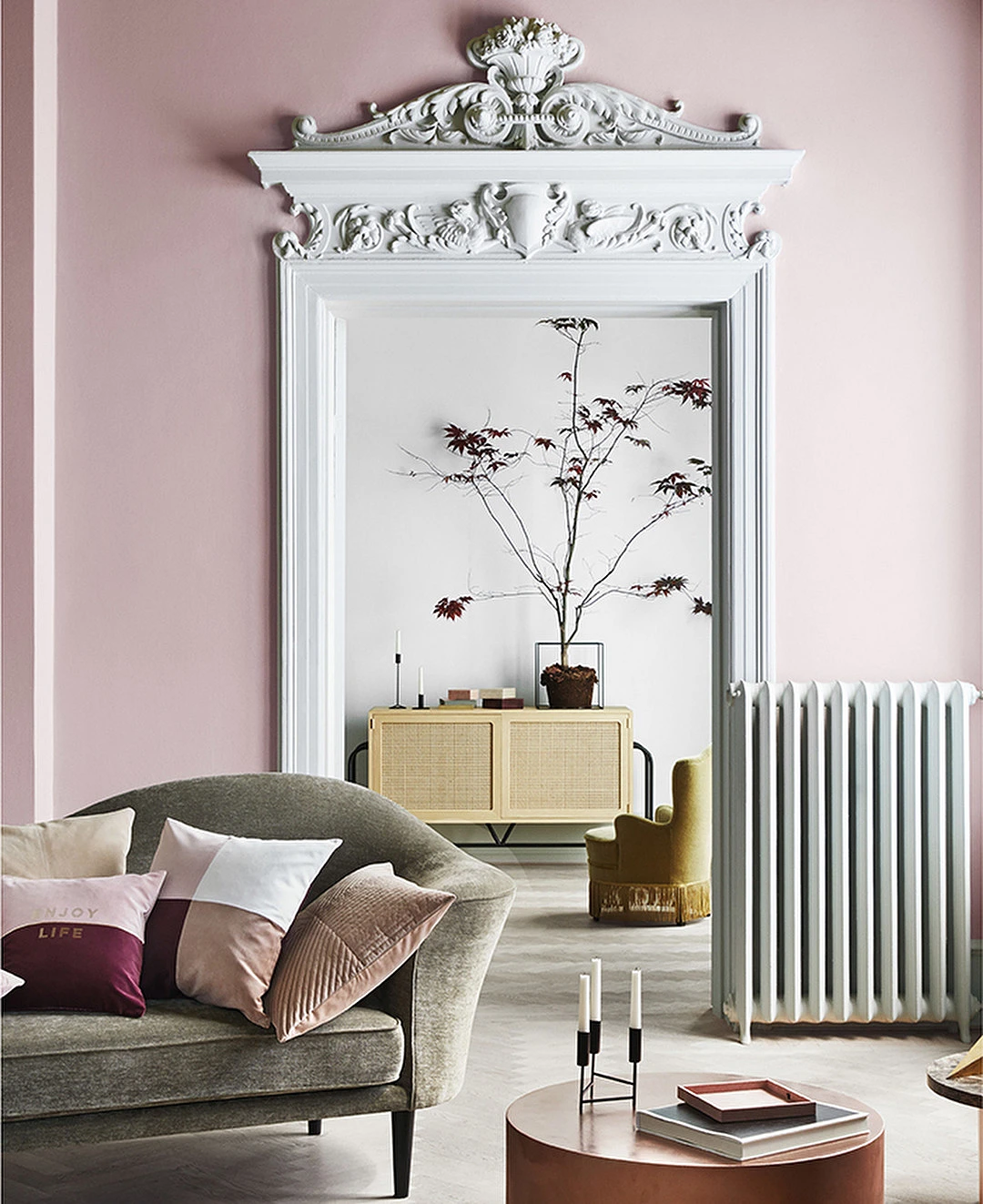
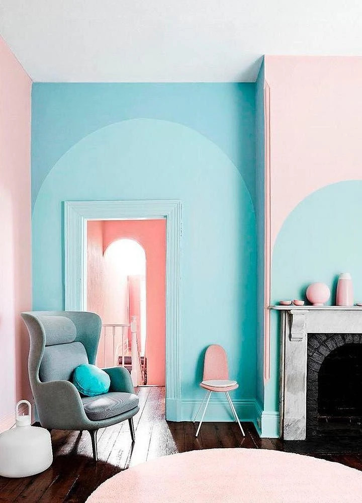
4. Pastel
Pastel colors are very diverse and look great in any interior. Pistachio, mint, soft blue, pale yellow, or pink can be the main background, making the room airy and delicate, or balance a bright and contrasting wall and furniture.
5. Purple
Violet and its shades (lavender, lilac, lilac, and violet) attract attention and set the tone for the interior. They also inspire a person and have a positive effect on brain activity.
When decorating an interior, it is important not only to choose the right color but also to determine its quantity. Violet rarely makes out large surfaces. As a rule, it is used as an accent and balanced by other elements.
Soft and calm tones of purple can be used in a classic interior. In pop art, minimalism, and hi-tech, more saturated options will look good. Against a purple background, light-colored furniture looks the most advantageous.


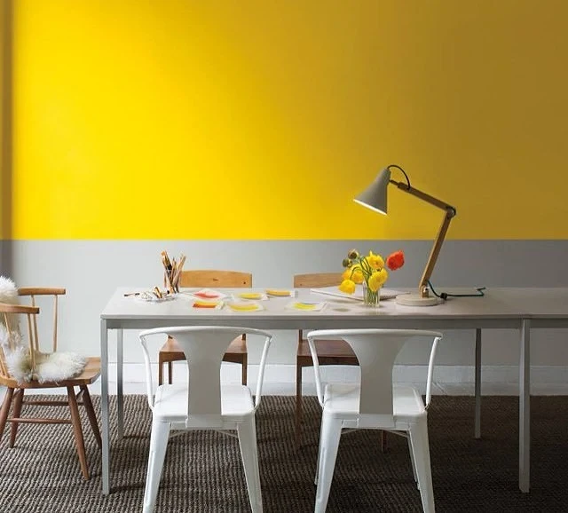
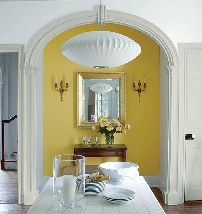
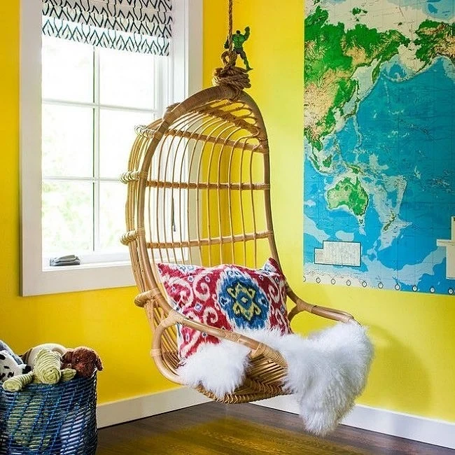
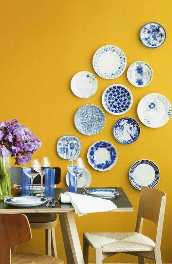
6. Yellow
Yellow, like its variations (sunny, light yellow, and lemon), has a positive effect on mood, and helps to relax. It is best to use this palette in rooms where there is not enough natural light. White and blue furniture and accessories are ideally combined with yellow.
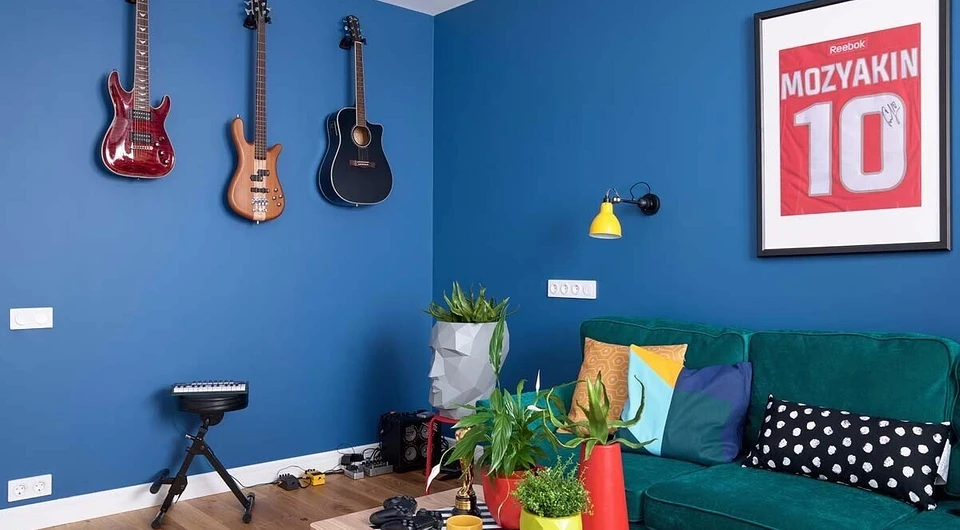
7. Blue
Blue creates a feeling of peace and tranquility. Despite the fact that it belongs to the cold palette, the right combinations with other shades and competent lighting ensure its harmonious existence in the interior.
For small rooms, a combination of blue and white is suitable. White will visually make the room wider, and blue will bring freshness. So that the interior is not too cold, you can use shades of blue, close to blue and turquoise, in combination with beige. Furniture in a blue interior can be neutral, wood-like, or, conversely, bright contrasting colors.


8. Green
It is considered the most pleasing color for human eyes. Green and its shades are recommended to decorate the walls in the bedroom and office. It allows you to tune in to calmness and concentrate on solving creative problems.
The variety of green tones is so great that it can be used in any interior. Light shades will visually enlarge the room, dark ones will make the interior elegant and deep.
Green and its shades go well with each other and wood.


9. Red
Red is associated with passion and luxury. It helps to become more active and energetic, excites, and attracts attention. But in order to paint a large area red, or at least make it the main focus, you will need to pay attention to furniture and accessories.
The best compliment to red is white. Light doorways, doors, window frames, and furniture will balance the aggressiveness of red. Also, red walls will look harmonious with red furniture and accessories.


The most important thing about our X that it is for
those who are in a hurry


