


We tell you how to choose the right tone in order to apply one of the most controversial palettes in the Itten circle in the design of the bathroom.
Bright and rich purple is not the most obvious color for decorating a bathroom. However, not many decide even on a delicate lilac. However, this does not make the palette unsuitable for the interior. We tell you how to design a purple bathroom and not regret the chosen decision.
Tone selection
The purple palette, undeservedly rarely used in the design of the bathroom, contains several dozen colors: from deep dark, almost blue, to light purple, almost indistinguishable from white. When choosing the right one, pay attention to a few recommendations.
- Experimenting with bright colors in the bathroom is not always a good idea. Most importantly, if you are wary of color, you will probably get tired of it soon. Purple itself is active, and even bleached colors cannot be compared with a calmer beige or blue palette.
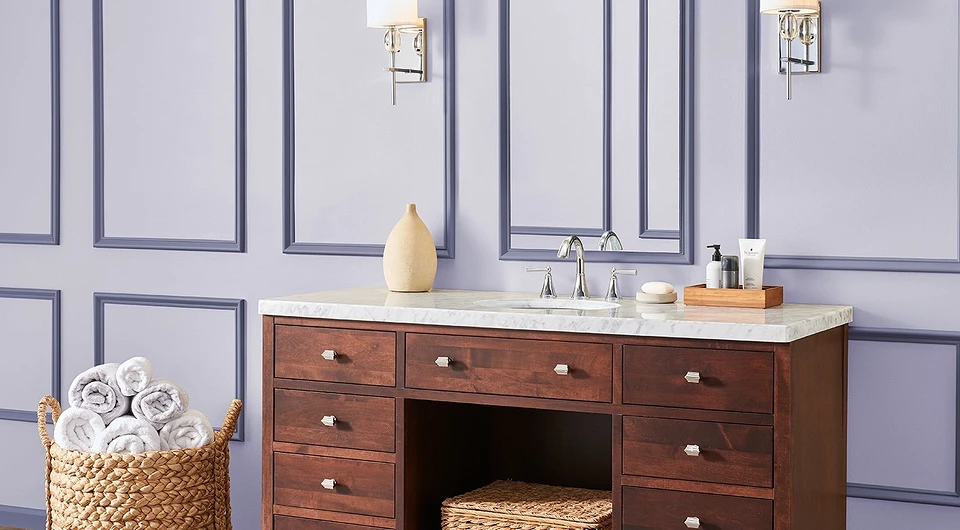
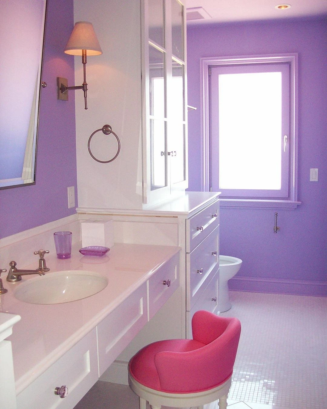
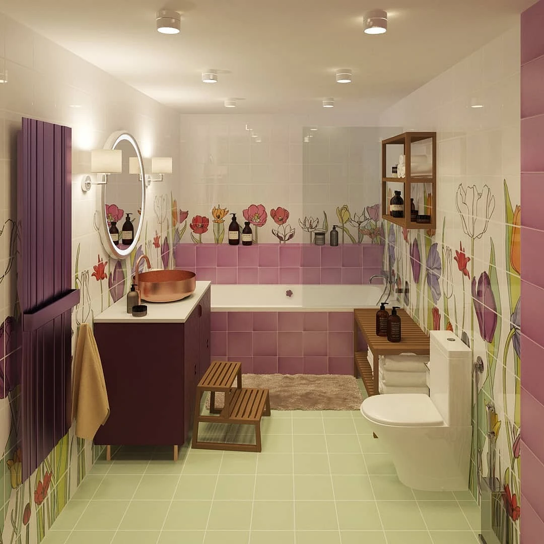
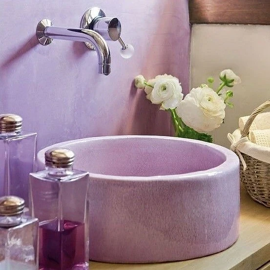
- Second point: planning. Small spaces up to 4 sq. meters still look better in a less contrasting design. Lilac, powdery, light berry tones are suitable here, moreover, as an addition, and not as a base.
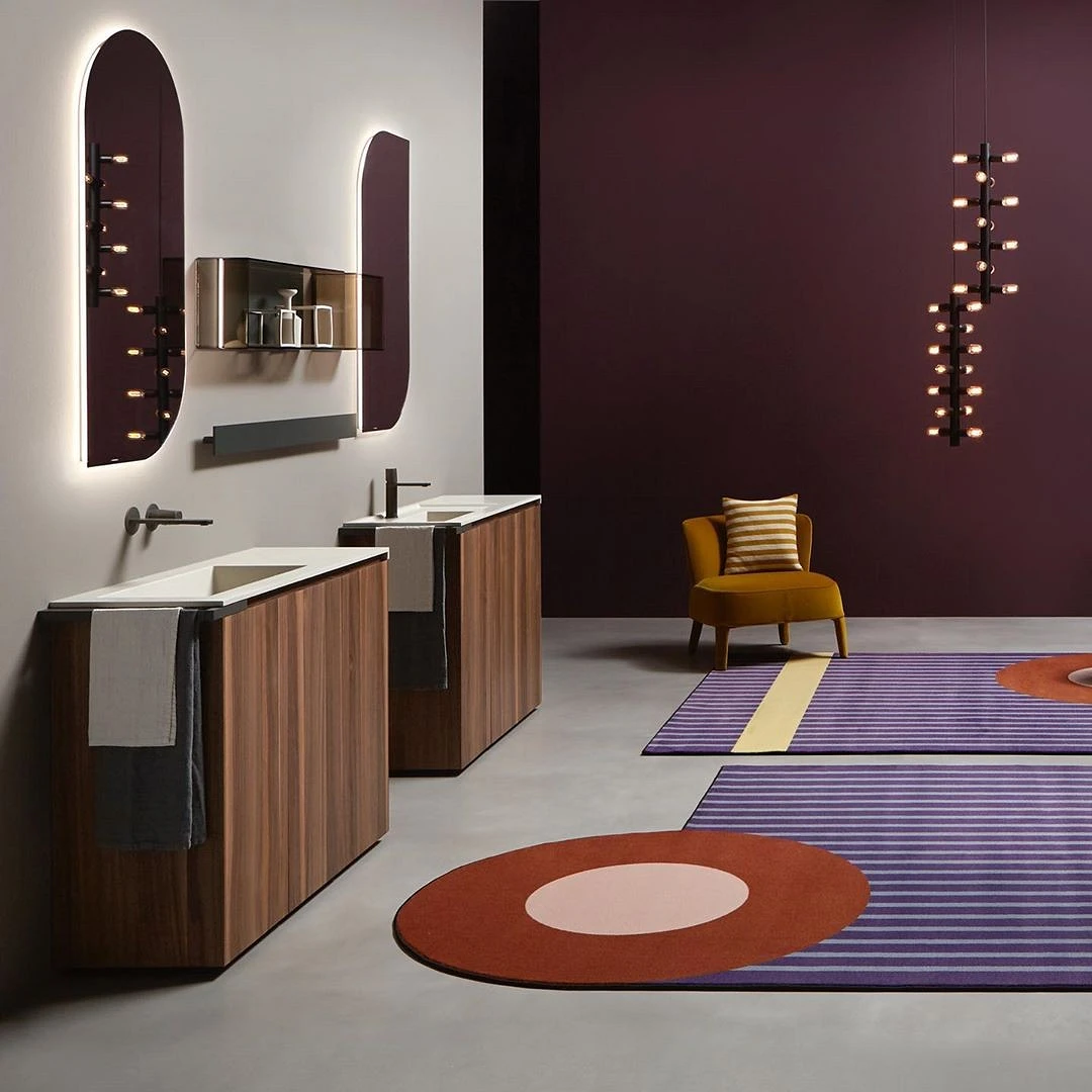
- In larger rooms, you can use contrasting combinations. We will talk about them a little lower.
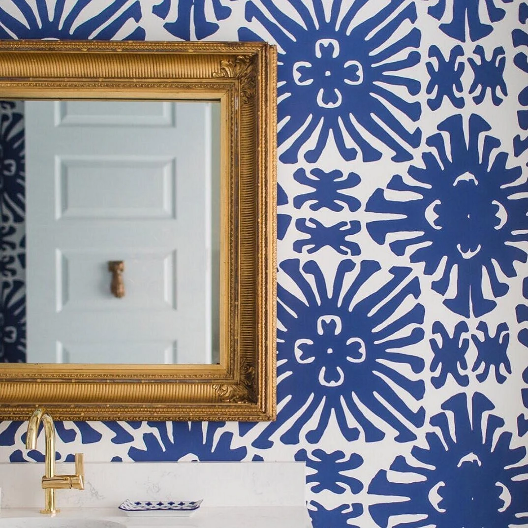
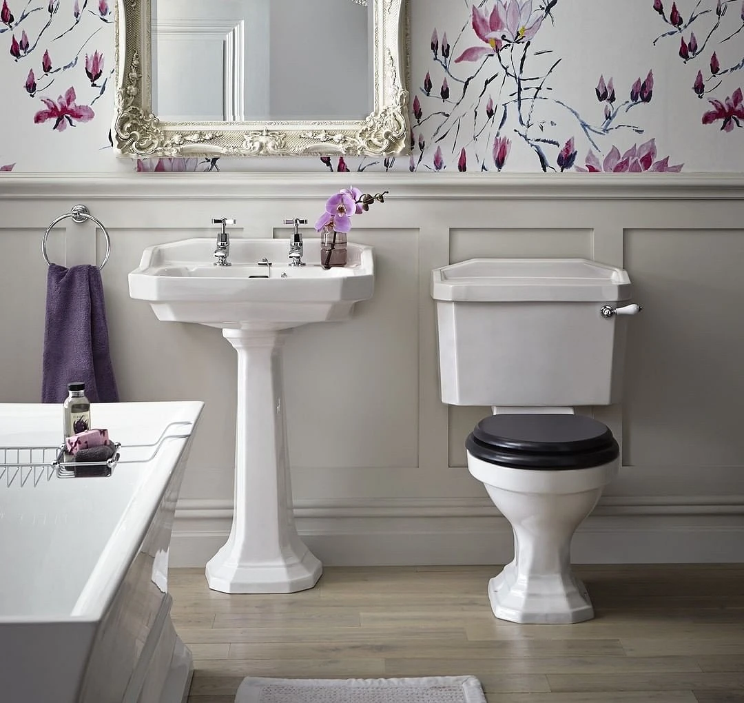
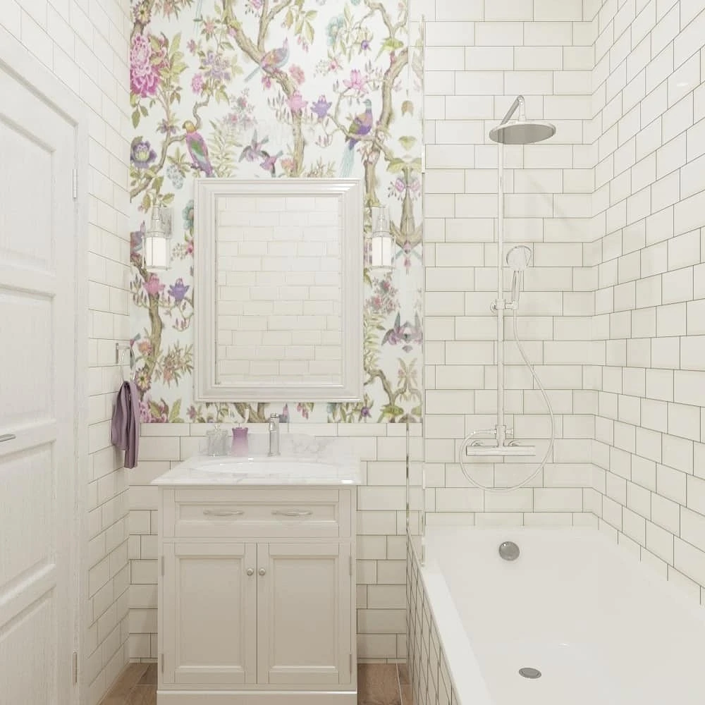
- We recommend introducing color not from accessories and decor, in which case it will look too pointy, but with small inclusions in the finish. You can paint a section of the wall in a certain area, choose a beautiful purple tile for the bathroom, or special wallpaper for wet rooms with a delicate print that contains the appropriate palette.
The color temperature in most cases does not depend on the layout. The choice of a warm or cold palette is purely a matter of taste. When choosing a color, pay attention to its purity. The more complex, the better: blue-violet tones, berry, dirty and dusty – all this is at the peak of popularity among interior designers. Pure lilac shades look a little outdated, light, and naive.


Harmonious combinations in the bathroom in purple
There are several options for the range in which purple and its tones look organic.
With base
Usually, a light or dark range acts as a base, the choice depends on the degree of lighting and the preferences of the owners.
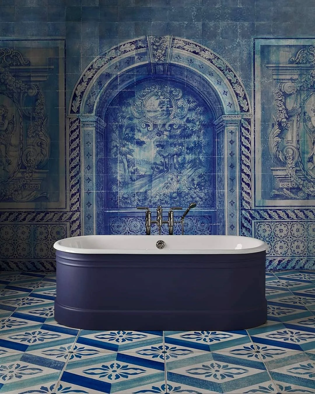
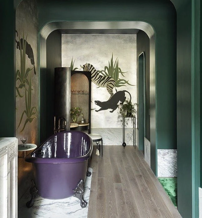
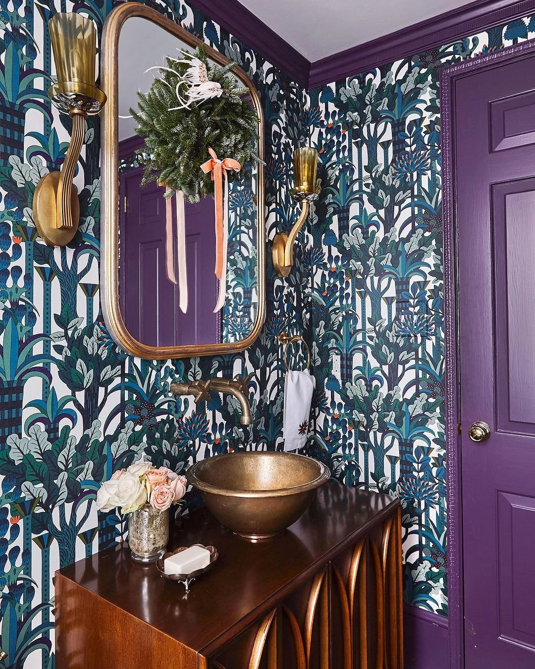
With purple, everything is somewhat more complicated. With a dark base, and it includes achromats: of black and dark gray, it looks rather gloomy and dark. In this case, designers mix colors very pointwise, choosing whitish tones in the environment for this pair.
With a light base, purple also does not always look harmonious. This base traditionally includes white and beige. With the latter, the situation is ambiguous, since on the Itten circle opposite the lilac ray there are yellow, orange, and ocher. Beige, one of the complex colors of this palette, is actually a contrast to purple. It’s not bad but looks pretty active as a base. Therefore, many designers use a more neutral white for the base: with an admixture of blue and blue – in a cold range, with a drop of beige – in a warm one.


Adjacent tones
In this version, the design of the purple bathroom is based on the combination of adjacent rays in the color wheel. It can be the following combinations.
- Fuchsia – purple-blue.
- Fuchsia – purple – red.
The brightness of colors is usually used in doses, often combined with a white or light gray base. Interiors look beautiful, based on basic shades, and complemented by printed wallpapers or tiles in bright colors, dotted with accessories.
Trio
Such schemes are rarely used. Purple in a small amount only complements other shades.
The easiest way is to focus on the prints already proposed by manufacturers. A more complex technique is color blocking, which involves the use of large color spots. Here are some options.
- Purple – green – orange.
- Purple – pink – yellow.
- Purple – red – green.
To make the colors look noble, we again recommend choosing complex tones. For example, instead of yellow-mustard, green will replace khaki or dusted turquoise, orange-ocher, and so on. Here the main task is not to select pure and accurate shades but to act within the framework of the beam.
Schemes for four or more beams are difficult to implement on their own. Such a range will be more harmonious if it is combined with prints selected in finished products and finishing materials.
Additionally
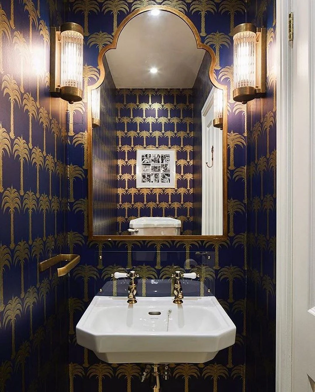
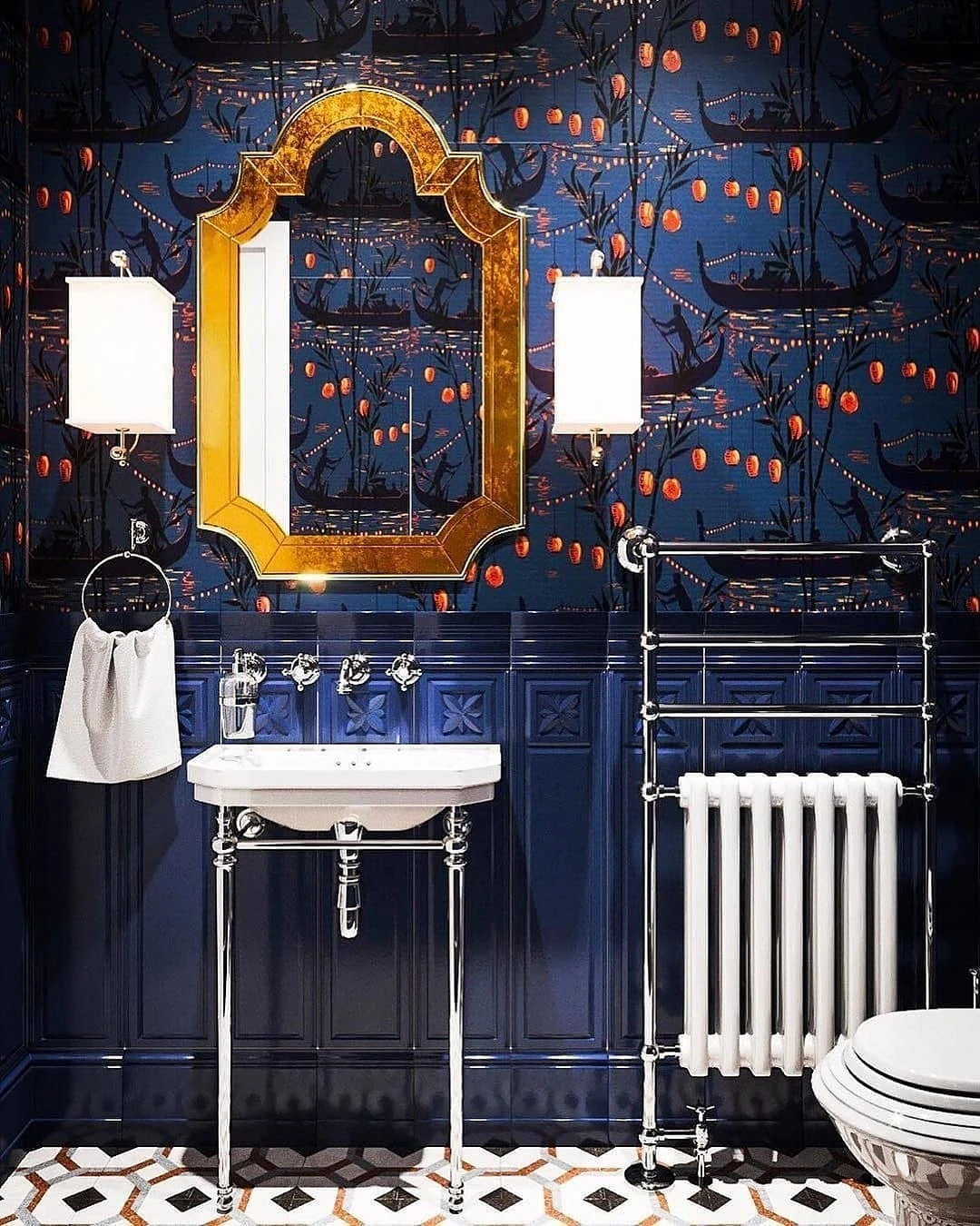
One of the most relevant techniques in the modern design of the bathroom is brass. Designers are happy to use aged faucets, watering cans, and heated towel rails made of warm metal.
In the case of lilac, choosing gold or brass plumbing is very careful. If both shades are bright, and saturated, the combination may end up looking cheap.
Perhaps it is worth starting the design with plumbing because there are much more shades of tiles, wallpaper, and paint.
A more traditional option is chrome products. These are relevant in designs made in cold colors. You can abandon metal in favor of color: black and white matte faucets, watering cans and taps also look stylish and are no less relevant than brass ones.
Use in the interior
There are several ways to introduce purple into a bathroom. We note right away: it is used extremely rarely as a base, perhaps only in the photo of creative projects that are not intended for living. In reality, it can often be seen in two versions.
Addition
This is the case when the base is the base tone, which makes up more than half of the palette, and lilac acts as an addition – 30%. The remaining 10 percent are small accent spots. The easiest way to implement this scheme is to use a large color spot, even without the support of small accessories. This spot can be accent zoning (a painted wall or an accent on a shower room), a curtain, a large cabinet under the sink, and so on.


Accents
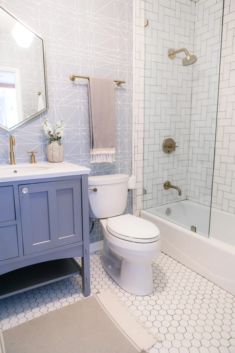
Accent spots are not small decor, as we mentioned above, but drawings (flowers, geometry, animalistic look especially gentle), as well as point support in furniture or accessories: a rug, towels, etc.
The most important thing about our X that it is for
those who are in a hurry


