


Just two colors – it’s not boring! We will tell you how to decorate any room or an entire apartment in black and white to make it spectacular and stylish.
Bright colors are not for everyone. If you expect tranquility from your home environment, a black-and-white apartment interior will be the perfect solution. In this article, we will analyze all the pros and cons of this classic combination and tell you how to play with it in different rooms so that the space looks organic and not boring.
Pros and Cons
Any color combination will have both fans and opponents – simply because each person has their own tastes and expectations from the interior. Let’s take a look at the advantages and disadvantages of an achromatic pair.
Pros
- It’s a classic. Like other neutral colors (brown, gray, beige), white and black will not lose their relevance — they are a base outside of trends. At the same time, you can easily dilute such a palette with bright textiles or décor, and then change them at any time or completely remove them, returning to a restrained palette.
- Both achromats are universal and impersonal in a good way. They are not bound by any gender stereotypes and do not cause negative associations. They don’t overload the nervous system, like bright red, and don’t make you sad like dark blue in large quantities. Thanks to this, they are suitable not only for any room, but also for any person – for example, such a range will be very successful for an apartment for rent.
- They are easy to combine. For those who renovate without a designer, it is often difficult to choose shades and create a harmonious palette. To do this, you need either an innate talent or a lot of observation, or better both. In black and white, you definitely can’t go wrong. The main thing is to choose the right proportions and not overdo it with dark elements.
- Achromatic tones look restrained and at the same time expensive, and together they create a spectacular contrast, which in itself makes the interior bright.
- With their help, you can visually adjust the proportions of the room. For example, adding more highlights to make the space appear larger than it is.


Cons
- It can be boring. The main complaint about achromatic interiors is their facelessness and flatness. But this effect is created not by specific shades, but by the lack of thoughtfulness of the design as a whole. The perception of space is influenced by many different factors: shapes and silhouettes, materials, lighting, a variety of textures, furniture, décor, etc.
- The choice of colors is limited. It seems that such a decision severely restricts freedom. But you can always add a couple of bright details to the palette for contrast or a local complementary color (for example, a shade of gray or a natural color of wood), as well as focus on clear lines and pronounced textures.
- Both colors are dirty. In fact, this can be said about any shade, and the essence — again, is in the nuances. Yes, a dark matte set in the kitchen or snow-white walls in the hallway sounds impractical. The problem is solved with the help of suitable surfaces and materials: for example, glass wallpaper of any color washes better and lasts longer than the cheapest vinyl.


The black and white interior of the rooms
Let’s take a look at how to beautifully implement a black-and-white style in the interior of different rooms.
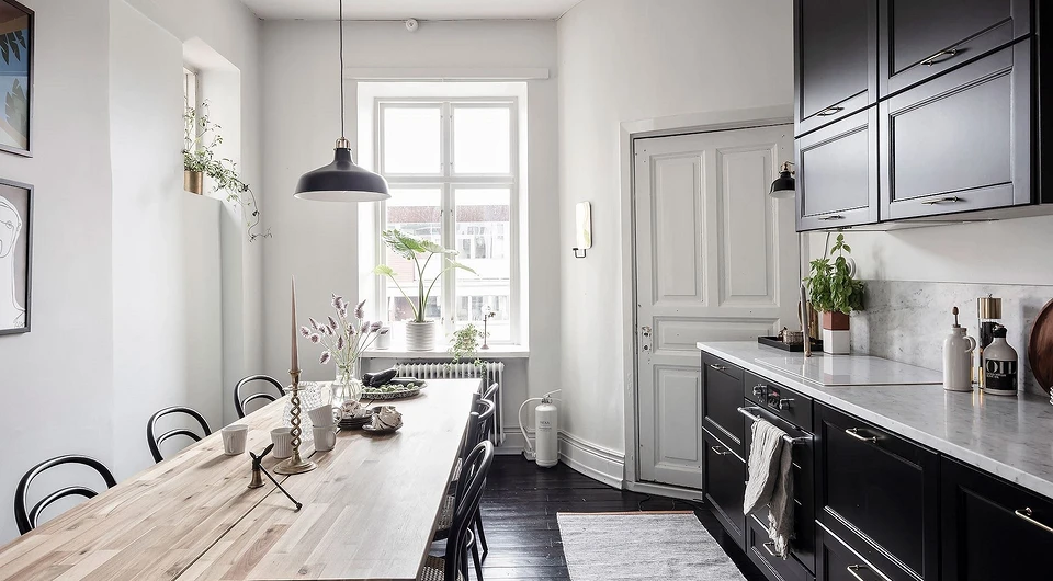
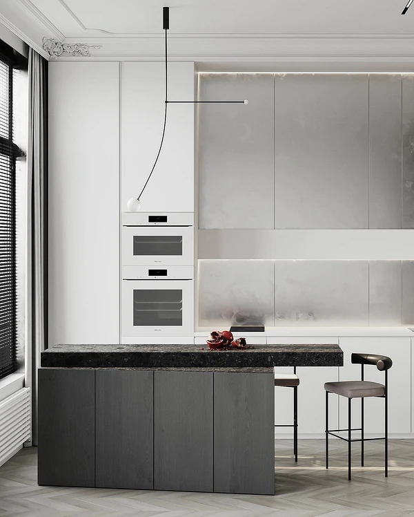
Kitchen
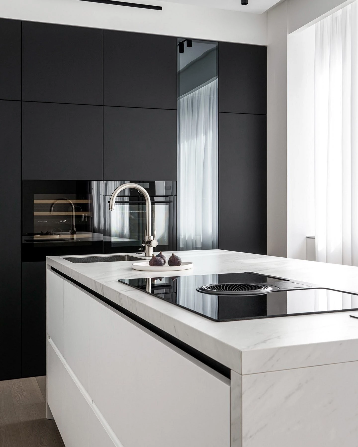
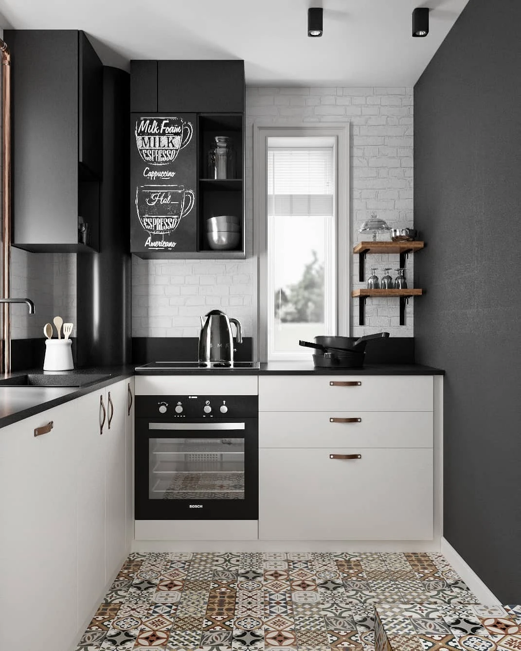
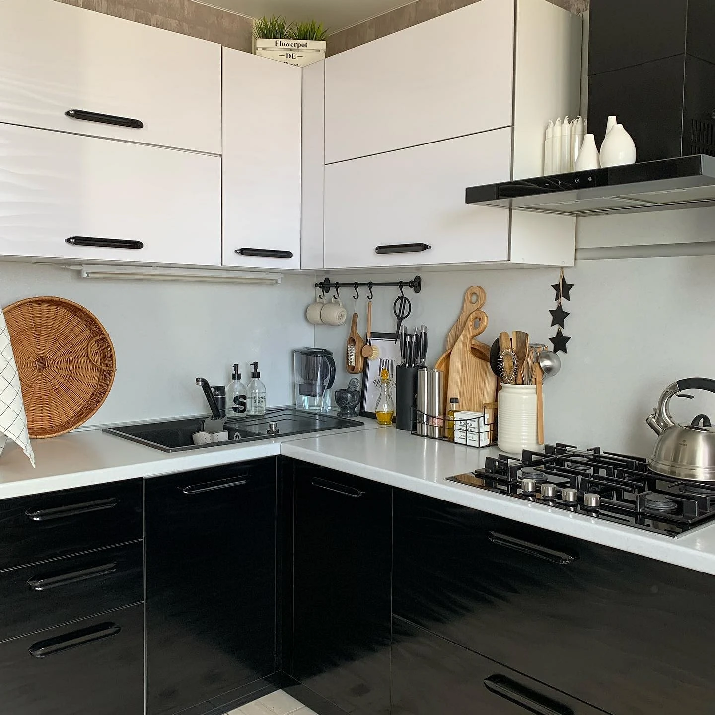
Black walls in the kitchen are rarely made, but dark cabinets are now in trend. However, it is not suitable for every apartment.
The smaller the footage, the more light tones there should be in the palette. If you have a tiny niche kitchen or a five-meter kitchen in a Khrushchev apartment, it is better to make an almost total white interior and use dark details locally: for example, for a countertop or backsplash, fittings, lamps, a bar counter, etc.
A snow-white set with a dark tabletop or backsplash looks unusual – it turns out graphic and stylish. This technique looks especially good when there is a texture of marble, stone or concrete. If there is little sun in the room, it may look cold. Complement a couple of achromats with a cozy wood texture: it can be a floor, a work surface, a dining table or shelves instead of the top tier.


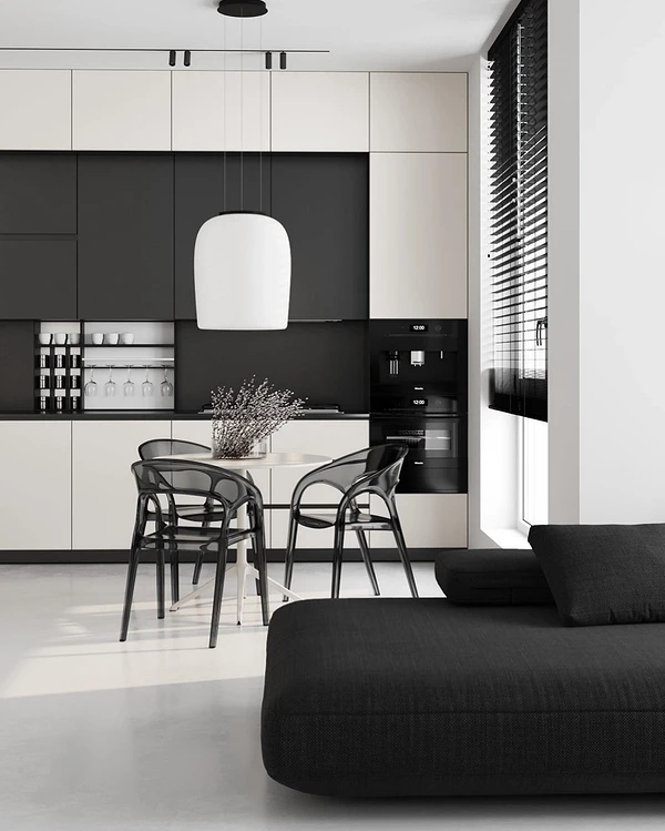
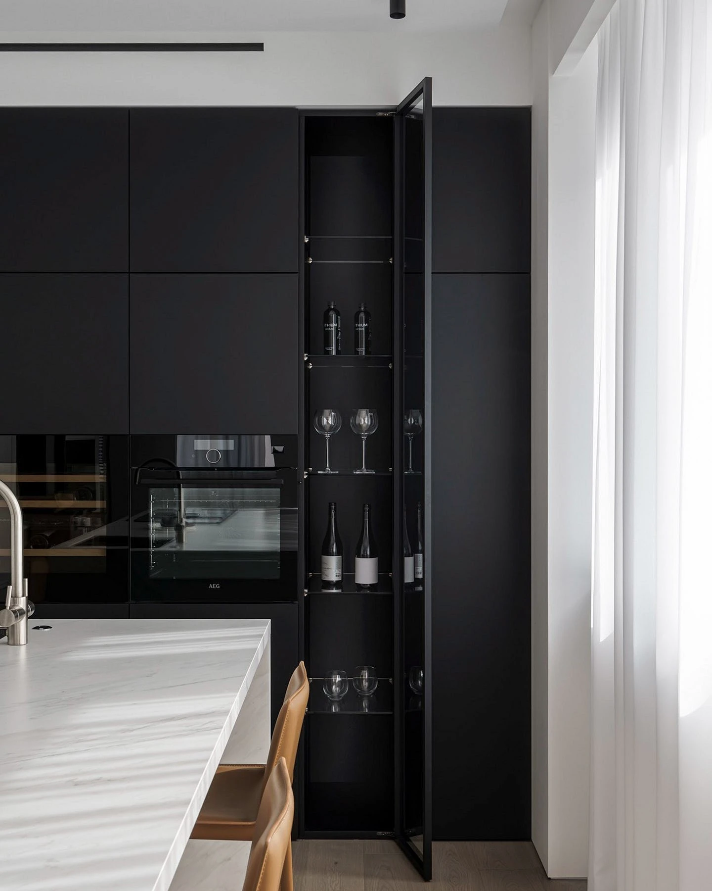
In minimalistic, high-tech, and loft interiors, a monochrome dark set with built-in appliances and smooth surfaces is often made. It looks very impressive, but it is important to remember two points:
- Firstly, deep tones hide the space, and the set occupies almost the entire area of the kitchen. Therefore, this design is suitable if the room is not too small, it has enough light and high ceilings.
- Secondly, be thoughtful in your choice of materials. Matte graphite facades produce a wow effect, but they will have to be constantly washed, and all fingerprints or grease stains will be very clearly visible. If you like the idea of a dark typeface, it’s better to choose a glossy or semi-glossy surface — or be prepared for daily cleaning.
Living room
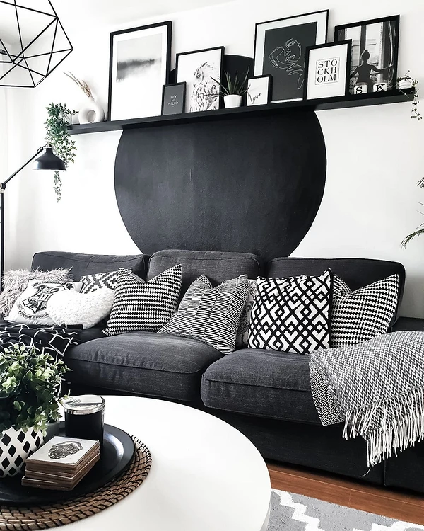
A room in a two-tone palette with well-chosen finishes, furniture, and décor will look elegant and expensive.
What is important to consider when designing a black and white living room:
- To make the space harmonious, first of all, think about the ratio of the elements of the palette. If you distribute them in equal proportions, the interior will seem too variegated.
- In most cases, it is better to choose a light shade for finishing: snow-white, pearl, ivory. The undertone depends on the amount of sun in the room, its size, and overall style. So, for example, for Scandi, eco, or classics, it is better to take warm creamy shades. And for minimalism, loft, and contemporary, a snow-white finish is suitable.
- The ceiling should also be made light. The floor is in any shade. It can be light gray, cool graphite, brown, or beige.
- It is not worth making absolutely all the furniture in the living room black. Let them be the largest items: a sofa, a chest of drawers, a wall, a table in the dining area. And for the rest, use transitional shades of gray or beige.
- But if you are not afraid of bright and bold decisions, then you can do the opposite. For example, make a dark accent wall and put snow-white furniture against its background. You will get a graphic and non-standard composition that immediately attracts the eye.
- Also, do not forget about the décor – it can be in the general range or, conversely, accent. Use a variety of textiles to add texture and coziness, vases and figurines, paintings and posters. Stucco moldings will fit well into such a duo chrome space: moldings, cornices, pilasters, etc. Moreover, such décor is suitable not only for classic styles, but also perfectly complements modern trends, whether it is scandi, contemporary, or restrained minimalism.


Bedroom
A black and white bedroom interior will help you relax after a stressful day and give your eyes a break from the abundance of colors.
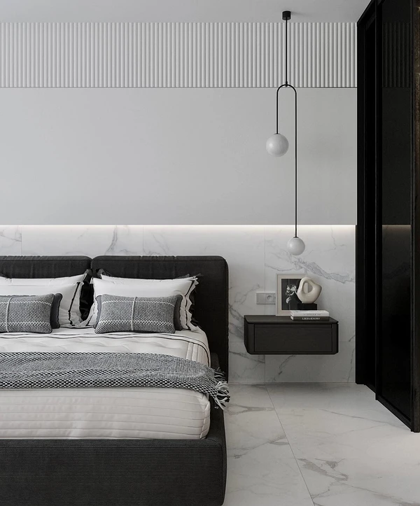
In this room, the approach to design should be different: it is important not to compensate for the lack of bright colors in the palette with contrasting combinations and pronounced geometry, but, on the contrary, to soften the atmosphere as much as possible.
To do this, use:
- Smooth outlines of furniture, rounded lines, curved silhouettes.
- Tactilely pleasant textures: wood, natural fabrics, multi-layer textiles. A good option is a bed with a soft frame or at least a headboard.
- A couple of planters with live plants.
- Multi-level lighting with local luminaires that provide a subdued soft light, or lighting around the perimeter of the floor or stretch ceiling.
- Shades of grey and beige in addition to the main palette.


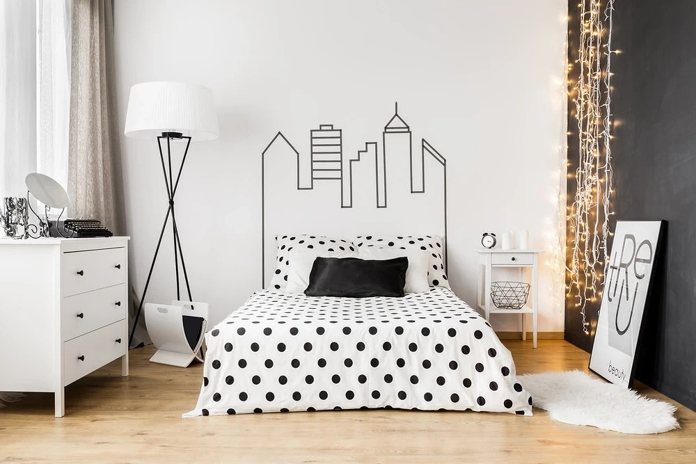
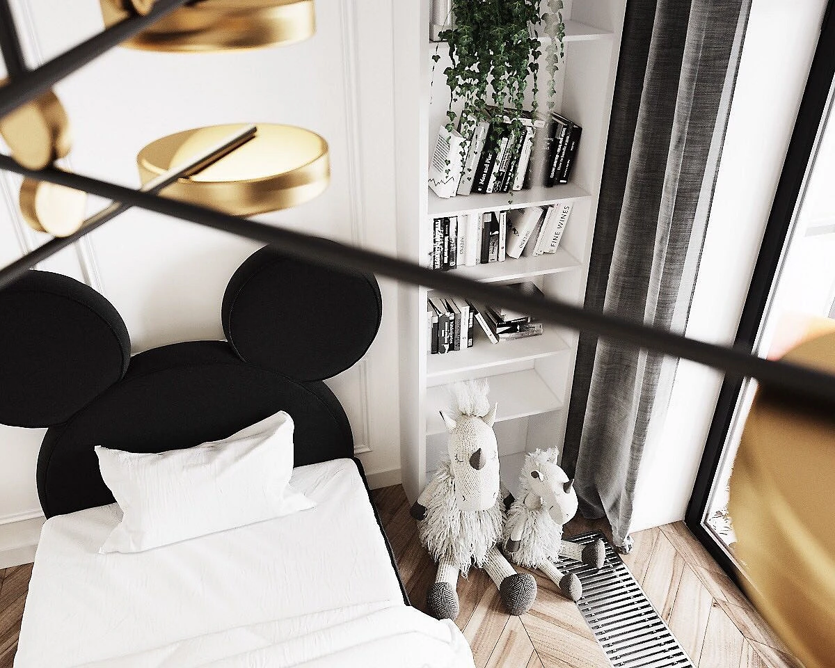
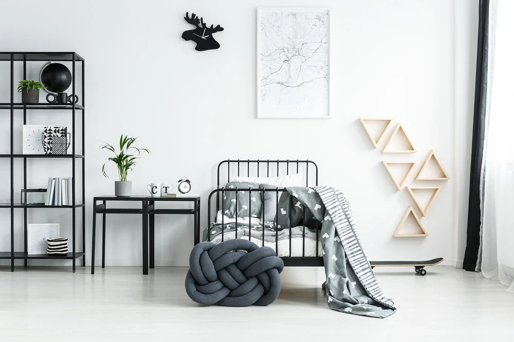
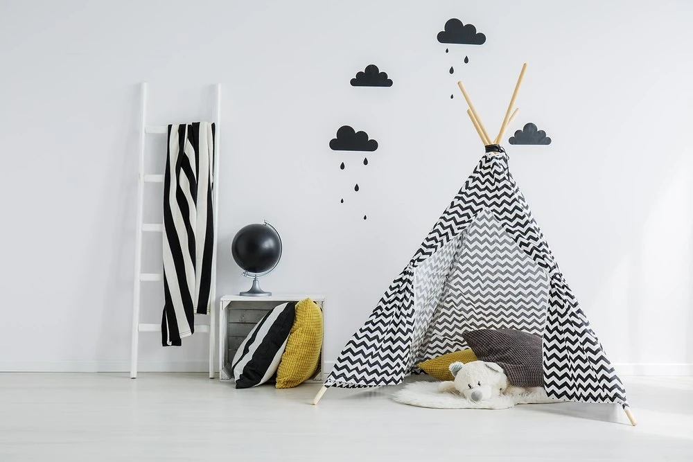
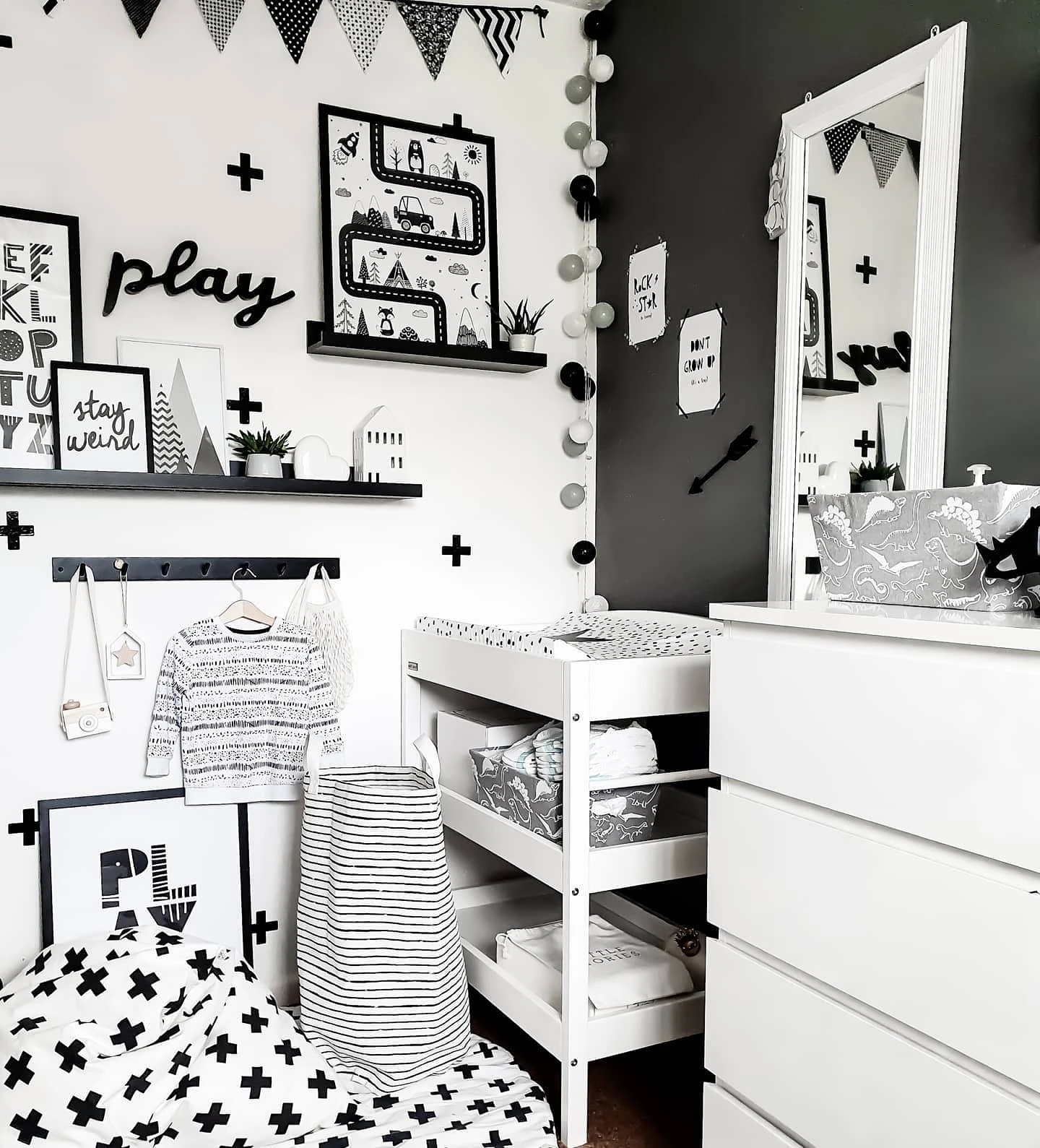
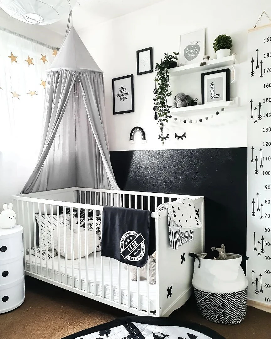
Nursery
For a children’s room, such a combination seems unsuitable to many, because the interior in the child’s room should be bright and cheerful.

But the achromatic palette doesn’t have to be gloomy at all. In addition, in the children’s room, it can be complemented with bright accents, warm wooden textures, and thematic prints. For example, stars on wallpaper or curtains, polka dots, and small abstract or geometric patterns look very cute (this technique is especially often used in the Scandinavian style). Another good option is artistic painting or stylized wall murals. They can depict a variety of subjects: fairy-tale motifs, space, city outlines, sketch sketches, drawings of cars or airplanes, and silhouettes of your favorite characters.
And in the nursery, there is a place for a slate. It can occupy the entire wall or some part of it, for example, in the creative area. Also, slate paint is applied to the door leaf of concealed installation: this solves both the issue of decoration and entertainment for the child.
Antechamber
Most often, standard non-staining colors are selected for the hallway: gray, beige, khaki, brown. But you don’t have to limit yourself to them.
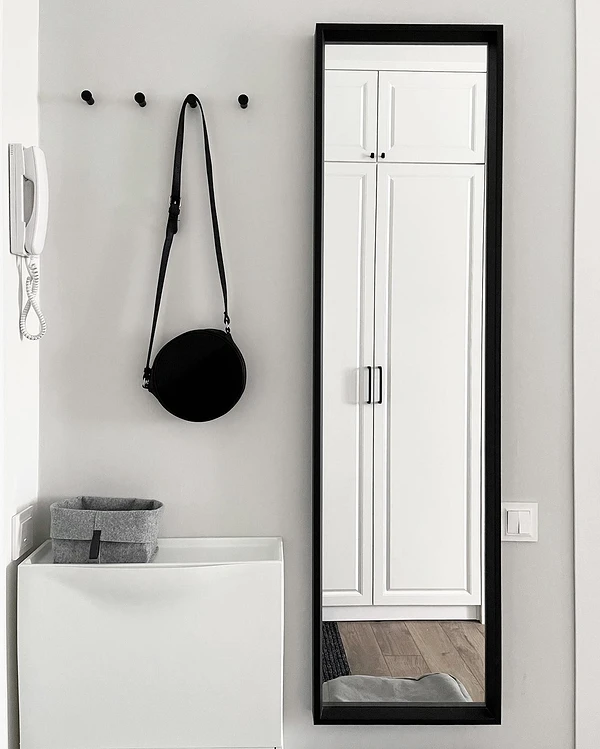
A contrasting two-tone combination will look original and spectacular, and several techniques will help to make it more practical:
- Suitable materials. Choose high-quality washable wallpaper, paint or decorative plaster for finishing. It is important that the material is not only not afraid of moisture but also is wear-resistant and can withstand repeated contact with household chemicals. Porcelain tiles, vinyl quartz tiles or tiles are best suited for flooring.
- The same goes for furniture. It is better to cover natural wood and upholstery fabrics with protective varnish and impregnation, respectively (if the manufacturer has not done this, you can cope with the task yourself).
- Use ornaments to hide surface imperfections and dirt. Of course, you will still have to clean the hallway, but against this background, dirt stains and dust will be less noticeable. The finer or more contrasting the pattern, the better.


Bathroom
Despite the fact that the bathroom is usually small in area, you can safely experiment with its design. For example, you can make a black ceiling, choose a bright pattern for the walls or floor, or install accent plumbing.
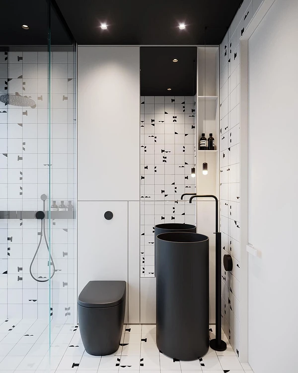
The main thing is to adhere to the basic rules when decorating a bathroom:
- Observe the proportions in the palette: the main color should be 60-70%, the second color should be 20-30%, and accents account for up to 10%.
- If you want to make the bathroom visually more spacious, choose a light base and local dark details. For example, snow-white or cream tiles on the walls and black plumbing.
- If dark tones are the main ones, consider sufficient lighting, as well as use mirror and glossy surfaces, which will additionally reflect light and add air to a small room.


