


The color palette is a powerful tool in the hands of those who do renovations. We tell you how to give your space respectability by choosing the right shades for decoration and furniture.
1. Cream
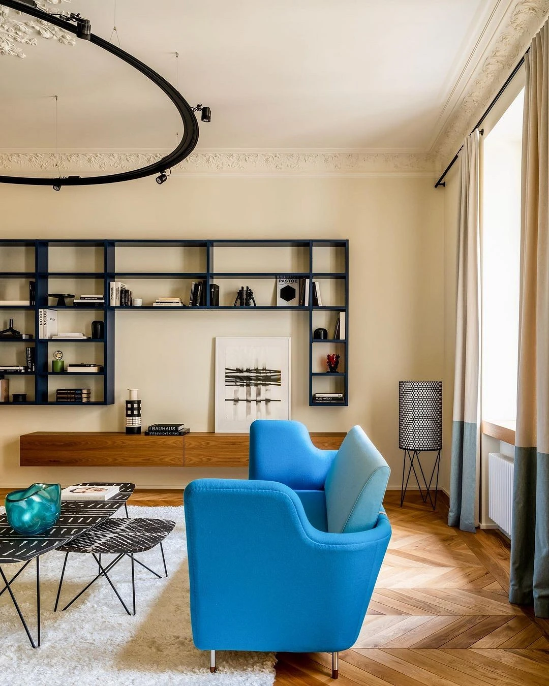
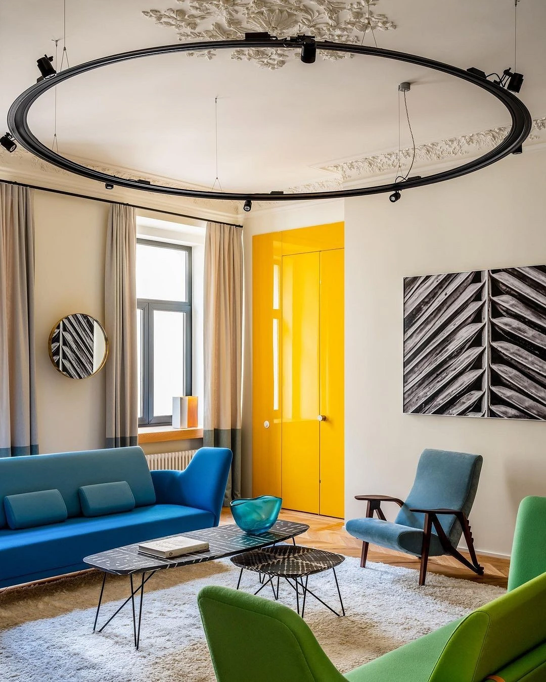
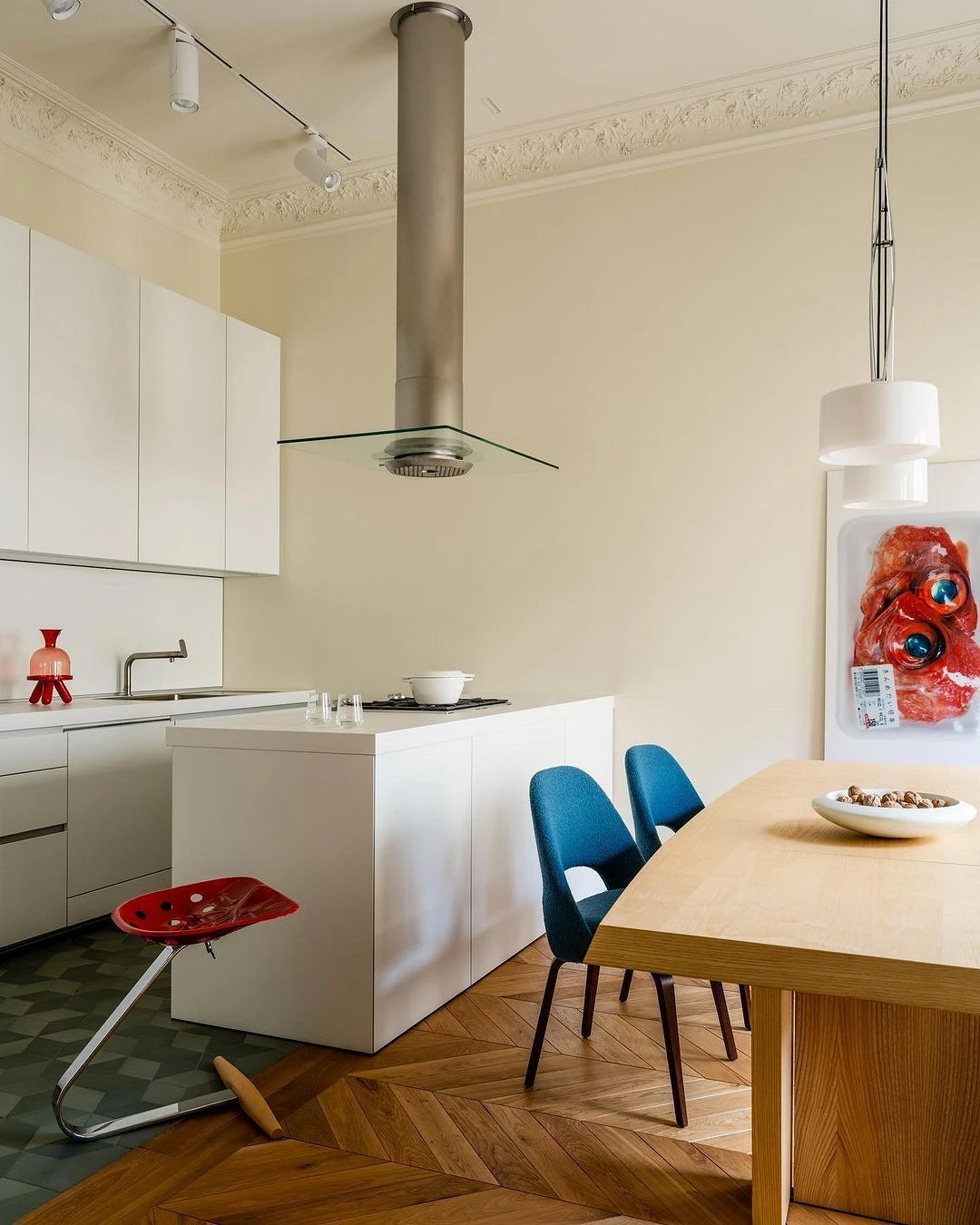
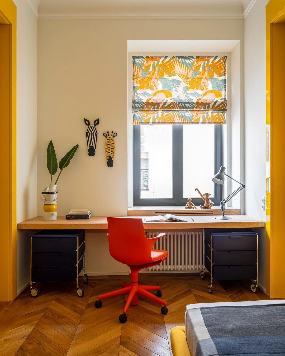
Cream is a softer color than white, but just as basic and neutral. Thanks to the warm undertone, it looks calmer and more comfortable, and goes well with all shades of the beige-yellow palette and other warm colors, making the interior harmonious and noble. In addition, it balances such bright colors as, for example, red – in contrast to the same white, which emphasizes the brightness of shades and sometimes brings excessive contrast to the space.
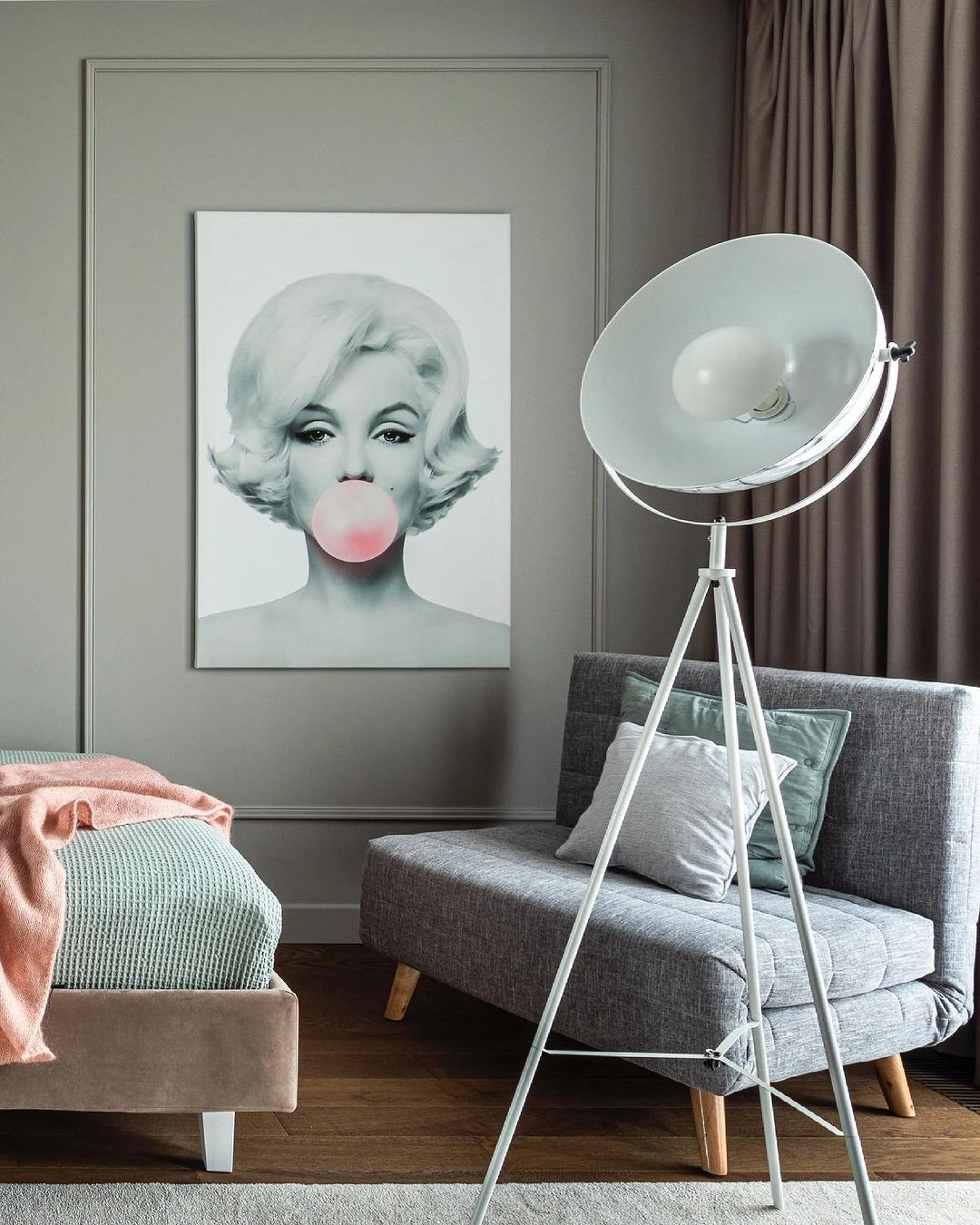
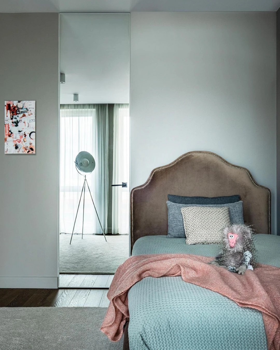
2. Warm gray
A thick and rich light gray color will be an ideal base for bold decisions or an independent accent in the interior. It can be supported by a natural palette: brown, green, or more romantic pink – in any case it will look advantageous. To emphasize the depth and beauty of warm gray, it is important to provide good lighting: use this shade in southern rooms and carefully consider artificial light.
3. Sand
The original and discreet sand shade looks best surrounded by the same natural warm colors (ocher, brown, marsh), as well as golden accents and natural textures. Sand can be complemented with a variety of styles: from classic to ethnic. This color is a wonderful base for expensive interior items; against its background, they look respectable and appropriate. At the same time, and is able to decorate even the simplest details of the decor and harmoniously fit them into the overall picture.
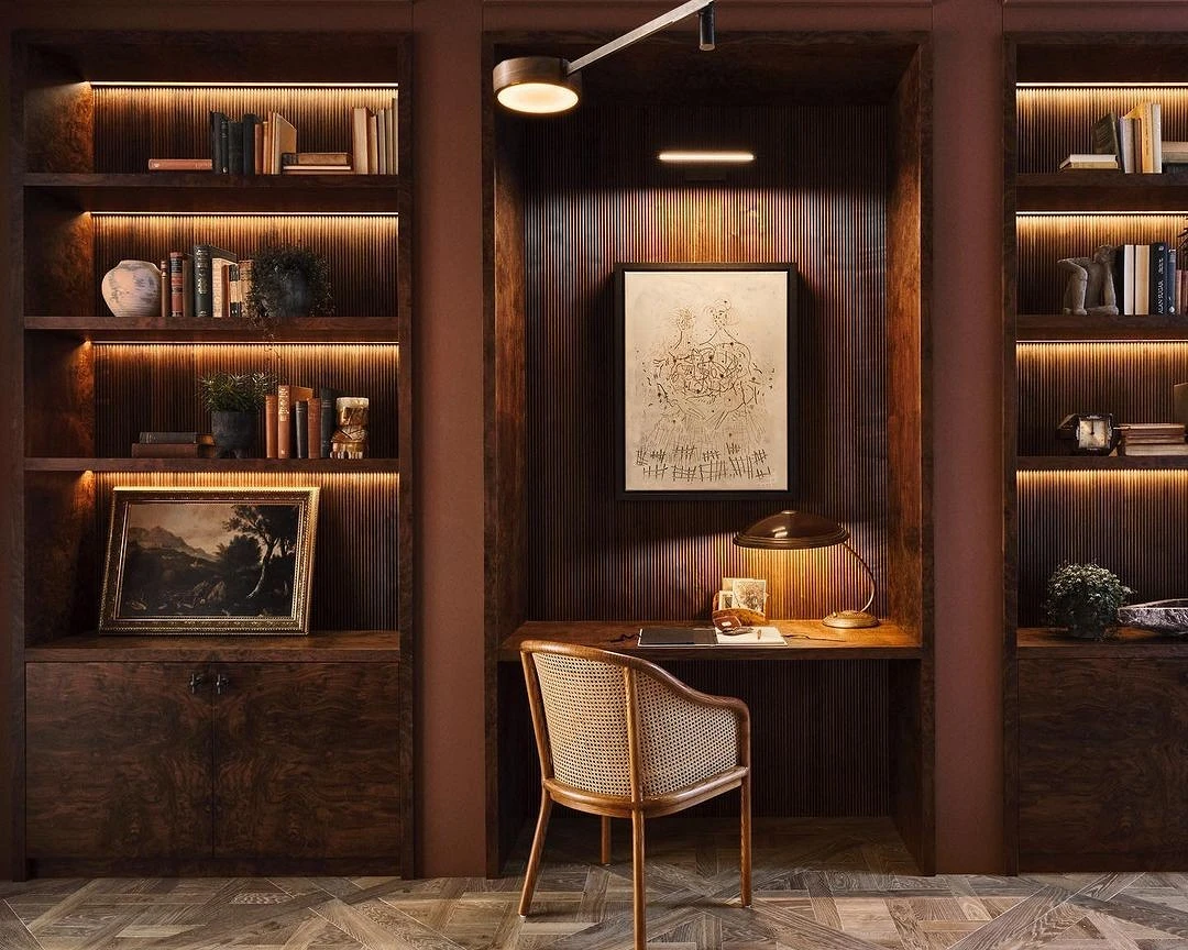
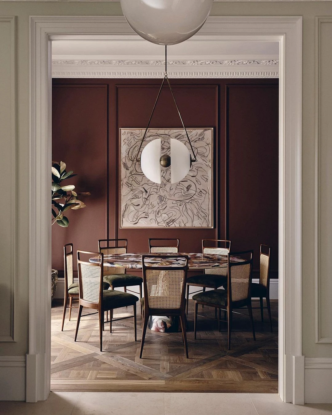
4. Red-brown
Quite saturated, but quite a basic color at the junction of brown and burgundy. It looks more interesting than just brown, and calmer than bright red. This complex shade can be used to decorate walls or choose furniture in this color (red-brown reminiscent of mahogany). Both options are ideal for creating a visually rich and vibrant space. The only thing worth remembering when using this tone in the interior is that it is quite active and is not suitable for the total decoration of the environment. It is better to choose a combination with neutral or contrasting palettes.
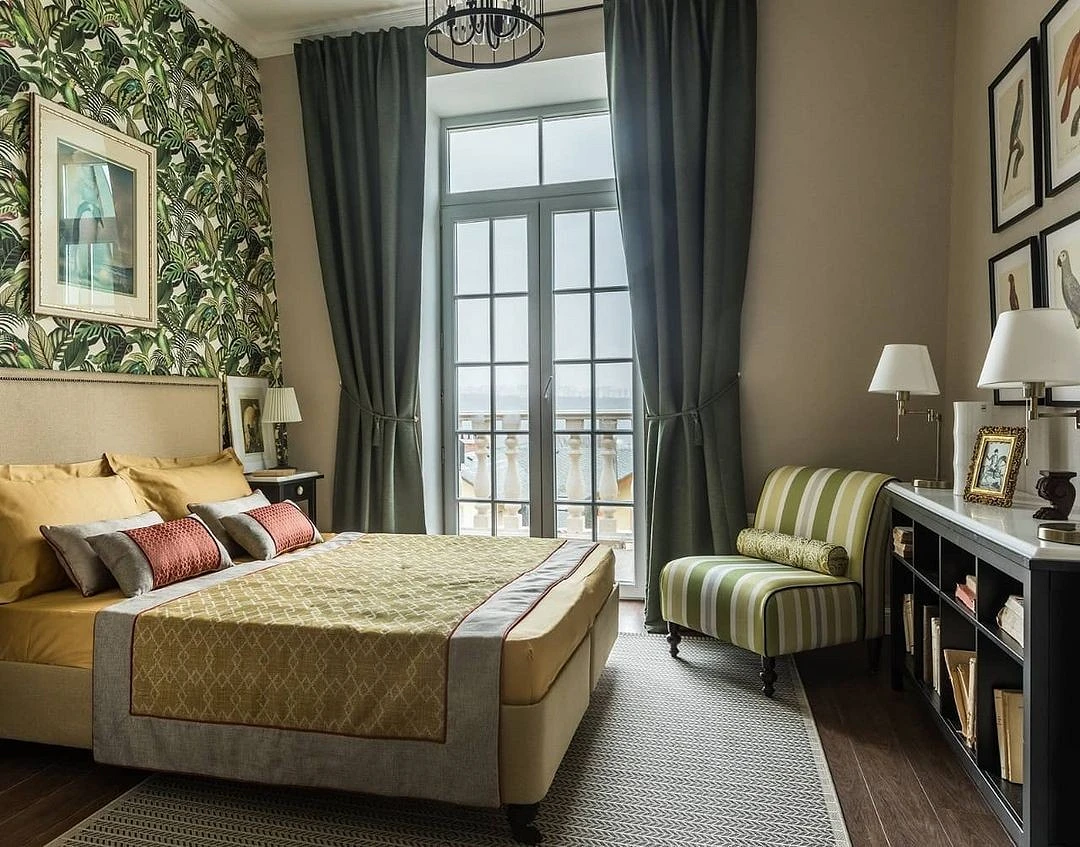
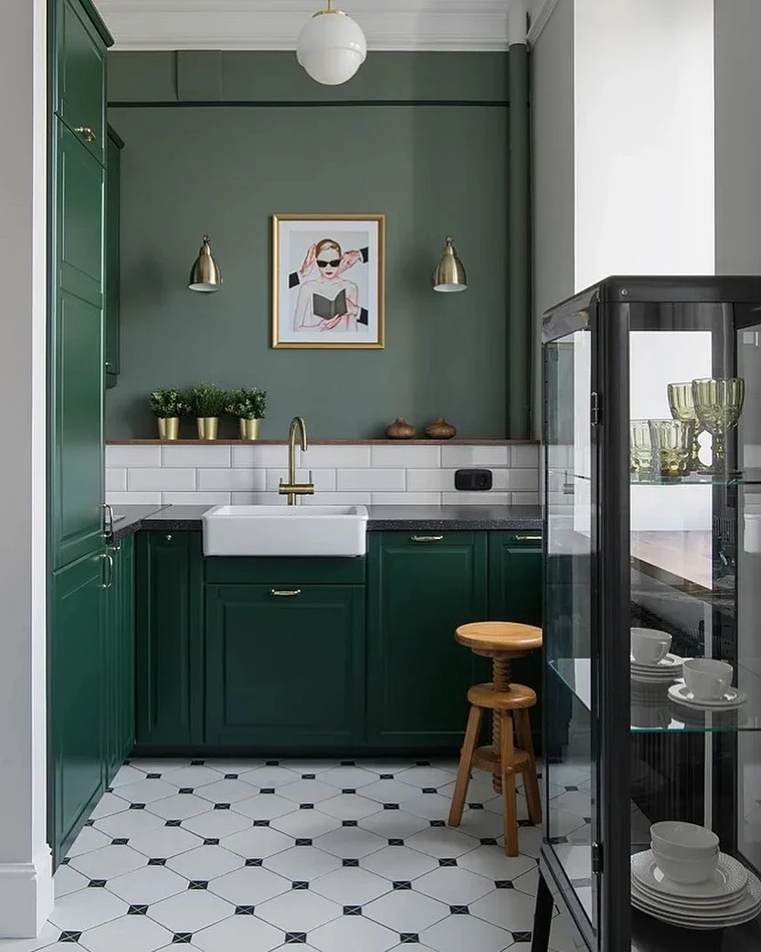
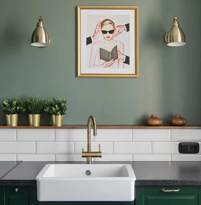
5. Natural green
The color of grass or algae – natural green – creates a powerful natural note in the space. You can paint the walls in it or choose textiles in a similar shade. Like sandy, this natural tone goes well with active textures, natural palettes, and natural materials. Suitable for almost any interior style and always makes the space more expensive and noble.
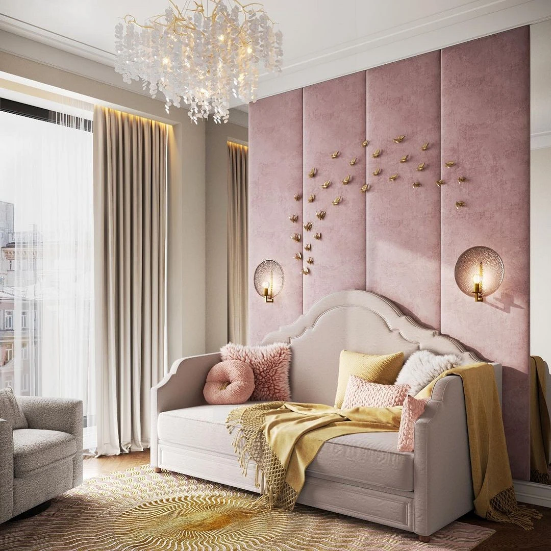
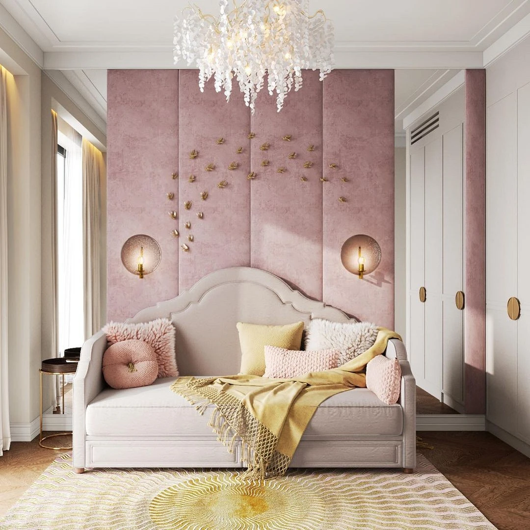
6. Dusty pink
Dusty pink is a complex but neutral shade in which you can see gray, beige, and pink undertones. It is perfect for rooms in modern and neoclassical styles with glossy surfaces, interesting textures, silver or gold details (for example, fittings and lamps). This shade can be called universal; it easily “adjusts” to the colors and furniture in the room that are combined with it. Due to the dusty gray undertone, it does not look too feminine and romantic.
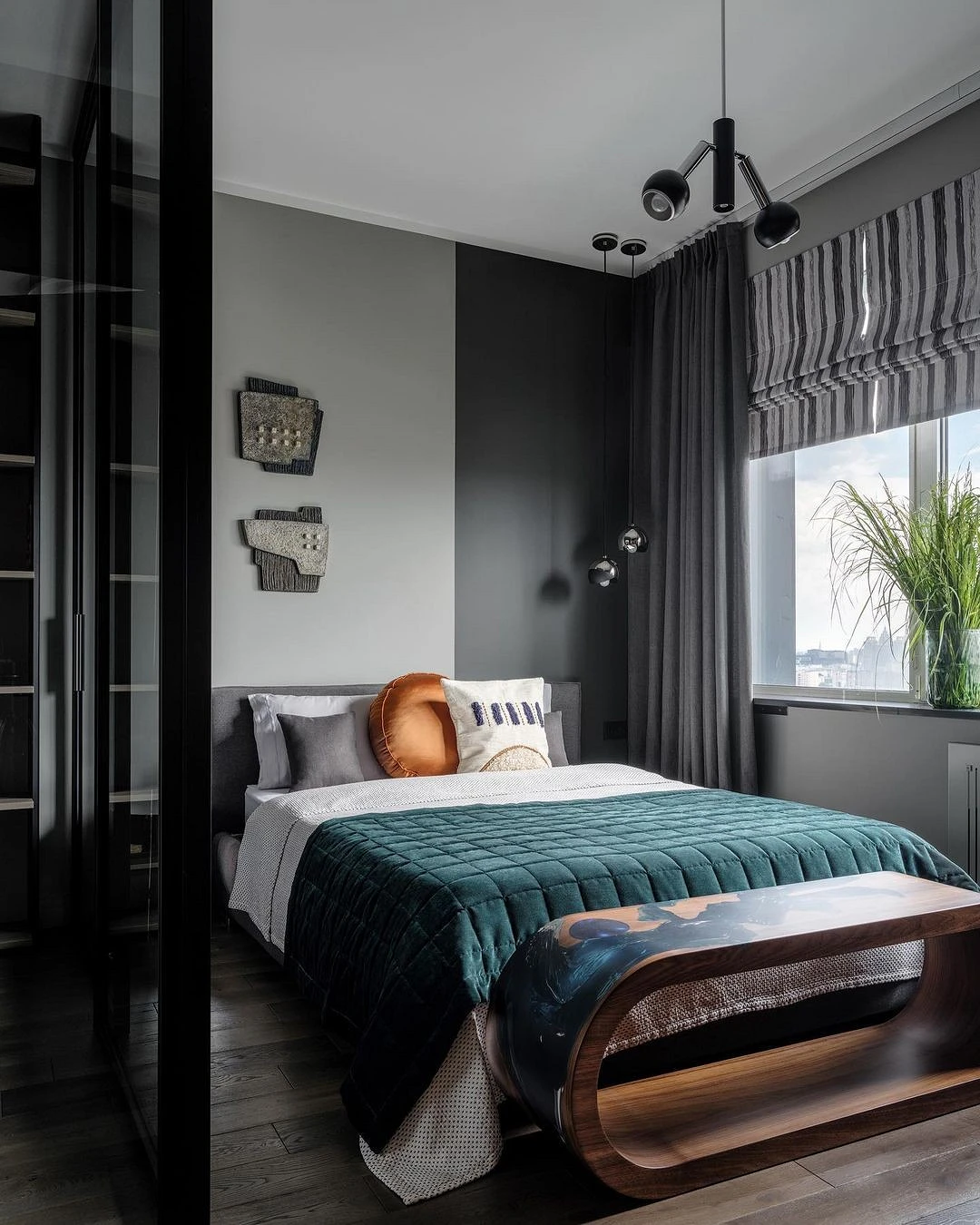
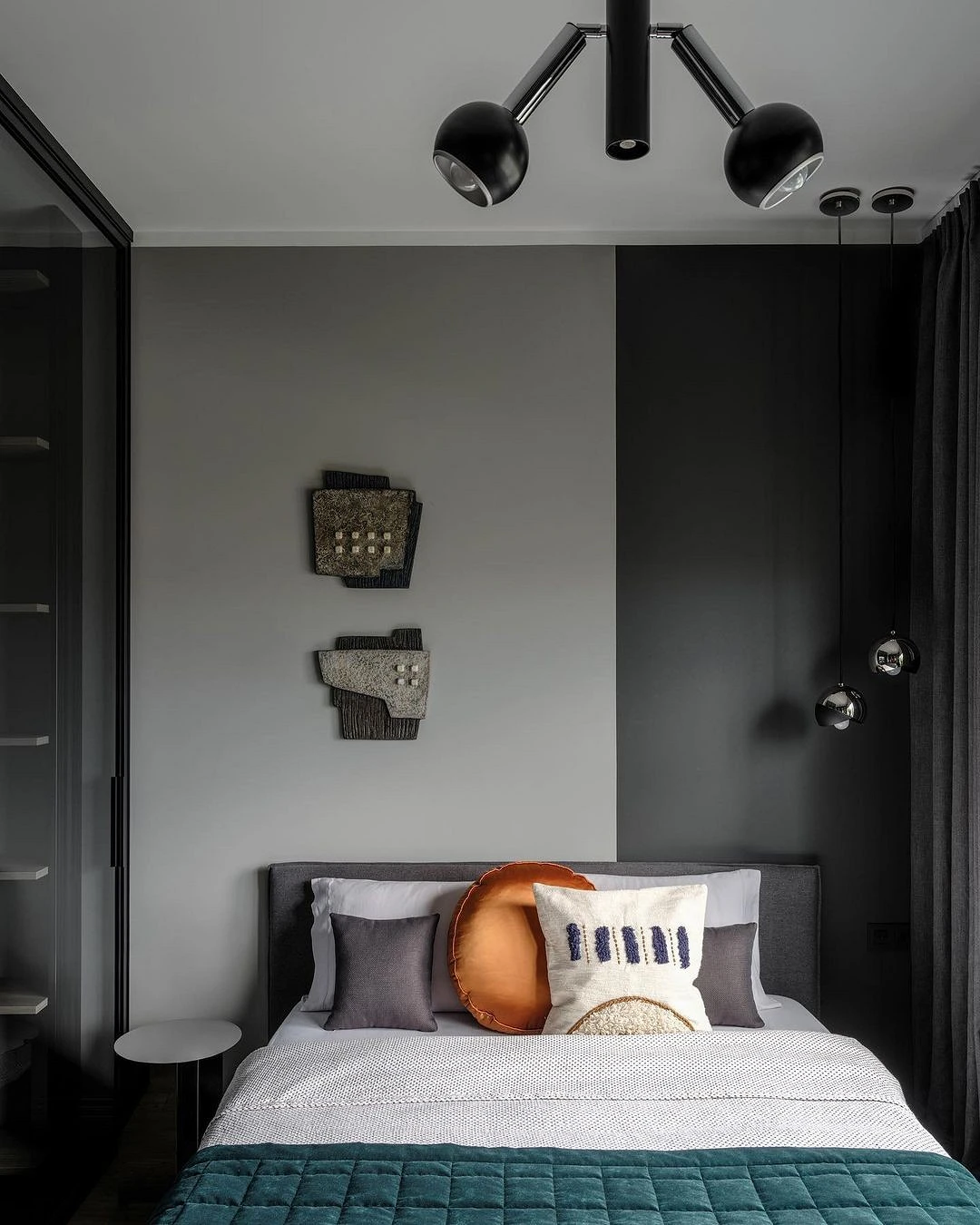
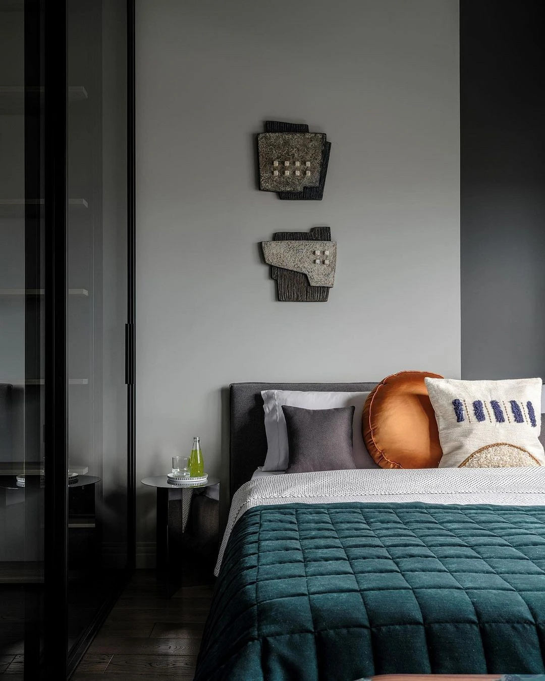
7. Charcoal gray
Charcoal gray is a deep and rich color that looks as calm and neutral as possible. This is not a dramatic black or original graphite, but also a very interesting and noble shade that is best combined with a lighter palette. Thanks to its depth and density, this color looks expensive and bright in the interior. Ideal for those who have long thought about an unusual accent – decorating a room with dark walls in this charcoal shade will look stylish and sophisticated.
The most important thing about our X that it is for
those who are in a hurry


