


Blue is one of the trending colors this year. We tell and show with examples what shades it is best to combine with so that the palette looks harmonious.
Cold tones often cause fears that the room will seem gloomy and uncomfortable. But in the right company, they add elegance to the interior, make it more spacious and voluminous, and emphasize the nobility of other colors. Blue looks especially beautiful in different forms: from thick indigo to light cornflower blue. In this article, we tell and show clear examples with what colors blue is combined with and how to organically fit it into any palette.
Peculiarities
In psychology, this color is associated with calm, peace, stability, inner strength, and wisdom. Thanks to these qualities, combining blue with other colors with a similar mood makes the interior truly relaxed and comfortable. But it is important not to overdo it with blue, since in large quantities, especially in decoration, it can put pressure on the psyche and cause blues. Therefore, complex cold shades must be diluted with lighter and more cheerful ones.
This color scheme is quite universal. It is suitable for creative individuals, businessmen, those who work a lot at home, and simply connoisseurs of elegant comfort. The perception of the interior can be completely different – depending on what colors the dark blue color or its lighter shades are combined with. It has a place in both modern and classical directions.
When choosing a palette, consider several important points:
- Cool tones create a feeling of coolness. Therefore, for example, cobalt or bluish-gray walls are suitable for a kitchen where it is often hot, a loggia or any room with large windows facing the sunny side. If there is little natural light or the room seems uncomfortable, it is better to take light neutral tones as a basis and leave the bright cold tone for local accents.
- In any color scheme, it is important to adhere to a single color temperature. This does not mean that you can only use the warm or the cold spectrum. The main thing is to maintain balance and avoid sharp contrasts: for example, deep sapphire and yellow-beige in one area, without any halftones or smooth transitions.
- There should be only one bright element in a color pair. For example, a combination of red and blue colors in their pure form will quickly tire, since both are active and will compete in the palette. It’s another matter if you replace bright red with noble wine or signal blue with a more subdued option.
- Itten’s color wheel will help you create a harmonious combination. This is the most popular palette selection tool, which is also used by professional designers. You just need to decide which color combinations with blue you like best (monochrome, complementary, contrasting) and find suitable elements on the circle. It’s easiest to work with two or three components.
- Remember the 60/30/10 rule. The main tone accounts for about 60% of the palette, the additional tone – 30%, and the accent tone (there may be several of them) – approximately 10%. Blue in this case can play any role. The larger part of the palette it will occupy, the more neutral the shade should be.


What colors go with blue in the interior?
Let’s take a closer look with what colors blue matches best together.
White
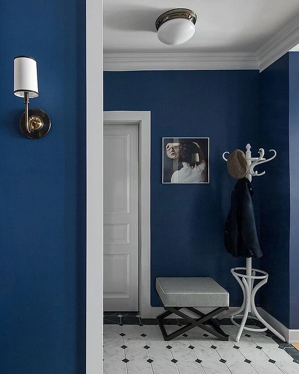
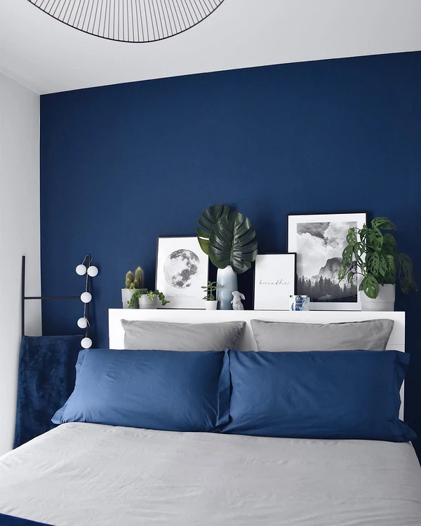
White is a universal achromat that is “friendly” with any elements of the palette, regardless of their color temperature and saturation. In essence, it is a blank canvas that does not draw attention to itself and does not distort the perception of other colors. In addition, white refreshes, fills the space with light and visually increases the area. To pair it, you can choose the same airy blue or darker and more saturated variations: indigo, signal, sapphire, etc. This is a classic pair for the Mediterranean style, but it can be used in almost any direction: from Scandi to neoclassical. If the room is small, it is better to use white for the walls and ceiling to adjust the actual proportions.


Beige
This pair is often found in nature (sea and sand, cornflowers among ears of corn, etc.), so it always looks harmonious.
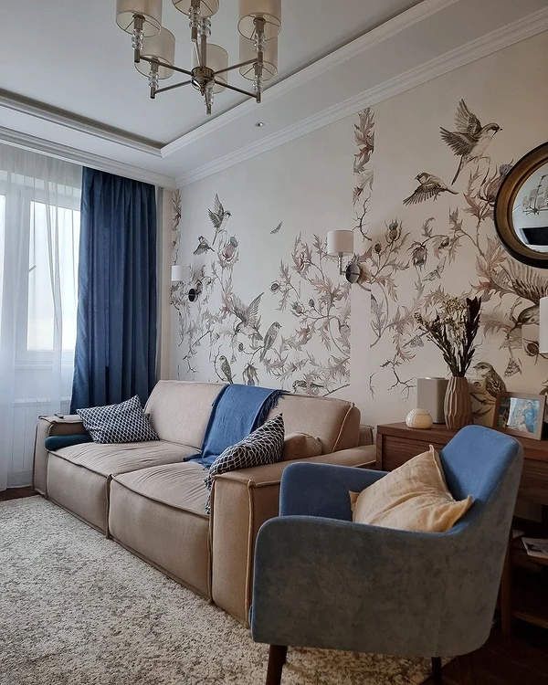
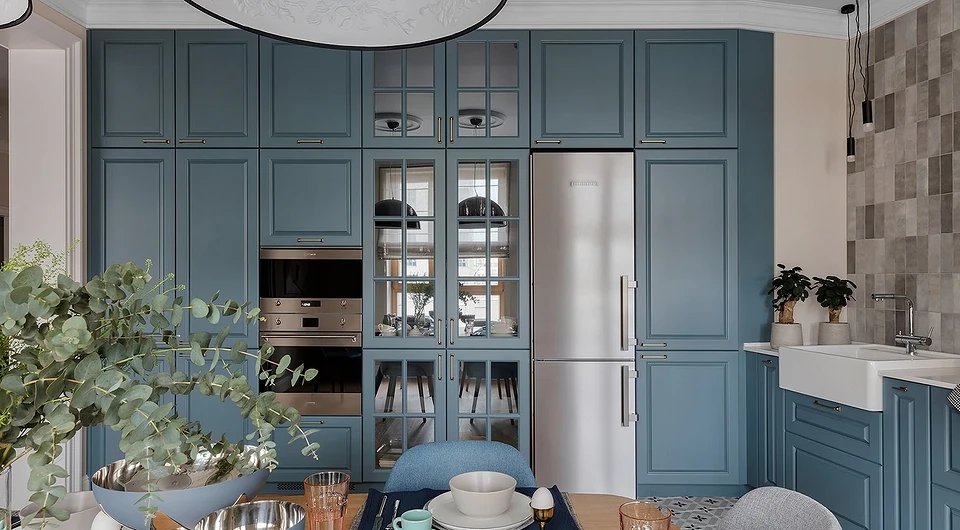
Most often, beige is used as a basis – this is the ideal base tone for decoration and large furniture. Cool blue and teal accents will freshen it up and prevent the interior from turning into a boring, flat space. And beige, in turn, will solve the main problem of all cold colors, making the room more comfortable. Such a pair will look good in any room, be it a bedroom, hallway, living room, or children’s room.


Grey
Just like white and black, gray is achromatic, so it feels great in any combination.
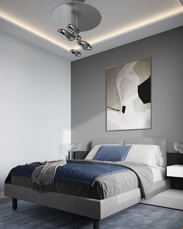
In the company of cobalt or heavenly, it opens up, looks more elegant, and is more expensive. At the same time, it emphasizes the depth of blue without drawing unnecessary attention to itself. Saturated shades are suitable as an accent, but for wall decoration, it is better to take more muted and diluted ones. The blue-gray color scheme gives a feeling of composure, is associated with the sky and air, and makes the room cooler and fresher. Therefore, if the windows face north and there is little sun in the room, complement this pair with warm accents.


Orange and red
One of the most spectacular is the combination of blue with orange and red.
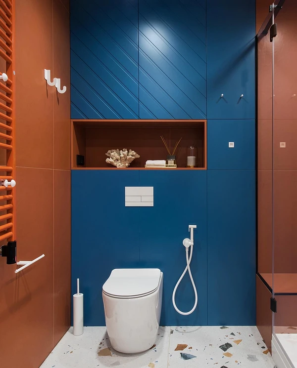
Each of the elements is self-sufficient and active, so it is important to balance them correctly. Depending on the chosen shades, proportions, and textures in the interior, such a combo will create a different mood: intimate, mysterious, solemn, and active.
- A calm bluish background and any “edible” variations of red and orange are suitable for the kitchen: berry tones, peach, and wine.
- Deep shades of red – burgundy, burgundy, ruby, garnet – will add intimacy to the bedroom.
- If you want to recharge your interior with vigor, complement the blue-blue elements with slightly muted nuances of orange.


Yellow
Another pair conceived by nature itself is the sky and the sun on a clear day.
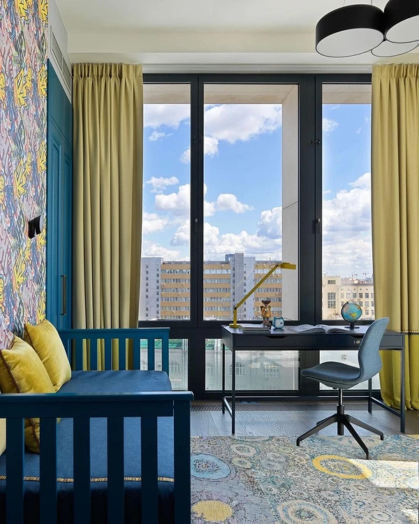
Yellow is “friends” with bright turquoise, muted cobalt, and delicate cornflower blue. But since both elements are quite active, it is better to dilute them with a calm base. In the classic 60/30/10 scheme, most of the palette should be a neutral tone (for example, white, gray, or beige), 30% – blue, and 10% – accent yellow. This combo is associated with relaxation and sunshine, fresh fruit, and a seaside vacation. Suitable for kitchen, nursery, and living room.


Green and blue
To understand what colors dark blue goes with, just look at Itten’s color wheel.
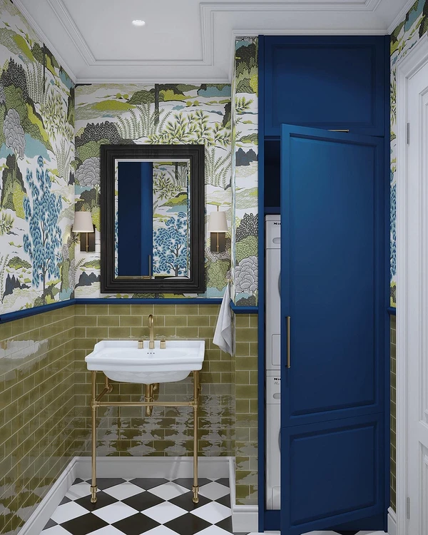
Analogue pairs and triplets look harmonious and at the same time impressive – that is, combinations of 2-3 adjacent tones. In this case, the companions will be blue and green. Together they form a refreshing, but not flashy-bright ensemble that is suitable for decorating any room: kitchen, living room, bedroom, bathroom, nursery, etc. Natural colors are easy to combine with each other, so you can experiment with this analog combination. But do not forget to balance the colorful palette with neutral tones: gray, white, black, and beige.


Combination table
This visual table will help you figure out what blue goes best and worst with. It is impossible to single out frankly unsuccessful combinations, however, there are classic win-win options and more complex pairs that require some experience in color in order to “make friends” between the shades.
| Hue | Successful companion colors | Complex combinations |
|---|---|---|
| Sapphire | Beige, light and neutral gray, sunny yellow, terracotta, wine, lingonberry | Dark brown, black, mint, peach |
| Indigo | Grey, white, beige, taupe, emerald, golden | Pink, black, olive, ocher, bright red, bistre |
| Bilberry | Mint, raspberry, sand, white, light gray, coral, lemon | Brown, violet, magenta, mustard |
| Denim | White, vanilla, canary, café au lait, carrot, pomegranate, leaf green | Mahogany, black, grage, watermelon, purple |
| Gray | Blue, light grey, white, ivory, garnet, canary, terracotta | Dark grey, cappuccino, mint, salmon, pink |
| Heavenly | White, black, grey, mint, emerald, pistachio, sunny yellow, red-violet | Straw, orange, olive |
| Gray | Yellow, orange, white, black, beige | Green, purple |
The most important thing about our X that it is for
those who are in a hurry


