


Here’s why bright burgundy, yellow, and pure white aren’t the best choice for a bedroom.
The palette of the room plays an important role, but it does not solve everything. A lot depends on the lighting, personal preferences, the environment, and even the daily routine. There are several shades that are more likely to spoil your mood for the new day and make it difficult to fall asleep. To create the most comfortable space in the bedroom, avoid the colors that we will discuss below.
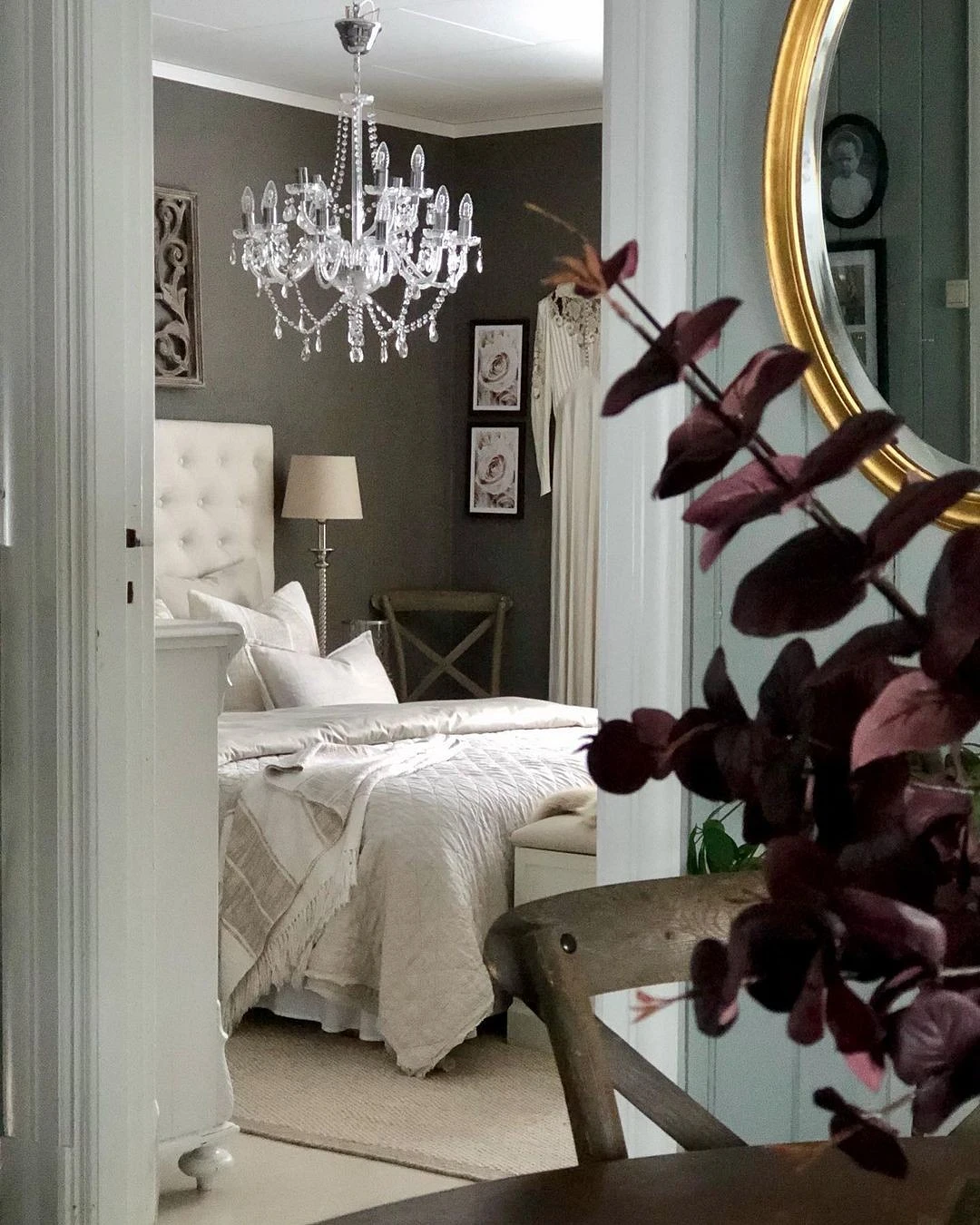
1. Violet
Perhaps the most controversial shade for the interior. This color is quite complex and suitable only for people with a stable psyche. Purple is built on a combination of two contrasting colors: red and blue. The first acts on the psyche exciting, and the second, on the contrary, calms. This is what causes the negative effect. Purple in the bedroom can interfere with falling asleep, and upon awakening, negatively affect mood.

What to change
Close to purple, blue, and even blue palette is ideal for the bedroom. Choose diluted and muted shades, they are best suited for sleep.


2. Pure white
A favorite of many, who came to the interior from the Scandinavian style, white can be used in the interior in different ways. The perception of white largely depends on the illumination of the room. So, in dim spaces, white will look lifeless. Interiors that are completely white can also look cold, depressing, uncomfortable and, of course, there is no question of any relaxation.

What to change
No matter how strange it may sound, white is different. Choose an option with a warm undertone, such as a shade of milk, or ivory. Or combine with neutral colors such as gray or beige. By the way, in Scandinavian interiors, the walls are often painted not in ordinary white, but in a shade with an admixture of gray and yellow tones, the so-called “Stockholm white”. It is warmer and visually pleasing.


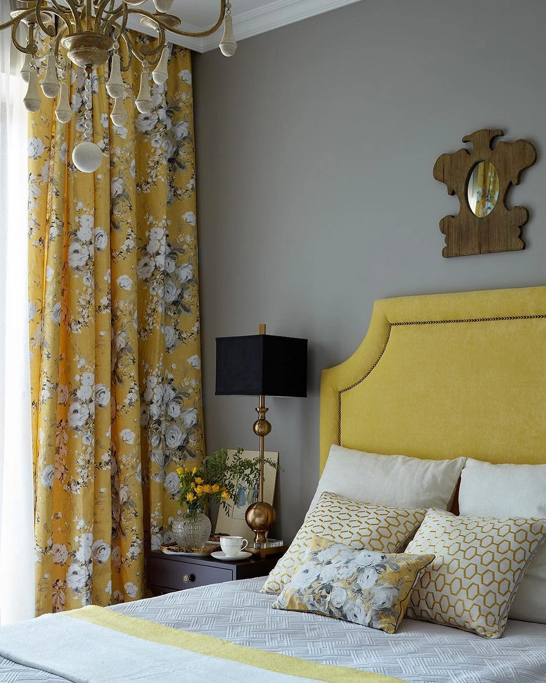
3. Bright yellow
The purer the color, the brighter and more active it looks in the interior. Yellow is associated with sunlight and is ideal for rooms where there is not enough natural light. But in the bedroom, a bright shade looks debatable. For this room, pure tones are contraindicated, because they excite the psyche and interfere with falling asleep. Pure colors in the interior require dilution with neutral tones and a minimum of additional details (due to the amount of textiles in the bedroom, this is not always realistic).
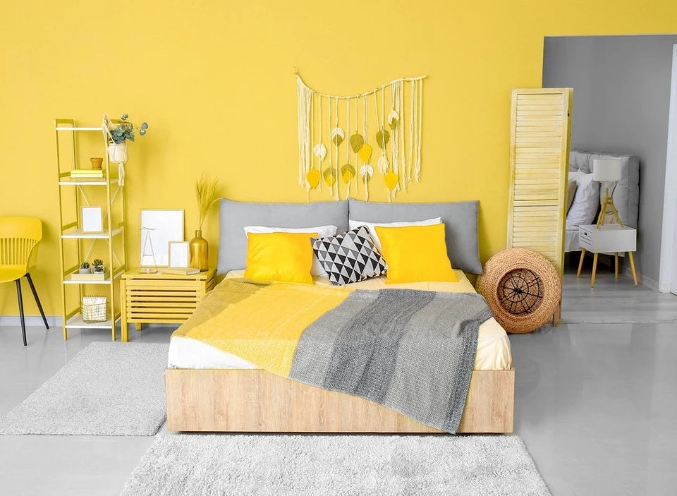
What to change
It is better to choose complex colors with a dimming effect. They look more elegant and expensive, do not draw attention to themselves, and promote relaxation. In the bedroom, the dusting effect still looks beautiful, that is, adding gray to the main one. You can replace excessively bright yellow, for example, with salmon, ocher, or mustard. These are more complex colors, they look deeper and more attractive.


4. True black
The interior of the bedroom in black looks dramatic and deep. But in terms of mood for a new day and psychological comfort, black is a complex color. The space can be perceived as gloomy, and depressing, provoking stress and feelings of depression. In addition, a black interior, like completely white, requires good proper lighting. Otherwise, it will turn from deep into mourning.
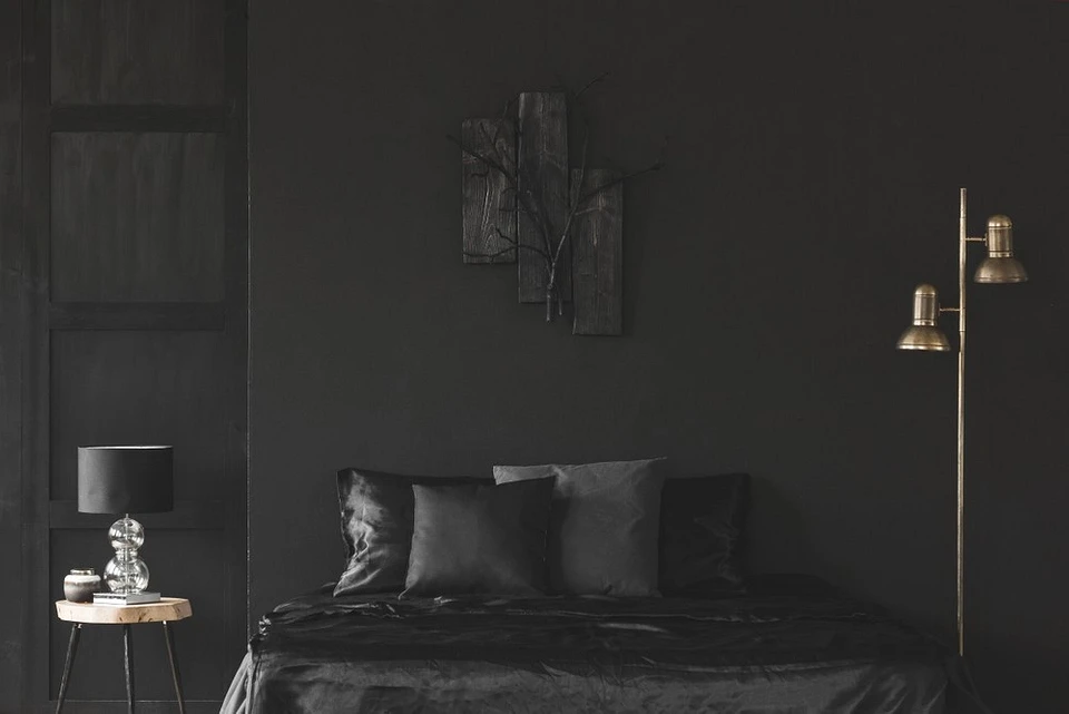
What to change
Here again, more complex colors come to the rescue. It can be a dark palette but with the addition of gray, and brown. Also important is the reasonable dosing of dark shades and combination with lighter tones.

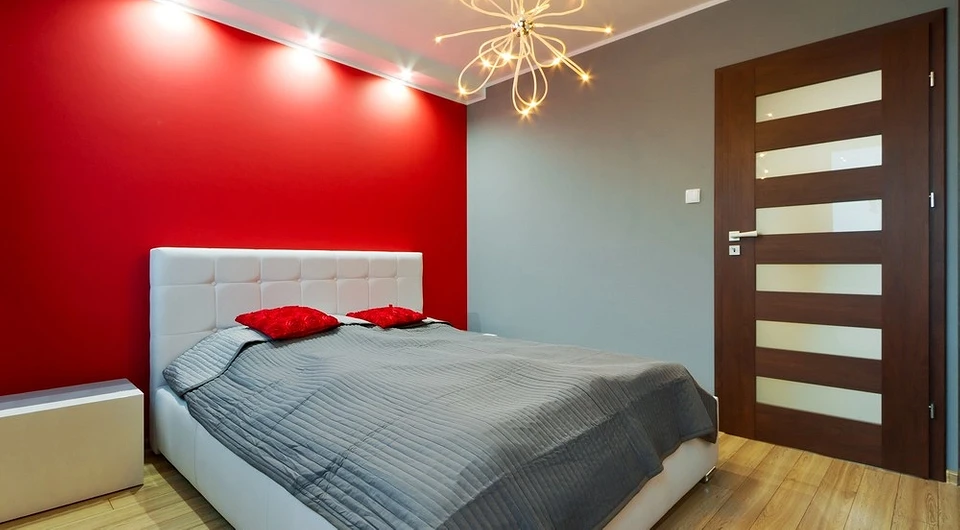
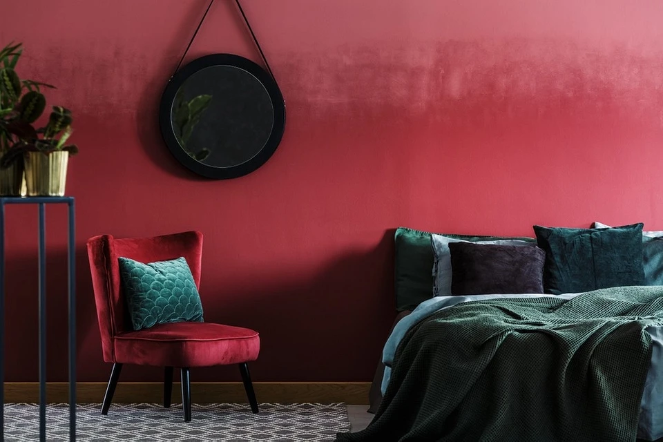
5. Bright burgundy
The classic burgundy shade is more muted than red. But in the bedroom, this color still looks quite stuffy and heavy. In addition, due to the fact that burgundy belongs to the group of red shades, and they excite the psyche, it is quite difficult to design a relaxed interior with it.
What to change
You can choose a burgundy shade, which has more brown undertones. It looks less flashy and more elegant. In addition, you can pay attention to lighter pastel shades of coral or salmon.

The most important thing about our X that it is for
those who are in a hurry


