


Beige, pink, blue, and five more best colors paired with green. Get inspired by our selection and create your ideal palette.
Greenery in the interior always lifts the mood, enlivens the space, and adds natural, but at the same time bright notes. The trend towards environmental friendliness and closeness to nature has made this color especially popular. And thanks to the variety of shades, you can choose the perfect tone for walls, furniture, or decor for any room. In this article, we will tell you which colors go best with green and how to use them correctly.
Peculiarities
Depending on the shade, green can look completely different, but it always evokes positive associations: living plants, the noise and aroma of the forest, summer warmth, energy, well-being, comfort, prosperity – the list goes on for a long time.
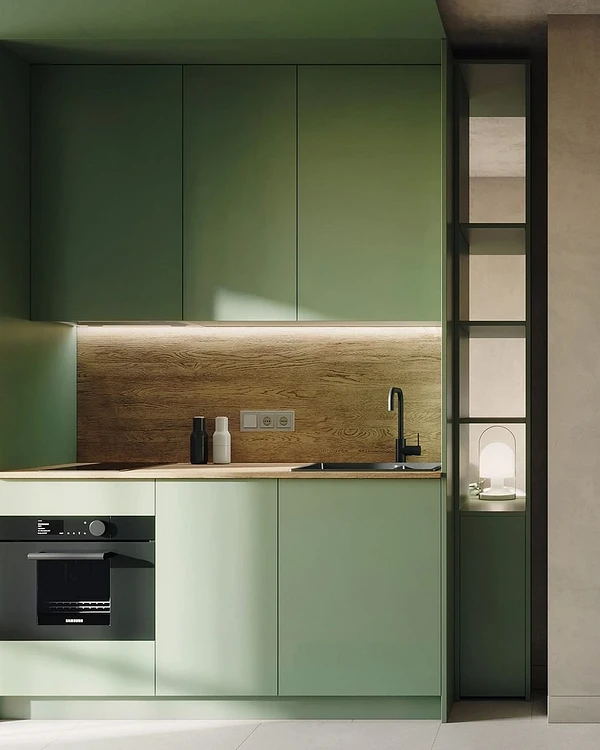
It is a warm color, although some variations with a hint of blue or gray (for example, mint ) look very refreshing. Greenish shades are also universal in terms of their role in the palette: dim and diluted shades are great for wall decoration, and more saturated shades are suitable for large furniture such as a sofa in the living room, textiles, and decor. They will be appropriate in all interior styles: from classic and Provence to minimalism and Scandi.
The combination of colors with green is selected based on the selected shades. Most often used in the interior:
- Warm natural – grassy, mossy, olive.
- Deep mineral ones – emerald, malachite, jade, turquoise.
- Pastels – mint, pistachio, honeydew, meadow dew.


The best combinations of green with other colors
Since it is a natural color, it looks best together with other natural tones, as well as with achromatic all-rounders. Let’s take a closer look at what colors green is combined within the interior.
White
White is a universal color that, like a blank slate, highlights other, brighter colors. It is not without reason that it is used for walls in art galleries.
It will reveal the depth of emerald and bottle glass, enhance the fresh feeling of mint or light green, and emphasize the nobility of olive tones. You can use any of these pairs in any way you like: white as a base or locally, in equal proportions. Neutral white very well balances dense, rich shades of green, which in large quantities and with pronounced textures can create an oppressive feeling.
This combination is suitable for any room: from the kitchen to the bathroom. The smaller the room, the more white you should use, best for wall decoration. This simple trick will make a small room appear larger. Greenery will add contrast and volume, especially if you take deep dark nuances.


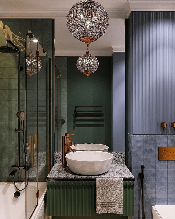
Grey
Just like white, gray feels great in any environment. In this case, it is important to choose the right shade and distribute the proportions correctly.
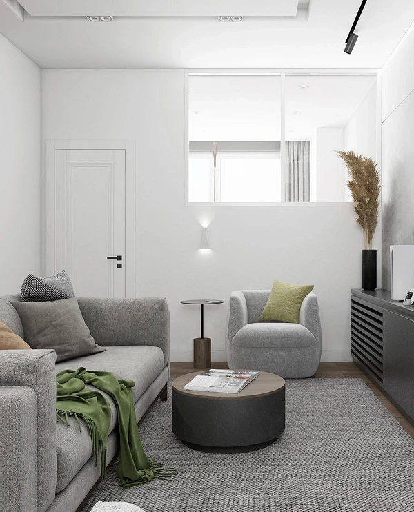
- If the windows face south or southeast and there is always a lot of sun in the room, use cool colors: emerald, pine, turquoise with graphite, steel, anthracite, and wet asphalt.
- If, on the contrary, there is not enough natural light, add warmth using a palette. Combine herbaceous, pistachio, olive, and forest with taupe, mouse, pearl, and grage.
- The complex and beautiful shade of marengo (gray with a blue undertone) looks very impressive with its closest neighbors on the spectrum: dark turquoise, bottle glass, and pine.


Beige
Beige is a universal base for any interior, but in large quantities and without contrasting inclusions it can look flat and monotonous.
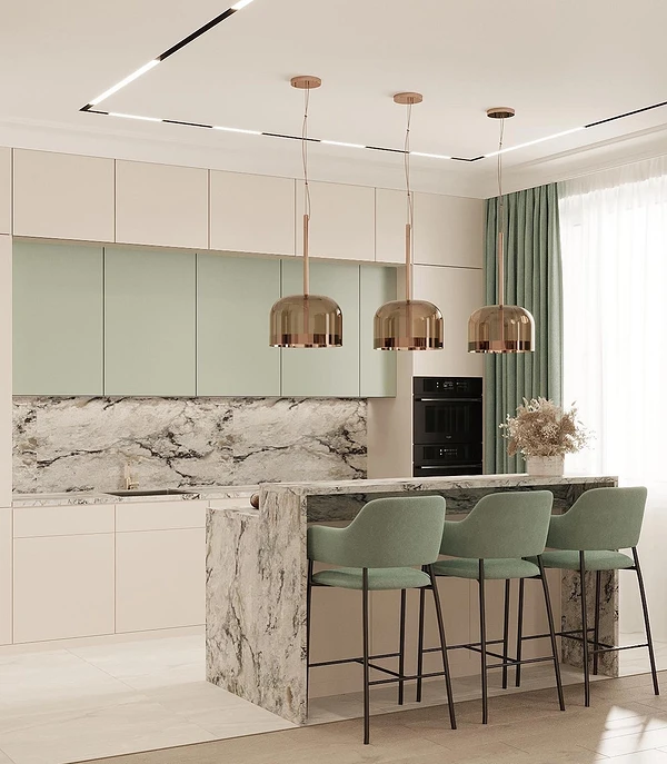
Greenery is ideal for the role of an additional tone or bright accents. The combination with beige is characteristic of nature in various forms, so you can safely be inspired by natural landscapes. For the same reason, both colors are best revealed in natural textures. An important point is warm shades, so there is a risk of making the space too “stuffy”. To prevent this from happening, complement the green-beige combo with contrasts: black, white, and light gray.


Brown
This combination is similar to the previous one both in color and associations.
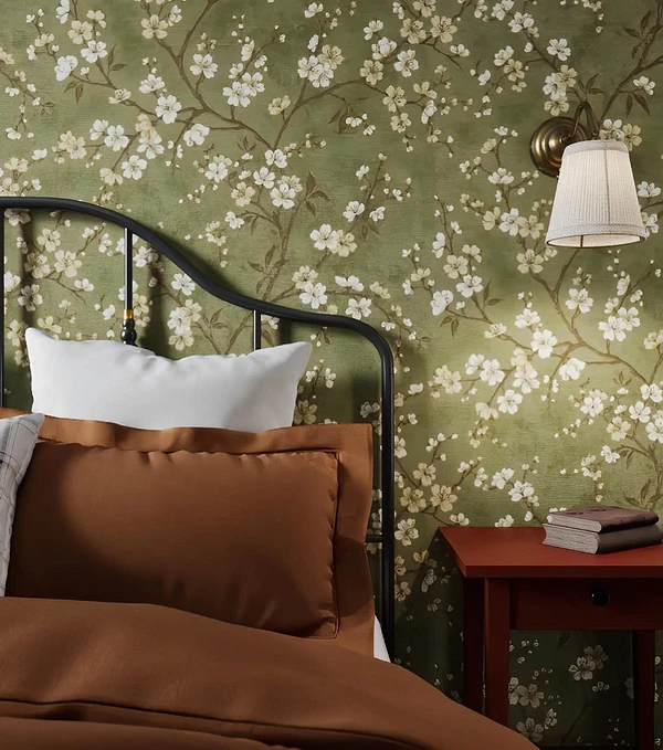
Brown is a beautiful natural tone that naturally coexists with greenery in the environment. Such a pair causes associations primarily with vegetation, therefore it is often used in eco-style along with wood and living indoor plants.
Also, the green-brown combination is loved by traditional styles: country, chalet, classic (especially English), and neoclassical. For such interiors, it is worth choosing richer and deeper shades that will not be lost on textured surfaces. Solid wood, and high-quality natural fabrics are required, and brown leather looks impressive. Greenish shades here can be both a background and an accent.
Remember that most variations of brown are dark and quite dense, so you need to be careful with them in a small room. Better yet, use light colors like coffee with milk. And be sure to dilute this active warm pair with cooler and contrasting achromats.


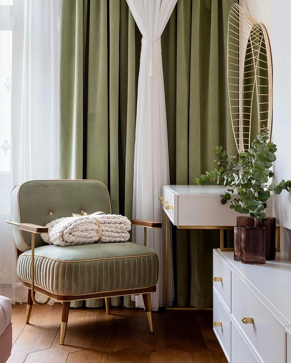
Blue
On Itten’s color wheel (we described in detail how to use it to create a harmonious palette), blue and green are located next to each other.
Neighboring elements of the circle form analog dyads and triads – that is, combinations of two or three colors closest to each other. In the interior, such combinations look impressive and at the same time harmonious, creating an interesting enveloping feeling. Also, such a smooth transition is well perceived by our brains.
What is important to consider when combining blue and green:
- Both colors are quite rich and active. The larger the area they occupy, the more diluted shades you need to take.
- Blue in large quantities can cause blues and put pressure on the psyche, so it is best used locally.
- Dark nuances create a mysterious and intimate atmosphere, while lighter nuances create a refreshing and bright atmosphere. Choose those that will give you the effect you need.
- The analog combination is necessarily diluted with neutral tones. Variations of beige, gray, as well as white, and black are suitable. The latter is used accentually so that the space does not look too gloomy.


Yellow
Cheerful, bright, and positive yellow is one of the best companions for greenery in the interior.
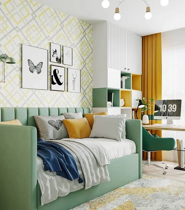
The overall picture of the interior will depend on the selected shades since both colors themselves are rich and active. Here it is important not to overdo it and to properly balance the self-sufficient couple. For this:
- Decide which element will be the leading one. One should be more saturated and be the first to attract the eye, the other should complement it and not draw attention to itself so that both colors do not conflict.
- The choice of the “main thing” in this pair depends on the rest of the palette, the style of the interior, and your preferences. Most often, bright yellow is taken and used as local color accents, but it can be done the other way around.
- This combination rarely becomes the basis of a color scheme. Usually, they are complemented by a calm neutral base: beige, brown, gray, or white.


Pink
Herbaceous, olive, mint, and light green look beautiful with any pastel tones, but a combination with pink is considered a real classic.
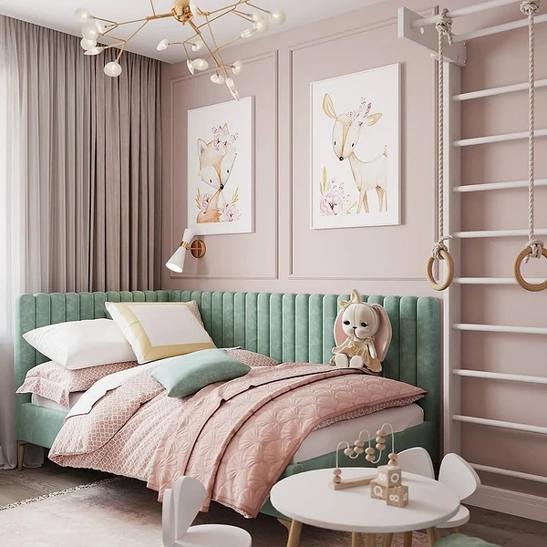
This combination is associated primarily with a blooming garden or a lush and fragrant bouquet of fresh flowers. Therefore, it is traditionally classified as a feminine palette, but this does not necessarily have to be the case. The perception of a “floral” combo is influenced by shades and their ratio.
- For the bedroom and private bathroom, deep, rich variations with a touch of cold are suitable: emerald, mossy, dark turquoise plus lilac, a shade of rose or peony, or dusty fuchsia.
- “Edible” motifs will look great in the kitchen: pistachio, olive, light green along with peach, salmon, and any berries.
- For other rooms, choose tones based on your preferences. Dusty versions of pink (powdery, antique, marble, royal, pearl) and calm greens, as well as mint and turquoise look noble and neutral.


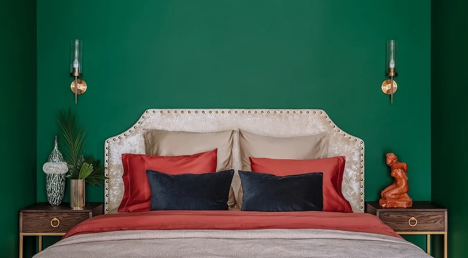
Red
If you are looking for a bright, eye-catching, and bold combination, then look no further than red.
Like yellow, it is a self-sufficient and active element of the palette, sometimes even aggressive, so you need to use it carefully and choose the right tones.
Diluted olive or pistachio can be used as a base, for example, for neutral wall decoration. In this case, use rich red as local accents: for example, for small furniture, textiles, or decor. However, most often both colors are taken as additional ones, choosing a more neutral option for the background – the same beige, classic gray, or refreshing white.
If you are looking for what colors dark green goes with, take a closer look at the noble, slightly muted variations of red: wine, pomegranate, cherry, and carmine.


Combination table
We have collected in a visual table what colors dark and light green go with. Pros indicate successful combinations, cons indicate those that are ambiguous or difficult to implement. This does not mean that certain tones cannot be combined, it’s just that such combinations have more nuances and require special attention to detail.
| Combinations | Shades of green | ||||||
|---|---|---|---|---|---|---|---|
| Olive | Emerald | Grassy | Turquoise | Mint | Bolotny | Pistachio | |
| White | + | + | + | + | + | + | + |
| Grey | + | + | + | + | + | + | + |
| Black | – | – | – | – | + | – | + |
| Beige | + | + | + | + | + | + | + |
| Brown | + | – | + | – | – | + | + |
| Yellow | + | + | + | + | + | + | + |
| Red | + | + | + | + | + | + | + |
| Blue | – | + | – | + | – | – | – |
| Pink | + | + | + | + | + | + | + |
| Violet | – | + | – | + | – | – | – |
| Orange | + | – | + | – | + | – | + |


