


Natural colors are on trend. We tell you how to add a deep olive shade to the interior and what to combine it with.
Shades of green fill the space with freshness and make it cozy. They are also pleasing to the eye, like any natural tones. They can be used as a background or accent. In this article, we tell you how to decorate an interior design in olive color: what shades to combine with and how to apply it in different rooms.
Color Features
Among all the variations of green, olive is most often perceived as an independent color. This is truly a self-sufficient shade with many undertones: from the lightest, almost pastel, to dark with a hint of brown or beige.
In psychology, green is associated with energy, warmth, well-being, and vitality. The color of olives is associated with warm summer evenings somewhere in a Tuscan villa or in a cozy English living room.
Depending on the saturation of impurities of other paints, color is perceived differently. It can be both an accent and a background since it does not put pressure on the psyche and does not tire the eyes. Another important feature is that the shade is stylistically versatile. It is used in eco-style, and in minimalism, and in classics.


What to combine with
Let’s consider which color combinations with olive look best in the interior.
Beige
Beige is a universal base that is suitable for all interior styles and looks organic in any room. With this combination, use cream, beige, or ivory as a base (for example, in wall decoration and for large furniture), and let the olive color play the role of an accent. The more saturated it is, the less quantity it should be present in the palette. Or dilute this pair with white and contrasting black.


White
White goes well with all colors, and green is no exception.
Achromat adds freshness and makes the space lighter and visually more spacious. You can combine the pair in any ratio: olive details will dilute the white background and vice versa – light interior elements will make it visually lighter if you choose warm green for decoration.


Pink
Pastel colors generally look great with green, and the combination with pink is already considered a classic.
Usually, this pair is used in a girl’s bedroom or nursery, but you can also decorate a bathroom, kitchen, or living room in pastel colors. For such a combination, the correct ratio of the two colors and suitable shades are important. To prevent the interior from looking naive and clumsy, choose muted pink, perhaps diluted with gray, white, or beige.


Grey
Gray goes well with any color, and olive is no exception.
The main thing is to choose the right shades. Focus on the location of the room (if the windows are large and there is a lot of light, cool colors are suitable, if there is little sun, warm colors) and the atmosphere that should be in the room. In the bathroom or kitchen, where it is humid and hot, cool combinations look good – they refresh and cool the interior. In the living room, nursery, or bedroom, to create coziness, it is better to choose softer and deeper variations.


Brown
Two warm natural shades are harmoniously combined in any proportion.
However, this is a dangerous combination – both colors absorb light, so there is a risk that the room will look too dark. To prevent this from happening, use lighter shades, and be sure to dilute this pair with white, cream, or light gray. Also, provide plenty of artificial light.


Orange
Olive color feels good in company with other warm tones.
An important rule: choose deep shades of orange. For example, closer to terracotta or peach instead of a pure acid color. To prevent the combination from being too active, dilute it with a neutral base: gray, white, and beige will do.


Blue
Even though olive is a warm shade, it goes well with muted blue or light blue.
The result is an effective and refreshing combination that adds restraint to the interior. To prevent the room from seeming too cold, especially if the windows face north, dilute this combination with a warm color: cream, pearlescent, creamy, egg yellow, brown, red, etc.


Ideas for different rooms
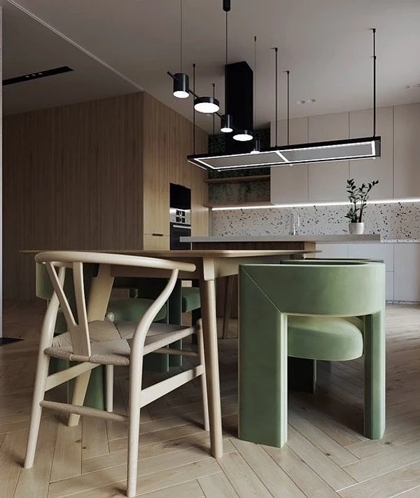
Olive kitchen in the interior
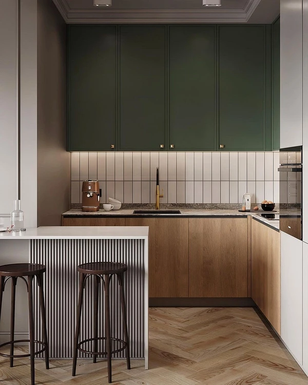
The “edible” olive color looks organic in the kitchen interior, as it is associated with cooking and delicious food. At the same time, it is not too aggressive and does not stimulate excessive appetite, like, for example, bright red.
Use it:
- For wall decoration, the smaller the kitchen, the lighter the shade, so that the space does not seem cramped.
- For furniture – a calm, muted olive color is suitable for a set, and for a sofa or dining chairs, you can take a more saturated tone. Combine with wood texture, beige, gray, or white.
- For accents – apply it locally, such as curtains, cushions, or decor.
The natural palette in the kitchen looks good both in modern styles (eco, contemporary, boho, hi-tech) and traditional (classic or neoclassical, country, Provence).


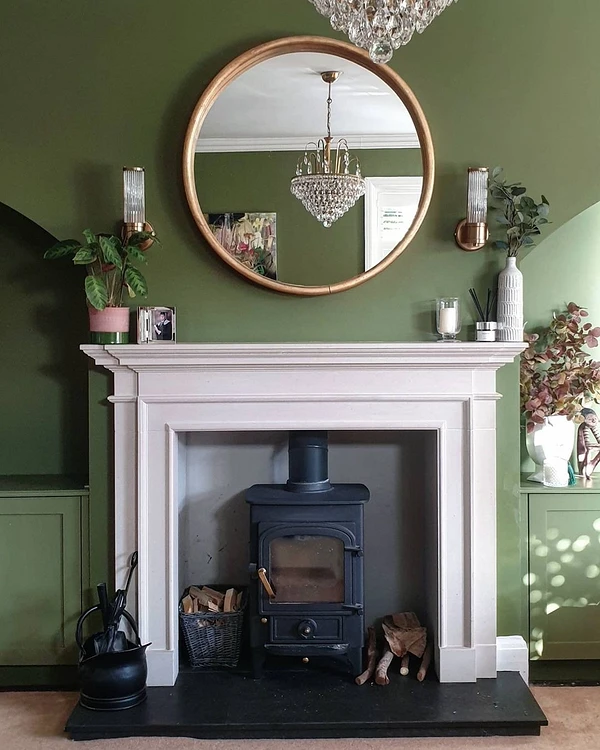
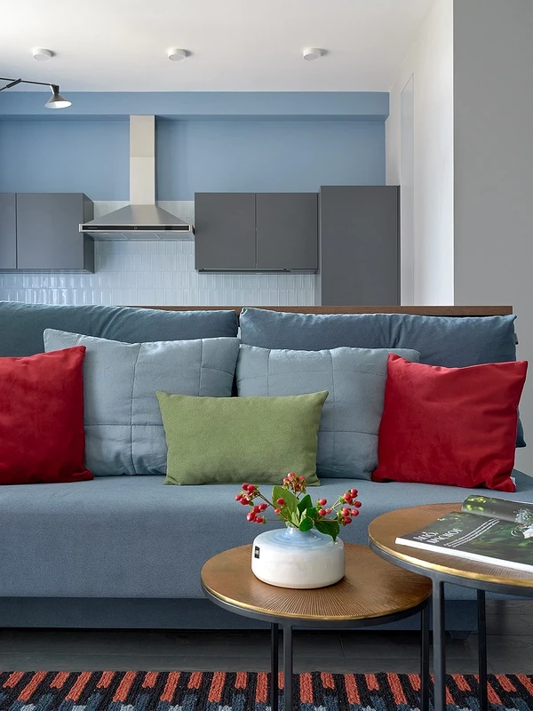
Living room
This color is ideal for the living room as it makes it both dramatic and cozy.
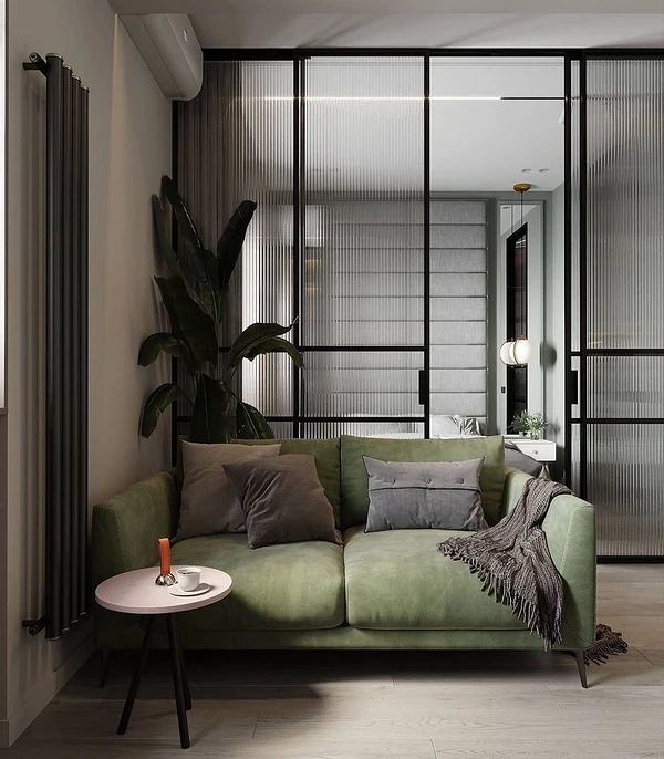
Choose companions for him depending on which characteristic you like best. In the first case, use deep, noble colors: graphite, malachite, plum, blue-gray, mint, indigo, and terracotta. In the second there are calmer tones: shades of brown, beige, white.
If the room is spacious and bright, with windows facing south or east, muted green will look beautiful on the walls. You can paint all four of them or just one, making it an accent. If you want a more neutral finish or the living room is small, make a color accent on furniture or textiles.


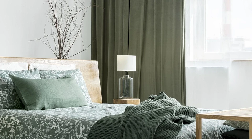
Bedroom
Any warm colors are welcome in the bedroom since the main task of this room is to calm, give comfort, and set the mood for relaxation.
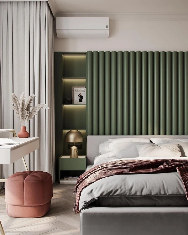
The “green-beige-brown” trio, typical of eco-style, looks best here, even if the interior is decorated in a different style. For an intimate, romantic bedroom, complement the green with muted pink, peach, or soft blue.
If the room is decorated in a monochrome color scheme (for example, based on beige or gray), dilute this palette with green bedding or curtains. The warm and cozy texture of the wood will additionally soften the decor of the bedroom.


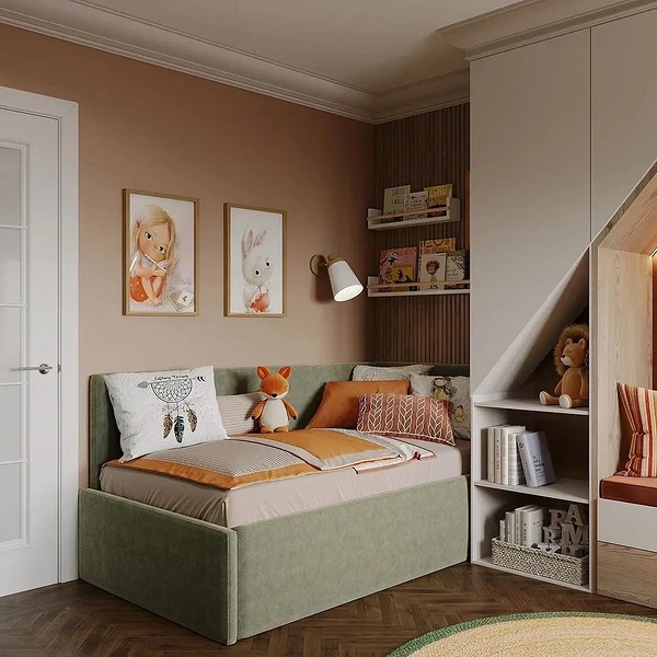
Children’s
The main advantage of green is that it is a gender-neutral color.
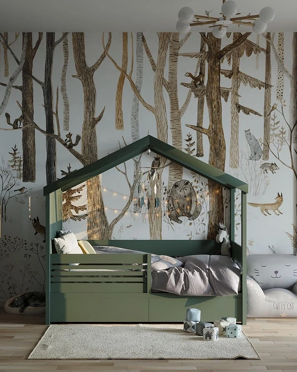
It is ideal for a room if children of different sexes will live in it or if you just want to decorate the interior without stereotypes. In addition, the child’s room should have cheerful and at the same time calm colors so as not to affect the already active child’s psyche.
Use a dark green tone for furniture, textiles, or accent trim. Combine with beige, white, brown, blue and yellow. This range will appeal to kids will not seem too naive to teenagers, and will also fit into any interior style.


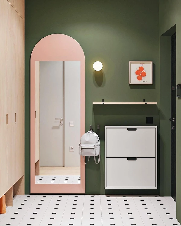
Hallway
The olive color in the hallway interior will be diluted by beige, brown, or gray.
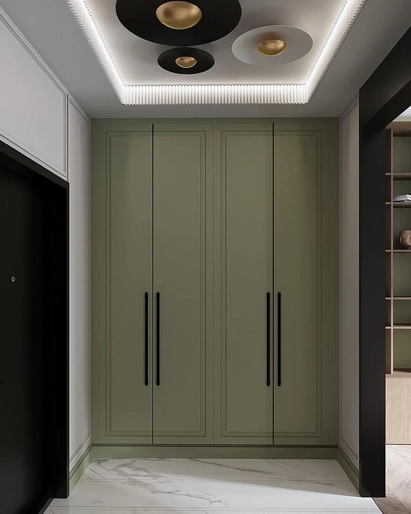
They are most often used for walls and floors: the entrance area quickly becomes dirty, and it is important that the finish is non-marking. But a completely beige or gray interior looks boring, so it needs to be refreshed – green is ideal for this role.
Choose the proportions of the palette depending on your preferences. You can balance a calm base and contrasting greens or apply olive locally: for example, for a chest of drawers, shoe racks or poufs. If you use it for walls, then provide multi-level lighting in the hallway so that it does not seem gloomy and too dark.


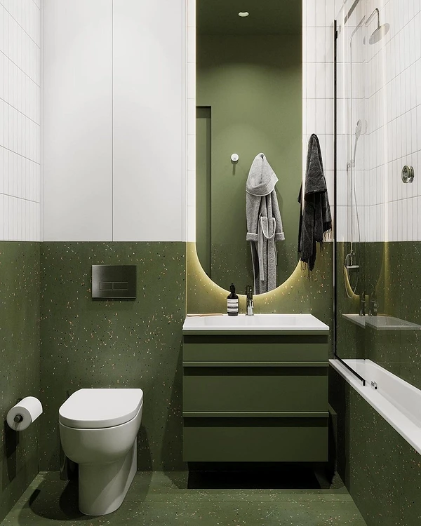
Bathroom
Bathrooms often have olive walls.
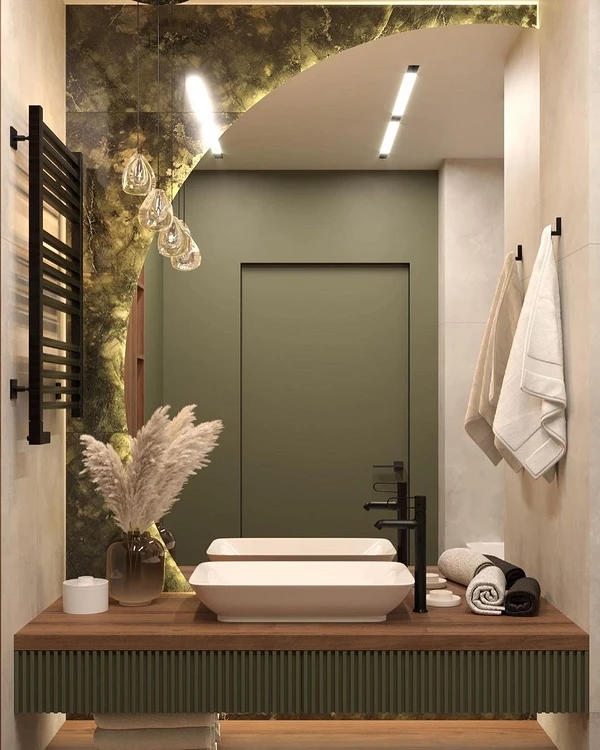
The color reveals well both on textured tiles and on a smooth painted surface. In an apartment, the bathroom is usually small in size, and it is optimal to zone a small space with color. Highlight the shower room, the area behind the mirror, or the storage system in green.
This shade also looks beautiful on furniture facades. This accent will dilute the calm basic finish and add brightness to the bathroom. Together with the murmur of water and the texture of wood (it is better to use imitation due to high humidity) or stone, you get a direct association with nature, which sets you up for relaxation after a hard day and helps you cheer up in the morning.


The most important thing about our X that it is for
those who are in a hurry


