


The history of this two-room apartment, in which a young family lives, proves that the laws of mathematics do not apply to interior design: as a result of “reversing the places of the terms,” the total area has become larger, and the comfort of housing has increased significantly.


An apartment renovated in the spirit of modern classics is a wedding gift from a mother to her daughter. There is nothing flashy in the design, everything is very calm, laconic, and neutral. The color shades chosen were warm and “tasty”: creme brulee, vanilla, chocolate. The owners asked designer Yulia Khokhlova to organize the layout of the apartment in such a way that, firstly, it would be comfortable for a young couple, and secondly, it would become a cozy home for the future baby. Everything was done competently and on time: by the end of the renovation, the family already consisted of three people.
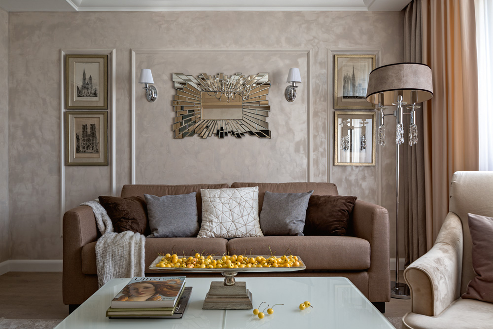
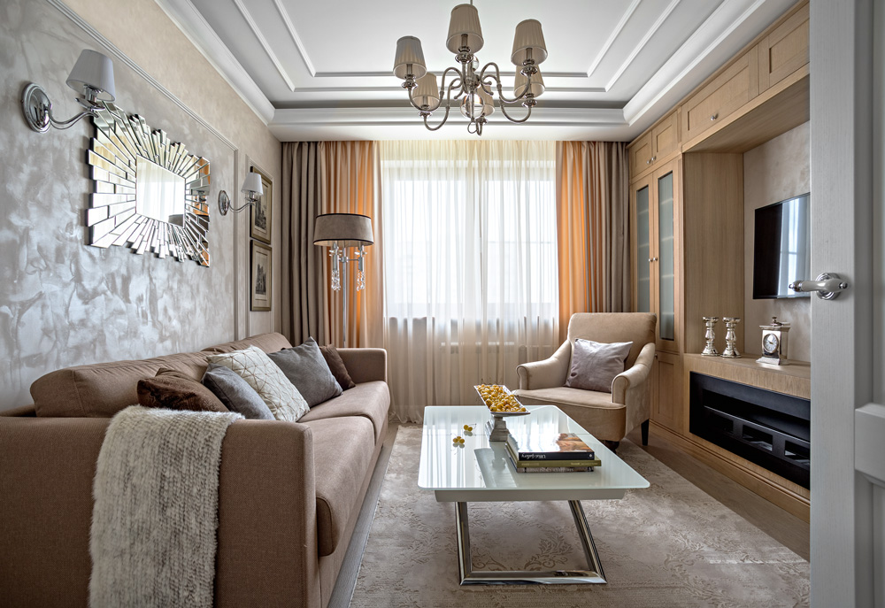
Division of the wall with moldings is a technique that sets the style, structures the plane of the wall, highlights the seating area, and emphasizes the sophistication of French engravings on the wall
Redevelopment
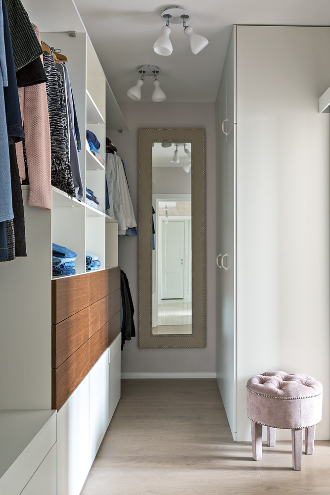
The dressing room in the bedroom is small and functional. Cabinets are made to order according to the designer’s sketches
A two-room apartment in a Khrushchev-era building is typical of the 60s. XX century: a small entrance hall, two rooms (about 18 and 14 m²), and a kitchen (12 m²), windows on one side. The young housewife grew up here. The large room used to be a living room (and mom’s room), and the small one used to be her children’s bedroom. Now a large room has been allocated as a bedroom and a full-fledged dressing room has been fenced off there (about 6 m²). In addition, in the couple’s bedroom, there was space for a baby’s crib and a changing table. The smaller room became a living room, where everything necessary for a family holiday fit, including a group of upholstered furniture, a wall, a TV panel, and a bio-fireplace.
The kitchen and bathroom were left in their original places. The bathroom was not combined. Using part of the corridor, space was allocated for a laundry room and built-in wardrobes in the bathroom. The intervention was minimal, and the effect at baseline was maximal.
In this interior, everything is thought out to the smallest detail, right down to where to seat guests, in which cups to serve tea and what flowers to put in a vase.
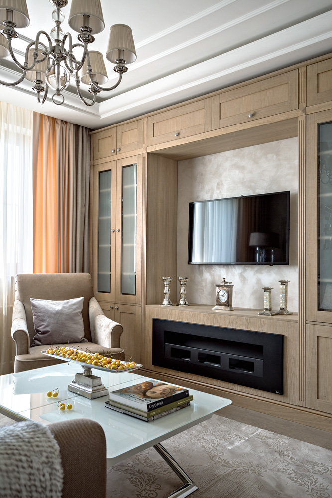
The twelve-meter living room seems too small to accommodate a fireplace. However, there was a place for it: a biofuel model was built into the cabinet under the TV panel
Repair
After dismantling the old finishing, the floors, ceilings, and walls were leveled, and windows and doors were replaced. New partitions between the bedroom and dressing room were built from foam blocks. They also made a niche for a built-in wardrobe between the hallway and the living room and fenced off the laundry room. Then the walls were leveled with plaster and a finishing coat was applied (Italian decorative silk paint). We glued the stucco molding from polyurethane foam and painted it. Wallpaper was pasted only at the head of the bed. A concrete screed was made on the floor, then leveled with finishing coatings. The floor was brought to one level. Laminate flooring was laid in the rooms, and porcelain tiles were installed in the wet areas and hallway. The ceilings were leveled with gypsum plasterboard on a metal frame and painted, as a result, the height of the rooms was reduced to 2.60 m. The total area increased from 53 to 54 m². The door between the dressing room and the bedroom was made sliding: this saves space, and there was no need for sound insulation (it must be taken into account that a sliding door, compared to a swing door, insulates sound worse).
Thanks to the organization of a full-fledged dressing room in the bedroom, there are no “extra” closets in any of the other rooms.
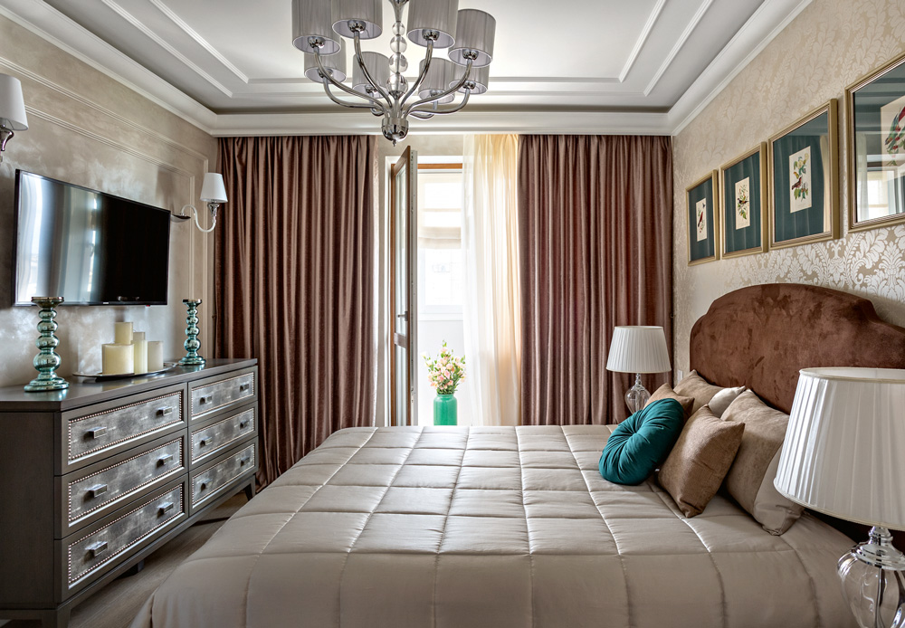
Eaves lighting is mounted on the ceiling. When it’s on, the ceiling appears higher. Light colors and a few accessories are what a small room needs to avoid overcrowding. Turquoise accessories break up the monochrome
Design
The starting point was “ American classics ” – a restrained, respectable style with hints of Art Deco. Laconic furniture in neutral shades, a mirror with “rays”, white metal lamps, porcelain tiles that subtly imitate marble – the “quantity” of Art Deco is dosed and verified, here it does not look deliberately luxurious, but rather simply comfortable – therefore there is no conflict with the initial data of the apartment, its small total area and historical context.
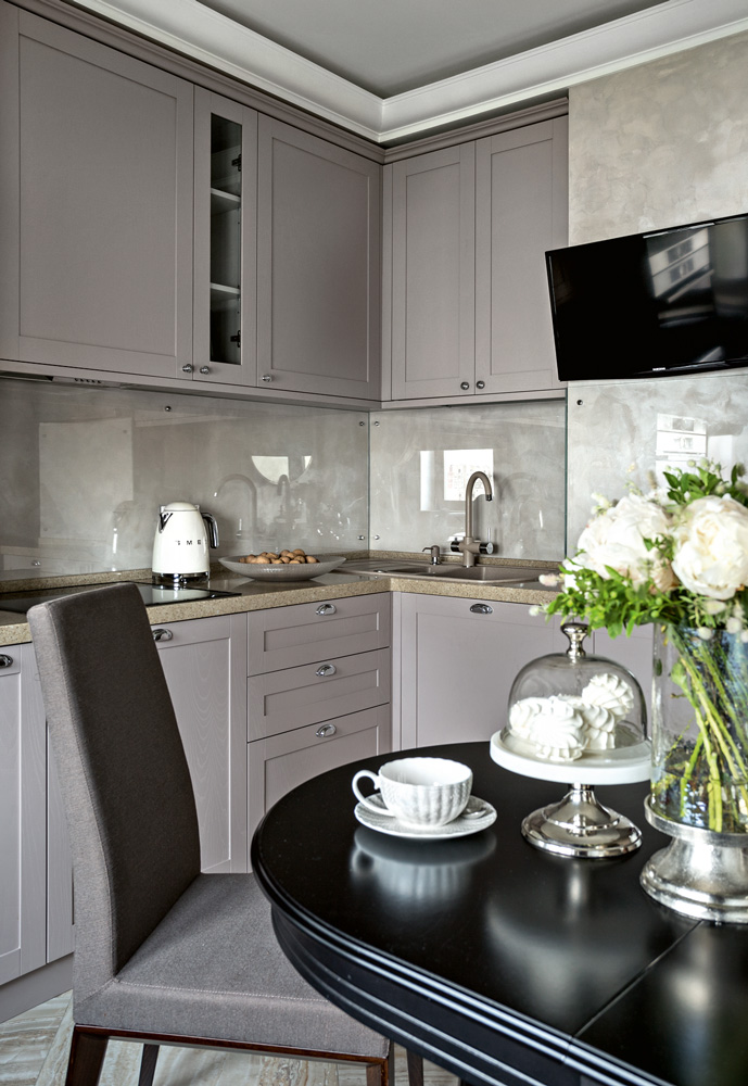
The light-colored kitchen practically merges with the walls, and the apron is finished with reflective glass. Thanks to such techniques, the idea of the true size of the kitchen is lost.
Materials and color
In this space, materials, textures, and colors are in balance: both are soft, unobtrusive, and psychologically comfortable. Silk-effect plaster, a matching silk carpet on the floor, an armchair with a velvety surface similar in tone and texture. The wood from which the cabinets are made is matte and has a pleasant golden color. Curtains in two shades: one to match the wood, the other to match the color of the sofa. The transforming table (Calligaris), it would seem, should not “stand out” from the interior composition, since it is minimalist in style. But no: “cool” glass and metal successfully emphasize the “warmth” of other materials and textures. As a result, everything goes together with everything, and the interior as a whole is distinguished by the unity of practical solutions.
Shiny marbled porcelain tiles and shiny silk-effect plaster “catch” the sunlight falling from the living room window
Cozy dining area
In a small kitchen, only blinds are often hung: after all, there is not enough space for two long curtains. But the chosen style dictated its conditions, and the designer planned a voluminous drapery, but one, without a pair. The cityscape outside the window is covered by a Roman blind. The author of the project was not afraid to put a cozy, fabric-covered sofa here, just like in the living room or in the “large” dining room. In fact, it does not eat up any footage, since it takes up no more space than two chairs. But, thanks to the thoughtful decor, the atmosphere of an elegant dining room in the style of a European villa is created in the premises of this Moscow kitchen.
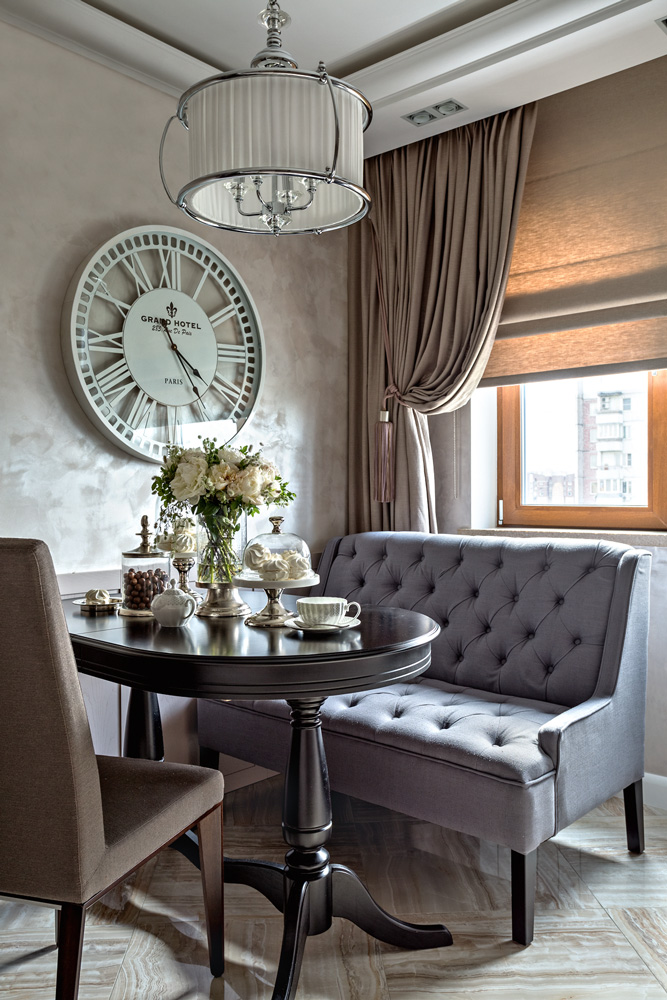
Designers say large accessories like this wall clock can make a small room seem larger. That’s why we chose a lamp with a large lampshade.
I consider the organization of storage systems to be my success on this project . You don’t need to think that in a standard two-room apartment like this there is no place to make a dressing room. The main thing is to move away from stereotypes and look at your home with an open mind. The customers agreed to the solution I proposed – to organize the entrance to the bedroom through the dressing room – and received an area they desperately needed. At the same time, part of the parent’s bedroom was allocated as a nursery for the newly born baby. When the child grows up, he will, of course, need his own room. But that will be a different story, although with this layout the space can be adapted to the new needs of the family.
Yulia Khokhlova
Architect, author of the project
The most important thing about our X that it is for
those who are in a hurry


