


Walls are an element to which it is easy to apply your talents. Choose a color, or an ornament, deepen it with niches, or maybe decorate it with wooden panels. There are endless options. Here are some of them.
1. In depth and breadth If the apartment initially has a niche – this is happiness. It must be played out, emphasized, and used. Another question: is it worth creating it on purpose? Go to the expense of hammering walls, and building false walls from plasterboard? It’s worth it if it’s part of the overall concept and not a random detail. Niches are well suited for display: from collectible art to small plastics, glass, and ceramics.
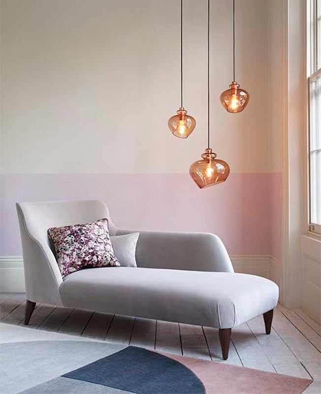
2. One color When the furniture is close in color to the walls, the room seems more spacious. And the shape of objects is not so striking. However, the contrasting background emphasizes and highlights the shape. “Create an interior based on similar shades. You can’t go wrong! – decorator Tricia Guild teaches us.
“Bright colors and sharp contrasts look impressive in pictures in magazines but are not suitable for everyday life. I want to live in harmony. What could be more harmonious than white walls? Perhaps only light gray or light sand – to my taste. If you make the doors and ceiling (and ideally also the floor) white, you will get an incredibly light, calm space. And what’s important is that it’s not monotonous.” Carola Baumgarten, decorator.
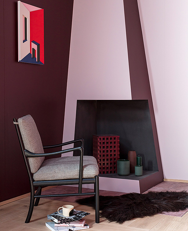
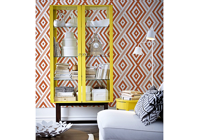
Saturated colors are good in rooms that are “naturally dark” – where there is no or little sunlight. Deep shades make them cozier. Black and white ornamental wallpaper is a good place to place a piece of furniture in a rich shade. Particularly lucky are things with a dark “silhouette” frame. They are both colorful and graphic.
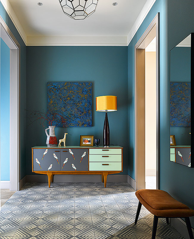
3. Accent wall “Everyone handles color as best they can. The main thing is not to be afraid of it and have fun,” says designer Karim Rashid. How to make walls bright? You can paint it, but you can also cover it with wallpaper; unlike paint, it has a texture – it looks “warmer.” A modern technique: highlight only one wall with color and leave the rest white. Or gray. So, by the way, you can adjust the proportions of the room.
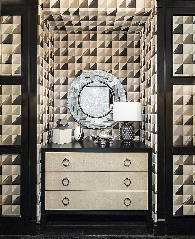
4. Ornament and rhythm. Active ornament is relevant. But don’t give him the whole room. When it runs as a continuous sheet, it tires the eye and becomes boring. It’s “safer” to emphasize one wall or a fragment of it. Designer and decorator Maggie Levien talks about the intricacies of handling large formats: “For furniture that is located next to curtains or large-patterned wallpaper, choose smooth, plain fabrics.”
You can order fabric with the same prints as on the wallpaper. Just use it sparingly and at some distance from the “active” wall. Attention! Wallpaper with large patterns has a drawback: in order to match images on different panels, you will have to buy additional meters. And also ornamental wallpaper does not get along well with works of art.
5. Fourth wall: window. “It is very important how the windows are decorated. There is a comparison: “Windows are the eyes of the house.” The idea is not new. The continuation is more interesting: “Framed by the curtains, they begin to shine.” The interaction of fabric with natural light really gives a stunning, different effect from day to day. The charm lies in difference. I wouldn’t give specific decorating tips. Listen only to yourself.” Ralph Anstoetz, designer and head of JAB Anstoetz.
The most important thing about our X that it is for
those who are in a hurry


