


Red, yellow, or green? We tell you how to choose a bright sofa and not spoil the interior.
A bright sofa in the interior of any room is a spectacular and favorite technique for designers. And repeating it is very simple: the main thing is to know just a few rules. We will talk about them in this article.
What to consider
In fact, despite its popularity, a bright sofa is not quite a universal solution. For example, in classical or country style, such a contrast would not be appropriate, but in more modern apartments, it is. These include the Scandinavian style, loft, modern, and even sometimes neoclassical. In minimalism, the technique is used very rarely, the same applies to eco. Contrasting furniture leads such decorations into eclecticism.
The second point is the implementation of the idea itself. The sofa can be supported in the design or used as a single accent. There are no strict rules, but the following principle is most often used in projects: if there are many colors (more than three) or color blocking is used, the shade of the sofa is duplicated in other elements.
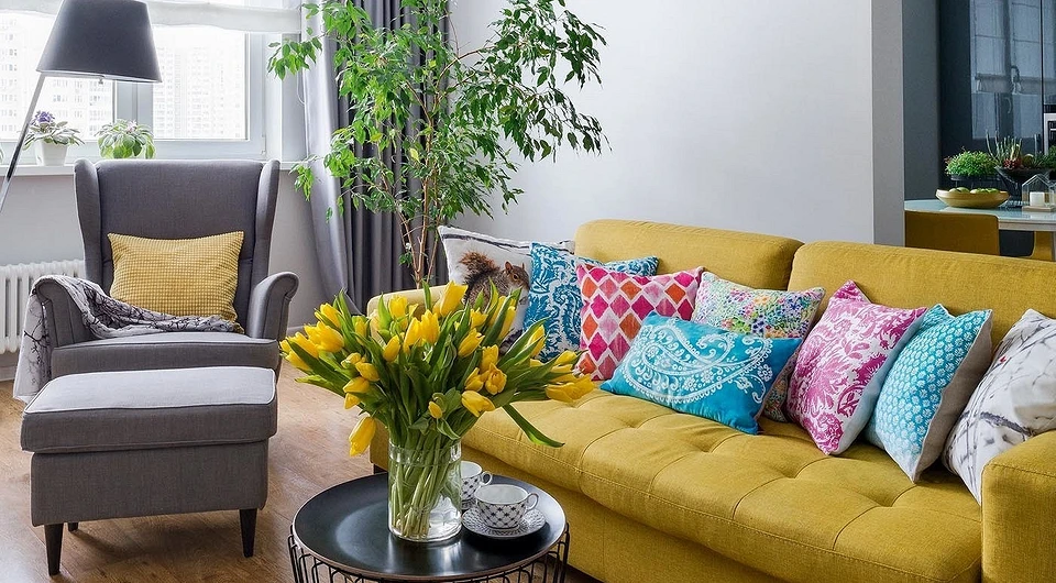
- The easiest way to do this is with the help of decor: paintings above the sofa, carpet, and vases in this area. Pay attention to the carpet: usually, designers choose multi-colored models, where the desired color scheme is presented to a lesser extent. This technique does not look so naive and, as they say, “on the forehead.”
- The combination option with curtains looks good in traditional designs.
- An interesting solution looks with small details, for example, with book covers placed on a nearby rack, or with flowers.


If the entire interior is made in basic colors, then the color spot does not have to be duplicated – this concept just works on its own. For example, in a room with light furniture, a bright sofa will become the main focus. This is suitable for any neutral range: beige, milky, gray, and muted pastels that are used as a base.
In design projects, plain furniture is much more common than patterned furniture. If you still like the pattern idea, choose less active patterns: geometry and abstraction. It is best to avoid floristry and various combinations of finishes when combining different fabrics. For example, they combine armrests and a back, pillows, and a base.
Actual shades
Not all saturated bright colors will look modern in the interior. The main trend today, which we are constantly talking about, is not pure, but complex tones. Those about which it is impossible to say exactly what kind of paint it is.
If we take into account microtrends, for example, popular in 2022, then designers distinguish several colors.
- First of all, it is yellow – the choice of Pantone. Its combination with gray is the most fashionable this season.
- Numerous warm variations of red are another notable trend. These include terracotta, scarlet, ocher, burgundy, and so on. Close options from the yellow-orange palette: copper, brick, caramel, and mustard.
- The turquoise sofa is a classic. Designers especially liked this solution in neoclassical interiors and modern decorations with a sublime touch.
- Bottle color can be considered as an alternative to turquoise. Emerald and grassy shades close to it also look great.


The principles of combining a bright sofa in the interior of the living room and another room
The choice of upholstery is influenced not only by trends. If, for example, you have already made repairs and are now thinking about buying a sofa, it is better to build on the basic design. The rules of color apply here. The simplest method is the play of opposites. You fit a contrasting sofa into the design. You can see what color will be contrasting in the Itten circle: these are two beams located opposite each other. Let’s take an example.

Let’s say the space is decorated in beige tones. Beige lies on the orange beam of the circle. Opposite the orange beam lies blue. Accordingly, a blue (or turquoise) sofa will organically fit into a beige living room.
You can adjust the saturation of the shade yourself: light, medium colors and dark ones will do.
In addition, beige, especially close to white, is considered the most neutral base. So you can choose any upholstery for it: delicate options in pink and bright ones in yellow look nice.


When there are several colors in the main design, you can choose a contrasting upholstery for one of them, for example, an additional one (it occupies 30% of the interior). In the gallery above, the designer paired an orange sofa with a blue-gray wall trim under the ceiling.
A classic addition to achromats, these are gray, black, white, and red shades. If you do not want too much contrast, choose a shade of red that is close in brightness to the main tone. When white is used as a base, bleached red is suitable, gray is in harmony with dusted color, and black is in harmony with burgundy.
Separately, it is worth mentioning the presence of textures in the interior. Marble is a neutral element, unlike dark wood. The first goes well with any colors, especially if the stone itself is black and white. With a tree, colors that are found in nature organically look.


Fashionable textures of upholstered furniture
The texture of the sofa also affects the choice of shade. For example, natural fabrics, such as linen or cotton, look great in calm natural colors. The latest trend is unpainted materials, such items are used in eco-style and scandinavian.
There are no fewer experiments with saturated tones. One of the most popular textures for turquoise, powdery pink, and other deep colors is velour. It looks noble and regal. Such models are suitable for rooms decorated in neoclassical or modern style.
Boucle is a hot trend in the coming seasons. Usually, this texture is used in light colors, but if you are ready to experiment, why not try brighter options?
Careful with the skin, especially in a rich palette. In this case, the shape of the furniture is very important. Choose simple models, without pretentious elements. And the classics are better to watch in a less colorful version.


The most important thing about our X that it is for
those who are in a hurry


