


Dark floors, light ceilings, and bright walls, or maybe bright furniture and neutral finishes? We show how to quickly and easily navigate in color combinations using our tables and ready-made schemes.
Coloring is one of the most interesting and at the same time complex components of design. No one wants to miscalculate and make a mistake with the choice of colors. Therefore, the issue of choosing a gamut of design should be approached responsibly. We offer tables of color combinations in the interior: walls, floors, ceilings, and furniture.
What you need to know about choosing a gamma
Let’s start with theory. According to the basics of color design, there are three colors in any interior: base, complementary, and accents. As a percentage, it looks like 60 – 30 – 10, where the main color occupies most of it, a little less – an additional one and the smallest part falls on accents. This does not mean that the palette of matching colors in the interior consists of only three tones, there may be more. Then they split up within the group.
The main ones are usually the decoration of the ceiling, floor, and walls. Furniture brings additional colors, it can also become an accent. Details, textiles, and metals – often act as accent colors. This distinction is arbitrary, in fact, designers are experimenting with the representation of colors.
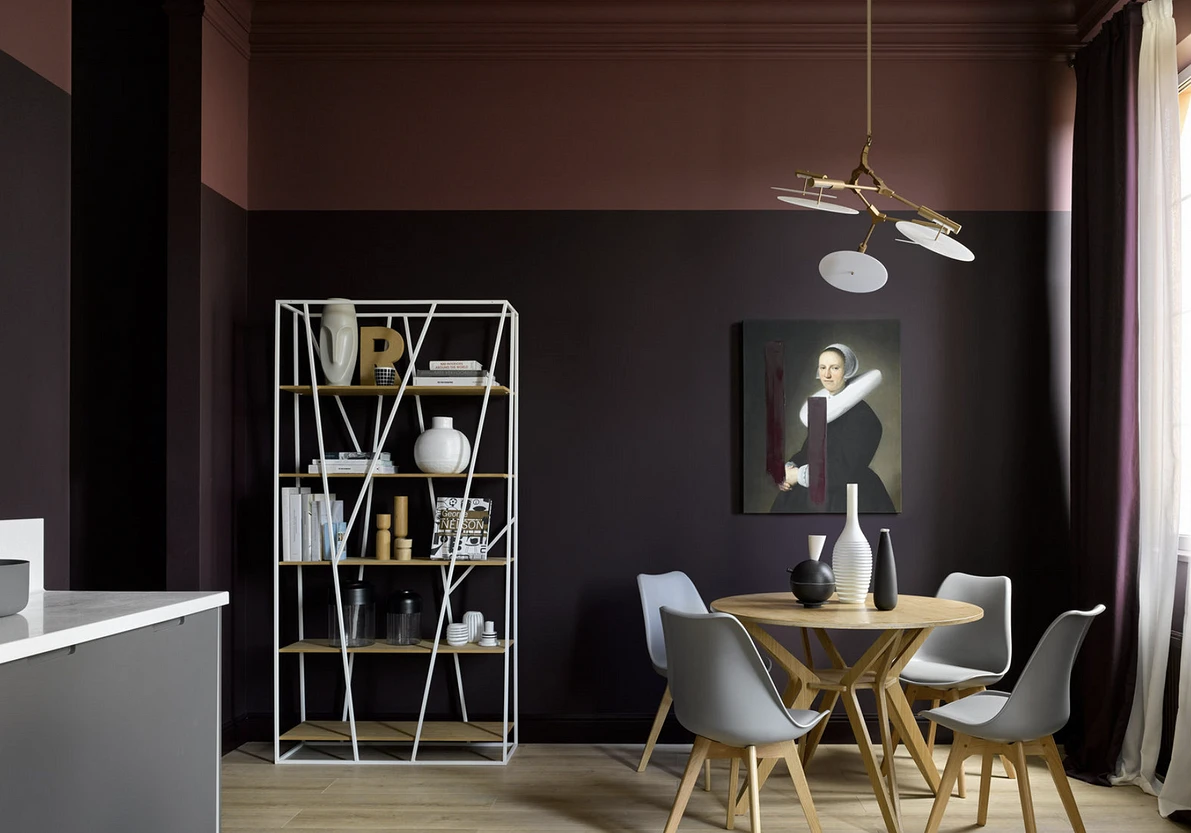
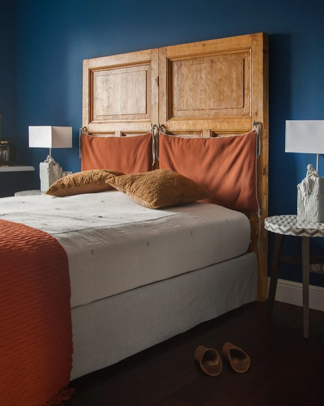
The second principle that follows from this rule concerns the favorite color. Many are ready to paint the walls in their adorable bright blue or green. But after a couple of years, they begin to regret this decision, and then the time comes for another repair. Our advice: choose a more neutral palette as a base. It can be both greenish and blue, but it is better to choose calmer, muted colors within them. You definitely won’t get tired of them. In addition, when choosing colors, it is worth considering the area and size of the room. Not all colors look good on a large area, for example, on a wall. You can find out with the help of coloring.
We propose to consider two approaches to the range in the interior. The first is monochrome, fashionable today.
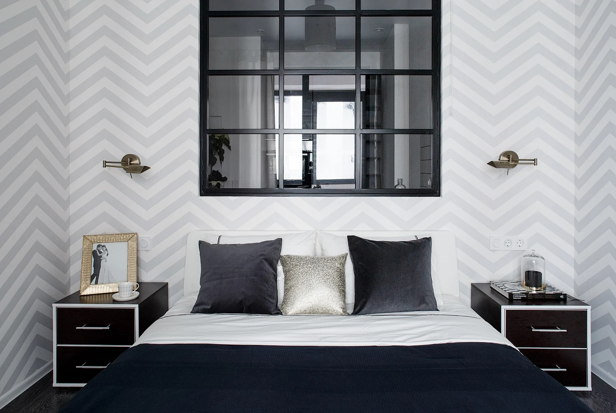
Monochrome
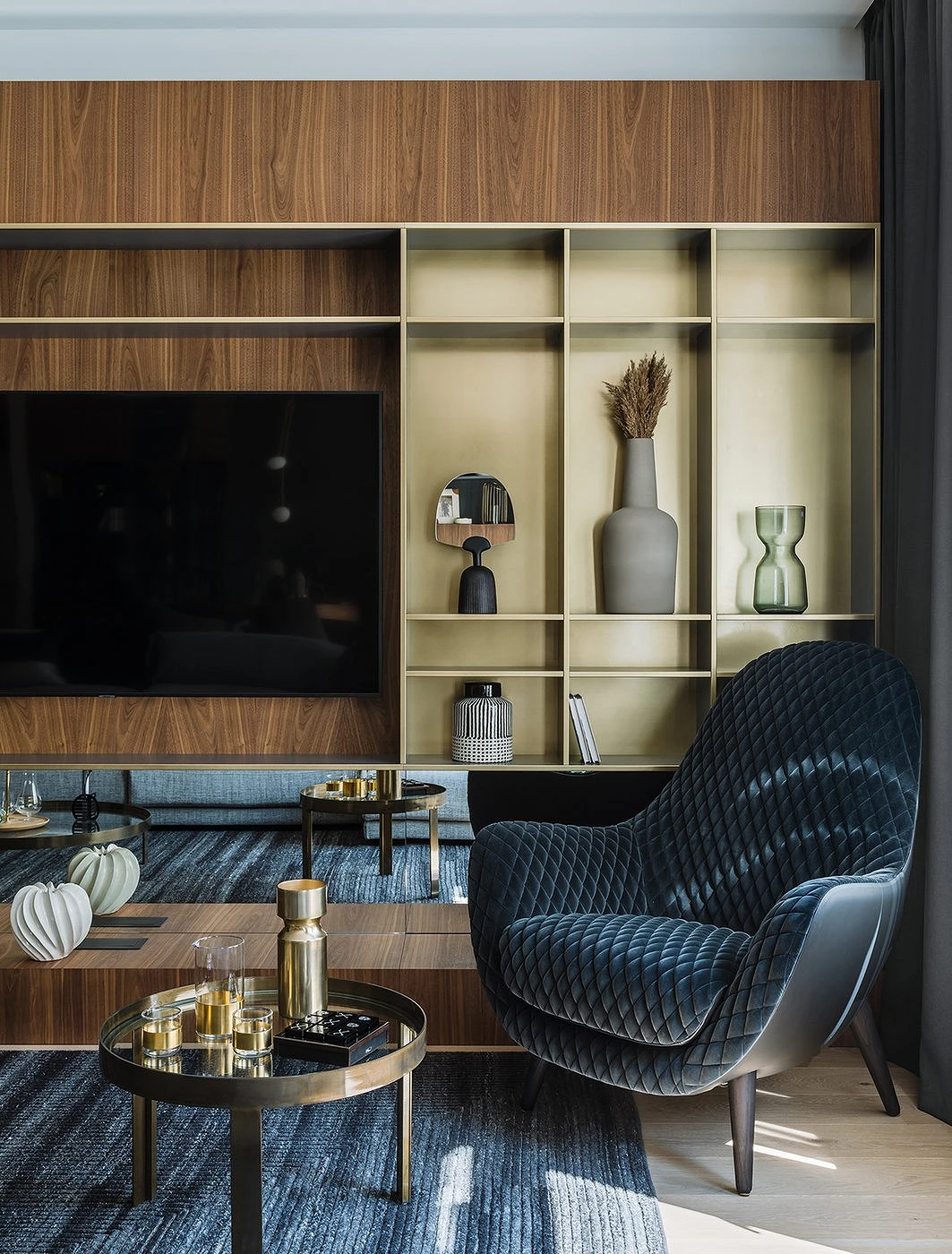
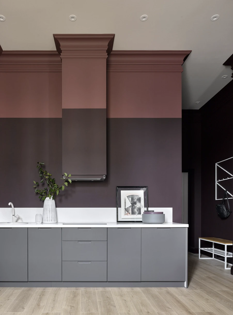
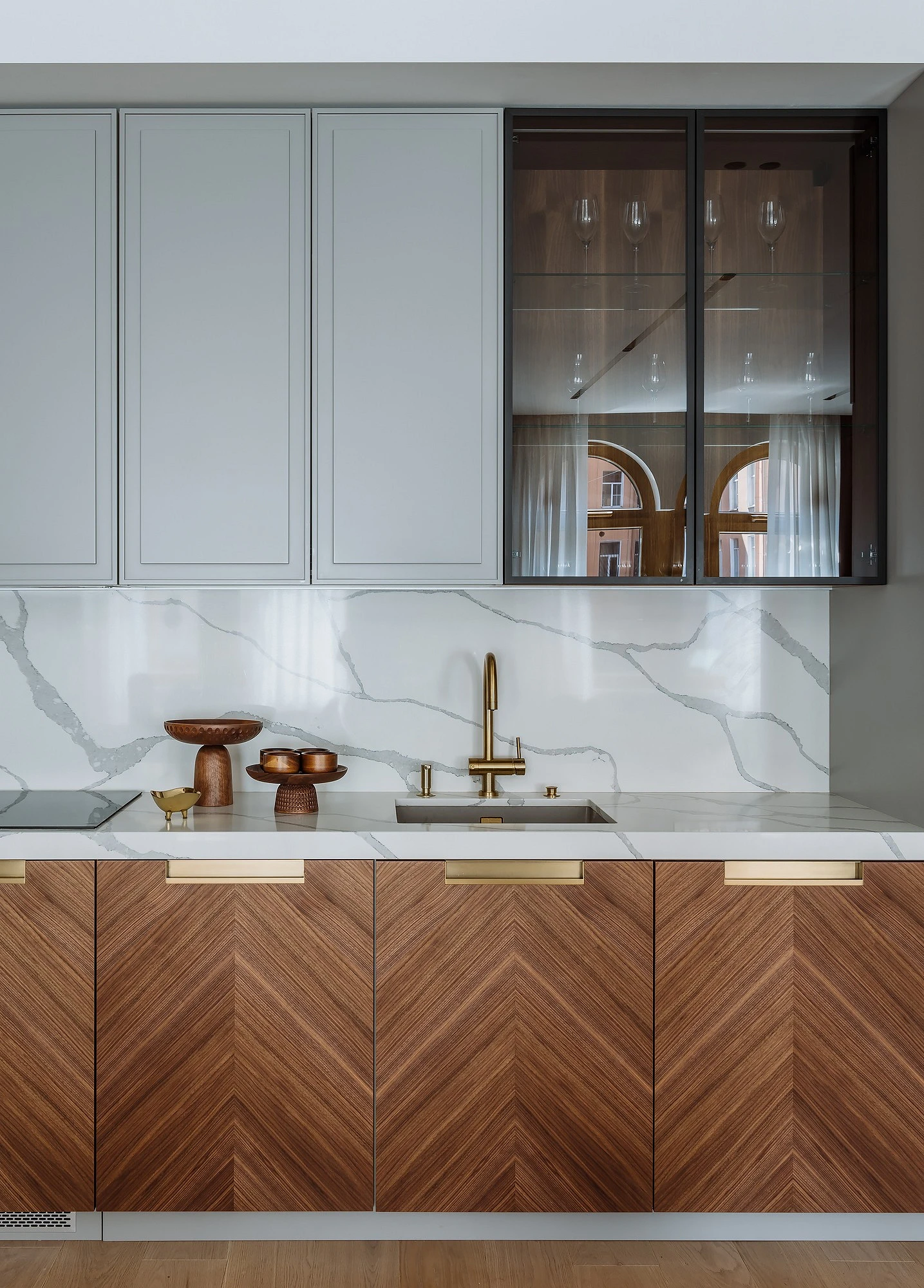
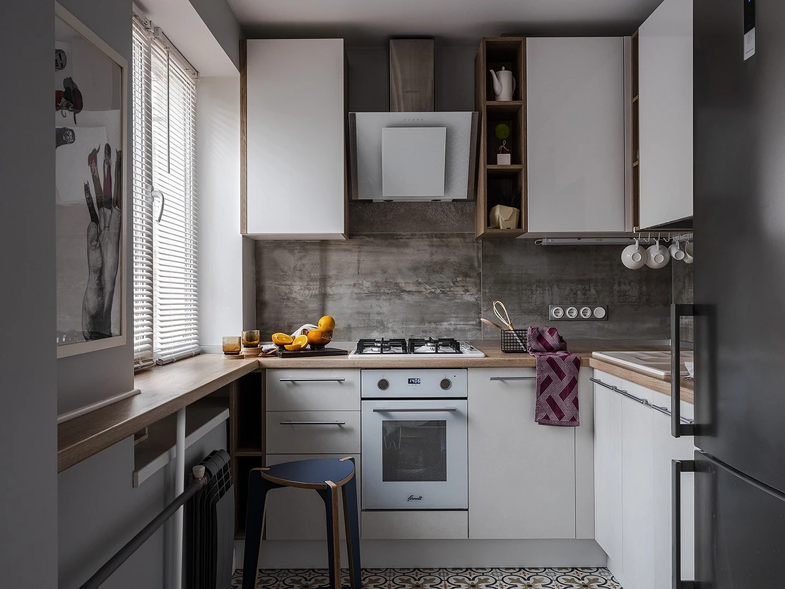
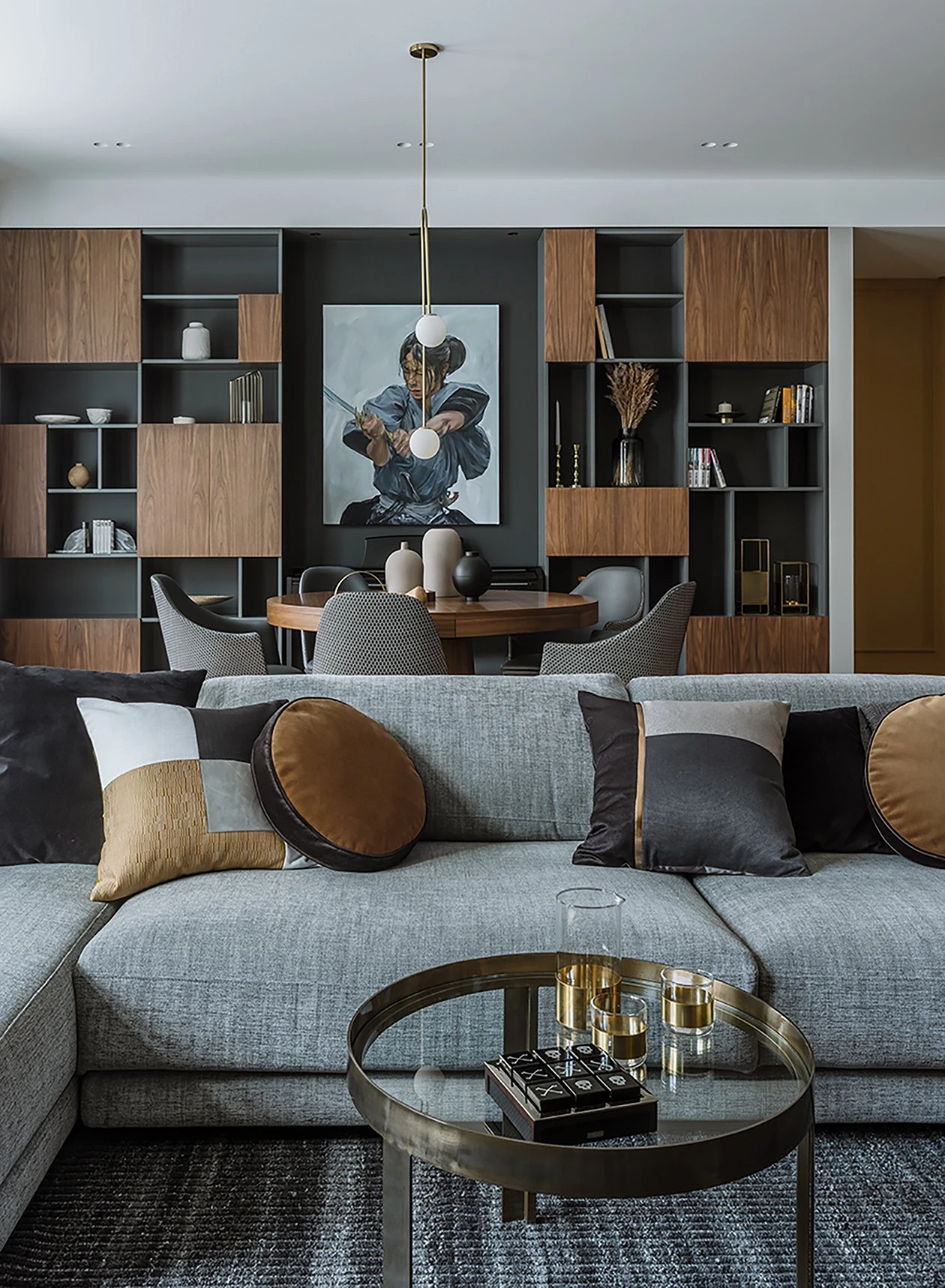
Monochrome – design within the same color palette. Most often, designers choose the basic ones for this: beige and gray. They add relevant textures to them. For example, different wood, stone, and concrete – selected by tone, are able to dilute the interior, and make it more interesting and dynamic.
Thus, for example, a table of combinations of beige colors in the interior may look like this.
| What | Color | Texture |
|---|---|---|
| Floor | Dark brown | Wood, porcelain stoneware |
| Walls | Warm or cold medium tones | Plaster, printed wallpaper, wood as accents (MDF panels, slats) |
| Furniture | Milky, reddish, dark brown | Leather, textiles, boucle, fur |
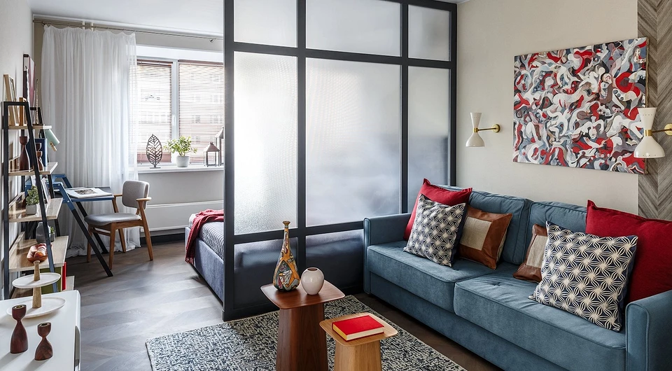
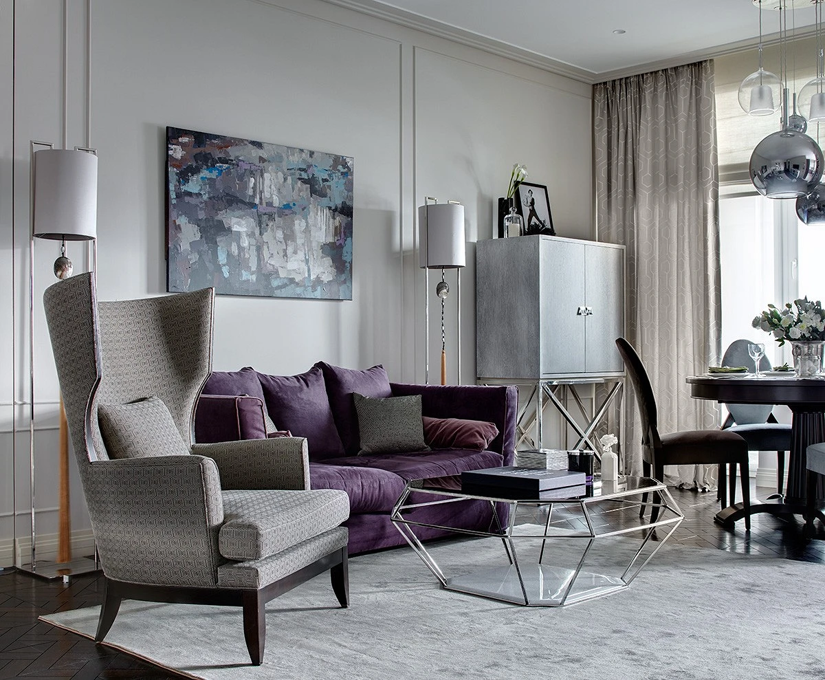
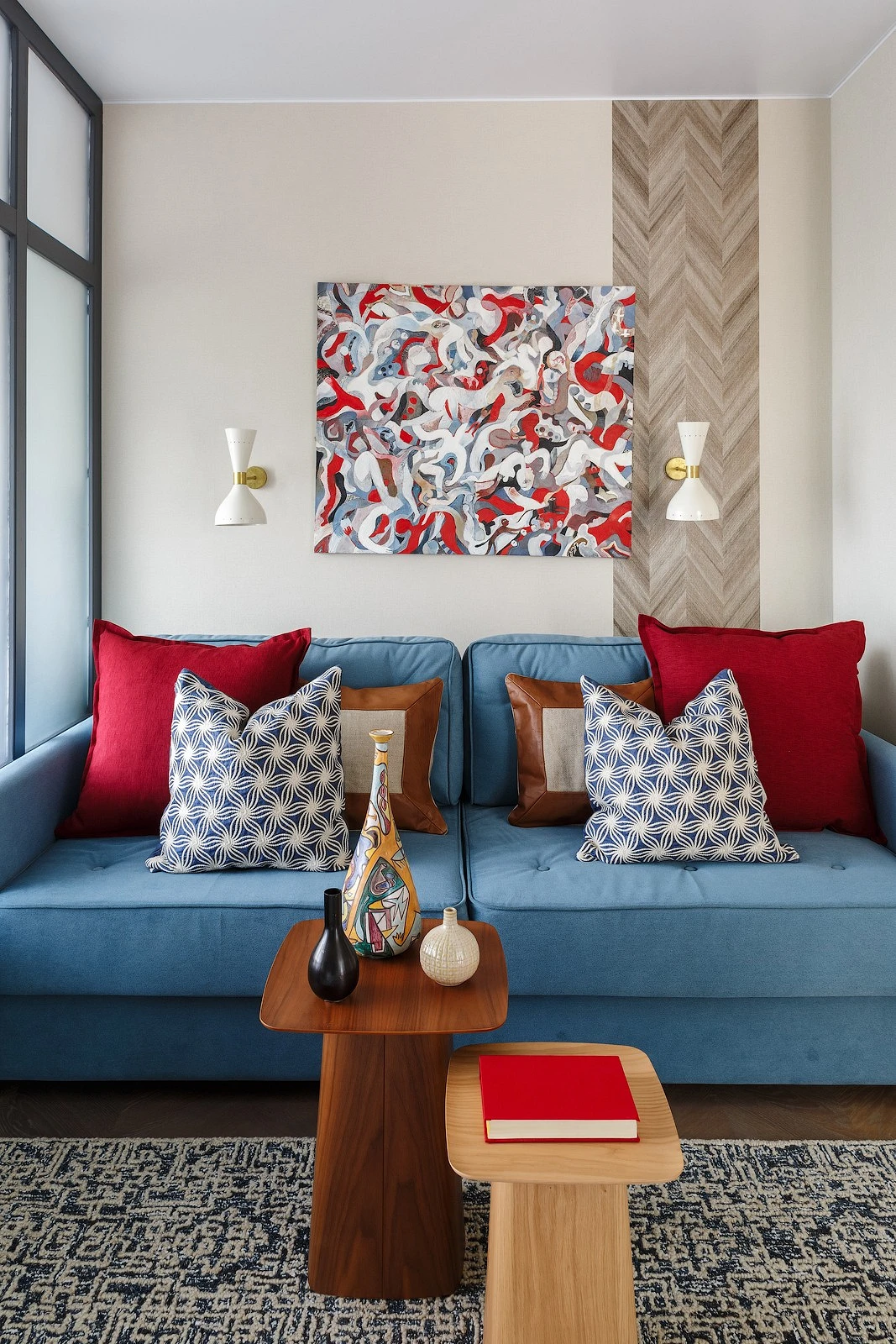
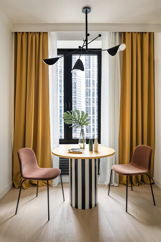
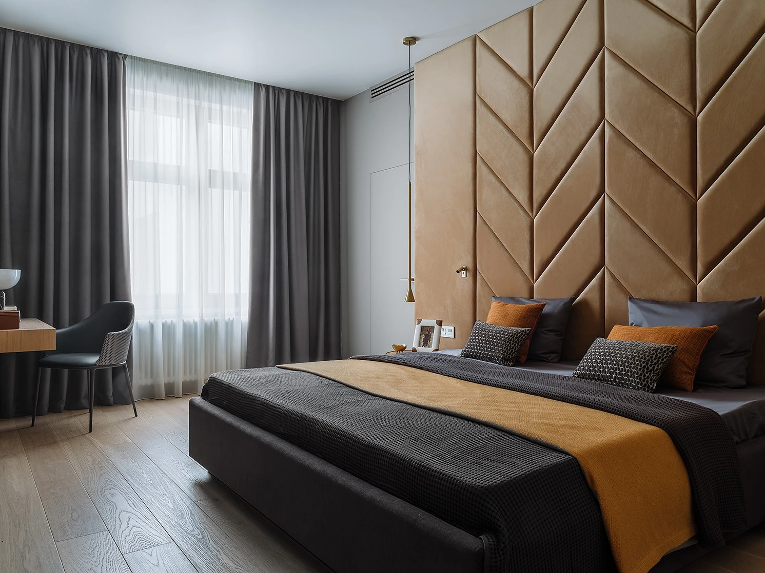
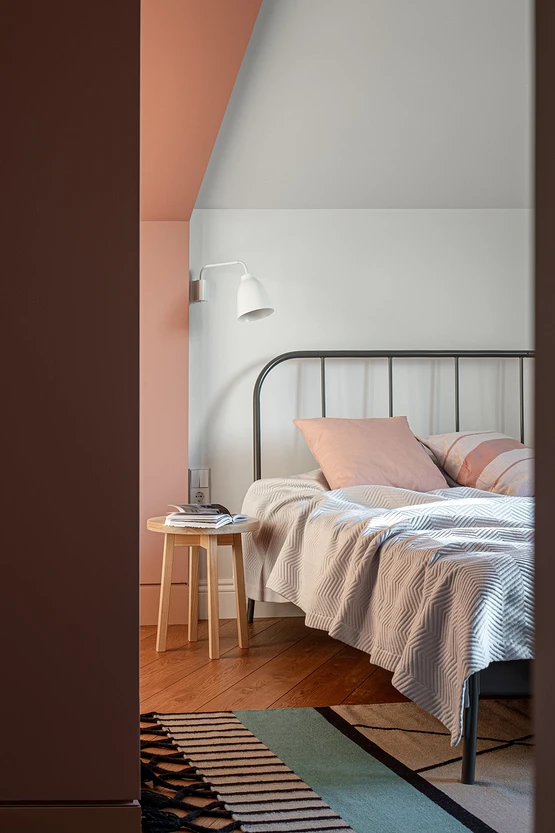
One of the fashionable design tricks is to dilute the monochrome with a solo bright accent. A medium-sized object acts as such a color spot: in the living room it can be an armchair or sofa, a picture or a coffee table, in the bedroom – curtains or textiles, in the kitchen – a dining group.
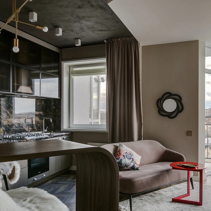
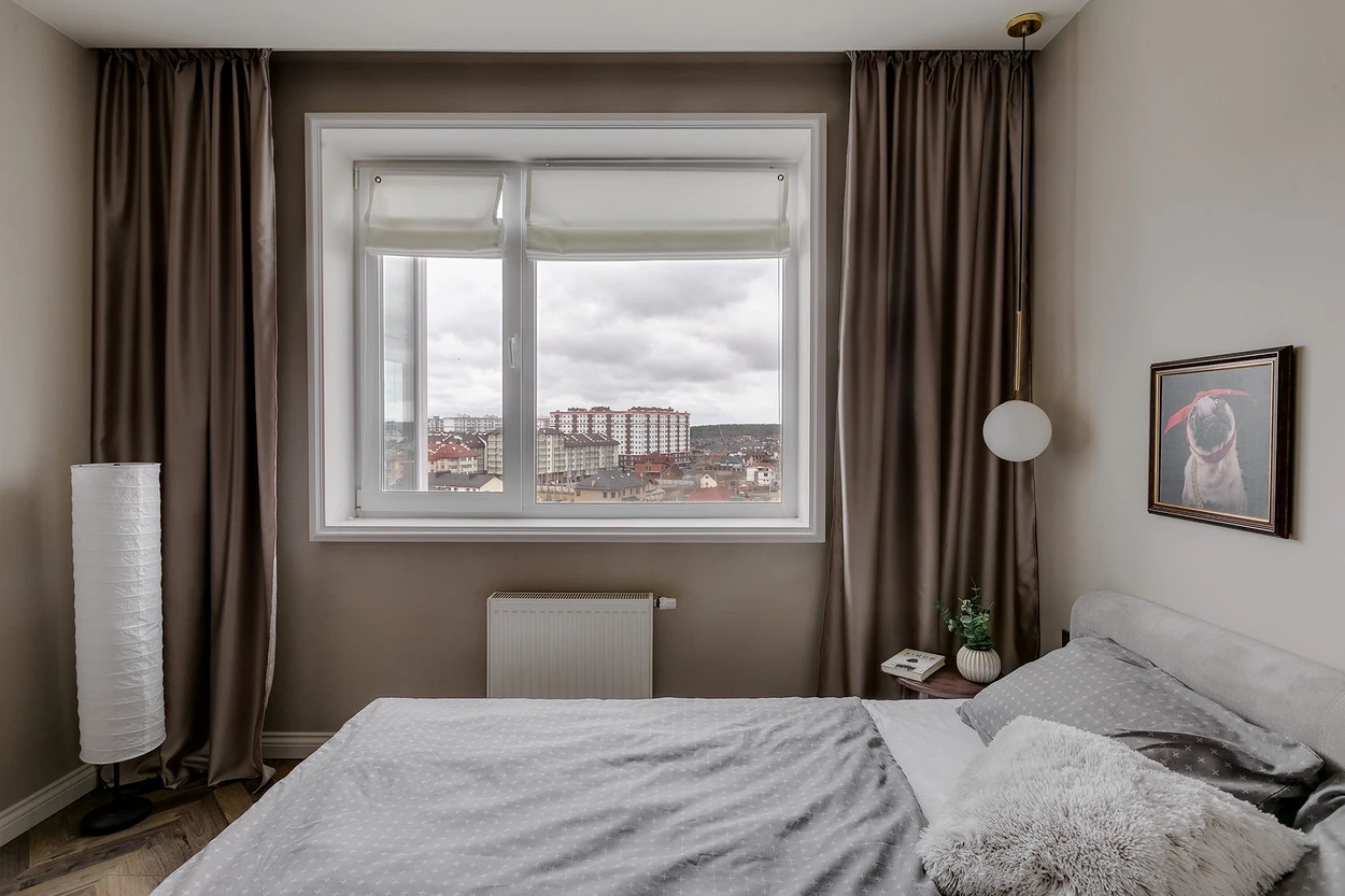
Pay attention to the distribution of tone. Most often, the floor is the darkest element, the walls are done in the middle range and the ceiling is the lightest. By default, we suggest not experimenting with its color, a white matte ceiling is a good solution in any style.
At the same time, you can experiment with the saturation and brightness of the walls, especially if the room is irregularly shaped: narrow and long rooms are adjusted in the same way as wide and low ceilings.
By analogy, you can make a table of gray combinations in a monochrome interior.
| What | Color | Texture |
|---|---|---|
| Floor | Graphite | Porcelain tile with stone or concrete look |
| Walls | Warm or cold medium tones | Textured plaster, printed wallpaper, paint |
| Furniture | Black, light grey, graphite | Leather, textiles, boucle, fur |
Combination principles
The second palette option is more difficult. This is a combination of different shades from the Itten circle. Four schemes are considered classic here.
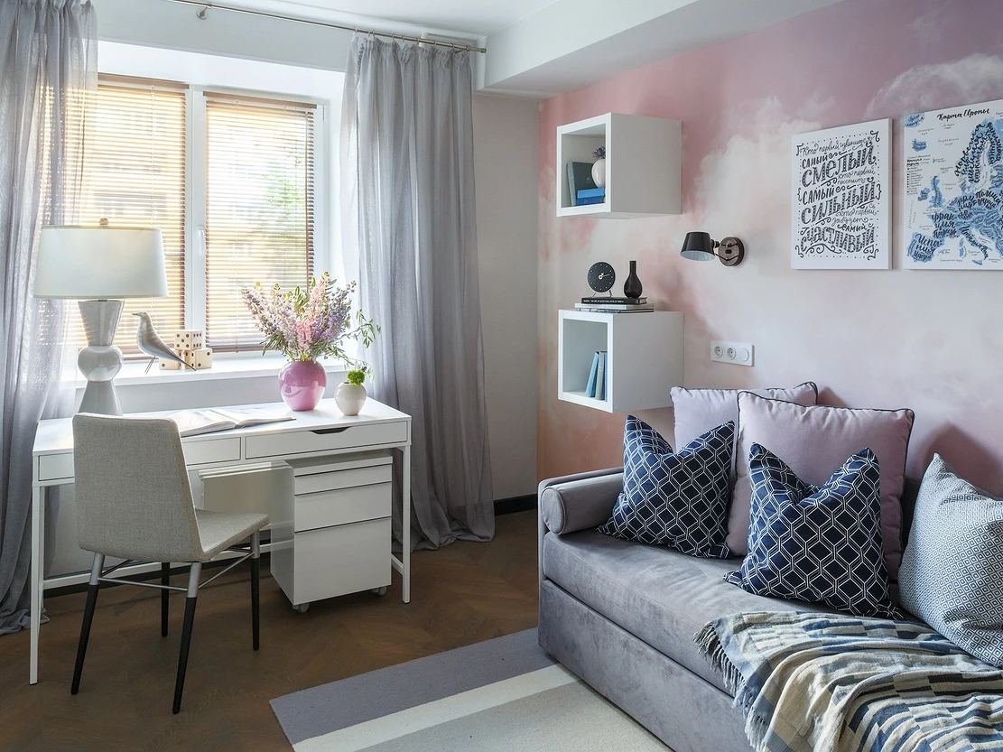
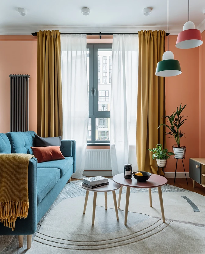
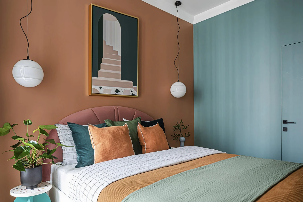
- Complementary or contrast. The basis of such a scheme is a combination of opposites and contrasting colors. These are, for example, the following pairs: blue – orange, lemon – purple, red – green, and so on.
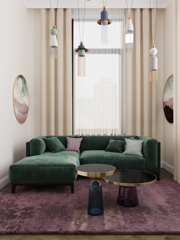
- Adjacent or analog. It resembles the monochrome principle of compatibility, but in fact, it is several shades (often three) lying side by side on the color wheel. This is red-yellowish-orange, purple-blue-cyan, and so on. The principle is very simple. In addition, each color can be divided into several components, and play their combinations. For example, use sky blue and indigo in combination with blueberry and emerald.
- A mix of three beams equidistant from each other is called a triad. This is a bright contrast: red – yellow – blue, purple – green – orange. Within these beams, you can also experiment with more complex and varied combinations without changing the essence of the approach. For example, break yellow into mustard and pastel, adding scarlet, burgundy, and indigo to it.
- Split complementary harmony is an isosceles triangle. Simply put, this is one contrasting color scheme, complemented by two practically adjacent ones. In practice, it looks like this: yellow – fuchsia – purple, green – purple – scarlet, orange – turquoise – blue.
- Finally, there are more complex combinations of 4 beams. But as part of an independent design, we do not recommend resorting to such a variety. It is difficult for a non-professional to choose such a scheme, it is easy to slide into chaos and color confusion.
The presented schemes work best when choosing additional and accent tones when you are in doubt about how to dilute the base colors. It is important to note here that against the background of achromats (gray, black, and white), as well as neutral beige, any combination will look good. This is the safest way to use and introduce color into rooms.
Actual shades
This paragraph is about current paints, according to manufacturers of paints and varnishes and design companies. The table will help you navigate the choice of specific ones.
| Gamma | Shades |
|---|---|
| yellow | Mustard, lemon, pastel yellowish |
| orange | Emerald, khaki, gray-green, grassy, mint |
| Red | Terracotta, burgundy, fuchsia, coral |
| purple | Lavender, blueberry, eggplant, blackberry, powdered |
| Blue | Dusty turquoise, bleached azure, blue-green, navy, natural blue |
| Green | Emerald, khaki, gray green, grassy, mint |
We deliberately do not introduce basic ones into this table, since they are relevant without reference to time. Their choice, in addition to personal preferences, may be influenced by the parameters of the room itself. This, for example, is the illumination (the more light, the darker the color can be). And also the style. So, in high-tech and loft, a cold gray palette is suitable, in modern designs – ocher, in minimalism all natural tones are relevant, and in Scandinavian – bleached.


Color combination table in the interior of any room: living room, bedroom, and kitchen
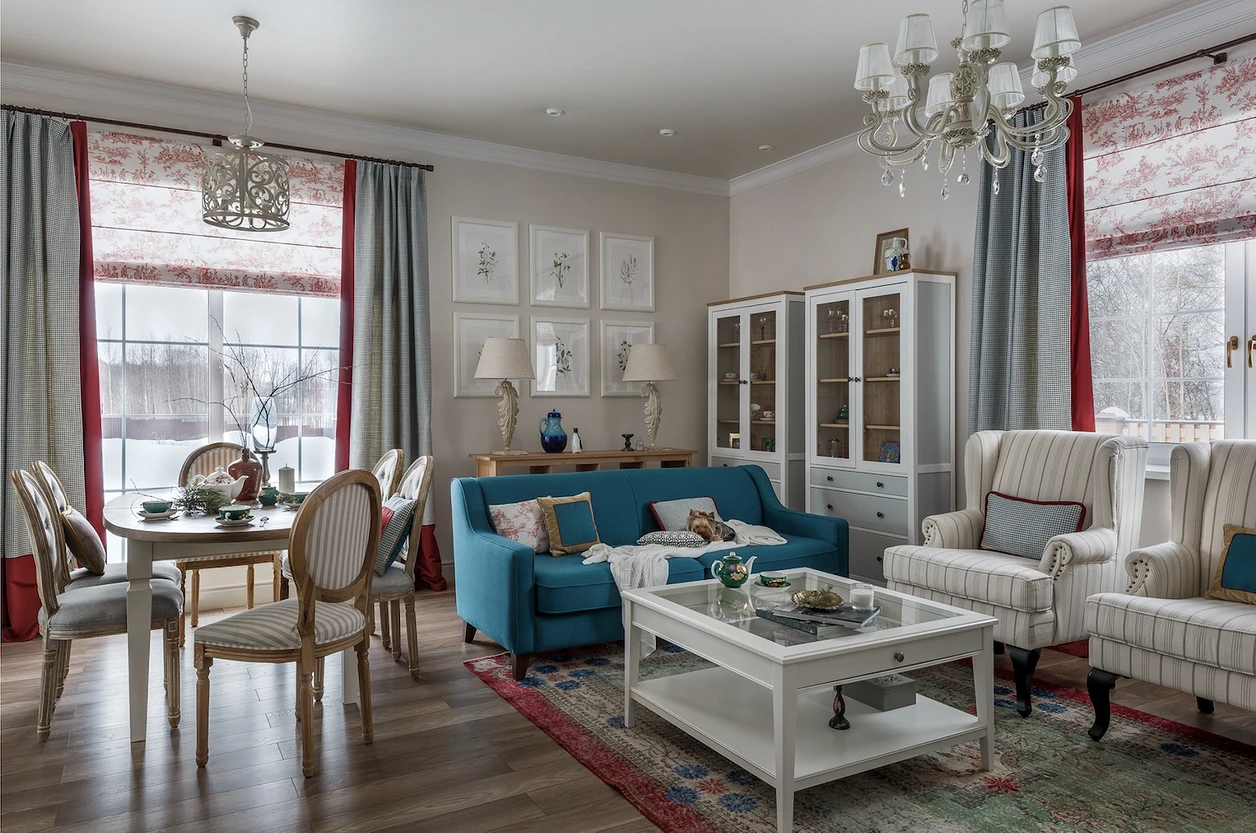
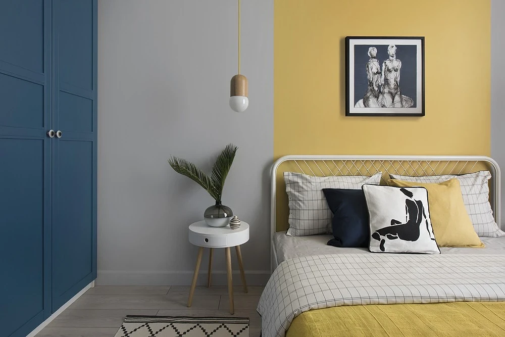
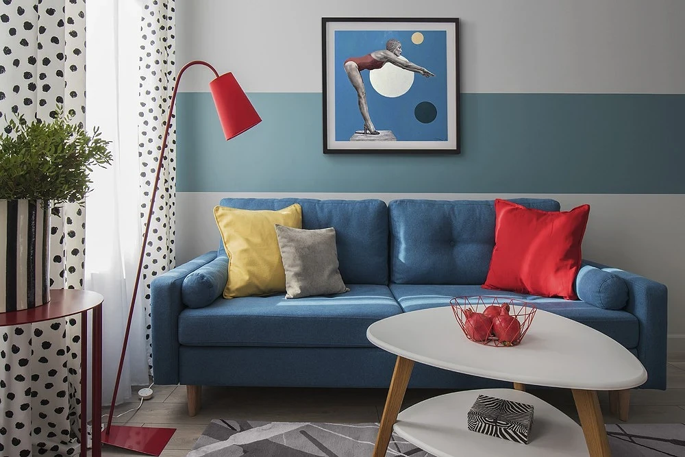
Also, the functionality of the room that you are decorating can also affect the palette. In the living room, where we spend the most time, it is better to give preference to more neutral tones, and in the bedroom, for example, you can experiment with colors. We tried to collect recommendations and ready-made schemes for these rooms. But they can easily swap places if you, on the contrary, want to make a bright living room and a calm resting room. These mixes are universal.
Some designers advise not to mix cold and warm colors in one design. In fact, such a game of temperatures can make the room more interesting. But, if natural light is not enough, you should not get carried away with cold and dark colors. It is better to use them as accents.
| Base tone: floors, walls, ceiling | Addition: furniture, curtains, carpets | Emphasis: individual objects, paintings, textiles |
|---|---|---|
| Contrasting combinations | ||
| Achromats and neutral beige | Ocher, clay, copper, gray-ocher, brick | Dusty turquoise, bleached azure, blue-green, navy, natural blue |
| Lavender, blueberry, eggplant, blackberry, dusted purple | Mustard, lemon, pastel yellow | |
| Emerald, khaki, gray green, grassy, mint | Terracotta, burgundy, fuchsia, coral | |
| Related | ||
| Achromats and neutral beige | Terracotta, burgundy, fuchsia, coralMustard, lemon, pastel yellow | Lavender, blueberry, eggplant, blackberry, dusted purple |
| Emerald, khaki, gray-green, grassy, mint | Turquoise, azure, navy, natural blue | |
| Mustard, lemon, yellow pastelEmerald, khaki, gray-green, grassy, mint | Lavender, blueberry, eggplant, blackberry, powdered | |
| Triad | ||
| Achromats and neutral beige | Turquoise, azure, navy, natural blueTerracotta, burgundy, fuchsia, coral | Mustard, lemon, pastel |
| Emerald, khaki, gray-green, grassy, mint lavender, blueberry, eggplant, blackberry, dusty tones | Ocher, clay, copper, gray-ocher, brick, all complex shades | |
| Split Complementary | ||
| Achromats and neutral beige | Lavender, blueberry, eggplant, blackberry, dusty purple tonesTerracotta, burgundy, fuchsia, coral | Mustard, lemon, pastel yellowish |
| Terracotta, burgundy, fuchsia, coralOcher, clay, copper, gray-ocher, brick, all complex shades of beige | Turquoise, azure, navy, and natural blue | |
| Mustard, lemon, yellow pastelOcher, clay, copper, gray-ocher, brick, all complex shades of beige | Turquoise, azure, navy, and natural blue | |
| Emerald, khaki, gray-green, grassy, mint | Lavender, blueberry, eggplant, blackberry, dusted purple | |
| Emerald, khaki, gray-green, grassy, mint turquoise, azure, navy, natural blue | Terracotta, burgundy, fuchsia, coral | |
The most important thing about our X that it is for
those who are in a hurry


