


Finishing, furniture, and decor – add warmth and coziness to any room with a cheerful orange color.

The orange color in the interior can scare away with its richness and activity. But if you get to know it better, it becomes clear that this sunny paint has a place in any room and in many styles. Today we tell you what shades of red to pay attention to, how to use it in the interior of different rooms, and what to combine with using photos of real projects as an example.
Color Features
Orange is a warm saturated color, representing a transition from yellow to red, therefore it combines their characteristics. Causes positive associations: fruits, south, autumn leaves, spices. And also – fire, sun, optimism, joy, vitality. It is also associated with spiritual growth – it is not for nothing that the robes of Buddhist monks are of this color.
It causes appetite, stimulates the brain, and, in general, has an exciting effect on the psyche, so you need to choose color combinations with orange in the interior so that it is always balanced by neutral calm shades. Caution should be used in the bedroom and in the children’s room: in large quantities, it is tiring and even alarming.
It is also important to note that it is not suitable for all styles. So, red is rarely used in classic, rococo, empire, and hi-tech. But it feels great in modern and minimalist interiors, country, and eco. Often used as an accent in the Scandinavian direction .


Shades
The activity and perception of an orange depend on which direction the subtone shifts: toward yellow or towards red. The closer to red, the richer and more aggressive the color is. Proximity to yellow gives a feeling of coziness and sun, creating the illusion of an increase in temperature in the room. But citrus does not have to be bright and concentrated – there are almost pastel variations that do not have an active effect on the psyche. There are many shades worthy of attention.
- Citrus fruits – orange, tangerine, grapefruit. These are the juiciest tones, only from the names of which vivacity emanates. In the general palette, they should take the place of a color accent, which will be balanced by neutral colors.
- Peach, and apricot – in contrast to the previous bright fruits, these tones, diluted with white and beige, tend to be pastel colors. They can be used in any room, not only in decor but also in furniture or decoration. They refresh the atmosphere but do not put pressure on the psyche, so they are often used in the bedroom and nursery.
- Amber is a darker and deeper tone associated with autumn warmth. It may be lighter with a yellow tint or fade to brown. It goes well with wooden elements and natural fabrics. It can also be used in decoration, but it is better to choose a diluted version. Or apply not on all surfaces, but to highlight an accent wall.
- Terracotta is the darkest of the popular shades, as close as possible to red. It makes the space elegant and cozy, and goes well with any natural textures, be it stone or wood. Can be used in any room. And to use terracotta as a base or as an accent depends on the saturation of the tone.


What to combine with orange
Consider what colors are best combined with orange in the interior.
Grey
Gray is a friend with any variation of red: from dark ocher to juicy tangerine. Achromat in this case will act as the basis of the palette, and orange can be used either as a bright accent or as an additional color.


Blue
An effective and win-win combination. The blue of the sea in nature itself is adjacent to warm sand or earth warmed by the sun, so this combination always works. If you want to use these two colors as the main ones, then it is better to choose deeper and muted variations: indigo, gray-blue, ocher, amber, terracotta, etc.


Black and white
Without further ado – both achromats are successfully combined with anything. Red adds a touch of warmth and energy to a restrained monochrome palette and immediately enlivens the interior. Or black and white can balance out a palette created with active paint.


Pastel shades
Citrus can coexist with any pastel tones, but in this case, it is better that the shade is also muted, diluted with white or beige. By reducing the brightness, you will get a harmonious and equal in intensity combination of colors in the interior with orange.


Ideas for different rooms
Living room
In the living room, the rusty orange will create a feeling of comfort and will set you up for heartfelt conversations with loved ones. So that the room does not turn into a huge orange, it is better to use an accent color: for furniture or decor. A popular technique is a living room in nude tones with a single bright element. It can be a pouffe, an armchair, or a sofa.
If there is little sunlight in the room, you can visually “warm” it with the help of decoration. In this case, it is better to choose a muted shade for the walls (peach, ocher, amber) and use it in combination with a neutral base. Or paint one accent wall red. This finish will go well with a wooden floor and a light ceiling.


Kitchen
In a kitchen with citrus notes, you need to be careful. Red significantly increases appetite, and the room in such warm colors seems hotter – this must be taken into account when decorating the cooking area.
How to use it so as not to overdo it?
- In decor and accessories.
- In textiles – for example, choose a red tablecloth or curtains.
- As an accent – chairs, household appliances, part of the wall.
- Take deep dark or diluted light colors for decoration if the kitchen is dark and uncomfortable.


Bedroom
In the recreation area, it is better to abandon rich fruit and vegetable shades in favor of calmer variations. The chamber atmosphere will be created by darkened deep tones: terracotta, amber, ocher, and copper. Chocolate, navy blue, emerald and gray will look good with them.
If there is not enough energy in the morning, pay attention to apricot, grapefruit, or peach – in this case, a combination of orange in the interior with a pastel or nude base is a must.


Kids room
The design of the kid’s bedroom should be cheerful, so that the child always has a good mood, and at the same time calm enough, suitable for the easily excitable child’s psyche. In the bedroom for a baby, red is best used as a local bright accent or as part of the decoration – in this shade, for example, a wallpaper pattern can be made.
The main plus of orange in this case is gender and age neutrality. Boys and girls will like it, and they won’t get bored after a few years.


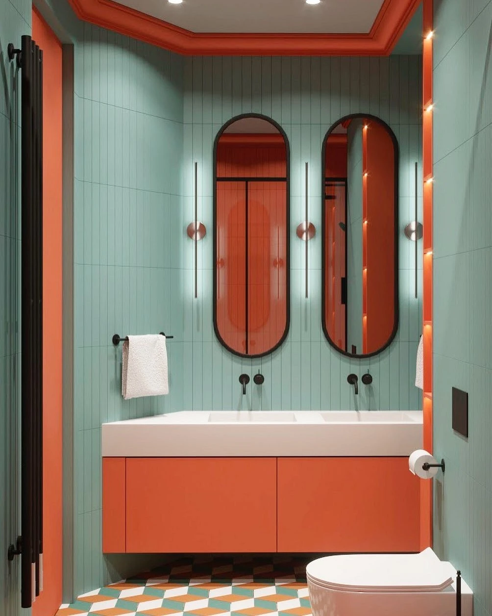
Bathroom
In a non-residential area without natural light, you can safely experiment. On the one hand, we come here often, on the other hand, we do not stay for too long. Finishing from and to, decor, accent elements – any option will do. And it is in the bathroom that you can decide on a juicy carrot or orange tone.


Hallway
The red gamma will enliven the entrance area, which, like the bathroom, in most cases suffers from a lack of windows. A win-win technique is 1-2 colored spots on a generally calm background. It can be an ottoman, a picture, or a hanger.
If you’re choosing a dark shade of orange for your hallway, think ahead about the lighting system so that the color looks good and reveals itself, and doesn’t look dirty and rusty.


The most important thing about our X that it is for
those who are in a hurry


