


We tell you how to choose beige wallpapers so that the interior does not look outdated, and share ideas on what to combine them with.
Finishing is the most static element of the interior, it cannot be replaced at any time, like textiles or a bouquet of flowers on the table. And so that such a desire does not arise, designers are advised to choose neutral, visually comfortable colors for the walls. In this article, we will talk about the most popular and win-win option – beige wallpaper in the interior. How to choose them, how to combine them, and what shade to choose.
Color Features
Beige is not just at the top of the most popular colors for interior decoration.
- It is versatile in terms of color combinations. Just like black and white, it can be safely combined with almost any shade – it will turn out well. Due to its neutrality, it is often used as a base, against which the depth of more saturated colors is revealed.
- This is a calm, comfortable color for vision and psyche. It is often found in nature and is characteristic of warm, cozy textures, so we are pleased to be surrounded by creamy, ocher, or wheaten shades.
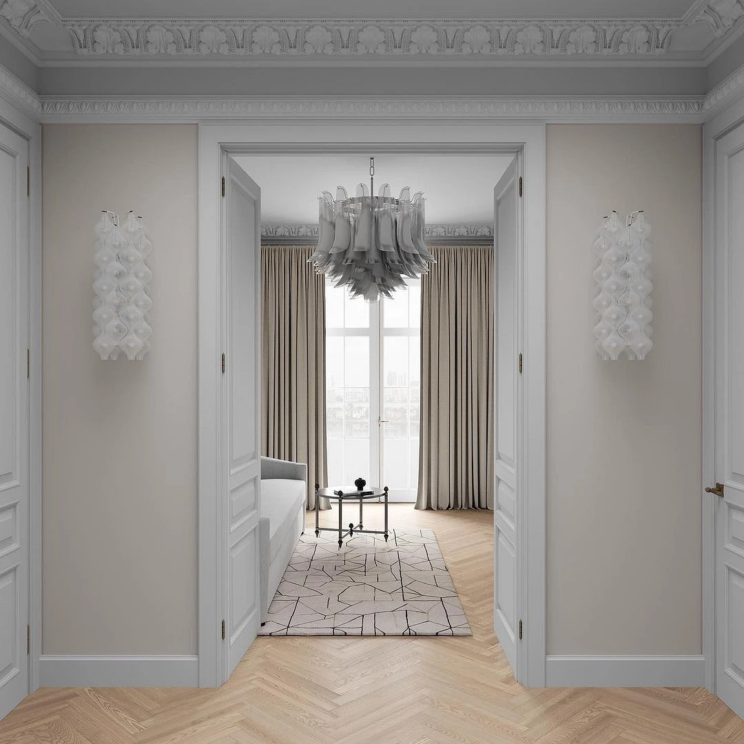
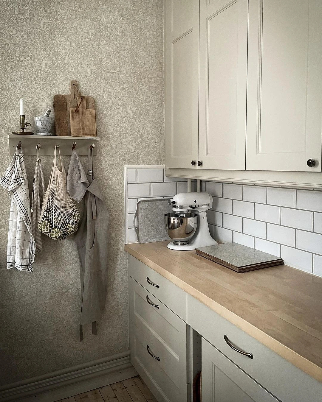
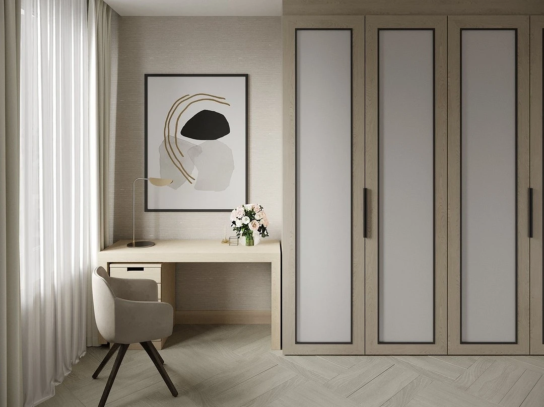
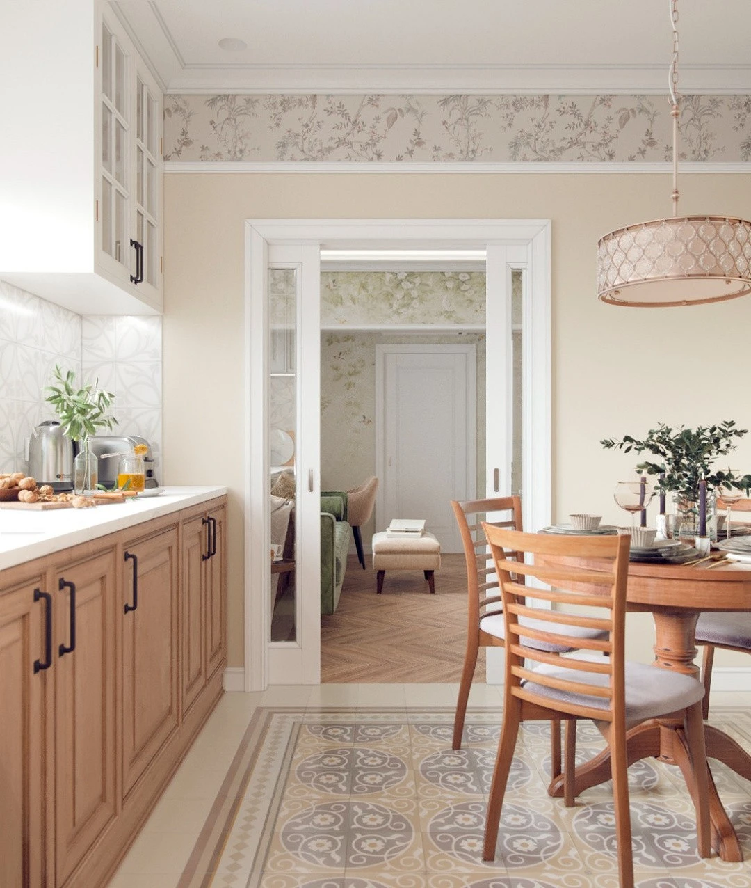
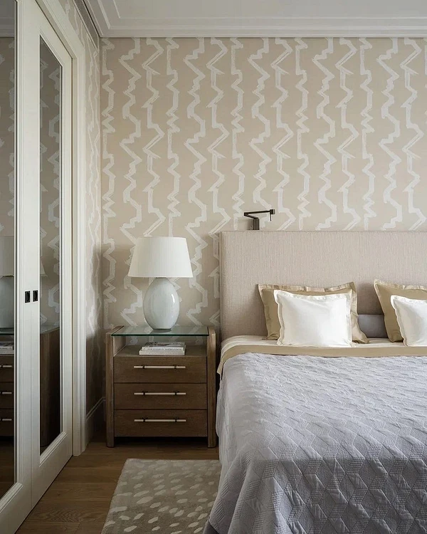
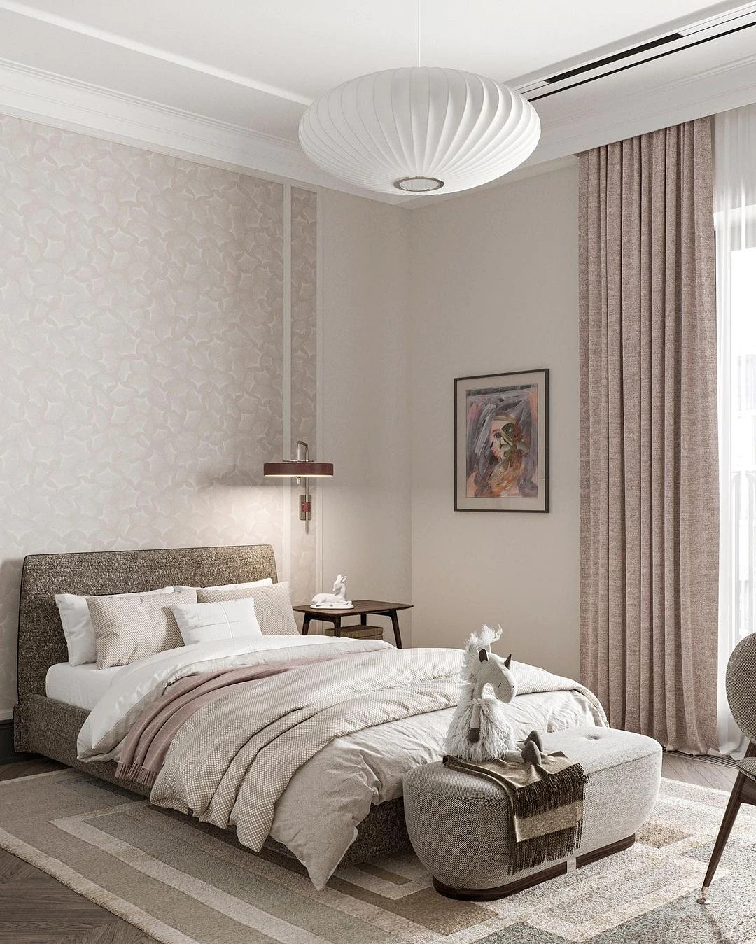
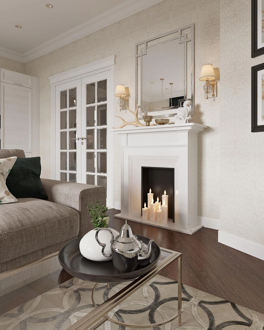
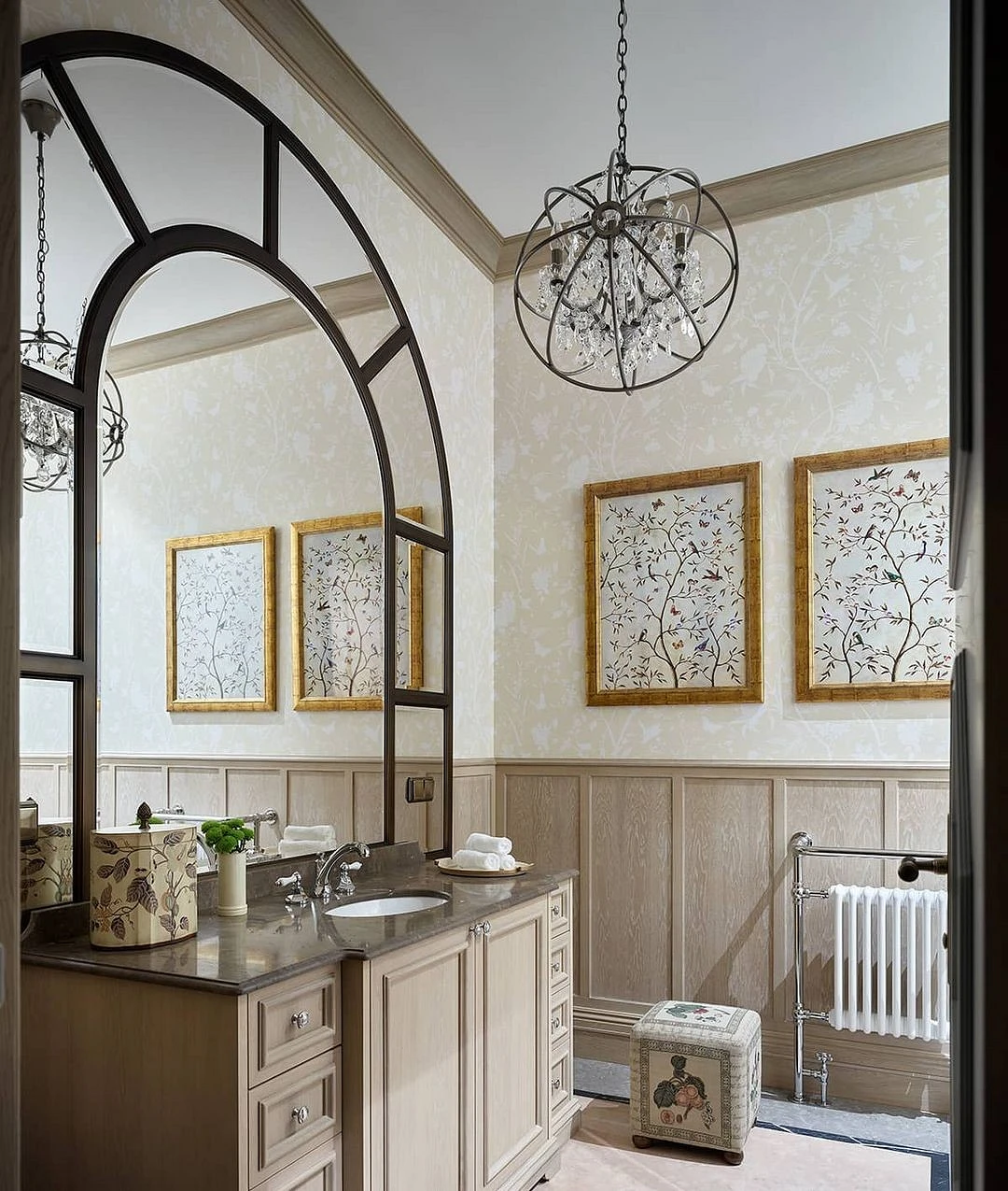
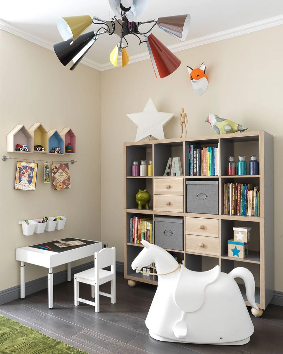
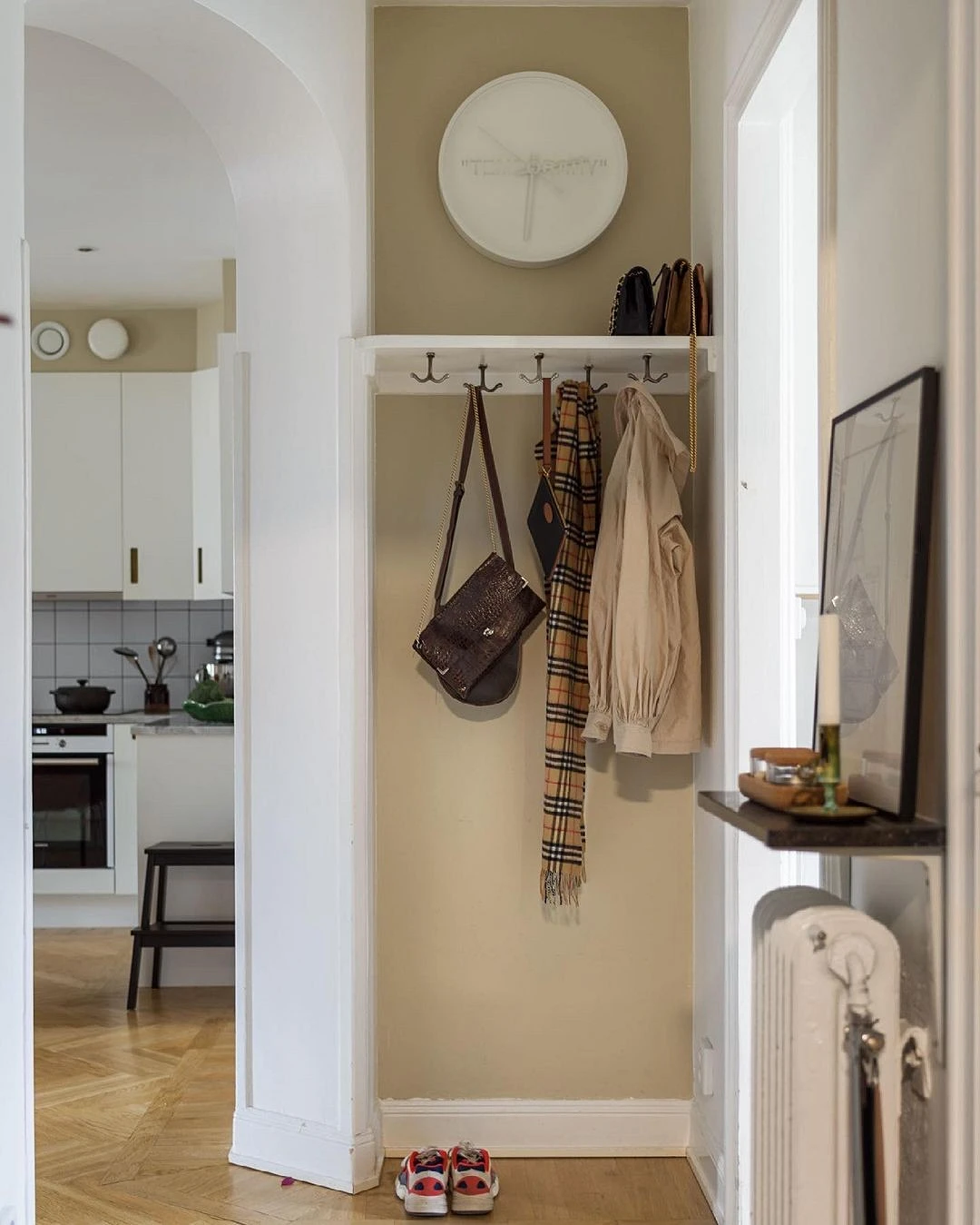
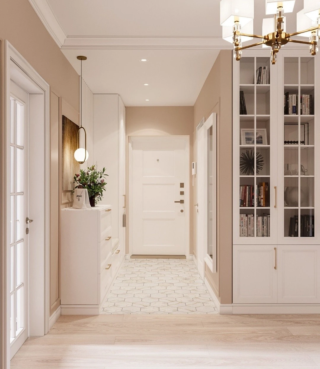
- Suitable for all styles and spaces. There are no prohibitions for him: light canvases can be glued in the corridor and in the nursery, in the kitchen, and even in the bathroom. There are no stylistic restrictions either. With the possible exception of hi-tech, beige can be used in any quantity in both classical and modern directions. It is combined with any materials and textures, adjusting to the general mood of the interior.
- It has many shades – you can definitely choose the right one. Despite the fact that formally it is considered a warm color, it has neutral and even cold tones close to noble gray: mother-of-pearl, dove-gray, mouse, and others.
- It is unmarked. “The color of dirt” does not sound very poetic, but it is believed that it is against a gray-beige-earthy background that household pollution is almost invisible, so this finish is optimal from the point of view of practicality.
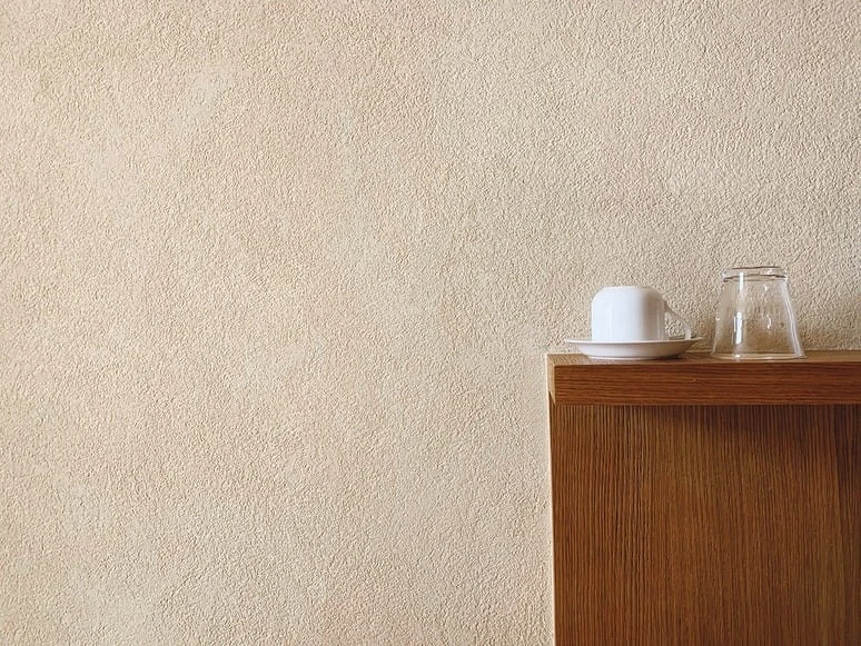
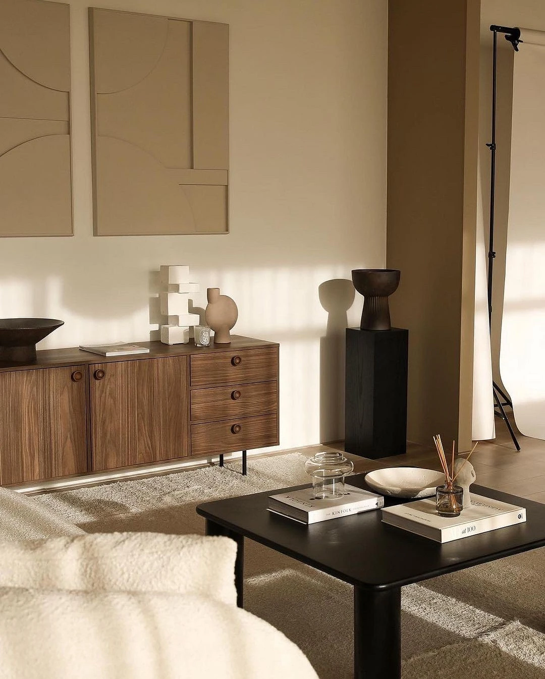
Variety of textures
The perception of the palette is influenced not only by the colors themselves but also by the textures. Beige walls are dreary when you imagine an empty flat surface, but modern wallpaper can look completely different.

For example, you can select the following for a room.
- Embossed coatings for painting
- Imitation of decorative plaster
- Volumetric texture canvases
- Textile or bamboo inserts
- Fiberglass with a pronounced texture
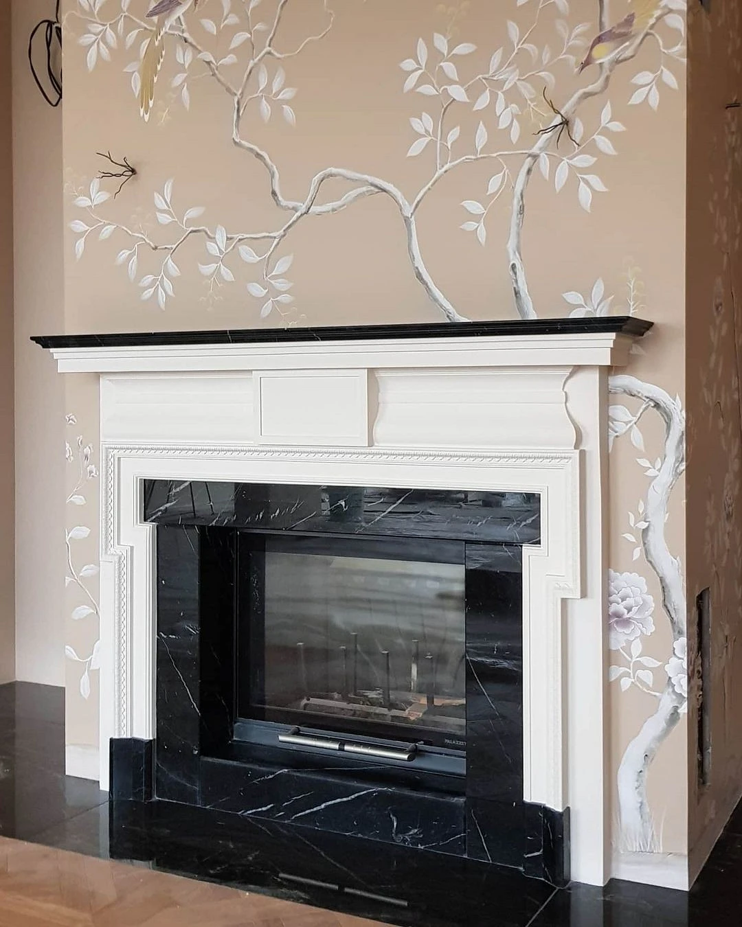

Successful combinations
Consider win-win combinations of beige wallpaper with other shades and beautiful design ideas.
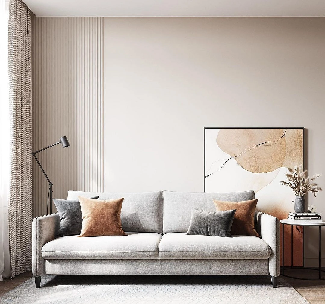
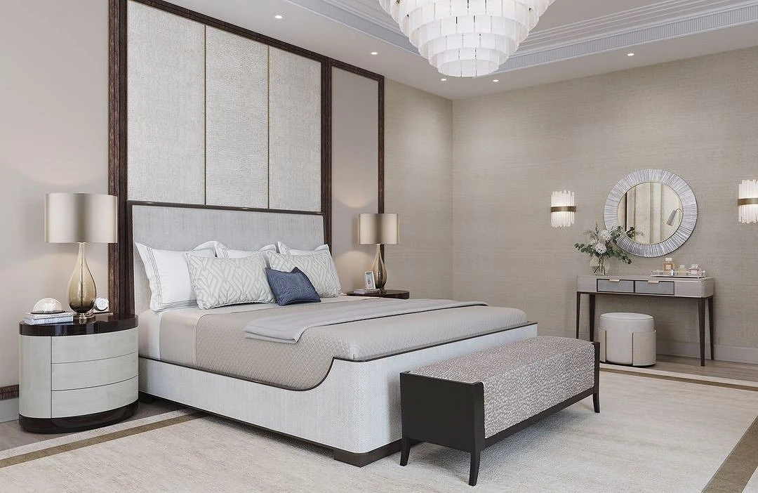
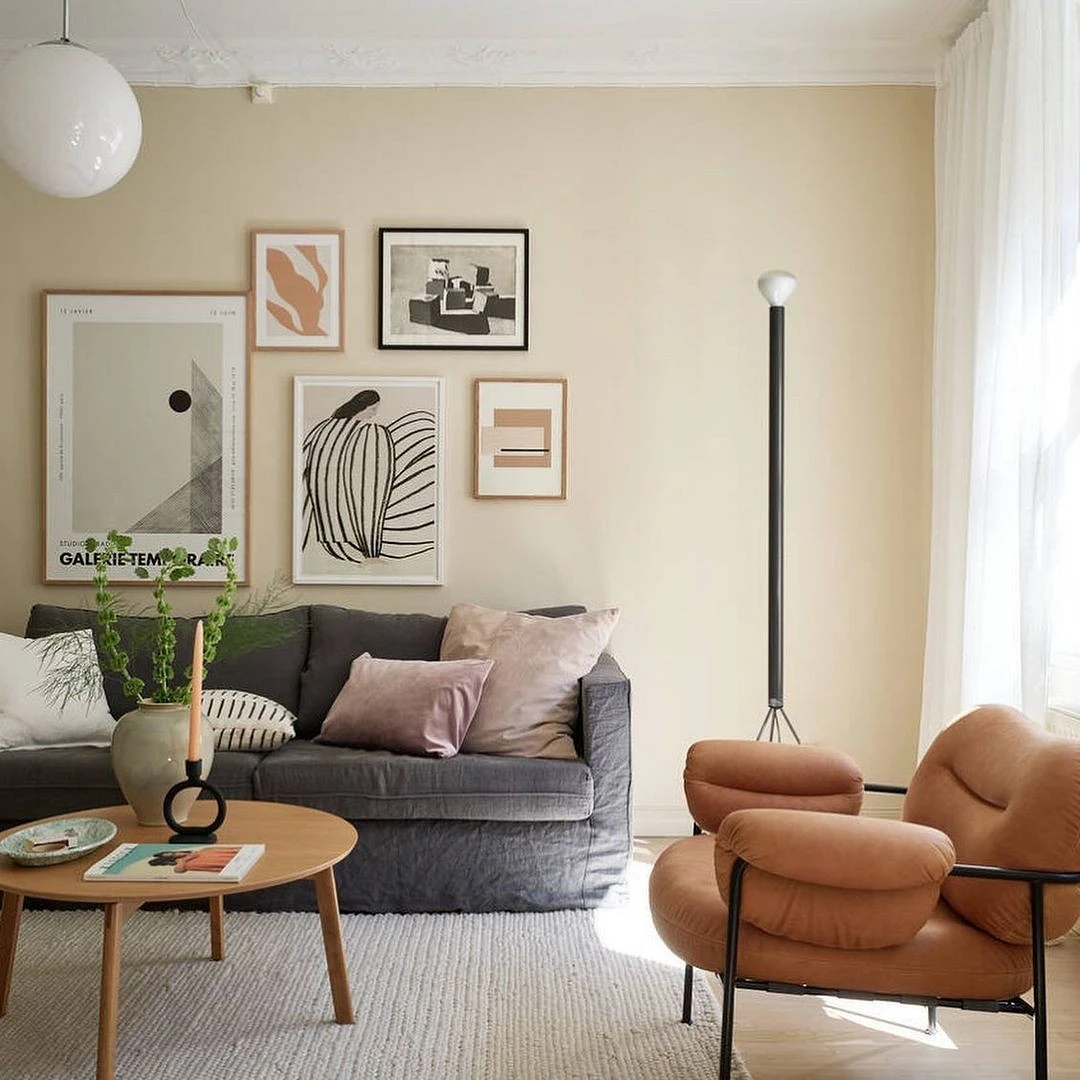
With achromats
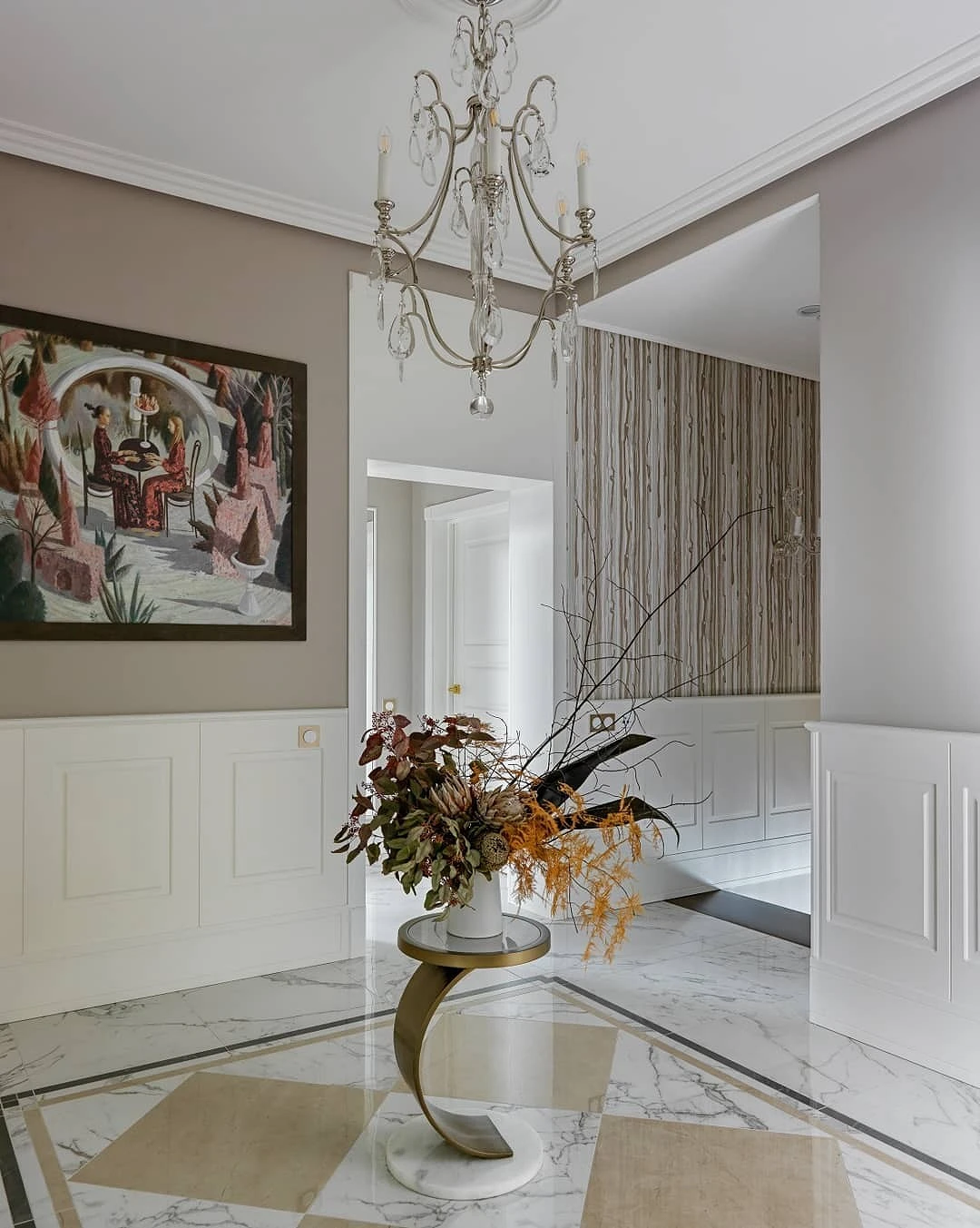
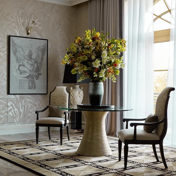
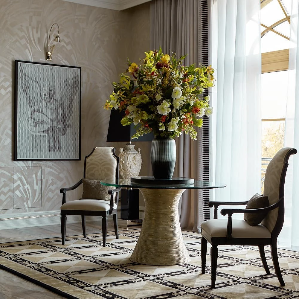
Gray, black, and white are universal by themselves, the same goes for beige. Therefore, it is almost impossible to make a mistake in their combination. But in order for the interior, in which the main color is cream, to look harmonious, follow a few rules.
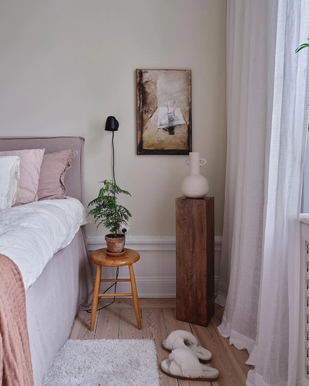
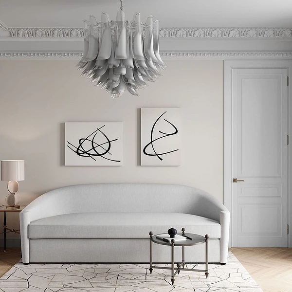
- White adds airiness. It can be used in any proportion, it will dilute the monotony of a light base, which can press a little on a large area. It is better to use white with a warm undertone, rather than a cold snow white. So the combination will turn out more natural and pleasing to the eye.
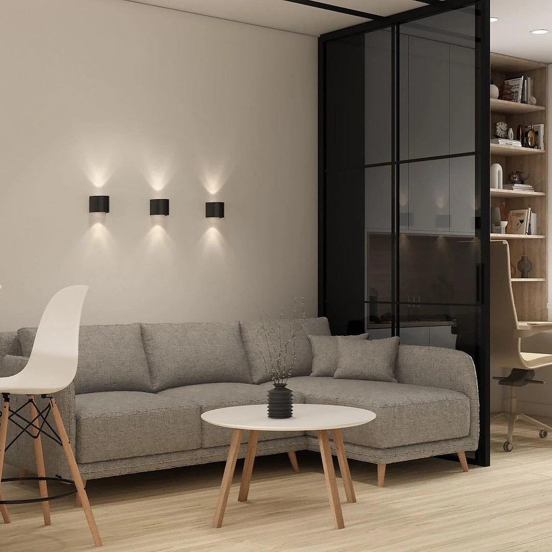
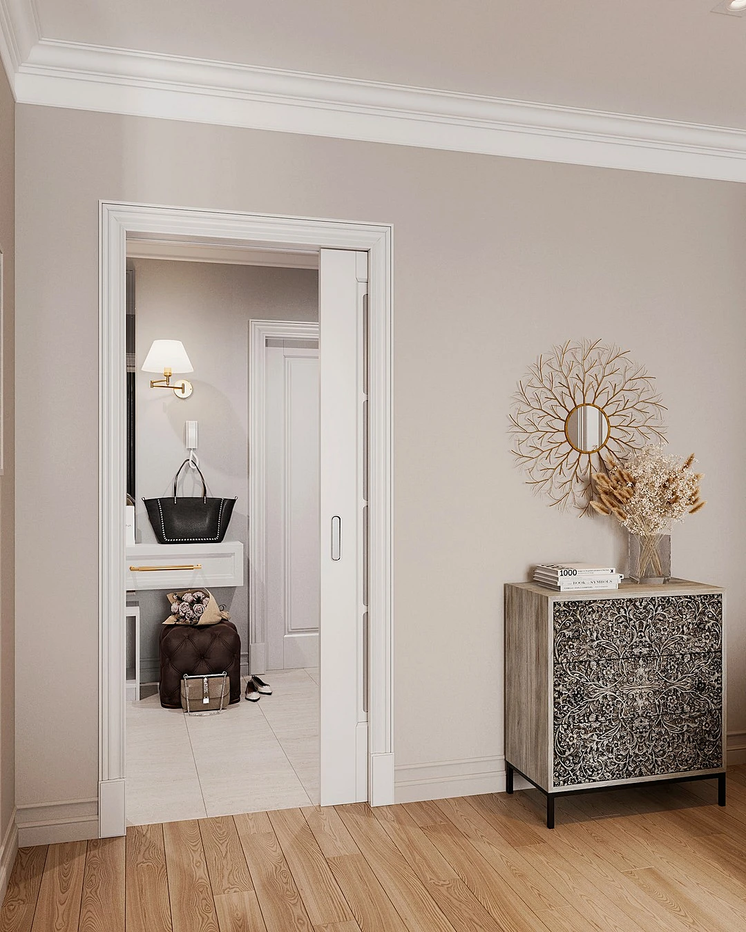
- Gray in the interior plays the same role as beige. Often they are used as a basis and background for bright accents, but they may well coexist. In the case when the cream is used as the base, you can experiment with more saturated and darker gray variations.
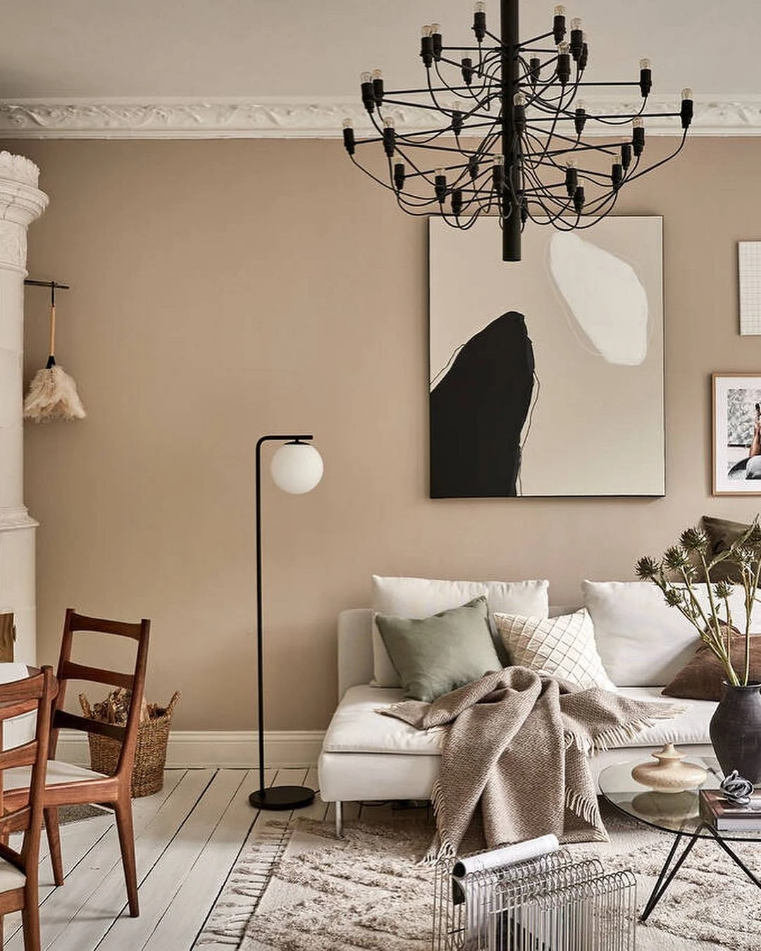
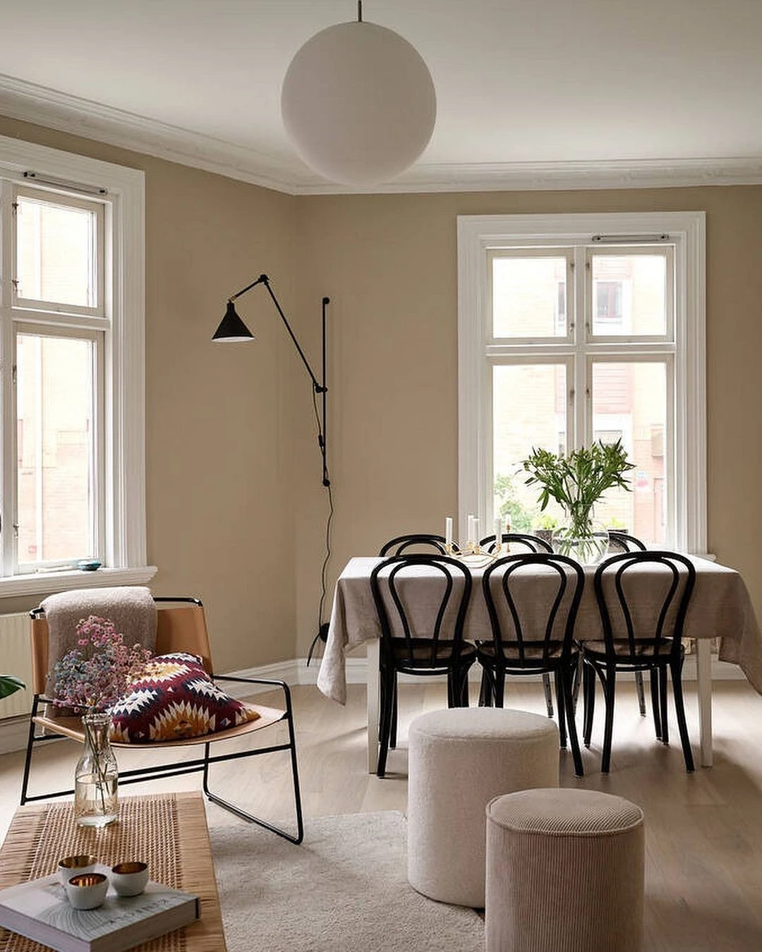
- Black helps to place accents, forms clear lines, and “collects” a light monochrome interior. Dark elements should be local. For example, it can be lamps, decor, fittings, or furniture frames.
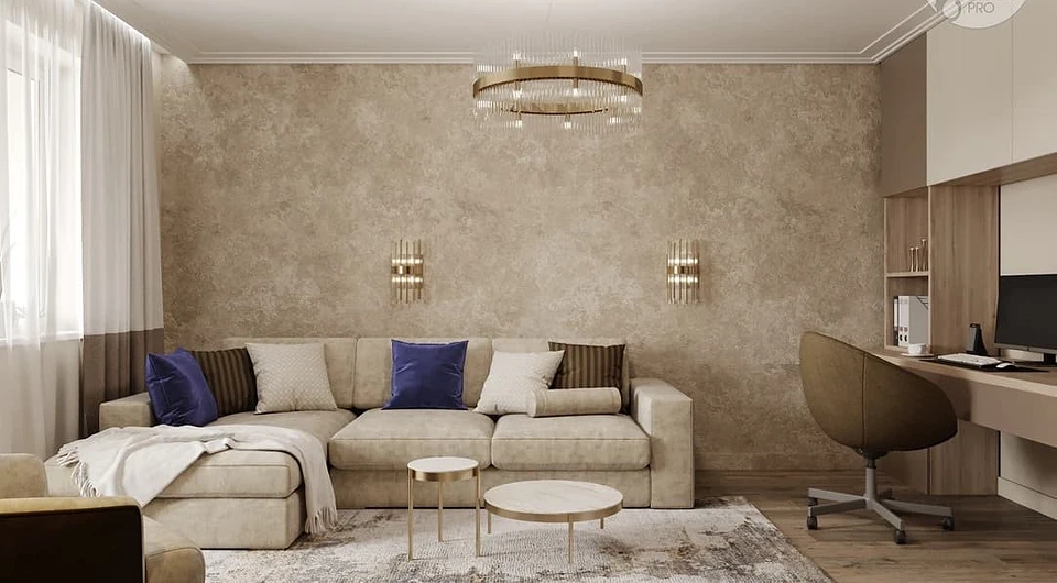
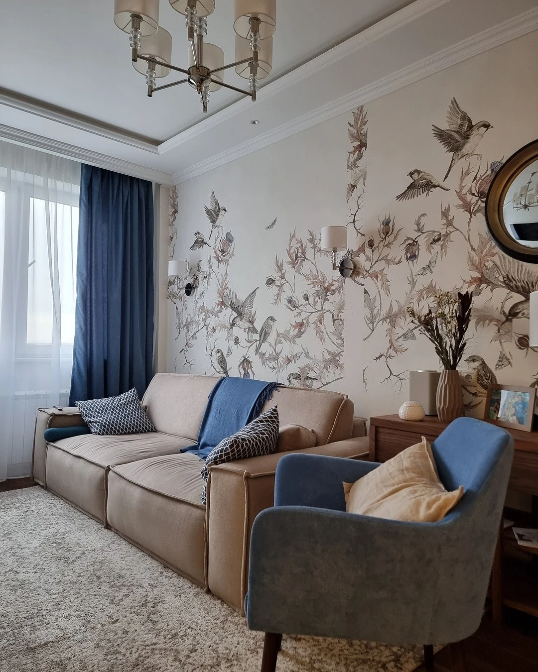
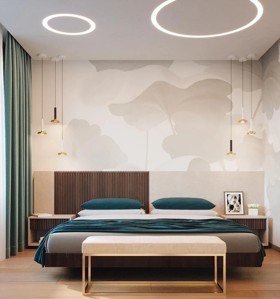
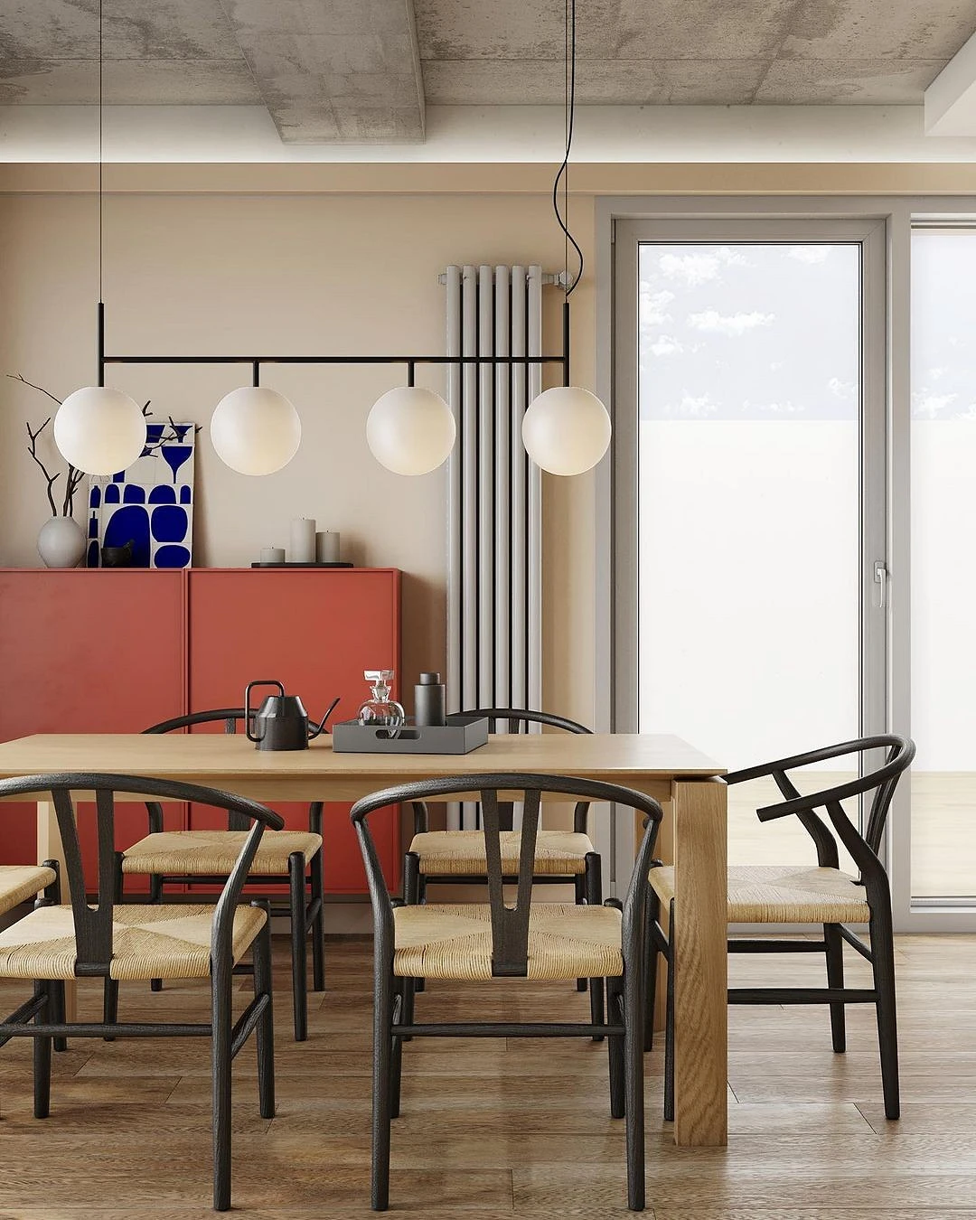
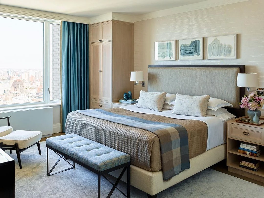
With blue
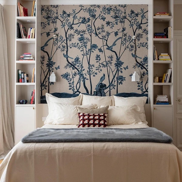
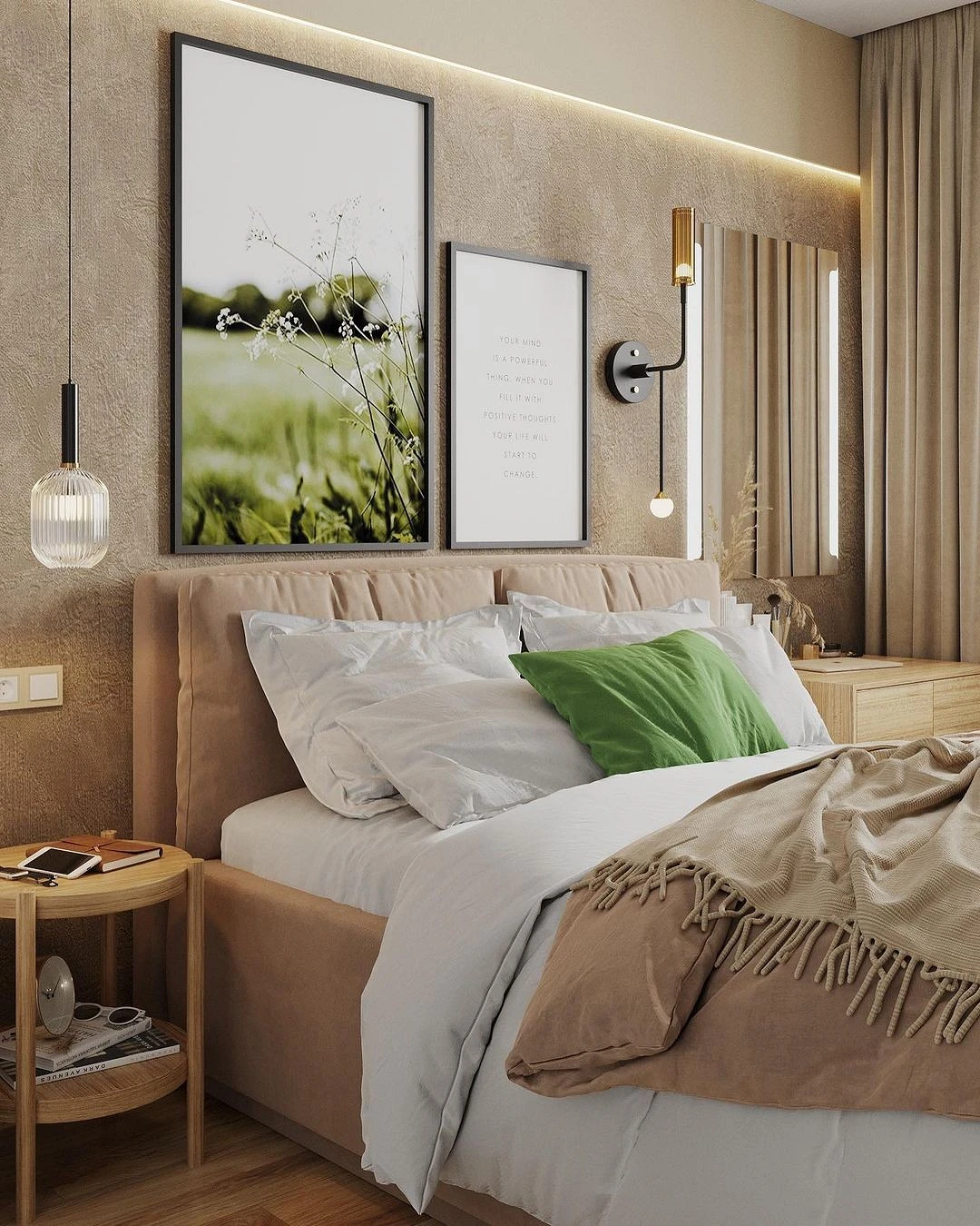
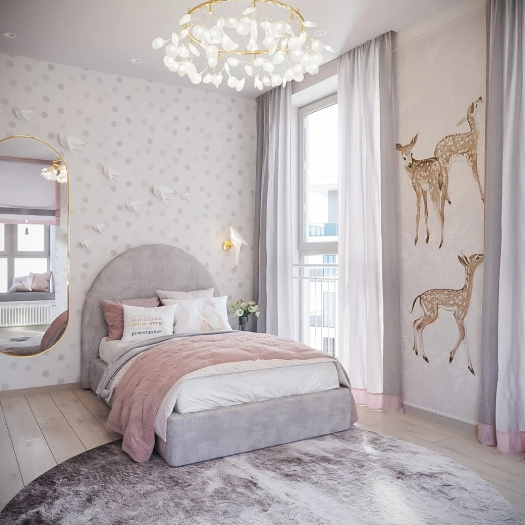
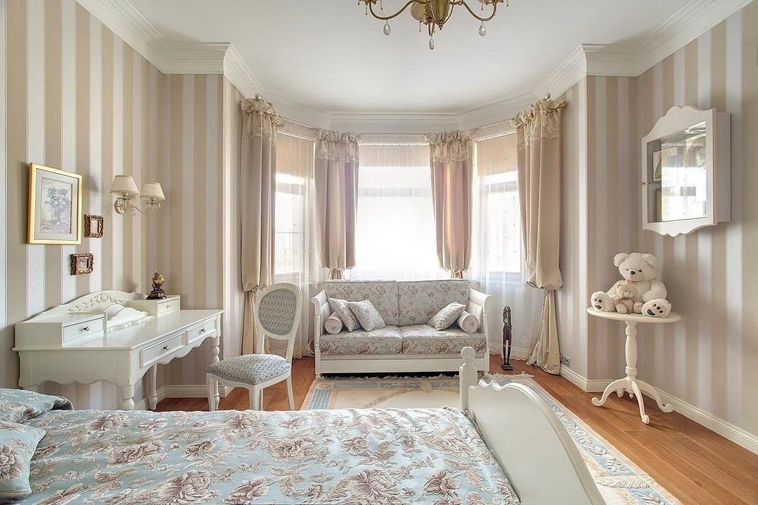
This combination was created by nature itself: just remember the idyllic picture with the beach, blue sky, and the sea. Blue and cyan belong to the cold spectrum, so they will refresh the beige background. It, in turn, will add warmth and balance to the deep thoughtful blue. This combination looks good in the kitchen, nursery, living room, and bedroom.

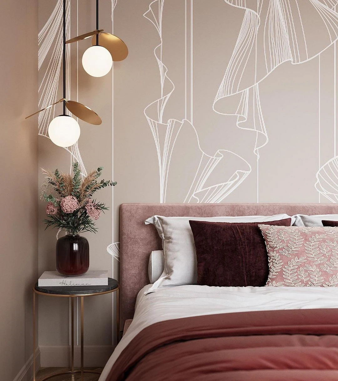
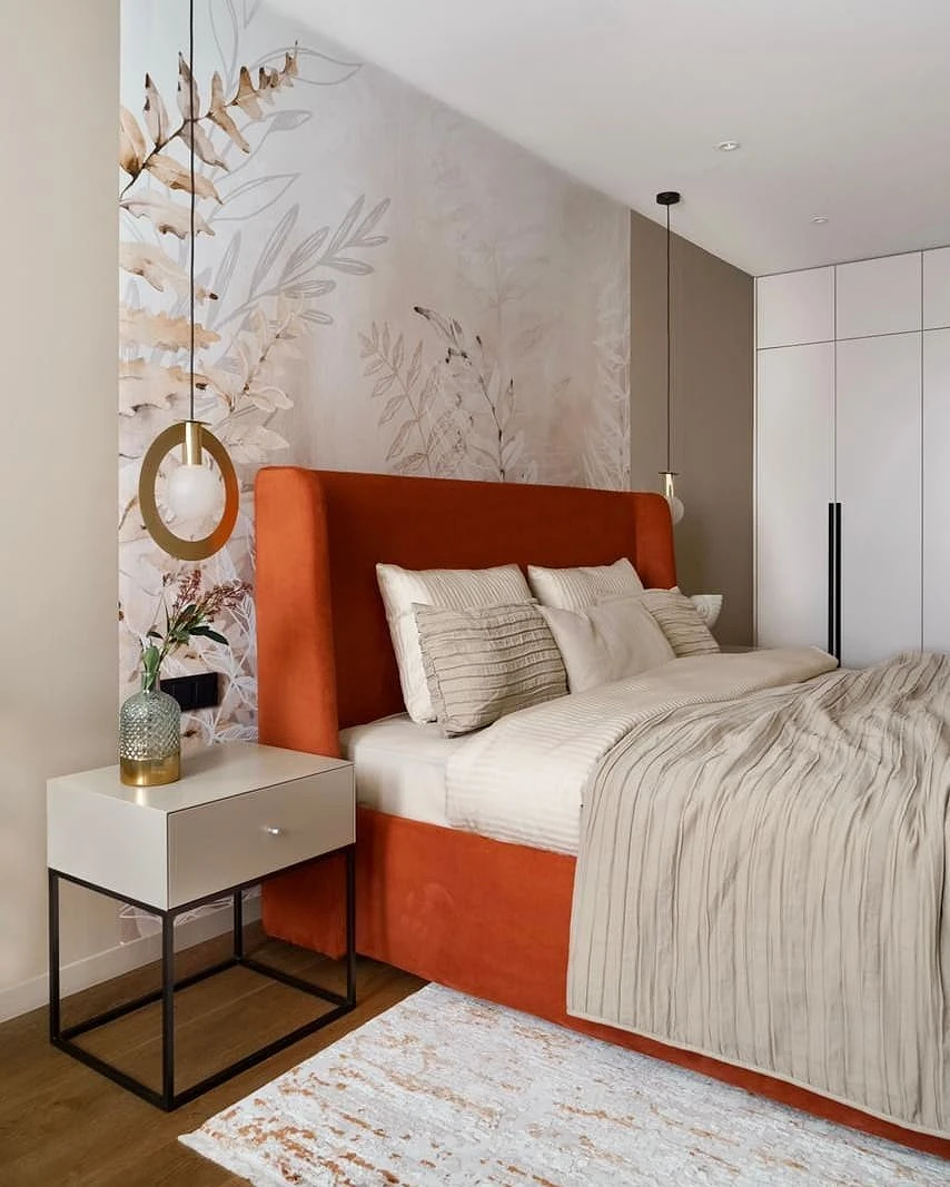
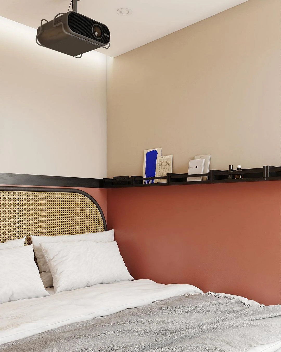
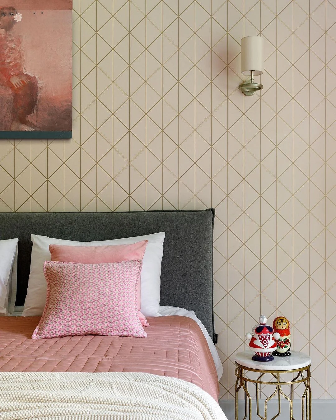
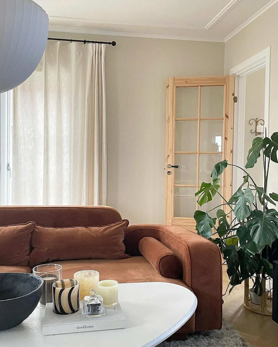
With red and orange
A warm, cheerful combination that is ideal for rooms where there is not enough sunlight. If the windows are small or facing north, this palette will compensate for the lack of natural light and make the room cozy.

It’s important to remember a few things.
- Red and orange are active, sometimes even aggressive colors, so they should be used accentuated. For example, you can pick up dark red or ocher-red curtains for beige wallpaper. It is better to choose not acidic, but slightly muted deep shades.
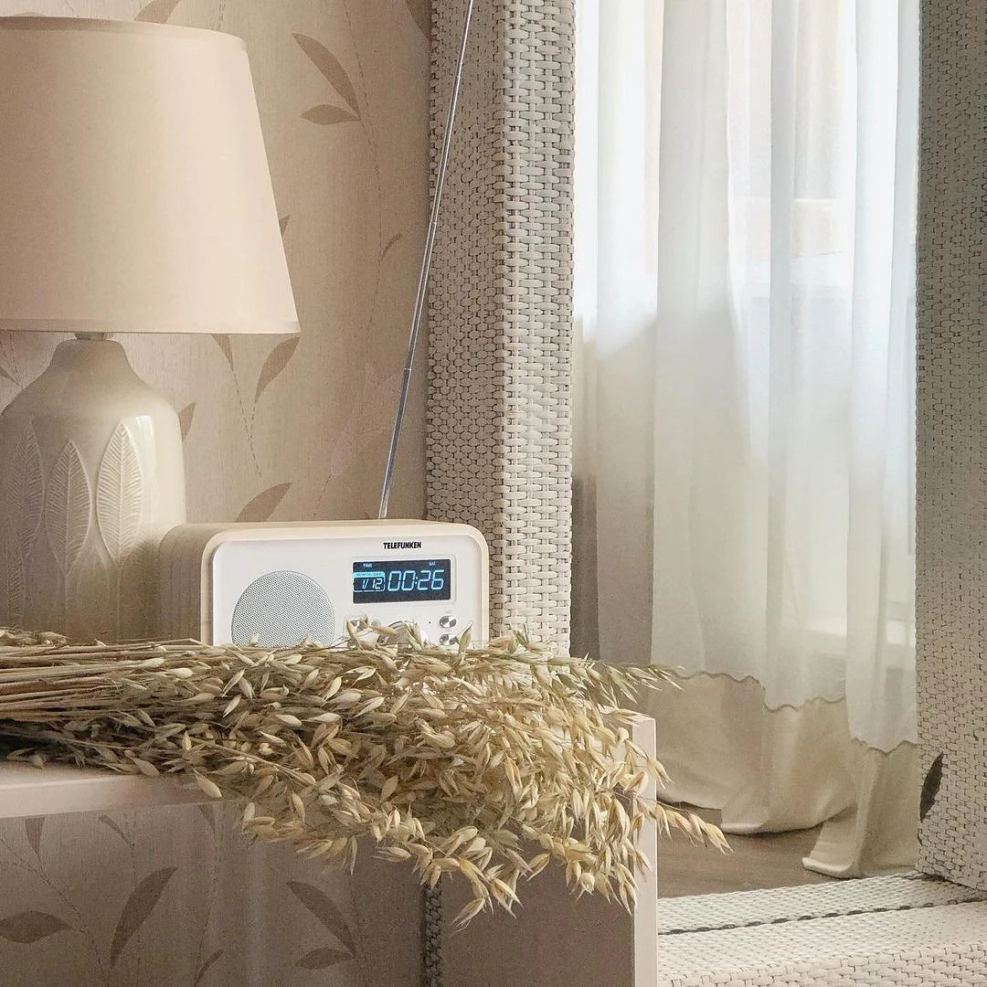
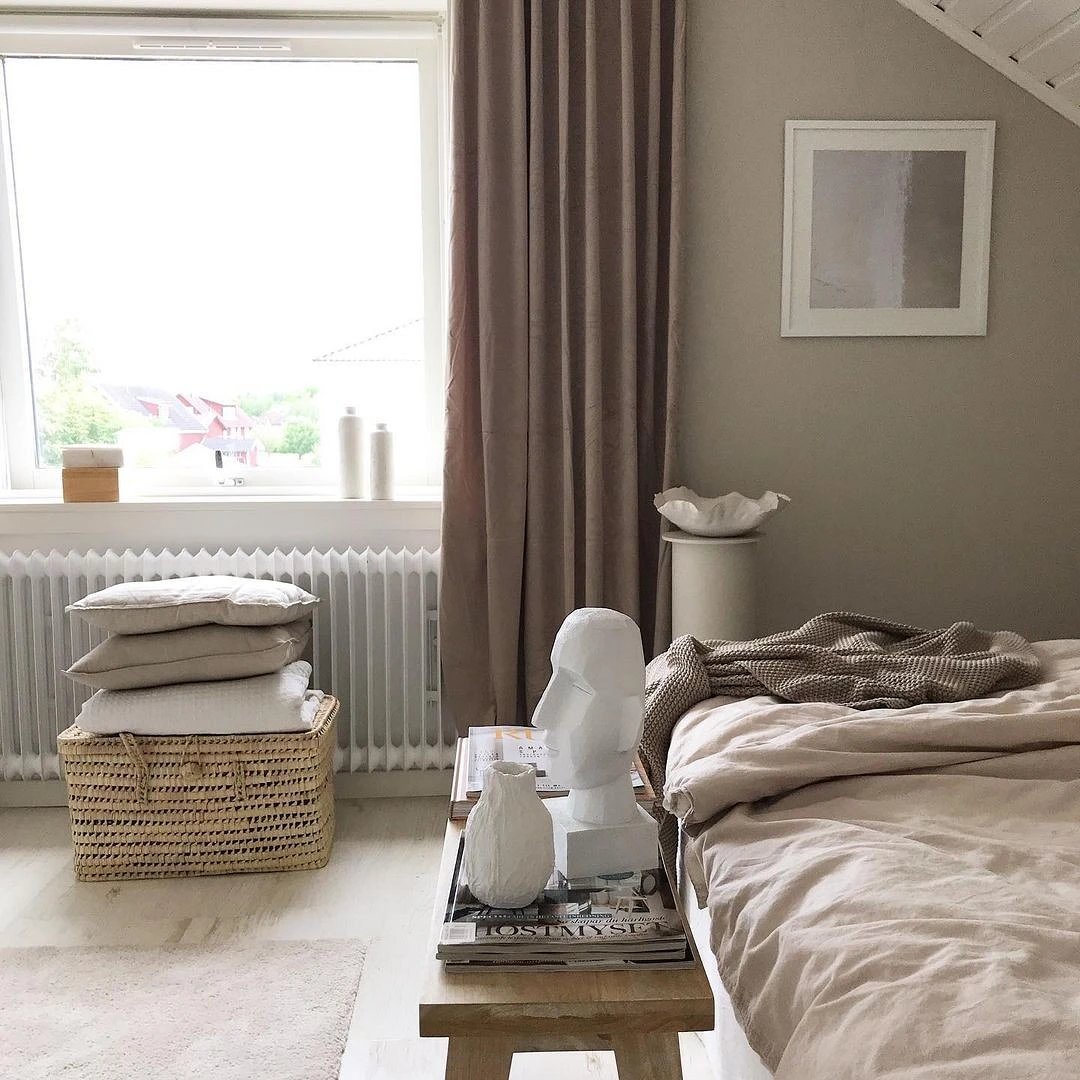
- In order for the ensemble to look harmonious, it is important that all the tones are of the same temperature. Wheat, cream, coffee, cream, sand, or caramel are suitable for walls.
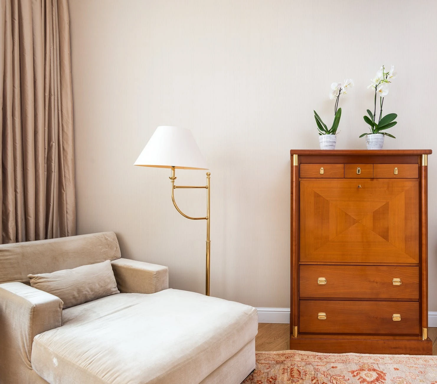
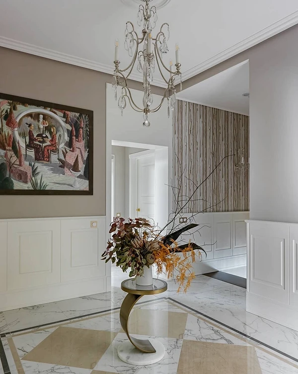
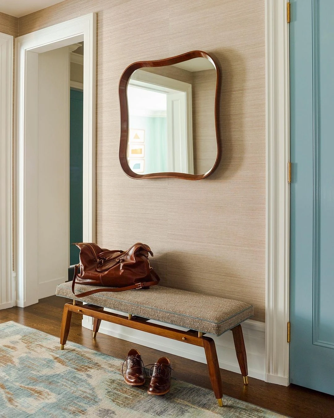
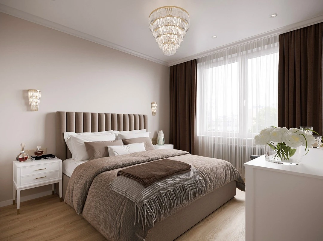
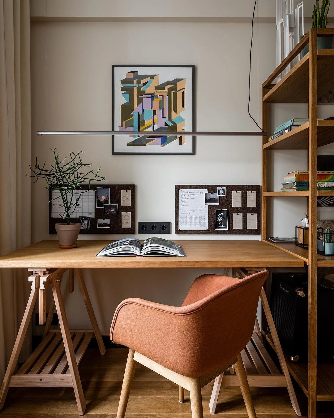
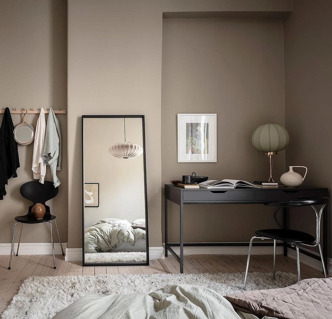
With brown
Another universal pair, since even in nature these colors are found side by side. The most obvious and natural combination is beige and wood texture in any of its manifestations. It is suitable for most styles: from pure classics to eco or minimalism.

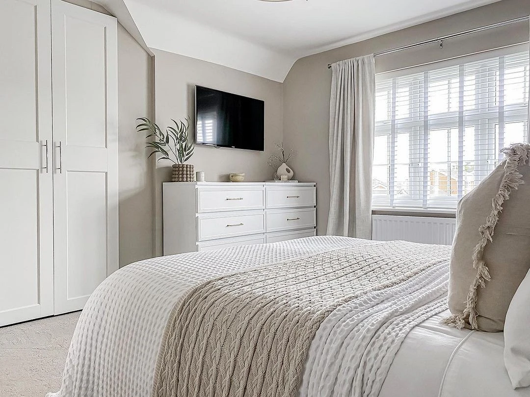
This is a fairly monumental and conservative combo; at the same time, if warm tones prevail, it is very cozy. Therefore, the brown-cream palette can be used in any room. It looks especially good in the home office, bedroom, hallway, and in the bedroom.
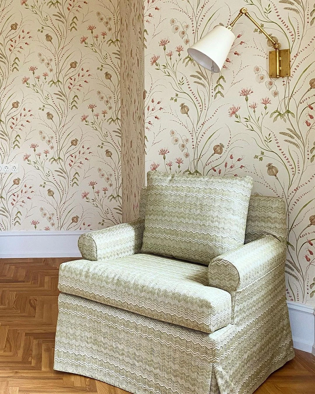
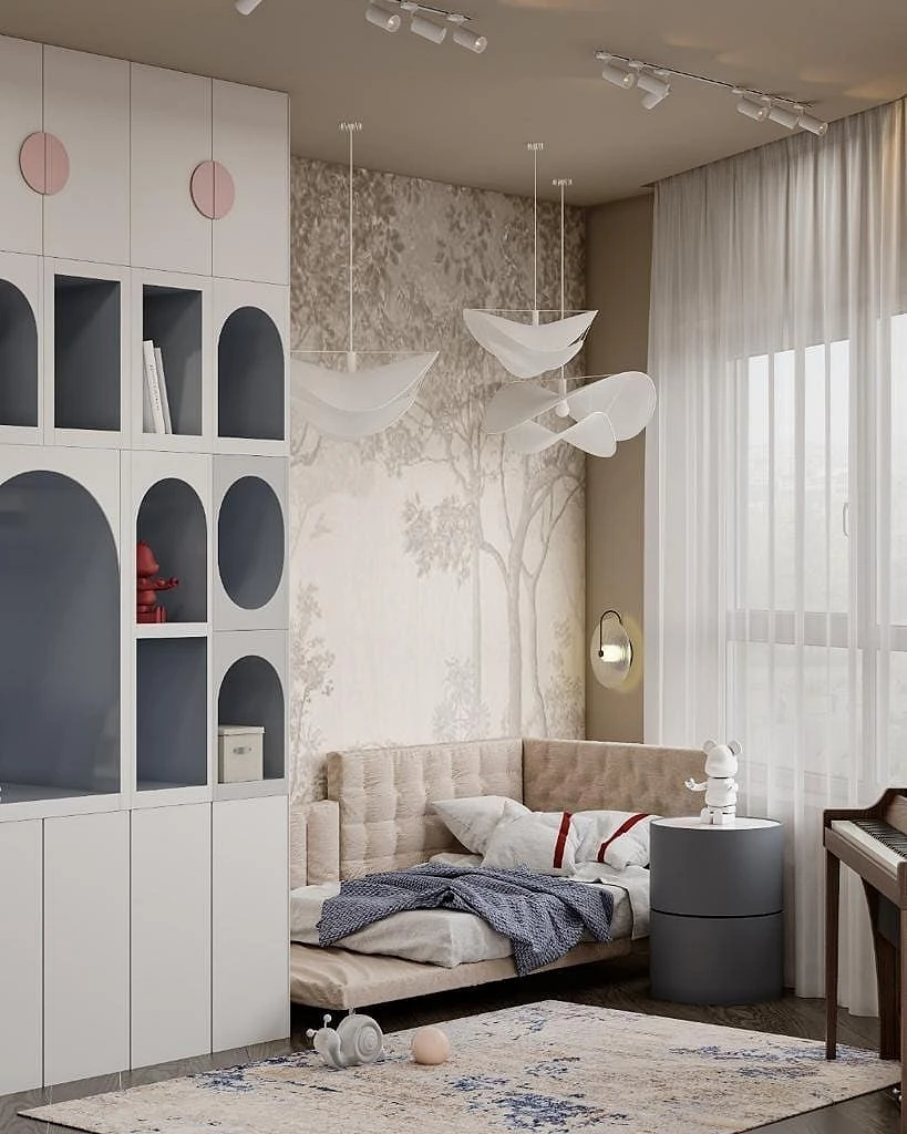
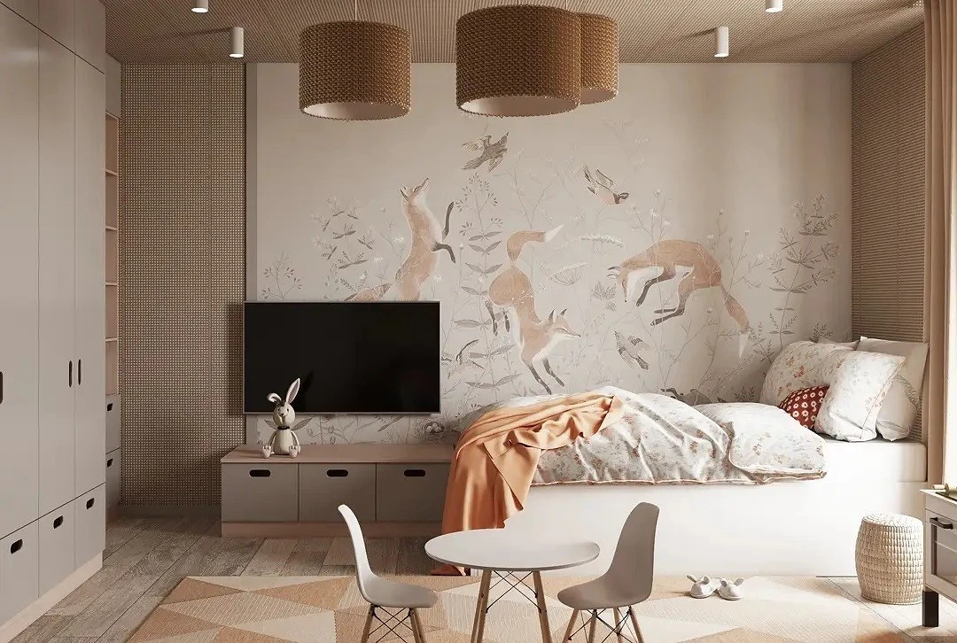
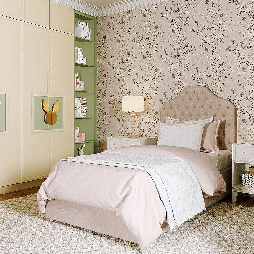
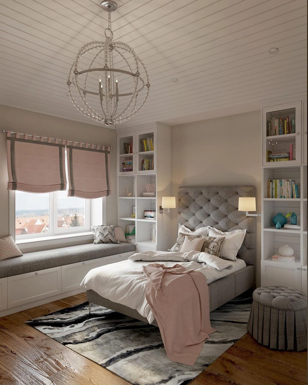
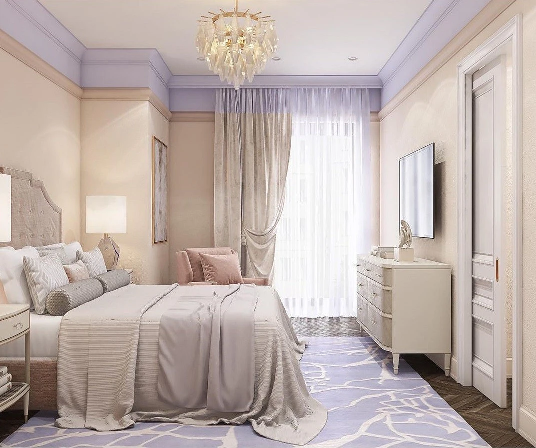
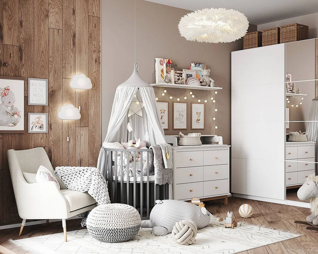
With pastel colors
Pastel colors will help create a gentle and natural interior. These include the following.
- Blue
- Mint and light green
- Peach
- Powder pink
- Lavender
- pale yellow
- Turquoise
- Coral, etc.
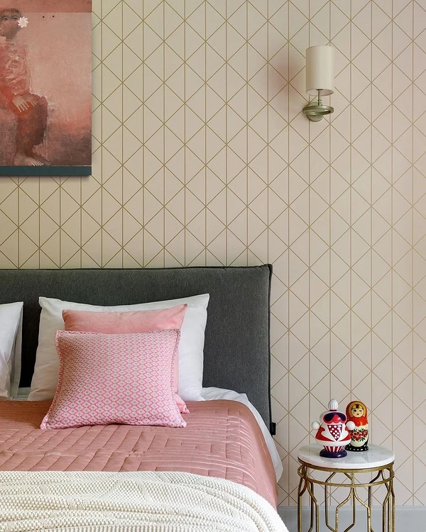
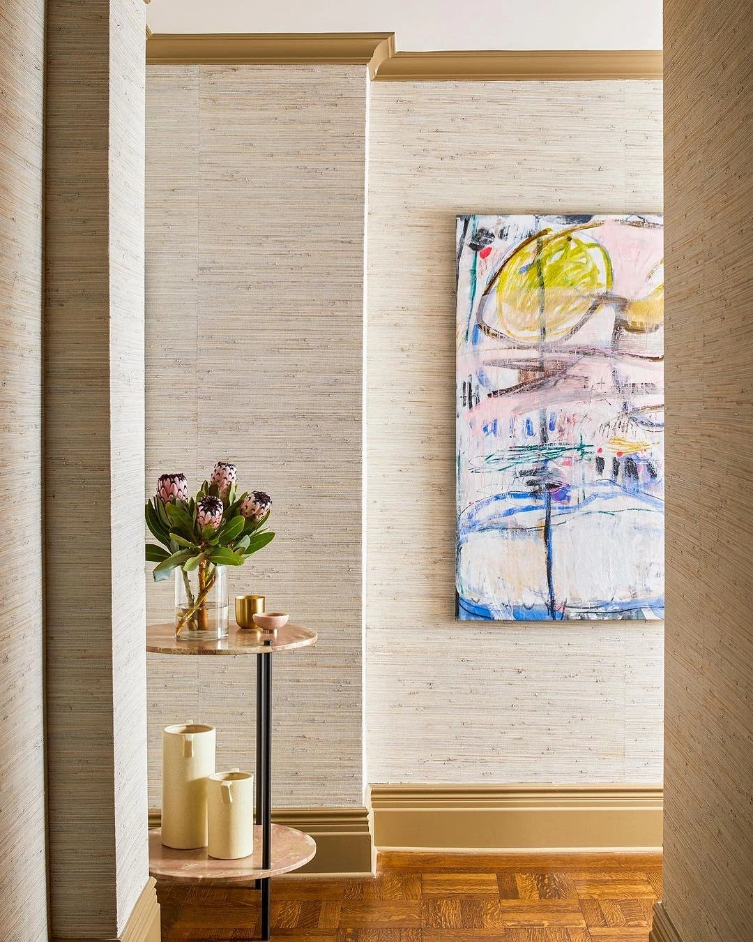
Against the background of mother-of-pearl or gray-beige walls, they open up and look fresh. The shade of the finish is selected depending on which pastel colors are included in the palette. Closer to gray if cold blue-lilac colors predominate; warm cream – for pink-yellow accents.
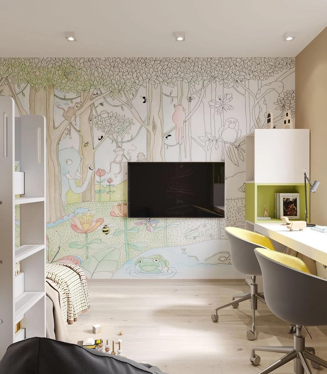
Best of all, this range is suitable for the bedroom and nursery.
Combination with other elements
Finishing
Finishing the floor and ceiling is made according to the classical principle of “white top, black bottom”.
- The ceiling is a few shades lighter than the walls, ideally white.
- The floor is a few shades darker – brown, dark gray.
This will result in a natural gradation.
Wall decoration in the room can be combined. So, neutral plain canvases are successfully combined with such elements.
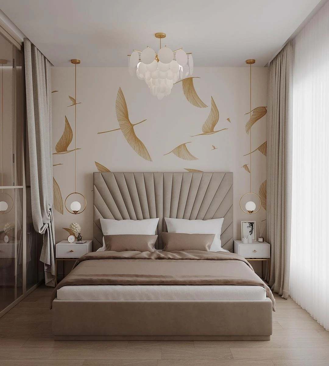
- Contrasting accent wall
- Photo wallpapers or canvases with a pattern 1-2 tones darker or lighter
- Wooden panels
- Textured decorative plaster

What curtains are suitable for beige wallpaper
Textiles give the interior completeness, so it is important to choose it correctly. Let’s figure out which curtains to take for beige wallpaper.
- If the walls are of a warm shade (cream, straw, sand, coffee, caramel), brown, wine, orange, or golden curtains will look good against their background.
- Colder variations (biscuit, grey, mouse) are best complemented with cool shades. It can be deep blue, gray-blue, bottle green, purple, or dark gray.
- If there is already an ornament on the walls, the curtains should be plain – and vice versa.
- Textiles on the windows can also be in neutral colors, but they should not completely repeat the color of the finish and merge with it.
- If the room is small and there is little light in it, choose light curtains made of loose fabrics in beige or light gray with milky or mother-of-pearl tulle.
Furniture
Let’s consider what color decor is suitable for beige wallpaper.
The first and most popular option is furniture darker than the walls. On a neutral background, objects look more expressive. If the space is decorated in natural colors, as in the photo below, then all variations of brown, dark gray, black are in priority. The simpler the finish, the greater the focus on expressive textures and the natural beauty of the material.
In eclectic, modern and neoclassical styles, bright colors are allowed. In the kitchen, it can be a dark blue, burgundy or emerald set. In the living room and bedroom, you can experiment with the upholstery of upholstered furniture, making a color accent on it. There is only one rule: use noble natural shades and do not disturb the temperature balance.
If you are decorating a light interior, then you can play on an atypical contrast: darker walls (for example, take an ocher or straw-colored coating) and light-colored furniture – white, gray or pastel colors. In this case, it is important to add at least a few dark details to the environment so that they place visual accents and make the design more graphic.

The most important thing about our X that it is for
those who are in a hurry


