


Contrasts will help make the environment more expressive or zone the space – we’ll tell you how to work with them correctly using the color wheel of Johannes Itten.
You’ve probably come across the phrase “contrasting accents” more than once or come across recommendations to make the environment “more contrasting. ” At first glance, everything seems quite clear: contrast means the opposite, and if you add black details to a white interior, it will become more contrasting. But what if your interior is not white or black at all, but colored? What shades to add, and most importantly, how and why to do it? Let’s figure it out together.
Why do we need contrasts in the interior?
First, let’s understand why contrasts are needed in the interior. Here is just a small fraction of what they can do:
- make the environment more expressive;
- add volume, get away from a boring, flat interior;
- highlight part of the room (create an accent surface);
- separate a section of the room, visually supporting the zoning of the space;
- fill the interior with color and “anchor” details.
Color wheel according to Johannes Itten
How to choose a harmonious color scheme or add contrasting shades to the interior? The simplest and most common solution is to use the color wheel, once proposed by the Swiss artist, and theorist of new art, and teacher Johannes Itten, author of the legendary book “The Art of Color”.

This is what the color wheel looks like according to Johannes Itten. This is what designers most often focus on when choosing a harmonious color scheme for the interior.
In the center of the circle is a triangle made up of primary colors: yellow, blue, and red. Three more colors (secondary) “complete” this triangle into a hexagon: mixing blue with yellow gives green, red with yellow-orange, and red with blue-purple. The vertices of the hexagon are about the primary and secondary colors of the circle, and between them along the circumference are tertiary shades: in addition, we get yellow-orange, red-orange, red-violet, blue-violet, blue-green, and yellow-green.
How to use the color wheel
How can a color wheel help in choosing contrasting combinations, and how to use it? There are many options, we suggest relying on the simplest and most common ones.
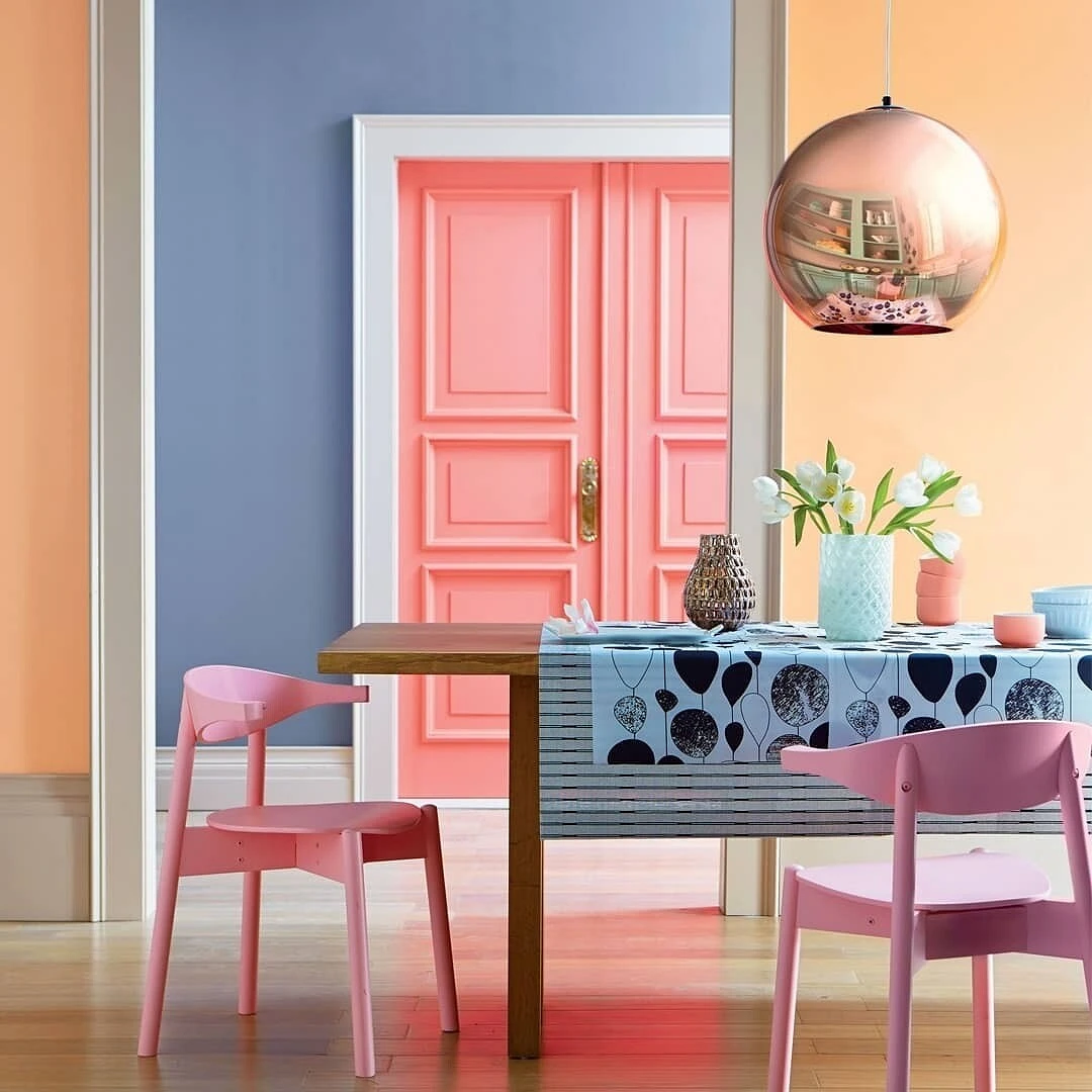
1. Duet of opposite circle colors
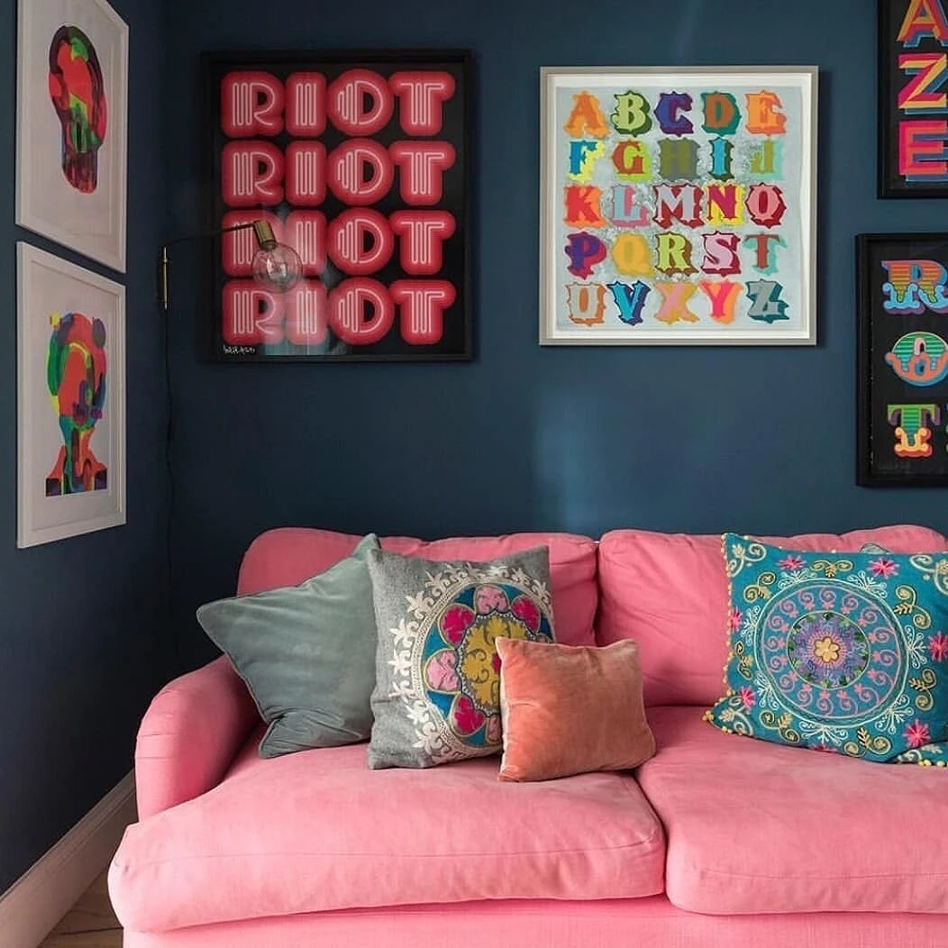
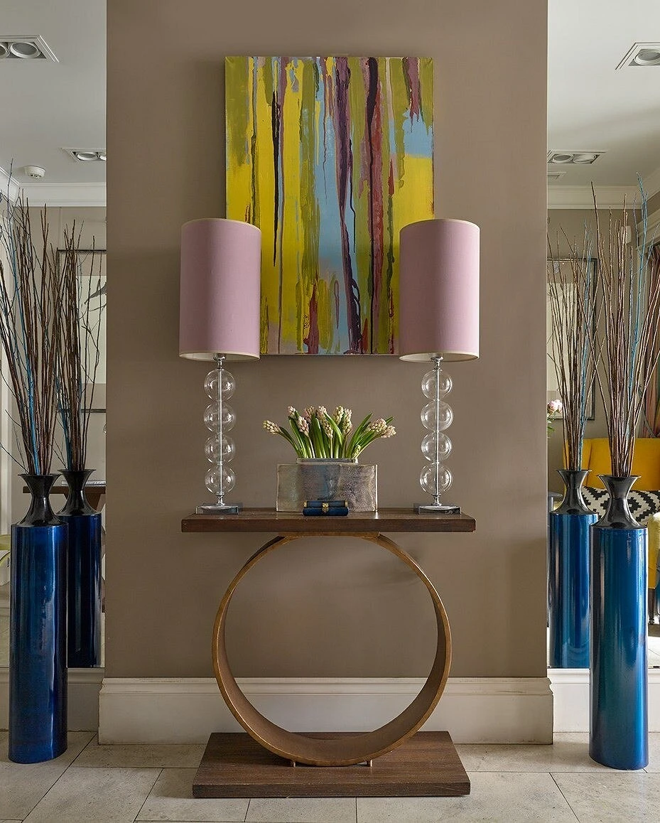
Colors located opposite each other on the color wheel are called complementary, complementary, or contrasting.

However, be careful: it would be a mistake to combine these tones in the interior in equal proportions. To achieve harmony, one color should be made the main one, and the second should be added in doses, as accents.
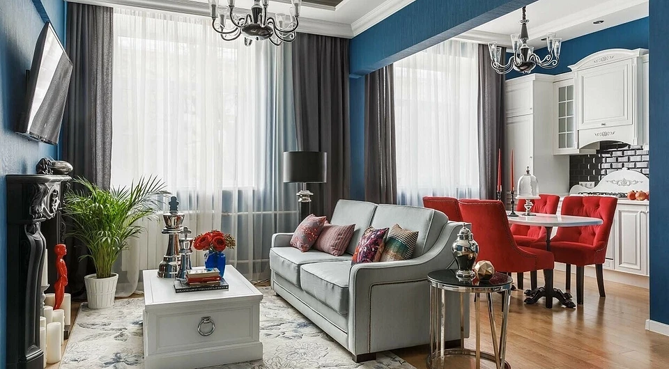
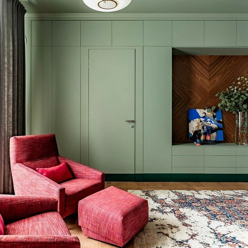
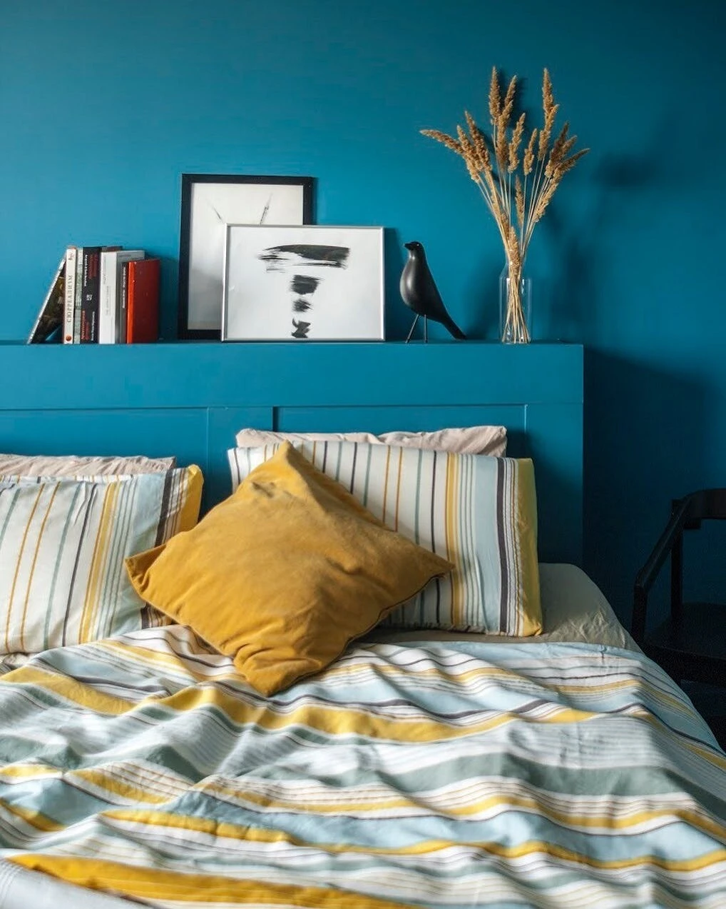
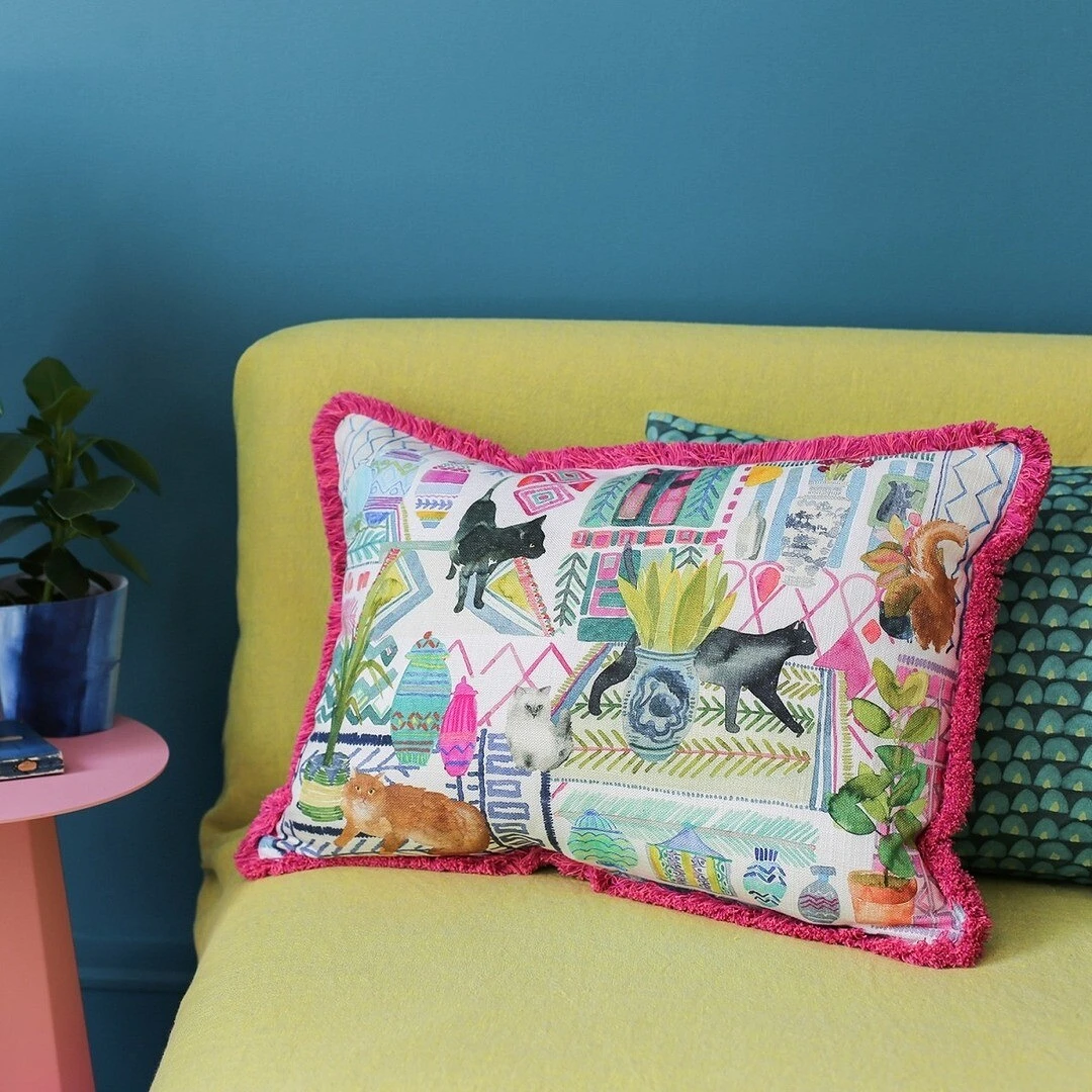
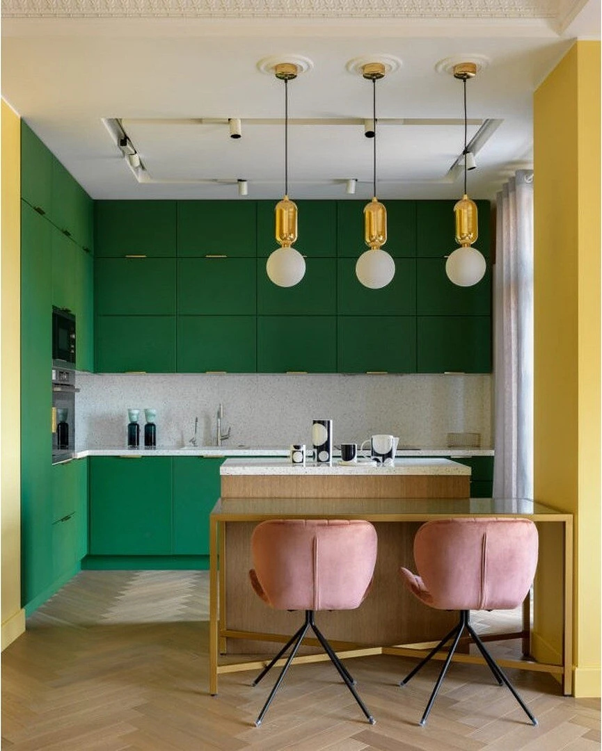
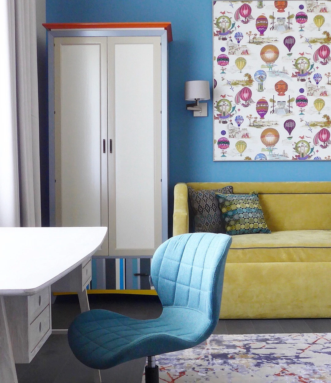
Red + green, blue + orange, yellow + purple, blue-green + red-orange – such combinations are ideal pairs in terms of contrast.
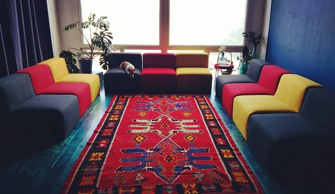
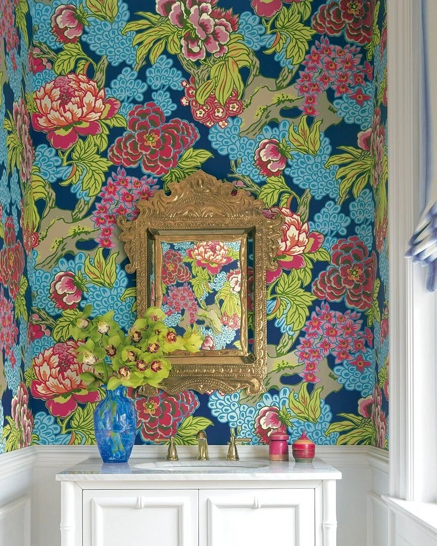
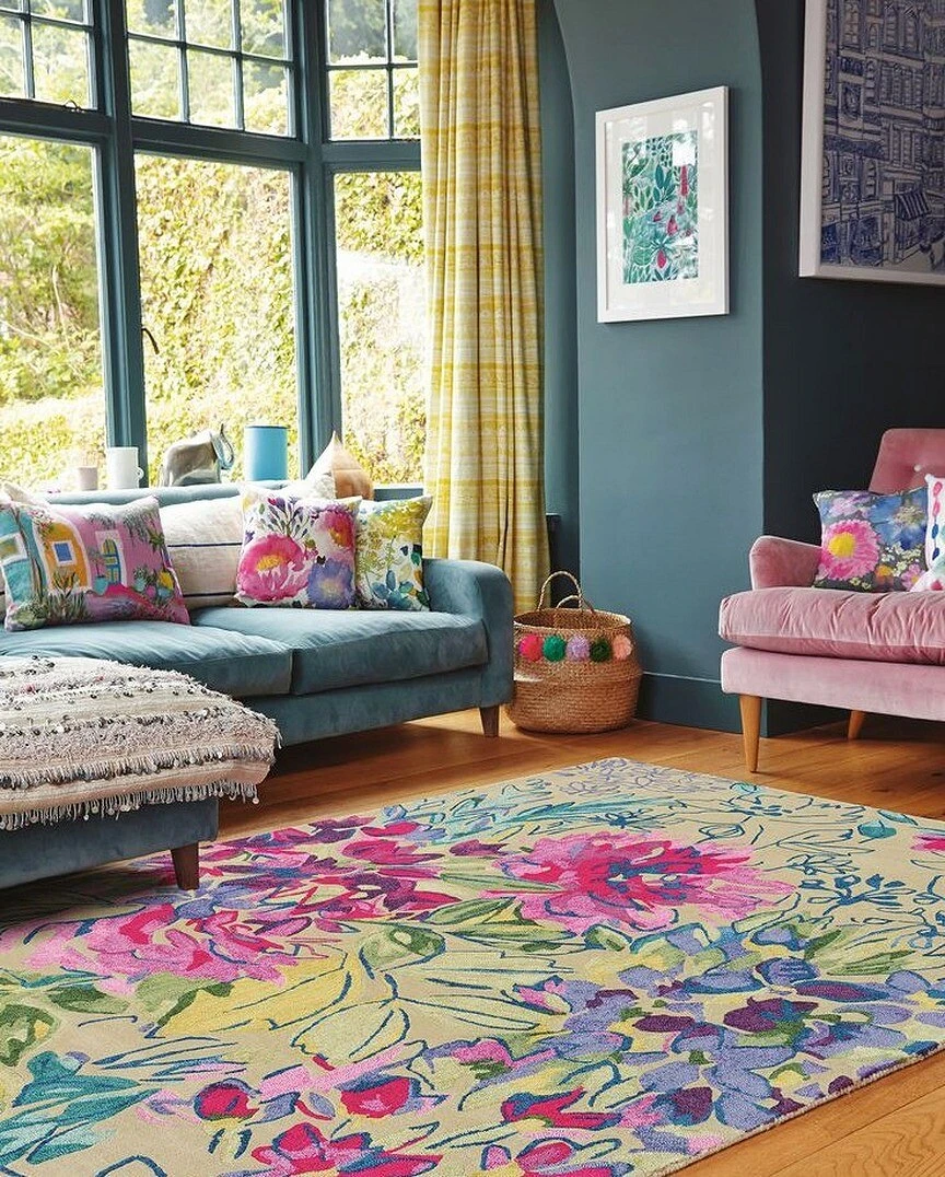
2. Triad
If you decide to choose three shades as the basis for your interior, mentally draw an equilateral triangle on the color wheel (in other words, choose three colors equidistant from each other).

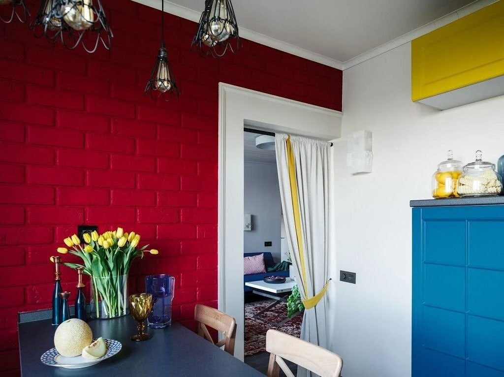
Examples of such combinations: are red-violet + blue-green + yellow-orange, red + blue + yellow, and red-orange + yellow-green + blue-violet.
Designers advise using three contrasting colors in proportions of 60/30/10 percent.
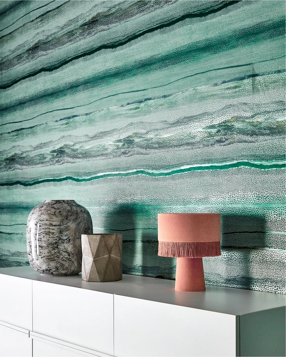
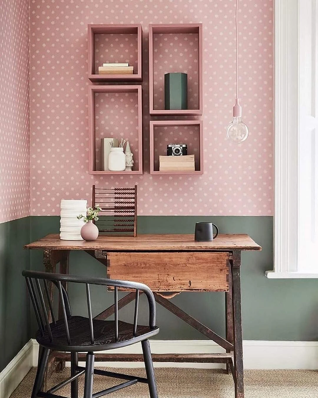
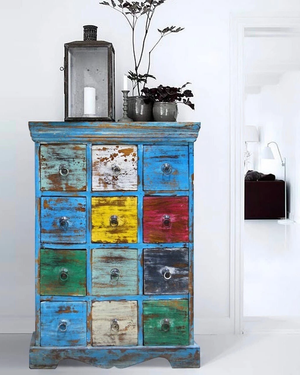
3. Combinations of similar shades of a circle

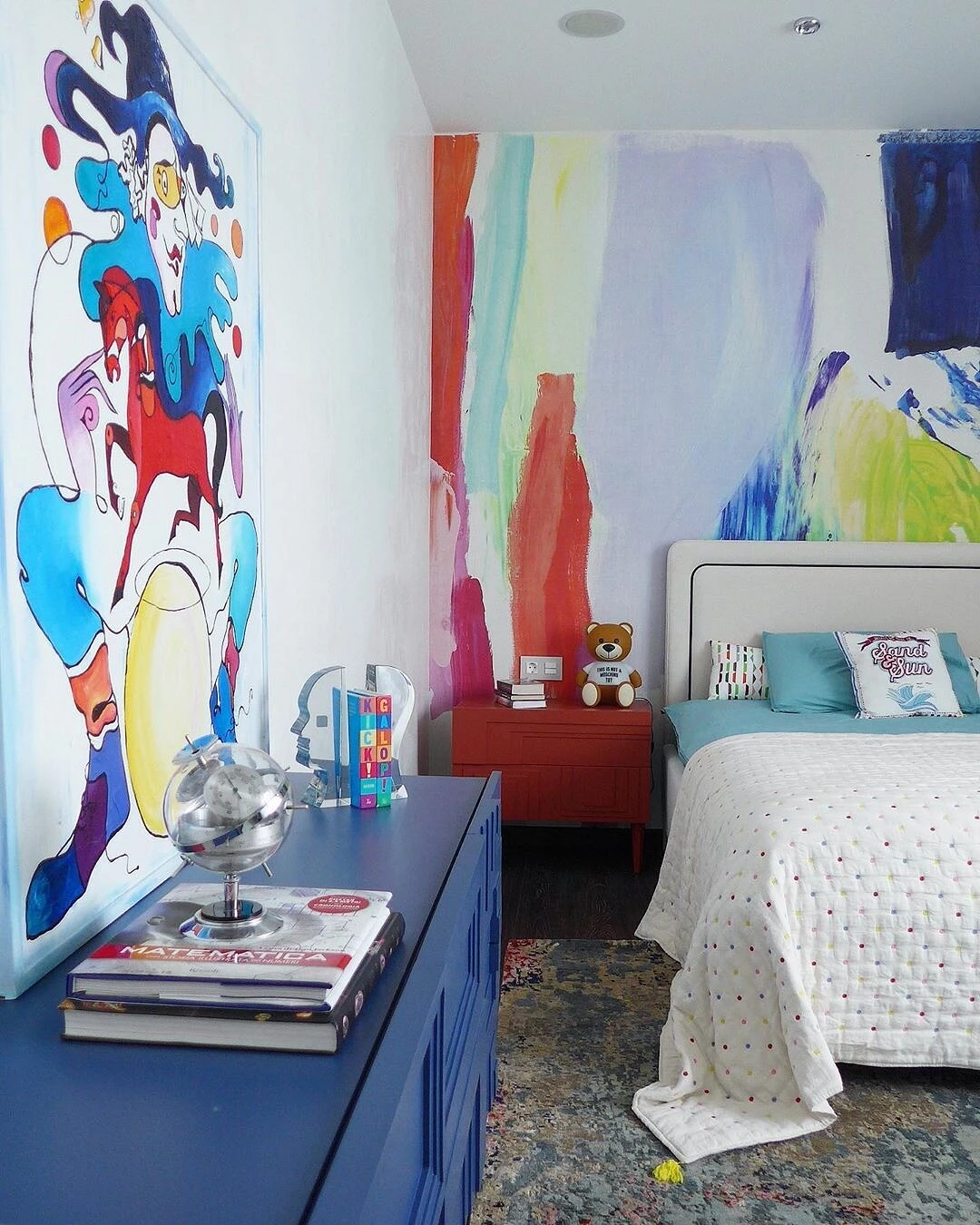
If you are not a fan of sharp contrasts, this option is for you: create a color scheme for the interior based on 2-5 tones located in a row on the color wheel.
It could be, for example, purple + blue-violet + blue. Or yellow + yellow-orange + red + red-orange.


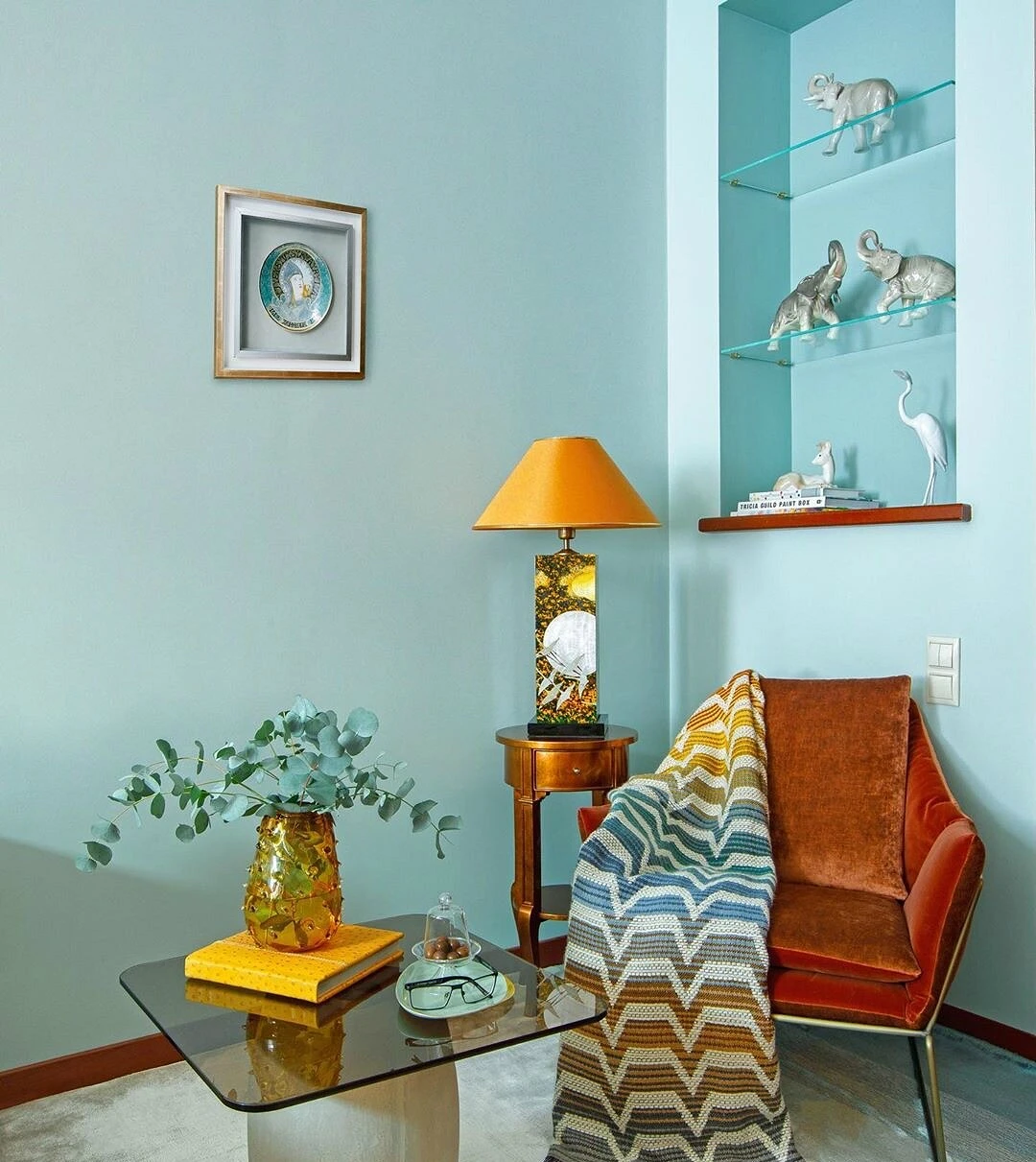
4. Separate-complementary combination
This scheme for selecting contrasting combinations is similar to the first one, however, the selected tone is paired not with one – opposite to it on the color wheel – but with two shades adjacent to the complementary one.

Such combinations will be quite contrasting, but not as sharp as duets of complementary colors.
So, to go with green instead of red, you can choose red-orange and red-violet. And to blue-violet – yellow and orange.
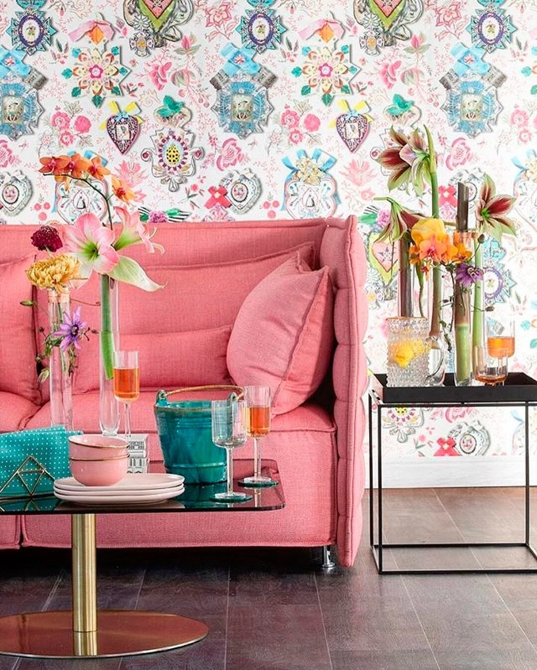
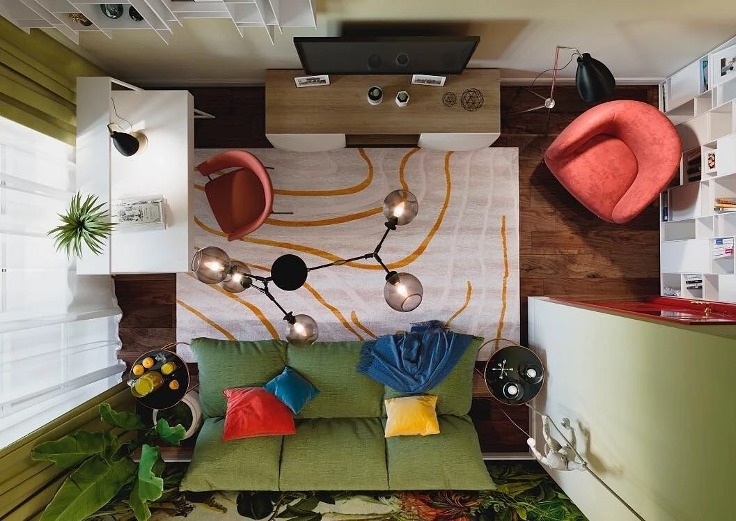
5. Rectangle

If you are one of those who never have enough color in the interior, we offer two schemes for selecting harmonious contrasting combinations of four shades. The first is “rectangle”.
Mentally draw this figure on the color wheel and get the combinations red-orange + blue-violet + blue-green + yellow-orange, red + violet + yellow + green, etc.
6. Square

The second is “square”, with its help you will select combinations: red-orange + purple + blue-green + yellow, red-violet + blue + yellow-green + orange, etc.
Typically, one color is chosen as the main color, two as complementary colors, and one is used spot-on for rare accents.
The most important thing about our X that it is for
those who are in a hurry


