


The minimalist concept of a modern, comfortable, and laconic man’s home was implemented in unusual ways, which, among other things, made it possible to realize the main decorative task: to visually increase the size of a small apartment.
The owner of the two-room apartment, located on the fourth floor of an old brick house, is a very energetic and busy person. The architects had to create a light, modern interior for it, not overloaded with furniture and details, with a practical, wear-resistant finish. Each element of furnishings and design had to be selected in such a way that it would last a long time and be convenient during operation and maintenance. It was necessary to design a bedroom, a combined living and dining area, and provide a workplace.
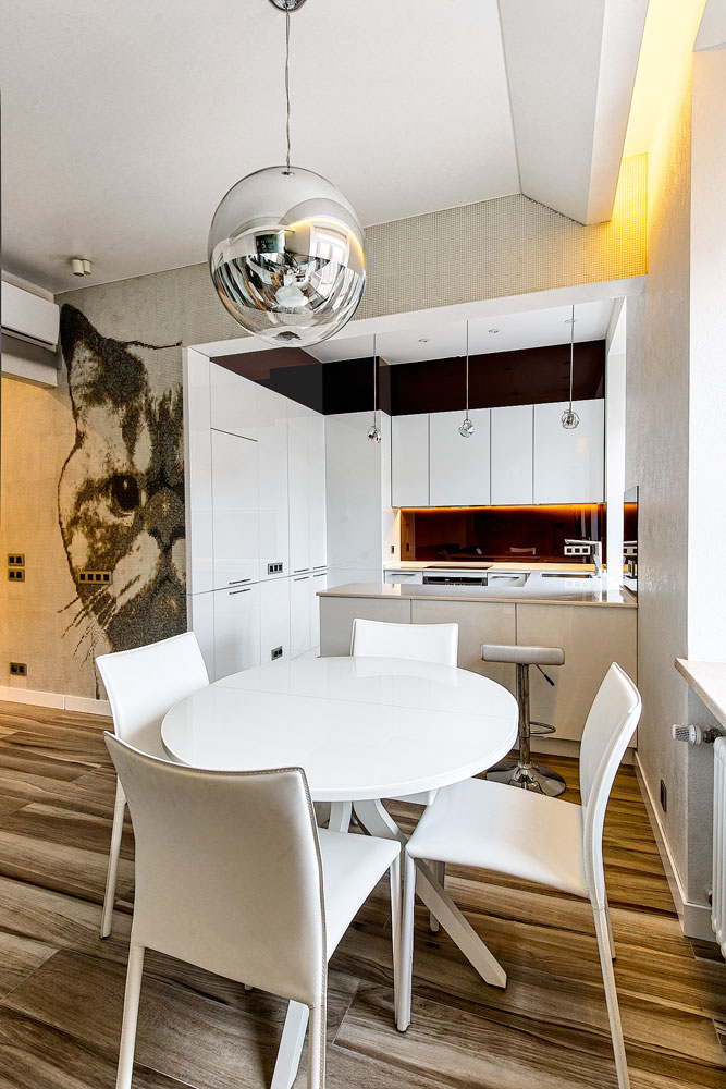
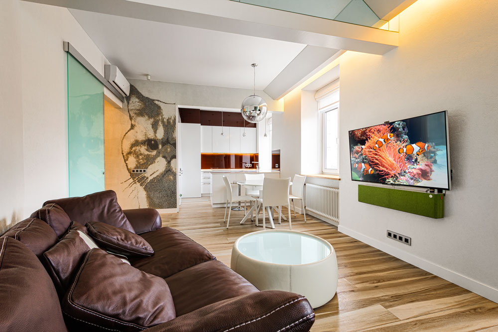
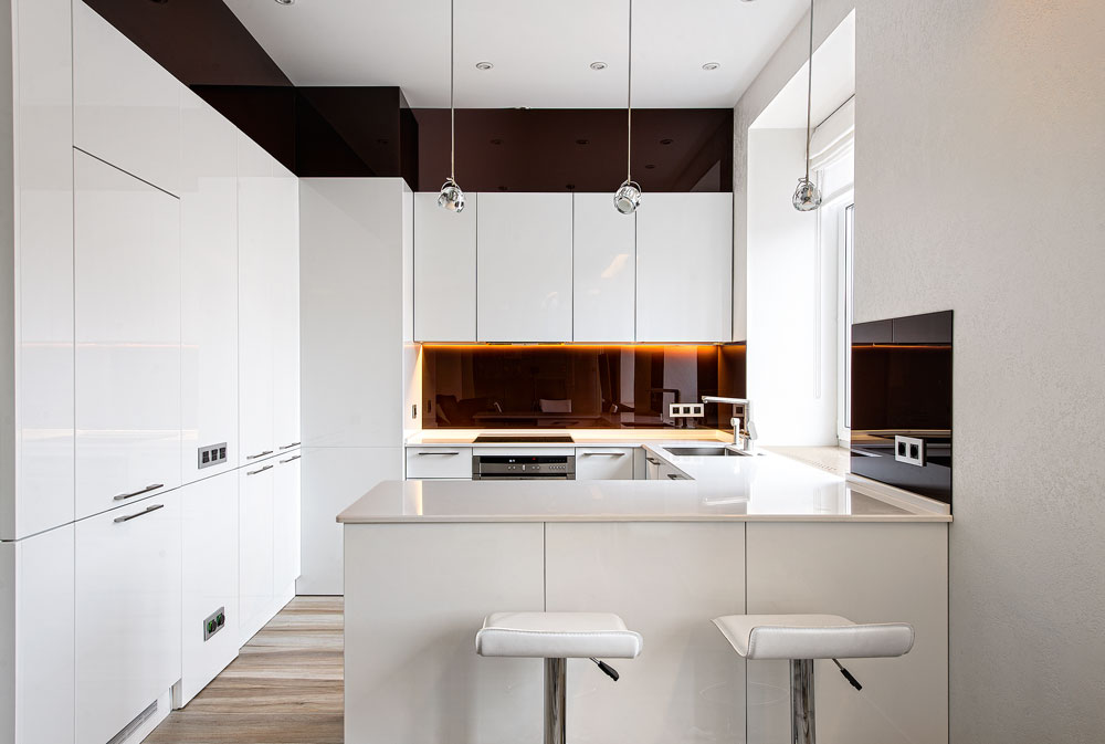
The half-bar counter successfully zones the studio. On the kitchen side, there are built-in storage sections. Three glass shades unobtrusively accent the dining area
Glass and mirrors in the interior
Glass and mirrors can adjust the proportions of even miniature rooms. In this project they are used unobtrusively and non-standardly. Thus, in a sparkling white kitchen (glossy facades, quartz countertops), the apron, the frieze strip between the ceiling and cabinets, and the panels on the wall in the area where the peninsula adjoins are made of dark brown painted glass.
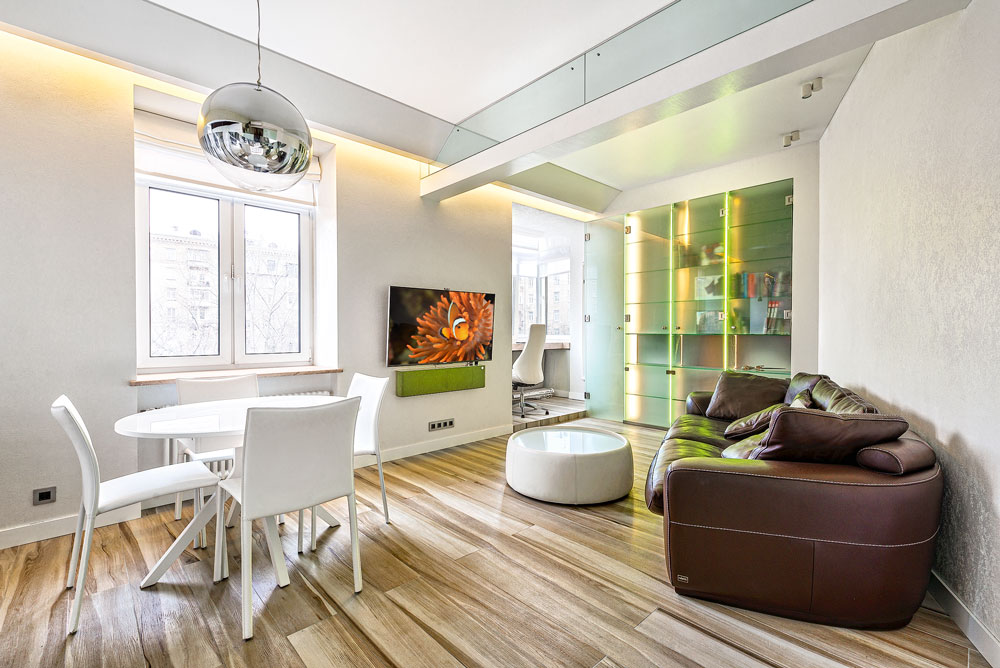
This unexpected contrast emphasizes the beauty of a rational composition and creates the effect of depth. Structural beams protruding half a meter from the ceiling planes were lined with mirrors to optically level out the massive volume. Along the window they were “balanced” by a false plasterboard beam with eaves lighting.
Redevelopment
The corner apartment with four windows and a standard structure – a rectangle, inside of which there were two rooms, a separate bathroom, and a kitchen, connected by an L-shaped corridor – was significantly refurbished.
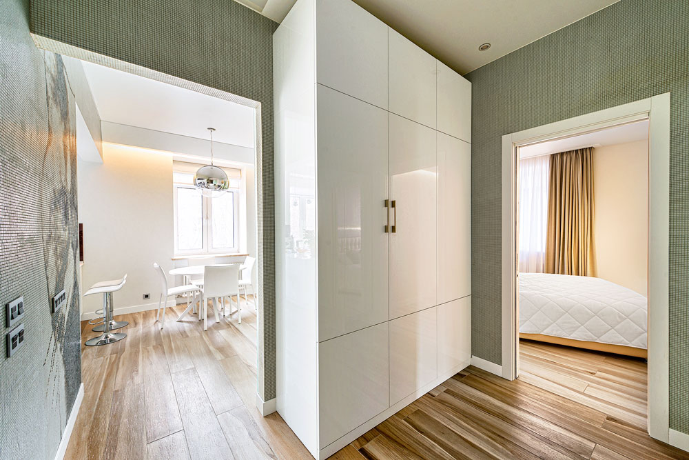
The previous non-load-bearing partitions between rooms were dismantled. In place of the corridor, a spacious hallway was made – its area was increased at the expense of the nearest room, and the bathroom was combined and expanded, adding part of the passage area to it.
The kitchen, dining room, and living room were combined, located along three windows facing one side, and separated from the hallway and bedroom by a diagonal partition. The bedroom was located next to the fourth window, facing west. The balcony was attached to the living room and the partition between the two windows was removed, the expanded opening was reinforced with a metal structure, having received the appropriate permits from the necessary authorities.
Layout: non-standard and practical
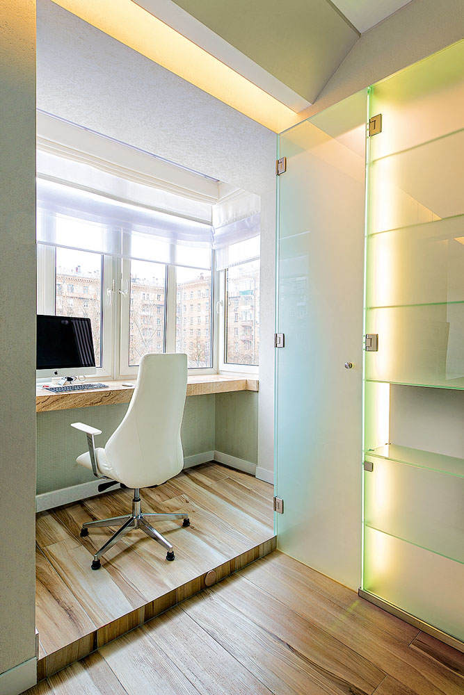
The office was set up on a small balcony. Where the window sill blocks were removed, the balcony slab was reinforced, then a fencing frame with a roof structure was built. Next, we leveled the floor, installed windows and insulated all surfaces.
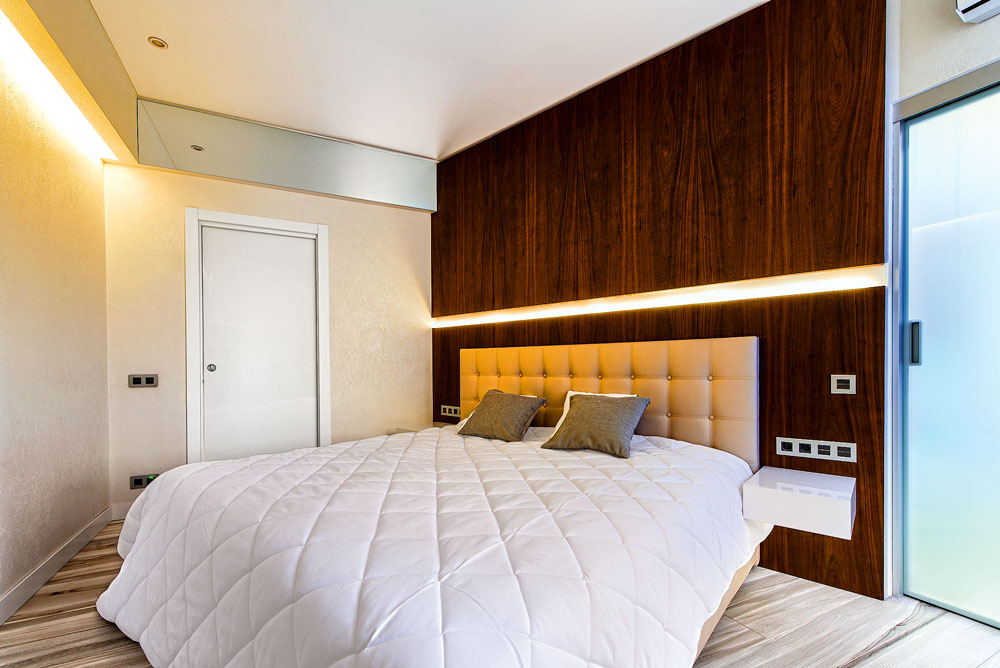
A tabletop was installed along the entire length of the balcony. The floor in the office was slightly raised relative to the floor in the bedroom due to the insulation “pie”. The work area is a semi-autonomous space, and the balcony has excellent insolation. A valuable find was the volumetric partition-wardrobe between the living room and the dressing room. The bedroom has two entrances: one through a swing door from the hallway, the second through a sliding glass partition in the dressing room.
Repair
The apartment’s screed was completely replaced, the floors were tiled with wood-look porcelain tiles, and electric heating was installed underneath. New partitions were erected from tongue-and-groove blocks. The walls were leveled with plaster partially covered with textured paint, and partially decorated with mosaics.
In the bedroom, the walls, floor, and ceiling were soundproofed. Stretch ceilings were installed in all rooms, their level was minimally lowered. The bedroom and living room were equipped with air conditioners, and the outdoor units were placed on the outer wall facing the courtyard.
Design
Each element of planning and design is closely related to the others, but at the same time they are all subordinate to a common task: to create a feeling of a larger, transparent, free living space. The studio layout was an important step towards the implementation of this idea, and the diagonal partition added dynamism to the composition and also contributed to the optical increase in the depth of the rooms. Colors became an important component of the interior: almost all the walls of the apartment are covered with white paint with a light texture, the window sills and most of the furniture are the same color, and splashes of dark brown and gray only emphasize the “luminosity” of the main planes.
There is not much furniture, large items are built-in and practically blend into the background, and even the shelf-stand for the TV in the bedroom seems to be pulled out at an angle from the wall. The repeatedly enlarged fragmentary “portrait” of the cat visually changes the scale and actual dimensions of the studio.
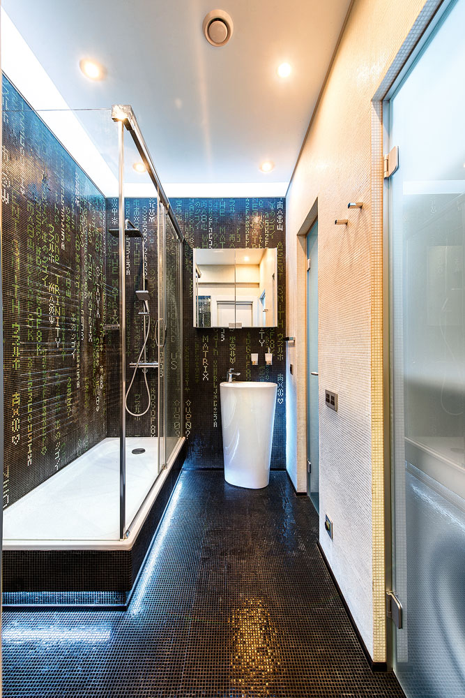
Almost all interior doors, the doors of the built-in wardrobe partitions, the frieze between the ceiling and the upper border of the kitchen cabinets, and the kitchen splashback are made of glass; voluminous ceiling beams are trimmed with mirrors. Most of the day, window openings are open; only curtains with a black-out effect are provided.
Lighting fixtures – curtain lighting, globes above the semi-bar table, lamps hidden behind the stretch ceiling of the bathroom and hallway – provide an even matte glow. Mosaic with small tesserae also contributes to the visual expansion of space: in the bathroom, all the walls are decorated with it, which creates an image of shimmering depth; The walls of the hallway are decorated with light gray mosaics.
When choosing an apartment, the customer took into account such criteria as proximity to highways and the metro, quiet area, proximity to a park, high ceilings, and a balcony. The owner spends a lot of time on business trips, and therefore his own home should become the embodiment of his dream of a relaxing holiday. The apartment is illuminated by the sun almost all day, so Roman blinds with thick lining were provided in the living room (they will come in handy when watching TV programs). And in the bedroom they hung full-length curtains with blackout lining. An important accent element was the mosaic panel on the kitchen wall. For a long time the customer could not choose one of the many panel themes we proposed: he wanted it to be unusual and at the same time not boring. In the end, we settled on a photo of our favorite cat. It turned out very original – the cat became the “face” of the apartment, although he lives in a different place.
The most important thing about our X that it is for
those who are in a hurry


