


Basic gray has a unique property to harmonize the environment, balance sharp contrasts and soften flashy tones. We will suggest how to choose combination colors for gray walls so that combinations of shades look fresh and original.
Gray is called the “new beige”: against a discreet background, accent colors, and textures that organize space to appear brighter. Only for some reason in the photo glossy interiors with basic gray captivate from the first minutes, but in practice, it turns out a boring depressive closet or a chaotic scatter of colors. Despite the wide range of compatibility, gray is not friendly with all shades, but only with some. The main thing is to get into the right tone and build a harmonious interior palette.
Selection of the base shade according to the level of illumination
The quirks of gray are explained by the influence of lighting. Mixing black and white spectrums creates an endless variety of shades of gray, replacing each other. Basic gray is best revealed in brightly lit rooms.
The same shade looks different: in a darkened room, gray walls seem almost black, and in a sunny room they turn white before our eyes. Therefore, in the decoration of shaded rooms light colors are preferable, and in sun-drenched rooms, cool shades of gray with blue and purple notes, which muffle the burning rays of the sun and visually expand the space. As a rule, finishing wall surfaces in gray is practiced in rooms oriented to the south or east, in other cases it is better to choose white and pastel colors for wall decoration and keep gray for upholstery of upholstered furniture and textiles.


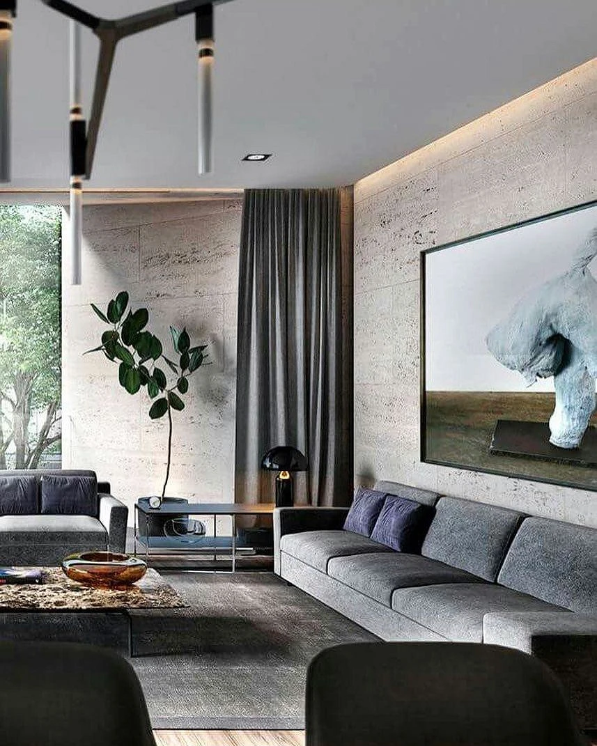
The least sensitive to lighting changes are light and translucent shades of gray with a silvery and pearly sheen. Such tones are often seen in unpainted concrete walls. The expressive texture of concrete goes well with amber and reddish wood and straw or rattan wicker furniture.
Gray color in monochrome interiors
The tone of the gray background affects the perception of partner colors. For example, pure white, which is usually positioned as universal, surrounded by dark gray walls can seem dirty. To avoid an unpleasant effect, give preference to “sweet white” with an admixture of yellow-creamy and creamy, and use soft gray tones for wall decoration and furniture upholstery.
In high-tech style, a combination of gray and black is often found, but the interior will not look gloomy if you increase the area of reflective surfaces and add shine. Chrome-plated and silver-plated fittings, glossy and matte facades, transparent glass, mirrors, and polished floors act as traps for the rays.


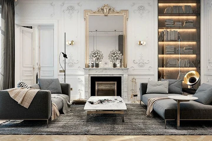
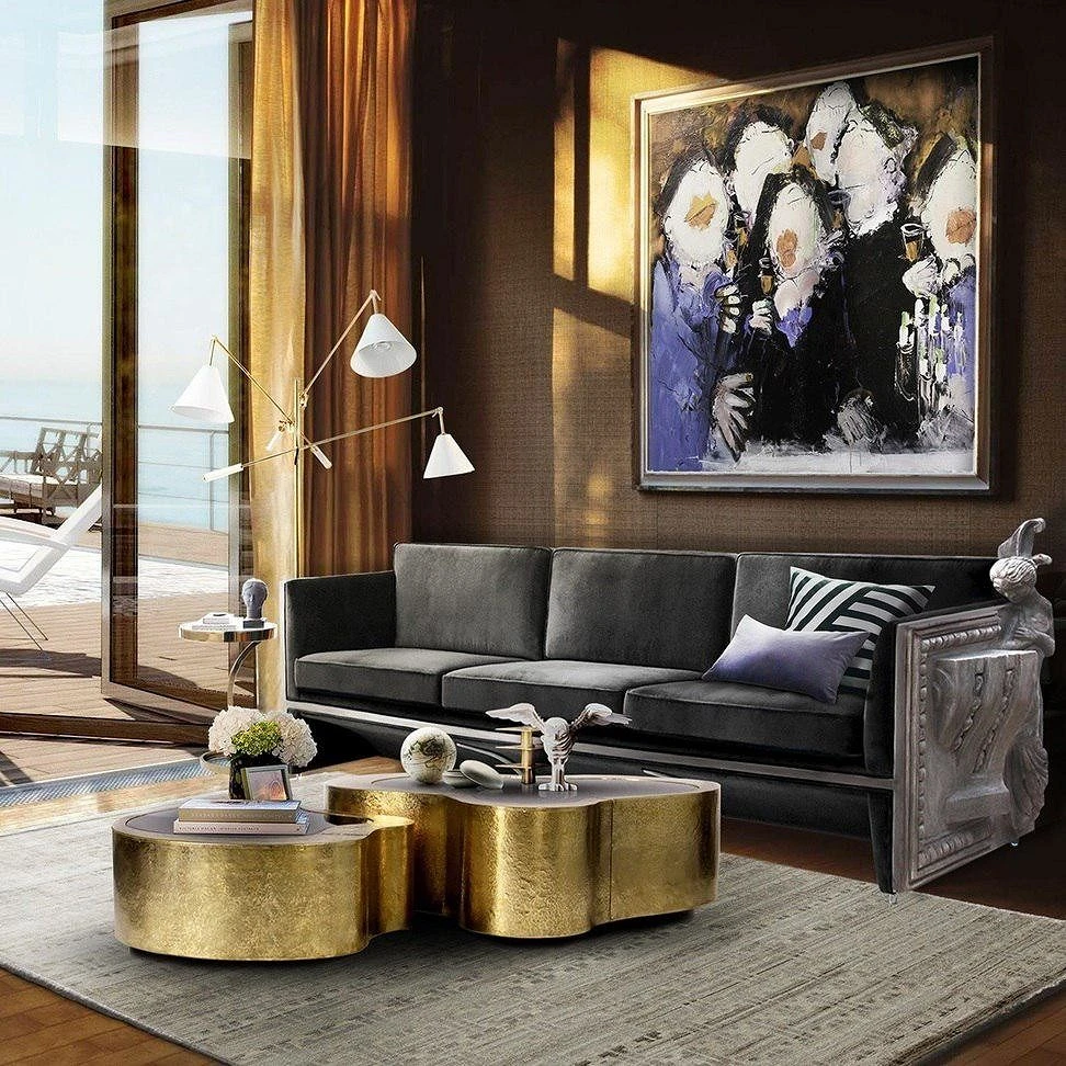
In design projects inspired by the luxury of palace classics and modern, golden, copper, and bronze accents are mixed with a strict duo of gray and black.

Smooth transitions between different shades of gray bring life to monochrome design projects. Paint perpendicular walls in different shades with a difference of 2-3 tones, or beat the gradient effect with the layout from bottom to top from dark to light.
Combinations with cool colors
Gray color belongs to the natural palette and perfectly coexists with the cold colors of the natural range. An elegant tandem of gray with blue and blue is one of the most popular combinations that finds application in various areas of interior design. Neoclassic loves clean, fresh hues, while delicate powdery tones with general lilac and pearly nuances create a nostalgic vintage vibe.
Intense turquoise paired with gray will make the marine surroundings more convincing, and faded blue, purple, and lavender hues against the background of whitewashed walls and floors begin to ooze with the aroma of blooming Provence.


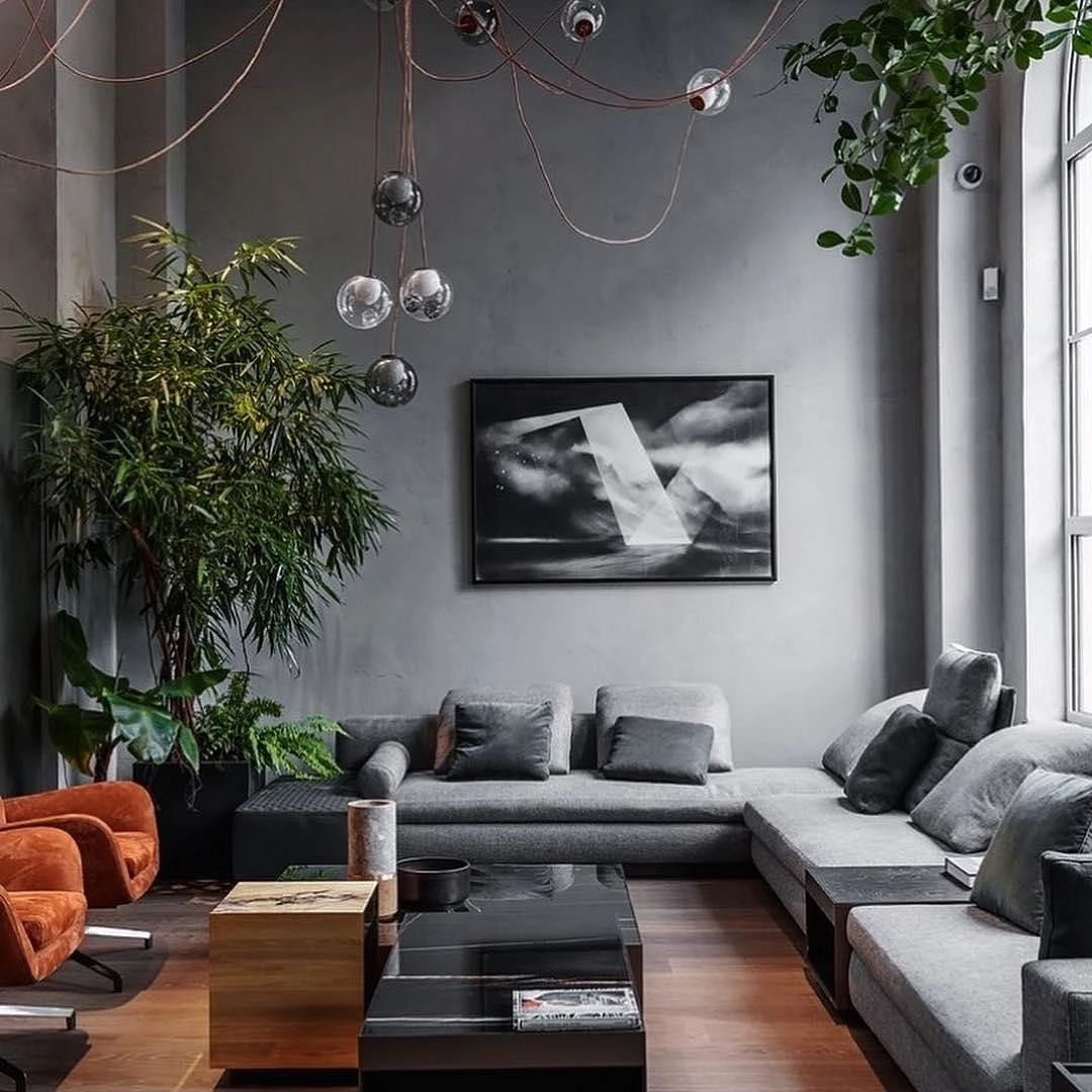
Cheerful green accents surrounded by matte gray walls also refresh the atmosphere quite well, but they act softer and calm the nerves, especially if you use live plants as decor. In modern interiors, combinations of gray with complex green tones are in great demand – coniferous, olive, pistachio, mint, or lime color. Complex concentrated colors, such as violet and magenta, are recommended to be used in doses and with sufficient artistic justification.

Combinations with warm colors
It is more difficult for modest gray to get along with contrasting bright colors, therefore their use is limited to the role of accents, and the most saturated warm tones – red, orange, and bright yellow must be balanced with neutral intermediary colors – white, cream, beige. Muted shades of yellow – apricot, sand, mustard – are more accommodating.
Gray has a difficult relationship with the earthy scale. With light browns, beiges, and woods, there is usually no problem, especially if you choose a deep shade of gray a couple darker than brown. Chocolate and fawn tones work well with medium-gray metallic shades.
Perhaps, of all the warm colors, pink coexist best of all with gray – from the wild fuchsia color to the delicate powdery shades that have become the hallmark of the romantic shabby chic style.


Summarize
Now let’s summarize our observations in the table of compatibility of gray with other colors.
| Successful combinations | Controversial combinations |
|---|---|
| grey-blue/blue | gray-violet |
| grey-green | indigo gray |
| grey-yellow | gray-red |
| grey-pink/purple | grey-orange |
| grey-white-black | gray-brown |
As you can see, for all its whims, the gray color is exceptionally convenient – there are simply no unsuccessful combinations with it, and you just need to think a little about controversial combinations. Dare!
The most important thing about our X that it is for
those who are in a hurry


