


We tell you how to correctly combine tiles of different colors, combine wood and stone textures, and choose finishes for walls and floors.
Because a bathroom is, as a rule, a small and windowless room, it is the finishing materials that are largely responsible for creating a harmonious interior and the desired atmosphere. In this article, we will show you the most successful options for tile color combinations, tell you how to combine textures, and choose wall and floor cladding.
Bathroom tile color combination
Red
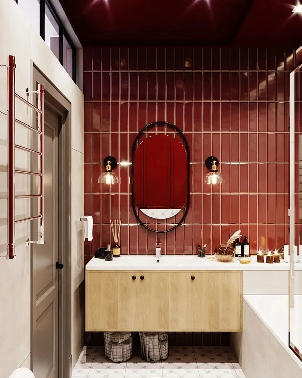
Many are strongly opposed to the color red in the bathroom, explaining that it will quickly become boring and will hurt the eyes in a small space. But it’s a good option for creating an accent wall.
Be careful when choosing a shade: cold tones are perceived easier by the eyes than contrasting warm ones. Also, do not forget about good lighting using lamps whose color temperature is close to natural light. The packaging with such a bulb will be marked with a color temperature of 3,500 to 4,300 K. Once you have chosen the shade and prepared the lighting, begin planning your finishing combinations. A classic technique is to set off a red accent with neutral white tiles. The latter in this case can be boiling white or creamy. The material on the floor and all plumbing must match.


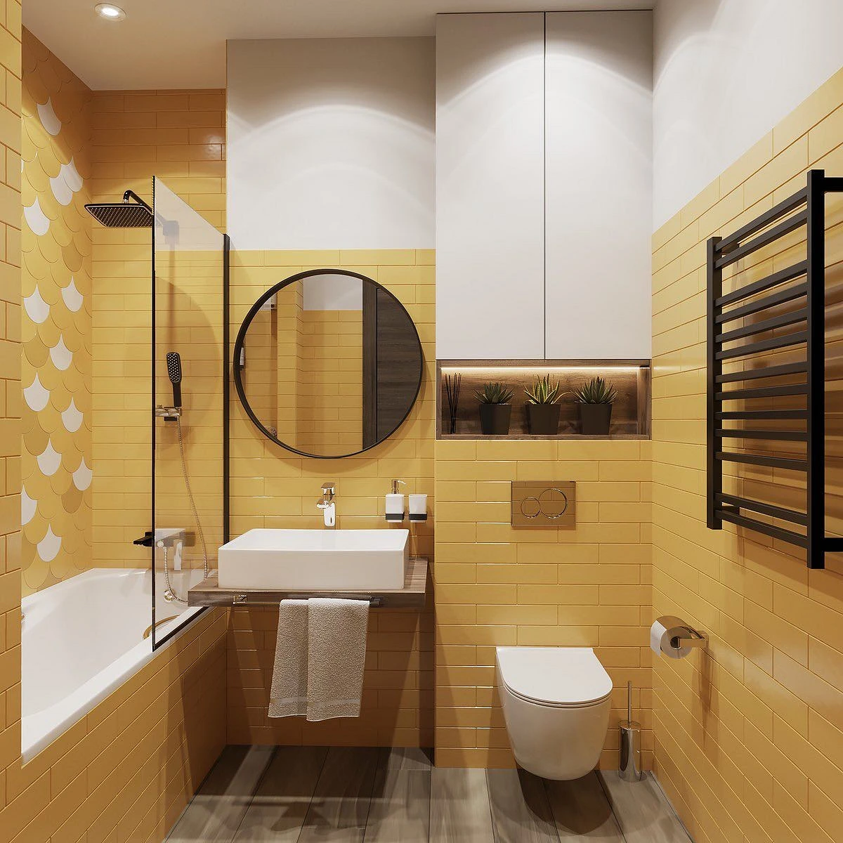
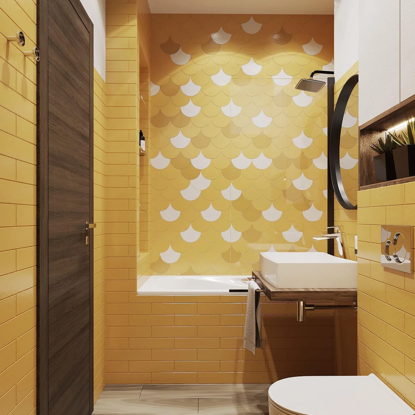
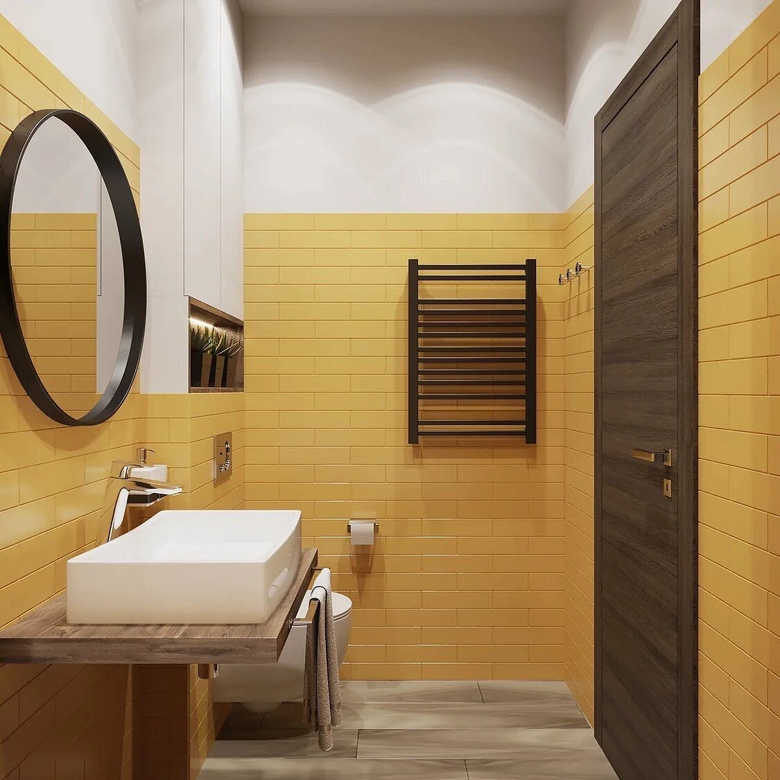
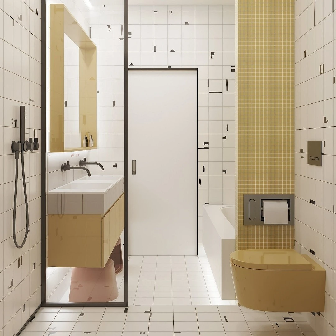
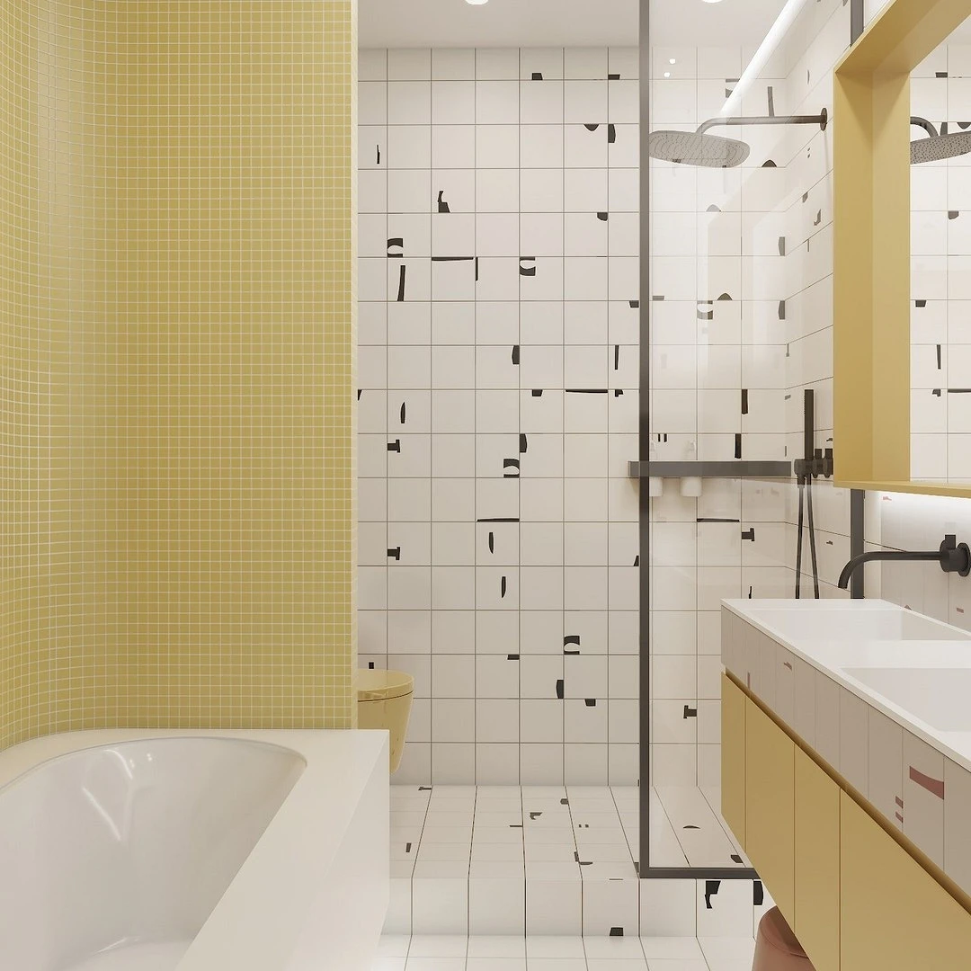
Yellow
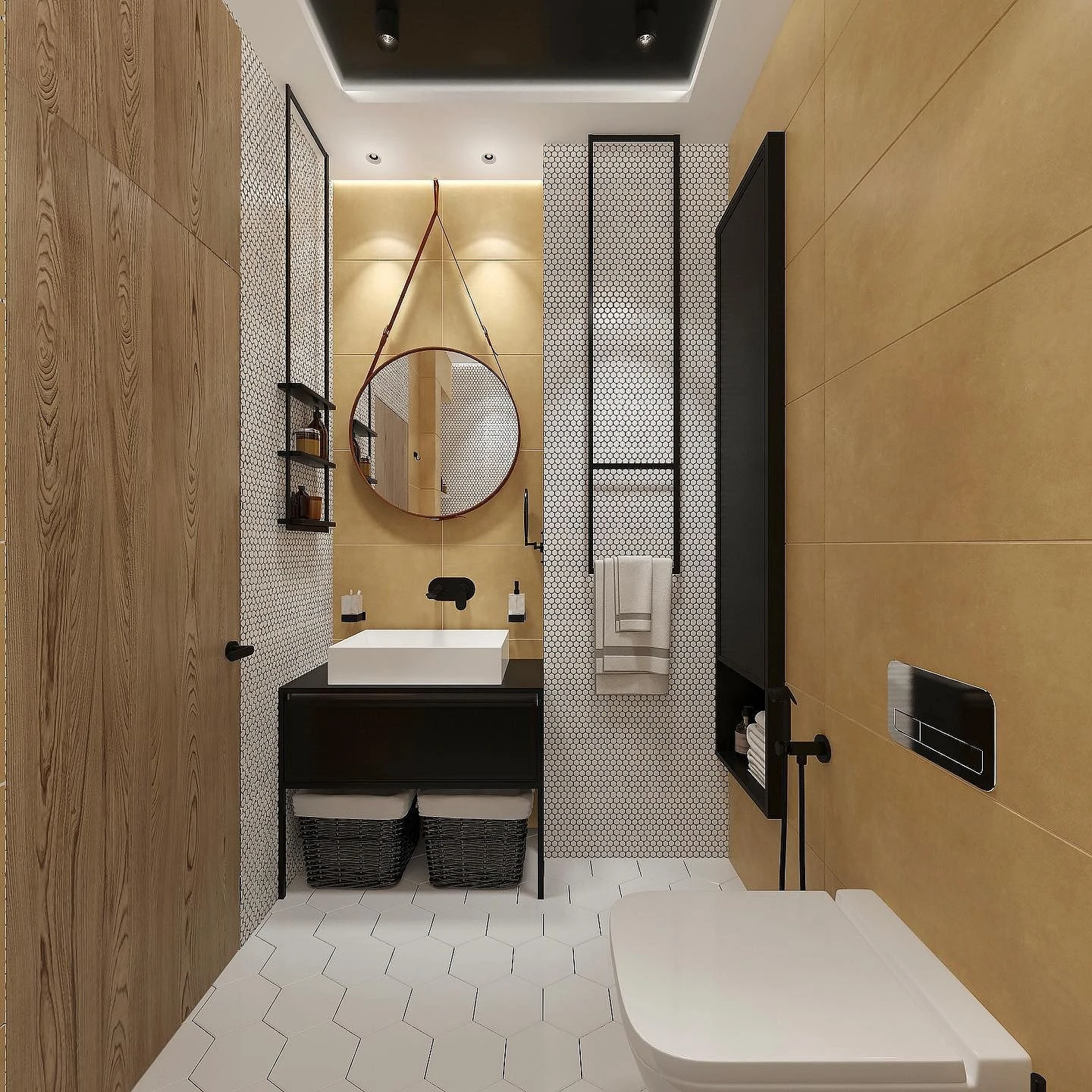
The combination of yellow tiles and other tiles in the bathroom makes the interior sunny and optimistic.
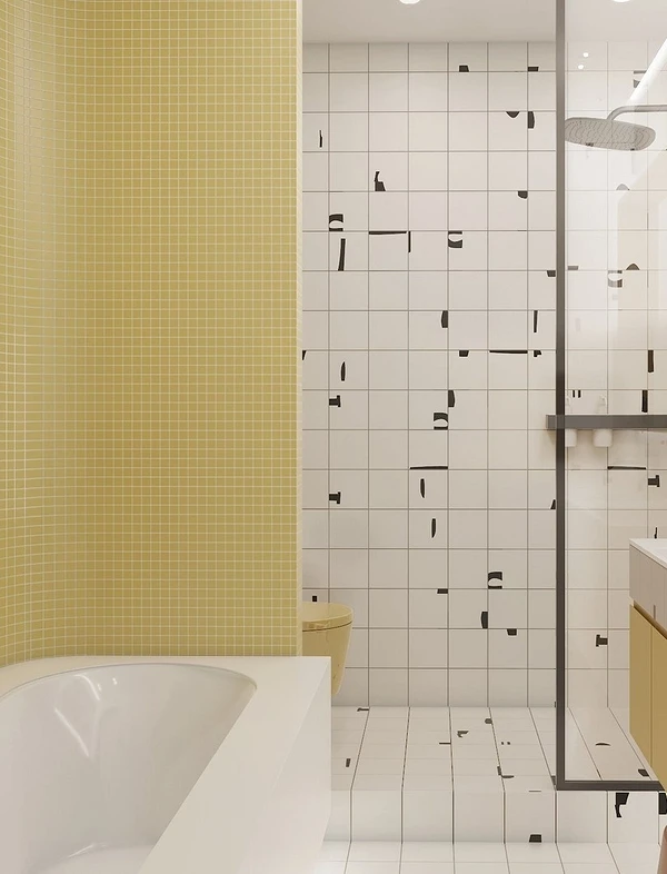
Choose lemon shades that are cool, but are close to warm on the color wheel, otherwise the space will turn out dull and uncomfortable.
Some tips for combining yellow trim with other details:
- Complete the interior with black and white. For example, you can lay a tile on the floor with a black and white pattern of a loose geometric shape, which does not dazzle the eyes, and paint the free sections of the walls with black paint.
- Use bold accent wallpaper.
- Set off the bright color with a light finish. Let some of the wall coverings, plumbing fixtures, and accessories be sparkling white, then the overall interior will turn out to be very fresh and cheerful.
- Lay out monochrome yellow ceramics on one wall and with a complex pattern on the other.
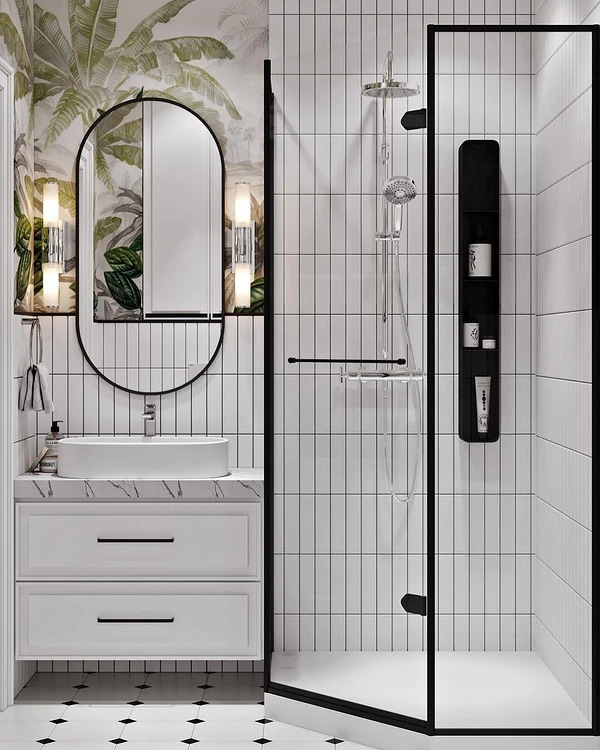
Green
Green tiles look very elegant and inspiring in the interior.
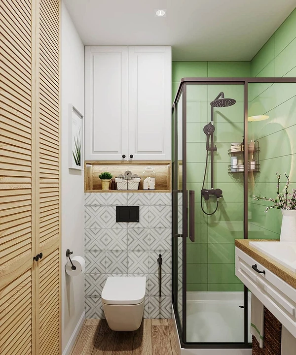
This could be an emerald color for one contrasting wall. In this case, it is best to decorate the rest of the space in neutral colors, gray and white. Mint-colored ceramics also look good in combination with white, soft green, and light blue. In this case, the coating does not necessarily have to be one color; options with flowers and leaves of tropical plants are also suitable.
For a more catchy colored interior, you can choose any contrasting combinations: for example, with deep blue and warm red.


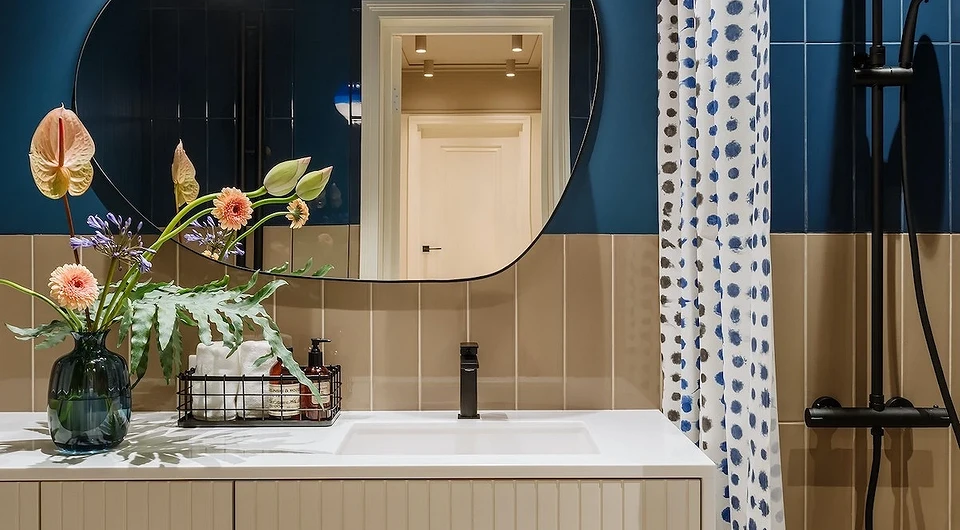
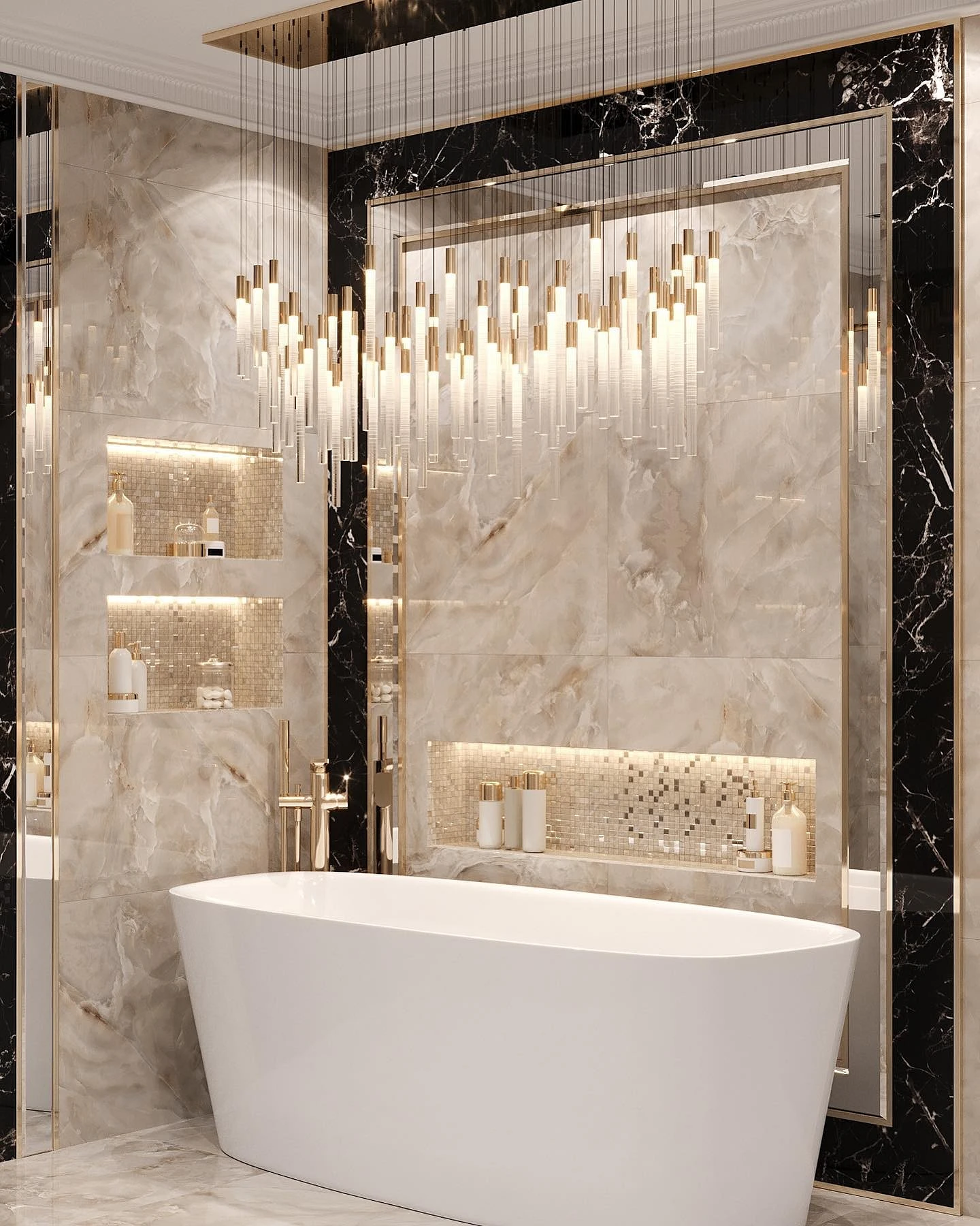
Blue or blue
Blue-blue tones look good both with basic shades like white or cool gray, and with grassy, olive green, beige, purple.
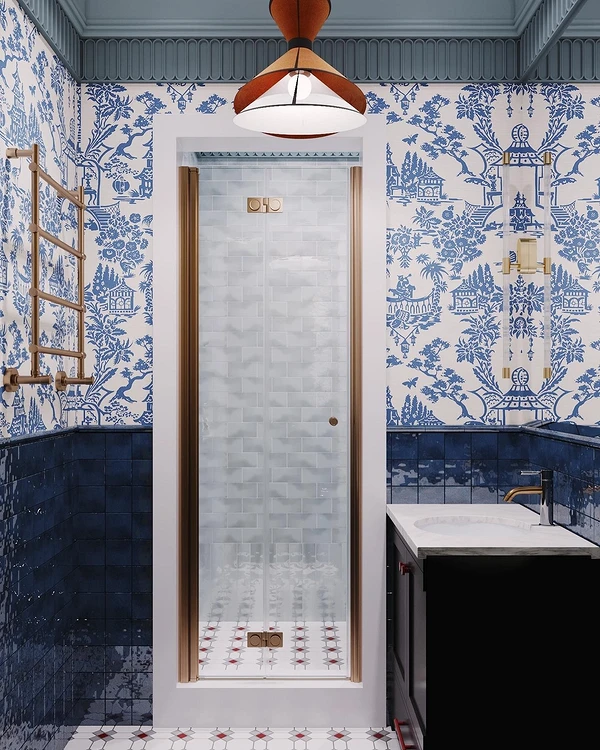
You can take white tiles as a basis, and arrange blue accents with chaotic inserts or diversify them with yellow. The combination of tiles in the bathroom becomes more interesting thanks to color: in the example, you can see deep azure and turquoise tones with splashes of gold and white. Take the time to find the perfect shade and accessorize it. The latter could be a mirror frame, faucets, beautiful sconces, or a soap dish.


Pink
Pink cladding in combination with other finishing materials looks very gentle. But different shades help create different atmospheres in the interior.
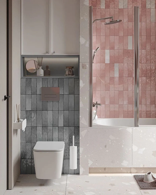
For example, the rich color of strawberry bubblegum along with beautiful colored plumbing fixtures will give the feeling of a doll’s room. A cooler pink mixed with red will have the opposite effect – such a room will look restrained and laconic. Pay attention to the last two photos: the combination of tiles with marble finish and pink ceramics turned out to be very delicate and stylish. Dusty pink in combination with black looks catchy and impressive.


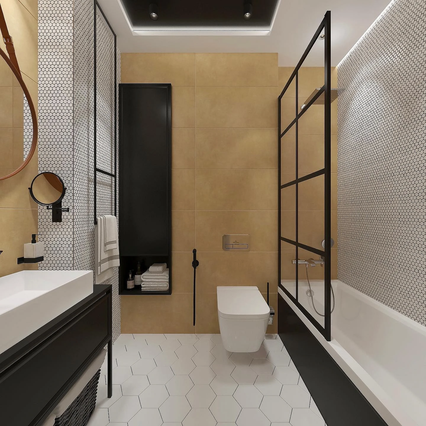
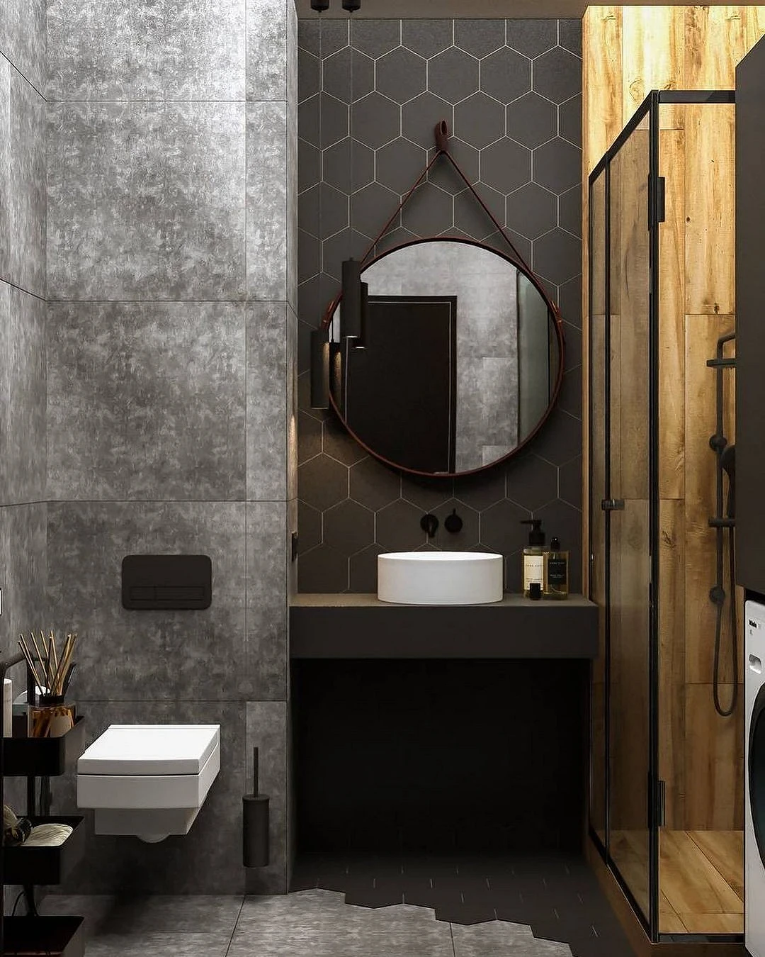
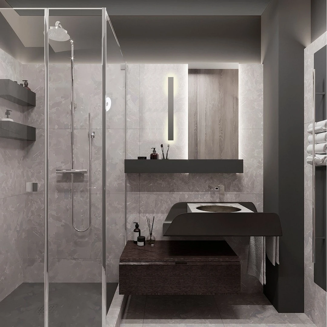
Black or gray
For a beautiful combination of finishing materials, you can even use black or dark gray as the main shade.

The main rule of working with black, even if you combine it with colored or wooden elements, is good lighting. The location of spotlights, pendant lamps, and diode strips should be thought out to the smallest detail. If the bathroom primarily uses light gray or creamy finishes, try playing with the tile layout or surface texture: by combining matte and glossy finishes.
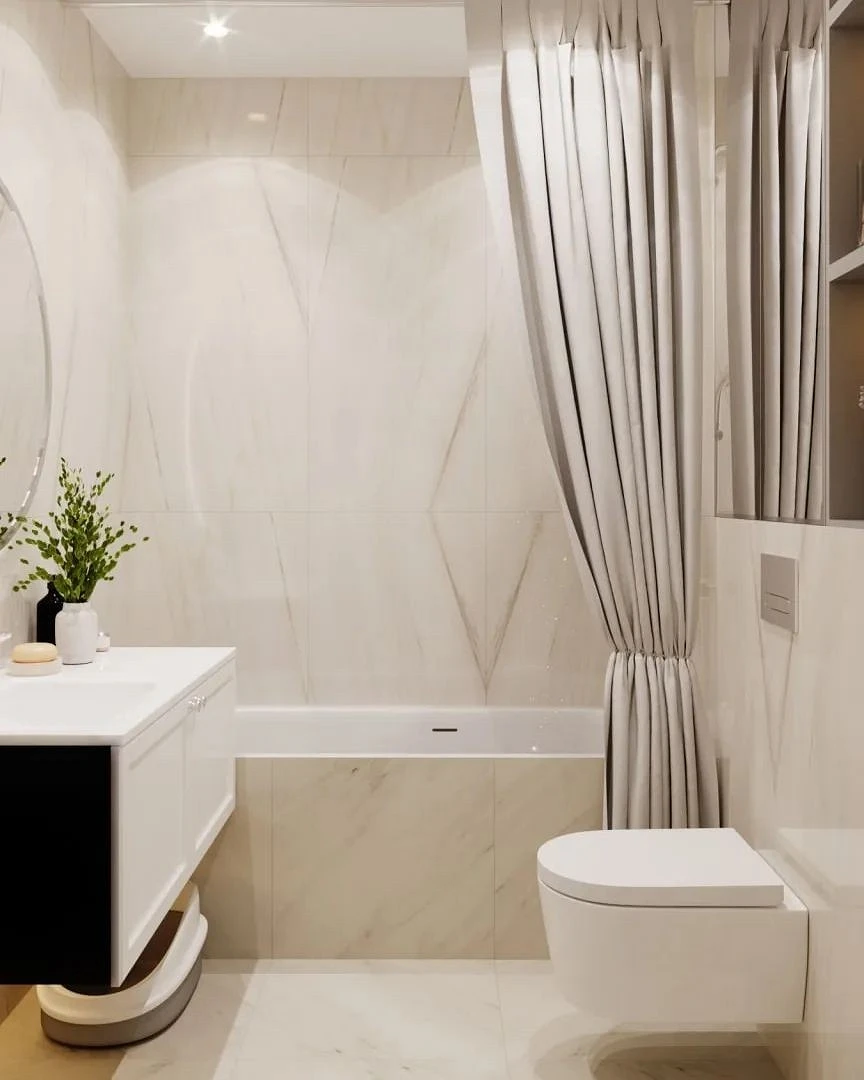
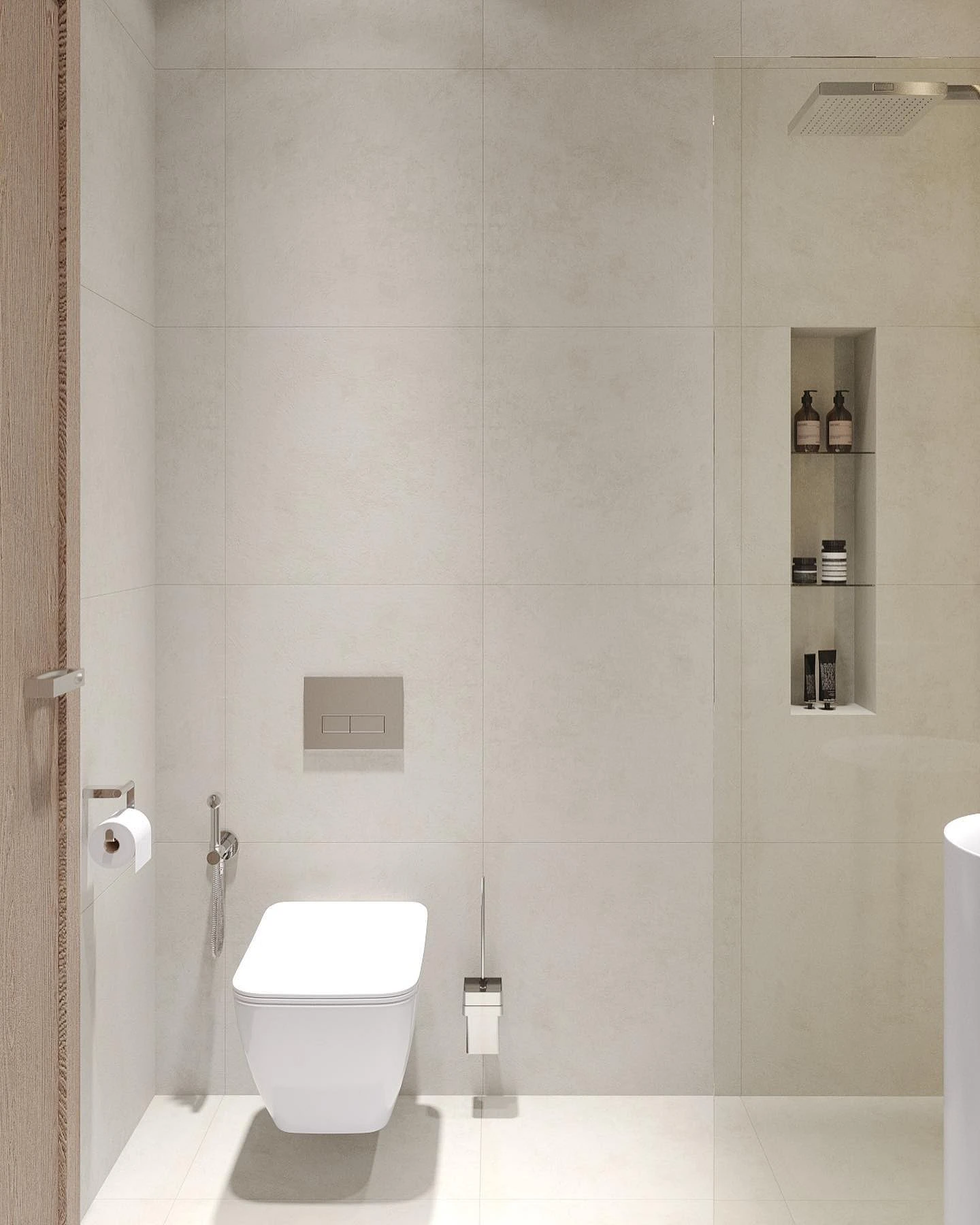
White or beige
It may seem that decorating the interior in white or beige tones is the easiest task, so you don’t have to think about successful and unsuccessful combinations.
But in fact, if you tile all the surfaces in the same color and shape and choose accessories to match, they will simply merge and the space will become flat.
How to combine white and beige trim with other colors:
- Use a white glossy surface for walls and floors along with contrasting black elements: heated towel rails, textiles, and parts of furniture.
- Complement the white area with a contrasting color, for example, dark green. Or, conversely, similar in tone: light gray, beige.
- Combine with tiles, paint, or wallpaper in a bright shade.
- Use tiles with a black pattern on part of the wall.
- Focus on the shape and texture of the material, use bright textures. So, the combination of wood and marble tiles looks great.


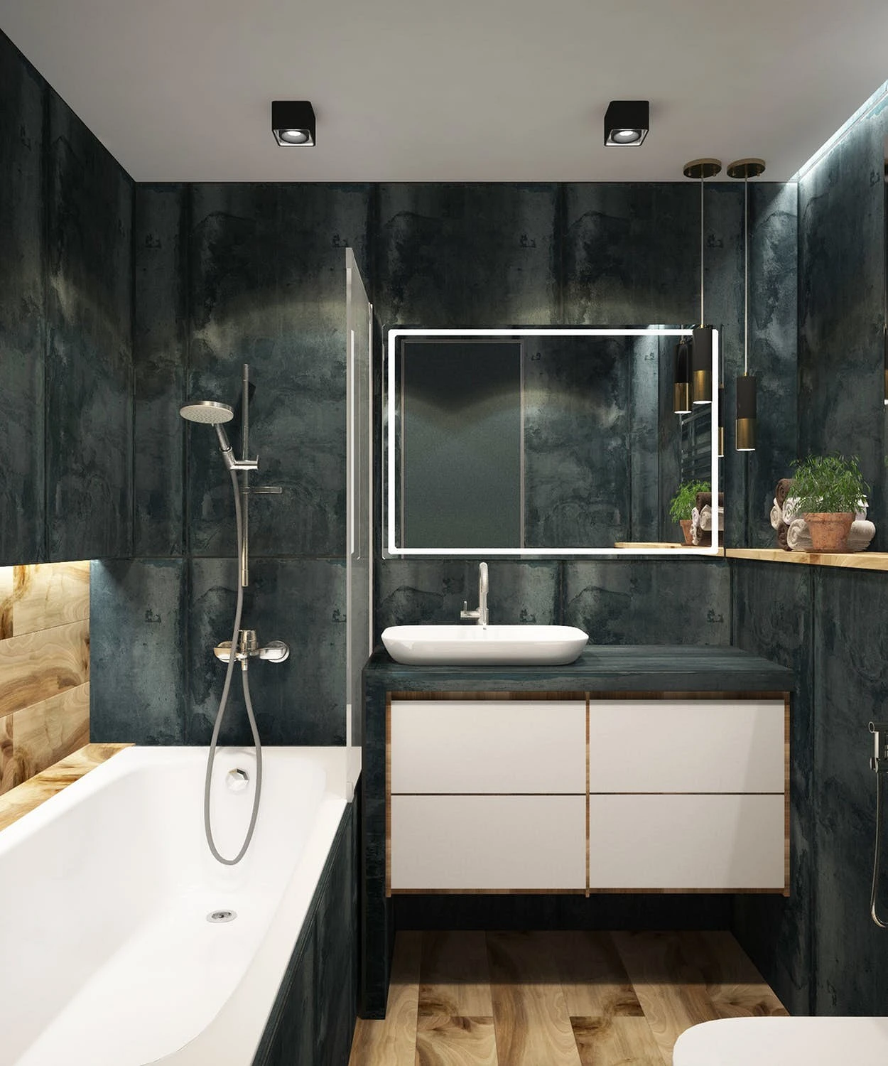
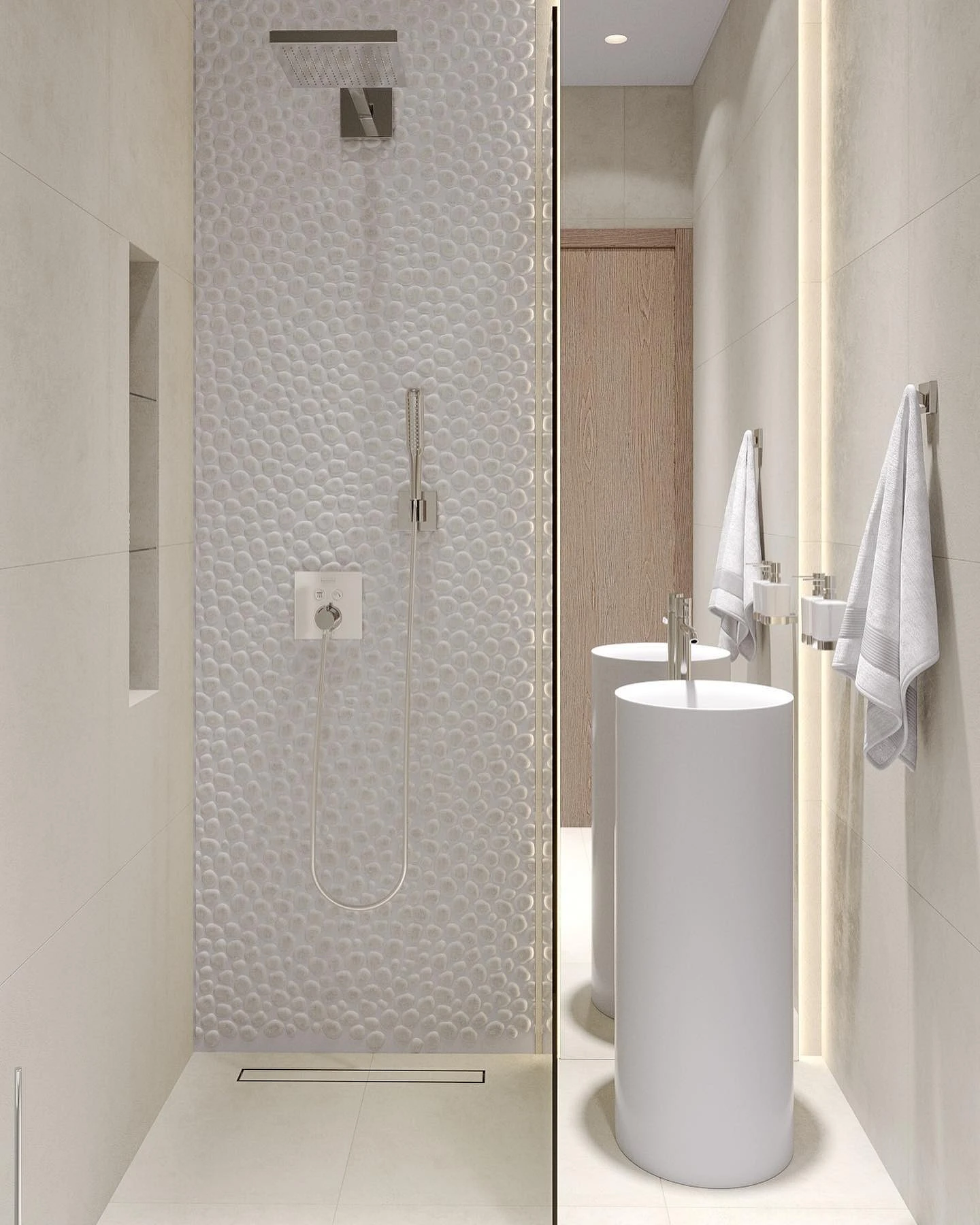
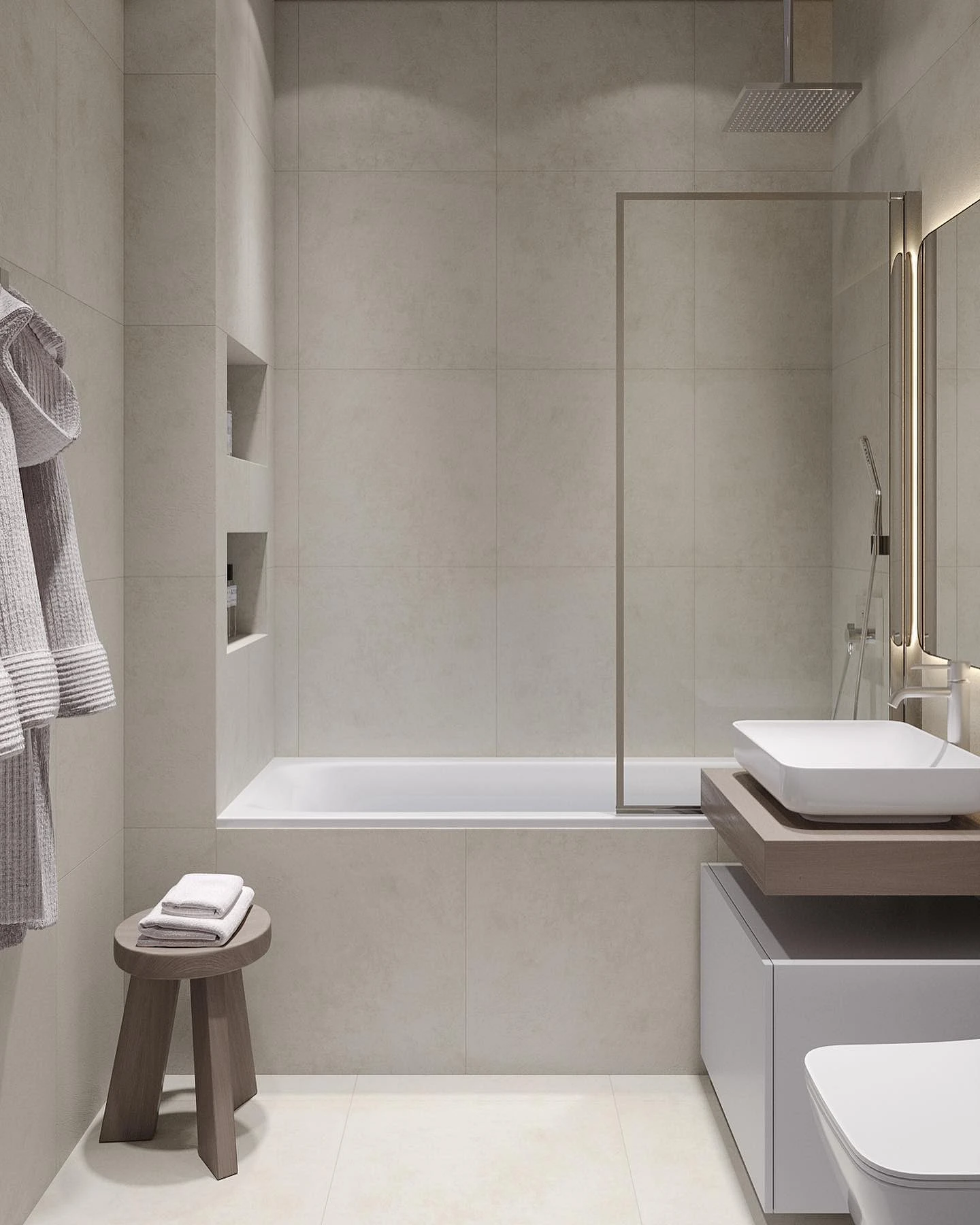
Combination of wood and stone tiles in the bathroom
You can complement multi-colored combinations or create a natural and eco-friendly space using ceramics that imitate wood or stone.
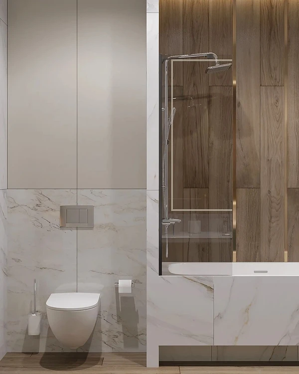
It will set off well complex design solutions, for example, a black wall, or it will act as the main accent for the interior, especially if you are decorating it in an eco- or Scandinavian style.
At the same time, you should not think that stone is always easily recognizable granite or marble. Manufacturers offer options with interesting patterns and bright color splashes that are not found in nature. It can also be an imitation of onyx, slate, travertine and other rocks.
Both textures combine perfectly with each other, and they can be safely used in the same room. The result is a moderately natural, moderately contrasting combination that helps to zone the space, while at the same time making it more comfortable and elegant. Both wood and stone are suitable for small areas, so you can combine this finish even on 2-3 square meters. Complement textured tiles with regular smooth or plain paint. But wallpaper with a pattern in such a composition will most often be superfluous.


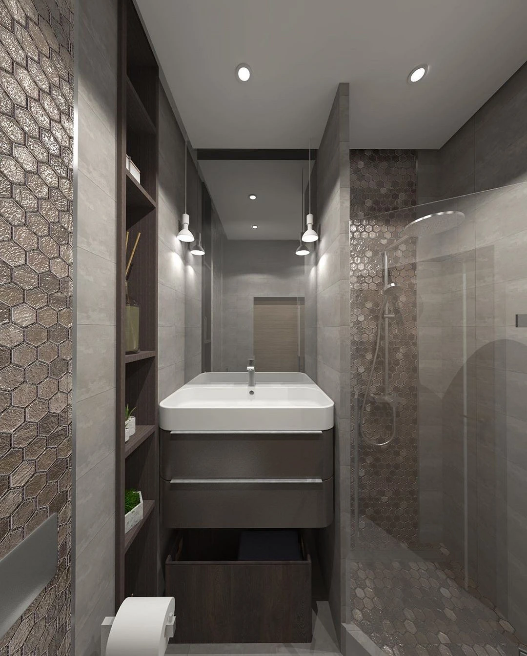
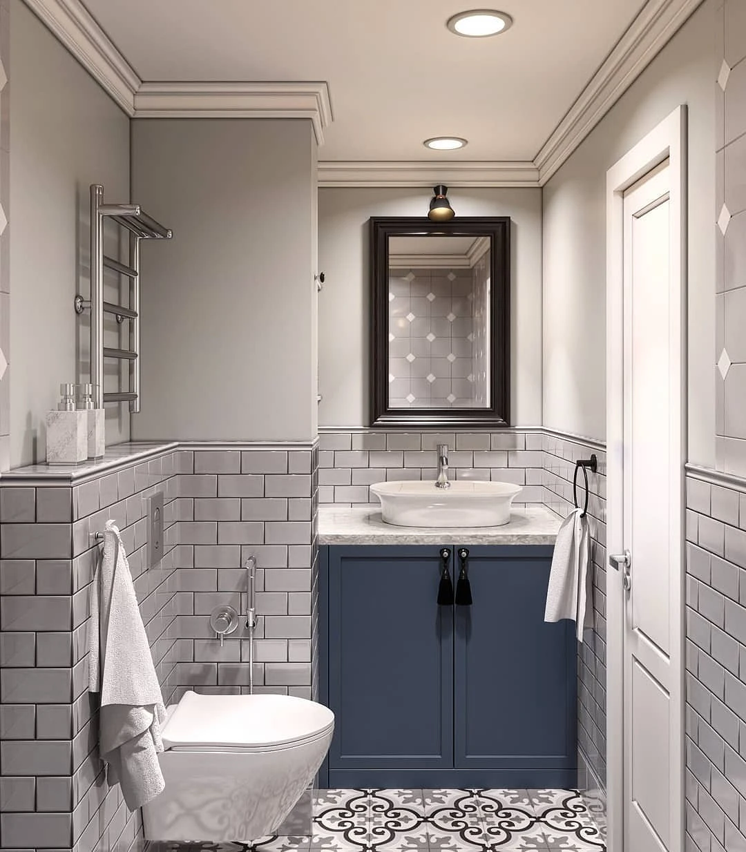
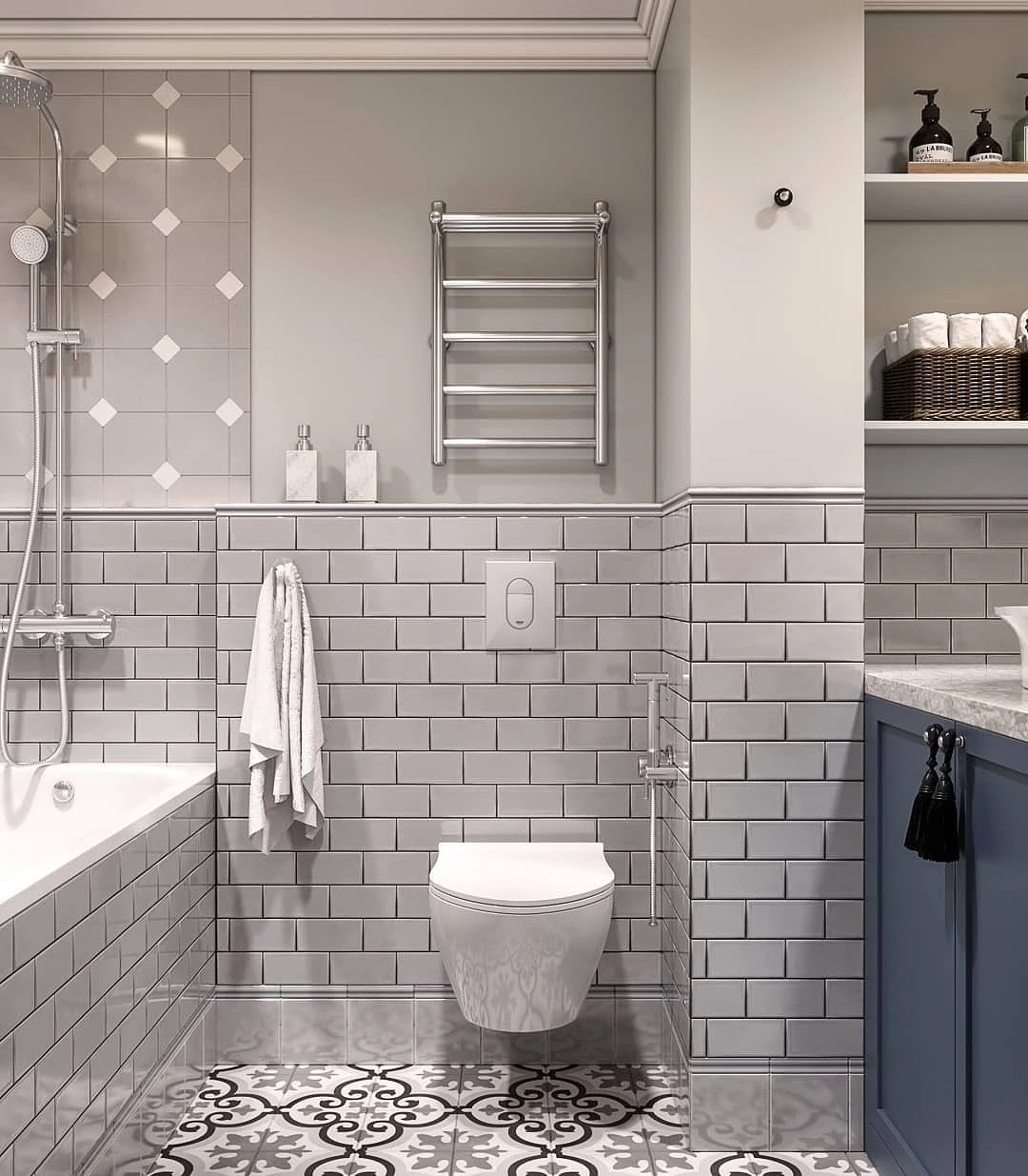
Different surfaces
In a small bathroom space, all surfaces are perceived by the eye as a whole, so it is important to harmoniously select cladding not only for the walls. There are two options for combining with floor tiles.
To match

This can be either a monochrome interior with a difference of 1-2 tones, or just a slight contrast between the color of the flooring and walls. In both cases, a visually holistic space is obtained – this is especially important in a small area, since this way it is not split into separate parts. This makes the bathroom seem more spacious and airy.
The combination of tiles can be any:
- White and light grey.
- Creamy and coffee.
- Nutty and chocolate.
- Any similar shades of the same color.
Remember that the darker the palette, the more attention needs to be paid to ensuring that the interior does not seem cramped and gloomy. Use splashes of light shades (furniture, plumbing fixtures, decor or patterns on the ceramics themselves), mirrors and multi-level lighting.
Contrasting
In this option, the combination of wall and floor tiles is based on noticeably contrasting colors. They may differ in darkness-lightness, saturation, color temperature.

You can even stay within the same color, just choose variations that are as different from each other as possible: for example, pearlescent and anthracite gray or wenge and light brown. A graphic combination of white with black or any other rich color looks impressive: bright blue, emerald, burgundy.
Also pay attention to textures or patterns. If they are on one surface, it is better to make the second one more discreet (ideally, generally monochromatic). For example, match a patterned dark or colored floor with simple wall tiles. And vice versa: if the main finish is multi-colored or with a pattern, the floor covering should be made neutral.


The most important thing about our X that it is for
those who are in a hurry


